April 11, 2019 at 19:34
New Mail.ru Mail and what does the octopus have to do with it
Mail.ru last year turned 20 years old. During its existence, the web version of the product has changed many times - there were only seven full versions. Sometimes we touched only on the technical part, sometimes noticeably changed the appearance. But each time the changes did not happen for a reason - we developed the product, making it faster, more convenient and more modern.
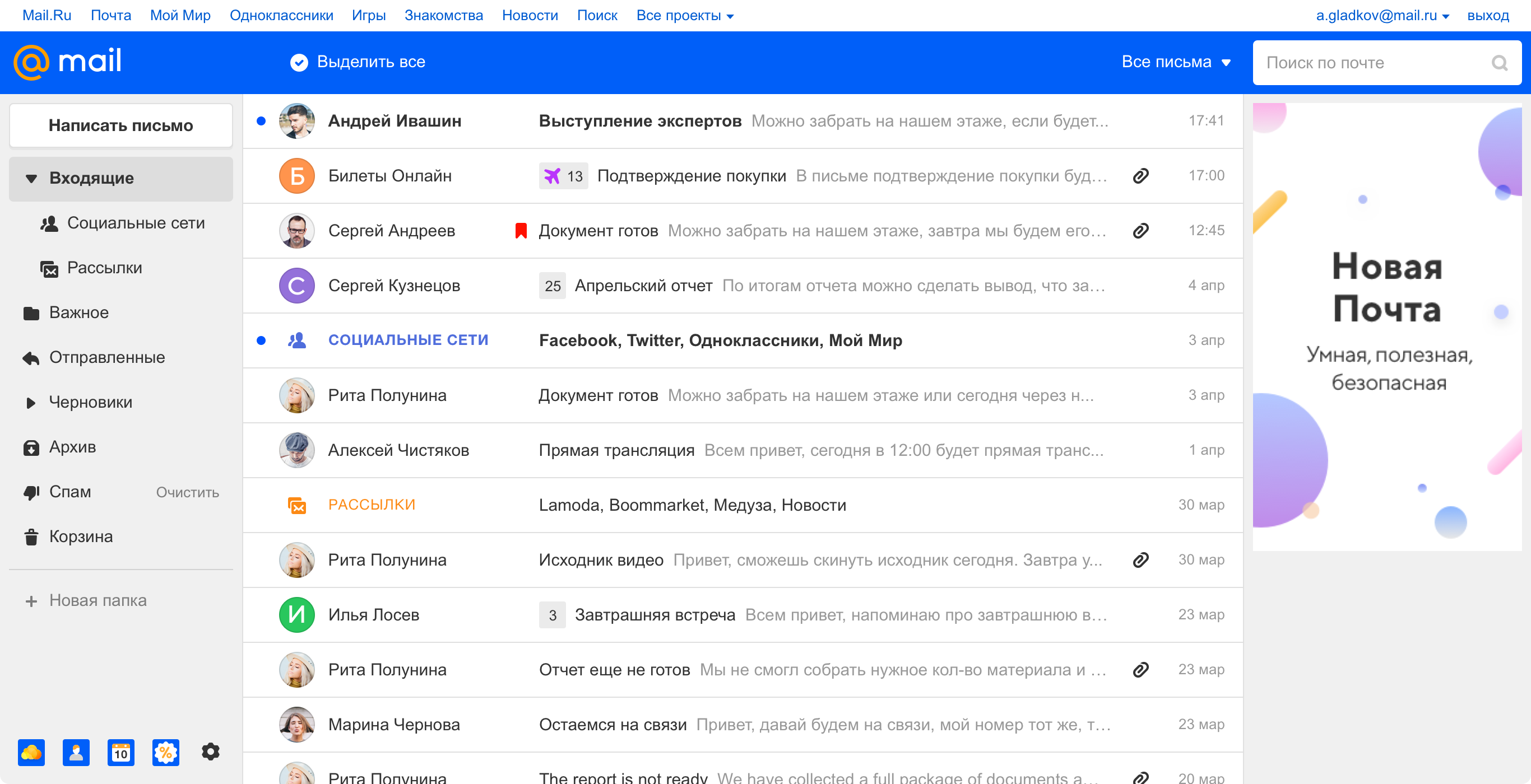
List of letters in the new design, 2019
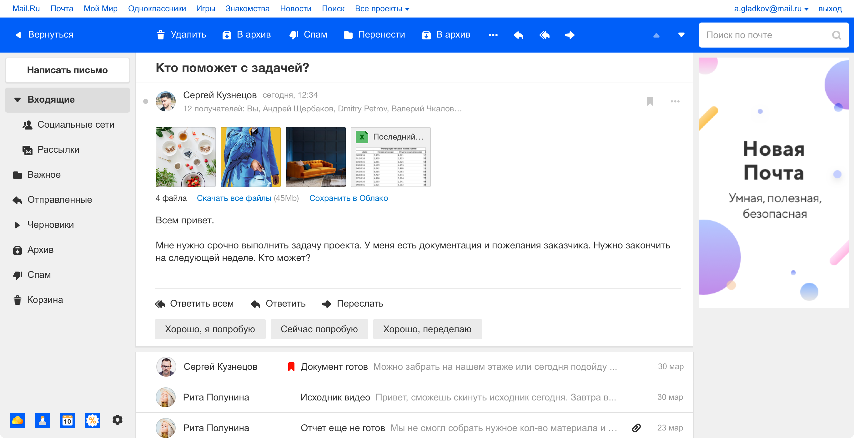
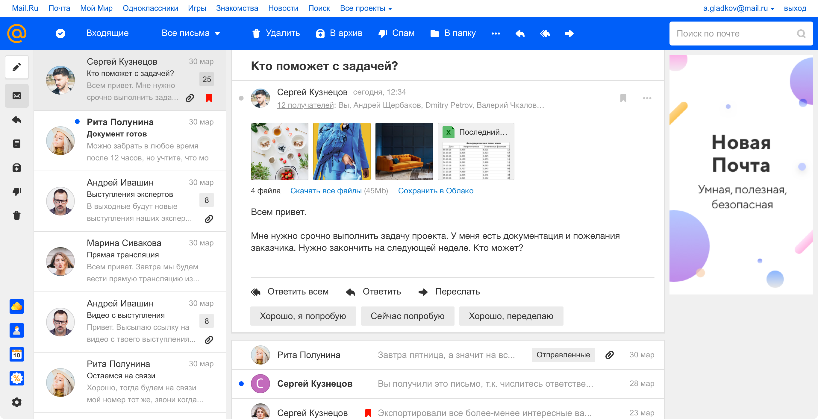
Reading letters in the new design, 2019
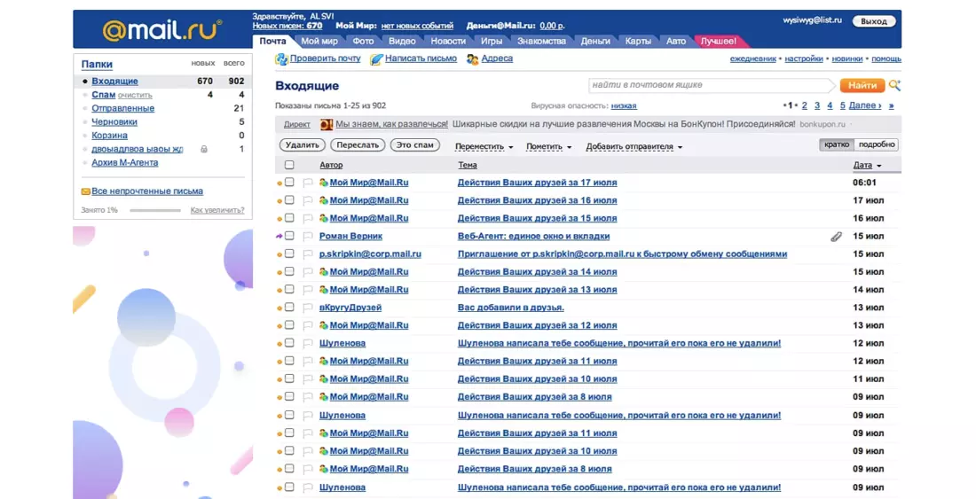
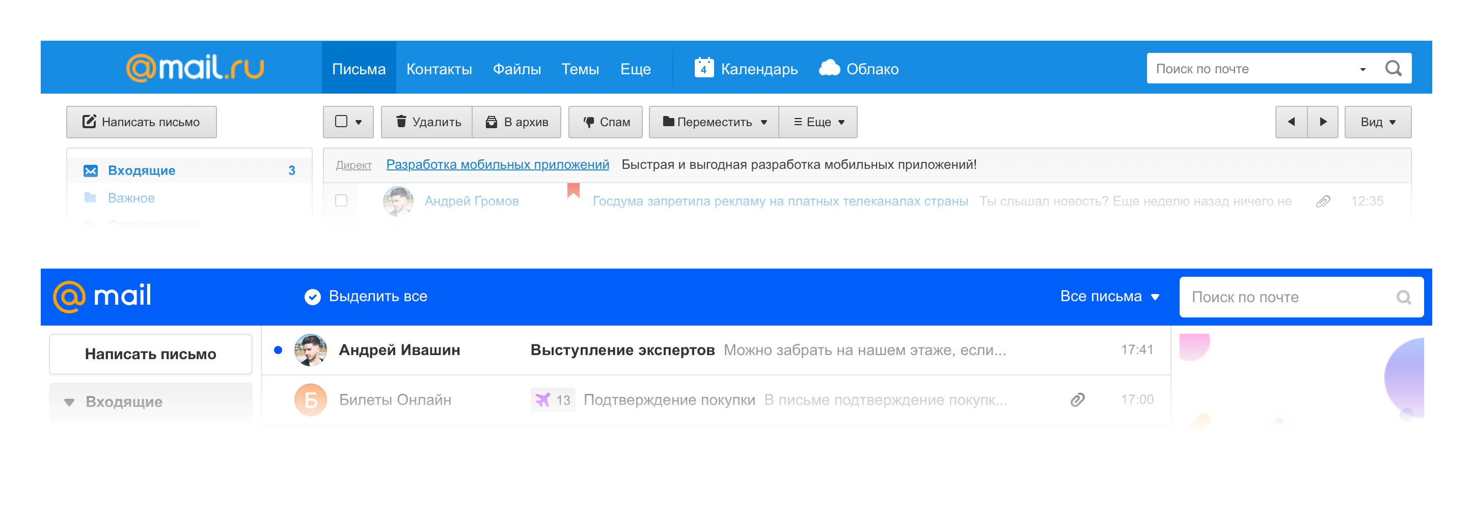
And ten years ago, in 2009, it looked like this:
Mail, 2009
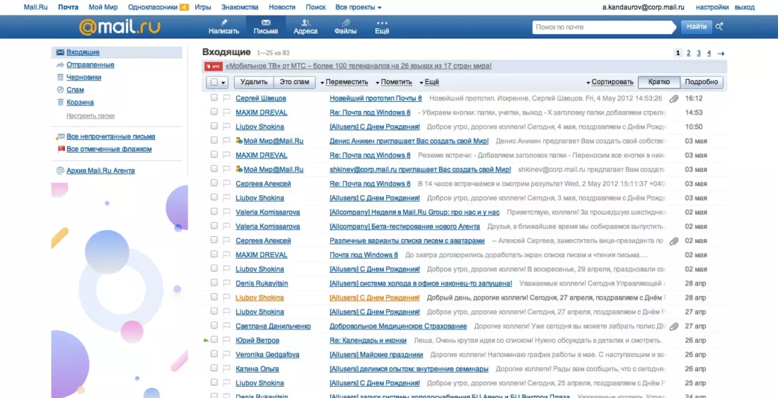
Mail, 2011
The 2014 version of Mail appeared as part of the unification of three products: Calendar, Mail and Cloud. Each service solves its own problem, but at the same time perfectly complements each other - this is a powerful set of tools for solving certain problems, in the company we call them productivity services.
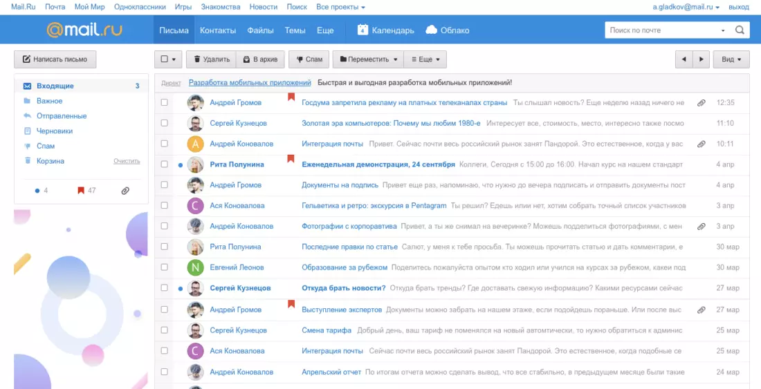
Mail, 2014
In parallel with the web version of Mail, mobile applications of the product were actively developing. The mobile audience grew at a tremendous pace, obvious intersections with the audience of the web became visible, that is, people used the web version at home or at work, and on the go they could use a mobile application or mobile web version. The next step for the product became obvious - it was necessary to move to a single view on all platforms.
There was another important impetus for change - the logo and corporate identity of the company did not change significantly for 10 years, while there was a strong desire to refresh the look. So we got the global task of rebranding the company along with the redesign of the flagship product, on which we could try a new style.
It all started with the product name inside the team. We have a funny tradition of calling versions using Greek numerals, so the project came to be called “Octavius”, because it was the eighth version (oct означает from Greek means “eight”).
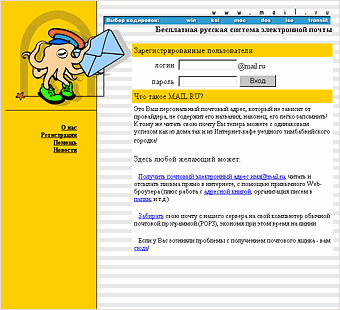
This is consonant with the word octopus, so in the current beta version on the download you can see an octopus - it has become a kind of mascot of the project. An interesting fact is that the octopus appeared in the very first version of the Post in 1998 as an image of a postman who copes with a large number of letters due to the number of hands.

We had a serious task: to remake the web interface of Mail so that it became the same for all platforms. And thereby lay a new approach for all other products of the company.
To decide which way to go, we used the Double-Diamond approach. When we first disagree in the solution options, and then narrow down to a specific one, there may be several such approaches until we get a suitable result.
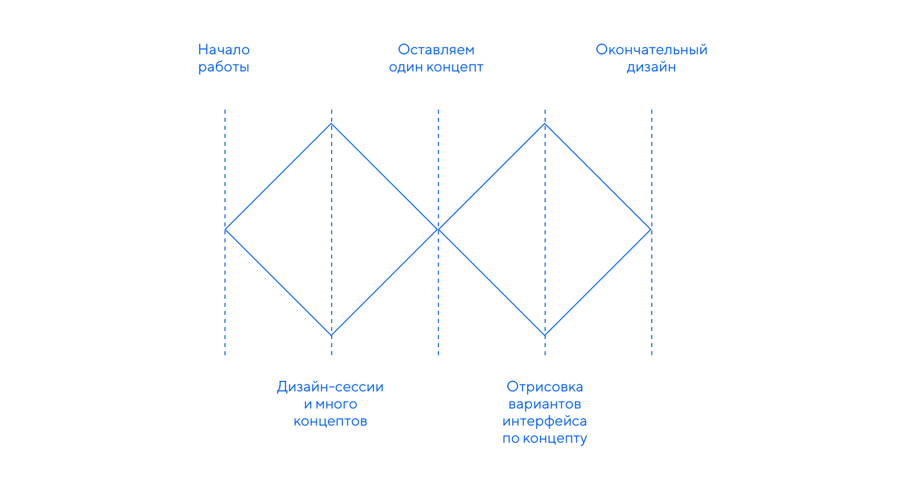
We needed to get more interesting concepts and ideas in order to leave one thing in the end. For this generation, we used design sessions when designers from all departments get together and solve one problem. We often use this approach in the company, it helps to dig a task deeper, and designers dream up and switch from the main working project.
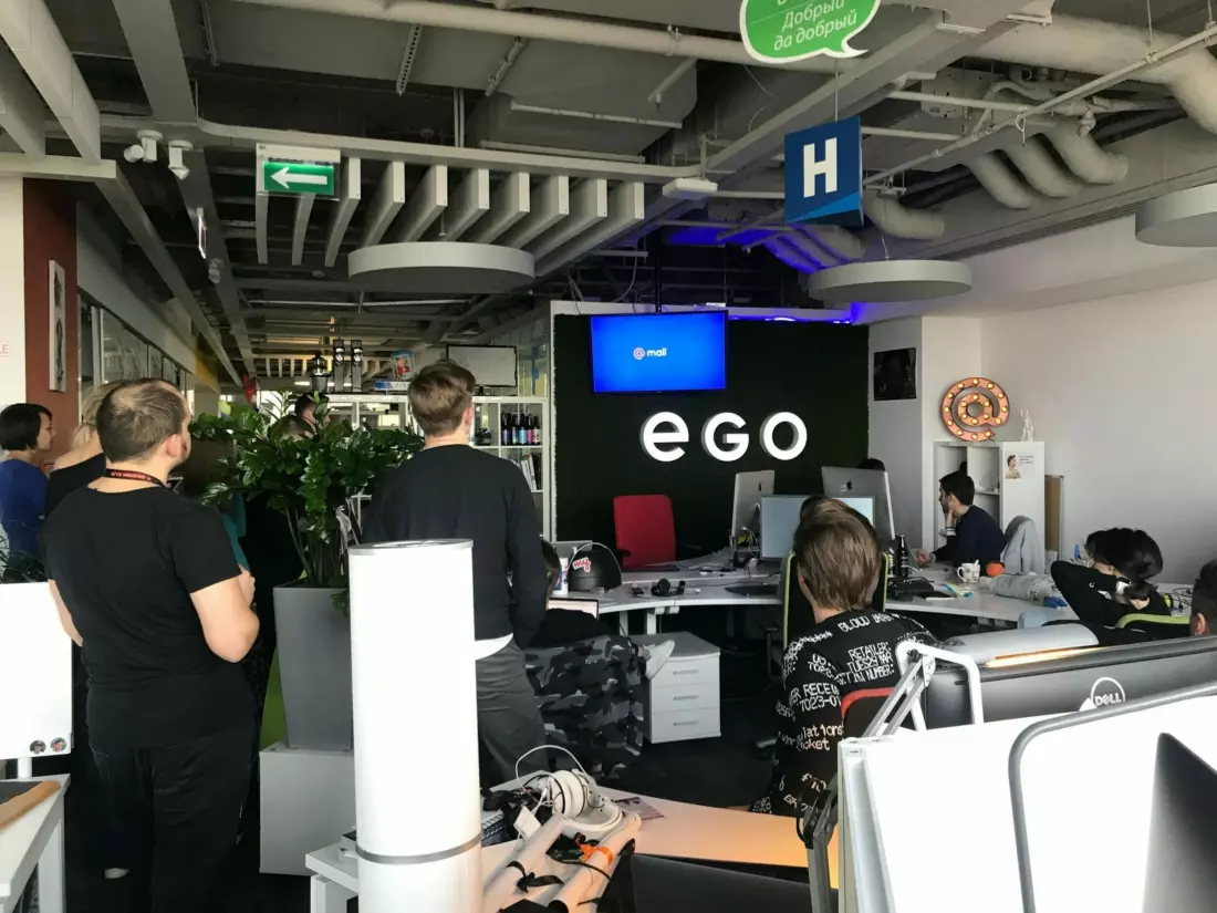
Design department during the presentation of one of the ideas.
First, each designer took on the task alone and without any restrictions drew his own version of the new Mail interface. So we got quite a few different concepts. We considered all the ideas, left strong approaches, combined similar options - this is how several teams formed.
The first group decided to dream up what would happen if the letter or the writing of the letter was opened with a pop-up window. Indeed, on a desktop, work most often occurs with a list of letters, this is the main screen for the user. The rest are additional screens and their states.
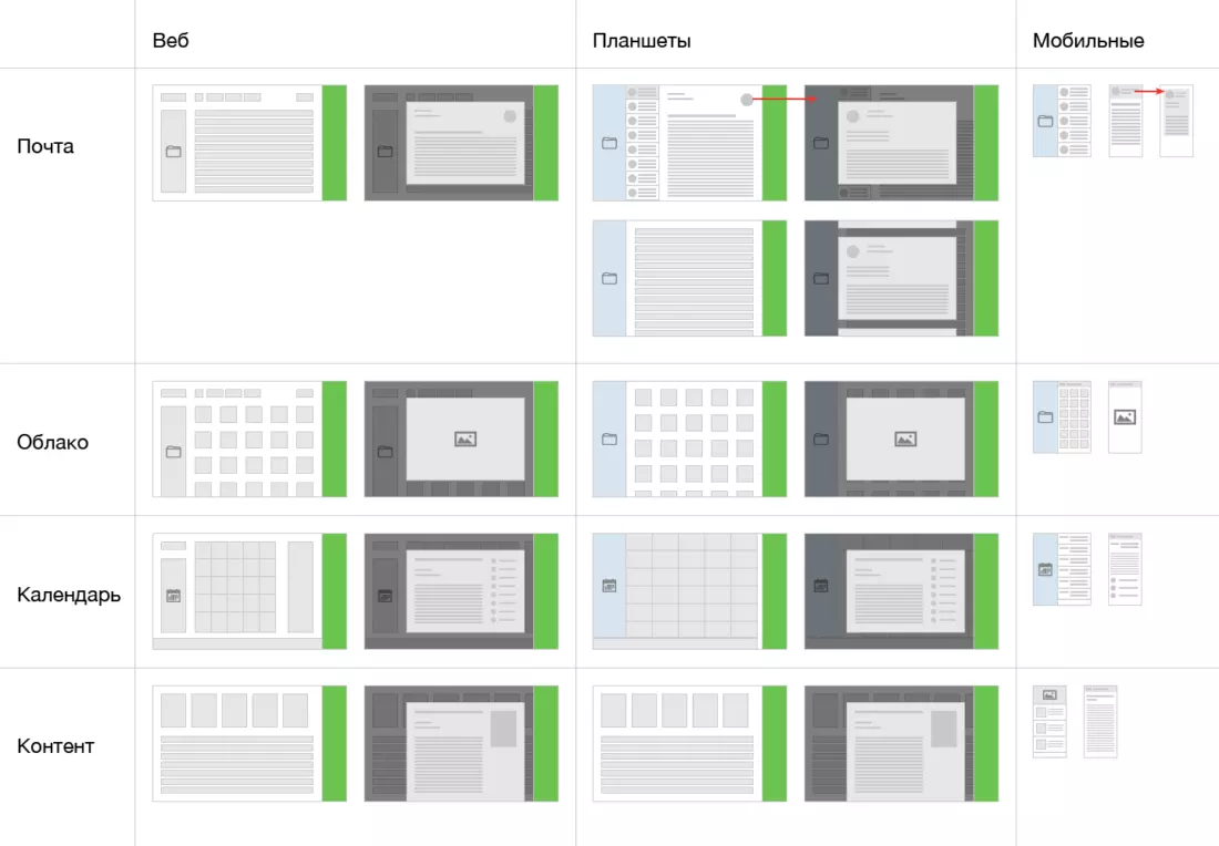
Conceptual diagram for different projects and different screens.
We decided not to take the user away from the main screen, but instead give him the opportunity to solve all problems through pop-ups: this saves interaction time with the interface and leaves the person in the context of his main screen.
For example, the user can scroll the list of letters for an infinitely long time, then write a new letter in the pop-up window and return to the same state of the list of letters as before.
On any site of the company there is a block with portal navigation, which contains links to all projects. We thought that if we revise this structure and give the product all the page space. Divide everything into modules (slice), build it horizontally with the ability to move on them (slide), where the first to put a list of all projects. At the same time, leave the usual movement in the vertical plane (scroll).
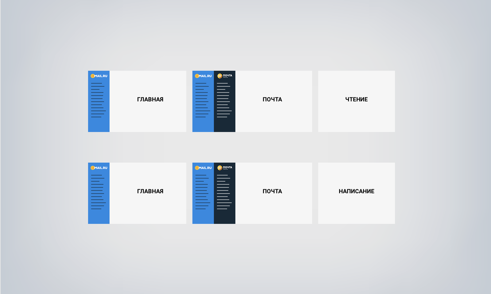
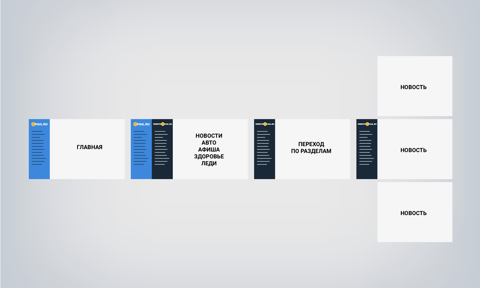
Slice, Slide & Scroll is a bolder look of one of our teams on the scalability and contrast of the visual, the guys from the very beginning did not limit themselves and fantasized about “all the money”. Although some solutions remained within the framework of “concept cars”, the team thought up dozens of interface trivia and microanimations and experimented with typography and “air”. This gave an effect not only for a specific task, but also spread to other projects.

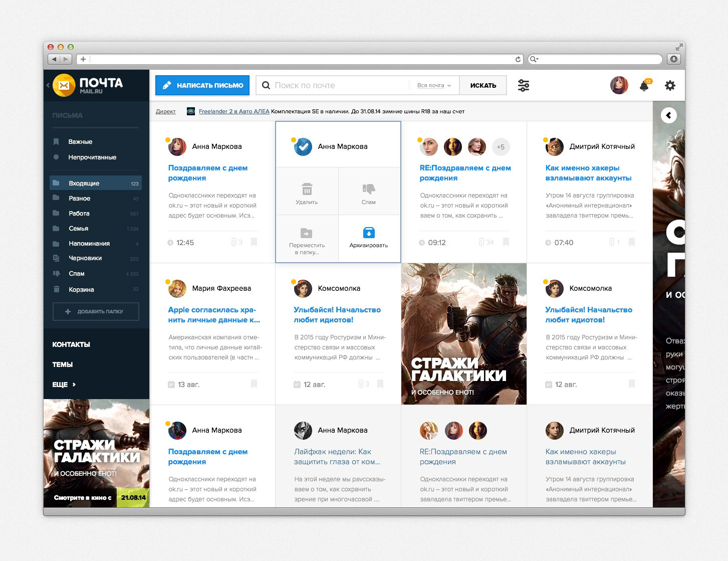

There were two more approaches that started two different teams, but came to very similar results.
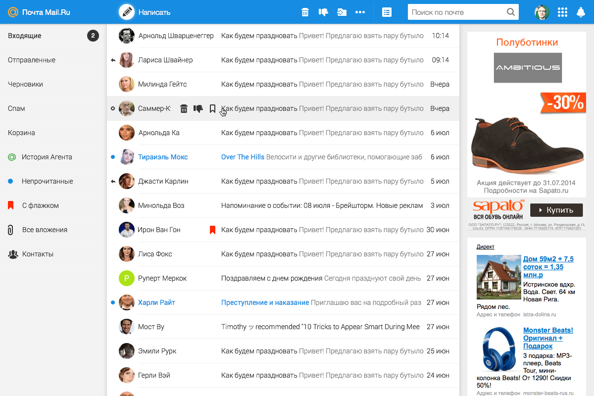
The Flex approach worked well for adaptability: it was clear how the product would look on any device. At the same time, real data and business requirements were taken into account. Those. it turned out to be the most realistic if it came to development.
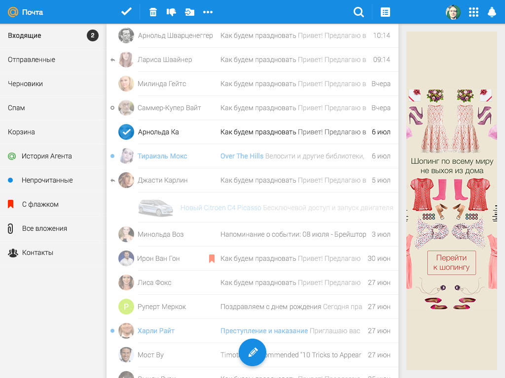
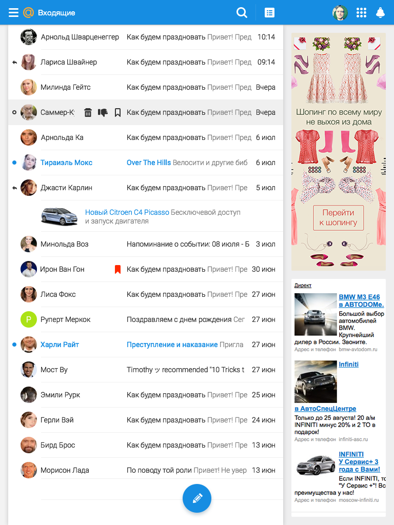
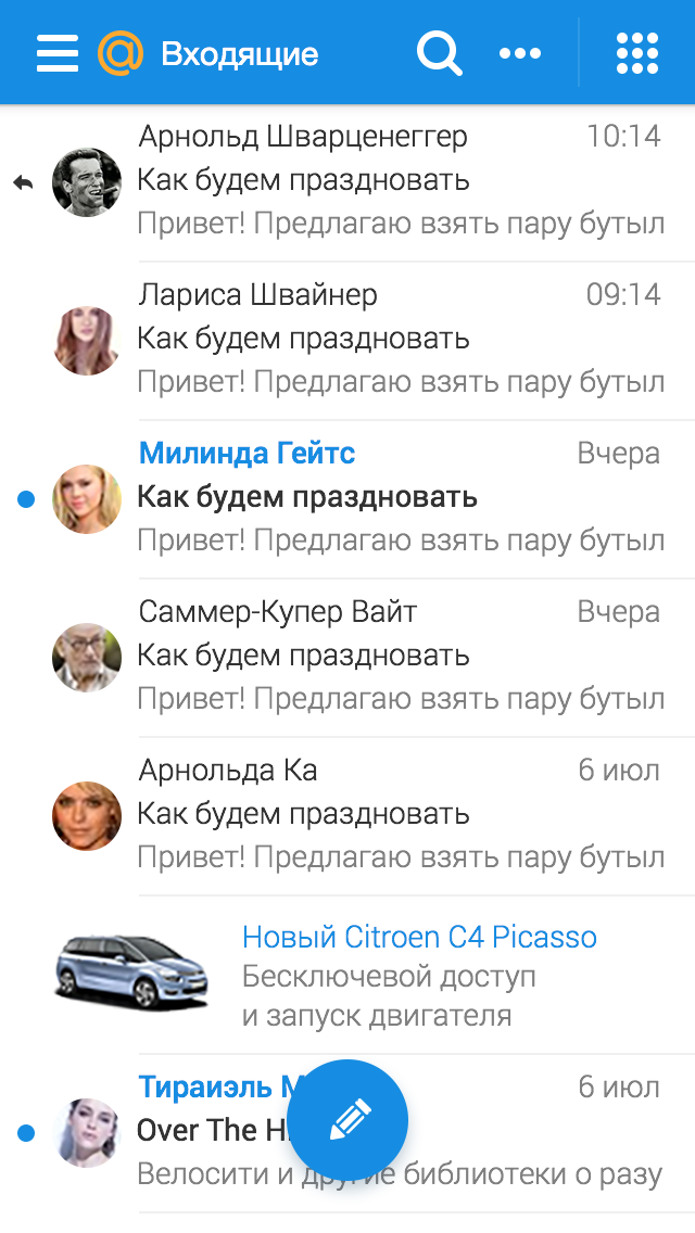
Another approach (Touch) supplemented the appearance with a three-column mode and a convenient view of a narrow column with folders. This gave flexibility to the interface and closed the gaps in scaling at certain screen resolutions.
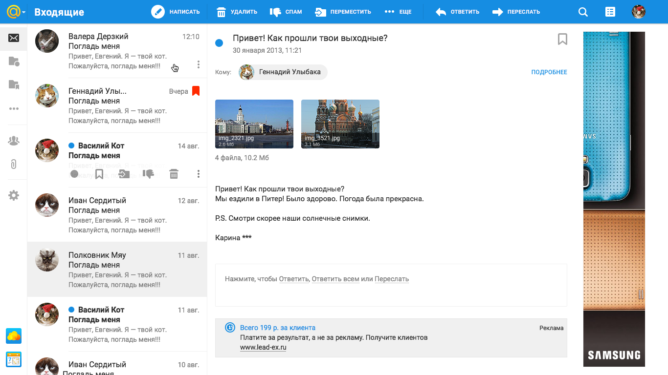
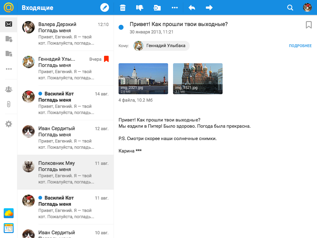
An important advantage of the approach was that it used a lot of mobile patterns. For example, the explicitly enlarged block size, which made the interface on the web suitable for touch use. An additional impulse was the appearance of desktop devices with touch control support, which meant that with the interface it should be convenient to control your finger everywhere, and not just on the tablet and phone.
Based on the results of the design sessions, we got a combined approach: we took Flex and Touch.Mail.ru approaches as the basis, supplementing with successful solutions from other concepts. As the famous cartoon says, we understood a lot from the work done and were able to formulate the design principles on which we assembled the new interface.
It was important for us to maintain a unified user experience on any device, so the adaptability of the interface was extremely important. A person should not experience discomfort when he opens Mail in a mobile browser after a tablet or desktop, the controls should immediately be on the screen.
List of letters.
On the old mail, we support three web versions of the project at once: for desktop, mobile phone and tablet. Now we come to a single view.
The task is not easy, because the product is very complex, therefore, in the beta version, the interface is adapted only to the viewport of the tablet version (the area of the web page visible to the user is equal to the resolution of the tablet). Adaptation to the mobile viewport is already on the way, but for now we are showing the old version in this form.
We needed to make a single interface not only within the web, but also to connect it with our mobile applications, so by default the interface elements are larger, they support comfortable clicking with your finger even on laptops or large tablets with touch screens. This allows you to maintain a single dimension on all devices.
But we know that for many users on desktop resolutions, the amount of information on the screen is important, so we also left a compact display of the interface.
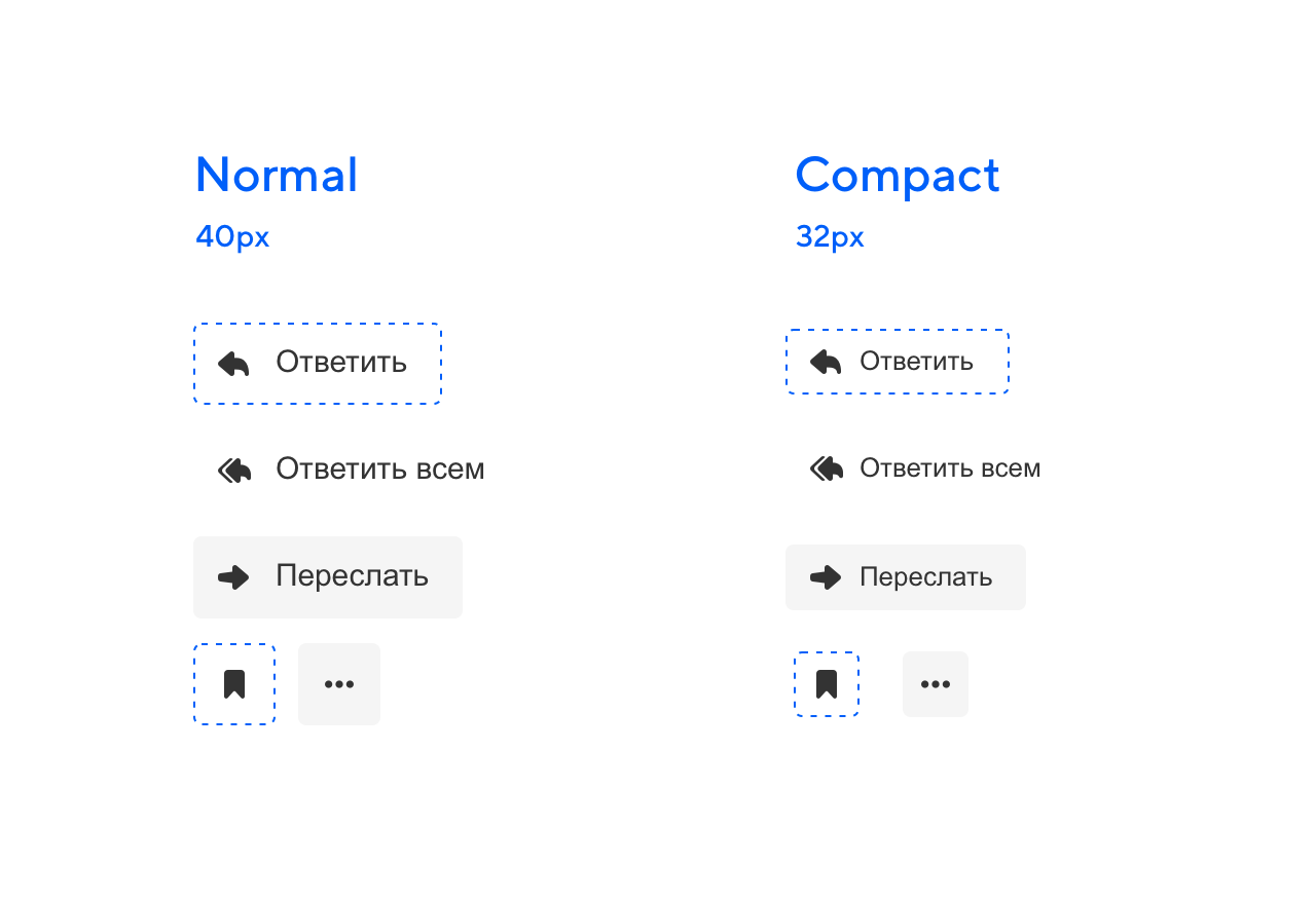
The compact version has always been in our interfaces, this is an important point for productive work. But now the logic of this kind is well developed and has become part of our design system. Change of view is available in Mail settings.
In the appearance settings, another view is also available for users who need to speed up work with letters - a view with a letter column. Thanks to research, we know that our users who are interested in productivity often switch, for example, to Microsoft Outlook, because there is precisely this display mode, when you can see both the list of letters and the open letter, which is extremely convenient in working correspondence.
In the old versions of Mail.ru Mail, it once looked like this, it was called pro.mail.ru, it lived separately and eventually got lost in an attempt to simplify the interface. Now it can be easily found in the settings of your mailbox.
We know that a huge number of our users use Mail for business purposes. And most of the correspondence in the Mail today is precisely business correspondence.
Previously, to write a letter and use the list of letters at the same time, it was necessary to open the spelling in a new window. The same thing happened when it was necessary to write several letters at the same time.
In UX studies of the current version of Mail, we often saw people writing letters in a new browser tab. Therefore, we immediately hoped that a person might need information from his mailbox, for example, from a certain letter. And in case he would need to write several letters at once, we added the window the possibility of folding.
Now all this can be done in one window and return to the list of letters at any time, folding and expanding the letter. You can also write multiple letters at once. That is, we do not take a person anywhere, but give the opportunity to perform everything in one window.
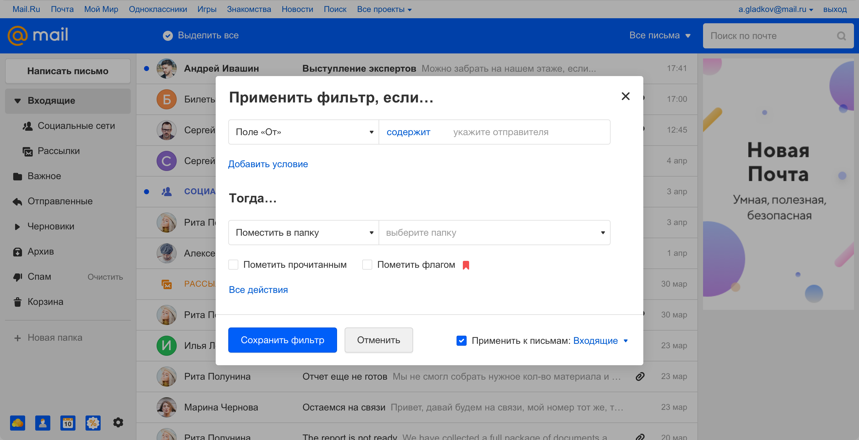
Creating a filter for letters also works. It is available directly from the letter, opening in a pop-up window and without taking a person to a separate screen. In future versions, we will also add the ability to minimize the window.
Relevance in our situation is the ability to cut off the unnecessary, leave only the necessary and emphasize the important.
For example, we used this principle in the upper blue menu, which in the new version began to contain the basic actions with letters and became contextual in order to display only what is needed at the moment.
For example, if we are in an open letter, then the main actions with the letter are displayed in the menu.
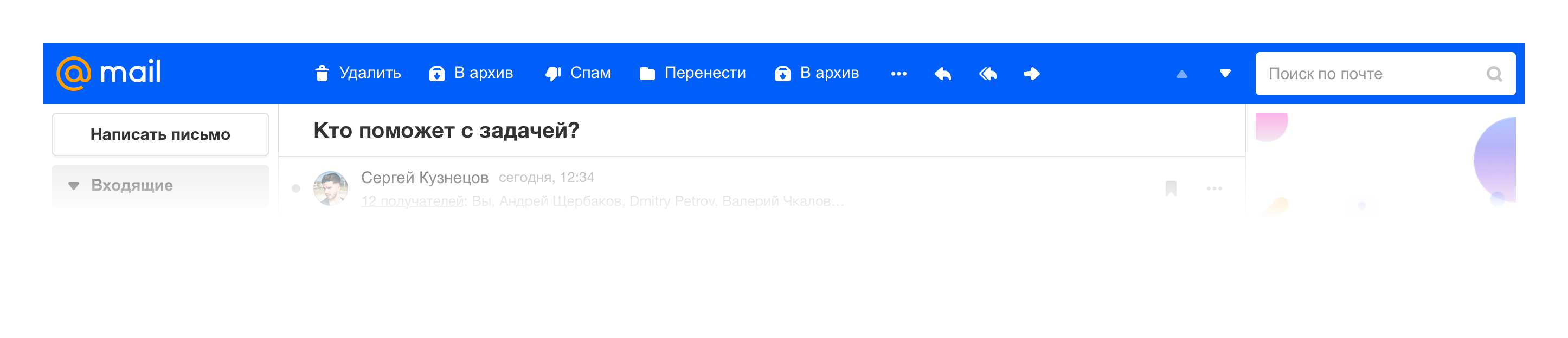
If we select several letters, then we see a set of group actions.
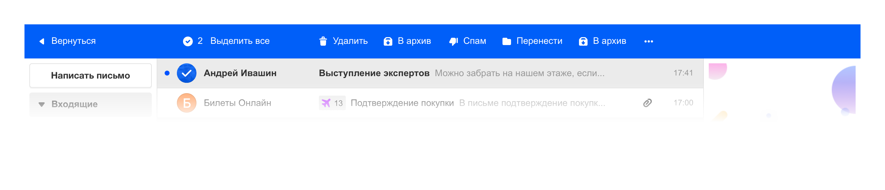
We are well aware of this interaction with the menu from mobile applications. So the project becomes more like a full-fledged web application than a website with endless menu layers.
To offload the interface, we worked with a list of letters. For example, we decided to remove the checkboxes for selecting a specific letter. Although the checkbox looks more obvious, we decided to choose the lightness, especially since such a pattern has already taken root in our mobile applications.
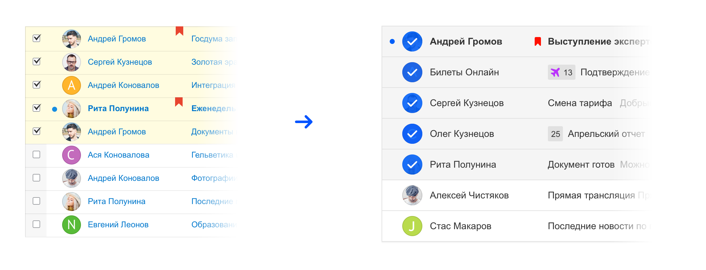
This is the very case of the evolution of a mature product, when some things become obvious and you can try to remove them, and everything will work.
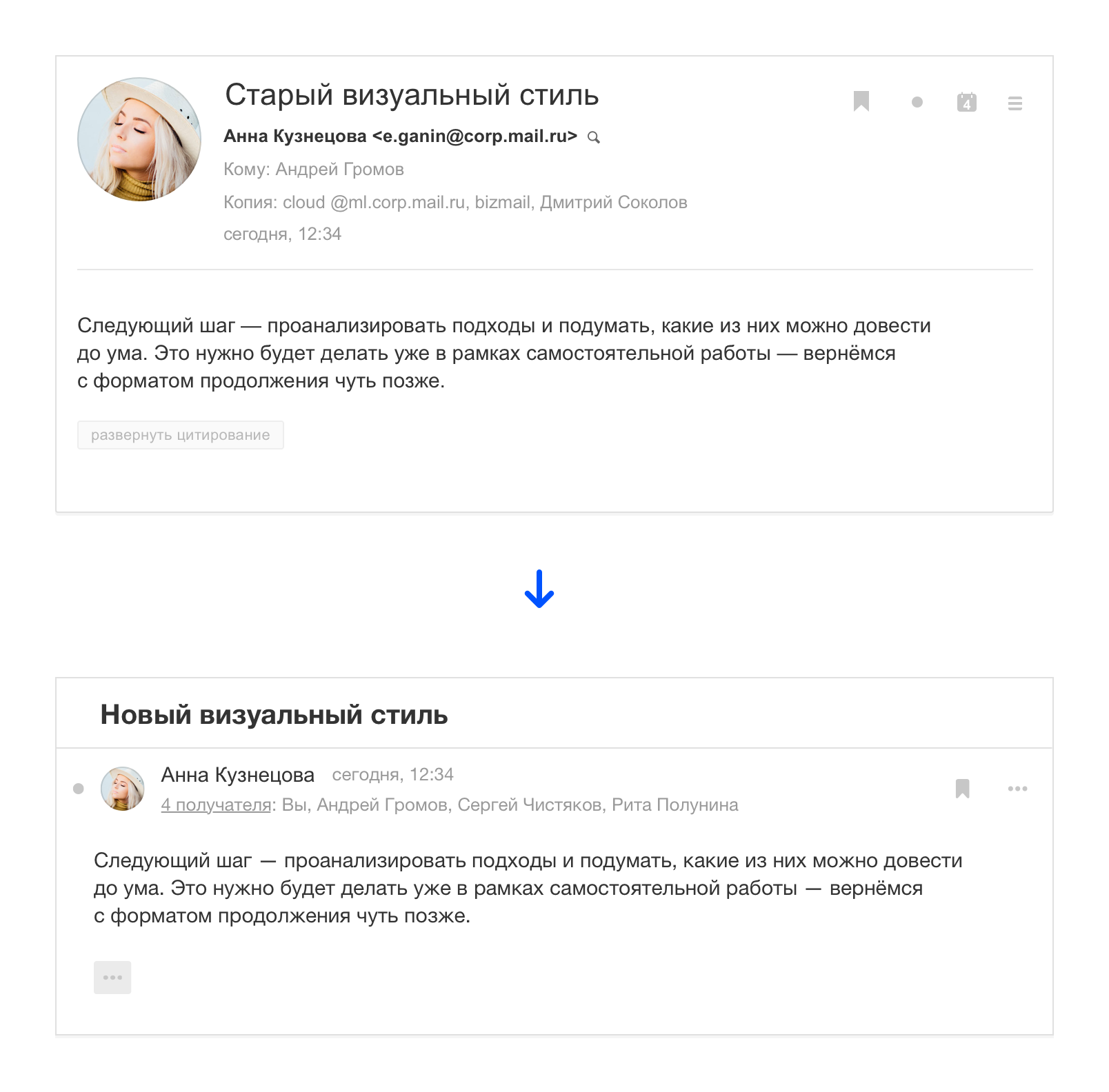
The header of the letter has become more compact so that the content is higher, thereby emphasizing the message itself, and not on who it is from. This can be considered a reference to instant messengers, where the correspondence works according to similar logic.
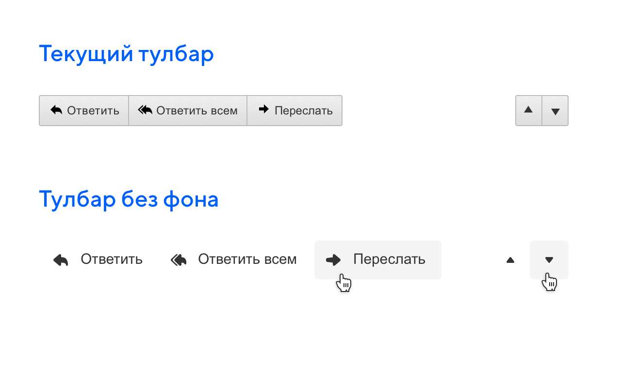
We worked with the interface elements themselves to make them less visual noise. We introduced a button style with no background that doesn't look so heavy. This trend came from mobile applications when the context itself prompts the purpose of the button. The background or underline can be omitted, and actions will still be read.
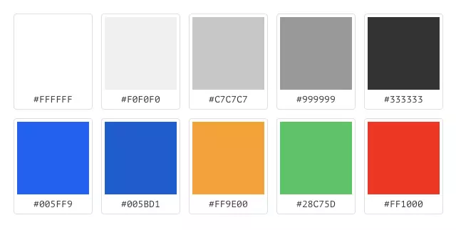
Since the product was constantly growing and sometimes changing in pieces, a mess appeared in the styles, there were too many colors and in different shades. It was not easy to figure out where to use one or the other color, which complicated the work.
In the eighth version, we supported the Paradigm design system, thanks to which we could manage with only 9 colors.
Modern mail is really smart and helps the user in a variety of ways. And our strong machine learning team helps us out.
All email clients suffer not only from spam, but also from a large number of mailings, which we ourselves subscribed to. They can be really useful, but at the same time create chaos in the mail.
In the new version, we made metatreds with the help of which mailings are hidden in a smart folder that can be opened directly on the list of letters. So really important letters, for example, correspondence with people are not lost among a large number of mailings.
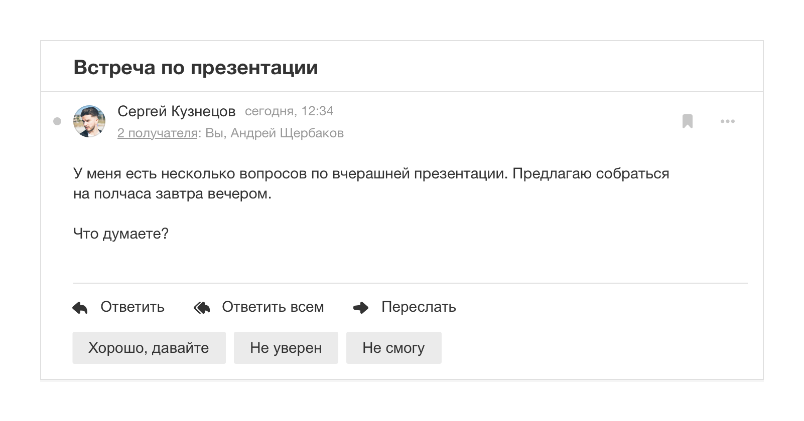
Machine learning has helped us with the answers to letters. Now we can offer ready-made phrases that can be sent quickly. There are always three options: positive, negative and neutral.
The testing process was divided into several stages, at each we checked a specific sample of people and how they solve their problems.
We needed to check how those principles that we used in the new interface work. A series of studies in our UX laboratory helped us with this.
For research, we collected specific respondents: one group of people who uses only the web version of the project and the second, which also adds mobile applications. Since the web interface contained many mobile patterns, we needed to test them on different types of users.
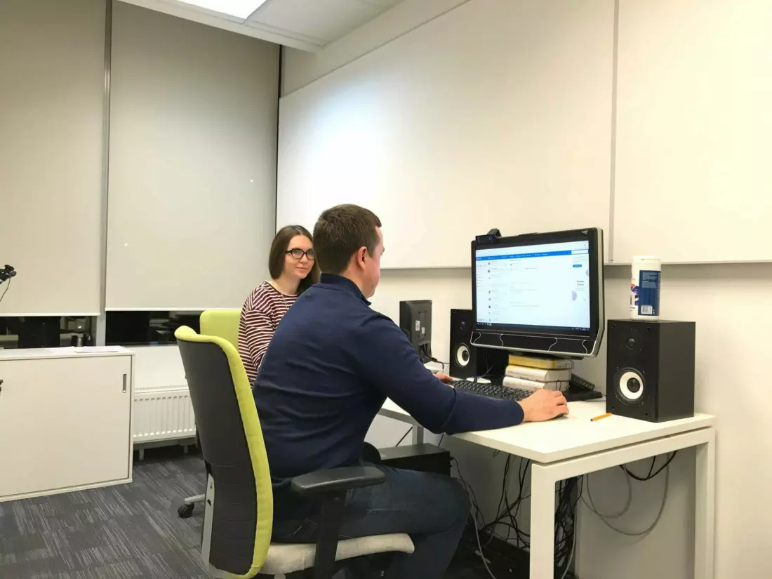
Respondent with research analyst during test.
All respondents performed basic tasks, for example, writing a letter, highlighting letters, and responding to a letter. We diluted standard scenarios with tasks with new features, for example, writing two letters at the same time, using a ready-made quick response to the letter, creating a filter for the sender directly in the letter.
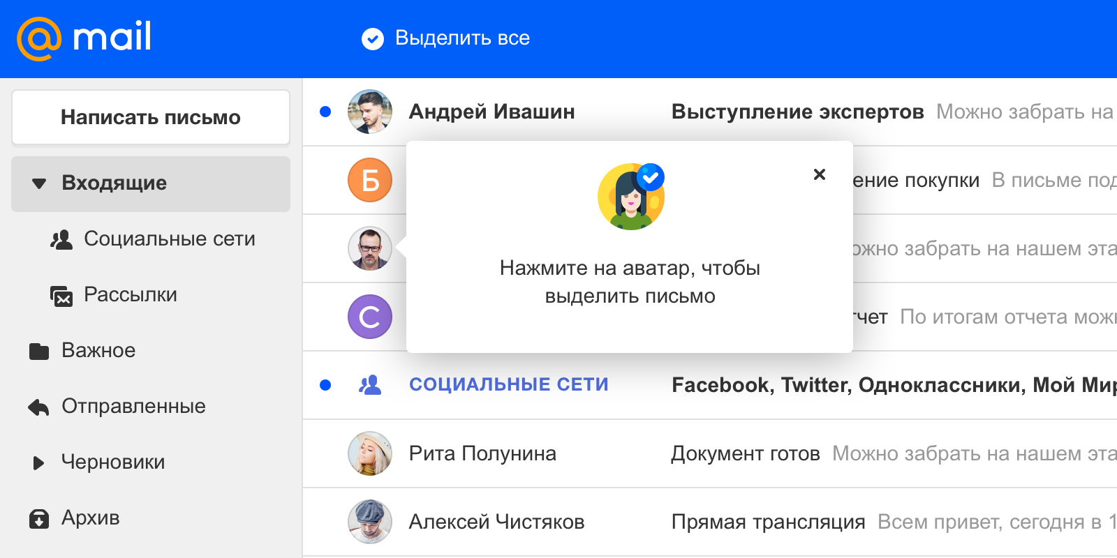
Of all the innovations, the most problematic was the allocation of letters by avatar, especially for users who are not familiar with our mobile applications, where such a solution has long been used. From the experience of applications, we know that over time, users get used to this selection of letters, to teach a new trip, we supplemented the interface by displaying an explicit button for selecting all letters and a hint at the start of use.
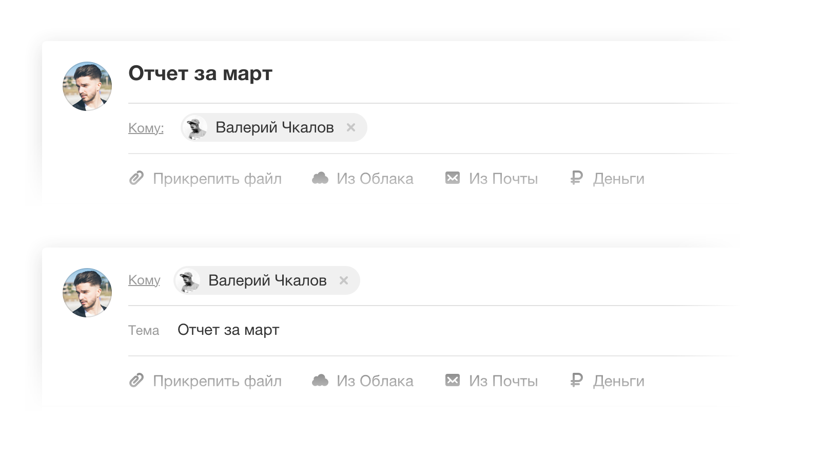
There were also difficulties with the new form of writing the letter, where we tried to swap the fields of the subject line of the letter and recipients. So the spelling repeated the structure of the fields when reading the letter, but the respondents out of habit typed the addressee in the subject of the letter and no prompts in the interface could help, because most people do not look at the screen when they type something. As a result, we returned the classic field order.
In the main scenarios, no more problems arose. Respondents positively evaluated the external new mail, talked about the cleanliness and simplicity of the interface, compared it with mobile and desktop applications of email clients, and this is what we achieved.
Mail.ru Group is a large company with a huge staff, so colleagues are among the first to get the opportunity to see new products, and we get useful feedback from them. For most, Mail is the main working tool, so this scenario becomes a good test for experienced users, and you can see problems across the entire set of tools, and not just in the basic scripts.
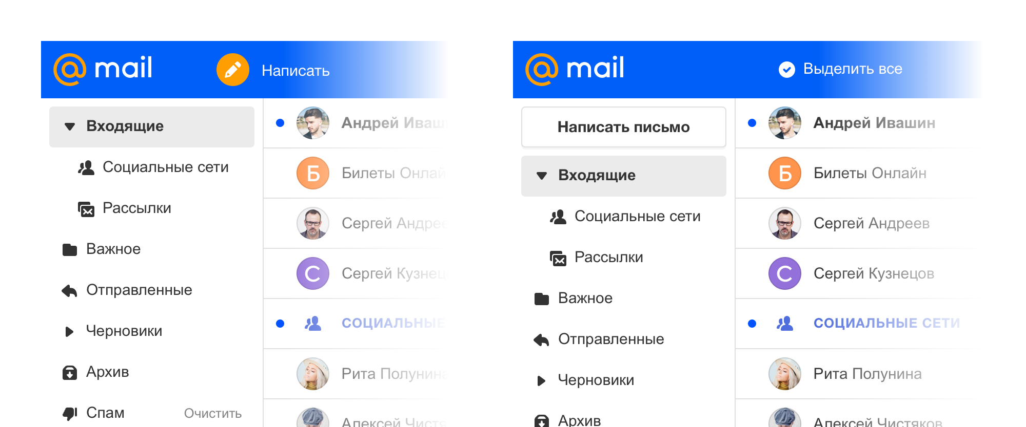
Having shown the product inside, we received a number of wishes. For example, in the first approach, the button for writing a letter was contextual and hid when switching to search or selecting letters in the list. The need for constant access to this button is an important point for professional users. Realizing the fact that it should always be available, we made it through.
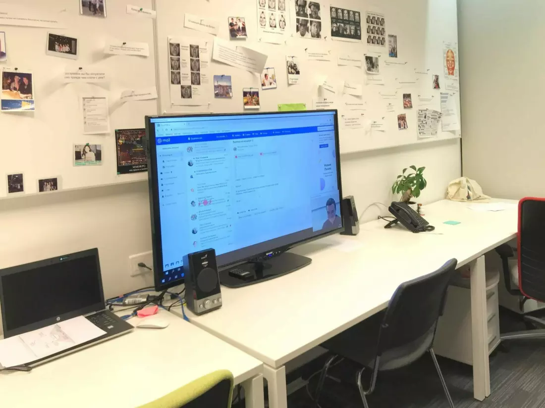
We tested adaptability great, because the company has a huge number of different monitors and laptops. We immediately began to receive feedback on what border permissions something broke.
At this stage, we did not start the view settings and showed a large view by default. The most important request among experienced users was to return a compact display. After that, it became obvious that this kind should be done as soon as possible if we do not want to sit in this audience.
Also, corporate users immediately drew attention to the little things that you get used to when working actively with letters and without them it becomes really uncomfortable. For example, a person writes about attachments in a letter, but does not attach them. Previously, we asked if he forgot to attach them, but in the new version they missed it. So users again began to make similar mistakes and told us about it.
Tests in corporate conditions are one-sided, because these are experienced users who actively use the product for work. In the UX lab, we meet just ordinary users, but the selection is very small for quantitative conclusions. And we needed to find out what we didn’t like or lacked for ordinary users. Therefore, the next step was testing on the beta community - we offer every Mail user to connect to it and test new features before they get to the main interface.
For example, a lot of requests were received for translating letters, which we wanted to postpone, but we reviewed the situation and added a little faster to the interface.
There wasn’t enough the transition to creating folders - in the old version there was a link in the list of folders. We returned this opportunity, but accelerated the process. Now you can create a folder directly in the list, raising the pop-up window, and not go to a separate page as before.
We also launched a survey of new users to hear their opinion about the new interface. Among other things, users noted that they liked the design, proximity to desktop clients, the ability to customize the appearance of the mailbox and the endless scroll of letters.
There were critical reviews, for example, for many, the new interface was simply unaccustomed to, which often happens with the redesign of mature products - it is difficult for users to change their habits and switch to a new interface in an instant.
It was important for us to hear about the sensations from prolonged use of the product - this is a quality metric. From previous reviews, we knew that switching to a new interface was uncomfortable. But even greater discomfort is the return to the old, when he had already spent time in the new. As a result, we see that the percentage of return to the old interface among connected users is steadily decreasing as product updates.
In addition to quality, we also checked quantitative metrics - the main thing for us is how often users return to the interface to solve their problems (retention rate). And this figure has grown. In addition, users began to interact more actively with emails, for example, there were almost half the answers and openings of attached files.
Mail is a large and mature project with a huge audience, and we know firsthand how difficult it is to make such a redesign. We are not in a hurry and are carefully moving towards making the beta version the main mail client, but the first conclusions can already be made.
The new web interface, along with mobile applications, helped build the product as a single system, where the visual style and interaction with elements is preserved. This changed the approach to working within the team: the separation between the mobile and the web designer has disappeared, today this is the person responsible for rendering the entire product. But most importantly, it gives a unified experience to users of Mail and makes the transition from one device to another as seamless as possible.
The new interface is available at: octavius.mail.ru .
List of letters in the new design, 2019
Reading letters in the new design, 2019
And ten years ago, in 2009, it looked like this:
Mail, 2009
Mail, 2011
The 2014 version of Mail appeared as part of the unification of three products: Calendar, Mail and Cloud. Each service solves its own problem, but at the same time perfectly complements each other - this is a powerful set of tools for solving certain problems, in the company we call them productivity services.
Mail, 2014
In parallel with the web version of Mail, mobile applications of the product were actively developing. The mobile audience grew at a tremendous pace, obvious intersections with the audience of the web became visible, that is, people used the web version at home or at work, and on the go they could use a mobile application or mobile web version. The next step for the product became obvious - it was necessary to move to a single view on all platforms.
There was another important impetus for change - the logo and corporate identity of the company did not change significantly for 10 years, while there was a strong desire to refresh the look. So we got the global task of rebranding the company along with the redesign of the flagship product, on which we could try a new style.
First concepts
It all started with the product name inside the team. We have a funny tradition of calling versions using Greek numerals, so the project came to be called “Octavius”, because it was the eighth version (oct означает from Greek means “eight”).
This is consonant with the word octopus, so in the current beta version on the download you can see an octopus - it has become a kind of mascot of the project. An interesting fact is that the octopus appeared in the very first version of the Post in 1998 as an image of a postman who copes with a large number of letters due to the number of hands.
We had a serious task: to remake the web interface of Mail so that it became the same for all platforms. And thereby lay a new approach for all other products of the company.
To decide which way to go, we used the Double-Diamond approach. When we first disagree in the solution options, and then narrow down to a specific one, there may be several such approaches until we get a suitable result.
We needed to get more interesting concepts and ideas in order to leave one thing in the end. For this generation, we used design sessions when designers from all departments get together and solve one problem. We often use this approach in the company, it helps to dig a task deeper, and designers dream up and switch from the main working project.
Design department during the presentation of one of the ideas.
First, each designer took on the task alone and without any restrictions drew his own version of the new Mail interface. So we got quite a few different concepts. We considered all the ideas, left strong approaches, combined similar options - this is how several teams formed.
Popup concept
The first group decided to dream up what would happen if the letter or the writing of the letter was opened with a pop-up window. Indeed, on a desktop, work most often occurs with a list of letters, this is the main screen for the user. The rest are additional screens and their states.
Conceptual diagram for different projects and different screens.
We decided not to take the user away from the main screen, but instead give him the opportunity to solve all problems through pop-ups: this saves interaction time with the interface and leaves the person in the context of his main screen.
For example, the user can scroll the list of letters for an infinitely long time, then write a new letter in the pop-up window and return to the same state of the list of letters as before.
Slice, Slide & Scroll
On any site of the company there is a block with portal navigation, which contains links to all projects. We thought that if we revise this structure and give the product all the page space. Divide everything into modules (slice), build it horizontally with the ability to move on them (slide), where the first to put a list of all projects. At the same time, leave the usual movement in the vertical plane (scroll).
Slice, Slide & Scroll is a bolder look of one of our teams on the scalability and contrast of the visual, the guys from the very beginning did not limit themselves and fantasized about “all the money”. Although some solutions remained within the framework of “concept cars”, the team thought up dozens of interface trivia and microanimations and experimented with typography and “air”. This gave an effect not only for a specific task, but also spread to other projects.
Flex and Touch
There were two more approaches that started two different teams, but came to very similar results.
The Flex approach worked well for adaptability: it was clear how the product would look on any device. At the same time, real data and business requirements were taken into account. Those. it turned out to be the most realistic if it came to development.
Another approach (Touch) supplemented the appearance with a three-column mode and a convenient view of a narrow column with folders. This gave flexibility to the interface and closed the gaps in scaling at certain screen resolutions.
An important advantage of the approach was that it used a lot of mobile patterns. For example, the explicitly enlarged block size, which made the interface on the web suitable for touch use. An additional impulse was the appearance of desktop devices with touch control support, which meant that with the interface it should be convenient to control your finger everywhere, and not just on the tablet and phone.
Principles of the new interface
Based on the results of the design sessions, we got a combined approach: we took Flex and Touch.Mail.ru approaches as the basis, supplementing with successful solutions from other concepts. As the famous cartoon says, we understood a lot from the work done and were able to formulate the design principles on which we assembled the new interface.
- Adaptability: the web version of Mail should be available on all devices, from desktop to mobile phone
- Versatility: the appearance adapts to specific tasks
- Efficiency: the ability to work with the interface in one window and accelerate the work with familiar tasks
- Relevance: maintain the context of the situation and show only the necessary
- Cleanliness and simplicity: less visual noise and extra elements
- Intelligence in the interface: the ability of Mail to solve routine tasks for the user.
Interface adaptability
It was important for us to maintain a unified user experience on any device, so the adaptability of the interface was extremely important. A person should not experience discomfort when he opens Mail in a mobile browser after a tablet or desktop, the controls should immediately be on the screen.
List of letters.
On the old mail, we support three web versions of the project at once: for desktop, mobile phone and tablet. Now we come to a single view.
The task is not easy, because the product is very complex, therefore, in the beta version, the interface is adapted only to the viewport of the tablet version (the area of the web page visible to the user is equal to the resolution of the tablet). Adaptation to the mobile viewport is already on the way, but for now we are showing the old version in this form.
Interface versatility
We needed to make a single interface not only within the web, but also to connect it with our mobile applications, so by default the interface elements are larger, they support comfortable clicking with your finger even on laptops or large tablets with touch screens. This allows you to maintain a single dimension on all devices.
But we know that for many users on desktop resolutions, the amount of information on the screen is important, so we also left a compact display of the interface.
The compact version has always been in our interfaces, this is an important point for productive work. But now the logic of this kind is well developed and has become part of our design system. Change of view is available in Mail settings.
In the appearance settings, another view is also available for users who need to speed up work with letters - a view with a letter column. Thanks to research, we know that our users who are interested in productivity often switch, for example, to Microsoft Outlook, because there is precisely this display mode, when you can see both the list of letters and the open letter, which is extremely convenient in working correspondence.
In the old versions of Mail.ru Mail, it once looked like this, it was called pro.mail.ru, it lived separately and eventually got lost in an attempt to simplify the interface. Now it can be easily found in the settings of your mailbox.
Interface Performance
We know that a huge number of our users use Mail for business purposes. And most of the correspondence in the Mail today is precisely business correspondence.
Previously, to write a letter and use the list of letters at the same time, it was necessary to open the spelling in a new window. The same thing happened when it was necessary to write several letters at the same time.
In UX studies of the current version of Mail, we often saw people writing letters in a new browser tab. Therefore, we immediately hoped that a person might need information from his mailbox, for example, from a certain letter. And in case he would need to write several letters at once, we added the window the possibility of folding.
Now all this can be done in one window and return to the list of letters at any time, folding and expanding the letter. You can also write multiple letters at once. That is, we do not take a person anywhere, but give the opportunity to perform everything in one window.
Creating a filter for letters also works. It is available directly from the letter, opening in a pop-up window and without taking a person to a separate screen. In future versions, we will also add the ability to minimize the window.
Interface Relevance
Relevance in our situation is the ability to cut off the unnecessary, leave only the necessary and emphasize the important.
For example, we used this principle in the upper blue menu, which in the new version began to contain the basic actions with letters and became contextual in order to display only what is needed at the moment.
For example, if we are in an open letter, then the main actions with the letter are displayed in the menu.
If we select several letters, then we see a set of group actions.
We are well aware of this interaction with the menu from mobile applications. So the project becomes more like a full-fledged web application than a website with endless menu layers.
To offload the interface, we worked with a list of letters. For example, we decided to remove the checkboxes for selecting a specific letter. Although the checkbox looks more obvious, we decided to choose the lightness, especially since such a pattern has already taken root in our mobile applications.
This is the very case of the evolution of a mature product, when some things become obvious and you can try to remove them, and everything will work.
The header of the letter has become more compact so that the content is higher, thereby emphasizing the message itself, and not on who it is from. This can be considered a reference to instant messengers, where the correspondence works according to similar logic.
Clean and simple interface
We worked with the interface elements themselves to make them less visual noise. We introduced a button style with no background that doesn't look so heavy. This trend came from mobile applications when the context itself prompts the purpose of the button. The background or underline can be omitted, and actions will still be read.
Since the product was constantly growing and sometimes changing in pieces, a mess appeared in the styles, there were too many colors and in different shades. It was not easy to figure out where to use one or the other color, which complicated the work.
In the eighth version, we supported the Paradigm design system, thanks to which we could manage with only 9 colors.
Intelligence in the interface
Modern mail is really smart and helps the user in a variety of ways. And our strong machine learning team helps us out.
All email clients suffer not only from spam, but also from a large number of mailings, which we ourselves subscribed to. They can be really useful, but at the same time create chaos in the mail.
In the new version, we made metatreds with the help of which mailings are hidden in a smart folder that can be opened directly on the list of letters. So really important letters, for example, correspondence with people are not lost among a large number of mailings.
Machine learning has helped us with the answers to letters. Now we can offer ready-made phrases that can be sent quickly. There are always three options: positive, negative and neutral.
Testing
The testing process was divided into several stages, at each we checked a specific sample of people and how they solve their problems.
UX research in the laboratory
We needed to check how those principles that we used in the new interface work. A series of studies in our UX laboratory helped us with this.
For research, we collected specific respondents: one group of people who uses only the web version of the project and the second, which also adds mobile applications. Since the web interface contained many mobile patterns, we needed to test them on different types of users.
Respondent with research analyst during test.
All respondents performed basic tasks, for example, writing a letter, highlighting letters, and responding to a letter. We diluted standard scenarios with tasks with new features, for example, writing two letters at the same time, using a ready-made quick response to the letter, creating a filter for the sender directly in the letter.
Of all the innovations, the most problematic was the allocation of letters by avatar, especially for users who are not familiar with our mobile applications, where such a solution has long been used. From the experience of applications, we know that over time, users get used to this selection of letters, to teach a new trip, we supplemented the interface by displaying an explicit button for selecting all letters and a hint at the start of use.
There were also difficulties with the new form of writing the letter, where we tried to swap the fields of the subject line of the letter and recipients. So the spelling repeated the structure of the fields when reading the letter, but the respondents out of habit typed the addressee in the subject of the letter and no prompts in the interface could help, because most people do not look at the screen when they type something. As a result, we returned the classic field order.
In the main scenarios, no more problems arose. Respondents positively evaluated the external new mail, talked about the cleanliness and simplicity of the interface, compared it with mobile and desktop applications of email clients, and this is what we achieved.
Testing on corporate users
Mail.ru Group is a large company with a huge staff, so colleagues are among the first to get the opportunity to see new products, and we get useful feedback from them. For most, Mail is the main working tool, so this scenario becomes a good test for experienced users, and you can see problems across the entire set of tools, and not just in the basic scripts.
Having shown the product inside, we received a number of wishes. For example, in the first approach, the button for writing a letter was contextual and hid when switching to search or selecting letters in the list. The need for constant access to this button is an important point for professional users. Realizing the fact that it should always be available, we made it through.
We tested adaptability great, because the company has a huge number of different monitors and laptops. We immediately began to receive feedback on what border permissions something broke.
At this stage, we did not start the view settings and showed a large view by default. The most important request among experienced users was to return a compact display. After that, it became obvious that this kind should be done as soon as possible if we do not want to sit in this audience.
Also, corporate users immediately drew attention to the little things that you get used to when working actively with letters and without them it becomes really uncomfortable. For example, a person writes about attachments in a letter, but does not attach them. Previously, we asked if he forgot to attach them, but in the new version they missed it. So users again began to make similar mistakes and told us about it.
Beta community
Tests in corporate conditions are one-sided, because these are experienced users who actively use the product for work. In the UX lab, we meet just ordinary users, but the selection is very small for quantitative conclusions. And we needed to find out what we didn’t like or lacked for ordinary users. Therefore, the next step was testing on the beta community - we offer every Mail user to connect to it and test new features before they get to the main interface.
For example, a lot of requests were received for translating letters, which we wanted to postpone, but we reviewed the situation and added a little faster to the interface.
There wasn’t enough the transition to creating folders - in the old version there was a link in the list of folders. We returned this opportunity, but accelerated the process. Now you can create a folder directly in the list, raising the pop-up window, and not go to a separate page as before.
We also launched a survey of new users to hear their opinion about the new interface. Among other things, users noted that they liked the design, proximity to desktop clients, the ability to customize the appearance of the mailbox and the endless scroll of letters.
There were critical reviews, for example, for many, the new interface was simply unaccustomed to, which often happens with the redesign of mature products - it is difficult for users to change their habits and switch to a new interface in an instant.
It was important for us to hear about the sensations from prolonged use of the product - this is a quality metric. From previous reviews, we knew that switching to a new interface was uncomfortable. But even greater discomfort is the return to the old, when he had already spent time in the new. As a result, we see that the percentage of return to the old interface among connected users is steadily decreasing as product updates.
In addition to quality, we also checked quantitative metrics - the main thing for us is how often users return to the interface to solve their problems (retention rate). And this figure has grown. In addition, users began to interact more actively with emails, for example, there were almost half the answers and openings of attached files.
First results
Mail is a large and mature project with a huge audience, and we know firsthand how difficult it is to make such a redesign. We are not in a hurry and are carefully moving towards making the beta version the main mail client, but the first conclusions can already be made.
The new web interface, along with mobile applications, helped build the product as a single system, where the visual style and interaction with elements is preserved. This changed the approach to working within the team: the separation between the mobile and the web designer has disappeared, today this is the person responsible for rendering the entire product. But most importantly, it gives a unified experience to users of Mail and makes the transition from one device to another as seamless as possible.
The new interface is available at: octavius.mail.ru .