An integrated approach to visualizing security events and measuring its effectiveness
Hi, Habr! We present to your attention the translation of the article " A Full-Scale Security Visualization Effectiveness Measurement and Presentation Approach ".
From the author of the translation.
Visualization provides invaluable assistance to experts in obtaining conclusions and knowledge about the object of research, especially if such studies are associated with processing a large amount of data. At the same time, the choice of visualization methods, as a rule, is of a creative nature and is not a reasonable choice based on any quantitative estimates. The article attempts to obtain quantitative estimates of visualization.
In addition, it should be noted that little attention is paid to the issues of visualization research in Russian-language sources. The studies described in the article are at the junction of several areas of knowledge: information security, psychology, data science, which allows the reader to become familiar with previously unknown topics for him. Also of interest is an extensive bibliography on the topic of the study of visualization.
The basic terms used in the text of the article are marked in italics and for them the meaning of a foreign term is indicated in brackets. Definitions of such terms are given after the text of the article.
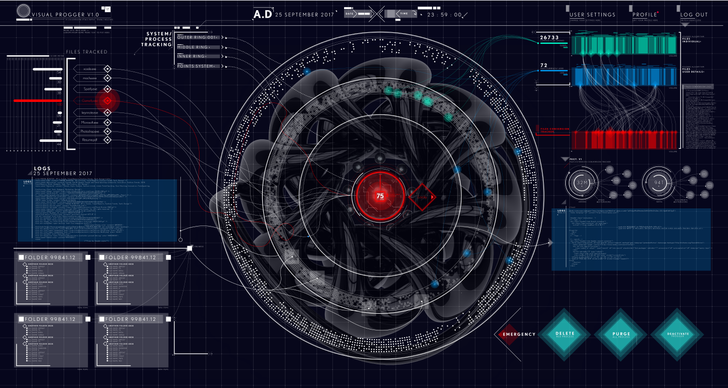
What makes a visual presentation of security events effective? How do we measure the effectiveness of visualization in the context of studying, analyzing, understanding reports on information security incidents? Detection and understanding of computer attacks are crucial for making decisions not only at the technical level, but also at the level of security policy management. Our study covers both issues, which allowed us to complement our system / platform for evaluating the effectiveness of visualization of security events (SvEm), providing a comprehensive approach to evaluating the effectiveness of both theoretical and user-oriented visualization techniques. Through the use of interactive three-dimensional visualization, our SvEm platform improves efficiency as a single user, and several users during their collaboration. Performance indicators such asvisual clarity (visual clarity), visibility (visibility), the speed of distortion (distortion rate) and response time (watching) the user (user response (viewing) times) .
The key components of the SvEm platform are:
To evaluate our platform for comprehensive assessment of the effectiveness of visualizing security events, we developed (using web and mobile technologies) a VisualProgger application for visualizing security events in real time. Finally, visualization SvEm aimed at increasing concentration (attention span) users by ensuring constant cognitive load (cognitive load) at the increased load on the working memory of the observer. In turn, the visualization of security events provides the user with the opportunity for the emergence of insight (insight) about the state of security of information. Our assessment shows that observers perform better with prior knowledge (load on working memory ) about security events, as well as that circular visualization better attracts and maintains the user's attention concentration . These results allowed to determine the direction of future research related to the assessment of the effectiveness of visualization of security events.
1 Introduction
2 Background and area of research
3 Related works
3.1 Methods for evaluating visual representations of information
3.2 Assessment method: ranking visual representations of correlations
3.3 Graphical presentation methods
3.4 Perception errors in visualizations
3.5 Cognitive, perception and insight concepts in visualization
4 SvEm platform diagram
4.1 Server architecture part of the system
4.2 Technical aspects of security events visualization
4.3 Entity relationship of space and security incidents
4.4 Color imaging standard used zopasnosti
4.5 Cognitive safety requirements for visualization
5 Results: Safety visualization platform
5.1 SvEm theory
5.2 Data processing flow
5.3 Example 1. Application for collaboration with visualization of security events in real time
5.4 Example 2. Locky ransomware visualization
5.5 Example 3. Effective interaction with augmented reality
visualization 5.6 Visualization scaling according to display size
6 Evaluation and testing of the SvEm platform
6.1 Conceptual model of SvEm
6.2 Testing the performance of the SvEm platform
6.3 SvEm user rating
6.4 Evaluation of cognitive load
6.5 Threat detection system
7 Conclusion
8 Acknowledgments
9 References to used sources
Security event visualizations (security visualizations) are useful in shaping an understanding of the state of security, but how effective are they? Does visualization help decision making in a critical situation or just distract attention? This study provides a basis for evaluating the effectiveness and developing visual representations in the field of information security.
Our main focus is on improving the SvEm platform [11] by conducting a comprehensive assessment of the effectiveness of visual representations of security events at each stage of visualization perception. It is assumed that the reader already has an idea about the visualization in the field of information security.
We are looking at performance issues in data processing,visual clarity , as well as the convenient use of the functions of interactive user data. Measuring the effectiveness of security event visualization requires a comprehensive assessment of both web and mobile platforms, as well as user response times when interacting with them.
At the moment when the user interacts with some visual presentation of security events, we are interested in, firstly, to understand how visualization can most quickly attract the user's attention, and, secondly, how to measure its attention span . This requires monitoring the effectiveness of the user's cognitive load and the load on his working memory.. Visualization is most effective when the cognitive load decreases and the load on the working memory increases.
In most scientific studies aimed at exploring visualization platforms and user interfaces, the concept of increased efficiency means increased productivity by reducing the time to achieve meaningful results. In the article for the platform developed by us, the concept of "efficiency" is associated with the visualization of security events as a holistic and integrated approach, which is designed to maximally simplify the perception of essential information as a result of user interaction with visualization.
In this article, we measure the effectiveness of the entire security visualization process: both the graphic display process and the user interaction process. We are also confident that the visualization of security events facilitates automated data analysis, obtaining useful information from the raw data about security events (network attacks). Visual representations of security events visually and dynamically show the user security incidents, as well as the connection of incidents to each other [14]. Interactivity arouses the user's interest in making the necessary interactions with visualizations to form an idea of the space for conducting computer attacks. Visualization also facilitates the ability to process large amounts of data and visualize trends and patterns.
However, there are problems associated with the presentation of information and performance, so the purpose of this article is to measure the effectiveness of the visualization of security events. Our study provides a link between the cognitive knowledge of users and the platform for measuring the effectiveness of visualization of security events (SvEm - security visualization effectiveness measurement) [11]. Our approach to measuring performance encompasses the stages of planning, designing, implementing, evaluating, validating, and interacting with the user (target audience).
In the next section, we will look at the results of existing research on the measurement of visualization efficiency. Then we discuss the results of the development of the SvEm platform. In conclusion, we will present directions for future research.
While users choose visualization methods based on their individual preferences and needs, there is a need to evaluate the effectiveness of such methods. Current approaches [11] , [12] , [17] , [40], using such indicators as the user throughput (user performance), visibility (clarity), the degree of quality / distortionimages (image quality / distortion rate), perception assessment (perception assessment), a measure of visualization correlations (visualization correlation measurement), measurements of brain activity (brain activity measurement) and the degree of conformity of visualization (how well visualization). Consider the available sources in more detail.
Most assessment methods take into account only the technical aspects of images, such as visibility and recognition. However, the most preferred are visual representations that attract observers and are able to independently convey the essence of the information without the need for further clarification. This is the most anticipated result for most artists and visualization experts. The basis that is present in both the visualization and the users, awakens their cognitive abilities that trigger efficiency mechanisms. Thus, to improve efficiency, some assessment methods are required to improve visualization.
An approach successfully used in training sessions on datasets is commonly used to obtain scientific assessments of performance, transparency, and integrity. Harrison in [12] showed the possibility of applying Weber's law [4] , [15] and the law of perception [15] when ranking the correlation visualization [20] . Other approaches consider the correlation of training and best data sets depicted using scatterplots and charts with parallel coordinates [33] . Recent psychological and cognitive studies [15] have shown that the laws of perception [20]can be used to model people's perception in the visualization of certain properties of the data under consideration. Rensink demonstrated the use of Weber's law [33] when creating the Weber Fit model [12] . These studies state that there is a relationship between people and the data presented. Human perception is able to distinguish between relationships and objective differences in correlated data. This statement is expressed by the following linear relationship:
Where
 - differential changes in perception;
 - experimentally obtained relative threshold (weber fraction);
 - differential increase in data correlation.
A number of statistical studies [12] were carried out using ranking criteria:
Although this method of ranking the visualization of correlations has proven to be effective, it is not relevant to this work.
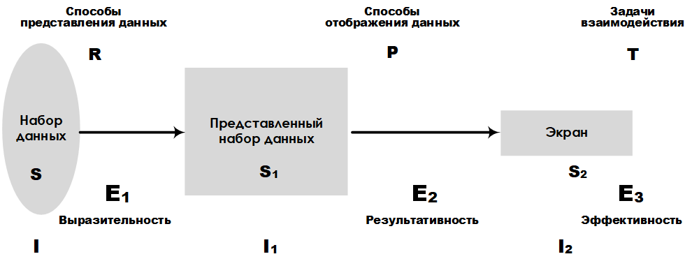
Fig. 1. Scheme of platform E 3
Most devices connected to the Internet have the ability to log, which allows for a high speed of data collection. Therefore, it requires the use of special methods of presenting information obtained from data sets. Consider as an example the graphical platform for presenting large data sets E 3 , developed by Leung K. I and Appley D. Mark [24] . Analytical platform E 3allows you to compare different ways of presenting data, taking into account the volume of such data. The main characteristics, such as expressiveness, efficiency, and effectiveness, make it possible to rank the accuracy of the presentation and the tasks of perception. In fig. Figure 1 shows the layout of the E 3 platform , which highlights key components and their links to the design stages of a large data set representation system.
Another common method of measuring visualization involves calculating the error rate (measurement rate) of image quality or image distortion. In fig. 2 shows the structure of the project, which includes the stages of preprocessing, filtering, channel separation, and error pooling.
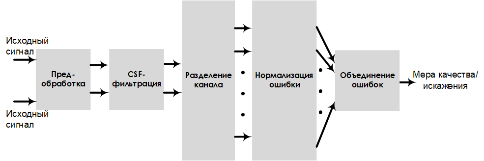
Fig. 2. Scheme of the project, evaluating the sensitivity to errors
In this model, the image quality is estimated by the indicators of visual clarity andimage distortion . Performing pre-processing and filtering improves the quality / distortion measurement results (which are easily converted from one to another).
In psychology, measurement of the effectiveness of visualization is carried out on the basis of assessments of cognitiveness (cognition), perception (perception), concentration of attention, and the load on a person’s working memory . The rational relationship between the user's cognitive ability and the load on the working memory can be determined by evaluating mental effort (mental effort) (Fig. 3). For example, the ideal user estimate, at which the reading speed is high and the mental effort is low, is in area A (Fig. 3) [30] .
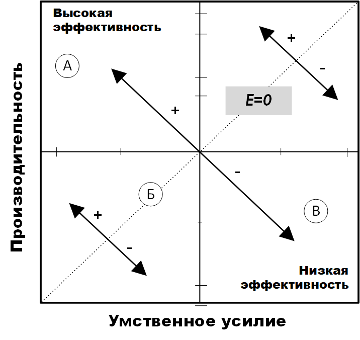
Fig. 3. The effectiveness of mental effort [30]
This also means that the load on the user's working memory is high. User research has provided tools for assessing cognitive load [17] , in particular, ways of assessing mental effort and performance that are related to visualization efficiency.
Research by [40] , [34] , [35] , conducted by InfoVis, showed the possibility of using insight as a measure of technology assessment. Illumination [40]is defined as a measure of an accurate and deep understanding of something, that is, a unit of measure for discovery. Illumination often does not come in the course of solving tasks specifically set for this purpose, but, as a rule, is a by-product of research without an initial goal of achieving insight.
Also an important role in defining insight is the process of comprehension (sensemaking) [32] , although the “information-scheme-insight-product” model used in this work includes insight as a component.
Summarizing the results of similar works, we see that the assessment of the effectiveness of visualization affects not only the technology, but also the person who uses the visualization. Having considered the key areas related to the effectiveness of visualization in this section, we now have a clear understanding of the place of real research in the visualization assessment methodology. However, our platform is limited to security visualization of information related to the measurement of measurement performance in relation to operational information about security incidents.
In order to implement a platform that will evaluate the effectiveness of visualization of security events, an important step is the design phase. Therefore, in this section we present the design solution of our platform. The SvEm security visualization performance evaluation platform consists of the following components: a mobile display working surface, security incident objects, user alert events, a threat assessment system, memory loading, and a color management component. These components are discussed below.
The server-side infrastructure of the SvEm security event visualization platform is designed to host both static and dynamic (real-time) visualization scripts. It manages all the analysis processes that occur when working with a database, as well as during the assembly and aggregation of information. The architecture of our system is built using the following technologies: Windows Progger (Logging Tool), Redis, MongoDB, Nodejs and WebGL. Windows progger (the linux progger version for Windows [21] ) is a system-level (kernel-level) event logging tool that is currently being developed with a focus on security in computer and cloud systems. Redis [2]facilitates communication between cache and database for Windows Progger and mongoDB. All data is permanently stored in mongoDB [3] , while nodejs [39] and webgl [5] , [31] reduce the complexity of the interface of the client part of the visualization platform.
The architecture of the server part is designed taking into account the peculiarities of the data processing process when managing their storage. Pre-processed data is created as a result of the rendering script. For example, in real-time mode, a log is written to the computer’s system kernel log in order to track and visualize sources for creating, modifying, and deleting files.
In addition, the data is standardized to enable the evaluation of the effectiveness of security visualizations in web and mobile platforms. The requirements for web and mobile devices ensured the effective solution of the tasks of requesting, processing, analyzing, rendering and scaling data solved in the interest of visualizing security events. In fig. Figure 4 shows the main tools and libraries needed to host the server side of the SvEm security visualization platform.
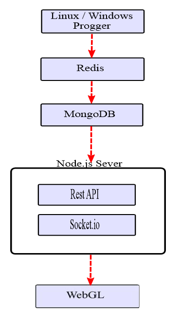
Fig. 4. The architecture of the server part of SvEm
When designing a platform, it is necessary to take into account many features of the application, the main of which also include security, data processing performance and visual presentation of visualization. These tasks for our platform are basic.
When developing visual representations, the dimensions of the mobile device must be taken into account. For example, the display limitations of 1920 x 1080 pixels for the iPhone 6s Plus with a height of 122 mm and a width of 68 mm (Fig. 5) make it necessary to have display controls in a visual representation.
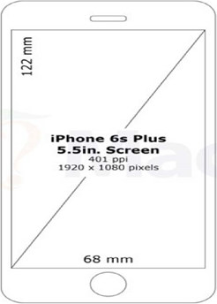
Fig. 5. Mobile device display parameters.
The controls include elements for regulating the amount of data being processed, the choice of visualization method and the types of visualization that best fit the screen size.
A clear understanding of these limitations allows developers to visualize security events to take into account the possibility of multidimensional and / or circular display. Such projects will allow for a large number of security incident data attributes.
The process of tracking (attribution) [38] in the context of information security is associated with determining the source of a computer attack. In the visualization of security events, the image of this process is quite a challenge. You must have a sufficient set of source data and a clear understanding of the tracking process . Our tracking project aims to build a path between the source and the targets of the attack. The focus is on identifying the source of the computer attack, since most of the trajectory points are victims. Despite our tracking visualization project , it’s not possible to fully visualize the tracking process based on data about real attacks.. Therefore, we offer a set of patterns for predictive analytics, with which points can be connected between key attack identifiers for tracking from a higher level using visualization.
Another key feature of the platform is the efficient display of sources based on the large amount of data collected. A large amount of data is converted to visualization for mobile platforms, taking into account the need for scaling and the limited working area of the screen.
Our platform uses tracking visualization projects and sources with a brief summary of data to alert users about security events. Mapping sources is crucial for security experts and end-users to be aware of the situation. In fig. 6 presents a project of visualization of sources with information about the time, type and source of the attack.
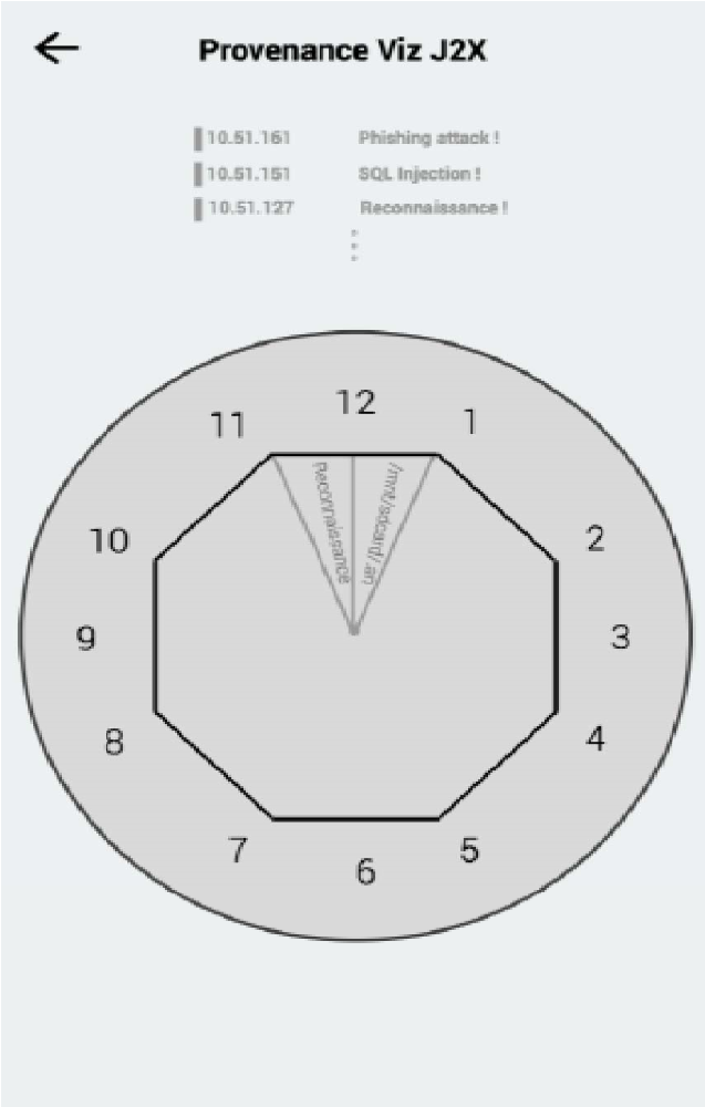
Fig. 6. Project of visualization of sources for a mobile device.
This circular project is designed to draw the user's attention to the information provided and to reduce the number of movements on the tabs for more information.
Another important aspect of visualization efficiency is providing users (observers) with the opportunity to choose from several variants of visualization projects depending on the requirements for viewing the displayed data. This allows you to meet the needs of a wider audience.
As elements for visualizing security events in real time, our infrastructure provides the following visual project options [6] : Curl (Spiral), Sphere, and Grid.
As shown in fig. 7, the Curl (Spiral) project is based on the Gestalt continuity principle / law [37] .
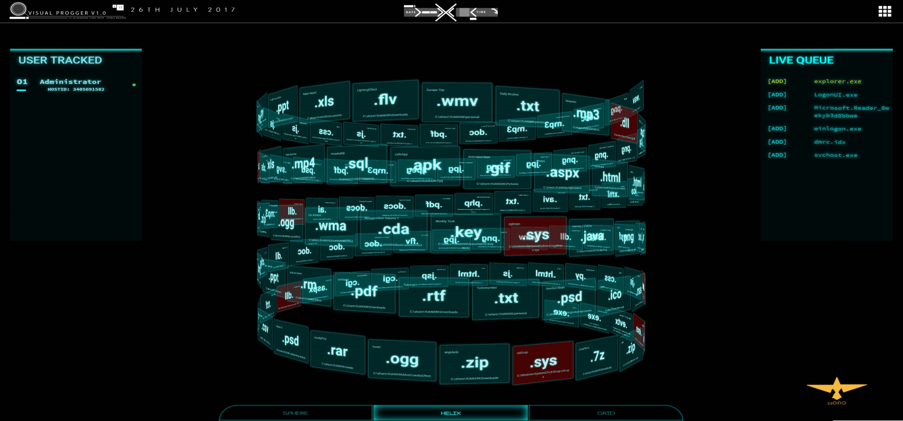
Fig. 7. “Curl (Spiral)”
visualization project This visualization displays the order of execution of files and processes in accordance with the “first entered, first showed” approach. When the user has paid attention to a specific file, pattern, or some group with the same behavior / color, he mentally perceives a visual image that is easy to understand.
The Sphere visualization project is based on the Gestalt law of closure / completion, where everything is perceived as part of the whole. In fig. 8 shows the visualization of the system content (important elements are highlighted in color).
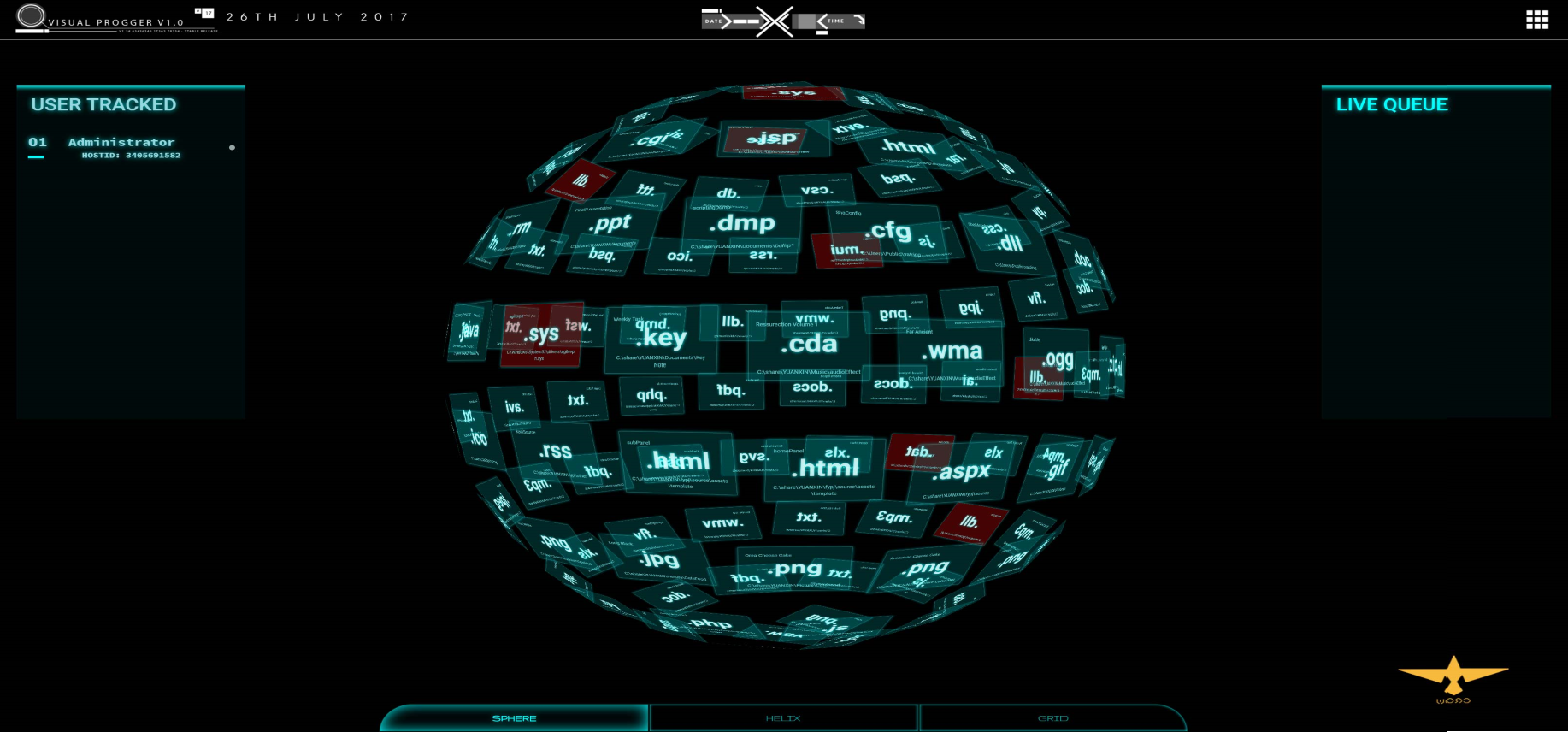
Fig. 8. Sphere visualization project
This method is simple and straightforward, and the visualization can be scaled depending on the display parameters of the mobile device. Regardless of how many files or processes are required to show, the spherical approach forms a visualization in which all parts are the sum of a whole.
The visualization project “Grid” implements a multi-level approach to visualization, in which new files are visually displayed in the foreground of the visualization grid. This design draws the attention of observers to new files / processes of interest. The constant attention of the observer keeps them in focus, at the same time leaving the possibility for other alert mechanisms to transmit information to the observer. In fig. 9 shows an example of the Grid project with several layers for files and processes.
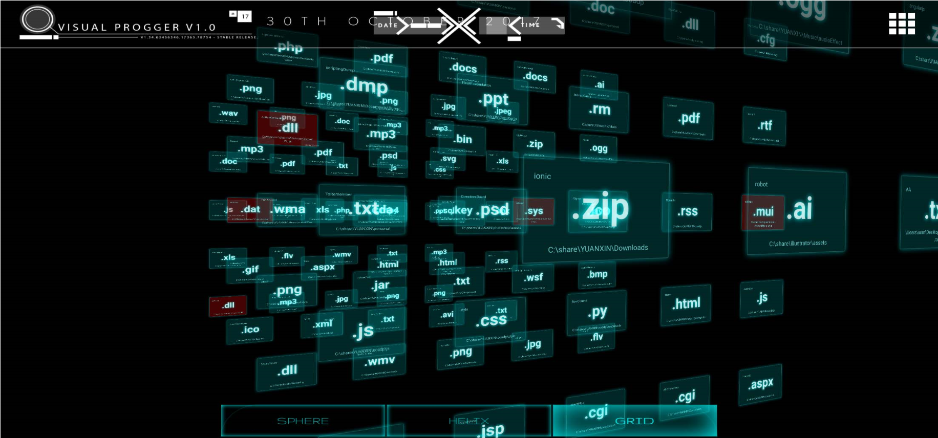
Fig. 9. “Grid” visualization project. In
addition, we provide the “Circular-layered” project shown in fig. ten.
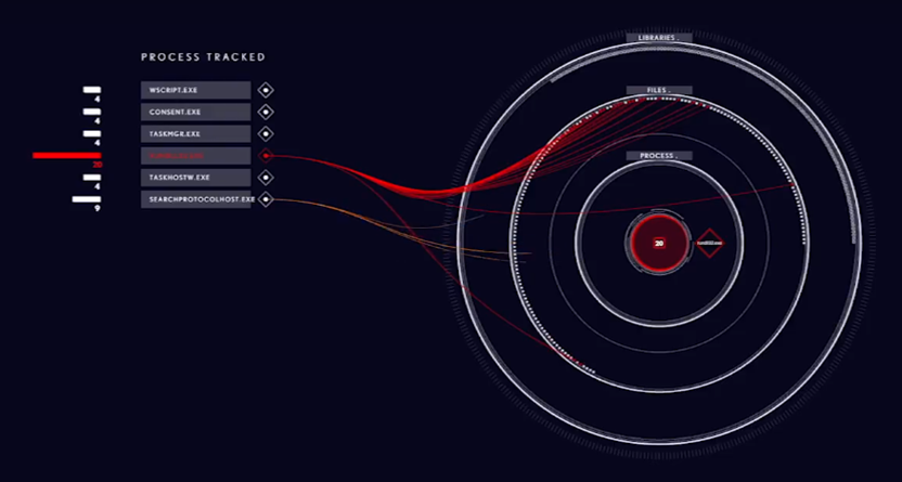
Fig. 10. Visualization project for mobile device of ransomware Locky
Project allows you to link several attributes and categories of various files and processes. Effectiveness in this case manifests itself in transitions between layers, allowing observers to see and understand how different file systems work. Using the approach to building multi-level visualizations allows you to connect both different levels of information hierarchy and informational relations.
Threat Assessment Components, which makes it possible to identify and visualize threats, is another important component of the SvEm infrastructure. Our threat assessment scheme (Figure 11) covers anomalies, malware, and custom detection mechanisms.
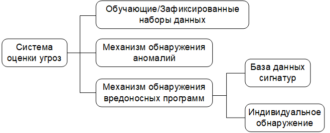
Fig. 11. Diagram of the threat analysis mechanism.
Data sets are filtered using test / training and captured data [10] and signature databases of known threats. Anomaly detection is carried out in accordance with the algorithm, which will be discussed in the section on assessment and validation. Our basic data set consists of known (previously detected) threats, user-filled logs, as well as known threat models and behavior patterns. This creates a better environment for control and monitoring.
Essentially, the relationship (entities relationships) and security area (security landscapes) are the main components of our operating platform. For entities include: the subjects of threats, malicious payloads compromised IP-address and many others. These objects are of interest for how the SvEm performance measurement theory works. The performance of our platform is affected by the ability to identify these entities using visualization in the shortest possible time.
Entity relationships , also known as links , are vital to our platform. Entity relationship functions link entities together. These links also activate the cognitive functions of the user, which help him to perceive hidden information and potentially contribute to insights about the state of security.
Security spaces create an incident area and environment for users (bystanders) to focus their mental images on a specific security incident. The familiar space helps the user to mentally limit the area of his interaction with visualization.
It is very important to standardize the use of colors to visualize security events. Large amounts of data on entities that may be of interest require simplifying the visualization of security events in order to speed up the processing of information. For example, using the colors “red” and “orange” in one visual space automatically creates confusion for users, which complicates the entire visualization process. Our standardized color set is shown in Fig. 12: "red, yellow, green, blue, purple and orange."
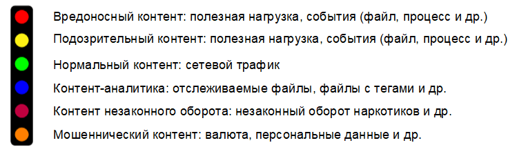
Fig. 12. Color standard for visualization of security events.
These colors are divided into two groups: primary and secondary. The main group of colors are: red, yellow, green and blue. Additional group includes: purple and orange. Complementary colors are intended for visualizing security events by law enforcement agencies using color schemes that comply with the Interpol notification system [1] , [18] . For example, orange color is used only to display the turnover of illegal content and is considered as an independent type of visualization.
The color standard is aimed at ensuring ease of prior acquaintance in a specially created for this comfortable environment. From the point of view of the developer, it is important to correctly understand how colors in the visualization relate to the attributes of security events. This creates a need for color management in order to avoid misinterpretation of the visualization due to possible color overlap problems when representing security incidents.
Information processing is a natural human function that cannot be controlled by technology. However, there are methods that can be applied in the processing of information for a specific visualization of security events, as forms of management. The use of such methods aimed at reducing the cognitive distortion (cognitive bias) [13] , which often leads to an incorrect perception, judgment and illogical inaccurate conclusions.
Therefore, the most important part of the design of our SvEm platform is the definition of cognitive-psychological signs in the visualization of security events. This allows you to set performance requirements for the entire process of visualizing user tasks.
Required requirements forcognitive load , load on the working memory , cognitive activators of the user.
The following psychological tasks are also defined:
From the point of view of the security event visualization application, cognitive alert activators are designed to connect the observer with the presented visualization. These activators we called the terms temporary hold (Semi-permanent Hold) and permanent retention (Permanent Hold). The evaluation section (section VI) will show the important role they play in our platform.
Let's start with a more detailed explanation of our SvEm algorithm. The SvEm algorithm is based on the following indicators:
Theoretical estimates of distortion and time are calculated by formulas (1) and (2), respectively:
Where
 - dimensions of the working surface of the mobile device;
 - the number of visual security elements (for example, an infected IP packet, a time stamp, etc.);
 - n- dimensional area of visualization of security events;
 - cognitive load (the number of identifiable features during the preliminary review);
 - load on working memory (effort based on temporary estimates of working memory);
 - the number of interactions with visualization.
The theoretical SvEm estimates are based on the distortion rate and time . Although the distortion rate is 50%, our overall rating is measured against a “high” or “low” rating, which makes it more realistic. The following factors affect the speed of distortion:
SvEm- time is measured relatively constant: 0.25 seconds [27] , known in psychology as the minimum time necessary for a person to understand information in the process of its perception. Thus, our overall estimate is calculated as an average and compared with numerous results from other measurements.
Application performance, as well as methods of data management, are implemented in view of improving the quality of the final values of the distortion and time indicators . The display of data in the visual space of our application is controlled to achieve balance when performing complex hardware visualization calculations.
Cognitive load () and the load on the working memory () are calculated on the basis of previous results of theoretical studies. Our algorithm SvEm implements known methods.
One of the advantages of the SvEm platform is the ability to manage data throughout the entire process: from writing to the database to rendering the visualization using WebGL technology. In fig. Figure 13 shows a data flow diagram showing the main components of the server part.

Fig. 13. Data Processing
Outcomes Using Progger, Redis and MongoDB provides the necessary data flow control. A large amount of data is transmitted to the security visualization interface taking into account the features of the used mobile platform (computing power of the equipment, size of the display and its resolution). This allows our analysis scenarios to scale the data accordingly to improve visibility by using simpler presentation forms.
Let us consider several examples of using our platform; Examples are developed based on the results of the analysis of data obtained during testing of the platform. A video demonstration of examples can be viewed at the following link: an example of using the SvEm security visualization platform (https://wiki.dataprivacyfoundation.org/index.php/Visual_Progger).
The VisualProgger security logs visualization tool was created by our team to visually investigate the history of events recorded by the Progger program [21] . VisualProgger is focused on the visualization of security events in real time and allows you to increase the efficiency of analysis due to visibility , high performance and the use of cognitive perception activators . In the course of data analysis carried out with the use of animated visualization and mechanisms for timely notification, important information about the state of security was revealed.
VisualProgger functionality: VisualProgger provides security event visualization functions both in real time and for previously captured data, for example, observed during cyber exercises between the red and blue teams (attacking and defending) [10] . In a real-time visualization scenario, we developed and applied an alert method that allows you to increase user focus. We called this method "cognitive activators SvEm" (SvEm: cognitive-activators). The following activators are implemented :

Fig. 14. Demonstration activator "Temporary Hold"
examined cognitive activators SvEm mainly used to display files and malicious attributes that are important from the point of view of information security. Files and attributes of the displayed data are transformed into some visual representations of security events in order to help in making decisions by providing better information.
The visualization of the security events of the Locky ransomware program shown in fig. 15, uses the Nested Rings project, designed specifically to focus the user's attention only on the visualization being demonstrated.

Fig. 15. Visualization of the Locky ransomware program that encrypts files
The Nested Rings project allows for mobile platforms to arrange data one above the other in the form of layers. In this way, the classification of libraries, processes and files of the infected system can be displayed. The ability to visually track the way Locky exposes files (.docx, .png, .jpeg, .xlsx, and others) before encrypting them during an attack, gives the user a clear picture of the extortioner's work. Encrypted files are then highlighted in red to show which file was encrypted.
Encrypted files (critical files) marked in red can be selected by observers (by mouse-clicking, clicking, or other actions) for further analysis (Fig. 16).

Fig. 16. Visualization of viewing events about files encrypted with the ransom lock program
Thanks to these functions, users are interested in conducting interactive research using visualization, which also increases the time of user interaction with visualization.
Augmented Reality (Augmented Reality, AR) in the field of information security visualization gives the user an interesting experience and opens up new opportunities for him. It draws the attention of the observer to security incidents through the use of visualization. Providing observers with 3-dimensional visualization with color interpretations contributes to a higher analysis speed with less mental effort [28] . In turn, observers seek to learn additional details in order to gain the necessary safety knowledge.
Our augmented reality visualization (Fig. 17) allows mobile phone users to use personal mobile platforms to visualize cyber-exercises of red and blue teams (attack / defense).

Fig. 17. The project of the client side of augmented reality visualization.
Creating an augmented reality experience enhances the observer's ability to perceive information [41] . Thus, thanks to the correct information selected using AR-visualization, observers were able to process more data and make better decisions that contribute to increased security.
With the help of multi-colored spheres (Fig. 17), expressing various aspects of an attack, the execution of a simulated computer attack is demonstrated in real time. Through interaction with interactive AR-visualization, the user can understand the characteristics of computer attacks conducted by the red team.
Taking into account the limitations imposed on mobile platforms, as well as due to the large amount of constantly collected data, there is a need for special approaches to visualization in order to visualize computer attacks. A diagram with parallel coordinates [9] , [19] allowed us to create a three-dimensional visualization design that contains all the necessary data. In fig. 18 illustrates the distribution of network traffic with security data between application, system, and network layers.

Figure 18. Multidimensional visualization of security events using a chart with parallel coordinates
We built the SvEm model based on the results of scientific research in the field of computer technology and psychology, which consisted in applying an integrated approach to measuring performance for the following main components:
This allowed us to develop a conceptual model that takes into account user experience in visualizing security incidents. In fig. 19 shows the SvEm model, consisting of all the above components of efficiency: the user, visualization and related factors, the cognitive perception of the user.

Fig. 19. Model SvEm, illustrating the interrelation of the components “User”, “Visualization” and “Cognitive Perception of the User”
The intersections of these components define the patterns that characterize the goals of extracting safety knowledge from visualization.
At the center of the SvEm model is the mechanism by which perception arises as a result of combining cognitive perception , user, and visualization . As a result of the observation made by the user in the process of perception, requests arise at the level of subliminal attention (pre-attentive). In the case of security event visualization comparison, mental effortarising from the user (the observer), use his cognitive abilities that are involved in the process of thinking. This whole process creates a load on the working memory of the user, depending on the specific visualization of security events presented. Taking into account the above relationship of relationships between the user , the cognitive perception of the user and the visualization , our effective ways of visualization create the final relationship of the relationship between the user and the presented visualization . The result is a distortion and / or time . The emergence of SvEm- insight(SvEm-insight) occurs when all components of the SvEm-model are matched, while the value of mental effort is defined as low, which leads to the conversion and transmission of the correct information about security events for processing by the user.
We tested the performance of the SvEm platform in the following areas:
Testing of visualization of visualization mapping was carried out at the application development stage. It consisted in designing the architecture of data processing units based on the security visualization standard (SCeeVis). For example, the use of 3-dimensional graphics technology WebGL gives the user interface new interactive visual overview when processing large amounts of information. The application architecture allowed to process a larger amount of data and present it on the client side.
In fig. 20 shows performance evaluations during data transfer.

Fig. 20. VisualProgger application performance
evaluation To evaluate the performance, the average data transfer time (in milliseconds) was recorded by various executable files (.exe) when transferring data of different types and sizes.
During the assessment, the following conclusion was made: in order for the visualization to be effective, the load on the working memory is crucial for high reading performance. To evaluate the effectiveness of the SvEm platform, user responses were used. The color standard has helped improve the user experience by allowing them to more quickly process patterns of behavior by classifying and tracking relationships. If the users were aware of the color standard, they could more quickly handle the connections between event points than in the case of applying an approach to visualization, in which security attributes were used instead of color.
The introduction of cognitive activatorsSvEm in our platform has provided users with a mechanism to attract attention during the tracking of security events. This automatically stimulates the cognitive abilities of the observer, prompting him to further interact with the presented visualization.
Previous studies in the field of psychology have made a significant contribution to user training, and theoretical evidence [7] , [8] has improved the understanding of the cognitive load of users. To determine the relationship between perception, cognition and the SvEm platform, we applied the well-known psychological approach associated with the method of determining cognitive load and load on working memory., as well as the concept of communication perception of the user and cognitive processes. The approach was used in conditions where the user's consciousness was able to perceive objects (such as images of safety nodes) in the course of interaction with the visualization of security events. Accordingly, users could think of keywords related to the presented images of security nodes, thereby improving their perception, which, in turn, is related to previous experience with interacting with visualization. This process in the presented security incident was performed under high load on the working memory.

Fig. 21. Comparing estimates of cognitive load and load on the working memory of observers
Thus, we conducted various experiments with the user and obtained the following results (Fig. 21). The experiment demonstrated the constancy of the performance of cognitive load and load on the working memory of observers: with increasing load on the working memory , cognitive load also increased, but kept the limit. In fig. 21 lines of best fit show that both characteristics are linear, and the cognitive load has a constant load limit (capacity), therefore, does not overlap the performance of the load on the working memory. This is an ideal situation for the user (observer) when analyzing the visualization of security events.
To filter the data collected using the Progger, known signature anomaly and malware detection algorithms were used. Based on real data, we have preselected the following algorithms that meet our expectations: Local Outlier Factor (LOF) [22] , DBscan [23] and K-Nearest Neighbors (KNN) [25] . This allowed us to test the performance of the threat detection evaluation system. Normal action will have a rating in the range from 10 to 80, and abnormal behavior will be expressed as a negative value. Similarly, suspicious files in the systems are also scanned based on the stored signature database. In fig. 22 shows normal and abnormal behavior and malicious entries.

Fig. 22. Results of the anomaly detection system.
In addition, scanning files in the system and having a pre-configured log history helps determine known file paths. Therefore, if a known or suspicious file appears in a different location, it is automatically marked in yellow or red.
We analyzed the performance of our threat assessment system on prepared real-world data sets. As filters, several algorithms for detecting anomalies and malicious signatures were used. To identify anomalies and malicious files, our assessment system uses the Progger application (event registration mechanism). The following color scheme was chosen for the image of files of interest: malicious data (red), suspicious data (yellow), traceable operational information (blue) and legitimate data (green).
The article presents a comprehensive approach to assessing the effectiveness of a security event visualization platform, with an indication of techniques that take into account both technical aspects and psychological characteristics of users. A conceptual model was presented illustrating the interaction between the components “ user ”, “ visualization ”, “ cognitive perception of the user ”, which allows to obtain and improve estimates of the effectiveness of visualization of security events. The use of cognitive activators SvEm allows you to increase the concentration of users and increase their attention span. We evaluated our SvEm platform based on existing platforms and basic datasets. Thus, we confirm that users are coping well with highloads on the working memory and effectively interact with the developed visualizations in order to obtain the necessary information about security events.
In the future, we would like to further evaluate the effectiveness of our platform for users from other areas (healthcare, financial education, etc.), and also analyze how they react when interacting with the platform.
The authors would like to thank Mark A. Will, Cameron Brown, Minu Mungro, members of the Waikato Cybersecurity Researchers (CROW Lab) and the contribution of our interns [Isaiah Wong, Jia Cheng Yip, Wen Liang Guo, Xin Li Yuan] from Nanyang Polytechnic Institute, Singapore. This project is supported by STRATUS (“Security Technologies that Ensure Transparency, Trust, and User Orientation in the Provision of Cloud Services”) ( https://stratus.org.nz ), an investment investment project in science, funded by the Ministry of Business, Innovation and Employment of New Zealand . (MBIE)). This work was also partially supported by the New Zealand and Pacific Scholarship Program (NZAid).
1. M. Anderson. Policing the world: Interpol and the international co-operation. Clarendon Press Oxford, 1989.
2. JL Carlson. Redis in Action. Manning Publications Co., Greenwich, CT, USA, 2013.
3. K. Chodorow. MongoDB: The De fi nitive Guide: Powerful and Scalable Data Storage. "O'Reilly Media, Inc.", 2013.
4. H. Choo and S. Franconeri. Enumeration of small collections violers webers law. Psychonomic bulletin & review, 21 (1): 93–99, 2014.
5. J. Congote, A. Segura, L. Kabongo, A. Moreno, J. Posada, and O. Ruiz. Interactive visualization of live data with webgl in real-time. In Proceedings of the 16th International Conference on 3D Web Technology, pages 137–146. ACM, 2011.
6. EOOD and M. Angelov. 20 Impressive Examples for Learning WebGL with Three.js, Nov. 2017
7. C. Firestone and BJ Scholl. Enhanced visual awareness for morality and pajamas? perception vs. memory in top-downeffects. Cognition, 136: 409–416, 2015.
8. C. Firestone and BJ Scholl. Cognition does not affect perception: Evaluating the evidence for “top-down” effects. Behavioral and brain sciences, 39, 2016.
9. Y.-H. Fua, MO Ward, and EA Rundensteiner. Hierarchical parallel coordinates for exploration of large datasets. Investigation of the Conference on Visualization'99: celebrating ten years, pages 43–50. IEEE Computer Society Press, 1999.
10. J. Garae, RK Ko, J. Kho, S. Suwadi, MA Will, and M. Apperley. Visualizing the new zealand cyber security challenge for attack behaviors. In Trustcom / BigDataSE / ICESS, 2017 IEEE, pages 1123–1130. IEEE, 2017.
11. J. Garae and RKL Ko. Trends in Decision Support for Cybersecurity, pages 243–270. Springer International Publishing, Cham, 2017.
12. L. Harrison, F. Yang, S. Franconeri, and R. Chang. Ranking visualizations of correlation using weber's law. IEEE transactions on visualization and computer graphics, 20 (12): 1943–1952, 2014.
13. MG Haselton, D. Nettle, and DR Murray. The evolution of cognitive bias. The handbook of evolutionary psychology, 2005.
14. J. Heer, FB Vi´egas, and M. Wattenberg. Voyagers and voyeurs: supporting asynchronous collaborative information visualization. In Proceedings of the SIGCHI conference on human factors in computing systems, pages 1029-1038. ACM, 2007.
15. Vac Henmon. The time of perception. Number 8. Science Press, 1906.
16. RV Hogg and AT Craig. Introduction to mathematical statistics. (5 ”” edition). Upper Saddle River, New Jersey: Prentice Hall, 1995.
17. W. Huang, P. Eades, and S.-H. Hong. Measuring the effectiveness of graph visualizations: A cognitive load perspective. Information Visualization, 8 (3): 139-152, 2009.
18. JJ Imhoff and SP Cutler. Interpol: Extending law enforcement reach around the world. FBI L. Enforcement Bull., 67:10, 1998.
19. A. Inselberg and B. Dimsdale. Parallel coordinates for visualizing multi-dimensional geometry. In Computer Graphics 1987, pages 25–44. Springer, 1987.
20. M. Kay and J. Heer. Beyond weber's law IEEE transactions on visualization and computer graphics, 22 (1): 469–478, 2016.
21. RK Ko and MA Will. Prog: an ef fi cient, tamper-evident kernelspace tracking. In Cloud Computing (CLOUD), 2014 IEEE 7th International Conference on, pages 881–889. IEEE, 2014.
22. A. Lazarevic, L. Ertoz, V. Kumar, A. Ozgur, and J. Srivastava. A comparative study of anomaly detection schemes in network intrusion detection. In Proceedings of the 2003 SIAM International Conference on Data Mining, pages 25–36. SIAM, 2003.
23. K. Leung and C. Leckie. Unsupervised detection in networks intrusion detection using clusters. The Australasian Computer Society, Inc., 2005.
24. YK Leung and MD Apperley. E3: Towards the metrication of graphical presentation techniques for large data sets. In International Conference on Human-Computer Interaction, pages 125–140. Springer, 1993.
25. Y. Liao and VR Vemuri. Use of k-nearest neighbor classifi intrusion detection. Computers & security, 21 (5): 439-448, 2002.
26. PE McKight and J. Najab. Kruskal-wallis test. Corsini Encyclopedia of Psychology, 2010.
27. T.Okoshi, J.Ramos, H.Nozaki, J.Nakazawa, AKDey, andH.Tokuda. Attelia: Reducing your load on the smart phones. In Pervasive Computing and Communications (PerCom), 2015 IEEE International Conference on, pages 96–104. IEEE, 2015.
28. T. Olsson, E. Lagerstam, T. K¨arkk¨ainen, and K. V¨ a¨an¨anen-VainioMattila. Expected user experience of augmented reality services: a user study in the context of shopping centers. Personal and ubiquitous computing, 17 (2): 287–304, 2013.
29. ¨ O. ¨Ozt¨urk and DA Wolfe. An improved ranked set two-sample mannwhitney-wilcoxon test. Canadian Journal of Statistics, 28 (1): 123–135, 2000.
30. F. Paas, JE Tuovinen, H. Tabbers, and PW Van Gerven. Cognitive load theory. Educational psychologist, 38 (1): 63–71, 2003.
31. T. Parisi. WebGL: up and running. "O'Reilly Media, Inc.", 2012.
32. P. Pirolli and S. Card. Identied through cognitive task analysis. Investigations of international conference on intelligence analysis, volume 5, pages 2-4, 2005.
33. RA Rensink and G. Baldridge. The perception of correlation in scatterplots. In Computer Graphics Forum, volume 29, pages 1203– 1210. Wiley Online Library, 2010.
34. P. Saraiya, C. North, and K. Duca. An insight-based methodology for evaluating bioinformatics visualizations. IEEE transactions on visualization and computer graphics, 11 (4): 443–456, 2005.
35. P. Saraiya, C. North, V. Lam, and KA Duca. An insight-based longitudinal study of visual analytics. IEEE Transactions on Visualization and Computer Graphics, 12 (6): 1511–1522, 2006.
36. EW Weisstein. Bonferroni correction. 2004.
37. M. Wertheimer. Identifying key theories and principles. Psychol Forsch, 4: 301–350, 1923.
38. DA Wheeler and GN Larsen. Techniques for cyber attack attribution. Technical report, INSTITUTE FOR DEFENSE ANALYSES ALEXANDRIA VA, 2003.
39. JR Wilson and J. Carter. Node. js the right way: Practical, server-side javascript that scales. Pragmatic Bookshelf, 2013.
40. JS Yi, Y.-a. Kang, JT Stasko, and JA Jacko. Understanding and characterizing insights: how do people gain insights using information visualization? The Prospects of the 2008 Workshop on Behavior for Information and Visualization, page 4. ACM, 2008.
41. F. Zhou, HB-L. Duh, and M. Billinghurst. Trends in augmented reality tracking, interaction and display: A review of ten years of ismar. In Proceedings of the 7th IEEE / ACM International Symposium on Mixed and Augmented Reality, pages 193–202. IEEE Computer Society, 2008.
About the Author Article

by Jeffrey Garay (Jeffery Garae), a graduate student lab Cybersecurity Department of Computer Science University of Waikato (New Zealand)

Ryan Ko (Ryan Ko), PhD, Head of Laboratory Cybersecurity of the Department of Computer Science, University of Waikato (New Zealand)

Mark Mark Apperley, PhD, Head of Computer Science, University of Waikato (New Zealand)
Attention (attention) - the concentration of mental effort on sensory or mental events. (Robert Solso - Cognitive Psychology)
Perception is the common result of what comes through our sensory system and what we already know about the world through experience. (Robert Solso - Cognitive psychology)
Visual clarity - specially created or selected graphic (charts, tables), artistic and visual (drawings, reproductions), natural (objects of reality), designed for visual perception, used as a means monitoring and evaluation of the test during the testing process.
Cognitive load (cognitive load)
1. A multidimensional construct that determines how the load affects the student’s performance of certain tasks. (Paas F. et al. "Cognitive load theory" // Educational psychologist. - 2003. - V. 38. - №. 1. - P. 63-71)
2. The number of identifiable signs in the preliminary examination.
Cognitive biases (cognitive bias) - the systematic error in judgment (Aleksandrov AA Integrative psychotherapy).
concentrations of attention (attention span) - one of the characteristics of attention, reflecting the degree or intensity of the concentration subject to the performance of any activity or on any subject. (Human psychology from birth to death. - SPb .: PRIME -EUROZNAK. Under the general editorship of A. A. Rean. 2002.)
Insight / Insight / Insight - Intuitive insight into the core of a task. (Robert Solso - Cognitive Psychology)
Subthreshold Attention (pre-attentive) - unconscious recognition on the screen of a monitor stimulus with a speed of less than 200 ms. (http://humanoit.ru/blog/166)
Mental effort (mental effort) - an aspect of cognitive load, which refers to the cognitive ability, which is actually allocated to meet the requirements of the task; thus, it can be considered that it reflects the actual cognitive load. Mental effort is measured while research participants are working on a task ([40]).
Visualization of the origin history.(provenance visualization) - display of sources based on a large amount of collected data.
Attribution visualization (mapping) - path mapping between source and attack targets.
Temporary hold (semi-permanent hold) is a cognitive activator, which is an animated function that allows you to temporarily hide the most important (suspicious) files for at least 3 seconds to attract the attention of the observer.
Cognitive activator (cognitive activator) - a mechanism to attract the user's attention during the tracking of security events.
Working memory load (working memory load) - an effort based on temporary estimates of working memory.
Tracking / attribution(attribution) - the process of determining the identity and / or location of the attacker or intermediary through which he acts.
Permanent hold (permanent hold) is a cognitive activator, which is a permanent color indicator of a file that marks a malicious (suspicious) file.
From the author of the translation.
Visualization provides invaluable assistance to experts in obtaining conclusions and knowledge about the object of research, especially if such studies are associated with processing a large amount of data. At the same time, the choice of visualization methods, as a rule, is of a creative nature and is not a reasonable choice based on any quantitative estimates. The article attempts to obtain quantitative estimates of visualization.
In addition, it should be noted that little attention is paid to the issues of visualization research in Russian-language sources. The studies described in the article are at the junction of several areas of knowledge: information security, psychology, data science, which allows the reader to become familiar with previously unknown topics for him. Also of interest is an extensive bibliography on the topic of the study of visualization.
The basic terms used in the text of the article are marked in italics and for them the meaning of a foreign term is indicated in brackets. Definitions of such terms are given after the text of the article.
annotation
What makes a visual presentation of security events effective? How do we measure the effectiveness of visualization in the context of studying, analyzing, understanding reports on information security incidents? Detection and understanding of computer attacks are crucial for making decisions not only at the technical level, but also at the level of security policy management. Our study covers both issues, which allowed us to complement our system / platform for evaluating the effectiveness of visualization of security events (SvEm), providing a comprehensive approach to evaluating the effectiveness of both theoretical and user-oriented visualization techniques. Through the use of interactive three-dimensional visualization, our SvEm platform improves efficiency as a single user, and several users during their collaboration. Performance indicators such asvisual clarity (visual clarity), visibility (visibility), the speed of distortion (distortion rate) and response time (watching) the user (user response (viewing) times) .
The key components of the SvEm platform are:
- the size and resolution of the display of the mobile device;
- entity (entity) security incidents;
- cognitive activators (cognition activators) user alerts;
- threat assessment system;
- load on working memory (working memory load);
- color management.
To evaluate our platform for comprehensive assessment of the effectiveness of visualizing security events, we developed (using web and mobile technologies) a VisualProgger application for visualizing security events in real time. Finally, visualization SvEm aimed at increasing concentration (attention span) users by ensuring constant cognitive load (cognitive load) at the increased load on the working memory of the observer. In turn, the visualization of security events provides the user with the opportunity for the emergence of insight (insight) about the state of security of information. Our assessment shows that observers perform better with prior knowledge (load on working memory ) about security events, as well as that circular visualization better attracts and maintains the user's attention concentration . These results allowed to determine the direction of future research related to the assessment of the effectiveness of visualization of security events.
Table of contents
1 Introduction
2 Background and area of research
3 Related works
3.1 Methods for evaluating visual representations of information
3.2 Assessment method: ranking visual representations of correlations
3.3 Graphical presentation methods
3.4 Perception errors in visualizations
3.5 Cognitive, perception and insight concepts in visualization
4 SvEm platform diagram
4.1 Server architecture part of the system
4.2 Technical aspects of security events visualization
4.3 Entity relationship of space and security incidents
4.4 Color imaging standard used zopasnosti
4.5 Cognitive safety requirements for visualization
5 Results: Safety visualization platform
5.1 SvEm theory
5.2 Data processing flow
5.3 Example 1. Application for collaboration with visualization of security events in real time
5.4 Example 2. Locky ransomware visualization
5.5 Example 3. Effective interaction with augmented reality
visualization 5.6 Visualization scaling according to display size
6 Evaluation and testing of the SvEm platform
6.1 Conceptual model of SvEm
6.2 Testing the performance of the SvEm platform
6.3 SvEm user rating
6.4 Evaluation of cognitive load
6.5 Threat detection system
7 Conclusion
8 Acknowledgments
9 References to used sources
1. Introduction
Security event visualizations (security visualizations) are useful in shaping an understanding of the state of security, but how effective are they? Does visualization help decision making in a critical situation or just distract attention? This study provides a basis for evaluating the effectiveness and developing visual representations in the field of information security.
Our main focus is on improving the SvEm platform [11] by conducting a comprehensive assessment of the effectiveness of visual representations of security events at each stage of visualization perception. It is assumed that the reader already has an idea about the visualization in the field of information security.
We are looking at performance issues in data processing,visual clarity , as well as the convenient use of the functions of interactive user data. Measuring the effectiveness of security event visualization requires a comprehensive assessment of both web and mobile platforms, as well as user response times when interacting with them.
At the moment when the user interacts with some visual presentation of security events, we are interested in, firstly, to understand how visualization can most quickly attract the user's attention, and, secondly, how to measure its attention span . This requires monitoring the effectiveness of the user's cognitive load and the load on his working memory.. Visualization is most effective when the cognitive load decreases and the load on the working memory increases.
2 Background and research area
In most scientific studies aimed at exploring visualization platforms and user interfaces, the concept of increased efficiency means increased productivity by reducing the time to achieve meaningful results. In the article for the platform developed by us, the concept of "efficiency" is associated with the visualization of security events as a holistic and integrated approach, which is designed to maximally simplify the perception of essential information as a result of user interaction with visualization.
In this article, we measure the effectiveness of the entire security visualization process: both the graphic display process and the user interaction process. We are also confident that the visualization of security events facilitates automated data analysis, obtaining useful information from the raw data about security events (network attacks). Visual representations of security events visually and dynamically show the user security incidents, as well as the connection of incidents to each other [14]. Interactivity arouses the user's interest in making the necessary interactions with visualizations to form an idea of the space for conducting computer attacks. Visualization also facilitates the ability to process large amounts of data and visualize trends and patterns.
However, there are problems associated with the presentation of information and performance, so the purpose of this article is to measure the effectiveness of the visualization of security events. Our study provides a link between the cognitive knowledge of users and the platform for measuring the effectiveness of visualization of security events (SvEm - security visualization effectiveness measurement) [11]. Our approach to measuring performance encompasses the stages of planning, designing, implementing, evaluating, validating, and interacting with the user (target audience).
In the next section, we will look at the results of existing research on the measurement of visualization efficiency. Then we discuss the results of the development of the SvEm platform. In conclusion, we will present directions for future research.
3 Related works
While users choose visualization methods based on their individual preferences and needs, there is a need to evaluate the effectiveness of such methods. Current approaches [11] , [12] , [17] , [40], using such indicators as the user throughput (user performance), visibility (clarity), the degree of quality / distortionimages (image quality / distortion rate), perception assessment (perception assessment), a measure of visualization correlations (visualization correlation measurement), measurements of brain activity (brain activity measurement) and the degree of conformity of visualization (how well visualization). Consider the available sources in more detail.
3.1 Methods for evaluating visual representations of information
Most assessment methods take into account only the technical aspects of images, such as visibility and recognition. However, the most preferred are visual representations that attract observers and are able to independently convey the essence of the information without the need for further clarification. This is the most anticipated result for most artists and visualization experts. The basis that is present in both the visualization and the users, awakens their cognitive abilities that trigger efficiency mechanisms. Thus, to improve efficiency, some assessment methods are required to improve visualization.
3.2 Method of assessment: ranking of visual representations of correlations
An approach successfully used in training sessions on datasets is commonly used to obtain scientific assessments of performance, transparency, and integrity. Harrison in [12] showed the possibility of applying Weber's law [4] , [15] and the law of perception [15] when ranking the correlation visualization [20] . Other approaches consider the correlation of training and best data sets depicted using scatterplots and charts with parallel coordinates [33] . Recent psychological and cognitive studies [15] have shown that the laws of perception [20]can be used to model people's perception in the visualization of certain properties of the data under consideration. Rensink demonstrated the use of Weber's law [33] when creating the Weber Fit model [12] . These studies state that there is a relationship between people and the data presented. Human perception is able to distinguish between relationships and objective differences in correlated data. This statement is expressed by the following linear relationship:

Where
- differential changes in perception; - experimentally obtained relative threshold (weber fraction);- differential increase in data correlation. A number of statistical studies [12] were carried out using ranking criteria:
- Kruskal-Wallis criterion [26] for assessing the relationship between visualization and correlations;
- Wilcoxon-Mann criterion [16] , [29] criterion for comparing pairs of visualizations;
- Bonferroni correction [36] to solve the problem of multiple comparisons and reduce false positive results.
Although this method of ranking the visualization of correlations has proven to be effective, it is not relevant to this work.
3.3 Graphic presentation methods
Fig. 1. Scheme of platform E 3
Most devices connected to the Internet have the ability to log, which allows for a high speed of data collection. Therefore, it requires the use of special methods of presenting information obtained from data sets. Consider as an example the graphical platform for presenting large data sets E 3 , developed by Leung K. I and Appley D. Mark [24] . Analytical platform E 3allows you to compare different ways of presenting data, taking into account the volume of such data. The main characteristics, such as expressiveness, efficiency, and effectiveness, make it possible to rank the accuracy of the presentation and the tasks of perception. In fig. Figure 1 shows the layout of the E 3 platform , which highlights key components and their links to the design stages of a large data set representation system.
3.4 Perception Errors in Visualizations
Another common method of measuring visualization involves calculating the error rate (measurement rate) of image quality or image distortion. In fig. 2 shows the structure of the project, which includes the stages of preprocessing, filtering, channel separation, and error pooling.
Fig. 2. Scheme of the project, evaluating the sensitivity to errors
In this model, the image quality is estimated by the indicators of visual clarity andimage distortion . Performing pre-processing and filtering improves the quality / distortion measurement results (which are easily converted from one to another).
3.5 The concepts of cognition, perception and insight in visualization
In psychology, measurement of the effectiveness of visualization is carried out on the basis of assessments of cognitiveness (cognition), perception (perception), concentration of attention, and the load on a person’s working memory . The rational relationship between the user's cognitive ability and the load on the working memory can be determined by evaluating mental effort (mental effort) (Fig. 3). For example, the ideal user estimate, at which the reading speed is high and the mental effort is low, is in area A (Fig. 3) [30] .
Fig. 3. The effectiveness of mental effort [30]
This also means that the load on the user's working memory is high. User research has provided tools for assessing cognitive load [17] , in particular, ways of assessing mental effort and performance that are related to visualization efficiency.
Research by [40] , [34] , [35] , conducted by InfoVis, showed the possibility of using insight as a measure of technology assessment. Illumination [40]is defined as a measure of an accurate and deep understanding of something, that is, a unit of measure for discovery. Illumination often does not come in the course of solving tasks specifically set for this purpose, but, as a rule, is a by-product of research without an initial goal of achieving insight.
Also an important role in defining insight is the process of comprehension (sensemaking) [32] , although the “information-scheme-insight-product” model used in this work includes insight as a component.
Summarizing the results of similar works, we see that the assessment of the effectiveness of visualization affects not only the technology, but also the person who uses the visualization. Having considered the key areas related to the effectiveness of visualization in this section, we now have a clear understanding of the place of real research in the visualization assessment methodology. However, our platform is limited to security visualization of information related to the measurement of measurement performance in relation to operational information about security incidents.
4 SvEm Platform Diagram
In order to implement a platform that will evaluate the effectiveness of visualization of security events, an important step is the design phase. Therefore, in this section we present the design solution of our platform. The SvEm security visualization performance evaluation platform consists of the following components: a mobile display working surface, security incident objects, user alert events, a threat assessment system, memory loading, and a color management component. These components are discussed below.
4.1 Architecture of the server part of the system
The server-side infrastructure of the SvEm security event visualization platform is designed to host both static and dynamic (real-time) visualization scripts. It manages all the analysis processes that occur when working with a database, as well as during the assembly and aggregation of information. The architecture of our system is built using the following technologies: Windows Progger (Logging Tool), Redis, MongoDB, Nodejs and WebGL. Windows progger (the linux progger version for Windows [21] ) is a system-level (kernel-level) event logging tool that is currently being developed with a focus on security in computer and cloud systems. Redis [2]facilitates communication between cache and database for Windows Progger and mongoDB. All data is permanently stored in mongoDB [3] , while nodejs [39] and webgl [5] , [31] reduce the complexity of the interface of the client part of the visualization platform.
The architecture of the server part is designed taking into account the peculiarities of the data processing process when managing their storage. Pre-processed data is created as a result of the rendering script. For example, in real-time mode, a log is written to the computer’s system kernel log in order to track and visualize sources for creating, modifying, and deleting files.
In addition, the data is standardized to enable the evaluation of the effectiveness of security visualizations in web and mobile platforms. The requirements for web and mobile devices ensured the effective solution of the tasks of requesting, processing, analyzing, rendering and scaling data solved in the interest of visualizing security events. In fig. Figure 4 shows the main tools and libraries needed to host the server side of the SvEm security visualization platform.
Fig. 4. The architecture of the server part of SvEm
When designing a platform, it is necessary to take into account many features of the application, the main of which also include security, data processing performance and visual presentation of visualization. These tasks for our platform are basic.
4.2 Technical aspects of security event visualization
When developing visual representations, the dimensions of the mobile device must be taken into account. For example, the display limitations of 1920 x 1080 pixels for the iPhone 6s Plus with a height of 122 mm and a width of 68 mm (Fig. 5) make it necessary to have display controls in a visual representation.
Fig. 5. Mobile device display parameters.
The controls include elements for regulating the amount of data being processed, the choice of visualization method and the types of visualization that best fit the screen size.
A clear understanding of these limitations allows developers to visualize security events to take into account the possibility of multidimensional and / or circular display. Such projects will allow for a large number of security incident data attributes.
4.2.1 Tracking Visualization Project (attribution visualization design)
The process of tracking (attribution) [38] in the context of information security is associated with determining the source of a computer attack. In the visualization of security events, the image of this process is quite a challenge. You must have a sufficient set of source data and a clear understanding of the tracking process . Our tracking project aims to build a path between the source and the targets of the attack. The focus is on identifying the source of the computer attack, since most of the trajectory points are victims. Despite our tracking visualization project , it’s not possible to fully visualize the tracking process based on data about real attacks.. Therefore, we offer a set of patterns for predictive analytics, with which points can be connected between key attack identifiers for tracking from a higher level using visualization.
4.2.2 Source Visualization Project (provenance visualization design)
Another key feature of the platform is the efficient display of sources based on the large amount of data collected. A large amount of data is converted to visualization for mobile platforms, taking into account the need for scaling and the limited working area of the screen.
Our platform uses tracking visualization projects and sources with a brief summary of data to alert users about security events. Mapping sources is crucial for security experts and end-users to be aware of the situation. In fig. 6 presents a project of visualization of sources with information about the time, type and source of the attack.
Fig. 6. Project of visualization of sources for a mobile device.
This circular project is designed to draw the user's attention to the information provided and to reduce the number of movements on the tabs for more information.
4.2.3 Types of visualization projects
Another important aspect of visualization efficiency is providing users (observers) with the opportunity to choose from several variants of visualization projects depending on the requirements for viewing the displayed data. This allows you to meet the needs of a wider audience.
As elements for visualizing security events in real time, our infrastructure provides the following visual project options [6] : Curl (Spiral), Sphere, and Grid.
As shown in fig. 7, the Curl (Spiral) project is based on the Gestalt continuity principle / law [37] .
Fig. 7. “Curl (Spiral)”
visualization project This visualization displays the order of execution of files and processes in accordance with the “first entered, first showed” approach. When the user has paid attention to a specific file, pattern, or some group with the same behavior / color, he mentally perceives a visual image that is easy to understand.
The Sphere visualization project is based on the Gestalt law of closure / completion, where everything is perceived as part of the whole. In fig. 8 shows the visualization of the system content (important elements are highlighted in color).
Fig. 8. Sphere visualization project
This method is simple and straightforward, and the visualization can be scaled depending on the display parameters of the mobile device. Regardless of how many files or processes are required to show, the spherical approach forms a visualization in which all parts are the sum of a whole.
The visualization project “Grid” implements a multi-level approach to visualization, in which new files are visually displayed in the foreground of the visualization grid. This design draws the attention of observers to new files / processes of interest. The constant attention of the observer keeps them in focus, at the same time leaving the possibility for other alert mechanisms to transmit information to the observer. In fig. 9 shows an example of the Grid project with several layers for files and processes.
Fig. 9. “Grid” visualization project. In
addition, we provide the “Circular-layered” project shown in fig. ten.
Fig. 10. Visualization project for mobile device of ransomware Locky
Project allows you to link several attributes and categories of various files and processes. Effectiveness in this case manifests itself in transitions between layers, allowing observers to see and understand how different file systems work. Using the approach to building multi-level visualizations allows you to connect both different levels of information hierarchy and informational relations.
4.2.4 Threat Assessment Components
Threat Assessment Components, which makes it possible to identify and visualize threats, is another important component of the SvEm infrastructure. Our threat assessment scheme (Figure 11) covers anomalies, malware, and custom detection mechanisms.
Fig. 11. Diagram of the threat analysis mechanism.
Data sets are filtered using test / training and captured data [10] and signature databases of known threats. Anomaly detection is carried out in accordance with the algorithm, which will be discussed in the section on assessment and validation. Our basic data set consists of known (previously detected) threats, user-filled logs, as well as known threat models and behavior patterns. This creates a better environment for control and monitoring.
4.3 Entities, relationships, and security incident spaces
4.3.1 Essence
Essentially, the relationship (entities relationships) and security area (security landscapes) are the main components of our operating platform. For entities include: the subjects of threats, malicious payloads compromised IP-address and many others. These objects are of interest for how the SvEm performance measurement theory works. The performance of our platform is affected by the ability to identify these entities using visualization in the shortest possible time.
4.3.2 Entity Relationships
Entity relationships , also known as links , are vital to our platform. Entity relationship functions link entities together. These links also activate the cognitive functions of the user, which help him to perceive hidden information and potentially contribute to insights about the state of security.
4.3.3 Security Incident Spaces
Security spaces create an incident area and environment for users (bystanders) to focus their mental images on a specific security incident. The familiar space helps the user to mentally limit the area of his interaction with visualization.
4.4 Security Visualization Color Standard
It is very important to standardize the use of colors to visualize security events. Large amounts of data on entities that may be of interest require simplifying the visualization of security events in order to speed up the processing of information. For example, using the colors “red” and “orange” in one visual space automatically creates confusion for users, which complicates the entire visualization process. Our standardized color set is shown in Fig. 12: "red, yellow, green, blue, purple and orange."
Fig. 12. Color standard for visualization of security events.
These colors are divided into two groups: primary and secondary. The main group of colors are: red, yellow, green and blue. Additional group includes: purple and orange. Complementary colors are intended for visualizing security events by law enforcement agencies using color schemes that comply with the Interpol notification system [1] , [18] . For example, orange color is used only to display the turnover of illegal content and is considered as an independent type of visualization.
The color standard is aimed at ensuring ease of prior acquaintance in a specially created for this comfortable environment. From the point of view of the developer, it is important to correctly understand how colors in the visualization relate to the attributes of security events. This creates a need for color management in order to avoid misinterpretation of the visualization due to possible color overlap problems when representing security incidents.
4.5 Cognitive requirements for security visualization
Information processing is a natural human function that cannot be controlled by technology. However, there are methods that can be applied in the processing of information for a specific visualization of security events, as forms of management. The use of such methods aimed at reducing the cognitive distortion (cognitive bias) [13] , which often leads to an incorrect perception, judgment and illogical inaccurate conclusions.
Therefore, the most important part of the design of our SvEm platform is the definition of cognitive-psychological signs in the visualization of security events. This allows you to set performance requirements for the entire process of visualizing user tasks.
Required requirements forcognitive load , load on the working memory , cognitive activators of the user.
The following psychological tasks are also defined:
- at the attention level ;
- at the level of subliminal attention (pre-attentive process);
- at the level of mental effort (for memory).
From the point of view of the security event visualization application, cognitive alert activators are designed to connect the observer with the presented visualization. These activators we called the terms temporary hold (Semi-permanent Hold) and permanent retention (Permanent Hold). The evaluation section (section VI) will show the important role they play in our platform.
5 Results: security visualization platform
5.1 SvEm Theory
Let's start with a more detailed explanation of our SvEm algorithm. The SvEm algorithm is based on the following indicators:
- theoretical estimate of the distortion (
 );
); - theoretical estimate of time (
 ).
).
Theoretical estimates of distortion and time are calculated by formulas (1) and (2), respectively:


Where
- dimensions of the working surface of the mobile device;- the number of visual security elements (for example, an infected IP packet, a time stamp, etc.);- n- dimensional area of visualization of security events;- cognitive load (the number of identifiable features during the preliminary review);- load on working memory (effort based on temporary estimates of working memory);- the number of interactions with visualization. The theoretical SvEm estimates are based on the distortion rate and time . Although the distortion rate is 50%, our overall rating is measured against a “high” or “low” rating, which makes it more realistic. The following factors affect the speed of distortion:
- the size and resolution of the phone;
- user knowledge;
- the number of user clicks.
SvEm- time is measured relatively constant: 0.25 seconds [27] , known in psychology as the minimum time necessary for a person to understand information in the process of its perception. Thus, our overall estimate is calculated as an average and compared with numerous results from other measurements.
Application performance, as well as methods of data management, are implemented in view of improving the quality of the final values of the distortion and time indicators . The display of data in the visual space of our application is controlled to achieve balance when performing complex hardware visualization calculations.
Cognitive load (
) and the load on the working memory () are calculated on the basis of previous results of theoretical studies. Our algorithm SvEm implements known methods.5.2 Processing Flow
One of the advantages of the SvEm platform is the ability to manage data throughout the entire process: from writing to the database to rendering the visualization using WebGL technology. In fig. Figure 13 shows a data flow diagram showing the main components of the server part.
Fig. 13. Data Processing
Outcomes Using Progger, Redis and MongoDB provides the necessary data flow control. A large amount of data is transmitted to the security visualization interface taking into account the features of the used mobile platform (computing power of the equipment, size of the display and its resolution). This allows our analysis scenarios to scale the data accordingly to improve visibility by using simpler presentation forms.
Let us consider several examples of using our platform; Examples are developed based on the results of the analysis of data obtained during testing of the platform. A video demonstration of examples can be viewed at the following link: an example of using the SvEm security visualization platform (https://wiki.dataprivacyfoundation.org/index.php/Visual_Progger).
5.3 Example 1. Application for collaboration with visualization of security events in real time
The VisualProgger security logs visualization tool was created by our team to visually investigate the history of events recorded by the Progger program [21] . VisualProgger is focused on the visualization of security events in real time and allows you to increase the efficiency of analysis due to visibility , high performance and the use of cognitive perception activators . In the course of data analysis carried out with the use of animated visualization and mechanisms for timely notification, important information about the state of security was revealed.
VisualProgger functionality: VisualProgger provides security event visualization functions both in real time and for previously captured data, for example, observed during cyber exercises between the red and blue teams (attacking and defending) [10] . In a real-time visualization scenario, we developed and applied an alert method that allows you to increase user focus. We called this method "cognitive activators SvEm" (SvEm: cognitive-activators). The following activators are implemented :
- “ Temporary Hold ”: An animated feature shown in Fig. 14, allowing you to temporarily hide the most important (suspicious) files for at least 3 seconds in order to attract the attention of the observer;
- “ Permanent Hold ”: a permanent color indicator of a file that marks a malicious (suspicious) file. The colors red or yellow are used depending on how important the file is;
- " Critical file found » (Critical-File Detected): Alert ID, which attracts the attention of an observer;
- " Sound alert " (Sound alert): an additional identifier of the alert, which allows to attract the attention of the observer (especially important for color blind).
Fig. 14. Demonstration activator "Temporary Hold"
examined cognitive activators SvEm mainly used to display files and malicious attributes that are important from the point of view of information security. Files and attributes of the displayed data are transformed into some visual representations of security events in order to help in making decisions by providing better information.
5.4 Example 2. Locky ransomware visualization.
The visualization of the security events of the Locky ransomware program shown in fig. 15, uses the Nested Rings project, designed specifically to focus the user's attention only on the visualization being demonstrated.
Fig. 15. Visualization of the Locky ransomware program that encrypts files
The Nested Rings project allows for mobile platforms to arrange data one above the other in the form of layers. In this way, the classification of libraries, processes and files of the infected system can be displayed. The ability to visually track the way Locky exposes files (.docx, .png, .jpeg, .xlsx, and others) before encrypting them during an attack, gives the user a clear picture of the extortioner's work. Encrypted files are then highlighted in red to show which file was encrypted.
Encrypted files (critical files) marked in red can be selected by observers (by mouse-clicking, clicking, or other actions) for further analysis (Fig. 16).
Fig. 16. Visualization of viewing events about files encrypted with the ransom lock program
Thanks to these functions, users are interested in conducting interactive research using visualization, which also increases the time of user interaction with visualization.
5.5 Example 3. Effective interaction with augmented reality visualization.
Augmented Reality (Augmented Reality, AR) in the field of information security visualization gives the user an interesting experience and opens up new opportunities for him. It draws the attention of the observer to security incidents through the use of visualization. Providing observers with 3-dimensional visualization with color interpretations contributes to a higher analysis speed with less mental effort [28] . In turn, observers seek to learn additional details in order to gain the necessary safety knowledge.
Our augmented reality visualization (Fig. 17) allows mobile phone users to use personal mobile platforms to visualize cyber-exercises of red and blue teams (attack / defense).
Fig. 17. The project of the client side of augmented reality visualization.
Creating an augmented reality experience enhances the observer's ability to perceive information [41] . Thus, thanks to the correct information selected using AR-visualization, observers were able to process more data and make better decisions that contribute to increased security.
With the help of multi-colored spheres (Fig. 17), expressing various aspects of an attack, the execution of a simulated computer attack is demonstrated in real time. Through interaction with interactive AR-visualization, the user can understand the characteristics of computer attacks conducted by the red team.
5.6. Visualization scaling according to display size.
Taking into account the limitations imposed on mobile platforms, as well as due to the large amount of constantly collected data, there is a need for special approaches to visualization in order to visualize computer attacks. A diagram with parallel coordinates [9] , [19] allowed us to create a three-dimensional visualization design that contains all the necessary data. In fig. 18 illustrates the distribution of network traffic with security data between application, system, and network layers.
Figure 18. Multidimensional visualization of security events using a chart with parallel coordinates
6 Evaluation and testing of the SvEm platform
6.1 Conceptual model SvEm
We built the SvEm model based on the results of scientific research in the field of computer technology and psychology, which consisted in applying an integrated approach to measuring performance for the following main components:
- user ;
- visualization ;
- cognitive perception of the user (user cognition).
This allowed us to develop a conceptual model that takes into account user experience in visualizing security incidents. In fig. 19 shows the SvEm model, consisting of all the above components of efficiency: the user, visualization and related factors, the cognitive perception of the user.
Fig. 19. Model SvEm, illustrating the interrelation of the components “User”, “Visualization” and “Cognitive Perception of the User”
The intersections of these components define the patterns that characterize the goals of extracting safety knowledge from visualization.
At the center of the SvEm model is the mechanism by which perception arises as a result of combining cognitive perception , user, and visualization . As a result of the observation made by the user in the process of perception, requests arise at the level of subliminal attention (pre-attentive). In the case of security event visualization comparison, mental effortarising from the user (the observer), use his cognitive abilities that are involved in the process of thinking. This whole process creates a load on the working memory of the user, depending on the specific visualization of security events presented. Taking into account the above relationship of relationships between the user , the cognitive perception of the user and the visualization , our effective ways of visualization create the final relationship of the relationship between the user and the presented visualization . The result is a distortion and / or time . The emergence of SvEm- insight(SvEm-insight) occurs when all components of the SvEm-model are matched, while the value of mental effort is defined as low, which leads to the conversion and transmission of the correct information about security events for processing by the user.
6.2 Testing the performance of the platform SvEm
We tested the performance of the SvEm platform in the following areas:
- visualization of visualization display;
- data transfer performance between the server and client side;
- Evaluation of the display of cognitive activators .
Testing of visualization of visualization mapping was carried out at the application development stage. It consisted in designing the architecture of data processing units based on the security visualization standard (SCeeVis). For example, the use of 3-dimensional graphics technology WebGL gives the user interface new interactive visual overview when processing large amounts of information. The application architecture allowed to process a larger amount of data and present it on the client side.
In fig. 20 shows performance evaluations during data transfer.
Fig. 20. VisualProgger application performance
evaluation To evaluate the performance, the average data transfer time (in milliseconds) was recorded by various executable files (.exe) when transferring data of different types and sizes.
6.3 SvEm user rating
During the assessment, the following conclusion was made: in order for the visualization to be effective, the load on the working memory is crucial for high reading performance. To evaluate the effectiveness of the SvEm platform, user responses were used. The color standard has helped improve the user experience by allowing them to more quickly process patterns of behavior by classifying and tracking relationships. If the users were aware of the color standard, they could more quickly handle the connections between event points than in the case of applying an approach to visualization, in which security attributes were used instead of color.
The introduction of cognitive activatorsSvEm in our platform has provided users with a mechanism to attract attention during the tracking of security events. This automatically stimulates the cognitive abilities of the observer, prompting him to further interact with the presented visualization.
6.4 Assessment of cognitive load
Previous studies in the field of psychology have made a significant contribution to user training, and theoretical evidence [7] , [8] has improved the understanding of the cognitive load of users. To determine the relationship between perception, cognition and the SvEm platform, we applied the well-known psychological approach associated with the method of determining cognitive load and load on working memory., as well as the concept of communication perception of the user and cognitive processes. The approach was used in conditions where the user's consciousness was able to perceive objects (such as images of safety nodes) in the course of interaction with the visualization of security events. Accordingly, users could think of keywords related to the presented images of security nodes, thereby improving their perception, which, in turn, is related to previous experience with interacting with visualization. This process in the presented security incident was performed under high load on the working memory.
Fig. 21. Comparing estimates of cognitive load and load on the working memory of observers
Thus, we conducted various experiments with the user and obtained the following results (Fig. 21). The experiment demonstrated the constancy of the performance of cognitive load and load on the working memory of observers: with increasing load on the working memory , cognitive load also increased, but kept the limit. In fig. 21 lines of best fit show that both characteristics are linear, and the cognitive load has a constant load limit (capacity), therefore, does not overlap the performance of the load on the working memory. This is an ideal situation for the user (observer) when analyzing the visualization of security events.
6.5 Threat Detection System
To filter the data collected using the Progger, known signature anomaly and malware detection algorithms were used. Based on real data, we have preselected the following algorithms that meet our expectations: Local Outlier Factor (LOF) [22] , DBscan [23] and K-Nearest Neighbors (KNN) [25] . This allowed us to test the performance of the threat detection evaluation system. Normal action will have a rating in the range from 10 to 80, and abnormal behavior will be expressed as a negative value. Similarly, suspicious files in the systems are also scanned based on the stored signature database. In fig. 22 shows normal and abnormal behavior and malicious entries.
Fig. 22. Results of the anomaly detection system.
In addition, scanning files in the system and having a pre-configured log history helps determine known file paths. Therefore, if a known or suspicious file appears in a different location, it is automatically marked in yellow or red.
We analyzed the performance of our threat assessment system on prepared real-world data sets. As filters, several algorithms for detecting anomalies and malicious signatures were used. To identify anomalies and malicious files, our assessment system uses the Progger application (event registration mechanism). The following color scheme was chosen for the image of files of interest: malicious data (red), suspicious data (yellow), traceable operational information (blue) and legitimate data (green).
7 Conclusion
The article presents a comprehensive approach to assessing the effectiveness of a security event visualization platform, with an indication of techniques that take into account both technical aspects and psychological characteristics of users. A conceptual model was presented illustrating the interaction between the components “ user ”, “ visualization ”, “ cognitive perception of the user ”, which allows to obtain and improve estimates of the effectiveness of visualization of security events. The use of cognitive activators SvEm allows you to increase the concentration of users and increase their attention span. We evaluated our SvEm platform based on existing platforms and basic datasets. Thus, we confirm that users are coping well with highloads on the working memory and effectively interact with the developed visualizations in order to obtain the necessary information about security events.
7.1 Directions for Further Research
In the future, we would like to further evaluate the effectiveness of our platform for users from other areas (healthcare, financial education, etc.), and also analyze how they react when interacting with the platform.
8 Thanks
The authors would like to thank Mark A. Will, Cameron Brown, Minu Mungro, members of the Waikato Cybersecurity Researchers (CROW Lab) and the contribution of our interns [Isaiah Wong, Jia Cheng Yip, Wen Liang Guo, Xin Li Yuan] from Nanyang Polytechnic Institute, Singapore. This project is supported by STRATUS (“Security Technologies that Ensure Transparency, Trust, and User Orientation in the Provision of Cloud Services”) ( https://stratus.org.nz ), an investment investment project in science, funded by the Ministry of Business, Innovation and Employment of New Zealand . (MBIE)). This work was also partially supported by the New Zealand and Pacific Scholarship Program (NZAid).
9 References to used sources
1. M. Anderson. Policing the world: Interpol and the international co-operation. Clarendon Press Oxford, 1989.
2. JL Carlson. Redis in Action. Manning Publications Co., Greenwich, CT, USA, 2013.
3. K. Chodorow. MongoDB: The De fi nitive Guide: Powerful and Scalable Data Storage. "O'Reilly Media, Inc.", 2013.
4. H. Choo and S. Franconeri. Enumeration of small collections violers webers law. Psychonomic bulletin & review, 21 (1): 93–99, 2014.
5. J. Congote, A. Segura, L. Kabongo, A. Moreno, J. Posada, and O. Ruiz. Interactive visualization of live data with webgl in real-time. In Proceedings of the 16th International Conference on 3D Web Technology, pages 137–146. ACM, 2011.
6. EOOD and M. Angelov. 20 Impressive Examples for Learning WebGL with Three.js, Nov. 2017
7. C. Firestone and BJ Scholl. Enhanced visual awareness for morality and pajamas? perception vs. memory in top-downeffects. Cognition, 136: 409–416, 2015.
8. C. Firestone and BJ Scholl. Cognition does not affect perception: Evaluating the evidence for “top-down” effects. Behavioral and brain sciences, 39, 2016.
9. Y.-H. Fua, MO Ward, and EA Rundensteiner. Hierarchical parallel coordinates for exploration of large datasets. Investigation of the Conference on Visualization'99: celebrating ten years, pages 43–50. IEEE Computer Society Press, 1999.
10. J. Garae, RK Ko, J. Kho, S. Suwadi, MA Will, and M. Apperley. Visualizing the new zealand cyber security challenge for attack behaviors. In Trustcom / BigDataSE / ICESS, 2017 IEEE, pages 1123–1130. IEEE, 2017.
11. J. Garae and RKL Ko. Trends in Decision Support for Cybersecurity, pages 243–270. Springer International Publishing, Cham, 2017.
12. L. Harrison, F. Yang, S. Franconeri, and R. Chang. Ranking visualizations of correlation using weber's law. IEEE transactions on visualization and computer graphics, 20 (12): 1943–1952, 2014.
13. MG Haselton, D. Nettle, and DR Murray. The evolution of cognitive bias. The handbook of evolutionary psychology, 2005.
14. J. Heer, FB Vi´egas, and M. Wattenberg. Voyagers and voyeurs: supporting asynchronous collaborative information visualization. In Proceedings of the SIGCHI conference on human factors in computing systems, pages 1029-1038. ACM, 2007.
15. Vac Henmon. The time of perception. Number 8. Science Press, 1906.
16. RV Hogg and AT Craig. Introduction to mathematical statistics. (5 ”” edition). Upper Saddle River, New Jersey: Prentice Hall, 1995.
17. W. Huang, P. Eades, and S.-H. Hong. Measuring the effectiveness of graph visualizations: A cognitive load perspective. Information Visualization, 8 (3): 139-152, 2009.
18. JJ Imhoff and SP Cutler. Interpol: Extending law enforcement reach around the world. FBI L. Enforcement Bull., 67:10, 1998.
19. A. Inselberg and B. Dimsdale. Parallel coordinates for visualizing multi-dimensional geometry. In Computer Graphics 1987, pages 25–44. Springer, 1987.
20. M. Kay and J. Heer. Beyond weber's law IEEE transactions on visualization and computer graphics, 22 (1): 469–478, 2016.
21. RK Ko and MA Will. Prog: an ef fi cient, tamper-evident kernelspace tracking. In Cloud Computing (CLOUD), 2014 IEEE 7th International Conference on, pages 881–889. IEEE, 2014.
22. A. Lazarevic, L. Ertoz, V. Kumar, A. Ozgur, and J. Srivastava. A comparative study of anomaly detection schemes in network intrusion detection. In Proceedings of the 2003 SIAM International Conference on Data Mining, pages 25–36. SIAM, 2003.
23. K. Leung and C. Leckie. Unsupervised detection in networks intrusion detection using clusters. The Australasian Computer Society, Inc., 2005.
24. YK Leung and MD Apperley. E3: Towards the metrication of graphical presentation techniques for large data sets. In International Conference on Human-Computer Interaction, pages 125–140. Springer, 1993.
25. Y. Liao and VR Vemuri. Use of k-nearest neighbor classifi intrusion detection. Computers & security, 21 (5): 439-448, 2002.
26. PE McKight and J. Najab. Kruskal-wallis test. Corsini Encyclopedia of Psychology, 2010.
27. T.Okoshi, J.Ramos, H.Nozaki, J.Nakazawa, AKDey, andH.Tokuda. Attelia: Reducing your load on the smart phones. In Pervasive Computing and Communications (PerCom), 2015 IEEE International Conference on, pages 96–104. IEEE, 2015.
28. T. Olsson, E. Lagerstam, T. K¨arkk¨ainen, and K. V¨ a¨an¨anen-VainioMattila. Expected user experience of augmented reality services: a user study in the context of shopping centers. Personal and ubiquitous computing, 17 (2): 287–304, 2013.
29. ¨ O. ¨Ozt¨urk and DA Wolfe. An improved ranked set two-sample mannwhitney-wilcoxon test. Canadian Journal of Statistics, 28 (1): 123–135, 2000.
30. F. Paas, JE Tuovinen, H. Tabbers, and PW Van Gerven. Cognitive load theory. Educational psychologist, 38 (1): 63–71, 2003.
31. T. Parisi. WebGL: up and running. "O'Reilly Media, Inc.", 2012.
32. P. Pirolli and S. Card. Identied through cognitive task analysis. Investigations of international conference on intelligence analysis, volume 5, pages 2-4, 2005.
33. RA Rensink and G. Baldridge. The perception of correlation in scatterplots. In Computer Graphics Forum, volume 29, pages 1203– 1210. Wiley Online Library, 2010.
34. P. Saraiya, C. North, and K. Duca. An insight-based methodology for evaluating bioinformatics visualizations. IEEE transactions on visualization and computer graphics, 11 (4): 443–456, 2005.
35. P. Saraiya, C. North, V. Lam, and KA Duca. An insight-based longitudinal study of visual analytics. IEEE Transactions on Visualization and Computer Graphics, 12 (6): 1511–1522, 2006.
36. EW Weisstein. Bonferroni correction. 2004.
37. M. Wertheimer. Identifying key theories and principles. Psychol Forsch, 4: 301–350, 1923.
38. DA Wheeler and GN Larsen. Techniques for cyber attack attribution. Technical report, INSTITUTE FOR DEFENSE ANALYSES ALEXANDRIA VA, 2003.
39. JR Wilson and J. Carter. Node. js the right way: Practical, server-side javascript that scales. Pragmatic Bookshelf, 2013.
40. JS Yi, Y.-a. Kang, JT Stasko, and JA Jacko. Understanding and characterizing insights: how do people gain insights using information visualization? The Prospects of the 2008 Workshop on Behavior for Information and Visualization, page 4. ACM, 2008.
41. F. Zhou, HB-L. Duh, and M. Billinghurst. Trends in augmented reality tracking, interaction and display: A review of ten years of ismar. In Proceedings of the 7th IEEE / ACM International Symposium on Mixed and Augmented Reality, pages 193–202. IEEE Computer Society, 2008.
About the Author Article
by Jeffrey Garay (Jeffery Garae), a graduate student lab Cybersecurity Department of Computer Science University of Waikato (New Zealand)
Ryan Ko (Ryan Ko), PhD, Head of Laboratory Cybersecurity of the Department of Computer Science, University of Waikato (New Zealand)
Mark Mark Apperley, PhD, Head of Computer Science, University of Waikato (New Zealand)
Terms and definitions used in the article
Attention (attention) - the concentration of mental effort on sensory or mental events. (Robert Solso - Cognitive Psychology)
Perception is the common result of what comes through our sensory system and what we already know about the world through experience. (Robert Solso - Cognitive psychology)
Visual clarity - specially created or selected graphic (charts, tables), artistic and visual (drawings, reproductions), natural (objects of reality), designed for visual perception, used as a means monitoring and evaluation of the test during the testing process.
Cognitive load (cognitive load)
1. A multidimensional construct that determines how the load affects the student’s performance of certain tasks. (Paas F. et al. "Cognitive load theory" // Educational psychologist. - 2003. - V. 38. - №. 1. - P. 63-71)
2. The number of identifiable signs in the preliminary examination.
Cognitive biases (cognitive bias) - the systematic error in judgment (Aleksandrov AA Integrative psychotherapy).
concentrations of attention (attention span) - one of the characteristics of attention, reflecting the degree or intensity of the concentration subject to the performance of any activity or on any subject. (Human psychology from birth to death. - SPb .: PRIME -EUROZNAK. Under the general editorship of A. A. Rean. 2002.)
Insight / Insight / Insight - Intuitive insight into the core of a task. (Robert Solso - Cognitive Psychology)
Subthreshold Attention (pre-attentive) - unconscious recognition on the screen of a monitor stimulus with a speed of less than 200 ms. (http://humanoit.ru/blog/166)
Mental effort (mental effort) - an aspect of cognitive load, which refers to the cognitive ability, which is actually allocated to meet the requirements of the task; thus, it can be considered that it reflects the actual cognitive load. Mental effort is measured while research participants are working on a task ([40]).
Visualization of the origin history.(provenance visualization) - display of sources based on a large amount of collected data.
Attribution visualization (mapping) - path mapping between source and attack targets.
Temporary hold (semi-permanent hold) is a cognitive activator, which is an animated function that allows you to temporarily hide the most important (suspicious) files for at least 3 seconds to attract the attention of the observer.
Cognitive activator (cognitive activator) - a mechanism to attract the user's attention during the tracking of security events.
Working memory load (working memory load) - an effort based on temporary estimates of working memory.
Tracking / attribution(attribution) - the process of determining the identity and / or location of the attacker or intermediary through which he acts.
Permanent hold (permanent hold) is a cognitive activator, which is a permanent color indicator of a file that marks a malicious (suspicious) file.