Product Design Digest, December 2018
The digest collects fresh articles on interface design, as well as tools, patterns, cases and historical stories since 2009. I carefully filter a large stream of subscriptions so that you can upgrade your professional skills and better solve work tasks. Previous issues: April 2010-November 2018 .
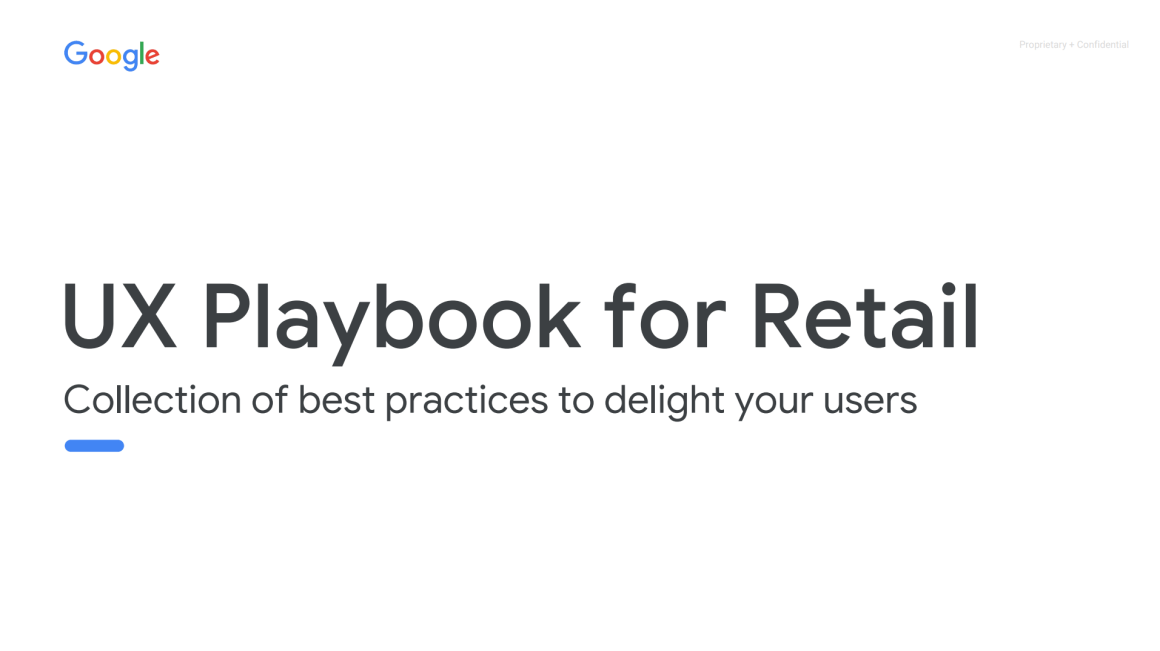
Google posted a training manual with the best practices of mobile online stores. They disassembled many famous brands.

A book about interface design for non-designers by Adam Wathan & Steve Schoger. They gave tips on how to improve frequency patterns and typical situations on Twitter, and now put it in a simple reminder with templates.
Kinneret Yifrah text writing tips for unsubscribe screens or product use in general. Many try to soften or shame the customer, but his refusal is not always associated with the product itself and it is important to show understanding.
A simple and useful reminder on the design of useful service error pages from Alana Brajdic. Checklist with user questions and examples of answers to them.
Tips for writing texts in the interface, taking into account the localization of Jen Schaefer from Google.
Steve Turbek from Goldman Sachs deals with gestures in mobile OS - they are difficult to detect and not always convenient to use.
Jeff Sauro talks about a comparative study of the usability of restaurant sites with food delivery.
Page Laubheimer of the Nielsen / Norman Group tells how to make the right bread crumbs.
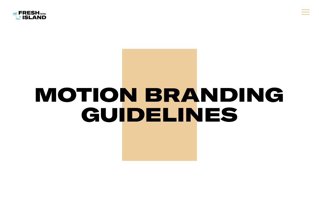
Insanely cool example of guidelines on motion-design for Fresh Island. A number of typical situations are shown, and the animation has a corporate character.
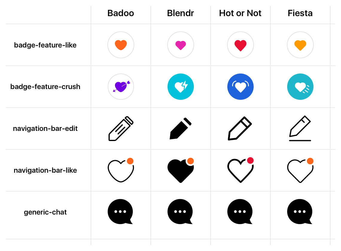
Badoo's Cristiano Rastelli from Badoo talks about exporting icons from Sketch to their Cosmos design system. The company has several products, so the approach supports thematic. Part 2 .
A simple framework for creating design systems using tokens. The presentation of the author, Danny Banks from Amazon .
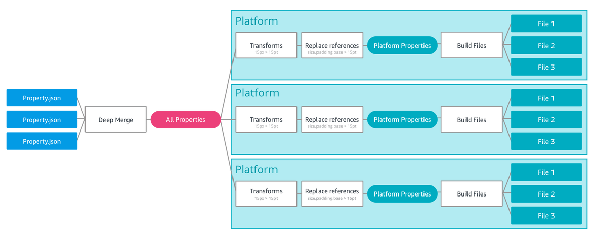
Other libraries and examples of using tokens:
Chic gadline on the texts for promotional sites from Stripe. They parse several pages and apply guidelines to them.
Nathan Curtis writes about holistic support for users with disabilities in design systems.
Nathan Curtis continues his series on the documentation of components in design systems and gives advice on the correct approach to the process and examines the myths and prejudices about the process .
Studio Pavlova Dog talks about creating a guideline on the interface text for Sberbank.
Figma, together with the organizers of the Clarity conference, conducted a survey of 499 designers working on design systems. Their opinions are collected in the report, although the confusion with the concept of “component” continues (naturally, for Figma, this is just a thing in the design template, not a piece of code).
The unified style of illustrations for Slack, which appeared in 2017, is an unconditional hit that half of the companies actively reproduce. It allows in a playful form to combine humanity (people are displayed entirely and in the plots) and to show the key metaphors of the product (objects and parts of the interface). Well, just a typical trend, for which everyone ran, grappled with a train - there are other stylistics that solve these problems.
Alice Lee, who started a wave commissioned by Slack, spoke about the work on the project. The starting mindboard, intermediate variations, library of typical objects and a large gallery of results - individually and in detail.
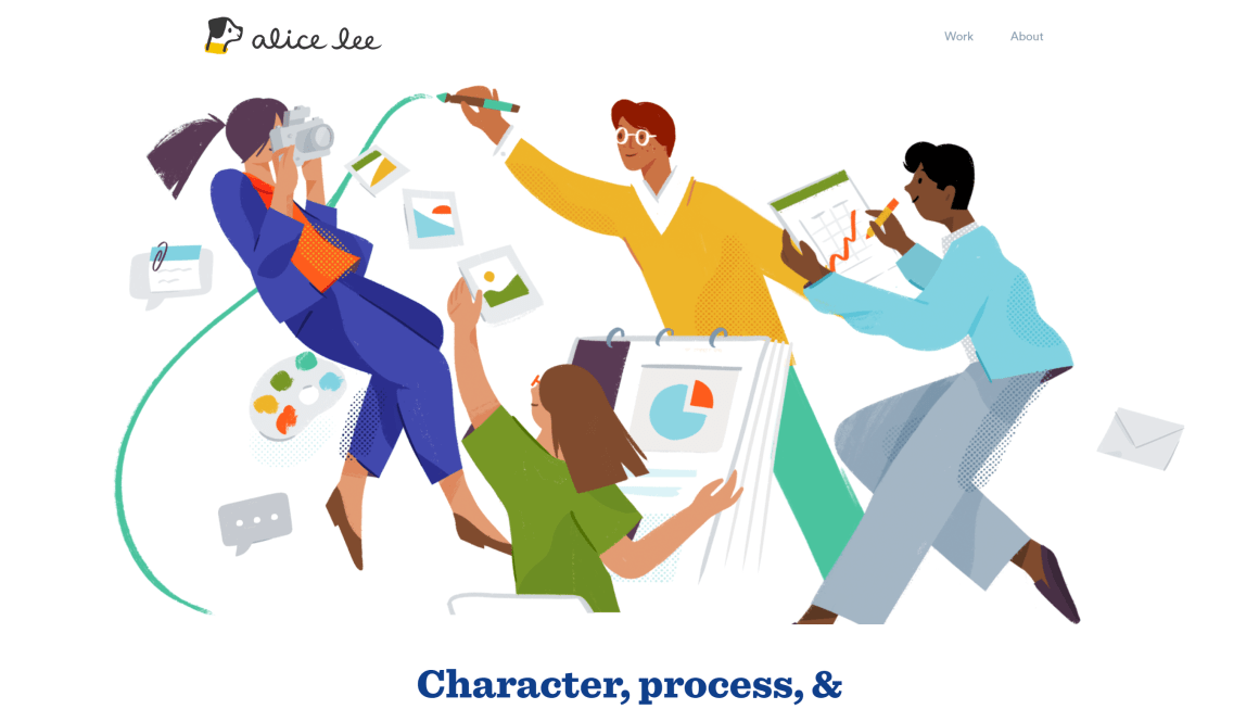
At the end of the article Alice gives good advice for those who are looking for their style. Now several generators of stock illustrations have appeared, which greatly reduce the cost of their creation and make them accessible to more companies (and cloning, of course, kills the diversity and value of one’s own face):
Cheaply repeat Slack style.
We collect the isometry on the template once or twice.
Of course, it was possible to get a stock result on Shutterstock or Getty Images, they have long been flooded with the Internet. The new generation of designers at least gives the integrity of the approach - it is easier to assemble your plot from ready-made objects.
But if you want to express your brand in illustrations, and not just put a story plug - you need to look for your language. The article Alice has a small seed on the subject. Well, in the last issue of the mini-digest there were many examples .
Of course, it is useful to study the trends: Creative Bloq just released a review . Good luck finding yourself!
Microsoft posted a more complete video of the current vision of the Fluent design system.
A section devoted to branded forms of interface elements appeared in the guidelines . Dave Chiu shows how this helps reveal the brand’s visual language , and David Allin Reese how to change buttons .
Guidelines on the availability of interfaces for users with disabilities from Sberbank. Explanatory detailed checklist.

A good and capacious checklist on optimizing interfaces for users with disabilities from Avinash Kaur.
Susan Weinschenk describes the principles of the brain during the solution of creative tasks. It is not in the alternate work of the right and left hemispheres, but in the principles of three-level information processing.
Therese Fessenden from the Nielsen / Norman Group gives examples of the use of the psychological method of “anchoring” in interfaces. He often justifies a higher price.
Andrew Grimes describes the concept of user interaction with the product. It shows when the user makes a decision himself, and when he needs help.
Chris Ashton tried to use the program to read the site content out loud. Problems in well-known services above the roof.
Another piece about interface design for kids from the Nielsen / Norman Group. Feifei Liu gives advice on taking into account the features of different age periods - cognitive abilities and motor skills are limited in the early years.
Alan Klement explains what it means to “hire” a product in the Jobs to Be Done method.
Jared Spool offers to talk not about "consistency", but about how current user knowledge will help him in working with your interface.
Daniele Catalanotto's free book on designing services. Written so that to use these ideas do not need a deep knowledge of this difficult subject area. Practically in any service there are low-hanging fruits - problems that can be fixed in a cheap and fast way, but with a significant effect. This book will help find such fruits. In fact, this is a checklist of typical situations in the design of services with options for their decisions.
The tool allows you to get code for the web and native Android and iOS applications from Sketch, Adobe XD, Photoshop and Balsamiq layouts (on the Figma approach).
Graeme Fulton reviewed the voice interface prototyping capabilities . All this is wrapped in a smart overview of the market itself and the features of communication with voice assistants. Similar article from Nikolay Babich and demo with Adobe MAX .
Shane Williams made a pack of simple and clear examples of using the new auto-animation feature in Adobe XD . What screen conditions are needed for each of the prototypes.
Simplified ability to work with dialogs and pop-up layers in prototypes and export to PDF - now you can make presentations or prepare resources for iOS.
Unusual approach to the design tool - it focuses on a large library of components that can be downloaded and modified for themselves.
The command shows how prototyping is simplified due to the built-in states of the components .
We launched a gallery of examples of well-made sites showing the capabilities of the platform.
Another visual site builder based on Bootstrap. Allows you to collect a page from standard blocks and draw it.
A collection of learning materials from Matt D. Smith .
The most simple online service for designing interfaces.
A new tool for illustrations and their subsequent animation. Announcement from the authors .
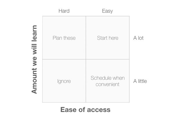
A simple and powerful approach to choosing user research methods from David Travis from UserFocus. It is based on the classic 2 × 2 matrices and offers 10 points of view on different tasks.
Paula Barraza shares tips for conducting rapid iterative user interface testing. How to conduct sessions, record the results and communicate with the team.
The plugin for Chrome allows you to change the page layout in a more visual form than the built-in Code Inspector. Memo on working with him from Adam Argyle and a review of similar plug-ins .

Shapy : Another tool for getting rich gradients on CSS.
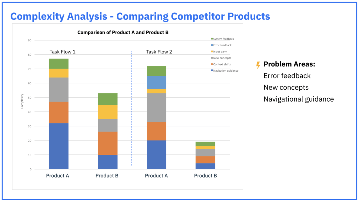
IBM's Gabriella Campagna talks about an interface complexity analysis method that the team uses to evaluate improvements and comparisons with competitors. On the basis of the checklist, it shows where the problem areas in the script.
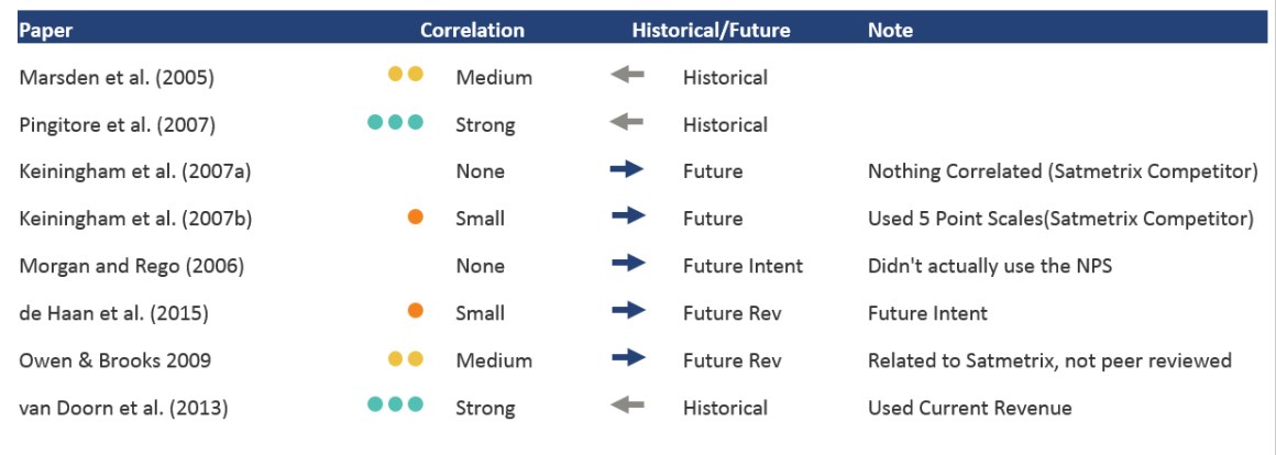
Jeff Sauro repeated the study of Fred Reichheld, author of the NPS metric, to verify its validity. In general, everything is so - profit is justified in the past and with a future probability of 30%.
He launched a course on digital product design management at Bang Bang Education. I am working on a book based on my series of articles and have already collected a draft in a new structure. The main idea is to describe the methods and practices of design management in a patterning format, approximately as usual typical interface solutions. In this form, they are easier to use in the right situation - there are step by step instructions and indications / contraindications for use. This means that advanced approaches can be applied even by those who are just starting.
In recent years, the demand for design managers has been growing - companies have pumped up their internal product teams, and there are more designers. It raises the question of how to make their work connected, which organizational structures are better for this, how to raise and motivate them, how to make the quality of their work predictable - and this list is very long.
We have come a good way in Mail.Ru Group and although there is still a lot of work ahead, it’s hard not to notice the changes that have already happened and their dynamics. Many companies are just starting their way - for example, banks and telecoms gradually take design expertise inward, and our transformation began about this 8-9 years ago.
If you want to start or accelerate changes in the design of your company - let's go to the course. Classes start on February 26th.
Interview with Irene Au from the Khosla Ventures Venture Fund about her experience in the development of design in companies of different types and stages of maturity. She actively helps startups and sees many different situations.

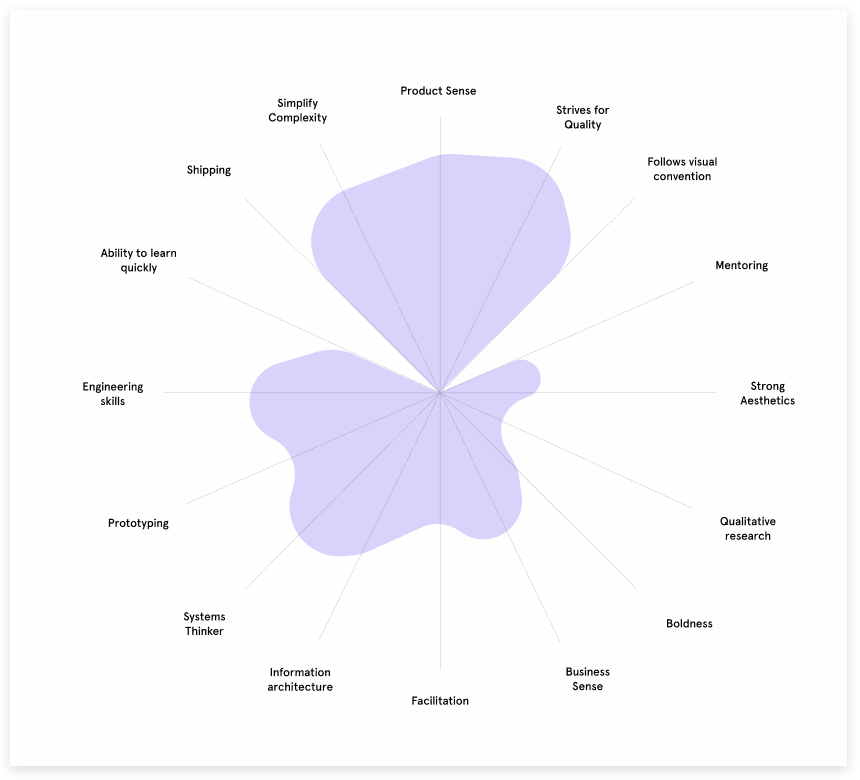
Noah Levin talks about the Figma design team's competency map. The format is a popular petal diagram. They published their template for profile card designers .
Facebook's Siva Sabaretnam describes its vision of a competency map and career path for designers.
Taylor Palmer from Lucid Software talks about integrating the design team into a common grocery. How the interaction format changed as the company grew.
Audrey Crane describes the essence of design debt and lists the problems in product development that it leads to.
Atlassian published a training manual on methods of teamwork and interface design in general.
Bonus: Templates are available in RealtimeBoard .
Hye-jin Lee, Katie Kahyun Lee and Junho Choi conducted a study on the link between User Experience, Customer Experience and Brand Experience. They also collected a breakthrough of previous works on the topic, so it will turn out a useful portal into the knowledge accumulated by the profession. The article looks great, but a significant part is devoted to the research methodology and can be skipped.
Sarah Gibbons from the Nielsen / Norman Group asked UX specialists about their understanding of design thinking. It turned out a good cut of different meanings that are embedded in the term. They promise more detailed materials in pursuit.
Review of the redesign of Duolingo and his brand new character, which increased the involvement of users.
An interesting example of how the promo page of a simple startup changed throughout the year.
December 9th is the 50th anniversary of the most important technological presentation in the history and history of interfaces in general. Douglas Engelbart arranged for The Mother of All Demos , where he showed the basics of modern computers as working-home tools and interfaces. Then they developed them in Xerox PARC, then their noobs are attributed to Apple. One of the best articles for the anniversary of Marc Weber , in which he examines the background, the fate of the project and the connection to the Internet.
21.7% - growth in the supply of wearable devices in the world
Since the fall of such collections, more than one hundred have come out, but these best show where to move in 2019. Good luck in differentiating your brands (and collecting likes on Dribbble).
Bonus: what was promised for 2018 .
Have released their annual review of trends. They are, as always, more technological than design. In the summer I was visiting their London office and Esther Duran told about the work on the report . They collect the opinions of 1000 employees and 85 clients on 5 continents in order to find insights and highlight patterns in a wide range of areas (society, politics, professional sectors). As a result, there are about 70 trends, 10 of which are published outside.
Announced the color of 2019 - coral. Jokes on a typical day at Dribbble next year have already gone .

As always make the best and most comprehensive reviews.

They focus on professional life, rather than specific technological or visual trends.

The beginning is fairly standard, but a lot of really fresh things are noted.
About colors.
About photos.

About illustrations.

Rather sensible branding development forecasts from the team of the iconic agency Saffron.
Method and Hitachi made a forecast on the topic of "trust" in the future.
Trendwatching Forecast.
The MIT experiment recreates pictures using 3D printing.
The tool turns the interface sketches on paper into fairly neat sketch layouts. I have been following alpha and beta versions for a long time, an excellent application of the Airbnb idea for a wide range of designers.
Generator design sneakers.
Jason Mesut - master of turning any interface concepts into visual models. He collected all his articles on a topic in a single blog. One of the latest describes problems with the interpretation of "empathy" among designers . And an intelligent model to account for all who are important to work on the product.
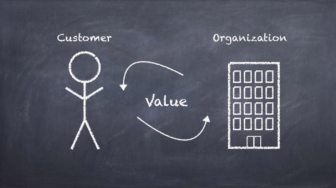
Erika Hall is a fitrid longrid on the topic of design ethics in making product decisions and in general limits of possibilities. She recommends comparing user value and business benefits in the early design stages so that there is no gap between them.
A good bundle of advice-guides on the correct approach to the work of the product designer from Eugen Eşanu. The second part .
InVision launched another community, this time for top designers.
The design management conference DesignOps Summit 2018 from Rosenfeld Media was held in New York on November 7-9. The organizers posted a video of speeches (last digest was a report on it ).
Patterns and best practices
UX Playbook for Retail
Google posted a training manual with the best practices of mobile online stores. They disassembled many famous brands.
Adam Wathan & Steve Schoger - Refactoring UI - The Book
A book about interface design for non-designers by Adam Wathan & Steve Schoger. They gave tips on how to improve frequency patterns and typical situations on Twitter, and now put it in a simple reminder with templates.
If you leave me now
Kinneret Yifrah text writing tips for unsubscribe screens or product use in general. Many try to soften or shame the customer, but his refusal is not always associated with the product itself and it is important to show understanding.
A UX Guide For Designing Error Pages
A simple and useful reminder on the design of useful service error pages from Alana Brajdic. Checklist with user questions and examples of answers to them.
Creating UI text that translates
Tips for writing texts in the interface, taking into account the localization of Jen Schaefer from Google.
Resisting the Dark Magic in User-Interface Design
Steve Turbek from Goldman Sachs deals with gestures in mobile OS - they are difficult to detect and not always convenient to use.
The UX of Restaurant Websites
Jeff Sauro talks about a comparative study of the usability of restaurant sites with food delivery.
Breadcrumbs - 11 Design Guidelines for Desktop and Mobile
Page Laubheimer of the Nielsen / Norman Group tells how to make the right bread crumbs.
Design systems and guidelines
Fresh Island Motion Design Guidelines
Insanely cool example of guidelines on motion-design for Fresh Island. A number of typical situations are shown, and the animation has a corporate character.
Generating multi-brand multi-platform icons with Sketch and Node.js script
Badoo's Cristiano Rastelli from Badoo talks about exporting icons from Sketch to their Cosmos design system. The company has several products, so the approach supports thematic. Part 2 .
Style Dictionary - Style once, use everywhere. A build system for creating cross-platform styles
A simple framework for creating design systems using tokens. The presentation of the author, Danny Banks from Amazon .
Other libraries and examples of using tokens:
- Badoo's Cristiano Rastelli talks about how tokens are used in their Cosmos design system . They are based on the Style Dictionary framework.
- Tokens of the Firefox Proton design system .
- A simple framework for creating design systems using tokens .
Writing copy for landing pages
Chic gadline on the texts for promotional sites from Stripe. They parse several pages and apply guidelines to them.
"Accessible" Design Systems Don't Guarantee Accessible Products
Nathan Curtis writes about holistic support for users with disabilities in design systems.
Authoring Component Documentation
Nathan Curtis continues his series on the documentation of components in design systems and gives advice on the correct approach to the process and examines the myths and prejudices about the process .
Guide for creating interface texts for Sberbank
Studio Pavlova Dog talks about creating a guideline on the interface text for Sberbank.
State of Design Systems 2018
Figma, together with the organizers of the Clarity conference, conducted a survey of 499 designers working on design systems. Their opinions are collected in the report, although the confusion with the concept of “component” continues (naturally, for Figma, this is just a thing in the design template, not a piece of code).
Unified illustrations in digital products
The unified style of illustrations for Slack, which appeared in 2017, is an unconditional hit that half of the companies actively reproduce. It allows in a playful form to combine humanity (people are displayed entirely and in the plots) and to show the key metaphors of the product (objects and parts of the interface). Well, just a typical trend, for which everyone ran, grappled with a train - there are other stylistics that solve these problems.
Slack
Alice Lee, who started a wave commissioned by Slack, spoke about the work on the project. The starting mindboard, intermediate variations, library of typical objects and a large gallery of results - individually and in detail.
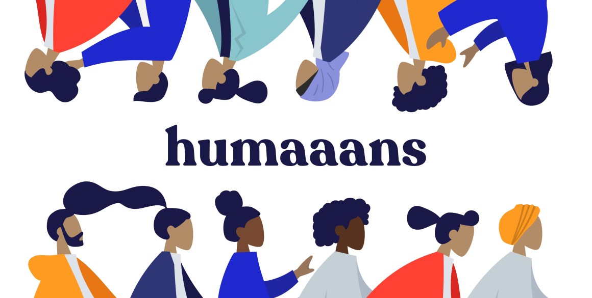
At the end of the article Alice gives good advice for those who are looking for their style. Now several generators of stock illustrations have appeared, which greatly reduce the cost of their creation and make them accessible to more companies (and cloning, of course, kills the diversity and value of one’s own face):
Humaaans and Drawkit
Cheaply repeat Slack style.
Isometriclove
We collect the isometry on the template once or twice.
Of course, it was possible to get a stock result on Shutterstock or Getty Images, they have long been flooded with the Internet. The new generation of designers at least gives the integrity of the approach - it is easier to assemble your plot from ready-made objects.
But if you want to express your brand in illustrations, and not just put a story plug - you need to look for your language. The article Alice has a small seed on the subject. Well, in the last issue of the mini-digest there were many examples .
Of course, it is useful to study the trends: Creative Bloq just released a review . Good luck finding yourself!
MS Office 365 Brand Film
Microsoft posted a more complete video of the current vision of the Fluent design system.
Material design
A section devoted to branded forms of interface elements appeared in the guidelines . Dave Chiu shows how this helps reveal the brand’s visual language , and David Allin Reese how to change buttons .
Understanding the user
Special Bank - Sberbank's Guideline
Guidelines on the availability of interfaces for users with disabilities from Sberbank. Explanatory detailed checklist.
Accessibility guidelines for UX Designers
A good and capacious checklist on optimizing interfaces for users with disabilities from Avinash Kaur.
What Is The Role Of Creativity In UX Design?
Susan Weinschenk describes the principles of the brain during the solution of creative tasks. It is not in the alternate work of the right and left hemispheres, but in the principles of three-level information processing.
The anchoring principlele
Therese Fessenden from the Nielsen / Norman Group gives examples of the use of the psychological method of “anchoring” in interfaces. He often justifies a higher price.
Designing for Interaction Modes
Andrew Grimes describes the concept of user interaction with the product. It shows when the user makes a decision himself, and when he needs help.
Using A Screen Reader
Chris Ashton tried to use the program to read the site content out loud. Problems in well-known services above the roof.
Designing for Kids - Cognitive Considerations
Another piece about interface design for kids from the Nielsen / Norman Group. Feifei Liu gives advice on taking into account the features of different age periods - cognitive abilities and motor skills are limited in the early years.
What does “Hiring” mean? (And Why Say That?)
Alan Klement explains what it means to “hire” a product in the Jobs to Be Done method.
Consistency in Design is the strong approach
Jared Spool offers to talk not about "consistency", but about how current user knowledge will help him in working with your interface.
Information architecture, conceptual design, content strategy
Daniele Catalanotto - Service Design Principles 1–100
Daniele Catalanotto's free book on designing services. Written so that to use these ideas do not need a deep knowledge of this difficult subject area. Practically in any service there are low-hanging fruits - problems that can be fixed in a cheap and fast way, but with a significant effect. This book will help find such fruits. In fact, this is a checklist of typical situations in the design of services with options for their decisions.
Design and design of interface screens
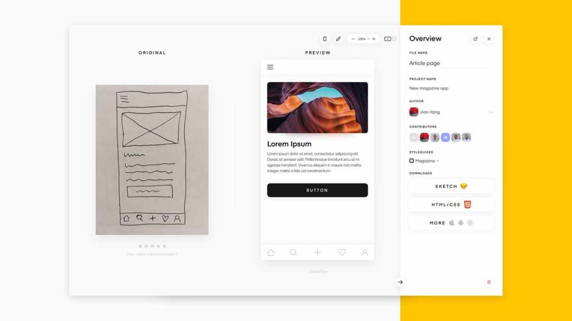
Yotako
The tool allows you to get code for the web and native Android and iOS applications from Sketch, Adobe XD, Photoshop and Balsamiq layouts (on the Figma approach).
Adobe XD
Graeme Fulton reviewed the voice interface prototyping capabilities . All this is wrapped in a smart overview of the market itself and the features of communication with voice assistants. Similar article from Nikolay Babich and demo with Adobe MAX .
Shane Williams made a pack of simple and clear examples of using the new auto-animation feature in Adobe XD . What screen conditions are needed for each of the prototypes.
Figma
Simplified ability to work with dialogs and pop-up layers in prototypes and export to PDF - now you can make presentations or prepare resources for iOS.
Montage
Unusual approach to the design tool - it focuses on a large library of components that can be downloaded and modified for themselves.
Phase
The command shows how prototyping is simplified due to the built-in states of the components .
Readymag
We launched a gallery of examples of well-made sites showing the capabilities of the platform.
UIConstructor
Another visual site builder based on Bootstrap. Allows you to collect a page from standard blocks and draw it.
InVision Studio
A collection of learning materials from Matt D. Smith .
Moca
The most simple online service for designing interfaces.
Flare
A new tool for illustrations and their subsequent animation. Announcement from the authors .
User research and testing, analytics
10 UX Research
A simple and powerful approach to choosing user research methods from David Travis from UserFocus. It is based on the classic 2 × 2 matrices and offers 10 points of view on different tasks.
6 Tips to Keep in Mind for Iterative Usability Testing
Paula Barraza shares tips for conducting rapid iterative user interface testing. How to conduct sessions, record the results and communicate with the team.
Visual programming and browser design
Visbug
The plugin for Chrome allows you to change the page layout in a more visual form than the built-in Code Inspector. Memo on working with him from Adam Argyle and a review of similar plug-ins .
New scripts
- Fingerprint Entry Animation .
- Spectacular background animation .
- Background animation with generative landscapes .
- How to make a gradient stroke block on CSS .
Work with color
Shapy : Another tool for getting rich gradients on CSS.
Metrics and ROI
Complexity Analysis for UX Research at IBM
IBM's Gabriella Campagna talks about an interface complexity analysis method that the team uses to evaluate improvements and comparisons with competitors. On the basis of the checklist, it shows where the problem areas in the script.
The One Number You Need To Grow (A Replication)
Jeff Sauro repeated the study of Fred Reichheld, author of the NPS metric, to verify its validity. In general, everything is so - profit is justified in the past and with a future probability of 30%.
UX strategy and management
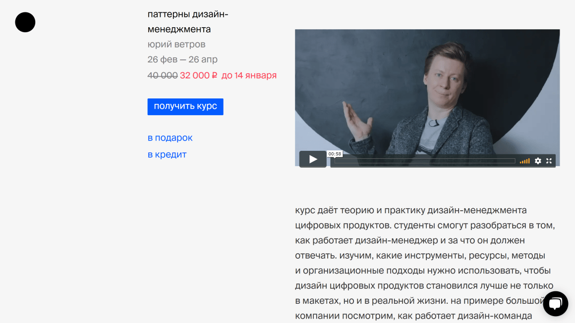
Course "Design Management Patterns"
He launched a course on digital product design management at Bang Bang Education. I am working on a book based on my series of articles and have already collected a draft in a new structure. The main idea is to describe the methods and practices of design management in a patterning format, approximately as usual typical interface solutions. In this form, they are easier to use in the right situation - there are step by step instructions and indications / contraindications for use. This means that advanced approaches can be applied even by those who are just starting.
In recent years, the demand for design managers has been growing - companies have pumped up their internal product teams, and there are more designers. It raises the question of how to make their work connected, which organizational structures are better for this, how to raise and motivate them, how to make the quality of their work predictable - and this list is very long.
We have come a good way in Mail.Ru Group and although there is still a lot of work ahead, it’s hard not to notice the changes that have already happened and their dynamics. Many companies are just starting their way - for example, banks and telecoms gradually take design expertise inward, and our transformation began about this 8-9 years ago.
If you want to start or accelerate changes in the design of your company - let's go to the course. Classes start on February 26th.
Irene Au
Interview with Irene Au from the Khosla Ventures Venture Fund about her experience in the development of design in companies of different types and stages of maturity. She actively helps startups and sees many different situations.
How we built the Figma design team
Noah Levin talks about the Figma design team's competency map. The format is a popular petal diagram. They published their template for profile card designers .
Designing a Better Career Path for Designers
Facebook's Siva Sabaretnam describes its vision of a competency map and career path for designers.
How UX Works with Product Teams at Lucid
Taylor Palmer from Lucid Software talks about integrating the design team into a common grocery. How the interaction format changed as the company grew.
Design debt
Audrey Crane describes the essence of design debt and lists the problems in product development that it leads to.
Team interaction
Atlassian Team Playbook - Team Building Activities that Work
Atlassian published a training manual on methods of teamwork and interface design in general.
Bonus: Templates are available in RealtimeBoard .
Methodologies, procedures, standards
Connecting User Experience, Customer Experience, and Brand Experience
Hye-jin Lee, Katie Kahyun Lee and Junho Choi conducted a study on the link between User Experience, Customer Experience and Brand Experience. They also collected a breakthrough of previous works on the topic, so it will turn out a useful portal into the knowledge accumulated by the profession. The article looks great, but a significant part is devoted to the research methodology and can be skipped.
What is Design Thinking, Really? (What Practitioners Say)
Sarah Gibbons from the Nielsen / Norman Group asked UX specialists about their understanding of design thinking. It turned out a good cut of different meanings that are embedded in the term. They promise more detailed materials in pursuit.
Cases
Duolingo redesigned owl to guilt-trip you even harder
Review of the redesign of Duolingo and his brand new character, which increased the involvement of users.
Evolution of a Landing Page - Website Design for Startups
An interesting example of how the promo page of a simple startup changed throughout the year.
Story
50 years of The Mother of All Demos: how Douglas Engelbart came up with (almost) everything
December 9th is the 50th anniversary of the most important technological presentation in the history and history of interfaces in general. Douglas Engelbart arranged for The Mother of All Demos , where he showed the basics of modern computers as working-home tools and interfaces. Then they developed them in Xerox PARC, then their noobs are attributed to Apple. One of the best articles for the anniversary of Marc Weber , in which he examines the background, the fate of the project and the connection to the Internet.
Trends
Market statistics (Quarter III 2018)
21.7% - growth in the supply of wearable devices in the world
Trends 2019
Since the fall of such collections, more than one hundred have come out, but these best show where to move in 2019. Good luck in differentiating your brands (and collecting likes on Dribbble).
Bonus: what was promised for 2018 .
Fjord
Have released their annual review of trends. They are, as always, more technological than design. In the summer I was visiting their London office and Esther Duran told about the work on the report . They collect the opinions of 1000 employees and 85 clients on 5 continents in order to find insights and highlight patterns in a wide range of areas (society, politics, professional sectors). As a result, there are about 70 trends, 10 of which are published outside.
Pantone
Announced the color of 2019 - coral. Jokes on a typical day at Dribbble next year have already gone .
Milo themes
As always make the best and most comprehensive reviews.
UX Collective
They focus on professional life, rather than specific technological or visual trends.
Webflow
The beginning is fairly standard, but a lot of really fresh things are noted.
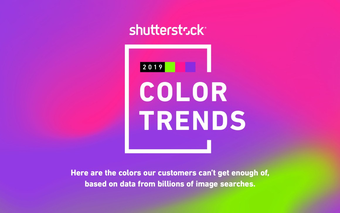
Shutterstock
About colors.
By
About photos.
Creative bloq
About illustrations.
Saffron Predictions for 2019
Rather sensible branding development forecasts from the team of the iconic agency Saffron.
Trust 2030 - How will we trust in the future?
Method and Hitachi made a forecast on the topic of "trust" in the future.
5 Trends for 2019
Trendwatching Forecast.
Algorithmic design
AI faithfully recreate
The MIT experiment recreates pictures using 3D printing.
Wizard
The tool turns the interface sketches on paper into fairly neat sketch layouts. I have been following alpha and beta versions for a long time, an excellent application of the Airbnb idea for a wide range of designers.
Sneaker generator
Generator design sneakers.
For general and professional development
Shaping design
Jason Mesut - master of turning any interface concepts into visual models. He collected all his articles on a topic in a single blog. One of the latest describes problems with the interpretation of "empathy" among designers . And an intelligent model to account for all who are important to work on the product.
Thinking in Triplicate
Erika Hall is a fitrid longrid on the topic of design ethics in making product decisions and in general limits of possibilities. She recommends comparing user value and business benefits in the early design stages so that there is no gap between them.
Product Design - Expectations vs Reality
A good bundle of advice-guides on the correct approach to the work of the product designer from Eugen Eşanu. The second part .
Design Exchange by InVision
InVision launched another community, this time for top designers.
Conference proceedings
Video from DesignOps Summit 2018
The design management conference DesignOps Summit 2018 from Rosenfeld Media was held in New York on November 7-9. The organizers posted a video of speeches (last digest was a report on it ).
Subscribe to a digest on Facebook , VKontakte , Telegram or by mail - there fresh links appear every week. Thanks to everyone who shares the links in the group, especially Gennady Dragun, Pavel Skripkin, Dmitry Podluzhny, Anton Artyomov, Denis Efremov, Alexey Kopylov, Taras Brizitsky, Yevgeny Sokolov and Anton Oleynik.