Solving the riddle of round numbers on the 2018 election schedule
This article is a response to this article ( Analysis of the results of the presidential election in 2018. At the federal and regional level ).
In that article, the author’s phrase surprised me:
Instead of a normal or lognormal distribution, we see an interesting curve, with very strange peaks at round values (70%, 75%, 80%, etc.), increasing by about -100% turnout and going far upwards by 100%.The questions immediately arise:
- Why does the author believe that instead of “strange” peaks there should be a normal or lognormal distribution?
- Why are peaks considered “strange” in general?
- Where can “natural” peaks appear at round values?
That article is highly politicized and the comments in it are relevant. In this article we will discuss only mathematics, so I ask you to keep political views to yourself.
And as a bonus, at the end of the article, a key will be laid out to solve the riddle of round numbers on the 2018 election schedule.
Initial data
Database file (MongoDB) with voting results (parsing from the state website ), which was uploaded by the author of the original article:
File = 15-04-18.tar.xz
MD5 = 3a1c198cbc4ce102fbc074752fc0ca99
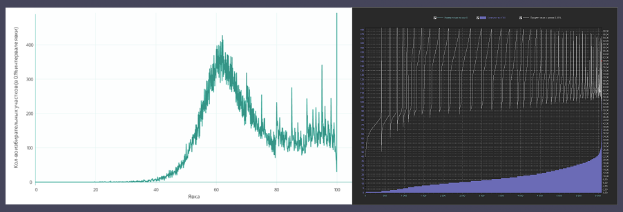
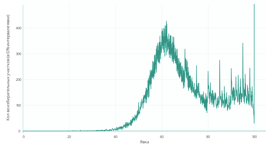
We will study the graph of the percentage of turnout and the number of PECs with this turnout . In the original article, it looks like this:
Introduction
Everyone can download the database and independently check for errors. My data from several PECs were randomly selected and checked by me from the obtained database, which allows us to state with some probability that the data were downloaded from the state. site correctly.
But, there are some comments:
The author of the original article has not yet given an explanation on the questions asked:
where results_0 is the “Number of voters included in the voters list ".
On the pages of the state. site attributes number_bulletin and share no.
The strange thing is that in the database, number_bulletin is not always considered correct (from the point of view of the official calculation of the number of people who participated in the elections).
Namely, the official formula is as follows:
In the database, number_bulletin in most cases coincides with this formula, but there are also many PECs where number_bulletin differs from the above formula by 1-2 or more ballots, and I did not see the pattern.
Here is a sample with an example and hash keys of PECs so that you can quickly find it in the database:
The order of the attributes in the line:
ID is the PEC key
RESULTS_0 is the results.0 field from the database ("The number of voters included in the voters list")
TEST_NUMBER_BULLETIN is the calculated value according to the formula
RESULTS_NUMBER_BULLETIN - value in the database
TEST_YAVKA - calculated value according to the formula
RESULTS_SHARE - value in the database
Thus, if the chart under discussion was built by the author from the database using the share value, then this chart does not correspond to the official version of the turnout calculation. But, I admit the possibility that these attributes were used by the author for testing purposes and the graph he presented was built without using the current share values from the database.
In any case, all the charts of this article are built according to official formulas and do not use the above attributes.
1. According to what formula did you count% turnout at each weekend?But, according to the structure of the database, it is clear that most likely the attribute number_bulletin is a independently calculated parameter that determines the number of voters included in the “turnout”, and share is the percentage of turnout calculated according to the formula
2. Please explain the purpose of the attributes share and number_bulletin.
3. How were values rounded to 0.1%?
share = number_bulletin / results_0;where results_0 is the “Number of voters included in the voters list ".
On the pages of the state. site attributes number_bulletin and share no.
The strange thing is that in the database, number_bulletin is not always considered correct (from the point of view of the official calculation of the number of people who participated in the elections).
Namely, the official formula is as follows:
- The number of ballots issued at the polling station +
- The number of ballots issued off-site +
- The number of ballots issued ahead of schedule
In the database, number_bulletin in most cases coincides with this formula, but there are also many PECs where number_bulletin differs from the above formula by 1-2 or more ballots, and I did not see the pattern.
Here is a sample with an example and hash keys of PECs so that you can quickly find it in the database:
The order of the attributes in the line:
ID is the PEC key
RESULTS_0 is the results.0 field from the database ("The number of voters included in the voters list")
TEST_NUMBER_BULLETIN is the calculated value according to the formula
RESULTS_NUMBER_BULLETIN - value in the database
TEST_YAVKA - calculated value according to the formula
RESULTS_SHARE - value in the database
5ab557a2866a6a69f2cf8c90 2241 1368 1367 0,610441 61

5ab557aa866a6a69f2cf8ca8 2853 1665 1662 0,583596 58,25

5ab557b1866a6a69f2cf8cba 2138 1413 1412 0,660898 66,04

5ab557b1866a6a69f2cf8cbb 2093 1291 1290 0,616817 61,63

5ab557b3866a6a69f2cf8cc2 2463 1688 1687 0,685343 68,49

5ab557b5866a6a69f2cf8cc7 1583 1085 1084 0,685407 68,48

5ab557b9866a6a69f2cf8cd7 1483 912 911 0,614969 61,43

5ab557ba866a6a69f2cf8cdb 2166 1403 1402 0,647737 64,73

5ab557bb866a6a69f2cf8cdd 2186 1204 1203 0,550777 55,03

5ab557bc866a6a69f2cf8ce1 1574 986 985 0,626429 62,58

5ab557bd866a6a69f2cf8ce5 1284 803 802 0,625389 62,46

5ab557bd866a6a69f2cf8ce6 2543 1610 1608 0,63311 63,23

5ab557bf866a6a69f2cf8ced 2215 1353 1350 0,610835 60,95

5ab557cf866a6a69f2cf8d36 1627 1374 1372 0,844499 84,33

5ab557f7866a6a69f2cf8dbd 449 262 261 0,583518 58,13

5ab557f8866a6a69f2cf8dbf 597 349 347 0,584589 58,12

5ab55809866a6a69f2cf8dfa 194 156 155 0,804123 79,9
Thus, if the chart under discussion was built by the author from the database using the share value, then this chart does not correspond to the official version of the turnout calculation. But, I admit the possibility that these attributes were used by the author for testing purposes and the graph he presented was built without using the current share values from the database.
In any case, all the charts of this article are built according to official formulas and do not use the above attributes.
Official turnout calculation formula:
- The number of ballots issued at the polling station +
- The number of ballots issued off-site +
- The number of ballots issued ahead of schedule
All graphs in this article are constructed by the following parameters:
Turnout at each weekend = formula above
Rounding to the nearest integer:
10.2 => 10
10.5 => 11
Rounding to the first decimal place and subsequent ..:
0.22 => 0.2
0.25 => 0.3
Visualization # 1
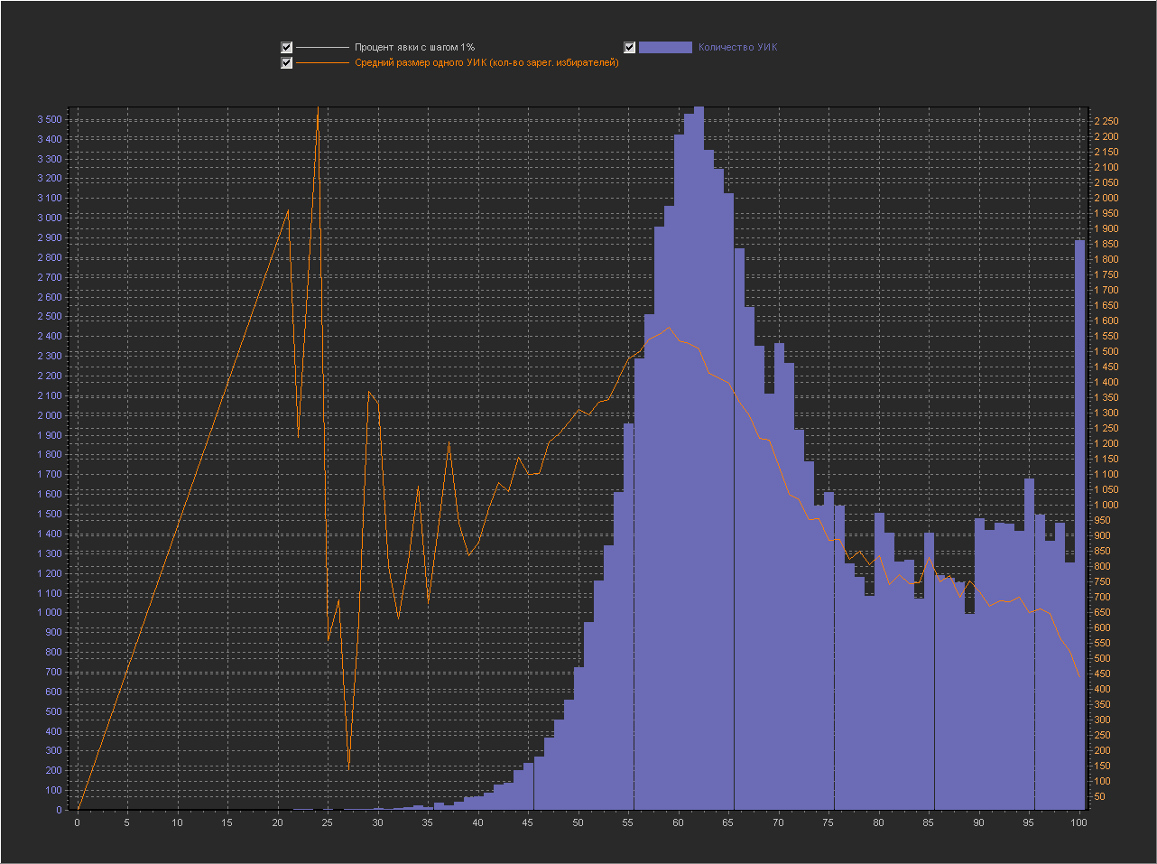
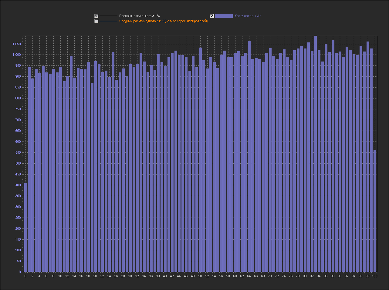
Let's look at the graphs with visualization of the number of PECs by turnout percentage, additionally adding a line with the average PEC size to check for possible correlation:
Chart_1a:
X axis - Turnout percentage (interval = 1%)
Y axis (left) - PEC number
Y axis (right) - Average size of one PEC (number of registered voters) It can be seen that at point X = 100 the value is very high, while the average size of PECs decreases. In the discussion of fediq , a logical assumption was made:
High turnout is a normal occurrence for highly organized PECs such as traditional communities, security institutions, and military units.Let's look at the first 10 regions by the number of PECs with 100% turnout:
K_ALL - the number of PECs in the region
K_100 - the number of PECs with 100% turnout
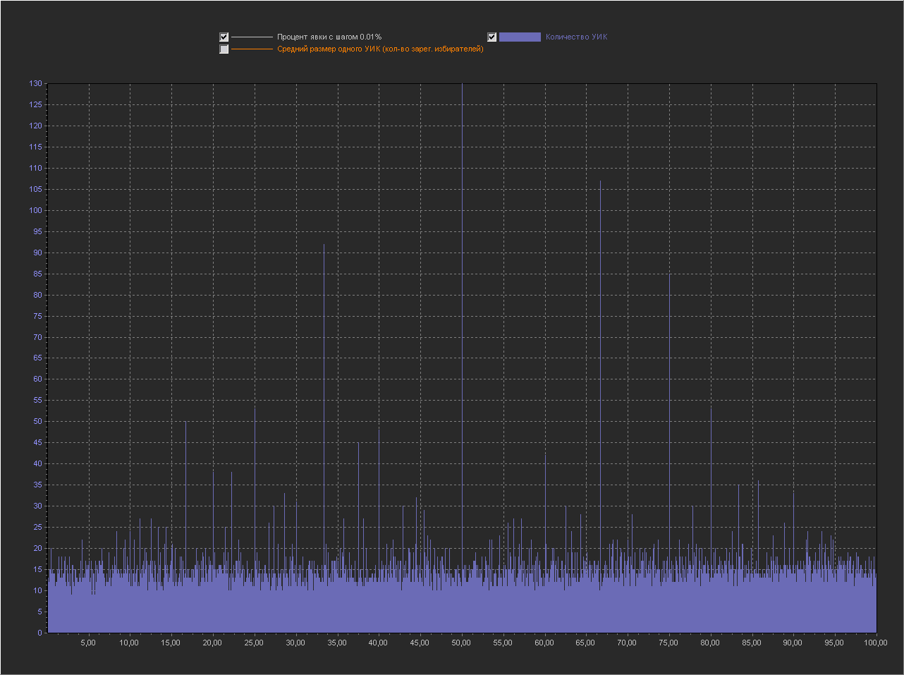
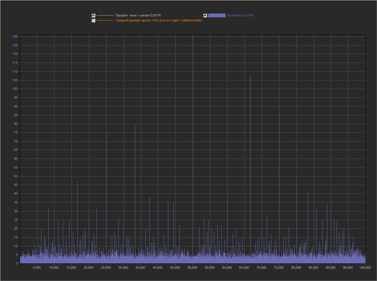
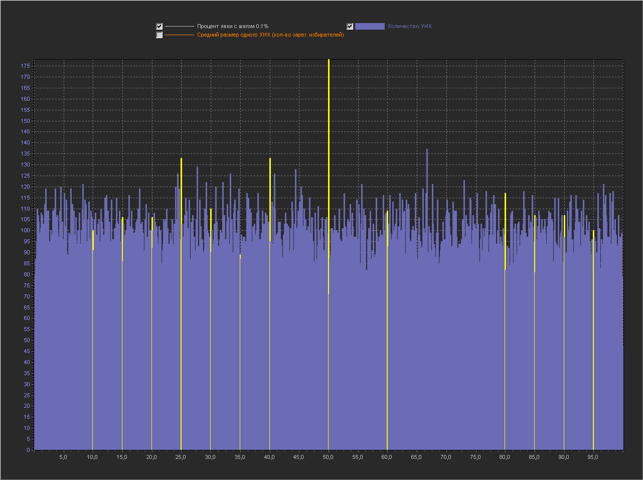
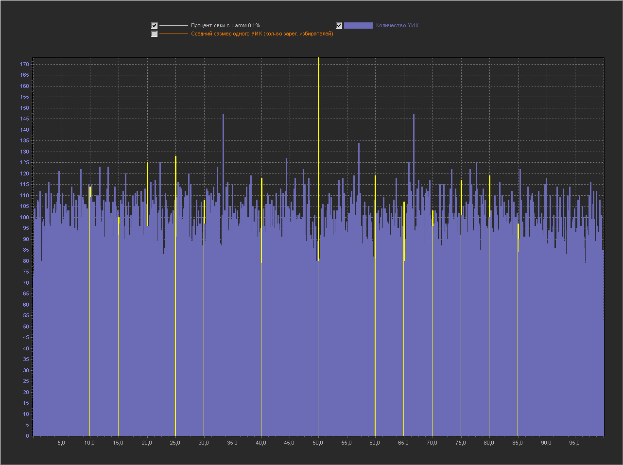
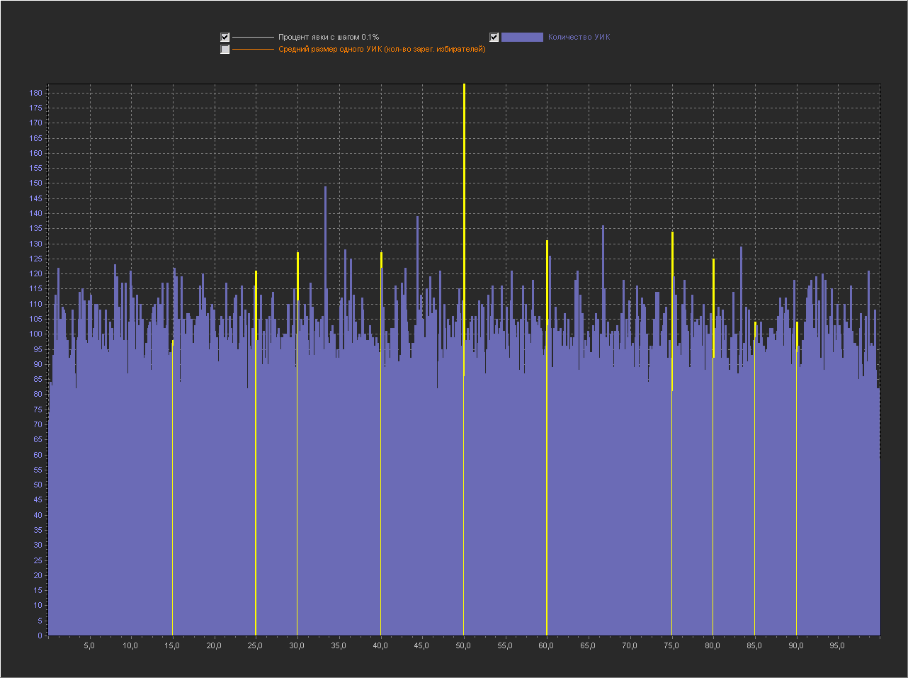
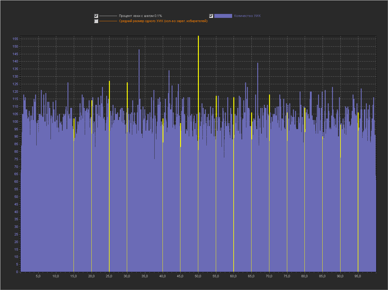
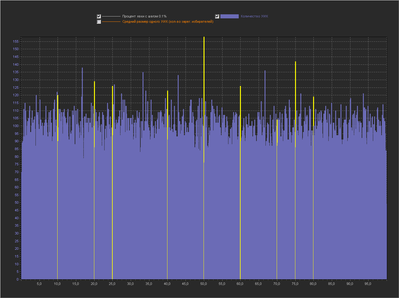
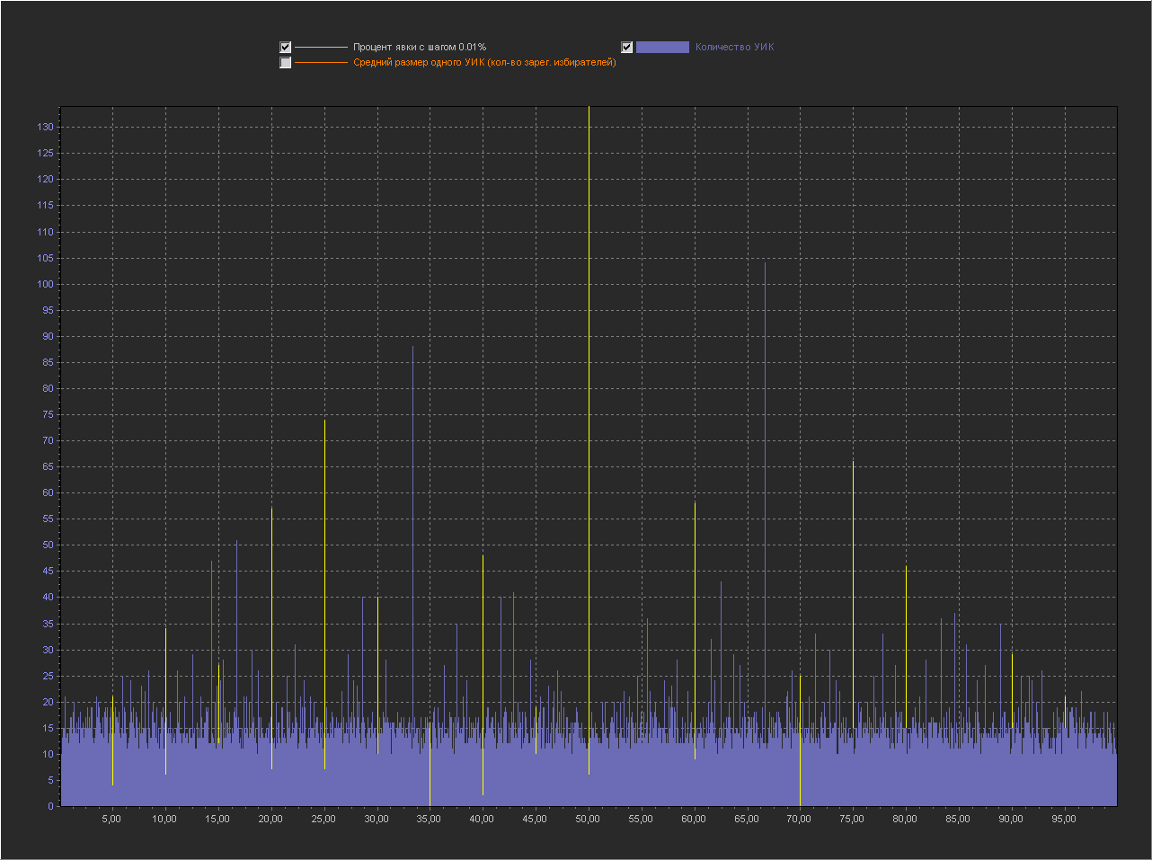
REGION - the name of the region Graph_1b: X axis - Percentage of turnout (interval = 0.1% ) Y axis (left) - Number of PECs Y axis (right) - Average size of one PEC (number of registered voters) + The point is not displayed 100%, because with her the rest of the values are too small. The same peaks appeared on the round values. Chart_1c: X axis - Percentage of turnout (interval = 0.01%) Y axis (left) - Number of PECs + The point is not displayed 100%, because with her the rest of the values are too small.
K_ALL K_100 REGION

393 346 foreign-countries

1580 213 primorsk

1911 165 dagestan

482 156 sakhalin

596 138 murmansk

2817 132 tatarstan

2052 128 st-petersburg

317 123 kamchatka_krai

948 67 arkhangelsk

854 60 khabarovsk
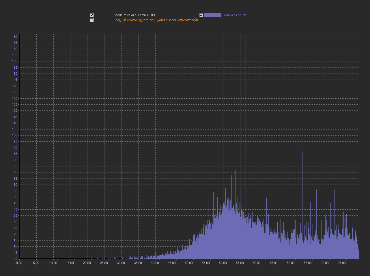
As expected, with a decrease in the step, the number of peaks increases and they are located throughout the graph.
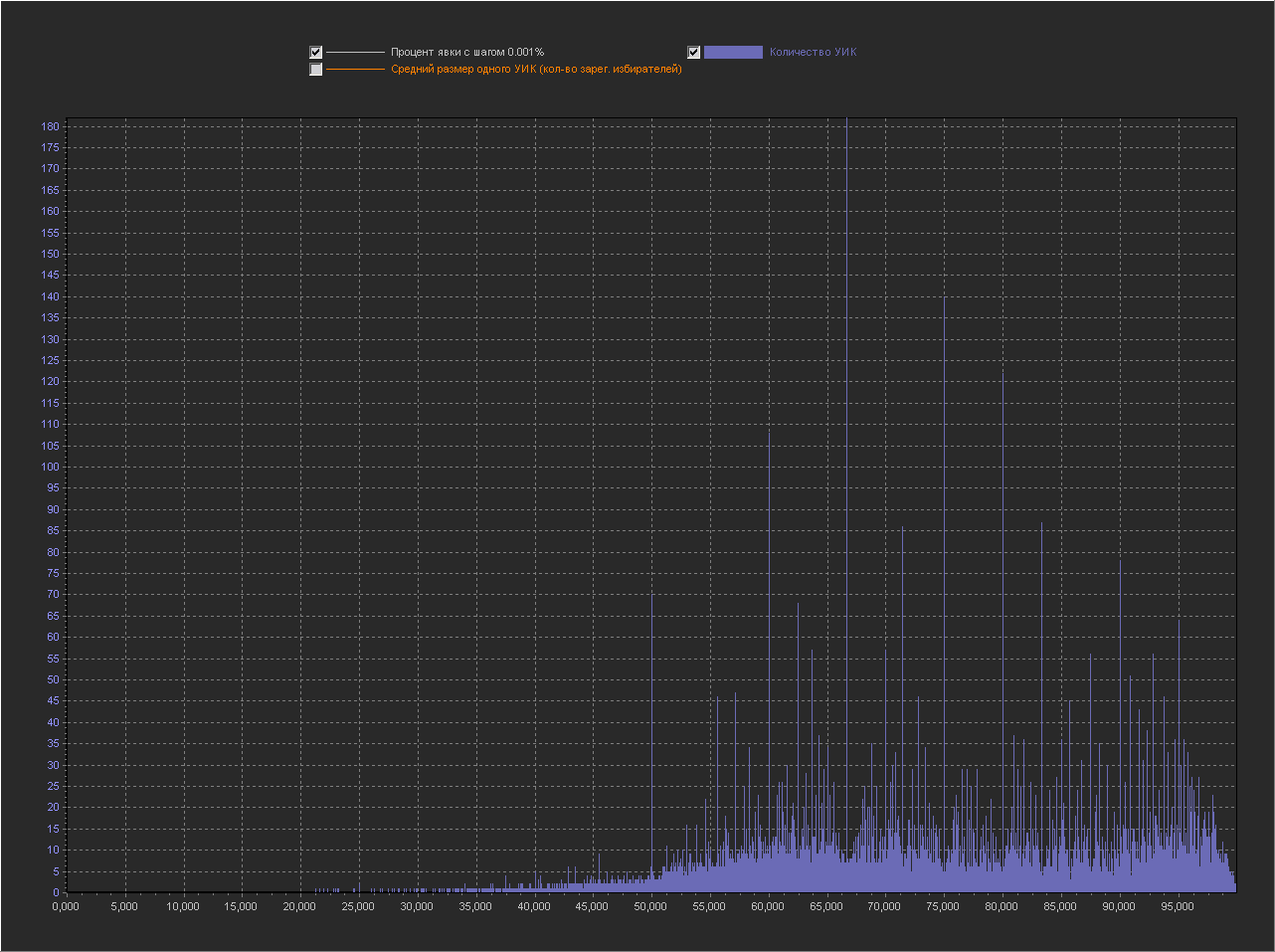
Graph_1d:
X axis - Percentage of turnout (interval = 0.001%)
Y axis (left) - Number of PECs
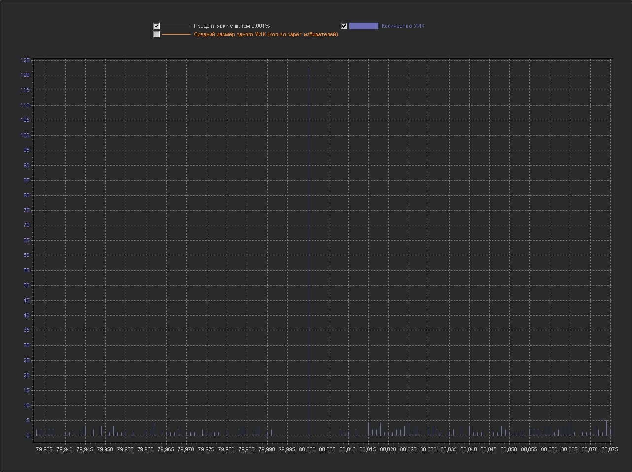
+ No 100% point is displayed, because with her the rest of the values are too small. As we see the whole graph in peaks, i.e. on this scale, peaks are normal. Graph_1d: X axis - Percentage of turnout (interval = 0.001%) Y axis (left) - Number of PECs Increased area for a value of 80% We see that next to the round 80% there are many small values.
Visualization # 2
Now let's look at the same graphs, but from a different angle. Since the points (turnout percentage) located next to each other on the graph along the X axis are not connected in any way (completely different PECs with different geo-position, size and mood of voters, etc., fall into each such sample point) , then there’s no difference in what order they are, so we’ll sort them along the X axis not by increasing percentage of turnout, but by increasing the number of PECs.
Those. in the graphs above we saw how the number of PECs behaves with an increase in the percentage of turnout, and in this graph we will see how the percentage of turnout behaves with an increase in the number of PECs.
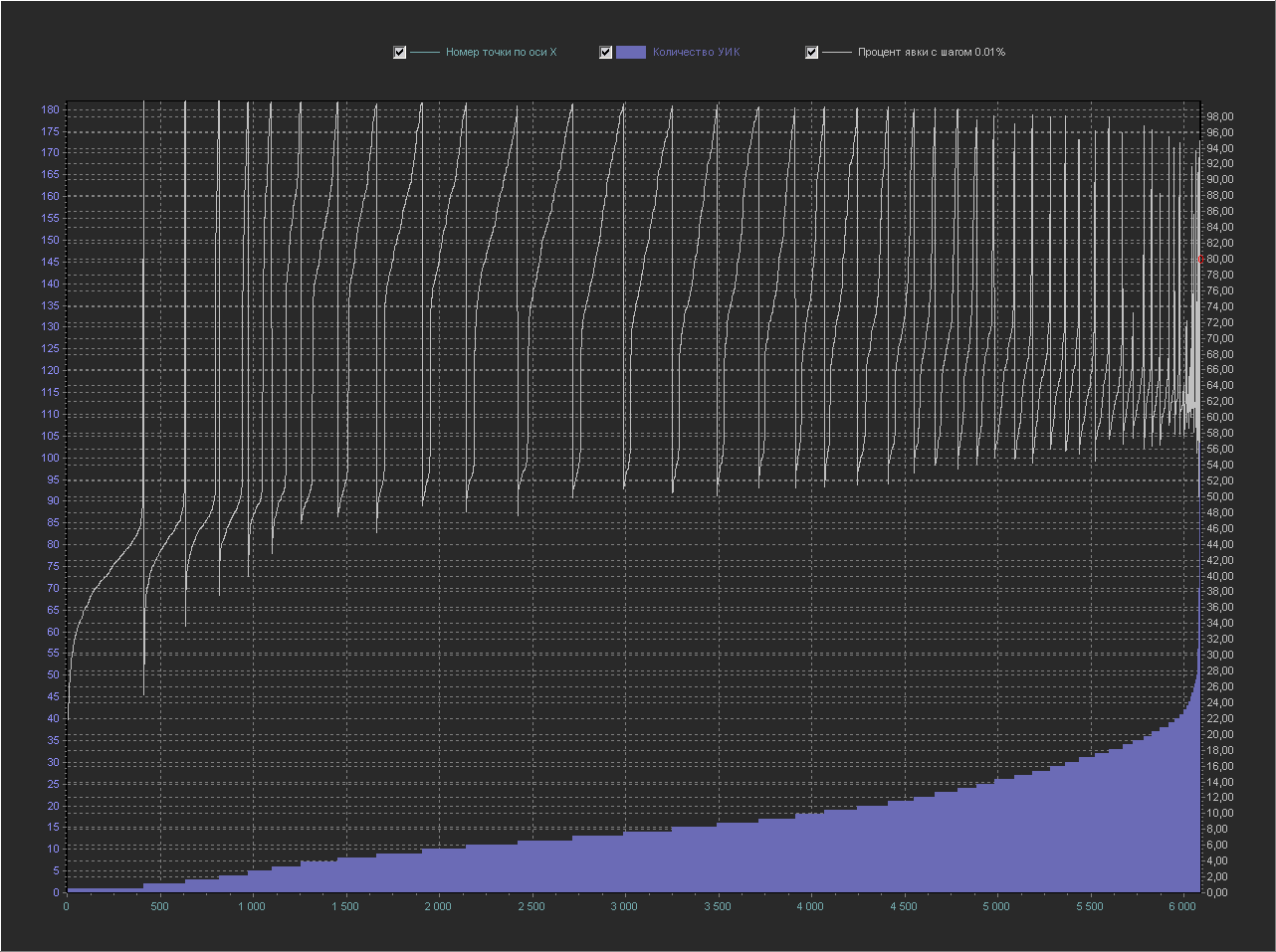
Graph_2a:
X axis - number of a point from the database in order
Y axis (left) - Number of PECs
Y axis (right) - Percentage of turnout (interval = 1%)
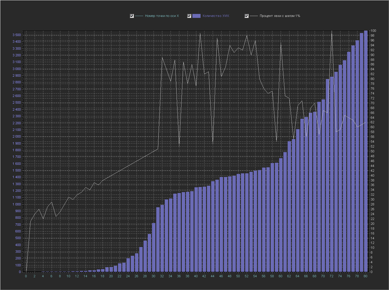
This is the same graph as above, but the X axis (white color) is now transferred to the Y axis (right) and displayed as a separate line, the Y axis (left), as before, displays the number of PECs, and on the X axis now simply displays the number of samples from the database (the number of the point along the X axis in order).
Explanation A
point along the X axis with number 60 corresponds to:
turnout percentage = 95
number of PECs = 1680
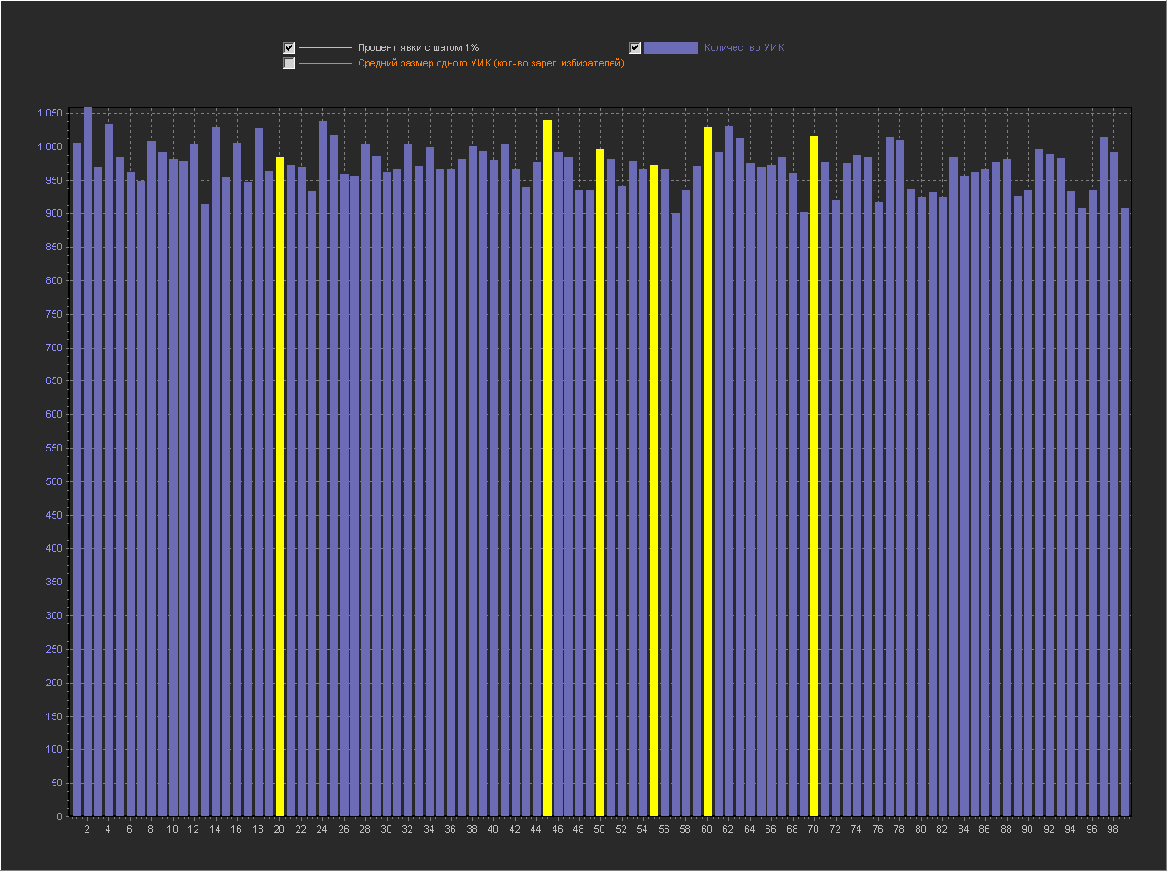
Graph_2b:
X axis - number of a point from the database in order
Y axis (left) - Number of PECs
Y axis (right) - Turnout percentage (interval = 0.1%)
+ The point of 100% is not displayed, because with her the rest of the values are too small.
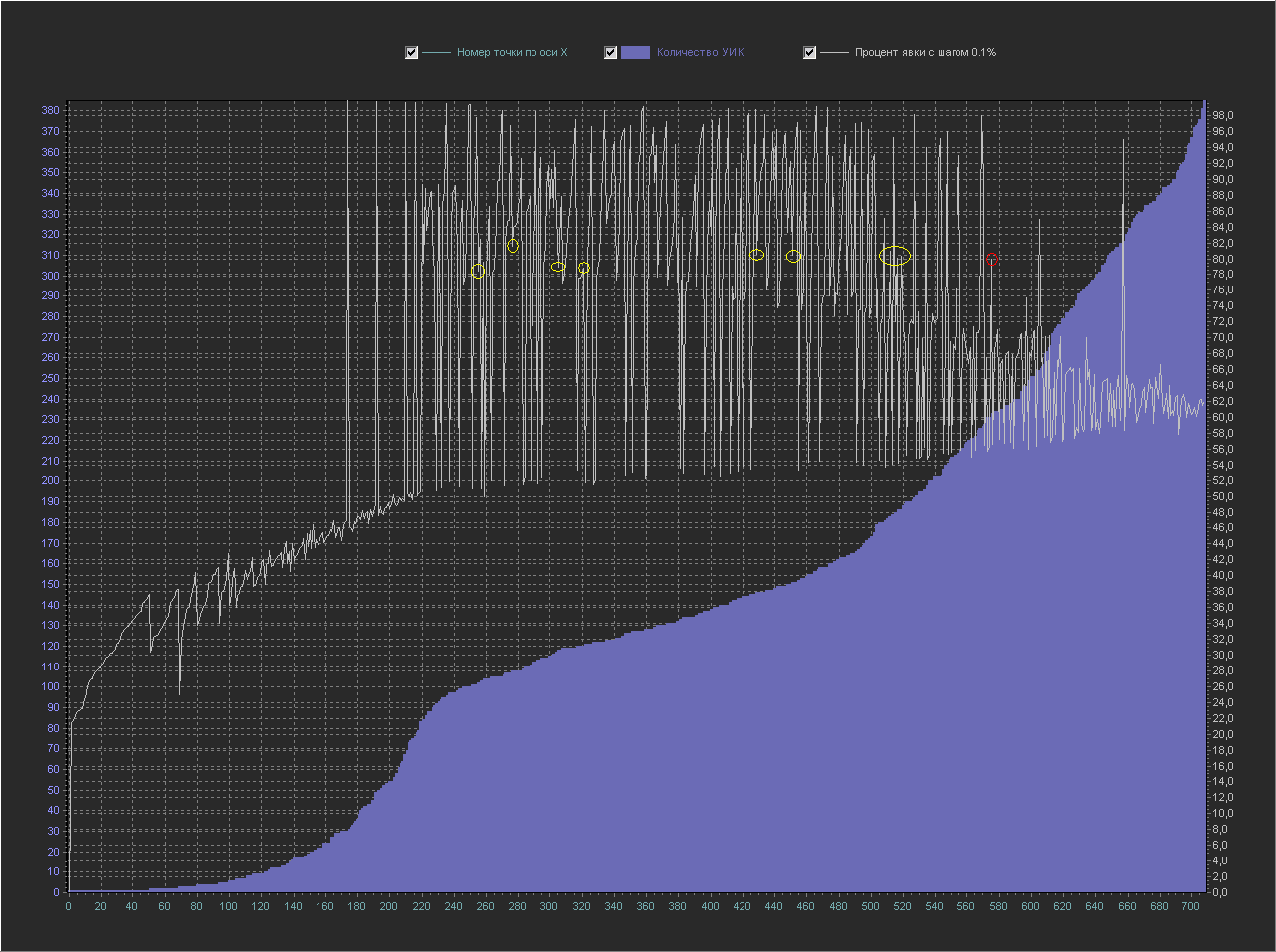
Let's find on this graph our 80% round dot (circled in red), which in the graph above looked like a peak with small values around it.
Here she already looks less pretentious on a line with points close to her in terms of percentage turnout (yellow circles).
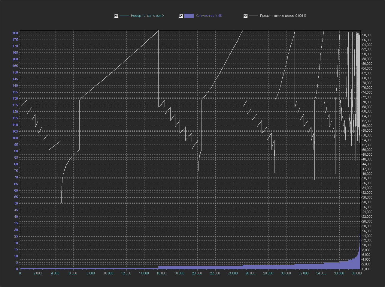
Graph_2c:
X axis - number of a point from the database in order
Y axis (left) - Number of PECs
Y axis (right) - Turnout percentage (interval = 0.01%)
+ Point 100% is not displayed, because with her the rest of the values are too small. But this is already interesting, those who understand mathematics are probably starting to understand what the trick is. And the point of 80% can no longer be distinguished, because on this scale it is no longer visible. Graph_2d: X-axis - point number from the database in order Y-axis (left) - Number of PECs
Y axis (right) - Turnout percentage (interval = 0.001%)
+ The 100% point is not displayed, because with her the rest of the values are too small. And this schedule is just a revelation. You can even count the number of steps in each period ...
The key to solving the riddle of round numbers
Well, and as a bonus, it is dedicated to fans of “conspiracy theories” and mathematical puzzles: This is a beautiful pattern that I found in “round numbers”. The bottom line is that starting from point 40% and then in increments of 5%, the number of registered voters in PECs is always a multiple of 2, 5 or 10. Actually, the table above displays this. PROCENTX - turnout percentage KOLVO - total number of PECs with exactly this percentage without any rounding X2 - number of PECs in which the number of registrations. voters in multiples of 2 X5 - the number of PECs in which the number of registered. voters in multiples of 5 X10 - the number of PECs in which the number of registered. voters of 10 Next, I decided to check the multiplicity in steps of 1 ...
PROCENTX KOLVO X2 X5 X10

25 2 2 0 0

40 5 2 5 2

45 3 3 3 3

50 70 70 15 15

55 10 10 10 10

60 108 57 108 57

65 34 34 34 34

70 57 57 57 57

75 140 140 29 29

80 122 62 122 62

85 36 36 36 36

90 78 78 78 78

95 64 64 64 64

100 2613 1370 582 324
PROCENTX KOLVO X2 X5 X10
25 2 2 0 0
34 1 1 1 1
36 1 1 1 1
40 5 2 5 2
42 1 1 1 1
44 2 0 2 0
45 3 3 3 3
46 1 1 1 1
47 1 1 1 1
48 2 0 2 0
50 70 70 15 15
51 3 3 3 3
52 7 4 7 4
53 4 4 4 4
54 4 4 4 4
55 10 10 10 10
56 10 6 10 6
57 5 5 5 5
58 9 9 9 9
59 4 4 4 4
60 108 57 108 57
61 3 3 3 3
62 18 18 18 18
63 1 1 1 1
64 23 10 23 10
65 34 34 34 34
66 14 14 14 14
67 8 8 8 8
68 22 10 22 10
69 2 2 2 2
70 57 57 57 57
71 4 4 4 4
72 17 5 17 5
73 6 6 6 6
74 8 8 8 8
75 140 140 29 29
76 23 11 23 11
77 4 4 4 4
78 10 10 10 10
79 2 2 2 2
80 122 62 122 62
81 10 10 10 10
82 14 14 14 14
83 6 6 6 6
84 24 11 24 11
85 36 36 36 36
86 10 10 10 10
87 3 3 3 3
88 23 8 23 8
89 4 4 4 4
90 78 78 78 78
91 4 4 4 4
92 31 17 31 17
93 6 6 6 6
94 13 13 13 13
95 64 64 64 64
96 25 11 25 11
97 6 6 6 6
98 17 17 17 17
99 4 4 4 4
100 2613 1370 582 324
It turns out that such a pattern is observed except for 100 on all integers (in which there is exactly an integer value, if there is no integer value, it is omitted from the list).
And finally, the total breakdown by the number of registered voters x2-10 for all PECs: KOLVO - the total number of PECs in which elections were held X2-10 - the number of PECs in which the number of registered. of voters is a multiple of 2-10 And the total breakdown by the number of voters who came to the polls is x2-10 for all PECs: KOLVO - the total number of PECs in which elections were held X2-10 - the number of PECs in which the number of voters who came in was a multiple of 2-10 Well , and then usually in such cases mathematicians write ... the solution is trivial :) Update:
KOLVO X2 X3 X4 X5 X6 X7 X8 X9 X10

97699 49413 32753 24724 20283 16649 13923 12464 10917 10411
KOLVO X2 X3 X4 X5 X6 X7 X8 X9 X10
97699 49268 32712 24634 20608 16492 14085 12192 10938 10752Conclusion
Oddly enough, but my article turned out to be rather ambiguous for those who joined the discussion without reading the main article to which the answer was made and the discussion that was conducted there. Therefore, I will add explanations here, in the form of answers to the questions posed by me at the beginning of the article.
Why does the author (of the original article) consider that instead of “strange” peaks there should be a normal or lognormal distribution?
“I never received an answer.”
But, my opinion is - to expect that on the voting schedule (where a reasonable choice is involved) there must be a normal or lognormal distribution - this is not true.
Why are peaks considered “strange” in general?
- In the original article, this was the version “But this can be explained by the fact that, when falsified, the chairmen preferred to take“ round ”percent numbers.”, As well as “Because I don’t see the natural reasons for their appearance on round numbers.”
Where can “natural” peaks appear at round values?
- This was already my question to myself, for the solution of which I asked the author of the original article to upload a database file for analysis.
Actually, this article answers it - according to the graphs of Graph_1c, Graph_1d we see that the presence of peaks on the graph under discussion is quite natural, and the reason for their appearance lies in the fraction of the
number of voters_ who came to the elections / number of voters of the registered
The value of which is more likely to be "round" than others, this is confirmed by the data from the section "The key to solving the riddle of round numbers". But we must keep in mind that here, “round” values are understood to mean “exactly round” values without any rounding, i.e. Illustrated peaks on Graph_1d and Graph_1c. On Graph_1b - the values are already very rounded and the values from the nearest neighborhood are added to the “exactly round” values, therefore the “naturalness” of the peak on the “exactly round” values has much less influence than the “reasonable choice”. Therefore, the appearance of high peaks at round values in real voting, the “naturalness” shown by us does not explain. But, the fact that they exist and can be enhanced by a “reasonable choice” is quite likely.
Additional explanation
The whole article was conceived as a kind of mystery that can be solved if you use logic and a minimum of mathematical knowledge. The solution itself, thanks to prompts in the form of graphs and “key” data, in my opinion, seemed so obvious that most readers would need a minimum of effort to understand what it was about. But, now it’s clear that this is not so, and as they say there are no telepaths, and this “mystery” is more confusing than helping to understand the meaning of the article.
Here are additional explanations (I will number the theses so that I can refer to them in case of disagreement):
Charts 2abvg were built to visualize my idea that the three points standing next to each other in order on charts 1abvg are not interconnected.
Those. for example, 79.80.81 - include PECs that are completely different in terms of parameters (size, geo-location, reasonableness of voters) and there is no direct connection between these points, i.e. let's say a peak at 80 relative to 79 and 81 peak is only due to the fact that on the number line these numbers are close and does not carry any additional semantic load. Those. there is no “obligation” for the change in the turnout percentage between these points to always be below a certain subjective threshold, above which this change can be called a “peak”. Simplified - the presence of a peak in the 1bvg charts causes some readers to have a subjective feeling of “not natural”, because they see that in other places the graph looks smoother, this is due to some subconscious expectation of a normal distribution of the function on the graph. But such an expectation is a delusion. To illustrate this error, 2abvg graphs were shown. The essence of these graphs is that they display exactly the same data as on graphs 1abvg, but the number of subjective "anomalies" is very different.
Charts 2abvg sorted not by increasing percentage of turnout, as 1abvg, but by increasing the number of PECs. Naturally, the peaks in the number of PECs disappeared, they are increasing, but now a broken curve (white) has appeared, on which we will look for “peaks”. Those. we are trying to find “anomalies” on another visualization of the same data.
Let's look at Graph_2a (1% step):
Depending on the subjective choice and our expectations on the graph, we can, how to detect “anomalies” here, and assume that they are not there.
They are not there, if you look along the 56% or 68% line, etc. ... then all the fluctuations (lower, upper peaks next to these lines) are not particularly distinguished.
They are, if we use the logic of “anomalies” from chart 1abvg, where the “anomaly” was formulated by the question “How can it be that the turnout X% is on a large number of PECs, and (X-1)% and (X + 1)% on small? ”, Then the“ anomaly ”is formulated by the question“ Why at point X - with N number of PECs a high percentage of turnout, and at points (X + 1) and (X-1) (in which N + 1 and N-1 are not much different from N) is the turnout percentage much lower? ”
There is some logic in the presence and absence of anomalies, let's see where it leads us further.
Graph_2b (step 0.1%):
Here, if we believed that on Graph_2a there are no anomalies, we are additionally convinced of this. This is shown by the example of a line with 80%, if on the graph_1b 80% is a lone peak, then here, next to the 80% line, there are many more values close to 80% (marked with yellow circles).
But if we adhere to the concept of “anomalous” for 1bvg graphs, then here we have everything at its peak and one continuous “anomaly” has practically no “smooth” spots on the white line.
Thus, depending on the method of visualization and the selected criterion of "anomalous", we can come to two completely opposite conclusions.
Graph_2c (step 0.01%):
On this scale, it is interesting that a lot of points are already displayed along the X axis to see how the percentage of turnout for PECs with the same number of registered voters changes. Within each already wide enough step there is a certain distribution of attendance and this distribution can already be compared between different steps. In the commentary on the graph, I hinted that mathematics lovers should clearly notice the form of the periodic function and some kind of “anomaly” due to the fact that the width of the period changes in it (I agree, there was a hint :).
Graph_2g (step 0.001%):
Well ... and here I just frankly pinned, showing that the "anomalies" can literally be created from the air. The graph shows real data, and if you check the values of each point, everything is fair, while we see clearly “artificial” steps that should categorically “prove” that the elections are “drawn”.
In fact, the secret is simple. On our graph, the sorting is by the number of PECs, and on one step (purple color) we see many PECs, each of which has its own turnout percentage (on the white line), and so, all the steps go in ascending order, and what happens inside the steps? And inside the steps we can do anything. In the previous graph, we sorted the PECs inside the steps by increasing percentage of their turnout ... and it turned out, such a curved smoothly growing line. And here, sorting inside the steps was generally disabled and they were displayed on the graph in the order in which they are stored in the database (binary tree or something like that), which led to the drawing of such percentage of turnout (on the white line).
Well, actually my first thesis:
Thesis 1:
The amount of a certain subjective “anomaly” on the graph depends on the chosen method of visualization. Moreover, it all depends on what we mean by “abnormality”. The peaks on the 1bvg graph are subjectively considered by some people to be “anomalous” only because of the “geometric” proximity of points with high and low values (without any evidence that there should not be such peaks on the graph), I note again that besides “ geometric "proximity between these points there is no connection. Roughly speaking, we can sort them all in a new and new way by finding more and more “geometric” anomalies that do not carry any semantic load. That's when there is evidence that there should not be peaks in any visualization, but they are there - then, such visualization makes sense.
Now explanations on the graphs 1abvg:
Here we analyze the option when “not knowing the way how these peaks can appear naturally” is given as a “proof” to ban the appearance of peaks. Those. for some people, the appearance of peaks on round values is a very unlikely event and, in addition to the intervention of “conspiracy” factors, is inexplicable.
Graph_1a (1% step):
This is a basic graph on which there are no “anomalies”.
Graph_1b (0.1% increment):
This is a graph in which the author of the original article found and showed “abnormal” peaks on round values. And yes, indeed, if on this visualization we follow the logic of the "geometric" proximity of points and expect a normal distribution, then the peaks are an anomaly.
Graph_1c (step 0.01%):
Here we reduce the step and already see much more peaks, and they are scattered throughout the schedule. What is this talking about? What did we discover even more anomalies? Or maybe for this graph, peaks are simply normal in themselves?
Graph_1g (step 0.001%):
Well, here the answer to the question above is obvious - the whole graph consists of a peak, then either the entire graph is an anomaly or peaks are a normal (natural) phenomenon for this visualization, and it means that it is unproven to assume that the peaks on graph Graph_1b "anomaly" is an error. For we can no longer claim that peaks are unlikely.
Thesis 2:
On charts 1abvg - just an unfounded statement that peaks are "unlikely" - is not proof of "anomalousness" of peaks, since there are none on Graph_1a, and on all subsequent Graph_bvg there are more and more of them with decreasing pitch.
Well, actually the answer to the peaks on round values:
According to the graphs Graph_1c, Graph_1d we see that the presence of peaks on the graph under discussion is quite natural, and the reason for their appearance lies in the fraction: the
number of voters_ who came to the elections / number of voters of the registered
round “The value of which has a higher probability to be , this is confirmed by the data from the section "The key to solving the riddle of round numbers."
Visually, a hint for this is given in the graph Graph_1d, where an empty funnel is visible around the value of 80%.
Input data for the task:
1. According to the table, we see that the points for all "round" turnout percentages are only PECs in which the number of registrations falls. of voters is a multiple of 2.5 or 10.
2. The following are tables with data on the multiplicity of 2,3,4,5,6,7,8,9,10 for all PECs
for the number of voters who came to the polls (numerator)
and
for number of registered. voters (denominator)
Well, then, we can calculate the probabilities for the appearance of interesting values, but I already leave this to the readers of the article. If someone needs, I can give more data on the multiplicity.
Still just for reference:
Minimum size (number of registered voters) of a precinct election committee = 3 people
Maximum = 7746 people
Update2:
Election model based on the multiplicity of PEC sizes from the 'Key' section
I think it’s impossible to create a model that can simulate a real “reasonable choice” of the whole country :)
But, I can build a model that uses real voting data and we will see what happens. In the “key” section, tables with data on the multiplicity were originally presented, I laid them out from the very beginning, because according to my estimates, the probabilities that they describe are precisely the “key” to solving the problem. But formulas and calculations are one thing, and practice is another ... let's check.
Here is a visualization based on the PEC size factor table:
Sampling step (1%) Sampling step (0.1%) Sampling step (0.01%) Sampling step (0.001%) Tables from the key section:

The general breakdown by the number of registered voters x2-10 for all PECs:
KOLVO X2 X3 X4 X5 X6 X7 X8 X9 X10
97699 49413 32753 24724 20283 16649 13923 12464 10917 10411
KOLVO - the total number of PECs in which the elections were held
X2-10 - the number PEC in which the number of registered. of voters is a multiple of 2-10
And the general breakdown by the number of voters who came to the polls is x2-10 for all PECs:
KOLVO X2 X3 X4 X5 X6 X7 X8 X9 X10

97699 49268 32712 24634 20608 16492 14085 12192 10938 10752
KOLVO - the total number of PECs in which elections were held
X2-10 - the number of PECs in which the number of voters who came was a multiple of 2-10
How the model works:
0. According to the table, the probability of occurrence of the number of multiple X2-X10
VerX2 = X2 / KOLVO
VerX3 = X3 / KOLVO
... is calculated .
1. The cycle starts according to the number of PECs = 97699
2. For each PEC its size is randomly generated from the real range of 3 - 7746 people
3. In accordance with the probability, the PEC multiplicity is selected, and the remainder from dividing by a multiple is deducted from the random PEC size. If none of the probabilities worked, then the PEC size remains unchanged (random).
4. The number of people who came to the polls for the PEC from the range 0 ... the size of the PEC is randomly selected.
5. In accordance with the probability, the multiplicity of people who came to PECs is selected and from this number, the remainder of dividing by a multiple is deducted. If none of the probabilities worked, then the number of people remains unchanged (random).
6. The turnout is considered and in the result array the corresponding turnout increases the number of PECs by +1.
7. A graph is plotted based on the result array.
As can be seen from the graphs at 1%, there are no peaks. At the step of 0.1% - there are, including at round values (90,85,80,75,70,65,60,50 ...). Having generated the graph a dozen times, you can choose the configuration of the peaks to your taste :) Such a long sequence of “round” numbers does not always appear, there are usually gaps or glues, but in about 10 generations it can be seen if you look all over the graph and take into account all the peaks, and not only 5 of the highest.
Remarks:
Naturally - this is a very simplified election model. I would say this is an election model where in real PECs all people choose to go / not go to the polls tossing a coin (therefore, the peak is 50% usually higher than the others, although this is not necessary (for example, on a chart with 0.1% I chose the option where the highest peak is not fifty%)). But as we can see, the very physical distribution of the size of PECs in terms of multiplicity and the number of voters who have arrived is already the reason for the appearance of peaks in the "random choice", and when a "reasonable choice" is added, these peaks can already increase or decrease depending on the distribution of the "reasonable of choice. "
Conclusion:
I believe that the peak model shown above fully explains their possibility of a “natural" origin on the real election schedule (due to the fact that it uses probabilities taken from real data). Peaks are not an “anomaly,” let’s say, base classes that display a certain generalized selection tendency.
But, I can build a model that uses real voting data and we will see what happens. In the “key” section, tables with data on the multiplicity were originally presented, I laid them out from the very beginning, because according to my estimates, the probabilities that they describe are precisely the “key” to solving the problem. But formulas and calculations are one thing, and practice is another ... let's check.
Here is a visualization based on the PEC size factor table:
Sampling step (1%) Sampling step (0.1%) Sampling step (0.01%) Sampling step (0.001%) Tables from the key section:
The general breakdown by the number of registered voters x2-10 for all PECs:
KOLVO X2 X3 X4 X5 X6 X7 X8 X9 X10
97699 49413 32753 24724 20283 16649 13923 12464 10917 10411
KOLVO - the total number of PECs in which the elections were held
X2-10 - the number PEC in which the number of registered. of voters is a multiple of 2-10
And the general breakdown by the number of voters who came to the polls is x2-10 for all PECs:
KOLVO X2 X3 X4 X5 X6 X7 X8 X9 X10
97699 49268 32712 24634 20608 16492 14085 12192 10938 10752
KOLVO - the total number of PECs in which elections were held
X2-10 - the number of PECs in which the number of voters who came was a multiple of 2-10
How the model works:
0. According to the table, the probability of occurrence of the number of multiple X2-X10
VerX2 = X2 / KOLVO
VerX3 = X3 / KOLVO
... is calculated .
1. The cycle starts according to the number of PECs = 97699
2. For each PEC its size is randomly generated from the real range of 3 - 7746 people
3. In accordance with the probability, the PEC multiplicity is selected, and the remainder from dividing by a multiple is deducted from the random PEC size. If none of the probabilities worked, then the PEC size remains unchanged (random).
4. The number of people who came to the polls for the PEC from the range 0 ... the size of the PEC is randomly selected.
5. In accordance with the probability, the multiplicity of people who came to PECs is selected and from this number, the remainder of dividing by a multiple is deducted. If none of the probabilities worked, then the number of people remains unchanged (random).
6. The turnout is considered and in the result array the corresponding turnout increases the number of PECs by +1.
7. A graph is plotted based on the result array.
Here is the c ++ code
	int k_uchastok = 97699;
	int arr[] = {49413 ,32753 ,24724 ,20283 ,16649 ,13923 ,12464 ,10917 ,10411};
	std::vector all_kratnost(arr, arr + sizeof(arr) / sizeof(int));
	std::vector ver_kratnost(all_kratnost.size());
	for (int i = 0; i < all_kratnost.size(); i++)
	{
		ver_kratnost[i] = (double)all_kratnost[i] / (double)k_uchastok;
	}
	int arr2[] = {49268, 32712, 24634, 20608, 16492, 14085, 12192, 10938, 10752};
	std::vector all_kratnost2(arr2, arr2 + sizeof(arr2) / sizeof(int));
	std::vector ver_kratnost2(all_kratnost2.size());
	for (int i = 0; i < all_kratnost2.size(); i++)
	{
		ver_kratnost2[i] = (double)all_kratnost2[i] / (double)k_uchastok;
	}
	for (int i = 0; i < k_uchastok; i++)
	{
		// Случайное значение от 0 до 1
		double ver_value = (double)rand() / RAND_MAX ;
		uik_size = 3 + rand()%7743;
		int k;
		for (k = 0; k < all_kratnost.size(); k++)
		{
			if (ver_value < ver_kratnost[k])
			{
				// кратно 2+k
				int ostatok = uik_size % (k+2);
				if (uik_size > (ostatok+3))
				{
					uik_size -= ostatok;
				}
				uik_yavka = uik_size - rand()%uik_size;
				// Случайное значение от 0 до 1
				double ver_value2 = (double)rand() / RAND_MAX ;
				for (int k2 = 0; k2 < all_kratnost2.size(); k2++)
				{
					if (ver_value2 < ver_kratnost2[k2])
					{
						// кратно 2+k2
						int ostatok = uik_yavka % (k2+2);
						if (uik_yavka > ostatok)
						{
							uik_yavka -= ostatok;
						}
						break;
					}
					else
					{
						ver_value2 -= ver_kratnost2[k2];
					}
				}
				procentx = (double)uik_yavka / uik_size;
				procentx = RoundTo(procentx * 100.0, round_digits);
				result_map[procentx] += 1;
				break;
			}
			else
			{
				ver_value -= ver_kratnost[k];
			}
		}
		// ни одна вероятность не сработала
		if (k == all_kratnost.size())
        {
			uik_yavka = uik_size - rand()%uik_size;
			procentx = (double)uik_yavka / uik_size;
			procentx = RoundTo(procentx * 100.0, round_digits);
			result_map[procentx] += 1;
		}
	}
	std::map::iterator it;
	for (it = result_map.begin(); it != result_map.end(); ++it)
	{
		m_BarSeries_Bottom->AddXY(it->first, it->second);
	}
As can be seen from the graphs at 1%, there are no peaks. At the step of 0.1% - there are, including at round values (90,85,80,75,70,65,60,50 ...). Having generated the graph a dozen times, you can choose the configuration of the peaks to your taste :) Such a long sequence of “round” numbers does not always appear, there are usually gaps or glues, but in about 10 generations it can be seen if you look all over the graph and take into account all the peaks, and not only 5 of the highest.
Remarks:
Naturally - this is a very simplified election model. I would say this is an election model where in real PECs all people choose to go / not go to the polls tossing a coin (therefore, the peak is 50% usually higher than the others, although this is not necessary (for example, on a chart with 0.1% I chose the option where the highest peak is not fifty%)). But as we can see, the very physical distribution of the size of PECs in terms of multiplicity and the number of voters who have arrived is already the reason for the appearance of peaks in the "random choice", and when a "reasonable choice" is added, these peaks can already increase or decrease depending on the distribution of the "reasonable of choice. "
Conclusion:
I believe that the peak model shown above fully explains their possibility of a “natural" origin on the real election schedule (due to the fact that it uses probabilities taken from real data). Peaks are not an “anomaly,” let’s say, base classes that display a certain generalized selection tendency.
Update3:
An even more realistic model for the actual size of PECs from the database
Теперь мы не будем генерировать размеры УИКа случайно, а возьмем реально каждый УИК в БД с его реальным размером и сгенерируем для него абсолютно случайную явку от 0 до размера УИКа.
Т.е. в симуляции мы полностью воспроизводим выборы в РФ на всех реально существующих в ней УИКах, но «разумный выбор» заменяем монеткой «пойти/не пойти».
График для шага 1%
(Пики на ровно «круглых» значениях с кратностью 5 выделены желтой линией. Подсвечиваются все пики в которых ровно круглое значение выше чем ближайшие справа и слева.).
Графики для шага 0.1%
Привожу для примера 5 генераций.
1
2
3
4
5
Графики для шага 0.01%
Графики для шага 0.001%
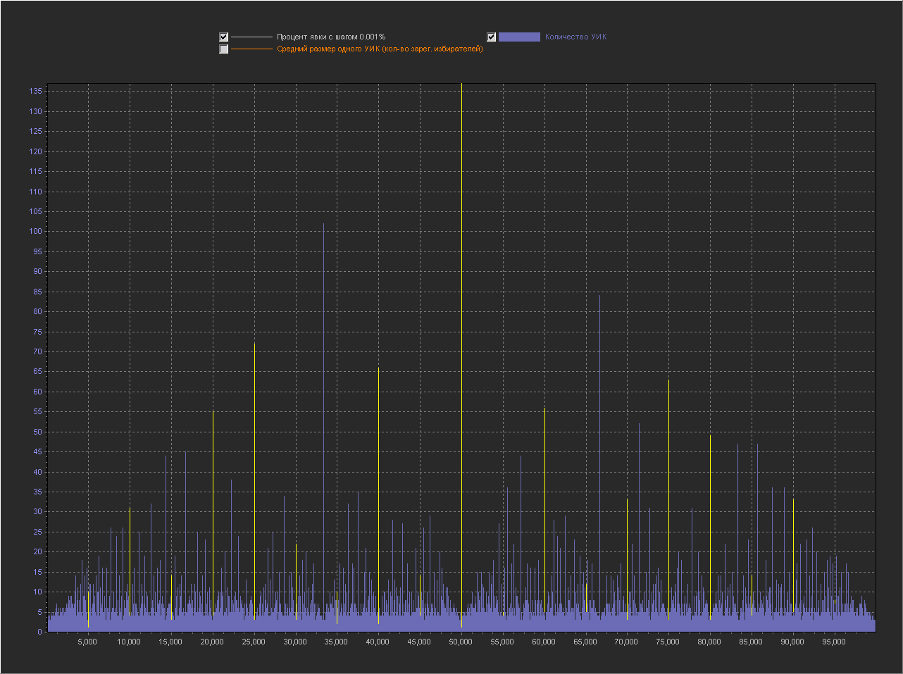
Выводы:
1. Мы видим — что пики это абсолютно нормальное явление на шаге 0.1% и тем более на 0.01% и 0.001%.
2. Мы видим, что пики на ровно «круглых» значениях с кратностью 5 — стабильно существуют на графике обычно в диапазоне (9 — 16 шт).
3. На шаге 0.001% — пики на «круглых» значениях включают в себя только ровно то количество УИКов, которое к ним относится. Далее при увеличении шага и округлении, к пикам добавляются значения из их ближайших окрестностей. При этом высота пик на «круглых» значениях перестает доминировать, на 0.01% это не очень заметно, а вот на графике 0.1% мы в зависимости от случайности в генерации уже можем увидеть наличие последовательности высоких пик на круглых значениях (сравнимых с самыми высокими пиками на графике) реже, но они стабильно появляются на графике.
Можно сказать, что существование высоких пик на круглых значениях с шагом 0.001% — связано с более высокой вероятностью появления целого значения в дроби при расчете явки. А вот дальнейшее распределение пик при более мелких шагах с округлением, уже больше зависит от «разумного выбора».
При симуляции выборов по реальному кол-ву и размерам УИКов мы использовали логику подбрасывания монетки, естественно результаты такой симуляции нельзя напрямую сравнивать с результатами реального голосования но, мы точно показали что:
Теперь мы не будем генерировать размеры УИКа случайно, а возьмем реально каждый УИК в БД с его реальным размером и сгенерируем для него абсолютно случайную явку от 0 до размера УИКа.
Т.е. в симуляции мы полностью воспроизводим выборы в РФ на всех реально существующих в ней УИКах, но «разумный выбор» заменяем монеткой «пойти/не пойти».
График для шага 1%
(Пики на ровно «круглых» значениях с кратностью 5 выделены желтой линией. Подсвечиваются все пики в которых ровно круглое значение выше чем ближайшие справа и слева.).
Графики для шага 0.1%
Привожу для примера 5 генераций.
1
2
3
4
5
Графики для шага 0.01%
Графики для шага 0.001%
Выводы:
1. Мы видим — что пики это абсолютно нормальное явление на шаге 0.1% и тем более на 0.01% и 0.001%.
2. Мы видим, что пики на ровно «круглых» значениях с кратностью 5 — стабильно существуют на графике обычно в диапазоне (9 — 16 шт).
3. На шаге 0.001% — пики на «круглых» значениях включают в себя только ровно то количество УИКов, которое к ним относится. Далее при увеличении шага и округлении, к пикам добавляются значения из их ближайших окрестностей. При этом высота пик на «круглых» значениях перестает доминировать, на 0.01% это не очень заметно, а вот на графике 0.1% мы в зависимости от случайности в генерации уже можем увидеть наличие последовательности высоких пик на круглых значениях (сравнимых с самыми высокими пиками на графике) реже, но они стабильно появляются на графике.
Можно сказать, что существование высоких пик на круглых значениях с шагом 0.001% — связано с более высокой вероятностью появления целого значения в дроби при расчете явки. А вот дальнейшее распределение пик при более мелких шагах с округлением, уже больше зависит от «разумного выбора».
При симуляции выборов по реальному кол-ву и размерам УИКов мы использовали логику подбрасывания монетки, естественно результаты такой симуляции нельзя напрямую сравнивать с результатами реального голосования но, мы точно показали что:
- Пики на круглых значениях стабильно существуют на нашем голосовании монеткой и это является подтверждением их «естественности».
- The peak sizes at the “round” values are comparable in size to the peaks at the “non-round” values, but can rarely exceed many other peaks with non-round values. Therefore, the appearance of high peaks at round values in real voting, the “naturalness” shown by us does not explain. But, the fact that they exist and can be enhanced by a “reasonable choice” is quite likely.
PS
And yet, in view of the negative karmic situation, I can’t immediately answer everyone in the commentary in the article, so sorry, I haven’t answered anyone yet :)