Evil by Design: Mephistopheles Interfaces (Part One)
Chris Nodder, author of Evil by Design , is immediately credible. Not so much with his track record of achievements in the psychology of UX design and consulting, but with an obvious ability to cling and sell. In fact, under the stylish cover with a demon demon is a collection of consumer manipulation techniques, many of which have been known for a long time. But, you must admit, “a guide for a designer who serves Evil, evoking dark instincts in people” sounds much more fascinating. Let's push the consumer to mortal sins!
Why are mortal sins? Because they all describe the usual behavior of the average person, highlight the points that are easiest to press on. After all, if people did not fall into the temptation precisely from these qualities, there would be no reason to ban them. Understanding what psychological features are behind each of the sins, we achieve a better understanding of human nature, and this is the key to creating good design. Well, if someone is curious, but ashamed, then this book can be read from the point of view of the user: in order to resist the immoral game on our weaknesses, you need to be able to recognize the appropriate mechanisms.
As you might have guessed, the techniques in this book are broken down into blocks corresponding to the seven deadly sins: pride, laziness, gluttony, anger, envy, lust, and greed. Each chapter provides a psychological rationale for this type of behavior, ways to use it in interfaces for motivation to action, and examples of real companies that knowingly or unconsciously apply these methods. Under the cut you will find a summary of the first three chapters, which deals with pride, laziness and gluttony.
Nowadays, few people perceive pride as a negative quality, but in some cases it becomes a weak point. People usually value their reputation so much that they are ready for self-deception, just to not face the dirt and remain right in their eyes and for those around them.
Cognitive dissonance
Cognitive dissonance arises when two concepts come into conflict in our minds. The condition is unpleasant precisely because it forces one to admit: one of the judgments was incorrect and needs to be reviewed. To avoid this, we often come up with some kind of rationalization (sometimes rather strange) that seems to eliminate the contradiction.
For users, the remorse of the buyer often becomes the source of cognitive dissonance (one really wants to buy it + one should not waste money = conflict). Accordingly, the sites provide everything to help people convince themselves that the purchase is profitable and necessary, and thereby resolve the conflict.
The arguments may be:
The last two points require more subtle, indirect methods: the selection of appropriate graphics, the competent compilation of texts. At the same time, it is important that the same message is traced everywhere: on different pages of the site, in advertising, in the documentation.
Social Justification
Pride makes us worry about how we look in the eyes of others. We model our behavior based on ideas about the norm. And the norm is what others do.
Therefore, in order to push the user to a decision, it can be useful to place messages about your product on several sources that he trusts. It is advisable that they do not just repeat, but rephrase and complement each other, and appear on third-party, neutral sites. This especially affects buyers who come for the first time or rarely deal with your industry.
Popularity markers also look very convincing: the number of purchased / remaining copies, labels “product has run out”, information that other users are viewing the product page, and statistics. You can attract stereotypes associated with the product, use associative relationships (everyone who makes X consumes Y).
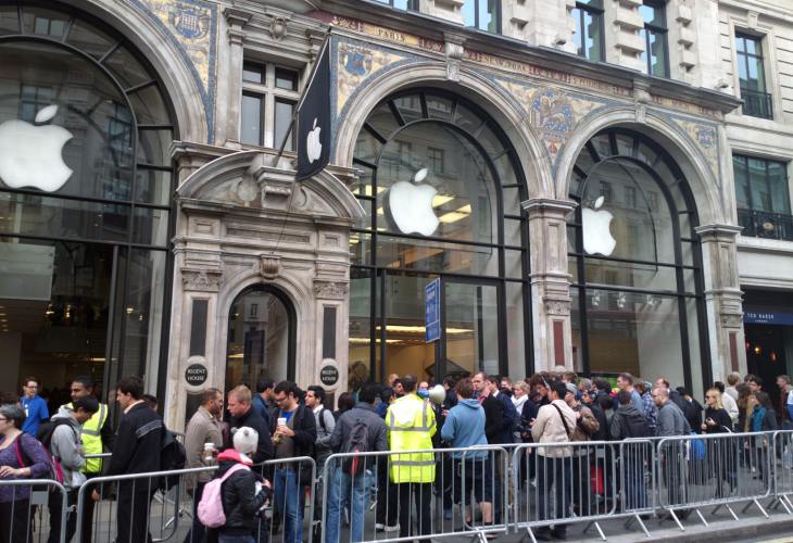
Apple fans are waiting for the release of the iPhone 6 and at the same time suggest passers-by with thoughts.
On the other hand, mentioning people who do things differently is always a risk. Even if you explain why they are wrong, their very presence may prompt the user to follow suit. A good illustration of this was one anti-alcohol campaign for teens. The organizers mentioned in the text what a huge percentage of minors are fond of drinking, trying to hit the audience, but they only got what teenage viewers realized: drinking is now fashionable.
Personal messages
For social justification, it is important not only what is said, but also by whom. Most of all we trust people with whom we are closely acquainted, therefore recommendations that come from them (or supposedly from them) usually give the desired effect.
This tactic is very widely used in social networks that do not accidentally inform us about every action of our friends. For example, notes like “such-and-such and such-and-such post” in the Twitter feed create the feeling that our friends actively recommend that we also click on the heart. Some services go further and present the action as something interactive, directed at us and requiring a response. Here you can recall Google+, which formulates a notification that someone has added our e-mail to your circle, such as “such and such invited you to Google+” - because when a friend invites you, it is inconvenient to refuse.
Announcement of choice
Falling in your own eyes is half the trouble, the main thing is that others do not know about the mistake. We do not like to publicly admit that we were wrong. If other people become aware of the user's choice, he will be less likely to change his mind. Many applications that help users achieve some goals (for example, lose weight or learn a language) build motivation on this.
There are several ways to achieve publicity: ask for access to social networks, create your own platforms for users to communicate, divide users into groups according to activity or involvement with appropriate markers.
Emphasis of similarity
Another feature of human thinking is called the tendency to confirm their point of view. We unconsciously filter and interpret information so that it confirms the opinions that we adhere to.
A great way to “feed” users a message is to surround it with theses with which the target audience will most likely agree and show how one follows from the other. Of course, there is always the danger of not guessing what visitors will agree with. Therefore, preference is usually given to banalities - universal values and aspirations that are shared by the majority (love of the family, healthy lifestyle, thirst for success and self-realization).
Similarly, calls to action work better if you do not convince people to change their habits, but show that they themselves are partially doing what you want from them.
Certification as a guarantee of reliability
A / B tests show that a blotch promising any guarantees significantly increases the level of site conversion. A reference to an authoritative source in connection with security issues gives visitors a sense of reliability (as practice shows, unreasonable). It is worth considering the option of obtaining or creating a certificate of what users care most about: refund, data security, service reliability. It’s better to demonstrate such logos not on every page, but at strategic moments when the user is just deciding on the decision.
The desire for completeness
Uncertainty causes tension and irritation, and the realization that the process is completed, on the contrary, brings satisfaction. If this cannot be achieved in a natural way, people are ready to deceive themselves by creating artificial “finish lines”. Also, the ability to bring things to the end is approved by society as a sign of organization and strong will.
On this desire to go the way, those retention schemes that offer a small amount of services for free, and the rest for a fee, are fully based. The fee does not have to be cash, it can be time or certain actions. Such tactics are especially effective when all the achievements of users are placed on a scale that visually displays how much they have already advanced and how many stages remain.
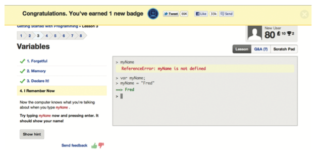
You now have one icon. I wonder how many of them all?
A good example of a game on this feature is how social networks push users to add personal information. Strictly speaking, this is not a prerequisite for using the site, but constant reminders that the profile is only “25% full” implicitly exert pressure, creating the feeling that the job is started and not finished.
In addition to craving for completeness, people are craving for order. If the interface feels some disharmony (say, gaping in place of the missing information), which is easy to fix, most likely they will do it.
Laziness is a reluctance to make efforts or an indifferent attitude to the outcome. On the Web, it manifests itself in the fact that users tend to take a minimum of actions to achieve the goal and refuse to interact with the site if it requires too much body movement.
Minimum Barriers A
custom journey should follow the path of least resistance. Usually, people browse the pages following the F-pattern: browse the header and glance up and down, stopping and moving deeper, once some kind of content will interest them. Key information should be located in the "hot" zones, what you want to hide - in the "dead". If you need to knock the user off the beaten track, bright, attractive objects (bright buttons, banners, graphics) can help.
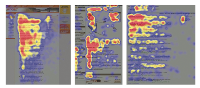
Visualization of “hot” and “dead” zones on the screen
Another tactic of hiding information is mimicry to the information noise. Users are trained to ignore certain types of content, such as ads or legal documents. Therefore, if the text is located where people expect to see the advertising banner, or merges with links to the privacy policy, few will read it.
An important turning point on the page is a call to action button. It should be bright and clearly signed in order to motivate the visitor to move on. Keep in mind that to all that is under it, the user with a high degree of probability simply will not reach.
Easier choice
It has long been known that an overly wide choice paralyzes, overestimates expectations and hinders decision making. People are too immersed in the selection process and are often disappointed with the result, which cost them so much effort.
The easiest way out is to cut the number of options. However, the assortment should still remain wide enough: users associate this with a high level of expertise. Filters and recommendation systems will help to satisfy both requirements. Try to group the parameters so that visitors do not have to compare products at once for several.
The opposite logic works here: if you want users to value their decision higher and not to abandon it later, make them make a choice (even if it’s purely formal, from a narrow set of options that suit you).
Thanks to the priming effect, users respond better to what they know from past experience. Therefore, you should make sure that the first option that catches your eye is the most optimal option. This rule is relevant both for the interface of your product (in all lists, the best option already marked with a tick should be first) and for external sources (if advertising banners mention a specific product or service package, new visitors will go to the site look for him).
More sophisticated priming techniques are associated with creating a brand image. How it works, we all know: if some product is “by ear”, our memory will tell us about it when the time comes and make a choice, and eliminates the need to think further.
The complication of refusal
Many companies go further and make the choice for the user by default - in order to change the situation, he must take active actions (check the profile, change the settings). Given that most people are too lazy to keep track of updates and read user agreements, they may not even suspect that they are passively agreeing to some conditions.
A classic example of the application of such tactics is the predefined checkmark arrangement in registration forms. The force of inertia often keeps visitors from reading, understanding and making any changes. An additional trick is the use of negative constructions, in which consent is considered as the default option, and rejection is considered as especially stipulated. Simply put, feel the difference between the “I want to receive newsletter about company news” and “I do not want to receive newsletter about company news” field.
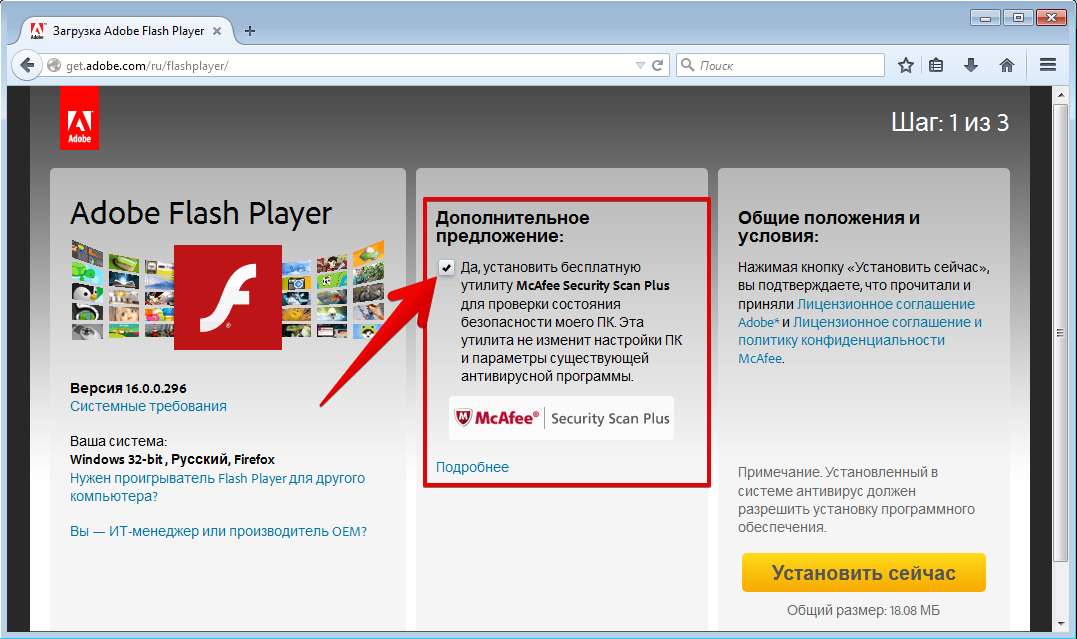
Do you remember the day you got McAfee? That's it.
A similar method is to mask an additional offer as the next step in the process that the user has already agreed to (for example, drawing up a customer’s card upon purchase, installing third-party software when downloading a file). Buttons with text like “Continue” or “Continue” reinforce this illusion.
In case the user still decides to take the initiative, the management of the settings is deliberately confusing, so that to refuse the service was as difficult as possible. Difficulty can be achieved with heavy, abstruse texts, slurred navigation, and a cumbersome settings system.
Gluttony can be said in cases where consumption exceeds reasonable limits. Such a behavior pattern develops when self-control is turned off and emotional reactions overlap rational assessments.
“You deserve it.”
In the current culture, it’s not a shame to not know the measure, so you can move people to gluttony with the magic words “you deserve it.” In order for the formula to sound convincing, you need to present the bonuses that customers receive (coupons, discounts, gifts) as a reward for their work. This idea underlies many gamification schemes. After the user has taken some actions in exchange for a bonus, he feels not just entitled, but practically obliged to use it.
It is important to maintain a balance: if it is too difficult to get a reward, laziness will prevail. But by requiring a relatively small amount of effort and reminding you of the work you have done, you can significantly increase the value of the proposal in the eyes of users. By the way, the value does not have to be great. Paradoxically, with little profit, people invest more emotionally - because they have to look for excuses that overcome cognitive dissonance.
Hidden numbers
If it becomes difficult to objectively evaluate a proposal, users will more likely rely on the first emotional reaction. So, you need:
It is possible to create the feeling that the purchase is profitable without lowering the price too much due to the difficulty of calculations. It is achieved in various ways:
iPad for only thirty cents (+ everything you spend on chips for the auction)!
Recognizing Deficiencies
Any product has flaws, and sooner or later, customers will find out about them. Talking about some of them right away, you gain confidence by showing yourself as honest people who have nothing to hide. This is also a form of disabling self-control.
Naturally, the flawed shortcomings are selected so that they can be immediately balanced with something - otherwise users will not be able to justify the purchase. Mentioning a minus, immediately give the relevant strength that smooths it out (ie “our lamps are more expensive, but work longer, allowing us to save in the long run”, and not “our lamps are more expensive, but give a brighter light ").
What to do if a company is faced with an incident that could jeopardize customer confidence? Oddly enough, the best strategy here is frankness and communication. If the error is serious and affects a large number of users, do not try to shut it down or take responsibility. On the contrary, it is necessary to actively work on eliminating the consequences, demonstrating competence, honesty and goodwill.
Increasing involvement
The trick is as old as the world, it was also used by distributors of goods that went home: get the client to agree to some little thing, and later it will be much easier for you to persuade him to do something more significant for you.
In the online environment, the role of the initial “hook” may be the issue of something insignificant (for example, a zip code) under the pretext of customizing the service. The transition from zero involvement to low is always the most difficult, so the request should be very unpretentious. Then, as you interact with the product, you can gradually and carefully increase the scale of requests, thereby increasing engagement.
If some time has passed between the requests, it will not be superfluous to remind the user about the history of your relationship in order to configure it in the right way.
Oddly enough, the opposite strategy also works - lowering the requirements. Sometimes it’s worth frankly burying yourself and getting a refusal in order to later put forward a much more modest request, which the client will already feel embarrassed to refuse. This is explained by the fact that people tend to show reciprocity, that is, respond to some relationship with an appropriate attitude. From their point of view, you make a concession, respectively, they do the same.
However, the success of this technique depends on several conditions:
In the online environment there are difficulties with the first point: the user will not feel guilty by refusing the interface. Therefore, it is worth introducing additional measures: to formulate the initial proposal with empathy (to recognize that the request is really significant) and to give the opportunity to refuse it easily and quickly, without too distracting from the trip.
The Tom Sawyer Effect
People hate to lose something of value. This also applies to what they currently have and the hypothetical benefits that they can get. The idea that some product or service may not be available to them significantly increases its value in their eyes and breaks self-control.
To arouse interest in a product, imagine it as:
- rare
It is possible to create a feeling that the buyer has the only chance to purchase a product due to the limited period of sale.
- Exclusive
Emphasize that the offer is only available to a specific group of people.
- challenging
Demonstrate that the product is popular, there are many others who want to buy it. Here again, quantitative metrics will be useful: how much product is left, how many views the page with the offer has.
You need to talk about the value of the product not only before the time of purchase, but also when trying to refuse the service. A reminder that he is losing will cause the user to fear loss and may make him change his mind.
Facebook forces the user to look into the eyes of all those who “will miss him” before deleting the account.
Compliance from rush The
fear of losing profit becomes especially acute when a sense of time pressure is added to it. Tight time frames trigger several psychological effects at once. Firstly, there is a feeling of panic that reduces the ability to think and choose rationally. Secondly, the desire to bring things to the end generates excitement. Thirdly, the proposal is perceived as limited, and therefore valuable.
As a result, a person in a hurry to complete the process most often agrees to everything that the system offers him by default. And these, as we recall, are the most profitable options for the company. A similar scheme is often used on ticket booking sites, where impatience is also spurred by objectively high competition.
Why are mortal sins? Because they all describe the usual behavior of the average person, highlight the points that are easiest to press on. After all, if people did not fall into the temptation precisely from these qualities, there would be no reason to ban them. Understanding what psychological features are behind each of the sins, we achieve a better understanding of human nature, and this is the key to creating good design. Well, if someone is curious, but ashamed, then this book can be read from the point of view of the user: in order to resist the immoral game on our weaknesses, you need to be able to recognize the appropriate mechanisms.
As you might have guessed, the techniques in this book are broken down into blocks corresponding to the seven deadly sins: pride, laziness, gluttony, anger, envy, lust, and greed. Each chapter provides a psychological rationale for this type of behavior, ways to use it in interfaces for motivation to action, and examples of real companies that knowingly or unconsciously apply these methods. Under the cut you will find a summary of the first three chapters, which deals with pride, laziness and gluttony.
Pride
Nowadays, few people perceive pride as a negative quality, but in some cases it becomes a weak point. People usually value their reputation so much that they are ready for self-deception, just to not face the dirt and remain right in their eyes and for those around them.
Cognitive dissonance
Cognitive dissonance arises when two concepts come into conflict in our minds. The condition is unpleasant precisely because it forces one to admit: one of the judgments was incorrect and needs to be reviewed. To avoid this, we often come up with some kind of rationalization (sometimes rather strange) that seems to eliminate the contradiction.
For users, the remorse of the buyer often becomes the source of cognitive dissonance (one really wants to buy it + one should not waste money = conflict). Accordingly, the sites provide everything to help people convince themselves that the purchase is profitable and necessary, and thereby resolve the conflict.
The arguments may be:
- positive reviews
- authoritative recommendations
- free nice little things
- promises of social and emotional bonuses
- connection with an attractive experience or lifestyle
The last two points require more subtle, indirect methods: the selection of appropriate graphics, the competent compilation of texts. At the same time, it is important that the same message is traced everywhere: on different pages of the site, in advertising, in the documentation.
Social Justification
Pride makes us worry about how we look in the eyes of others. We model our behavior based on ideas about the norm. And the norm is what others do.
Therefore, in order to push the user to a decision, it can be useful to place messages about your product on several sources that he trusts. It is advisable that they do not just repeat, but rephrase and complement each other, and appear on third-party, neutral sites. This especially affects buyers who come for the first time or rarely deal with your industry.
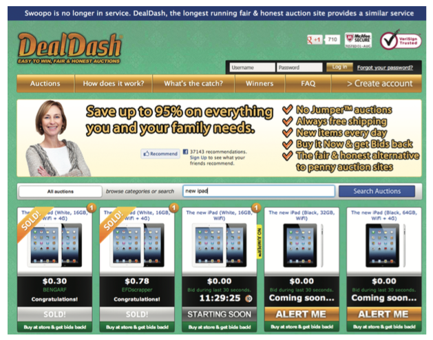
Popularity markers also look very convincing: the number of purchased / remaining copies, labels “product has run out”, information that other users are viewing the product page, and statistics. You can attract stereotypes associated with the product, use associative relationships (everyone who makes X consumes Y).
Apple fans are waiting for the release of the iPhone 6 and at the same time suggest passers-by with thoughts.
On the other hand, mentioning people who do things differently is always a risk. Even if you explain why they are wrong, their very presence may prompt the user to follow suit. A good illustration of this was one anti-alcohol campaign for teens. The organizers mentioned in the text what a huge percentage of minors are fond of drinking, trying to hit the audience, but they only got what teenage viewers realized: drinking is now fashionable.
Personal messages
For social justification, it is important not only what is said, but also by whom. Most of all we trust people with whom we are closely acquainted, therefore recommendations that come from them (or supposedly from them) usually give the desired effect.
This tactic is very widely used in social networks that do not accidentally inform us about every action of our friends. For example, notes like “such-and-such and such-and-such post” in the Twitter feed create the feeling that our friends actively recommend that we also click on the heart. Some services go further and present the action as something interactive, directed at us and requiring a response. Here you can recall Google+, which formulates a notification that someone has added our e-mail to your circle, such as “such and such invited you to Google+” - because when a friend invites you, it is inconvenient to refuse.
Announcement of choice
Falling in your own eyes is half the trouble, the main thing is that others do not know about the mistake. We do not like to publicly admit that we were wrong. If other people become aware of the user's choice, he will be less likely to change his mind. Many applications that help users achieve some goals (for example, lose weight or learn a language) build motivation on this.
There are several ways to achieve publicity: ask for access to social networks, create your own platforms for users to communicate, divide users into groups according to activity or involvement with appropriate markers.
Emphasis of similarity
Another feature of human thinking is called the tendency to confirm their point of view. We unconsciously filter and interpret information so that it confirms the opinions that we adhere to.
A great way to “feed” users a message is to surround it with theses with which the target audience will most likely agree and show how one follows from the other. Of course, there is always the danger of not guessing what visitors will agree with. Therefore, preference is usually given to banalities - universal values and aspirations that are shared by the majority (love of the family, healthy lifestyle, thirst for success and self-realization).
Similarly, calls to action work better if you do not convince people to change their habits, but show that they themselves are partially doing what you want from them.
Certification as a guarantee of reliability
A / B tests show that a blotch promising any guarantees significantly increases the level of site conversion. A reference to an authoritative source in connection with security issues gives visitors a sense of reliability (as practice shows, unreasonable). It is worth considering the option of obtaining or creating a certificate of what users care most about: refund, data security, service reliability. It’s better to demonstrate such logos not on every page, but at strategic moments when the user is just deciding on the decision.
The desire for completeness
Uncertainty causes tension and irritation, and the realization that the process is completed, on the contrary, brings satisfaction. If this cannot be achieved in a natural way, people are ready to deceive themselves by creating artificial “finish lines”. Also, the ability to bring things to the end is approved by society as a sign of organization and strong will.
On this desire to go the way, those retention schemes that offer a small amount of services for free, and the rest for a fee, are fully based. The fee does not have to be cash, it can be time or certain actions. Such tactics are especially effective when all the achievements of users are placed on a scale that visually displays how much they have already advanced and how many stages remain.
You now have one icon. I wonder how many of them all?
A good example of a game on this feature is how social networks push users to add personal information. Strictly speaking, this is not a prerequisite for using the site, but constant reminders that the profile is only “25% full” implicitly exert pressure, creating the feeling that the job is started and not finished.
In addition to craving for completeness, people are craving for order. If the interface feels some disharmony (say, gaping in place of the missing information), which is easy to fix, most likely they will do it.
Laziness
Laziness is a reluctance to make efforts or an indifferent attitude to the outcome. On the Web, it manifests itself in the fact that users tend to take a minimum of actions to achieve the goal and refuse to interact with the site if it requires too much body movement.
Minimum Barriers A
custom journey should follow the path of least resistance. Usually, people browse the pages following the F-pattern: browse the header and glance up and down, stopping and moving deeper, once some kind of content will interest them. Key information should be located in the "hot" zones, what you want to hide - in the "dead". If you need to knock the user off the beaten track, bright, attractive objects (bright buttons, banners, graphics) can help.
Visualization of “hot” and “dead” zones on the screen
Another tactic of hiding information is mimicry to the information noise. Users are trained to ignore certain types of content, such as ads or legal documents. Therefore, if the text is located where people expect to see the advertising banner, or merges with links to the privacy policy, few will read it.
An important turning point on the page is a call to action button. It should be bright and clearly signed in order to motivate the visitor to move on. Keep in mind that to all that is under it, the user with a high degree of probability simply will not reach.
Easier choice
It has long been known that an overly wide choice paralyzes, overestimates expectations and hinders decision making. People are too immersed in the selection process and are often disappointed with the result, which cost them so much effort.
The easiest way out is to cut the number of options. However, the assortment should still remain wide enough: users associate this with a high level of expertise. Filters and recommendation systems will help to satisfy both requirements. Try to group the parameters so that visitors do not have to compare products at once for several.
The opposite logic works here: if you want users to value their decision higher and not to abandon it later, make them make a choice (even if it’s purely formal, from a narrow set of options that suit you).
Thanks to the priming effect, users respond better to what they know from past experience. Therefore, you should make sure that the first option that catches your eye is the most optimal option. This rule is relevant both for the interface of your product (in all lists, the best option already marked with a tick should be first) and for external sources (if advertising banners mention a specific product or service package, new visitors will go to the site look for him).
More sophisticated priming techniques are associated with creating a brand image. How it works, we all know: if some product is “by ear”, our memory will tell us about it when the time comes and make a choice, and eliminates the need to think further.
The complication of refusal
Many companies go further and make the choice for the user by default - in order to change the situation, he must take active actions (check the profile, change the settings). Given that most people are too lazy to keep track of updates and read user agreements, they may not even suspect that they are passively agreeing to some conditions.
A classic example of the application of such tactics is the predefined checkmark arrangement in registration forms. The force of inertia often keeps visitors from reading, understanding and making any changes. An additional trick is the use of negative constructions, in which consent is considered as the default option, and rejection is considered as especially stipulated. Simply put, feel the difference between the “I want to receive newsletter about company news” and “I do not want to receive newsletter about company news” field.
Do you remember the day you got McAfee? That's it.
A similar method is to mask an additional offer as the next step in the process that the user has already agreed to (for example, drawing up a customer’s card upon purchase, installing third-party software when downloading a file). Buttons with text like “Continue” or “Continue” reinforce this illusion.
In case the user still decides to take the initiative, the management of the settings is deliberately confusing, so that to refuse the service was as difficult as possible. Difficulty can be achieved with heavy, abstruse texts, slurred navigation, and a cumbersome settings system.
Gluttony
Gluttony can be said in cases where consumption exceeds reasonable limits. Such a behavior pattern develops when self-control is turned off and emotional reactions overlap rational assessments.
“You deserve it.”
In the current culture, it’s not a shame to not know the measure, so you can move people to gluttony with the magic words “you deserve it.” In order for the formula to sound convincing, you need to present the bonuses that customers receive (coupons, discounts, gifts) as a reward for their work. This idea underlies many gamification schemes. After the user has taken some actions in exchange for a bonus, he feels not just entitled, but practically obliged to use it.
It is important to maintain a balance: if it is too difficult to get a reward, laziness will prevail. But by requiring a relatively small amount of effort and reminding you of the work you have done, you can significantly increase the value of the proposal in the eyes of users. By the way, the value does not have to be great. Paradoxically, with little profit, people invest more emotionally - because they have to look for excuses that overcome cognitive dissonance.
Hidden numbers
If it becomes difficult to objectively evaluate a proposal, users will more likely rely on the first emotional reaction. So, you need:
- Make the offer extremely profitable at first glance
- Make it hard for users to verify this impression with facts
It is possible to create the feeling that the purchase is profitable without lowering the price too much due to the difficulty of calculations. It is achieved in various ways:
- distractions: time pressure, high competition, external attractiveness of the offer
- use of specific terminology to describe transaction conditions
- introduction of internal currency (tokens, points, coins) - it’s easier for the buyer to part with “toy” money
- write-off automation, which allows the client to forget about expenses
- emphasis on the initial price, not additional costs and conditions
- use of the effect of sunk costs
iPad for only thirty cents (+ everything you spend on chips for the auction)!
Recognizing Deficiencies
Any product has flaws, and sooner or later, customers will find out about them. Talking about some of them right away, you gain confidence by showing yourself as honest people who have nothing to hide. This is also a form of disabling self-control.
Naturally, the flawed shortcomings are selected so that they can be immediately balanced with something - otherwise users will not be able to justify the purchase. Mentioning a minus, immediately give the relevant strength that smooths it out (ie “our lamps are more expensive, but work longer, allowing us to save in the long run”, and not “our lamps are more expensive, but give a brighter light ").
What to do if a company is faced with an incident that could jeopardize customer confidence? Oddly enough, the best strategy here is frankness and communication. If the error is serious and affects a large number of users, do not try to shut it down or take responsibility. On the contrary, it is necessary to actively work on eliminating the consequences, demonstrating competence, honesty and goodwill.
Increasing involvement
The trick is as old as the world, it was also used by distributors of goods that went home: get the client to agree to some little thing, and later it will be much easier for you to persuade him to do something more significant for you.
In the online environment, the role of the initial “hook” may be the issue of something insignificant (for example, a zip code) under the pretext of customizing the service. The transition from zero involvement to low is always the most difficult, so the request should be very unpretentious. Then, as you interact with the product, you can gradually and carefully increase the scale of requests, thereby increasing engagement.
If some time has passed between the requests, it will not be superfluous to remind the user about the history of your relationship in order to configure it in the right way.
Oddly enough, the opposite strategy also works - lowering the requirements. Sometimes it’s worth frankly burying yourself and getting a refusal in order to later put forward a much more modest request, which the client will already feel embarrassed to refuse. This is explained by the fact that people tend to show reciprocity, that is, respond to some relationship with an appropriate attitude. From their point of view, you make a concession, respectively, they do the same.
However, the success of this technique depends on several conditions:
- both requests are made by the same person
- the second request is a variation of the first, and not something radically different
- the contrast between - two queries is very strong
- the client can only answer “yes” or “no”, without compromise options
In the online environment there are difficulties with the first point: the user will not feel guilty by refusing the interface. Therefore, it is worth introducing additional measures: to formulate the initial proposal with empathy (to recognize that the request is really significant) and to give the opportunity to refuse it easily and quickly, without too distracting from the trip.
The Tom Sawyer Effect
People hate to lose something of value. This also applies to what they currently have and the hypothetical benefits that they can get. The idea that some product or service may not be available to them significantly increases its value in their eyes and breaks self-control.
To arouse interest in a product, imagine it as:
- rare
It is possible to create a feeling that the buyer has the only chance to purchase a product due to the limited period of sale.
- Exclusive
Emphasize that the offer is only available to a specific group of people.
- challenging
Demonstrate that the product is popular, there are many others who want to buy it. Here again, quantitative metrics will be useful: how much product is left, how many views the page with the offer has.
You need to talk about the value of the product not only before the time of purchase, but also when trying to refuse the service. A reminder that he is losing will cause the user to fear loss and may make him change his mind.
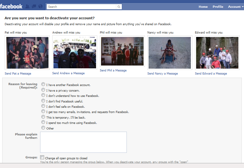
Facebook forces the user to look into the eyes of all those who “will miss him” before deleting the account.
Compliance from rush The
fear of losing profit becomes especially acute when a sense of time pressure is added to it. Tight time frames trigger several psychological effects at once. Firstly, there is a feeling of panic that reduces the ability to think and choose rationally. Secondly, the desire to bring things to the end generates excitement. Thirdly, the proposal is perceived as limited, and therefore valuable.
As a result, a person in a hurry to complete the process most often agrees to everything that the system offers him by default. And these, as we recall, are the most profitable options for the company. A similar scheme is often used on ticket booking sites, where impatience is also spurred by objectively high competition.