Conversion Tips From Your Business Presentations
An important aspect in the interaction between the company and its customers / partners is the presentation. She is able to visually tell all the important information about the product or services and prompt the client / partner to action.
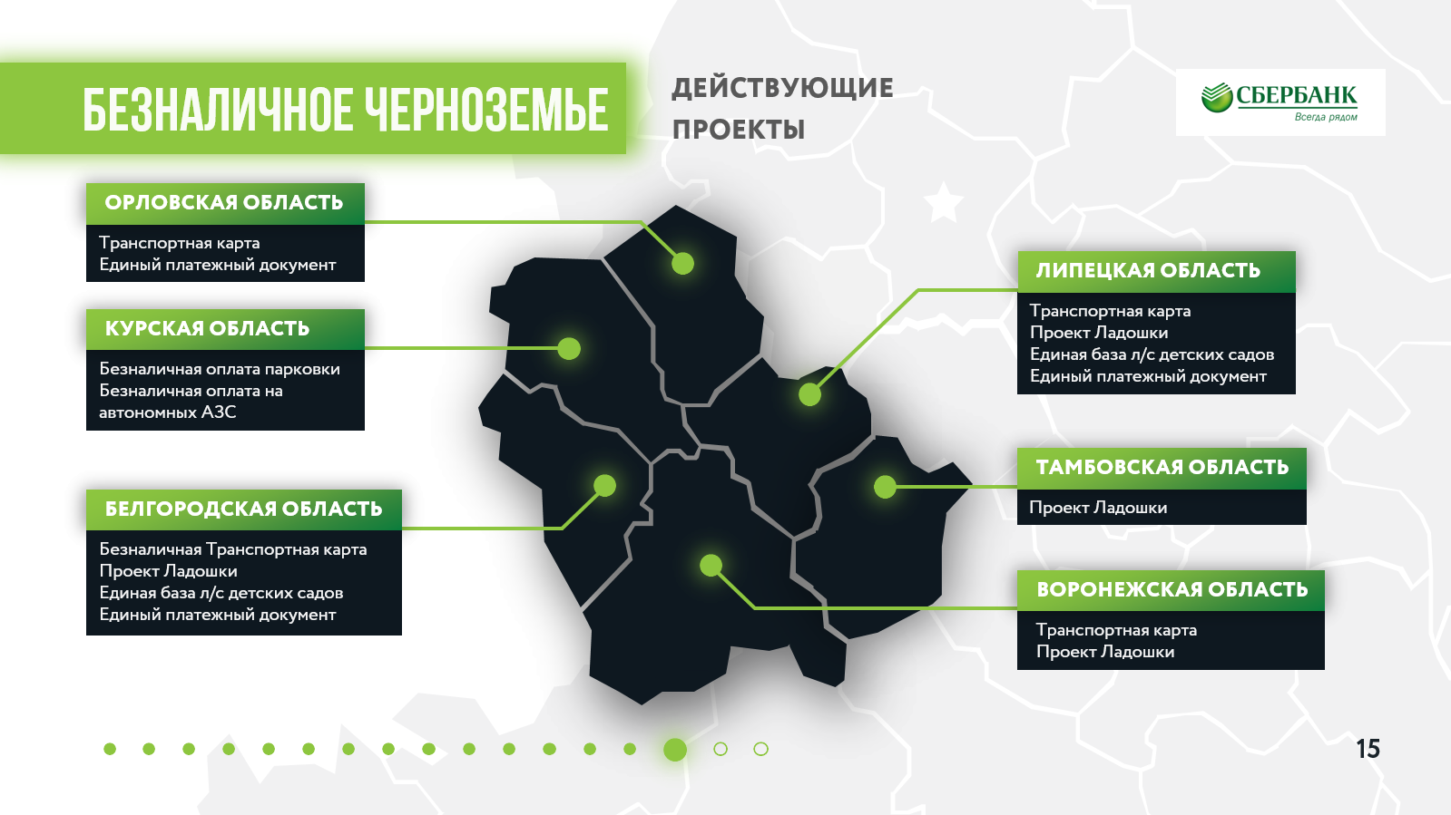
Dear readers of Habrahabr! I previously published an article “10 Tricks for Creating Beautiful Business Presentations” and noticed that some readers perceive a business presentation as a regular presentation for a presentation. Here I would like to expand on the topic and highlight this type of presentation in a separate format. For clarity, I used real slides of investment presentations, sponsorship packages and commercial offers from the agency’s portfolio.
Important: I will not give basic information about presentation design and special platforms. You will need some initial PowerPoint skills to understand and apply the tips from this article.
Differences between a business presentation and a presentation for a speech.
A business presentation for reading and a presentation for public speaking are completely different types of presentations from each other .
The main differences:

Conclusion: a business presentation in PowerPoint is the same document or commercial offer, but it is designed in a more modern way. Data visualization is gaining popularity, and the modern world dictates the trend for thoughtful presentation of information. Therefore, a beautifully formatted document in PowerPoint format will be more effective than a regular Word file.
For the convenience of reading and viewing the presentation, I use interactive navigation. It helps to move from section to section in one click. Usually it is placed at the edge of the slide in the form of figures or icons. A hyperlink to the necessary slide is created for them, and the reader, when pressed, goes to the necessary slide.
Important : numbering slides is no longer necessary. You can “highlight” the navigation item on which the reader is located.
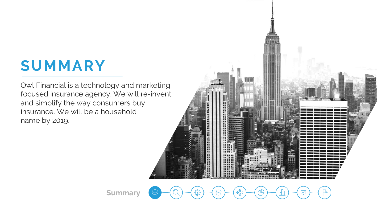
Navigation at the bottom of the slide in the form of navigation points with the icons on the left of the slide. The icon “lights up” on the desired slide. It may happen that you do not fit in 10 slides. And then what?

2 - 10 slides - the best number for a business presentation.
Try to adhere to the Guy Kawasaki 10-20-30 rule: 10 slides for 20 minutes of playing with a 30pt size. For business presentations only, use a smaller size; 30 pins are more suitable for presentations for performances.
Quite often I see 4: 3 format presentations. This is due to the format of the projectors, and also in the first versions of PowerPoint this ratio was standardly used.
Now it’s more convenient to immediately set the format to 16: 9, since most will read the presentation with this orientation. As a plus, it is more convenient to divide 16: 9 format slides into 2-3 semantic parts. This will allow you to logically structure the information in the presentation.
Using modular grids in presentations is already half the success of effective design. It will help not to overload the slide with unnecessary details.
We will not delve into the intricacies of creating a modular grid, but I will help you set it up: using the guides function, you can make a frame for the slide with indents on the sides . Above and below the frame should retreat the same distance. To add new guides in PowerPoint, right-click -> on the slide area, select "grid and guides" -> and then click "add guides".
A line appears that you can drag to the desired location. Why is it needed?
If the information does not fit into the slide completely, then it makes sense to divide it into several parts or reduce the amount of information to the main points.

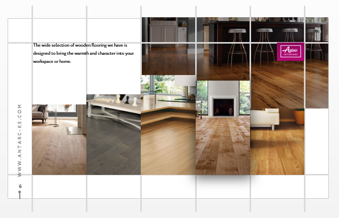
Modular grid at work. Presentation for a furniture company from Kenya:

5 - Dark background in business presentations: to use or not?
Many speakers adhere to the rule when preparing presentations for speeches - do not use a dark background. If you do not need to print a presentation, feel free to write in white on black! Your presentation will definitely stand out from the rest.
Important : use only pure white for text to maintain maximum contrast on the background text of the slide.
The dark background was diluted with red accents in the presentation for Prime Partner

Infographics on a dark background. Kuko App Investment Presentation:

Two special types of business presentations
Next, I will tell you about the features of two presentations that are often used in a business environment.
Investment presentation of the project (pitch deck)
In our portfolio we have collected investment presentations for American and European companies and accelerators.
I think that both investors and start-ups will agree with the proposed slide structure, which is necessary for a complete and successful investment presentation. If you do not agree, then share your opinion in the comments, we will discuss. Pitch Deck
presentation slide structure, according to Guy Kawasaki:
Sequoia slide structure:
Slide structure from D ocsend:
Sequoia and Docsend are proposing to include in the presentation a good slide “Why now?”. The investor needs to be convinced that your project is relevant and will benefit the community.
Why all this?
Presentation of the project to the investor is considered to be one of the difficult stages in the search for investments. It should be thought out and clearly structured. Alternatively, an investment presentation can serve as the basis for a B2B sales presentation or sponsorship package.
Commercial offer
Many may disagree with further information, so let's share our opinions in the comments. By tradition, commercial offers are sent in Word format. In the past, organizations drafted proposals and sent them in the form of letters without any design. I share a link to examples of these letters in English .
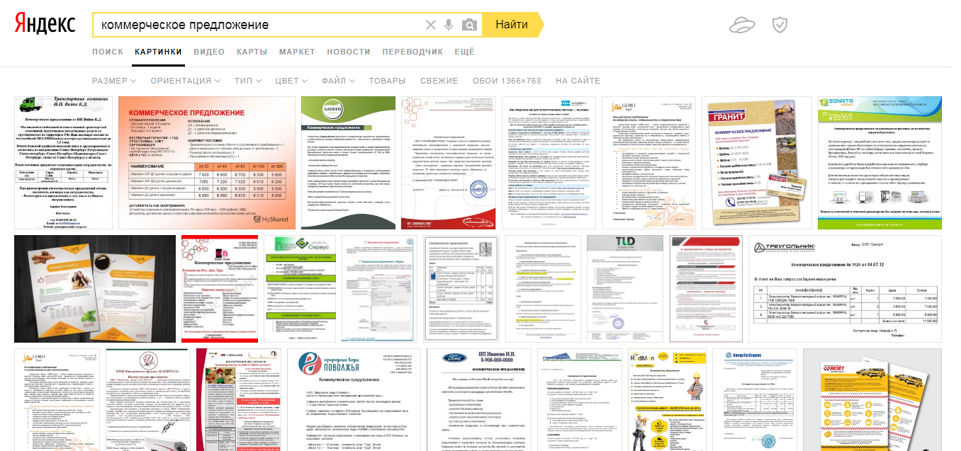
Result of Yandex on the query "commercial offer":
Companies are trying to cut back on design costs, considering this a futile exercise. But your customers will see your offer. Think about their first impression of your company.
I suggest you:
In some cases, you have to step back from the five-slide rule. For example, a commercial proposal for the development of a site. Sometimes the technical aspects of development need to be painted on 2-3 slides so that the client presents the whole picture of cooperation.
Technology does not stand still in the world of presentations!
Speaking about commercial offers in the form of presentations, now the Slider team is developing a function for corporate clients that will allow you to quickly create a template for a commercial offer. Through the application’s office, the employee will be able to change information immediately on the phone or tablet, add data and images individually for the client, upload everything to PowerPoint or PDF format and immediately send it to the client by e-mail or messenger.
While the guys manually connect such a function to Slider after requesting them to the email support@slider.pw. You can try it.
Imagine you took the time to create a presentation, used all your creativity to create a cool design. What's next? How to understand that a presentation is participating in a sales funnel?
Solution:
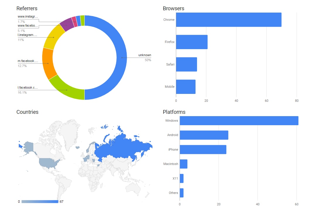
I suggest using interactive hyperlinks to the site or landing page in the presentation. You can track clicks and viewing depth on the site.
Here are 2 commonly used tools:
Content
- Idea of article
- Differences between a business presentation and a presentation for a speech
- 5 tips for creating quality business presentations
- Two special types of business presentations
- We measure the effectiveness of a business presentation and consider the conversion
- Summarizing

Idea of article
Dear readers of Habrahabr! I previously published an article “10 Tricks for Creating Beautiful Business Presentations” and noticed that some readers perceive a business presentation as a regular presentation for a presentation. Here I would like to expand on the topic and highlight this type of presentation in a separate format. For clarity, I used real slides of investment presentations, sponsorship packages and commercial offers from the agency’s portfolio.
Important: I will not give basic information about presentation design and special platforms. You will need some initial PowerPoint skills to understand and apply the tips from this article.
Differences between a business presentation and a presentation for a speech.
A business presentation for reading and a presentation for public speaking are completely different types of presentations from each other .
The main differences:
- Application. Typically, business presentations are used for e-mail distribution or shown on devices personally to the client. Presentation for public speaking is demonstrated using a projector.
- Engagement. A business presentation does not require the presence of a special person who would explain the information, since it already contains all the necessary data for understanding the essence. It is not possible to show a presentation for a speech without a speaker. Most often they contain only tables, charts, and pictures for the entire slide.
- The amount of text. Presentation for public speaking ideally does not contain text, only additions in the form of abstracts. The rest of the content is images and diagrams (as, for example, Steve Jobs). Business presentations, on the contrary, should contain text. Standard - point size 12 and 14 . There are options for using 8 and 10 pins in presentations for case championships and financial statements.

- The format of the document. You can make a presentation in PowerPoint or Keynote, but the final file must be in PDF format , and now I will explain why.
The client will be able to open such files on the phone, tablet or PC, and there will not be any influx of text or shifts in the design. Risks of unwanted “modifications” to the presentation are minimal. Presentations for the speech can be shown in any convenient format, as the speaker himself controls the entire process of the demonstration and checks everything before showing the presentation. Personally, I like to use the Prezi tool. So presentations are lively and interactive.
Conclusion: a business presentation in PowerPoint is the same document or commercial offer, but it is designed in a more modern way. Data visualization is gaining popularity, and the modern world dictates the trend for thoughtful presentation of information. Therefore, a beautifully formatted document in PowerPoint format will be more effective than a regular Word file.
5 tips for creating quality business presentations
1 - Use interactive navigation.
For the convenience of reading and viewing the presentation, I use interactive navigation. It helps to move from section to section in one click. Usually it is placed at the edge of the slide in the form of figures or icons. A hyperlink to the necessary slide is created for them, and the reader, when pressed, goes to the necessary slide.
Important : numbering slides is no longer necessary. You can “highlight” the navigation item on which the reader is located.
Navigation at the bottom of the slide in the form of navigation points with the icons on the left of the slide. The icon “lights up” on the desired slide. It may happen that you do not fit in 10 slides. And then what?


2 - 10 slides - the best number for a business presentation.
Try to adhere to the Guy Kawasaki 10-20-30 rule: 10 slides for 20 minutes of playing with a 30pt size. For business presentations only, use a smaller size; 30 pins are more suitable for presentations for performances.
3 - The orientation of the slide is 16: 9, not 4: 3.
Quite often I see 4: 3 format presentations. This is due to the format of the projectors, and also in the first versions of PowerPoint this ratio was standardly used.
Now it’s more convenient to immediately set the format to 16: 9, since most will read the presentation with this orientation. As a plus, it is more convenient to divide 16: 9 format slides into 2-3 semantic parts. This will allow you to logically structure the information in the presentation.
4 - Modular grid for business presentation.
Using modular grids in presentations is already half the success of effective design. It will help not to overload the slide with unnecessary details.
We will not delve into the intricacies of creating a modular grid, but I will help you set it up: using the guides function, you can make a frame for the slide with indents on the sides . Above and below the frame should retreat the same distance. To add new guides in PowerPoint, right-click -> on the slide area, select "grid and guides" -> and then click "add guides".
A line appears that you can drag to the desired location. Why is it needed?
If the information does not fit into the slide completely, then it makes sense to divide it into several parts or reduce the amount of information to the main points.

Modular grid at work. Presentation for a furniture company from Kenya:


5 - Dark background in business presentations: to use or not?
Many speakers adhere to the rule when preparing presentations for speeches - do not use a dark background. If you do not need to print a presentation, feel free to write in white on black! Your presentation will definitely stand out from the rest.
Important : use only pure white for text to maintain maximum contrast on the background text of the slide.
The dark background was diluted with red accents in the presentation for Prime Partner

Infographics on a dark background. Kuko App Investment Presentation:

Two special types of business presentations
Next, I will tell you about the features of two presentations that are often used in a business environment.
Investment presentation of the project (pitch deck)
In our portfolio we have collected investment presentations for American and European companies and accelerators.
I think that both investors and start-ups will agree with the proposed slide structure, which is necessary for a complete and successful investment presentation. If you do not agree, then share your opinion in the comments, we will discuss. Pitch Deck
presentation slide structure, according to Guy Kawasaki:
- Title slide
- Problem
- Prove the severity of the problem
- Problem Solving - Your Product
- Business model
- Market promotion
- Competitor analysis
- Command
- Forecasts and metrics (financial, marketing)
- Project Current Status
Sequoia slide structure:
- Existing problem
- Decision
- Why now?
- Market volume
- Market competition
- Product
- Business Model Project
- Command
- Mentors / Consultants
- Finance
- Investment size
Slide structure from D ocsend:
- Company goal setting
- Problem
- Solution
- Why now?
- Market volume
- Product
- Command
- Business model
- Market competition
- Financial performance
Sequoia and Docsend are proposing to include in the presentation a good slide “Why now?”. The investor needs to be convinced that your project is relevant and will benefit the community.
Why all this?
Presentation of the project to the investor is considered to be one of the difficult stages in the search for investments. It should be thought out and clearly structured. Alternatively, an investment presentation can serve as the basis for a B2B sales presentation or sponsorship package.
Commercial offer
Many may disagree with further information, so let's share our opinions in the comments. By tradition, commercial offers are sent in Word format. In the past, organizations drafted proposals and sent them in the form of letters without any design. I share a link to examples of these letters in English .
Result of Yandex on the query "commercial offer":

Companies are trying to cut back on design costs, considering this a futile exercise. But your customers will see your offer. Think about their first impression of your company.
I suggest you:
- Create a well-thought-out template of a commercial offer in PowerPoint. You just have to make changes individually for a specific client;
- A4 format with landscape slide orientation for correct printing.
- Ideally, such an offer should not exceed 5 slides:
- USP of a product or service.
- Product advantages over competitors
- Announcement of discounts, sales, seasonal offers.
- Offer details, technical specifications (Optional depending on the scope).
- Contact and call to action.
In some cases, you have to step back from the five-slide rule. For example, a commercial proposal for the development of a site. Sometimes the technical aspects of development need to be painted on 2-3 slides so that the client presents the whole picture of cooperation.
Technology does not stand still in the world of presentations!
Speaking about commercial offers in the form of presentations, now the Slider team is developing a function for corporate clients that will allow you to quickly create a template for a commercial offer. Through the application’s office, the employee will be able to change information immediately on the phone or tablet, add data and images individually for the client, upload everything to PowerPoint or PDF format and immediately send it to the client by e-mail or messenger.
While the guys manually connect such a function to Slider after requesting them to the email support@slider.pw. You can try it.
We measure the effectiveness of a business presentation and consider the conversion.
Imagine you took the time to create a presentation, used all your creativity to create a cool design. What's next? How to understand that a presentation is participating in a sales funnel?
Solution:
I suggest using interactive hyperlinks to the site or landing page in the presentation. You can track clicks and viewing depth on the site.
Here are 2 commonly used tools:
- Add a link to the presentation with a UTM tag. You can analyze the conversion through Yandex.Metrics or Google Analytics.
- Generate a link in Google Url Shortner , add to the presentation and see how many times you clicked on it

Summarizing
- Now you know the differences between a business presentation and a presentation for public speaking.
- Implement slide navigation.
- Stick to 10 slides for business presentations and 5 slides for business offer.
- Set the format to 16: 9 or A4 landscape orientation when printing slides on plain sheets.
- The dark background of the presentation will help you stand out from the rest.
- Take as a basis the structure of the investment presentation the next time you create a business presentation.
- Replace boring business offers in Word with more presentable ones in PowerPoint.
- UTM tagged hyperlinks and the use of Google URL Shortner links will help you track the conversion from your presentation.
- Write your impressions in the comments! It is interesting to know your opinion.
