 October 18, 2017 at 15:36
Organization of indentation in layout (margin / padding)
- From the sandbox
- Tutorial
The purpose of this article is not to complicate simple things, but to focus on well-known standards, which for some reason are forgotten. It is important to observe a meaningful structure in all aspects of layout, and it is equally important to adhere to it indentation. And one of the basic principles of layout is flexibility. Namely, the ability to easily make any changes without breaking anything. Proper handling of margin and padding plays a very important role in this matter.
The following principles are implemented in the positioning environment of elements on the page. The decor elements are also executed. But not so categorically.
Basic principles:
- Indentation goes from the previous element to the next.
- Indentation is given to the last possible element in the house.
- Indentation cannot be set for independent elements (BEM block).
- At the last element of the group, the indent is reset (always).
Indentation goes from the previous element to the next.
margin (s) are set from the previous element to the next, from the first to the second, from top to bottom, from left to right.

This means that properties such as margin-left and margin-top are not used (not without exceptions). With padding, everything is a little the other way around (except that it is used for decorative purposes, increasing the link area, etc.). When a block needs to be indented from above or to the left, it gets it at the expense of the padding-top and padding-left of the parent.
The indentation goes in the direction of the flow of the tree house , the block does not push itself.
Initially, he is in a static position, and receives some kind of impact, at the expense of others.
Indentation is given to the last possible element in the house.
margin (s) are set only between adjacent elements of the tree house.
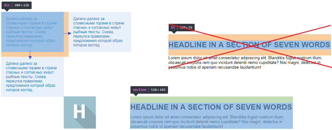
In example 3 of the list, in the following structure:
- Далеко-далеко, за словесными.
- ...
- ...
- ...
- ...
......
Not at the expense of children, but at the expense of neighboring elements, indentation is made.

In this situation
.main-section__item, it is the last possible one to whom you can indent to separate the lists. You can achieve the same effect if you indent the diva, list, excess, link, but this will not be correct. This example is pretty simple. But if you imagine a lot of nesting, where someone litters with indentation when some margins collapse. and some are added to the paddings.
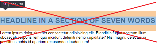
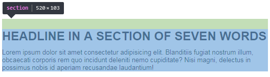
headline in a section of seven words
If you take an example with a heading, and you need to indent the heading above. then the last element will be section and padding-top is set for it, margin (s) that are defaulted always need to be reset.
The simplest reason to adhere to this principle is to make it easier to find indentation in the future, either for you or someone who will continue to work with your layout. This is about convenience.
Real problems can arise when a layout with a poor indentation structure is displayed dynamically or duplicated.
Indentation cannot be set for independent elements (BEM block)
Never indent elements that can be used more than once. Even if you don’t adhere to the methodologies, consider the perspective. There are wrappers for this. Wrappers are good. Or additional classes.
If you need to indent the block . Without prejudice, this is done with:
- Inheritance through the element (if you pull this block from the element, there will be no indentation, and it can simply be placed in another place).
- Adding a class (you can make a block an element).
- Wrapper (as a block with a role only in positioning).
.block__item > .block { margin-right: 10px; }
.block.block__item { margin-right: 10px; }
.block-wrap > .block { margin-right: 10px; }
At the last element of the group, the indent is reset (always)
Take for example the list and image.
![]()
This is a horizontal menu and logo (which for some reason is on the right).
Between links and logo the same distance. But if there is a distance between the last excess and the new block, then this indentation is not done at the expense of the excess. And the list recedes.
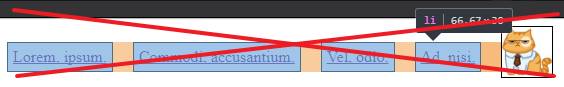

For the last, the
liindent is reset to zero. And the indentation is between adjacent elementsul and img. What was said in the second principle. Take another example:

We are interested in the indent between the news that is being asked
.blog-preview__item { margin-bottom: 20px; }. The last margin is zeroed, and the bottom indentation is done by padding blog-preview. What was said in the second principle. More often than other pseudo-classes, you should use: last-child.
.item:not(:last-child) {
  margin-bottom: 20px;
}
// или //
.item {
  // другие стили //
  margin-bottom: 20px;
  &:last-child {
    margin-bottom: 0;
  }
}
// или margin-top, основная идея здесь, не в направлении маргина, а в отсутствии лишнего //
.item + .item {
  margin-top: 20px;
}
// или //
.item {
  // другие стили //
  & + & {
    margin-top: 20px;
  }
}
Exceptions
- First of all, it is adding text content through the admin panel . This is where the browser indentation approach works great. But this approach cannot be considered suitable in the usual layout, as well as several

- "Dynamic elements." When an element appears after a block, it will appear with its indent.
- Sometimes vertical padding is better for child blocks than for the entire section. If in the future, on other pages in the same place, this refers to the second principle, indent the last possible , here sometimes the section is last, but not possible.
- Negative margins, auto, padding for container.
Of course there are special cases, non-trivial tasks, and nuances in which it is impossible to adhere to these principles, but the rest is to strive for perfect indentation to make the layout as clean as possible.
PS I advise you to read the publication Custom approach to normalize and reset styles (custom-reset.css) . And I advise you to use css linters. And who cares, can solve the css puzzle .