Machine Learning: From Iris to Telecom

Mobile operators, providing a variety of services, accumulate a huge amount of statistical data. I represent a department that implements a subscriber traffic management system that generates hundreds of gigabytes of statistical information per day during the operator’s operation. I was interested in the question: how to reveal the maximum of useful information in these Big Data? Not for nothing that one of V in the definition of Big Data is an additional income.
I took up this task, not being a specialist in data mining. A lot of questions arose immediately: what technical means should I use for analysis? At what level is it enough to know math, statistics? What machine learning methods do you need to know and how deep? Or maybe it's better to start to learn a specialized language for researching R or Python data?
As my experience has shown, not much is needed for the initial level of data research. But for a quick dive, I did not have a simple example, which would clearly show the complete algorithm for data mining. In this article, by the example of Iris Fisherwe will go all the way through the initial training, and then apply the understanding to the real data of the telecom operator. Readers already familiar with data mining can skip right to the chapter on Telecom.
Terms
To begin, let's deal with the subject of study. Now the terms Artificial Intelligence, Machine Learning, Deep Machine Learning are often used as synonyms, but in fact there is a well-defined hierarchy:
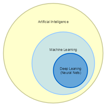
- Artificial Intelligence includes all tasks in which machines perform intellectual tasks, such as playing checkers or chess, helpers who are able to recognize speech and give answers to questions, various robots.
- Machine Learning is a narrower concept and belongs to the class of tasks for the solution of which the computer is trained to perform certain actions, having the right answers in advance, for example, classifying objects according to a set of attributes or recommending music and films.
- By Deep Learning we mean tasks that are solved using neural networks and Big Data, such as pattern recognition or text translation.
In the article we will talk about Machine Learning. It distinguishes two ways of learning:
- with teacher
- without teacher
With a teacher, this is when we have data with the correct answers. Then the algorithm can be trained on this data set, and then apply it for prediction. These algorithms include classification and regression. Classification is the assignment of objects to a specific class according to a set of characteristics. For example, recognition of car numbers, or in medicine, diagnosis of diseases, or credit scoring in the banking sector. Regression is the prediction of a material variable, such as stock prices.
Without a teacher (self-learning) is the search for hidden patterns in data. Such algorithms include clustering. For example, all major retail chains look for patterns in the purchases of their customers and try to work with target groups of customers, and not with the general mass.
Regression, classification and clustering are the main algorithms for data research, and therefore we will consider them.
Data exploration
The data mining algorithm consists of a certain sequence of steps. Depending on the task and the available data, the set of steps may vary, but the general direction is always determined:
- Collection and purification of data. As practice shows, this stage can take up to 90% of the entire data analysis;
- Visual analysis of data, their distribution, statistics;
- Analysis of the relationship (correlation) between variables (features);
- Selection and definition of features that will be used to build models;
- Separation into data for training models and test ones;
- Building models on data for training / evaluation of the result on test data;
- Interpretation of the obtained model, visualization of the results.
We figured out the algorithm, and what tools should I use for analysis? There are tons of tools, from Excel to specialized tools, such as MathLab. We will take Python with specialized libraries. No need to be afraid of difficulties, everything is simple:
- Download Python and all math packages in one distribution called Anaconda
- Installing under Linux will not cause problems: bash Anaconda2-4.4.0-Linux-x86_64.sh
- Run: jupyter notebook
- This automatically opens the browser:

- Check that the application is working: print “HelloWorld!”
- Press Ctrl + Enter, see that everything is ok.
There is a ton of information available on the Internet to learn how to use IPython Notebook on the Internet, for example, a simple introduction: Ipython Notebook 2.0 Overview .
And we are starting our research!
Data collection and purification
In the example with Iris, for us, all the data was collected and filled. Just load them and watch:
#Импортируем нужные библиотеки:
import numpy as np
import pandas as pd
from sklearn import datasets
from sklearn import linear_model
from sklearn.cluster import KMeans
from sklearn import cross_validation
from sklearn import metrics
from pandas import DataFrame
%pylab inline
Further:
# Загружаем набор данных Ирисы:
iris = datasets.load_iris()
# Смотрим на названия переменных
print iris.feature_names
# Смотрим на данные, выводим 10 первых строк:
print iris.data[:10]
# Смотрим на целевую переменную:
print iris.target_names
print iris.target
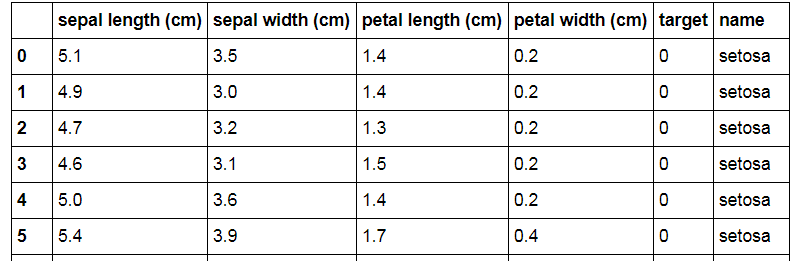
We see that the data set consists of the length / width of two types of Iris petals: sepal and petal. Do not ask me where they are from Iris). The target variable is the Iris variety: 0 - Setosa, 1 - Versicolor, 2 - Virginica. Accordingly, our task is to try to find the relationship between the size of the petals and the varieties of Iris, according to available data.
For the convenience of manipulating data, we make a DataFrame from them:
iris_frame = DataFrame(iris.data)
# Делаем имена колонок такие же, как имена переменных:
iris_frame.columns = iris.feature_names
# Добавляем столбец с целевой переменной:
iris_frame['target'] = iris.target
# Для наглядности добавляем столбец с сортами:
iris_frame['name'] = iris_frame.target.apply(lambda x : iris.target_names[x])
# Смотрим, что получилось:
iris_frame
It seemed to work out what they wanted:
Descriptive Statistics
# Строим гистограммы по каждому признаку:
pyplot.figure(figsize(20, 24))
plot_number = 0
for feature_name in iris['feature_names']:
for target_name in iris['target_names']:
   plot_number += 1
   pyplot.subplot(4, 3, plot_number)
   pyplot.hist(iris_frame[iris_frame.name == target_name][feature_name])
   pyplot.title(target_name)
   pyplot.xlabel('cm')
   pyplot.ylabel(feature_name[:-4])
Looking at such histograms, an experienced researcher can immediately draw the first conclusions. I only see that the distribution of some variables seems to be normal. Let's try to do it more clearly. We build a table with dependencies between the signs and color the points depending on the varieties of Iris:
import seaborn as sns
sns.pairplot(iris_frame[['sepal length (cm)','sepal width (cm)','petal length (cm)','petal width (cm)','name']], hue = 'name')
Here even an inexperienced researcher can see that "petal width (cm)" and "petal length (cm)" have a strong dependence - the points are elongated along the same line. And in principle, based on the same characteristics, it is possible to build a classification, because dots are grouped by color quite compactly. But, for example, using the variables “sepal width (cm)” and “sepal length (cm)”, a qualitative classification cannot be built, because points related to varieties Versicolor and Virginica are intermixed.
Dependency between variables
Now let's look at the mathematical values of the dependencies:
iris_frame[['sepal length (cm)','sepal width (cm)','petal length (cm)','petal width (cm)']].corr()
In a more visual form, we construct a heat map of the dependence of the signs:
import seaborn as sns
corr = iris_frame[['sepal length (cm)','sepal width (cm)','petal length (cm)','petal width (cm)']].corr()
mask = np.zeros_like(corr)
mask[np.triu_indices_from(mask)] = True
with sns.axes_style("white"):
ax = sns.heatmap(corr, mask=mask, square=True, cbar=False, annot=True, linewidths=.5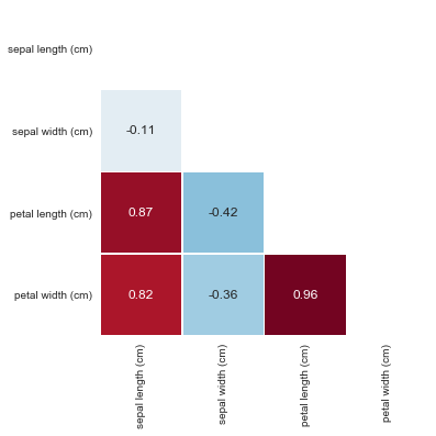
The values of the correlation coefficient are interpreted as follows:
- Up to 0.2 - very weak correlation
- Up to 0.5 - weak
- Up to 0.7 - average
- Up to 0.9 - high
- More than 0.9 - very high
Indeed, we see that between the variables “petal length (cm)” and “petal width (cm)” a very strong dependence of 0.96 was revealed.
We select and create signs
In a first approximation, you can simply include all the variables in the model and see what happens. Further it will be possible to think which signs to remove and which to create.
Training and Test Data
We divide the data into data for training and test data. Typically, the sample is divided into training and test in a percentage of 66/33, 70/30 or 80/20. Other partitions are possible depending on the data. In our example, we assign 30% of the entire sample to the test data (parameter test_size = 0.3):
train_data, test_data, train_labels, test_labels = cross_validation.train_test_split(iris_frame[['sepal length (cm)','sepal width (cm)','petal length (cm)','petal width (cm)']], iris_frame['target'], test_size = 0.3, random_state = 0)
# визуально проверяем, что получившееся разбиение соответствует нашим ожиданиям:
print train_data
print test_data
print train_labels
print test_labels
Model building cycle - evaluation of the result
We pass to the most interesting.
Linear Regression - LinearRegression
How to visualize linear regression? If you look at the relationship between the two variables, this is drawing a line so that the vertical distances from the line to the points are in total minimal. The most common optimization method is to minimize the mean square error using the gradient descent algorithm. There is a lot of explanation of gradient descent, for example, here in the section “What is gradient descent?”. But you can not read and perceive linear regression as an abstract algorithm for finding a line that most closely follows the direction of distribution of objects. We build the model using variables that, as we understood earlier, have a strong dependence - these are “petal length (cm)” and “petal width (cm)”:
from scipy import polyval, stats
fit_output = stats.linregress(iris_frame[['petal length (cm)','petal width (cm)']])
slope, intercept, r_value, p_value, slope_std_error = fit_output
print(slope, intercept, r_value, p_value, slope_std_error)
We look at the model quality metrics:
(0.41641913228540123, -0.3665140452167277, 0.96275709705096657, 5.7766609884916033e-86, 0.009612539319328553)
Of the most interesting is the correlation coefficient between the r_value variables with the value 0.962757707050. We have already seen it before, but here we are once again convinced of its existence. Draw a graph with points and a regression line:
import matplotlib.pyplot as plt
plt.plot(iris_frame[['petal length (cm)']], iris_frame[['petal width (cm)']],'o', label='Data')
plt.plot(iris_frame[['petal length (cm)']], intercept + slope*iris_frame[['petal length (cm)']], 'r', linewidth=3, label='Linear regression line')
plt.ylabel('petal width (cm)')
plt.xlabel('petal length (cm)')
plt.legend()
plt.show()
We see that, indeed, the found regression line repeats well the direction of the distribution of points. Now, if we have available, for example, the length of the pental leaflet, we can determine with great accuracy what width it has!
Classification
How to intuitively represent the classification? If you look at the problem of dividing into two classes of objects that have two characteristics (for example, you need to separate apples and bananas if their sizes are known), then the classification is reduced to drawing a line on a plane that divides the objects into two classes. If it is necessary to divide into a larger number of classes, then several lines are drawn. If you look at objects with three variables, you will see three-dimensional space and the task of drawing planes. If the variables are N, then you just need to imagine a hyperplane in an N-dimensional space).
So, we take the most famous classification training algorithm: Stochastic Gradient Descent. We have already encountered gradient descent in linear regression, and stochastic descent indicates that not all the sample, but random data is used for speed. And apply it to the SVM (Support Vector Machine) classification method:
train_data, test_data, train_labels, test_labels = cross_validation.train_test_split(iris_frame[['sepal length (cm)','sepal width (cm)','petal length (cm)','petal width (cm)']], iris_frame[['target']], test_size = 0.3, random_state = 0)
model = linear_model.SGDClassifier(alpha=0.001, n_iter=100, random_state = 0)
model.fit(train_data, train_labels)
model_predictions = model.predict(test_data)
print metrics.accuracy_score(test_labels, model_predictions)
print metrics.classification_report(test_labels, model_predictions)
We look at the model quality metrics:

In fact, you can evaluate the model without really understanding the essence of the metric values: if accuracy, precision and recall are greater than 0.85, then this is a good model, if greater than 0.95, then excellent.
In short, the metrics used in the example reflect the following:
- accuracy is the main metric that shows the proportion of correct model responses. Its value is equal to the ratio of the number of correct answers that the model gave to the number of all objects. But it does not fully reflect the quality of the model. Therefore, precision and recall are introduced.
These metrics are given both in terms of the recognition quality of each class (variety of iris), and the total values. We look at the total values:
- precision (точность) — эта метрика показывает, насколько мы можем доверять модели, другими словами, какое у нас количество «ложных срабатываний». Значение метрики равно отношению числа ответов, которые модель считает правильными, и они действительно были правильными (это число обозначается «true positives») к сумме «true positives» и числа объектов которые модель посчитала правильными, а на самом деле они были неправильные (это число обозначается «false positives»). В виде формулы: precision = «true positives» / («true positives» + «false positives»)
- recall (полнота) — эта метрика показывает насколько модель может вообще обнаруживать правильные ответы, другими словами, какое у нас количество «ложных пропусков». Ее численное значение равно отношению ответов, которые модель считает правильными, и они действительно были правильными к числу всех правильных ответов в выборке. В виде формулы: recall = «true positives» / «all positives»
- f1-score (f-мера) — это объединение precision и recall
- support — просто число найденных объектов в классе
There are also important model metrics: PR-AUC and ROC-AUC, you can find them, for example, here: Metrics in machine learning problems .
Thus, we see that the metric values in our example are very good. Let's look at the chart. For clarity, we draw the sample in two coordinates and colorize it by class.
First, display the test sample as it is:

Then, as our model predicted. We see that the points on the border (which I circled in red) were classified incorrectly:
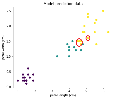
But most of the objects were predicted correctly!
Cross validation
Somehow a very suspiciously good result ... What could be wrong? For example, we accidentally divided the data well into a training and test sample. To remove this randomness, the so-called cross-validation is used. This is when the data is divided several times into a training and test sample, and the result of the algorithm is averaged.
Let's check the algorithm work on 10 random samples:
train_data, test_data, train_labels, test_labels = cross_validation.train_test_split(iris_frame[['sepal length (cm)','sepal width (cm)','petal length (cm)','petal width (cm)']], iris_frame['target'], test_size = 0.3)
model = linear_model.SGDClassifier(alpha=0.001, n_iter=100, random_state = 0)
scores = cross_validation.cross_val_score(model, train_data, train_labels, cv=10)
print scores.mean()
We look at the result. It expectedly worsened: 0.860909090909
Selection of optimal algorithm parameters
What else can be done to optimize the algorithm? You can try to choose the parameters of the algorithm itself. We see that alpha = 0.001, n_iter = 100 are transferred to the algorithm. Let's find the optimal values for them.
from sklearn import grid_search
train_data, test_data, train_labels, test_labels = cross_validation.train_test_split(iris_frame[['sepal length (cm)','sepal width (cm)','petal length (cm)','petal width (cm)']], iris_frame['target'], test_size = 0.3)
parameters_grid = {
'n_iter' : range(5,100),
'alpha' : np.linspace(0.0001, 0.001, num = 10),
}
classifier = linear_model.SGDClassifier(random_state = 0)
cv = cross_validation.StratifiedShuffleSplit(train_labels, n_iter = 10, test_size = 0.3, random_state = 0)
grid_cv = grid_search.GridSearchCV(classifier, parameters_grid, scoring = 'accuracy', cv = cv)grid_cv.fit(train_data, train_labels)
print grid_cv.best_estimator_
At the output, we get a model with optimal parameters:
SGDClassifier (alpha = 0.00089999999999999998, average = False, class_weight = None,
epsilon = 0.1, eta0 = 0.0, fit_intercept = True, l1_ratio = 0.15,
learning_rate = 'optimal', loss = 'hinge', n_iter = 96, n_jobs = 1,
penalty = 'l2', power_t = 0.5, random_state = 0, shuffle = True, verbose = 0,
warm_start = False)
We see that it has alpha = 0.0009, n_iter = 96. Substitute these values in the model:
train_data, test_data, train_labels, test_labels = cross_validation.train_test_split(iris_frame[['sepal length (cm)','sepal width (cm)','petal length (cm)','petal width (cm)']], iris_frame['target'], test_size = 0.3)
model = linear_model.SGDClassifier(alpha=0.0009, n_iter=96, random_state = 0)
scores = cross_validation.cross_val_score(model, train_data, train_labels, cv=10)
print scores.mean()
We look, it got a little better: 0.915505050505
We select and create signs
It's time to experiment with the signs. Let's remove less significant features from the model, namely “sepal length (cm)” and “sepal width (cm)”. We drive into the model:
train_data, test_data, train_labels, test_labels = cross_validation.train_test_split(iris_frame[['petal length (cm)','petal width (cm)']], iris_frame['target'], test_size = 0.3)
model = linear_model.SGDClassifier(alpha=0.0009, n_iter=96, random_state = 0)
scores = cross_validation.cross_val_score(model, train_data, train_labels, cv=10)
print scores.mean()
We look, it became even a little better: 0.937727272727
To illustrate the approach, let's make a new sign: the area of the petal leaf and see what happens.
iris_frame['petal_area'] = 0.0
for k in range(0,150):
iris_frame['petal_area'][k] = iris_frame['petal length (cm)'][k] * iris_frame['petal width (cm)'][k]
Substitute in the model:
train_data, test_data, train_labels, test_labels = cross_validation.train_test_split(iris_frame[['petal_area']], iris_frame['target'], test_size = 0.3)
model = linear_model.SGDClassifier(alpha=0.0009, n_iter=96, random_state = 0)
scores = cross_validation.cross_val_score(model, train_data, train_labels, cv=10)
print scores.mean()
It's funny, but in our example it turns out that the area of the petal petal (or rather, not even the area, because the petals are not rectangles, but “the product of length by width”) most accurately predicts the Iris variety: 0.942373737374
Probably, this can be explained by the fact that the variables 'petal length (cm)' and 'petal width (cm)', which divides the Irises into classes quite well, and their product still “stretches” the classes along a straight line:

We’ve got acquainted with the main ways of optimizing models, now we will look at the clustering algorithm - an example machine learning without a teacher.
Clustering - K-means
The essence of clustering is extremely simple - it is necessary to divide the existing objects into groups so that similar objects are included in the groups. Now we don’t have the right answers for training the model, so the algorithm itself must group the objects according to the "proximity" of the location of the objects to each other.
For example, consider the most famous K-means algorithm. It is not for nothing called K-means, because the method is based on finding the K centers of the clusters so that the average distance from them to the objects that they belong to is minimal. First, the algorithm determines K arbitrary centers, then all objects are distributed in proximity to these centers. Got K clusters of objects. Further, in these clusters, the centers are re-calculated according to the average distance to the objects, and the objects are redistributed again. The algorithm works until the centers of the clusters cease to shift by a specific delta.
train_data, test_data, train_labels, test_labels = cross_validation.train_test_split(iris_frame[['sepal length (cm)','sepal width (cm)','petal length (cm)','petal width (cm)']], iris_frame[['target']], test_size = 0.3)
model = KMeans(n_clusters=3)
model.fit(train_data)
model_predictions = model.predict(test_data)
print metrics.accuracy_score(test_labels, model_predictions)
print metrics.classification_report(test_labels, model_predictions)
We look at the results:

We see that even with default parameters it turns out very well: accuracy, precision and recall are greater than 0.9. Make sure in the pictures. We see a decent, but not always accurate result:


The algorithm has a drawback - for its operation, you need to specify the number of clusters that we want to find. And if it is inadequate, then the results of the algorithm will be useless. Let's see what happens if you set the number of clusters, for example, 5:
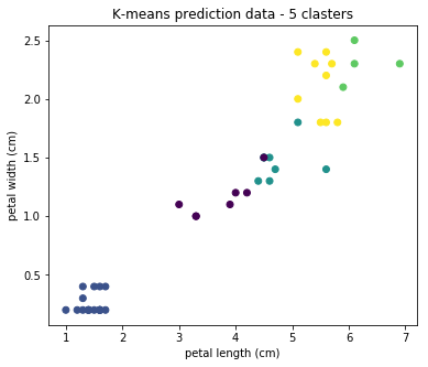
We see that in practice the result is not applicable. Algorithms exist for determining the optimal number of clusters, but in this article we will not dwell on them.
Conclusion on the study of Iris
So, using the example of Iris, we examined three main methods of machine learning: regression, classification, and clustering. We carried out optimization of algorithms and visualization of the results. We got very good results, but this was expected on a specially prepared data set.
The full Python Notebook can be found on Github . We pass to Telecom.
Telecom
There are tasks in Telecom that, with the help of data analysis, can be solved in other areas (banks, insurance, retail):
- Prediction of an outflow of subscribers (Churn Prevention);
- Fraud Prevention
- Identification of similar subscribers (Subscriber base segmentation);
- Cross-selling (Cross-Sale) and raising the amount of sale (Up-Sale);
- Identification of subscribers who strongly influence their environment (Alpha subscribers).
- Prediction of consumption of network resources by subscribers: traffic volume, number of calls, SMS;
- Investigation of subscribers' movements in order to optimize the network.
- The billing system stores data on payments and expenses of subscribers, tariffs, personal data;
- Data on which sites the subscriber visited was extracted from the DPI equipment ;
- From base stations, you can get geodata with the location of the subscriber;
- Service equipment generates data on the consumption of communication services by the subscriber.
My goal was to determine what tasks you can try to solve using the data generated by the subscriber traffic management system. In order for the billing system to correctly rate the subscriber’s traffic, it needs to know: who / where / when / what type and volume of traffic has consumed. This information comes from the equipment in the form of so-called CDR (Call Data Record) files. IMSI and MSISDN subscriber identifiers , location with accuracy to the CELL ID base station, IMEI subscriber equipment identifier , session timestamp and information about the consumed service are written to these files in csv format .
To maintain confidentiality, all research data was depersonalized and replaced with random values in compliance with the format. Let's look at the data:

What machine learning algorithms can be applied to this data? You can, for example, aggregate the consumption of traffic of various types by subscribers for a certain period and carry out clustering. Should get something like this:
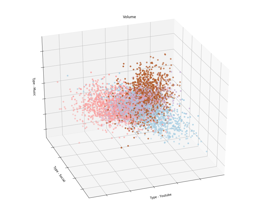
That is, if, for example, the result of clustering showed that subscribers are divided into groups that use Youtube in different ways, social networks and listen to music, then you can make tariffs that take into account their interests. I suppose that telecom operators are doing this by issuing tariff lines with differentiation of payment by type of traffic.
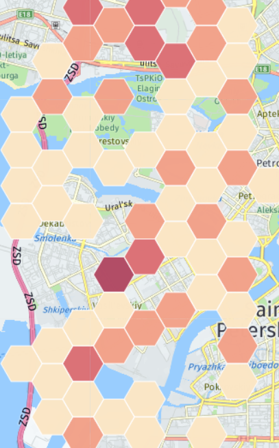
What else can be analyzed in the available data? There are several cases with the equipment of subscribers. The operator knows the model of the subscriber’s device and can, for example, offer certain services only to Samsung users. Or, knowing the coordinates of the base stations, you can draw a heat map of the distribution of Samsung phones (I don’t have real coordinates, so the map doesn’t have any relation to reality):
It may happen that in some region there will be more of them in percentage terms than in others . Then this information can be offered to Samsung for conducting promotions or opening salons for the sale of smartphones. Next, you can look at the Top models of devices from which subscribers access the Internet:

To disguise the current state of affairs, an obsolete IMEI database was taken, but this does not change the essence of the approach. The list shows that most of the devices are Apple, modems and Samsung, and Meizu, Micromax and Xiaomi appear at the end.
Actually, these are all the applications of the source data that I could find in a short time. Of course, according to these data, you can look at a variety of statistics and time series, analyze emissions, etc., but in such a way as to reveal any dependence using machine learning ... unfortunately, I have not yet found how to do this.
Thus, the conclusion on the research by Telecom of data is as follows: for a complete solution of the tasks of a telecom operator, data from all available information systems are needed, because only having access to all the data can one effectively cost the model.
General conclusions
- In the initial data analysis, there is no magic. Everything is based on several simple algorithms that can be understood and applied on an intuitive level.
- But of course, there remain complex problems that can only be solved with experience and in-depth knowledge of statistics, with an algorithm for machine learning and programming.