May 22, 2017 at 16:58
Analysis of the report of Roman Nevolin about F #
A lot of time has passed since the previous analysis, but I did not give up the idea. Today I bring to your attention a report by Roman nevoroman Nevolin on what kind of solution a person has if he, firstly, is a data scientist, and secondly, for some reason loves .NET.
It is logical that this performance took place on DotNext in December 2016:
Slides can be found here .
Traditional Disclaimer: About .NET, only the report parsed in the article, not the article itself.
In the previous reviews, there was no reason to focus on this, but Roman wrote separately that he considers himself not a very experienced speaker, so I will comment on a couple of points.
Please note that the speaker’s gaze returns to the hall very quickly every time he has to look somewhere to the side. The story contains code on slides, demos, and other things that require the attention of the speaker. Very many people, even quite experienced people, have a glance after this for a long time sticking on the screen, and Roman copes well, that is exactly what needs to be done.
Another remarkable moment came at about 3:45 a.m.. If a person was put on the podium and ordered to stand there, because the camera is aimed there, he will often do so, even if it is inconvenient. In this case, the speaker did the right thing: his discomfort during the speech should be corrected immediately if possible, and the camera will somehow adjust.
A speaker who is lively and in touch with the audience can afford more flaws in the content and slides and still perform well. Of course, no contact with the audience can save the failed nonsense, but the speaker’s liveliness gives a normal story a lot of credibility points.
In general terms, the meaning of Roman’s story is as follows: there are typical tools that a data scientist needs, and so far this set of tools has not been associated with .NET. Meanwhile, within the framework of the platform, there is an excellent F # tongue, in which almost everything is already there, take it and use it.
Suppose the goal of the performance is to popularize F #. Since this is a tool at the junction of .NET and data science, it would be promising to go to those who have data science and sell them .NET + F #. It is hard to imagine how to transfer to .NET a researcher who now has a completely different technology stack, and the developers who surround him do not use .NET either, but it seems to me that the sales market is there. At the .NET conference, there are hardly a lot of people who suddenly slap their foreheads and realize that F # is suitable for solving their problems.
I am deeply convinced that a story with a plot, at least somehow, into which technical information is interwoven, works better than simply listing these technical information. In the report, we see aspects of the data scientist's work, backed up by small tasks on F #. There are several problems with this approach.
Firstly , it does not follow from all of this that the system as a whole is suitable for solving global problems.
Secondly , every task, even if it’s small, has to be comprehended by viewers from scratch, having previously thrown out the previous one. During the report, we encountered the following subject areas:
Since the task is completely new each time, the conditions have to be explained from scratch, and part of the previously accumulated information the viewers have to unload from their heads. It seems to me that one big cross-cutting story would have looked more advantageous, in which along the way tasks would have arisen that could demonstrate the power of F #. It’s easier to put an integral picture in the head of the viewer.
At the same time, a real or similar task is better than a clearly fictitious one. Even if this is custom development and all real tasks under the NDA, quite often the customer is not opposed to the story, since we do not need to disclose anything truly confidential. Having asked the customer for permission, we lose nothing.
If we have a cross-cutting task, it will be a little easier for the audience, but it may take more time: it will be necessary to do an intro to the subject area, describe the solution architecture (which is also referred to more than once), and the code, probably, will be harder. In order to find this time, I propose to reduce the demonstrations, which now is the time to say a few words.
In my opinion, the demonstration organically looks in the hands of the front-end. True, that’s how it slows down, but commercials - no longer. It produces beautiful 3d effects, but it doesn’t work out there. With a demo, you can immediately relate the code and the effects that it produces. But even this can be done with a pre-recorded screencast.
There is no need to demonstrate the server application live, it is easier to show the result of its work on a slide. The audience, even without demonstrations, is inclined to believe the speaker if he as a whole looks reasonable and says plausible things.
Separately, I want to criticize the demo with linear regression of bike rental (starts at 27:20) For those unfamiliar with linear regression, it doesn’t give anything, because the code appears and disappears quickly, and all the time there are references to relevant mathematics. Here Roman says just not quite plausible things, and from this it becomes very difficult to follow. If we don’t like the mistake we received in some kind of machine learning (whether this term refers to linear regression is a separate philosophical debate), then feeding all the available data into training is a bad idea. First of all, the thought of retraining comes to my mind, and not at all that there is some kind of fake dataset and there is no natural noise in it. That is, it was not mathematically accurate to tell here, and even a flicker between applications.
Based on the results of the report, I am ready to believe that F # has everything that is needed, so it seems that you do not need to repeat this in a separate summary slide. Outside of the brackets are limitations and performance, but you can’t talk about everything.
The slides are quite decent, so most of my comments are minor improvements. The main thing that’s good is that on the slides there is something that needs to be shown, and there is no excess text. That is, the slides fulfill exactly the role that they should play in an ideal world: the role of illustrations for the speaker’s speech.
But to improve, of course, there is always something.
A significant part of the code appears on the screen during demonstrations, but it is also a lot on the slides. I have some suggestions for the code.
On slides 22-25, classes that need to be implemented in order to wrap around the Stackoverflow API call appear in sequence. On the one hand, I want to focus on the word sequentially : it’s right, it’s better to open all any complicated objects in parts. But you can make this process cleaner. Look, in the end, everything comes to three additional classes:

You can immediately see on this slide why these three additional classes were needed? It takes some time, right? Therefore, I propose to highlight only what should be looked at:

It seems to me that it is much more clear which of them is pulling whom. When sequentially opening pieces of code, the highlighting of already worked out sections can, of course, be removed.
Slide 51, on which there is a lot of code, appears in the report at 20:33 and shows two seconds with the comment “not the essence”. I think it's better to just remove it. No need to show people anything that they should not look at.
Every time we show the dynamics of a process or successive approximations to a solution, it is better to change in the picture only what we want to draw attention to. All other information, while it remains relevant, is best left in place. In most places, the novel does just that, but on slides 36-38, I suggest redrawing the diagrams:
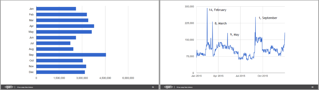
What can be improved here? Firstly, time is such a thing that in the minds of most people flows from left to right, therefore it is better not to use horizontal bars for data that changes in time, unlike almost any other case. In addition, if you rotate the chart from slide 36, you can overlay the chart from slides 37 and 38, and the viewer will have the previous version of the attempt to solve the problem for contrast. Of course, the situation that Roman shows is quite simple, so here it is understandable without all these tricks, but in some more complicated case this will save the audience a lot of energy.

In order not to suffer with two scales, it is better to completely remove the vertical axis, leaving only a qualitative comparison. I understand that a real data scientist will not do this during real work, but here we only need to convey the idea. I did not ask the speaker for the source of the schedule, otherwise I would remove the grid.
Side note: Interestingly, Valentine's Day is cooler than March 8th. However, maybe in the next stall everything is different.
Honestly, the noticed negligence does not catch the eye, but since I got caught, I will not say anything. Firstly, in several places the objects on the slide are shifted without any obvious need. The problem here is that if the object has not changed, but has moved, the eye still captures the change, and the mind is no longer sure whether the object has changed or not. And since the previous object has already left the field of view, then the conscious effort cannot compare them either. Therefore, immutable objects should not spontaneously jump on the slide.
When switching between slides 22 and 23, it is noticeable that the upper block of code is jumping, although it has not changed. The same thing happens with the bottom block of code between slides 30 and 31. It’s even clear how it turns out: since manually lancing on the slide is too lazy, it’s more convenient to copy the code from the IDE as a screenshot. Further on one of the slides, the picture accidentally moves or resizes, and the author does not notice this. It is better to refuse syntax highlighting, but have the code in the form of text: it is easier to align.
Another fun thing was found in the sales of the flower stall, which we already looked at above. The year on slides 33-35 and 37-38 does not coincide:
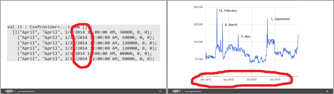
This may have many valid explanations, but the sediment remains.
If you want to receive feedback on your presentation, then I will gladly provide it to you.
On Wednesday, June 7, at about seven in Moscow, we are holding a joint event with Kirill Anastasin . We have accumulated a decent list of typical mistakes that speakers often make before entering the stage: when choosing a topic and during preparation. If you start speaking, come: it will be useful.
It is logical that this performance took place on DotNext in December 2016:
Slides can be found here .
Traditional Disclaimer: About .NET, only the report parsed in the article, not the article itself.
Speaker Behavior
In the previous reviews, there was no reason to focus on this, but Roman wrote separately that he considers himself not a very experienced speaker, so I will comment on a couple of points.
Please note that the speaker’s gaze returns to the hall very quickly every time he has to look somewhere to the side. The story contains code on slides, demos, and other things that require the attention of the speaker. Very many people, even quite experienced people, have a glance after this for a long time sticking on the screen, and Roman copes well, that is exactly what needs to be done.
Another remarkable moment came at about 3:45 a.m.. If a person was put on the podium and ordered to stand there, because the camera is aimed there, he will often do so, even if it is inconvenient. In this case, the speaker did the right thing: his discomfort during the speech should be corrected immediately if possible, and the camera will somehow adjust.
A speaker who is lively and in touch with the audience can afford more flaws in the content and slides and still perform well. Of course, no contact with the audience can save the failed nonsense, but the speaker’s liveliness gives a normal story a lot of credibility points.
Plot
In general terms, the meaning of Roman’s story is as follows: there are typical tools that a data scientist needs, and so far this set of tools has not been associated with .NET. Meanwhile, within the framework of the platform, there is an excellent F # tongue, in which almost everything is already there, take it and use it.
The target audience
Suppose the goal of the performance is to popularize F #. Since this is a tool at the junction of .NET and data science, it would be promising to go to those who have data science and sell them .NET + F #. It is hard to imagine how to transfer to .NET a researcher who now has a completely different technology stack, and the developers who surround him do not use .NET either, but it seems to me that the sales market is there. At the .NET conference, there are hardly a lot of people who suddenly slap their foreheads and realize that F # is suitable for solving their problems.
Listing vs. history
I am deeply convinced that a story with a plot, at least somehow, into which technical information is interwoven, works better than simply listing these technical information. In the report, we see aspects of the data scientist's work, backed up by small tasks on F #. There are several problems with this approach.
Firstly , it does not follow from all of this that the system as a whole is suitable for solving global problems.
Secondly , every task, even if it’s small, has to be comprehended by viewers from scratch, having previously thrown out the previous one. During the report, we encountered the following subject areas:
- Distribution of developers by country
- Flower sales
- Contact Lens Recipes
- Third World Macroeconomic Indicators
- Bicycle rental + linear regression
- Stock price analysis
Since the task is completely new each time, the conditions have to be explained from scratch, and part of the previously accumulated information the viewers have to unload from their heads. It seems to me that one big cross-cutting story would have looked more advantageous, in which along the way tasks would have arisen that could demonstrate the power of F #. It’s easier to put an integral picture in the head of the viewer.
At the same time, a real or similar task is better than a clearly fictitious one. Even if this is custom development and all real tasks under the NDA, quite often the customer is not opposed to the story, since we do not need to disclose anything truly confidential. Having asked the customer for permission, we lose nothing.
Live music
If we have a cross-cutting task, it will be a little easier for the audience, but it may take more time: it will be necessary to do an intro to the subject area, describe the solution architecture (which is also referred to more than once), and the code, probably, will be harder. In order to find this time, I propose to reduce the demonstrations, which now is the time to say a few words.
In my opinion, the demonstration organically looks in the hands of the front-end. True, that’s how it slows down, but commercials - no longer. It produces beautiful 3d effects, but it doesn’t work out there. With a demo, you can immediately relate the code and the effects that it produces. But even this can be done with a pre-recorded screencast.
There is no need to demonstrate the server application live, it is easier to show the result of its work on a slide. The audience, even without demonstrations, is inclined to believe the speaker if he as a whole looks reasonable and says plausible things.
Separately, I want to criticize the demo with linear regression of bike rental (starts at 27:20) For those unfamiliar with linear regression, it doesn’t give anything, because the code appears and disappears quickly, and all the time there are references to relevant mathematics. Here Roman says just not quite plausible things, and from this it becomes very difficult to follow. If we don’t like the mistake we received in some kind of machine learning (whether this term refers to linear regression is a separate philosophical debate), then feeding all the available data into training is a bad idea. First of all, the thought of retraining comes to my mind, and not at all that there is some kind of fake dataset and there is no natural noise in it. That is, it was not mathematically accurate to tell here, and even a flicker between applications.
conclusions
Based on the results of the report, I am ready to believe that F # has everything that is needed, so it seems that you do not need to repeat this in a separate summary slide. Outside of the brackets are limitations and performance, but you can’t talk about everything.
Slides
The slides are quite decent, so most of my comments are minor improvements. The main thing that’s good is that on the slides there is something that needs to be shown, and there is no excess text. That is, the slides fulfill exactly the role that they should play in an ideal world: the role of illustrations for the speaker’s speech.
But to improve, of course, there is always something.
The code
A significant part of the code appears on the screen during demonstrations, but it is also a lot on the slides. I have some suggestions for the code.
On slides 22-25, classes that need to be implemented in order to wrap around the Stackoverflow API call appear in sequence. On the one hand, I want to focus on the word sequentially : it’s right, it’s better to open all any complicated objects in parts. But you can make this process cleaner. Look, in the end, everything comes to three additional classes:
You can immediately see on this slide why these three additional classes were needed? It takes some time, right? Therefore, I propose to highlight only what should be looked at:
It seems to me that it is much more clear which of them is pulling whom. When sequentially opening pieces of code, the highlighting of already worked out sections can, of course, be removed.
Slide 51, on which there is a lot of code, appears in the report at 20:33 and shows two seconds with the comment “not the essence”. I think it's better to just remove it. No need to show people anything that they should not look at.
Saving Context
Every time we show the dynamics of a process or successive approximations to a solution, it is better to change in the picture only what we want to draw attention to. All other information, while it remains relevant, is best left in place. In most places, the novel does just that, but on slides 36-38, I suggest redrawing the diagrams:
What can be improved here? Firstly, time is such a thing that in the minds of most people flows from left to right, therefore it is better not to use horizontal bars for data that changes in time, unlike almost any other case. In addition, if you rotate the chart from slide 36, you can overlay the chart from slides 37 and 38, and the viewer will have the previous version of the attempt to solve the problem for contrast. Of course, the situation that Roman shows is quite simple, so here it is understandable without all these tricks, but in some more complicated case this will save the audience a lot of energy.
In order not to suffer with two scales, it is better to completely remove the vertical axis, leaving only a qualitative comparison. I understand that a real data scientist will not do this during real work, but here we only need to convey the idea. I did not ask the speaker for the source of the schedule, otherwise I would remove the grid.
Side note: Interestingly, Valentine's Day is cooler than March 8th. However, maybe in the next stall everything is different.
Negligence
Honestly, the noticed negligence does not catch the eye, but since I got caught, I will not say anything. Firstly, in several places the objects on the slide are shifted without any obvious need. The problem here is that if the object has not changed, but has moved, the eye still captures the change, and the mind is no longer sure whether the object has changed or not. And since the previous object has already left the field of view, then the conscious effort cannot compare them either. Therefore, immutable objects should not spontaneously jump on the slide.
When switching between slides 22 and 23, it is noticeable that the upper block of code is jumping, although it has not changed. The same thing happens with the bottom block of code between slides 30 and 31. It’s even clear how it turns out: since manually lancing on the slide is too lazy, it’s more convenient to copy the code from the IDE as a screenshot. Further on one of the slides, the picture accidentally moves or resizes, and the author does not notice this. It is better to refuse syntax highlighting, but have the code in the form of text: it is easier to align.
Another fun thing was found in the sales of the flower stall, which we already looked at above. The year on slides 33-35 and 37-38 does not coincide:
This may have many valid explanations, but the sediment remains.
Regular reviews
If you want to receive feedback on your presentation, then I will gladly provide it to you.
What is needed for this?
All this needs to be sent to the p0b0rchy habrayuzer , that is, to me. I promise that the review will be constructive and polite, and will also highlight positive aspects, and not just what needs to be improved.
- Link to the video of the speech.
- Link to slides.
- Application from the author. Without the consent of the speaker himself, we will not analyze anything.
All this needs to be sent to the p0b0rchy habrayuzer , that is, to me. I promise that the review will be constructive and polite, and will also highlight positive aspects, and not just what needs to be improved.
A moment of shameless self-promotion
On Wednesday, June 7, at about seven in Moscow, we are holding a joint event with Kirill Anastasin . We have accumulated a decent list of typical mistakes that speakers often make before entering the stage: when choosing a topic and during preparation. If you start speaking, come: it will be useful.