5 worst tricks of domestic design from the 90s
In the nineties, when the first computers became available, everyone could become a designer and make a sign for their stall.
A variety of logos are sent to us under the heading #logomachine_help, but many still enjoy the same amateur design from the 90s. We've put together the most common problems in the 5 worst tricks that are best avoided if you don't carry rubble on the truck.

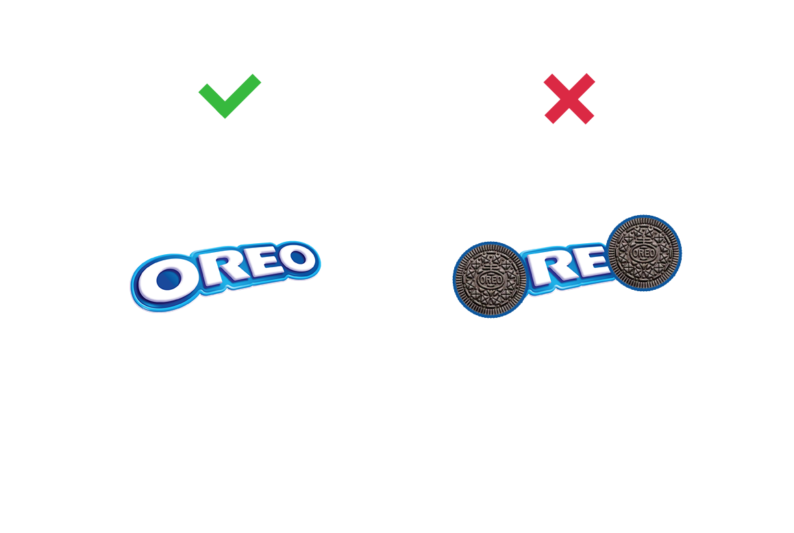
One of the “creative” tricks, which over the years has become like a hackneyed joke joke, told by an elderly taxi driver. Yes, a wheel, cake, or orange looks like the letter “O”. But this is not such a brilliant find to certainly use it. You can without this:

When the designer is afraid that the text does not make an even rectangle, he begins to adjust the sizes of the lines so that they are equal in width. Because of this, each line gets a unique and non-verifiable font size. Do not be afraid of the natural form of the text:


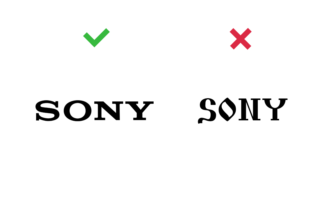
Few people are interested in fonts. Ask to name five favorite fonts - most will not. This illegibility leads to the fact that we are surrounded by unreadable, inappropriate and simply vulgar fonts. If you are not a professional, it’s better not to try to make the font “more interesting”:

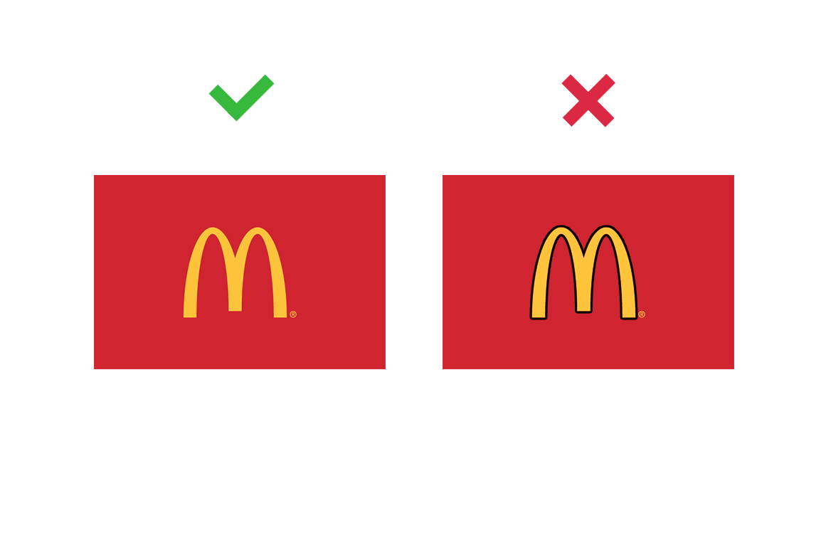
I don’t know where this love came from to separate everything with a black line, but in most cases the stroke is not needed for the shapes.

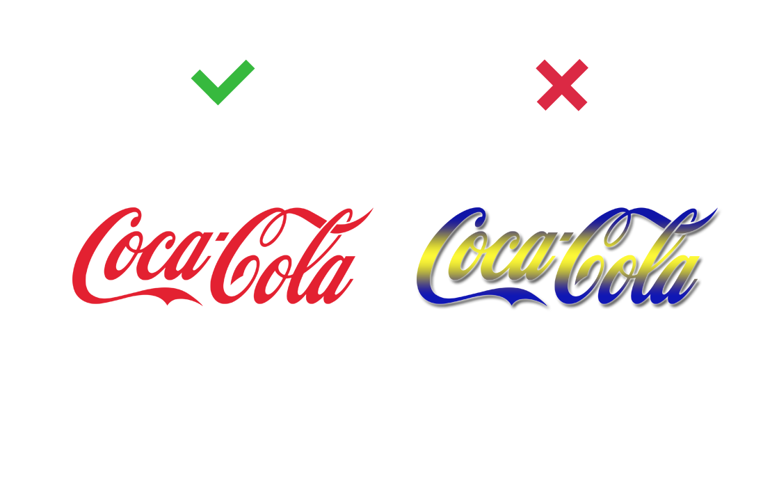
If the third trick didn’t help, and the font still looks boring, you can paint it with a gradient and add a shadow! Use with caution:
These are the tricks that are found on city streets and in RuNet most often. Of course, all of them can be used for good, to make a unique and expressive design. But more often they talk about bad taste or an outdated product - beware!
And, as always, good luck in design
A variety of logos are sent to us under the heading #logomachine_help, but many still enjoy the same amateur design from the 90s. We've put together the most common problems in the 5 worst tricks that are best avoided if you don't carry rubble on the truck.

First method, creative: use the full potential of the letter “O”

One of the “creative” tricks, which over the years has become like a hackneyed joke joke, told by an elderly taxi driver. Yes, a wheel, cake, or orange looks like the letter “O”. But this is not such a brilliant find to certainly use it. You can without this:

Reception of the second, typographical: to align the inscriptions in width

When the designer is afraid that the text does not make an even rectangle, he begins to adjust the sizes of the lines so that they are equal in width. Because of this, each line gets a unique and non-verifiable font size. Do not be afraid of the natural form of the text:

Reception third, accidental: pick up a font more interesting

Few people are interested in fonts. Ask to name five favorite fonts - most will not. This illegibility leads to the fact that we are surrounded by unreadable, inappropriate and simply vulgar fonts. If you are not a professional, it’s better not to try to make the font “more interesting”:

Reception Four, Professional: Circle

I don’t know where this love came from to separate everything with a black line, but in most cases the stroke is not needed for the shapes.

Reception fifth, expressive: add effects to the font

If the third trick didn’t help, and the font still looks boring, you can paint it with a gradient and add a shadow! Use with caution:

Total
These are the tricks that are found on city streets and in RuNet most often. Of course, all of them can be used for good, to make a unique and expressive design. But more often they talk about bad taste or an outdated product - beware!
And, as always, good luck in design
