 January 22, 2017 at 16:44
Cases: development of specifications and guidelines (web ui kit)
Today I will share my experience in developing graphic documentation for guidelines. This turned out to be my second assignment for Viline. And as you do not remember from the first part , I did the redesign of the video course page. In this article I will describe the process of developing the style of all elements and various states. I’ll think up and formulate some rules so that the interface is balanced and accessible, taking into account the audience ...
By the way, if you use Figma , I recommend paying attention to our ready-made design systems . They help freelancers complete more orders per month, programmers are allowed to create beautiful applications on their own, and team leads “sprint” sprints faster using ready-made design systems for team work.
And if you have a serious project, our team is ready to deploy a design system within the organization based on our best practices and tailor it to specific tasks using Figma. Web / desktop, and any mobile. We are also familiar with React / React Native. Write to T: @kamushken
In the first chapter, I forgot to mention that it was necessary to act on the basis of the approved color scheme. The task of inventing and offering new colors was not. To select a color, sometimes I use Adobe Color CC (authorization is required (!)) Or ColorScheme.ru . I insert the code for the main color, and then select shades for it in different modes: analog, monochrome, triad, etc. Very strong and harmonious contrasts can be selected, for example, in the triad mode. This is me because I couldn’t get the best gamut from where, but there were no such wishes.
I also had questions about the Open Sans font, which was used in the current version of the site. He seems to be less and less common in the everyday world. Now relevant: Helvetica, Lato, Source Sans Pro, Roboto, etc ... But this question, it turns out, was at the stage of rethinking by marketers.
I’ll make a reservation right away: you will not see colorful and trendy pictures with designs that pop up to the top on behance or dribbble. I have little doubt that women will be able to stay on the site for a long time, the design of which is made in such a style. This is the main audience, and I will take this factor into account. Nevertheless, I will try to improve the overall picture, as far as the framework set by the client and my experience allow me.
Guidelines
Guidelines are a set of rules and / or recommendations for shaping the appearance of a product. They are formed by the designer and described in an understandable way for developers. On the one hand, this is a sentence for the first, because in the future, new sections of the product can be visualized without a designer, relying on a graphic document. On the other hand, nowadays the addition of the interface designer to such documentation is already - is a must, now the bar is quite high. So the guidelines are recommendations for: colors, fonts, elements, states, iconography, sizes and indents.
Let me remind you that the main audience of the web-product in my case is young or expectant mothers. I need to adhere to: customer-approved colors; a font that he considers optimal for his audience; the radius of the fillet corners of the elements. The latter is necessary so that the elements in the eyes of the fair sex do not look too “sharp” or “angular”.
1/15: Circe Font

Important news from the marketing team at the start: we are leaving Open Sans and taking Circe as the main font.
Font Description
Circe is a geometric grotesque with a human face and many nice additions. The headset consists of 6 styles of different saturations, from thin to super-fat. The font owes its name both to the geometricity of forms and the process of creation, turned into mass entertainment, and to a peculiar, somewhat dangerous character. While the basic forms of Circe are quite calm geometric grotesque with some humanistic features, alternative forms and signs with strokes can completely change the nature of the font. On the one hand, a designer can enjoy a variety of forms unprecedented in the Cyrillic alphabet, but, on the other hand, the only restriction for all this variety is only the taste and common sense of the user, so that to some extent the font becomes dangerous for him, as the sorceress of Circe for the Odyssey sailors. Circe's super-expanded iconic composition, which includes both characters for most European languages based on Latin and Cyrillic letters, and a huge number of alternative and stroke options, is organized into stylistic sets that allow you to quickly, conveniently and flexibly change the nature of the set. The font is good both in a fairly small text set, and in large pins, for example, in magazine headlines, posters, etc. Designer - Alexandra Korolkova. The font was released by ParaType in 2011. conveniently and flexibly change the nature of the set. The font is good both in a fairly small text set, and in large pins, for example, in magazine headlines, posters, etc. Designer - Alexandra Korolkova. The font was released by ParaType in 2011. conveniently and flexibly change the nature of the set. The font is good both in a fairly small text set, and in large pins, for example, in magazine headlines, posters, etc. Designer - Alexandra Korolkova. The font was released by ParaType in 2011.
Speaking in your own words: the font is unconventional for the web, in style it is closer to the typographic one, it has a “literary sound”. These are purely my associations. If we compare Open Sans and Circe, then the latter wins a little in density
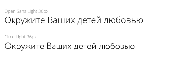
Okay, the new font is approved. Suggestions for rounding corners from marketers: use a 6px radius. Agreed, I will consider! (by the way, a rather rare wish in my practice). You can start working on all the elements.
2/15: Colors
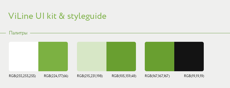
The palette in the center is the received diagram from the client. The color scheme is on the left: I lightened the green a little (it is useful to us for oncovers) and placed it next to the white. So you can roughly imagine how a typical card will look in design. The shades on the right are an example of rendering green next to contrasting black. An urgent need for such use was not foreseen, it was rather done for a change. The overall background of both the site and this ui kit remains #EFEFEF (light gray), this will avoid strong contrast on mobile devices.
3/15: Typography
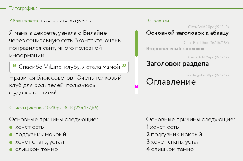
These are guidelines for using text dimension. I drew a paragraph of the text, embedded a quote in it. Made several types of headers. And added regular and numbered lists. An example of a scroll bar is also here, it was added later. In fact, these text rules do not have to be rigid. If you need to put a paragraph of text in small 14px font - yes, please. The main thing is to observe the proportionality of the text. For example, a paragraph of text in small print would look strange with a large heading “Table of Contents”.
4/15: Links
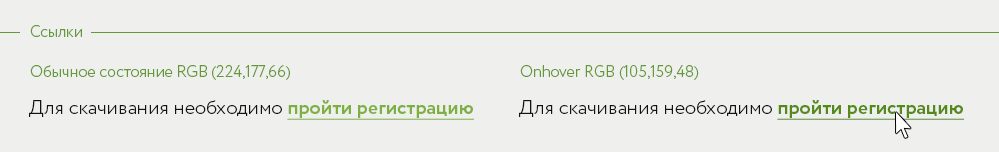
Nothing new and extraordinary. In general, the color of the links is still controversial. My position is this: if the design uses blue or blue shades of color for reference, then you can do without underlining. If my own color is used, then personally I always use the underline underline font. This is something like an unofficial standard and the user quickly realizes that this text is clickable. Later, by the way, marketers replaced the color of the links with orange. I did not mind, the main thing is that the links remain underlined.
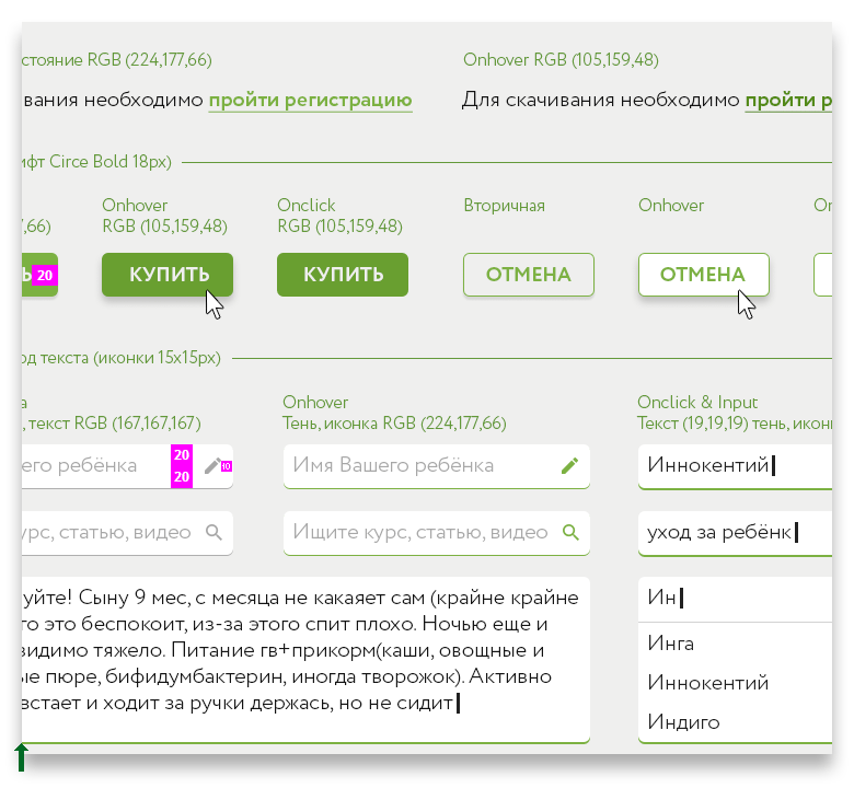
5/15: Buttons
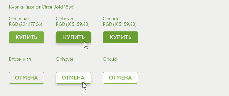
In this section, you need to take into account all the possible states of the buttons and work through them. I separate the types of buttons into the primary and secondary ones (or the ghost button as they are called). Logically, the main button leads to a priority action, and the secondary button leads to the action, which we want less from the user. Design manipulation again. Here is an example of such use:
Now theories of Google Material Design are actively used in design, so these days, many buttons again began to look like buttons. Some physics from the real world began to be applied to interface design. The button in the normal state has a slight shadow; when you hover the mouse, the shadow becomes larger and more blurry - the button “rises” higher; when clicked, this shadow disappears, simulating the “pressing” of the button. Here is a pseudo-three-dimensionality that connects design a little more with the real world. As far as I remember, this came from the application guidelines for smart tv, where users sit in a certain range of distance from the TV and it is vital to use noticeable shadows with a high blur coefficient. This greatly facilitates the perception of what is happening.
6/15: Entering text
If we again refer to GMD, then we can see that the tendency to use such inputs is:
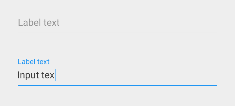
It is increasingly found in web-products. If you prefer Android, understand or work in the field of IT, then with such inputs you are like “fish in water”. But for a female audience who prefers the iPhone mostly, such an ascetic style for text input elements is rather a pain. I tried to find a middle ground and proposed a design when the input still remains an input, but it also has some GMD roots:

Any form of input below has a 1px underline shadow without blur. When you mouse over it turns green; when clicked, it thickens and turns green, demonstrating the state of in action. The pencil icon on the right is an experimental attempt to add “too much clarity”. In some cases, this icon can enhance the meaning: ordinary input - pencil; search input - magnifier; password input input - lock icon, for example; etc. An example will be closer to the end of this article.
7/15: Drop-down lists

Their principles of response are carried out in the same way as input. When you hover over the mouse, the icon color and underscore changes. When you expand the drop-down list, a more voluminous shadow appears, still “raising” the element in the plane above. If you approach the matter with due attention, then it is worth thinking about the expanded state. The icon is flipped, the active line is highlighted by bold, and when onhover, we tint the background with a light shade of the main green color.
8/15: Sliders
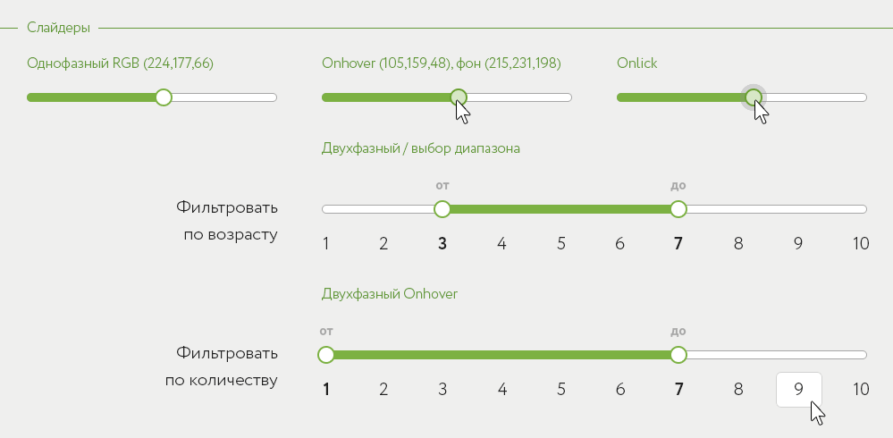
Everything is extremely transparent with them. I’m not inventing anything new here, the standard component, by analogy, is designed in accordance with the guides: fonts, colors and dimensions. The slider can be moved either with a drag of the mouse or by clicking on a numerical value, for example, when it is proposed to indicate the age of the child “from” and “to”.
9/15: Tabs / tabs
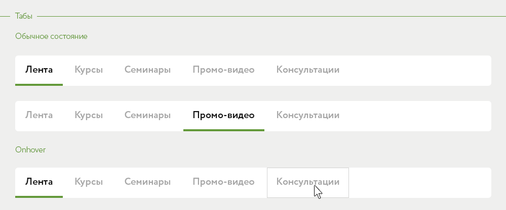
“- Yes, everything is clear, then come on!”
10/15: Selection Items

Here I grouped all the remaining elements: state selection (additional filtering), switches, checkboxes and radio-buttons. For the last two, it’s just a reminder to the developers that the visibility of the selection is enhanced by the intensive writing of the text. Well, with the rest, it seems to me everything is obvious.
11/15: Table
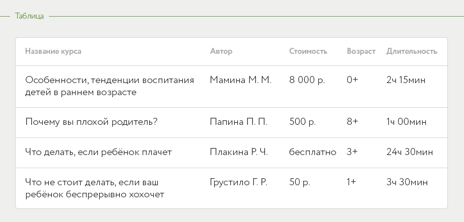
I supplemented the kit with an example table too. Everything is standard, I use only a common similar style. Of course, the table is more useful if the specifications for indentation are given. More about them, by the way, at the end of the chapter.
12/15: Iconography
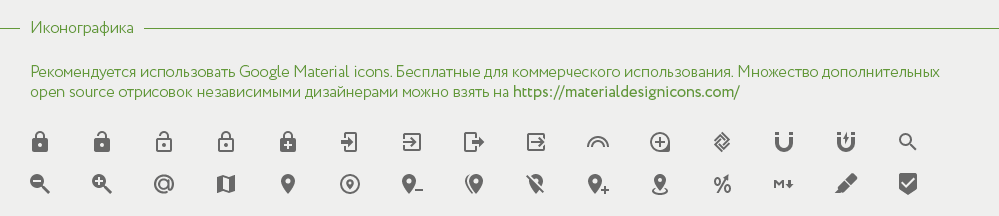
Recommendations and examples of the use of icons. I believe that the intense and conspicuous GMD icons have stymied the evolution of iconography. Once upon a time there were pixel ones, then convex ones, somewhere between them the ios circuits (outline) entered the trend, a color flat-style flashed for a short while (remember when an infinite pseudo-shadow stretched at an angle from the object?). And then Google came and said how to do it. And if you do not go deep into the lyrics, then I have been using only GMD icons recently for my versatility and performance. You can take a lot of metaphors from independent icon designers here (free, give all sizes, png / svg / zip, hint: it is convenient to right-click and download the desired size). I think that intensive icons are more understandable and noticeable (and here there should be a reference to traffic signs).
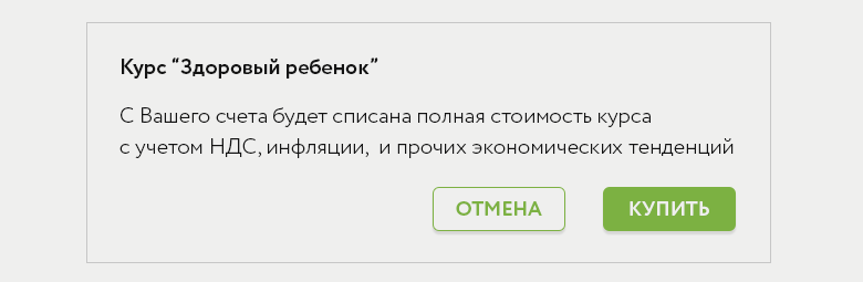
13/15: Cards
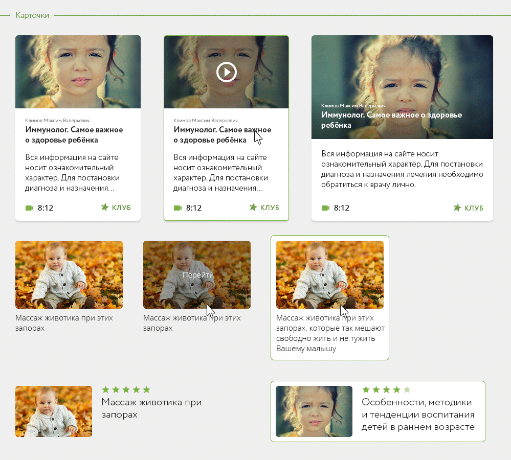
This is already a transition from individual worked out elements to their combinations. I made several options for cards to use on the site, because it was an actual way of presenting some information, and the client’s personal preference.
But I always remind you that it is undesirable to overdo it with them in design. Best of all, their meaning is understood in conjunction with the specifications:
There are no strict rules in determining the composition of cards. If you observe the dimensions of the indents indicated by me, then almost any will look uniformly with the developed guidelines.
14/15: Login

As a bonus, I worked through the login / registration popups, made a layout with an example of use. This is more needed to visualize how a full-time web designer of the project could independently assemble any section for the product without my participation in the future. All that needs to be done is to take ready-made elements from the source and arrange them evenly in accordance with the specifications.
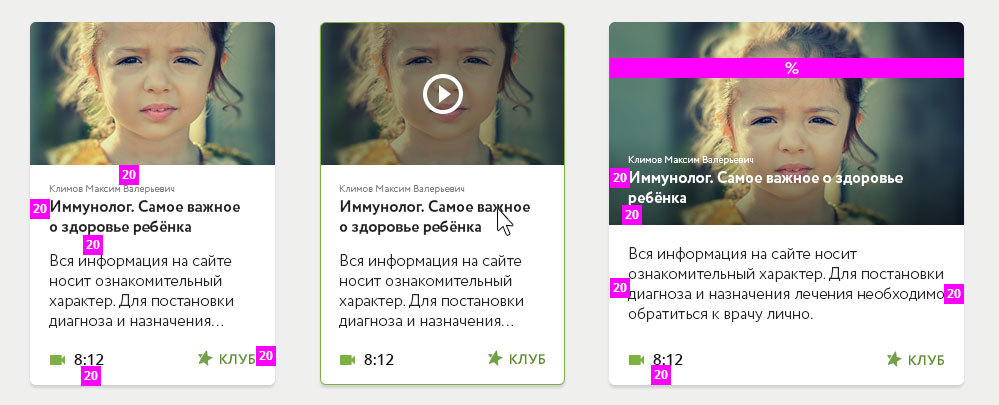
15/15: Specifications

They are in a separate group in the source. The group can be made visible and speks will be rendered. Without them, this user interface kit would be inferior. Respecting proportions of dimensions and indentation leads to a balanced interface. If I do not give instructions on this subject, then there is a risk that it will be done differently. And then I can not guarantee quality implementation.
If you prefer an 8px grid, then it is worth considering that all indents are multiples of 8; if you use a 10px grid, as in my case, then you will not find in this design the distances between elements at 13 or 27px, all indents will be a multiple of 10.
The rules exist for the number of colors and their shades: I did not use too many shades of gray, for example - there were no more than three of them in this set. I'm sure with my owninterface rules are easier for both designers and developers. Although there are exceptions, if the system gives feedback with different states, then red and blue, etc. may be required. to enhance the semantic difference (for example, for pop-up notifications).
Chapter conclusion
- Guidelines for graphic documentation are a visual language for developers to continue product development and not engage a designer again.
- A set of guidelines can be developed taking into account the goals of the future product. Fonts, colors and general styling can take into account the specifics of future users of the resource / application.
- To optimize the interaction, the guidelines should contain recommendations on element dimensions and indentation.
- It is desirable, but not necessary, that the kit also includes examples of ready-made solutions. This can be a shopping cart, product page, friend, cards, landing page, etc.
- The modern approach is to return to the client not a sketch / psd file, but give html / css code. Some time ago I completely switched to Axure, and it copes with this task quite effectively.
In addition, I propose to see how other colleagues in the workshop solve similar problems. It’s good to have someone to take examples from:
- Jan Losert is very cool, his UI overview for Tapdaq is just perfect
- Although Mateusz Dembek is a little smaller, he nevertheless famously designed the Deskmetrics Ui Style Guide
- Greg Dlubacz picked up and made a strong dark eversion with dashboard elements | and designed in a light range Retail Banking Service
- Cupi Wong is not so extensive, but stylishly designed AfterShip guides
- Jeremy Sallée describes everything in great detail about design in the Nutanix Product Guideline
I apologize that it did not work out in two chapters. If you look ahead, then suddenly there are many tasks performed for Viline. In the next chapter, I will “pull” these guidelines on the course page from the first part , and also talk about the redesign of the “Consultations” section - an important interaction environment for young mothers and Viline experts who promptly answer their questions for free. ↑ Until we meet again ...