What italics are and how to use it: 12 practical tips
- Transfer
We already wrote that typography and its selection have a great influence on the quality of mailing in particular (and life in general ). Of course, when choosing the main font for writing, you need to focus on its readability (we talked about which fonts and their characteristics are most popular with well-known brands that create mailing lists here ).
However, as in any high-quality text, it is important to place emphasis in the mailing list, including visual ones (why it is so important and how to do it, read in this topic ). Italics, which will be discussed in the material of the Typogrpaphy.com resource, can do just fine with this task - we present to your attention its adapted translation.
Italics, perhaps, is the brightest part of any font family, standing out from the background of its “brothers”. Below we will talk about 12 varieties of italic fonts along with a description of their cultural and historical heritage and practical application.
Unlike a direct font, italics are more like handwritten text. As in the handwritten text with which we make shopping lists or official invitations, different types of italics can reflect a completely different mood. Understanding the features of italic fonts can make them a valuable tool in the hands of the designer.

Some calligraphy masters believe that italics reached their peak in the 16th century in a style known as clerical italics. These calligraphic lettering with thin and thick strokes and sharp angles looking upward were drawn with a wide-pointed pen. Stationery italics has long been considered an element of luxury that allows you to express joy in a wedding invitation or touching in a collection of poems. As an example, we took the pleasant Requiem Italic style.
Tip : Since graceful, elongated extension elements are used in clerical italics, the line spacing should be increased.


Many "lively" types of italics are made in the style of postmodernism and contain elements of various genres. The basis of this design is letters with a fixed width: they are made taking into account the features of direct and handwritten fonts and have a welcoming and lax appearance. This headset has nine degrees of saturation, so that the light and super-bold font styles are very different.
Tip : The Eclectic italics of Operator recalls the variety of styles that make up a headset. The difference between capitals and lowercase letters or between light and bold can be no less pronounced than between direct and italics.


This sophisticated design of letters in the traditional English style has nothing to do with the history of the casting of the font. Initially, it was used in mapping - in the names of water bodies. Instead of serifs, the letters have long and smooth “tails” below: they help the gaze follow the wavy line of the font, resembling the meandering shape of the course of a river or coast. Such a style can be a great solution for a designer who needs to impose a font on a curve, especially in icons and logos where there are small letters.
Tip : Choose the line thickness in Surveyor fonts according to the opticalsize required in specific conditions. Surveyor Text is more suitable for plain text, Surveyor Display for standard headings, and Surveyor Fine for larger labels.


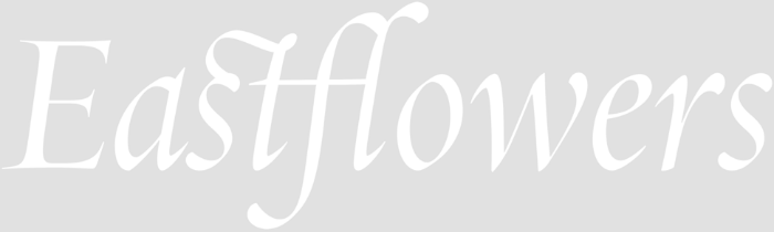
Old-style Dutch fonts look rich and vibrant at the same time. After its appearance in the 17th century, when the airborne Garamond was replaced by a more severe Northern European style, these headsets began to be used more often in cases where you want to get a dense color and preserve the classic look of the text. Their saturation is especially appropriate when the text is displayed on an opaque background, like a white font on a gray background in the figure above.
Tip: Bold strokes and sweeping curves make headsets like Quarto a good option for both increasing and decreasing tracking. Inscriptions with widely spaced uppercase letters, as in the example above, will express solemnity and grandeur, while dense text can be made friendly and more readable.


The proliferation of posters and posters during the sunset of the Industrial Revolution led to the first bright italic fonts. These headsets, oddly enough, called “bold”, will look spectacular in any size, if the design is selected correctly.
Tip : The Surveyor Fine Black Italic font has a decorative counterpart in the Obsidian family. In particular, Obsidian Italic contains the same extensive kit.font characters as the Surveyor, including small caps and strokes.


The angles of inclination of the italics form its personality. The font, slightly inclined at an angle of 6 °, can be gentle and lyrical, but if you tilt it at 15 °, it will immediately become lively. This energetic super-cursive is made at the highest possible angle of 28 °, reflecting speed and sharpness. This headset , suitable for both political campaigns and motorcycling competitions, is used by designers everywhere they need to express unstoppable power. Among other things, the family is complemented by an oblique font tilted to the left, offering an alternative to direct and italic fonts.
Tip: Despite the dense arrangement of letters by default, the Nitro headset non-standard solves the issue with letter spacing. A strong slope sets an energetic pace so that the reader’s gaze moves faster along the line, so that even tightly knit text will remain coherent and legible.


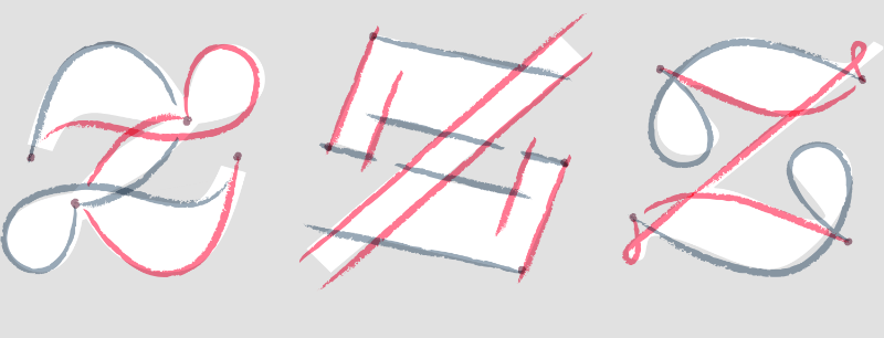
Uppercase letters with a stroke, which have been an element of typography since the advent of the first italic fonts, reached their peak in the old-style French fonts Garamond and Granjon. Although strokes are usually used only at the beginning of a word, many headsets contain curls in capital letters. At the same time, it is important to ensure that letters with intricate curls do not interfere with their neighbors.
Tip: In Hoefler Titling Italic, the strokes C, E, J, K, Q, S, T, X, Y, and Z are designed so as not to interfere with adjacent letters. Mid-word strokes are used in Hoefler Text Italic headsets.


Some italic fonts resemble handwritten handwriting, following the natural movement of the hand; others look like a straight font made at an angle. Headsets of a new style often contain elements of both of them, combining smooth transitions between lowercase letters with a fairly strict capitalization. Such a balance between technical accuracy and aesthetic liveliness is popular in applied arts and is especially characteristic of the typography of cultural institutions and architectural objects, but is most often found in the field of fashion .
Tip: Fashionable typography - both in magazines and in advertising - has long held on to the accuracy and elegance of the HTF Didot headset. In addition to its well-known direct fonts, it is worth paying attention to more rare variants of italics. They express the same depth with a slight grace.


Antique style headsets have massive serifs without rounding - at least their direct fonts. No less original and rarer Antique Italic. Its thick fillets and barely noticeable teardrop-shaped elements form a texture that distinguishes it from a direct fellow and while maintaining the same solidity and audacity of the style. Universal Antique fonts express not only calmness and seriousness, but also warmth and mobility at extremely high saturation, which makes the font bright and catchy.
Tip: Despite the fact that headsets like Sentinel are often considered incidental, they can be successfully used in the main text . Given the full range of font saturation, their clear elements and sophisticated structure will be clearly visible even in a very small set. Depending on your taste, the light, normal and bold font styles of this family can be taken as the “usual” saturation for the text.


Many grotesques, in accordance with their logic, italics are often too restrained and look like a regular font with a slant. However, in working with more humanistic headsets, it makes sense to choose a different approach that uses italic types specific to serif font designs. The protruding elements and neatly rounded lines in the example above give italic style close to handwritten.
Tip : A sans-serif font with smooth italics can be used in the main text . Ideal Sans Italic includes not only elements of the handwritten font and oval shapes, but also a closer arrangement of letters compared to the direct font, which gives it a special rhythm.


One way to bridge the gap between the formality of a printed font and the informality of a handwritten one is to create mixed letter forms that combine typographic and calligraphic elements. This approach is applied in Archer Italic italics, eliminating a number of contradictions inherent in the original design. The headset should be informative, but not pedantic; attractive, but not catchy; sweet, but not sugary - the balance arose as a result of mixing strict serifs and smooth "tails" in one letter. Many notable details in the design of lowercase letters, such as the teardrop-shaped element in lowercase C, are now also used in capital letters. This non-standard move further softened the style of the block font, which could become too strict.
Tip: Drop-type fonts with drop-shaped elements may look unusual at extreme degrees of saturation, often losing balance in the bright part of the spectrum and becoming inappropriate when super-bold. Pay attention to the design of fonts, which with super-light saturation become clear and restrained, and with super - greasy - strict and peppy. The headset can also be used in plain text - there is no need to additionally look for a suitable serif font.


Some of the most interesting types of italics have no historical background at all. The above option disputes the idea that all italic fonts should have a rounded shape. Such a font can be effectively used in projects where historical links or visual cliches should be avoided.
Tip : Italics with an unexpected design can produce the desired effect if used to the best of their ability. Fonts where such a design is used sparingly - from logos and monograms to individual letters, attract more attention .
However, as in any high-quality text, it is important to place emphasis in the mailing list, including visual ones (why it is so important and how to do it, read in this topic ). Italics, which will be discussed in the material of the Typogrpaphy.com resource, can do just fine with this task - we present to your attention its adapted translation.
Italics, perhaps, is the brightest part of any font family, standing out from the background of its “brothers”. Below we will talk about 12 varieties of italic fonts along with a description of their cultural and historical heritage and practical application.
Unlike a direct font, italics are more like handwritten text. As in the handwritten text with which we make shopping lists or official invitations, different types of italics can reflect a completely different mood. Understanding the features of italic fonts can make them a valuable tool in the hands of the designer.
Some calligraphy masters believe that italics reached their peak in the 16th century in a style known as clerical italics. These calligraphic lettering with thin and thick strokes and sharp angles looking upward were drawn with a wide-pointed pen. Stationery italics has long been considered an element of luxury that allows you to express joy in a wedding invitation or touching in a collection of poems. As an example, we took the pleasant Requiem Italic style.
Tip : Since graceful, elongated extension elements are used in clerical italics, the line spacing should be increased.
Many "lively" types of italics are made in the style of postmodernism and contain elements of various genres. The basis of this design is letters with a fixed width: they are made taking into account the features of direct and handwritten fonts and have a welcoming and lax appearance. This headset has nine degrees of saturation, so that the light and super-bold font styles are very different.
Tip : The Eclectic italics of Operator recalls the variety of styles that make up a headset. The difference between capitals and lowercase letters or between light and bold can be no less pronounced than between direct and italics.
This sophisticated design of letters in the traditional English style has nothing to do with the history of the casting of the font. Initially, it was used in mapping - in the names of water bodies. Instead of serifs, the letters have long and smooth “tails” below: they help the gaze follow the wavy line of the font, resembling the meandering shape of the course of a river or coast. Such a style can be a great solution for a designer who needs to impose a font on a curve, especially in icons and logos where there are small letters.
Tip : Choose the line thickness in Surveyor fonts according to the opticalsize required in specific conditions. Surveyor Text is more suitable for plain text, Surveyor Display for standard headings, and Surveyor Fine for larger labels.
Old-style Dutch fonts look rich and vibrant at the same time. After its appearance in the 17th century, when the airborne Garamond was replaced by a more severe Northern European style, these headsets began to be used more often in cases where you want to get a dense color and preserve the classic look of the text. Their saturation is especially appropriate when the text is displayed on an opaque background, like a white font on a gray background in the figure above.
Tip: Bold strokes and sweeping curves make headsets like Quarto a good option for both increasing and decreasing tracking. Inscriptions with widely spaced uppercase letters, as in the example above, will express solemnity and grandeur, while dense text can be made friendly and more readable.
The proliferation of posters and posters during the sunset of the Industrial Revolution led to the first bright italic fonts. These headsets, oddly enough, called “bold”, will look spectacular in any size, if the design is selected correctly.
Tip : The Surveyor Fine Black Italic font has a decorative counterpart in the Obsidian family. In particular, Obsidian Italic contains the same extensive kit.font characters as the Surveyor, including small caps and strokes.
The angles of inclination of the italics form its personality. The font, slightly inclined at an angle of 6 °, can be gentle and lyrical, but if you tilt it at 15 °, it will immediately become lively. This energetic super-cursive is made at the highest possible angle of 28 °, reflecting speed and sharpness. This headset , suitable for both political campaigns and motorcycling competitions, is used by designers everywhere they need to express unstoppable power. Among other things, the family is complemented by an oblique font tilted to the left, offering an alternative to direct and italic fonts.
Tip: Despite the dense arrangement of letters by default, the Nitro headset non-standard solves the issue with letter spacing. A strong slope sets an energetic pace so that the reader’s gaze moves faster along the line, so that even tightly knit text will remain coherent and legible.
Uppercase letters with a stroke, which have been an element of typography since the advent of the first italic fonts, reached their peak in the old-style French fonts Garamond and Granjon. Although strokes are usually used only at the beginning of a word, many headsets contain curls in capital letters. At the same time, it is important to ensure that letters with intricate curls do not interfere with their neighbors.
Tip: In Hoefler Titling Italic, the strokes C, E, J, K, Q, S, T, X, Y, and Z are designed so as not to interfere with adjacent letters. Mid-word strokes are used in Hoefler Text Italic headsets.
Some italic fonts resemble handwritten handwriting, following the natural movement of the hand; others look like a straight font made at an angle. Headsets of a new style often contain elements of both of them, combining smooth transitions between lowercase letters with a fairly strict capitalization. Such a balance between technical accuracy and aesthetic liveliness is popular in applied arts and is especially characteristic of the typography of cultural institutions and architectural objects, but is most often found in the field of fashion .
Tip: Fashionable typography - both in magazines and in advertising - has long held on to the accuracy and elegance of the HTF Didot headset. In addition to its well-known direct fonts, it is worth paying attention to more rare variants of italics. They express the same depth with a slight grace.
Antique style headsets have massive serifs without rounding - at least their direct fonts. No less original and rarer Antique Italic. Its thick fillets and barely noticeable teardrop-shaped elements form a texture that distinguishes it from a direct fellow and while maintaining the same solidity and audacity of the style. Universal Antique fonts express not only calmness and seriousness, but also warmth and mobility at extremely high saturation, which makes the font bright and catchy.
Tip: Despite the fact that headsets like Sentinel are often considered incidental, they can be successfully used in the main text . Given the full range of font saturation, their clear elements and sophisticated structure will be clearly visible even in a very small set. Depending on your taste, the light, normal and bold font styles of this family can be taken as the “usual” saturation for the text.
Many grotesques, in accordance with their logic, italics are often too restrained and look like a regular font with a slant. However, in working with more humanistic headsets, it makes sense to choose a different approach that uses italic types specific to serif font designs. The protruding elements and neatly rounded lines in the example above give italic style close to handwritten.
Tip : A sans-serif font with smooth italics can be used in the main text . Ideal Sans Italic includes not only elements of the handwritten font and oval shapes, but also a closer arrangement of letters compared to the direct font, which gives it a special rhythm.
One way to bridge the gap between the formality of a printed font and the informality of a handwritten one is to create mixed letter forms that combine typographic and calligraphic elements. This approach is applied in Archer Italic italics, eliminating a number of contradictions inherent in the original design. The headset should be informative, but not pedantic; attractive, but not catchy; sweet, but not sugary - the balance arose as a result of mixing strict serifs and smooth "tails" in one letter. Many notable details in the design of lowercase letters, such as the teardrop-shaped element in lowercase C, are now also used in capital letters. This non-standard move further softened the style of the block font, which could become too strict.
Tip: Drop-type fonts with drop-shaped elements may look unusual at extreme degrees of saturation, often losing balance in the bright part of the spectrum and becoming inappropriate when super-bold. Pay attention to the design of fonts, which with super-light saturation become clear and restrained, and with super - greasy - strict and peppy. The headset can also be used in plain text - there is no need to additionally look for a suitable serif font.
Some of the most interesting types of italics have no historical background at all. The above option disputes the idea that all italic fonts should have a rounded shape. Such a font can be effectively used in projects where historical links or visual cliches should be avoided.
Tip : Italics with an unexpected design can produce the desired effect if used to the best of their ability. Fonts where such a design is used sparingly - from logos and monograms to individual letters, attract more attention .
Other materials on the topic of design and typography from " Pechkin ":
- 3 tips for using fonts in emails
- How to Design a Mailing List That Is Not Annoying: 10 Simple Tips
- Interfaces: How not to do the option to unsubscribe from email newsletters
- Interfaces: How to create email subscription forms and alerts
- Experiment: Should I use forms in email
- How-to: Typography in Email Design