July 28, 2016 at 14:23
Graphical user interface as a reflection of the real world: shadows and elements rise
- Transfer

When developing graphical interfaces, they are now trying to gradually get rid of all that is superfluous and focus on functionality. But although functionality is one of the key success factors for a product, the visual component is equally important - especially because it can improve functionality.
In this article I will show how visual elements, such as shadows, can carry information that is perceived by the user of the interface.
Interface evolution: from pseudo-three-dimensionality to super-flat design
Three-dimensional effects and skeuomorphism: an illusion of the depth of the interface
Although the displays have become almost flat, designers and developers have done a lot to make their content seem three-dimensional. Since the inception of graphical interfaces, they have used pseudo-three-dimensional effects (shadows, gradients, highlighting) - helping the user at a glance understand how to interact with one or another element. Such effects created the illusion of depth, informed the user about the position of elements in the hierarchy, and also indicated their interactivity. Among other things:
· Elements that appear elevated look like they can be pressed. So often the buttons are indicated.
· Elements that appear to be depressed (or empty) look as if they could be filled. So often indicate input fields.
The Windows 95 dialog box below illustrates how using shadows and highlighting can create 3D effects.
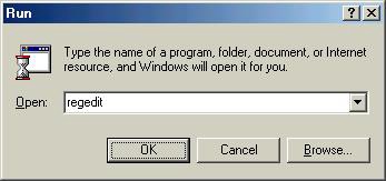
Pay attention to the fact that the buttons seem elevated, and the input field is depressed.
Skeuomorphism became the next stage in the evolution of this idea: now interface elements imitate real-world objects, transferring them to the digital world. Skeuomorphism in the digital world is often associated with Apple products (especially with iOS up to version 7). They really are a great example of how skeuomorphism looks in digital design. Take for example the Newsstand app. It uses a skeuomorphic bookcase with three “shelves” and wood textures. The bookcase metaphor should help users quickly learn how to interact with the application.

Newsstand on iOS6. Cast shadows and background textures - a means of simulating real-world objects.
And yet, early attempts to create three-dimensionality and apply skeuomorphism often made interfaces too cumbersome - they were overloaded with elements and implementation details distracted from the functional.
Flat design: removing shadows, you reduce the potential for mastering the interface.
For every action, there is a reaction. So in the world of digital design, there was opposition to skeuomorphism. The idea was this: no matter how hard we try, the contents of the screen will never look truly three-dimensional, so why not get rid of all this tinsel and focus on functionality?
Unlike three-dimensional design or skeuomorphism, a truly flat design does not even try to reproduce the appearance of objects in the real world. The elements in it are really flat. There is no lighting model, not even light shadows, which would indicate that the element is clickable (because it is as if raised above others) or filled (because it is as if pressed into the surface).
Take, for example, the Microsoft Metro design language in Windows 8.
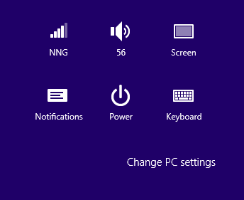
Windows 8 is an example of super-flat design
The exact opposite extreme: everything seems too flat. The “Change PC Settings” element is more like a signature of this group of icons than a button. As a result, many users never use it, without even realizing that it exists. When an element is simply released from view or misunderstood its function, the reason for this is the poor distinguishability of the element and the action associated with it.
Interface designers have made objects so detailed for decades for a reason. All that was rejected by the super-flat design is glare, the effect of elation in buttons or indentation in input fields, that is, various highlighters- were intended to indicate the possibility of interaction with the element. And although the specific means by which this feature was designated varied from application to application, users could always assume that:
- You can most likely click on clearly marked elements;
- Most likely, you cannot click on elements without a clear selection.

Before and after the introduction of flat design - the almost complete absence of elements with a clear selection does not allow to determine exactly which objects are clickable.
For this reason, the complete rejection of any means of distinguishing elements by their functionality is clearly an unsuccessful decision. Users need highlighters - indicators by which you can instantly understand what is clickable on the page or application. Among other things, shadows are an extremely important indicator that the human brain relies on.
Almost flat design
Recently, designers have begun to understand what problems with usability leads to a flat design. The result is more balanced solutions, sometimes called “almost flat design” or “flat design 2.0”. They are almost flat in style, but use light shadows, selections, and layers to add depth to the interface.
Developed by Google Material Design is a good example of such an almost flat design. It uses physical principles to make the interface meaningful and visually organize elements. Notable for its simplicity, Material Design does not sacrifice highlighters.
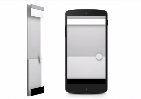
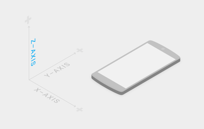
Android GUI Depth
Shadows and Element Rise
Modern interfaces are more layered and make full use of the Z axis, that is, depth. This approach makes them more “tangible”.
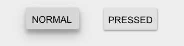
A sense of depth is created by shadows - elements and images casting shadows look like they are hovering over a page. Shadows “spice up” the design a bit, but they don’t make it too “cloying” either. They do not distract the user, on the contrary - thanks to them, he can understand that:
- A shadow casting element can be pressed.
- If one element casts a shadow on another, then the first is higher - this allows you to organize the elements, creating a hierarchy.

Before and after - if not for the shadow, it would be impossible to understand that the pink circle and the blue surface are separate elements
- Shadows also make it clear in which direction the object has moved.
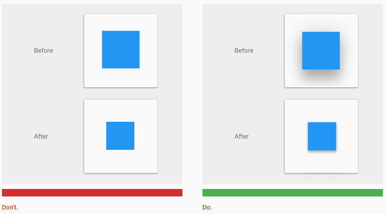
Before and after - the cast shadow decreases and becomes sharper or increases and erodes as the object falls or rises
- Shadows are used in conjunction with lifting elements. The rise is the relative depth (or height), the distance between two surfaces along the Z axis. The rise is measured from the top of one element to the top of the other and determines the depth of the shadow that the first casts on the second.

Different lifting amounts of two objects in Material Design
If the user is not sure whether the element is clickable or not, he must understand this from the changes that occur after clicking. This is where the rise comes in. When the elevation of an element changes, its shadow changes:
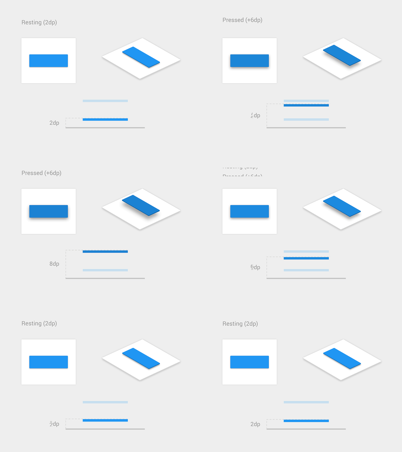
The button rises after pressing. The
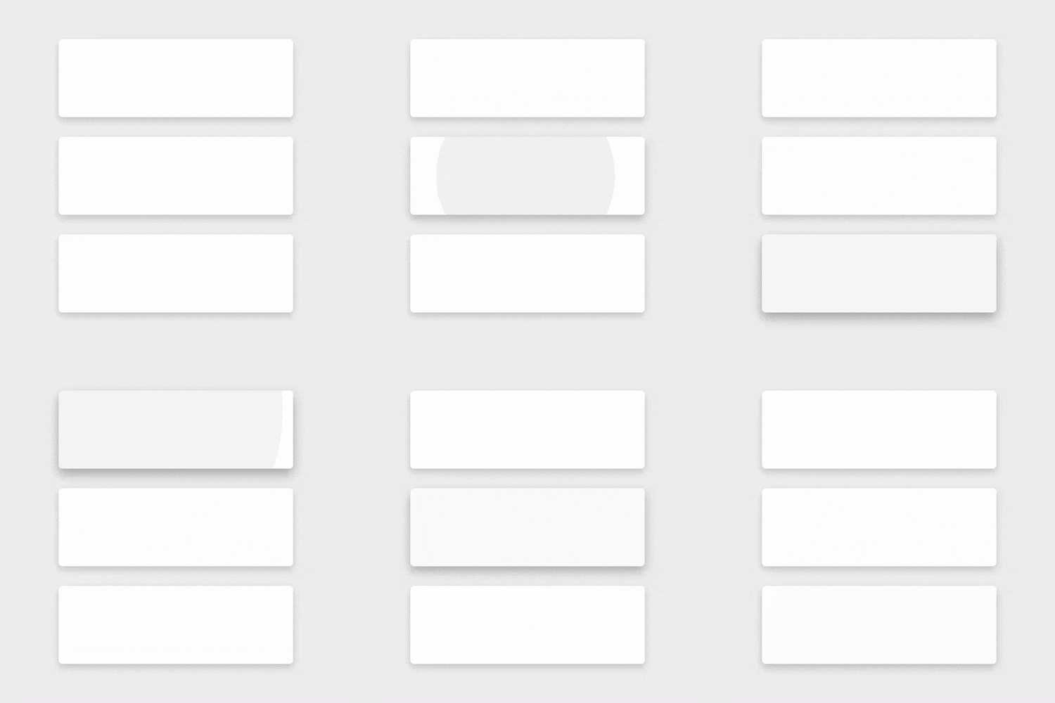
card rises after activation.
Conclusion
In the design, you should not rely on hard shadows, unnecessarily colorful gradients or complex lighting effects - all this can distract the user from the purpose of the elements.
However, soft shadows and other means of “non-planar” interfaces can be useful - they carry important information, highlighting objects and indicating their functionality and state.
Users prefer simplicity, clarity and orderliness - and when developing interfaces, you should rely on the characteristics of human perception. The examples of successful interfaces that have appeared in recent years show: the one who brings the principles underlying the design to perfection wins.