How to build a multi-funnel using Mailchimp and Google Analytics as an example and optimize it
- Tutorial
We all know about A / B tests and other conversion optimization techniques, we constantly use them. However, it is not always clear which aspect to pay more attention to and which change will produce the best result. It’s clear that if the landing page is confused, registration is broken or activation in the product requires enormous labor costs on the part of the user, then testing the text of the letter and its call-to-action will not bring tangible results.
But what if the situation is not at such an extreme point, and the problems are blurred along the entire user path (from writing to the product interface)? Of course, you can simply compose several options for writing, vote as a team, even conduct an A / B test, send it to users and calm down, but why, if as a result, we will inefficiently empty the channel?
Any business or startup is a complex mechanism that cannot be managed without feedback. To get the maximum effect, we will compose the text of the letter, send the first batch of users, measure the effectiveness at each stage of the funnel (Letter - Landing Page - Product), put together a team to analyze the results, find bottlenecks and generate ideas, realize ideas and repeat it all over again. And then again. And further. Rushed off?
Here is one of our cases. During the closed beta, we actively sent invites, but a certain number of users did not receive them. This is the audience for which the product is interesting, and therefore, it is worth reminding them that we have graduated and we have a free tariff.
I’ll be setting up a funnel and experimenting using our hopox service .
It all starts with an idea. Here's how it sounds:

If you noticed, I immediately put down the expected result. This is a kind of forecast and at the same time, the minimum threshold for the success of an idea. If there will be fewer orders, the cost of implementing the idea is unlikely to pay off and scaling is out of the question.
This idea, like any other, for implementation requires a number of preliminary works:
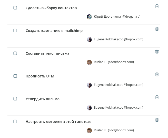
So, we described the tasks, handed them to colleagues, now it’s time to write a letter. The initial version contained a couple of button links to the manual (a little about HADI cycles and the ideology of data-driven marketing), and a link to register in the service. Overall enough to test.
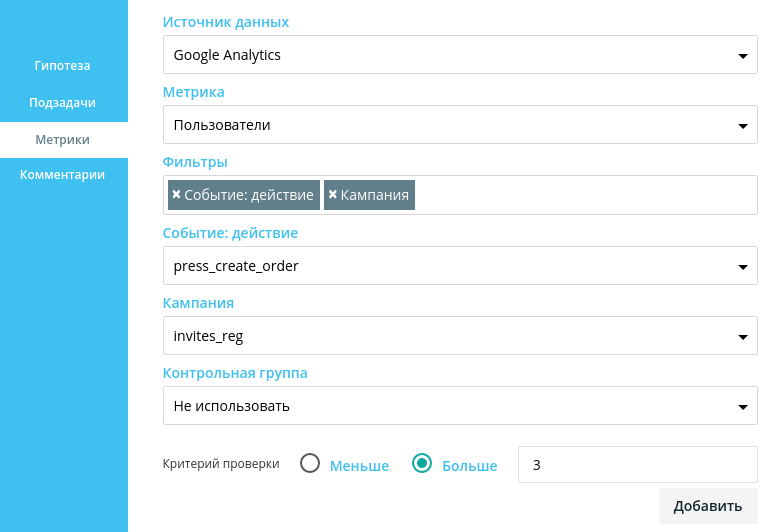
In order to track the user's path from the letter to the product, I marked the link to the landing page with a UTM tag. The landing page is configured in such a way that translates these tags into the product. Thanks to this, now I can configure the metric in the hypothesis so that the service considers purchases only by those users who were attracted by our email campaign:
After the end of the hypothesis testing period, we received 0 purchases. The hypothesis failed. Why did this happen? Obviously, something prevented users from going through the funnel from start to finish. In order to understand what exactly, we need to build a funnel and analyze the bottlenecks.
For works of a cyclical nature, as well as for work with key business metrics, hopox has a “Summary" section. This is the very same business management panel that links the team’s experiments with their results in a quantitative form. On this panel you can always see how the implementation of a certain idea influenced key indicators, how quickly the team moves, how many ideas it generates, how focused and where the business or startup is “flying”.
The funnel is such a kind of conveyor belt that the user moves along, and in our interests - to lead it to the end. I want to note that hopox receives all the data from various sources of analytics, and accordingly, an important value is the ability to build multi-funnels where each stage can represent data from different sources (After all, the user’s path is often not covered by one analytics system, as in our example).
As a result, our funnel should look like this:
- Number of letters read (source: Mailchimp)
- The number of transitions to the landing page from the letter (source: Mailchimp)
- The number of users who clicked on “Access” on the landing page (source: Google Analytics)
- The number of users who clicked “Pay” in the service (source: Google Analytics)
- The number of users who came to the final payment page (source: Google Analytics)
Thus, with the help of a single funnel, we connect the statistics that Mailchimp and Google Analytics give us, which allows us to see the whole picture:
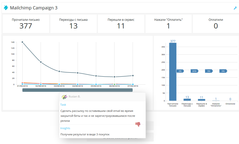
With the naked eye, it is clear that the main problem is that people do not follow the link in the letter. As mentioned above, the letter had several links (to the manual, to the survey and to the landing page), which not only blurred attention, but simply distracted the letter from its main purpose.
We sent the next version of the users the next version of the letter, in which there was a short reminder of what the service was for (nevertheless, the person received the previous letter more than two months ago) and an explicit button that leads to the landing page.
The conversion of the first stage of the funnel increased to 17%. Of course, if a person receives a letter from a service that he has signed up for a long time, you should not overload him with information. We wrote this case into the conclusions of the hypothesis and are ready for the next iteration.
After evaluating the next stage (the number of people who switched to the service), at the next growth rally, we described about fifteen ideas related to the landing that could affect the conversion of the transition to the service. After evaluating the implementation deadlines and the expected effect of each of them, we settled on the fact that we need to critically reduce the amount of information on the landing page, conduct an A / B test of the value proposition, the position of the button, remove the extra “Name” field and replace the static image in the header on the video with the service interface.
After all the changes, our funnel looked like this:
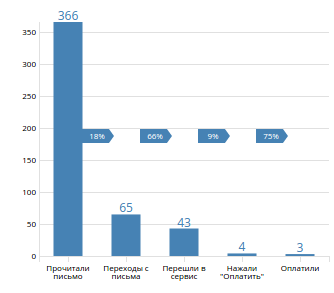
After working with the remaining two steps, we increased the conversion of the last two to 12% and 83%, respectively. At each growth rally, we continue to generate ideas for increasing the overall conversion of this funnel.
Each campaign, each channel, each user segment needs constant optimization. The found patterns and hypotheses that have been fired are at times a revelation, and sometimes a banal truth that they simply forgot about. Experiment every day, try new ideas, get feedback from your business in the form of metrics and invent new ways of growth.
We continue to work on the hopox service ., which helps to quickly check ideas and focus the team on growth. And also, we have an unlimited time free tariff.
Thank you, hopox team.
