 March 12, 2016 at 12:59
How to create animations and transitions using Motion UI
Animations and transitions allow developers to visualize changes and modernize content. Dynamic design enhances websites and makes them more compelling and comprehensible.
You can animate various elements of the page yourself or use the Motion UI . This is a library for creating smooth transitions and animations on Sass, a member of the Foundation family.
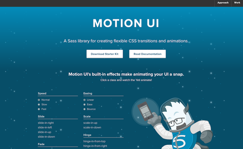
Zurb provides developers with a convenient starter pack that contains stocked CSS. Therefore, it is not necessary to use Motion UI with Sass. The package can be downloaded from the site page and quickly start prototyping using ready-made classes for animations and CSS transitions.
The starter package contains the index.html file . If more global settings are needed, you can install the full version containing .scss files with npm or Bower.
There are three main types of predefined CSS classes in Motion UI:
Transition classes - they allow you to add transitions (sliding, fading, and other effects) to HTML elements.
Animation classes - allow you to use various effects of shaking, moving and rotating. They specify the name of the animation and the rules by which it works (what, where and where to animate).
Modification classes - interact with transition and animation classes, allow you to set the speed, time period, motion delay, etc.
A feature of predefined CSS classes is that they can be used not only as classes, but also as other HTML attributes. The slow and ease attributes are used as classes, and data-animation is designed for scale-up transition. When you click the Click me button , a certain effect occurs.
Motion UI also includes a small JavaScript library, which can be found in the starter pack at motion-ui-starter> js> vendor> motion-ui.js .
You can create objects in Motion UI using animateIn () and animateOut () .
And as a result, when you click on the Click Me button, the inscription “Boom” becomes dynamic.
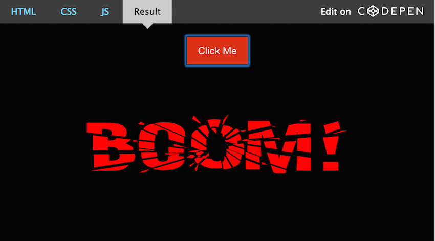
Creating transitions and animations is possible in other ways. For example, in the example above, it is not necessary to use the data-animation of the user attribute. You can do the following:
Pre-made Motion UI CSS classes use arbitrary values that are easily customizable with Sass. Each transition and animation is followed by an admixture of Sass, which allows you to change the effect settings. Thus, the opportunity appears to easily create an animation or transition solely for your tasks.
To set up a transition or animation, you first need to find the appropriate admixture. The _classes.scss file contains the names of the compiled CSS classes with the corresponding impurities.
Example:
Motion UI uses the mui- prefix for impurities. Each impurity has its own file.
Modifier classes that control the behavior of animations and transitions are also configured with Sass by changing the values of the corresponding variables in the _settings.scss file .
After the changes are made, Motion UI will use the new default when creating animations and transitions.
You can animate various elements of the page yourself or use the Motion UI . This is a library for creating smooth transitions and animations on Sass, a member of the Foundation family.
Beginning of work
Zurb provides developers with a convenient starter pack that contains stocked CSS. Therefore, it is not necessary to use Motion UI with Sass. The package can be downloaded from the site page and quickly start prototyping using ready-made classes for animations and CSS transitions.
The starter package contains the index.html file . If more global settings are needed, you can install the full version containing .scss files with npm or Bower.
There are three main types of predefined CSS classes in Motion UI:
Transition classes - they allow you to add transitions (sliding, fading, and other effects) to HTML elements.
Slide:
.slide-in-down
.slide-in-left
.slide-in-up
.slide-in-right
.slide-out-down
.slide-out-left
.slide-out-up
.slide-out-right
Fade:
.fade-in
.fade-out
Hinge:
.hinge-in-from-top
.hinge-in-from-right
.hinge-in-from-bottom
.hinge-in-from-left
.hinge-in-from-middle-x
.hinge-in-from-middle-y
.hinge-out-from-top
.hinge-out-from-right
.hinge-out-from-bottom
.hinge-out-from-left
.hinge-out-from-middle-x
.hinge-out-from-middle-y
Scale:
.scale-in-up
.scale-in-down
.scale-out-up
.scale-out-down
Spin:
.spin-in
.spin-out
.spin-in-ccw
.spin-out-ccw
Animation classes - allow you to use various effects of shaking, moving and rotating. They specify the name of the animation and the rules by which it works (what, where and where to animate).
.shake: горизонтальное сотрясание элемента.
.wiggle: поворот элемента назад и вперед.
.spin-cw: один поворот элемента.
.spin-ccw: один поворот элемента против часовой стрелки.
Modification classes - interact with transition and animation classes, allow you to set the speed, time period, motion delay, etc.
Speed:
.slow (750ms)
.fast (250ms)
Timing:
.linear
.ease
.ease-in
.ease-out
.ease-in-out
.bounce-in
.bounce-out
.bounce-in-out
Delay:
.short-delay (300ms)
.long-delay (700ms)
HTML creation
A feature of predefined CSS classes is that they can be used not only as classes, but also as other HTML attributes. The slow and ease attributes are used as classes, and data-animation is designed for scale-up transition. When you click the Click me button , a certain effect occurs.

Animations and Transitions with jQuery
Motion UI also includes a small JavaScript library, which can be found in the starter pack at motion-ui-starter> js> vendor> motion-ui.js .
You can create objects in Motion UI using animateIn () and animateOut () .
$(function() {
 $(".button").click(function() {
  var $animation = $("#boom").data("animation");
  MotionUI.animateIn($("#boom"), $animation);
 });
});
And as a result, when you click on the Click Me button, the inscription “Boom” becomes dynamic.
* {
  background-color: #000;
}
.transitions {
  text-align: center;
  width: 100%;
  height: 100%;
}
.button {
  margin: 20px 0;
}
#boom {
  display: block;
  width: 60%;
  max-width: 960px;
  margin: 0 auto;
}
Creating transitions and animations is possible in other ways. For example, in the example above, it is not necessary to use the data-animation of the user attribute. You can do the following:
$('#boom').addClass('scale-in-up');
Settings with Sass
Pre-made Motion UI CSS classes use arbitrary values that are easily customizable with Sass. Each transition and animation is followed by an admixture of Sass, which allows you to change the effect settings. Thus, the opportunity appears to easily create an animation or transition solely for your tasks.
To set up a transition or animation, you first need to find the appropriate admixture. The _classes.scss file contains the names of the compiled CSS classes with the corresponding impurities.
Example:
// Transitions
@mixin motion-ui-transitions {
 ...
 // Scale
 .scale-in-up  { @include mui-zoom(in, 0.5, 1); }
 ...
}
Motion UI uses the mui- prefix for impurities. Each impurity has its own file.
@mixin mui-zoom(
  $state: in,
  $from: 1.5,
  $to: 1,
  $fade: map-get($motion-ui-settings, scale-and-fade),
  $duration: null,
  $timing: null,
  $delay: null
) { ... }
Modifier Class Formation
Modifier classes that control the behavior of animations and transitions are also configured with Sass by changing the values of the corresponding variables in the _settings.scss file .
After the changes are made, Motion UI will use the new default when creating animations and transitions.