Memo on the basic layout of the article for Habr without using Markdown-markup
- Tutorial
On Habré, by the standards of old-timers, I just recently, only two years, but I write actively, whenever possible every day. So, reading articles, and just scrolling through the feed of fresh publications both on Habré and on GT, I realized that many simply can not cope with the layout of the text and, as a result, quite often suitable publications are buried by their authors because of unreadable text. Or the KDPV curve scares off, or something else happens.
Perhaps, for experienced authors, the post will seem captain’s, petty, or whatever, because the main content, but for those who want to go through the sandbox and join the Habra community, I’m sure it will help not only write something useful, but also beautifully your labor to present.
It so happened that the entire ribbon of Habrahabr is aligned to the left. For this reason, experienced authors leave small images on the left or use pictures with a width of 800-1000 px . I would also like to note that the ratio of KDPV 2 to 1 is almost the best , i.e. 800x400 px image . A similar proportion allows the SMM-box social. networks do not go out of your picture (or even look for something else, more suitable in size), but use the original without violating the author’s ideas.
Even if your image has a lower aspect ratio, for example, 800x700, then try to reduce its height. The critical threshold is 500-600px, except in exceptional cases, when KDPV and in truth "drags" or contains useful information (screenshots of the interface, for example). Everything is quite prosaic here: not everyone has monitors with a resolution of 1920 × 1080 and, for example, a laptop user with a maximum screen resolution of 1366 × 768 simply will not appreciate all of these beautiful KDPVs with sizes of 1000 × 1000. But even in the case when the picture carries a payload in the form of text, for example, you can make it clickable, so it will be easier for everyone.
Due to the fact that images are rarely larger than 500-800 pixels wide, everyone is trying to use left alignment. And you try, now I will explain why.
When the user scrolls the article feed, his focus of attention is shifted to the left side of the feed, to the beginning of the headlines, a list of hubs and buttons for voting. If you take a small picture to the center, or, God forbid, to the right, you make a cheap marketing trick "we are not like everyone else and we attract the attention of the reader through annoying factors." In fact, such tricks usually end sadly for authors.
I will give an example based on my old article.
Correct KDPV location:
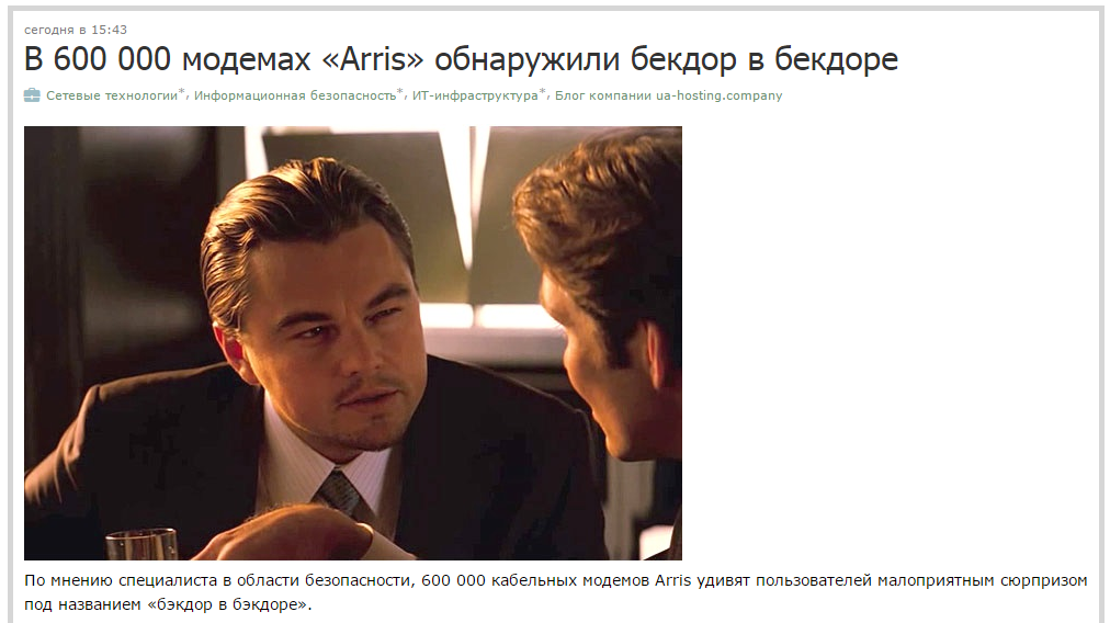
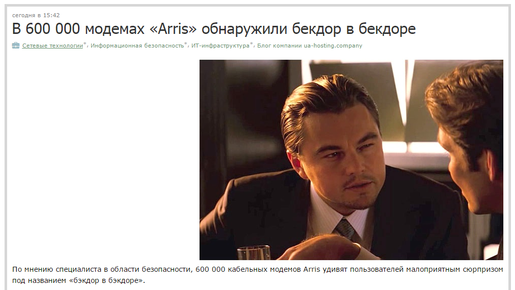
Incorrect KDPV location:

Very wrong KDPV location:
Okay, we figured out the picture. 2 to 1, no wider than 1000 px, left alignment. But if the picture is narrow, but suitable for the text? What to do? Use wrap, vestima. It was then that a lot of copies (such sharp, with tips) were broken by more than one hundred authors. Completely inexperienced gentlemen just try not to move to another line and continue the text after the code for inserting the image, like this:

Logically getting this:
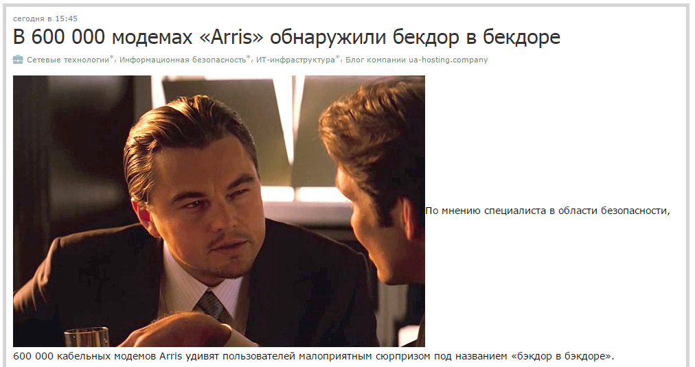
Okay, we need a flow around. It is set in the classical Haber-layout through the
Using this code we get:
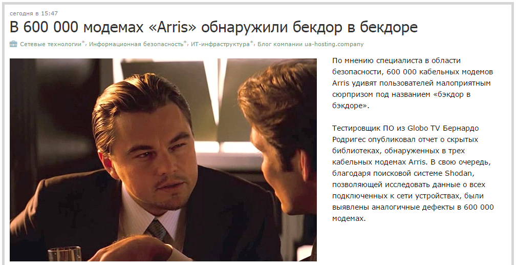
So, STOP! And why is another paragraph sucked that we used to have under the cut? We do not need him here, we want only the first sentence! To do this, we need to use

And after the publication we get this:
If you want the button “kata” to be not under the picture, but right after the text for which you wrote the wrap, move it under : Do not practice text wrap on the left, and the picture on the right. As I said, the tape is aligned to the left. If you put the picture on the right, you again use the annoying “not like everyone else” move.

Yes, I highlighted this point separately, because so many do not pay enough attention to this. Where to put the cut is up to you. The question is how exactly do you do it.
The bottom line is that after the publication of the article, cut is displayed as an empty string. Thus, the code
Correct:


Wrong:


As you can see in the screenshot above, with an empty line before or after
Separately, it is worth designating the layout of headers, lists, and code. The point here, again, is to increase the readability of the text due to the correct arrangement of empty lines. Unfortunately, for many, the layout of articles is not obvious.
For example, after the header text that you entered in an

If you put an empty line in the form of writing text after the heading, you will get a double empty line and the reader will be given the impression that the heading refers more to the text above it than under:


Also, it’s not quite logical to behave and lists. Let's look at an example.
As you can see, indenting the line above and below the list is available, everything is beautiful, the first item in the list does not merge with the text above. But with layout, everything doesn’t look so cool:

Many cleanly intuitively remove the empty line from the top and add it after the list, getting:


In some cases, a laid-up list is “squeezed” between paragraphs, but then the items “prop up” the text above themselves, merging with it, which significantly reduces the readability and perception of what is written as an enumeration of something (and in fact, they are usually engaged in enumeration in item lists).
Quotes behave exactly the same way. When quoting through blockquote, an automatic indentation is created from below, but not from above:
Comment by the author on a cool quote.

The same goes for the code:
Comment on the code.
But it actually looks like this:

In the end, I would like to say that the paragraph length that is optimal for understanding is 3-5 lines (you can check through the article’s preview). When translating English texts, it is often necessary to combine several paragraphs of the original into one, since many foreign authors have a craving for a thesis presentation of one or two sentences, which turns into a picket from Habré from single-double lines. Well, and with the rest, I think you can handle it yourself, since I don’t profess and do not recommend beauty in the form of colored text and, especially, color headings.
Following the recommendations set forth above will allow you to make your text pleasant to the eye and easy to read without much distortion.
I hope I wrote at least something useful. Thank you all for your attention, Cap flew.
Perhaps, for experienced authors, the post will seem captain’s, petty, or whatever, because the main content, but for those who want to go through the sandbox and join the Habra community, I’m sure it will help not only write something useful, but also beautifully your labor to present.
Attention Image and Left Alignment
It so happened that the entire ribbon of Habrahabr is aligned to the left. For this reason, experienced authors leave small images on the left or use pictures with a width of 800-1000 px . I would also like to note that the ratio of KDPV 2 to 1 is almost the best , i.e. 800x400 px image . A similar proportion allows the SMM-box social. networks do not go out of your picture (or even look for something else, more suitable in size), but use the original without violating the author’s ideas.
Even if your image has a lower aspect ratio, for example, 800x700, then try to reduce its height. The critical threshold is 500-600px, except in exceptional cases, when KDPV and in truth "drags" or contains useful information (screenshots of the interface, for example). Everything is quite prosaic here: not everyone has monitors with a resolution of 1920 × 1080 and, for example, a laptop user with a maximum screen resolution of 1366 × 768 simply will not appreciate all of these beautiful KDPVs with sizes of 1000 × 1000. But even in the case when the picture carries a payload in the form of text, for example, you can make it clickable, so it will be easier for everyone.
Due to the fact that images are rarely larger than 500-800 pixels wide, everyone is trying to use left alignment. And you try, now I will explain why.
When the user scrolls the article feed, his focus of attention is shifted to the left side of the feed, to the beginning of the headlines, a list of hubs and buttons for voting. If you take a small picture to the center, or, God forbid, to the right, you make a cheap marketing trick "we are not like everyone else and we attract the attention of the reader through annoying factors." In fact, such tricks usually end sadly for authors.
I will give an example based on my old article.
Correct KDPV location:

Incorrect KDPV location:

Very wrong KDPV location:

Text Wrap
Okay, we figured out the picture. 2 to 1, no wider than 1000 px, left alignment. But if the picture is narrow, but suitable for the text? What to do? Use wrap, vestima. It was then that a lot of copies (such sharp, with tips) were broken by more than one hundred authors. Completely inexperienced gentlemen just try not to move to another line and continue the text after the code for inserting the image, like this:

Logically getting this:

Okay, we need a flow around. It is set in the classical Haber-layout through the
align="side"inside of the insert code: 
Using this code we get:

So, STOP! And why is another paragraph sucked that we used to have under the cut? We do not need him here, we want only the first sentence! To do this, we need to use
align="left"where we wish. In the text editing form, the code will look like this: 
And after the publication we get this:

If you want the button “kata” to be not under the picture, but right after the text for which you wrote the wrap, move it under : Do not practice text wrap on the left, and the picture on the right. As I said, the tape is aligned to the left. If you put the picture on the right, you again use the annoying “not like everyone else” move.

Habra-kat installation
Yes, I highlighted this point separately, because so many do not pay enough attention to this. Where to put the cut is up to you. The question is how exactly do you do it.
The bottom line is that after the publication of the article, cut is displayed as an empty string. Thus, the code
Correct:


Wrong:


As you can see in the screenshot above, with an empty line before or after
Headings, lists, text and all-all-all that are searched by trial and error
Separately, it is worth designating the layout of headers, lists, and code. The point here, again, is to increase the readability of the text due to the correct arrangement of empty lines. Unfortunately, for many, the layout of articles is not obvious.
For example, after the header text that you entered in an

If you put an empty line in the form of writing text after the heading, you will get a double empty line and the reader will be given the impression that the heading refers more to the text above it than under:


Also, it’s not quite logical to behave and lists. Let's look at an example.
- List item No. 1
- List item No. 2
- List item 3
- List item No. 4
- List item No. 5
As you can see, indenting the line above and below the list is available, everything is beautiful, the first item in the list does not merge with the text above. But with layout, everything doesn’t look so cool:

Many cleanly intuitively remove the empty line from the top and add it after the list, getting:


In some cases, a laid-up list is “squeezed” between paragraphs, but then the items “prop up” the text above themselves, merging with it, which significantly reduces the readability and perception of what is written as an enumeration of something (and in fact, they are usually engaged in enumeration in item lists).
Quotes behave exactly the same way. When quoting through blockquote, an automatic indentation is created from below, but not from above:
Cool quote.
Comment by the author on a cool quote.

The same goes for the code:
Крутой код тут;
код;
еще код;
конец кода.
Comment on the code.
But it actually looks like this:

In the end, I would like to say that the paragraph length that is optimal for understanding is 3-5 lines (you can check through the article’s preview). When translating English texts, it is often necessary to combine several paragraphs of the original into one, since many foreign authors have a craving for a thesis presentation of one or two sentences, which turns into a picket from Habré from single-double lines. Well, and with the rest, I think you can handle it yourself, since I don’t profess and do not recommend beauty in the form of colored text and, especially, color headings.
Following the recommendations set forth above will allow you to make your text pleasant to the eye and easy to read without much distortion.
I hope I wrote at least something useful. Thank you all for your attention, Cap flew.
