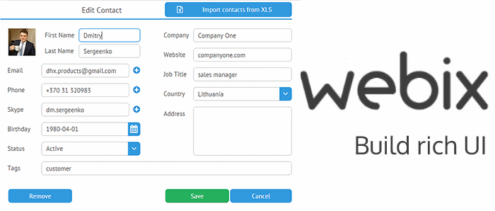
Working with forms in Webix UI
Creating forms using pure HTML is a fairly trivial task and is discussed in detail in every self-respecting textbook. But everything becomes much more complicated if you need, for example, to spread the elements of the form into several tabs. In this case, a framework is indispensable. In this article, I’ll show you how you can create complex web forms using the Webix UI framework .
The basics. How to create a simple form
First, let's look at how you can create a form using Form Component . In Webix, all interface elements are described through JSON. To create a form, you need to use an object with a property
view:"form". The property must be set for the same object elements- this is an array containing the elements that make up your form. Here's how it works:
webix.ui({
	view:"form",
	elements: [
		{ /* первый компонент формы */ },
		{ /* второй компонент формы */},
		{ /* и т.д. */}
	]
});
You can use any other component of Webix UI as a form element: a text field, a checkbox, a button, etc.
In order to see how all this works in practice, let's create a simple form as an example. For this we need: two text fields : one for the username and one for the password; one checkbox to be sure that the user accepts the terms of the agreement; and the last item is the Submit button .
So the code:
webix.ui({
	view:"form",
	id:"myForm",
	container: "areaA",
	width: 350,
	elements: [
		{view:"text", label:"Username", name:"username"},
		{view:"text", label:"Password", name:"password",
		 type:"password"},
		{view:"checkbox", labelRight:"I accept terms of use",
		 name:"accept"},
		{view:"button", value: "Submit", width: 150, align:"center",
		 click:submit}
	]
});
Nothing that we were not ready for. Property
view:"form"u says that it is the form that interests us. Properties labelwork just like an HTML tag label. You can get the value of each form element through the property name. In order to hide the entered characters in the Password field, a property is used type:"password". What is interesting is the property click:submitin the button description code. It defines the function that will be called after the button is pressed. This property is optional, but it will be useful to check with it if everything is fine with the entered data. Here is a sample code that displays the entered values. To display messages, it uses the Webix Message Box :
function submit(){
	webix.message(JSON.stringify($$("myForm").getValues(), null, 2));
}
In this example, using the getValues () method, we get the values of the Webix elements, and the JSON.stringify () method converts the received data into a JSON string.
So, everything is ready and we can check the result:

After entering the data, you can check the form using the Submit button:
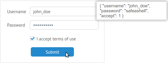
Everything works as expected. Since we now know the basics of creating forms, you can try to create something more complex.
The code and demo can be viewed here - webix.com/snippet/2259ec41
Using complex controls using the example of Multicombo
Webix provides several controls to help the user with a choice while working with forms. In my opinion, one of the most interesting of them is Multicombo . This control allows you to implement multiple selections from the drop-down list items.
For example, you want to create a page to create a developer’s resume. Here is a simplified example of a form that you can use:
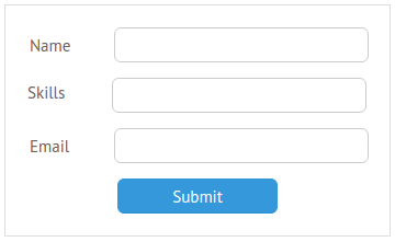
Since it is likely that the user speaks more than one programming language and you are armed with a list of languages, this is the case when you can use Multicombo. Here is an example data.js file that contains the required data:
var languages = [
	{id:1, lang:"4th Dimension/4D"},
	{id:2, lang:"ABAP"},
	/* и т.д. */
]
Let's use Multicombo in the Skills field:
{view:"multicombo", name:"skills", label:"Skills", button: true,
 suggest: {
      body:{
        data:languages,
        template:webix.template("#lang#")
      }
 },
}
In addition to the properties already familiar to us, there is something new in this example. The property
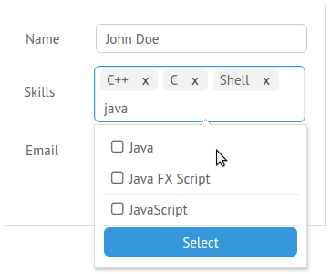
button: truewill create a confirmation button in the drop-down list. To specify the content source for the drop-down list, use the property suggest. You can, for example, simply specify the path to the file: suggest: "path/to/file/data.js". But it’s best to use the template in combination with the property data, which will allow you to extract exactly the data you need from the target archive. The following is an example of how such a control works. After clicking in the text box, a drop-down menu will appear with options available for selection:
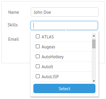
You can scroll through the list and select the options you need or start typing:
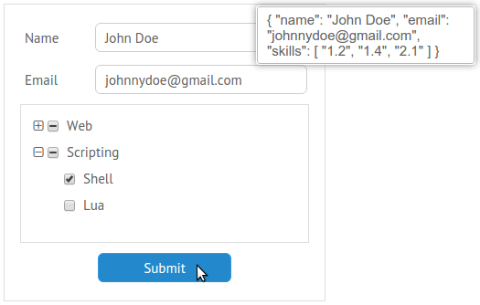
The form from this example will return a list of IDs of selected items: You

can look at the code and demo here -webix.com/snippet/63f6328e Controls
such as Grid Suggest and Dataview Suggest may also be useful.
Using a tree as a form element
Webix does not limit you to using text fields, buttons, checkboxes and other familiar components as form elements. Almost any widget can be placed on a form. Let's try to do this using the Tree example . It was not originally intended for use inside the form, so it does not have the methods
setValue()and getValue()necessary to obtain data about the selected elements. How can this be fixed? You can use the protoUI method , which allows you to create new elements based on existing ones:webix.protoUI({
name:"formTree",
setValue:function(value){ this.checkItem(value); },
getValue:function(){ return this.getChecked(); }
}, webix.ui.tree);
In this example, we created a new component called
formTree. Then we determined the methods for it setValue()and getValue(). And finally, they indicated that we want to create a new component based on a tree. Before using it, let's create the necessary data for our tree:
var treedata = [
	{ id: "1", value: "Web", data: [
		{ id: "1.1", value: "HTML" },
		{ id: "1.2", value: "CSS" },
		/* some more data */
	]},
	{id:"2", value:"Scripting", data: [
		{ id: "2.1", value: "Shell" },
		/* some more data here */
	]},
]
Now you can add a new element to the form. You can do this the same way as with any other element:
{view:"formTree", name:"skills", data:treedata,
 height: 150, threeState: true,
 template: "{common.icon()} {common.checkbox()}   #value#"
},
The property
threeState:trueincludes 3-state checkboxes , and the template adds checkboxes to tree nodes. Result:

In order to check how well the methods we defined for the new component work: You
can look at the code and demo here - webix.com/snippet/9f166141
Tab Forms and Multi-Step Forms
If you want to create a sufficiently large form, it may be useful to divide it into several tabs or create a multi-step form. Webix allows you to put different UI components inside the form to achieve the desired result.
Adding Tabs Using Tabview
Tabview component allows you to create a set of components with a tabbar that serves to switch between them. As the contents of each tab, you can use a separate component or create your own layout using the
rowsand properties cols. Here is how Tabview works:
view:"tabview",
/* содержимое элемента */
cells: [
	{
		header:"First tab label",
		body: {
			/* содержимое первого таба */
		}
	},
	{
		header:"Second tab label",
		body: {
			rows:[
				{ /* содержимое первого ряда */},
				{ /* содержимое второго ряда */}
			]
		}
	},
	/* и т.д. */
]
The main idea of this approach is to place the Tabview with the necessary fields inside the form. However, it is worth remembering that the components common to the whole form (for example, the Submit button or the “I agree” checkbox) should be located outside the Tabview.
For instance:
view:"form",
elements:[
	{view:"tabview", height:250,
	 cells:[
		 /* заголовок и содержимое 1-го таба */
		 {header:"Personal Info",
		  body:{
			  rows:[
				  {view:"text", label:"Name", name:"name"},
				  /* еще поля */
			  ]
		 }
		},
		/* заголовок и содержимое 2-го таба */
		{header:"Delivery Details",
		 body:{
			 rows:[
			 /* еще немножко полей */
			 ]
		 }
		}
	]
   }, /* здесь кончается Tabview */
   {view:"button", value: "Submit", width: 150,
    align:"center", click:submit}
]
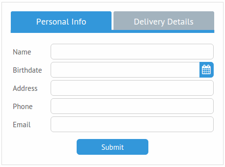
This is all you need to create a tab form. Below is the result: The
best part of the whole story is that you don’t need to write any additional code so that the different parts of the form work as a whole. Just put Tabview inside the form and don't forget about the property
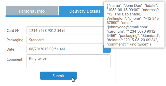
namefor each of its elements. The Submit button confirms this: You
can look at the code and demo here - webix.com/snippet/79eb2712
As an alternative to tabs, you can try, for example, Accordion .
Create a multi-step form using Multiview
Multiview allows you to create a sequence of elements and view them one by one, which saves space on the screen. Moreover, switching happens with the effect of animation! You can create tabs for switching between components, but since we are interested in a multi-step form, let's use the buttons for our example.
First of all, we need functions for transition between form elements:
function next(){
	var parentCell = this.getParentView().getParentView();
	var index = $$("formCells").index(parentCell);
	var next = $$("formCells").getChildViews()[index+1]
	if(next)
		next.show();
}
function back(){
	$$("formCells").back();
}
This code uses the ID value of the Multiview element, so be sure to set it. As for the form code, it practically does not change. We only need to change the contents of the array
elements. The Multiview component itself is created in a similar way to the Tabview element from the previous example. This time we need to add an additional row to this component that will contain the control buttons. Here's how to do it:
 {view:"multiview", id:"formCells", cells: [
	/* 1-й шаг формы */
	{rows:[
		 {/* определение полей */},
		 {cols:[
			 /* кнопки */
			 {}, /* пустой элемент */
			 {view:"button", value:"Next", click:next}
		  ]}
	]},
	/* 2-й шаг формы */
	{rows:[
		{/* ещё поля */},
		{cols:[
			/*кнопки*/
			{view:"button", value:"Back", click:back},
			{view:"button", value:"Next", click:next}
		]}
	]},
	/* последний шаг формы */
	{rows:[
		{/* поля... */},
		{cols:[
			/*кнопки*/
	        {view:"button", value:"Back", click:back },
	        {view:"button", value:"Submit", click:submit}
		]}
	]}
]}
Let's look at the result:
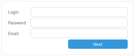
After clicking the Next button, the following part of the form will appear:
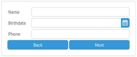
And now let's check the entered data:
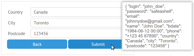
Everything works.
The code and demo can be viewed here - webix.com/snippet/39464194
Conclusion
Webix allows you to create almost any combination of components. You can place any widget or control inside the form. If you are not satisfied with the functionality of a certain component, you can create your own on its basis with the help of,
protoUIand, again, put it in the form. Thus, practically nothing limits your imagination.