June 9, 2015 at 09:58
Visual call graph: VTune Amplifier and more
Many people like the presentation of the program structure in the form of a call graph, a “function call graph”. It is especially interesting if this graph reflects the performance profile, the “hottest” code branches.
The call graph can be obtained using Intel VTune Amplifier XE, but for this we need a couple more utilities.
First about the basic functionality. Presenting performance profile data is one of the most powerful things in the VTune Amplifier arsenal. You can study the call tree on the Caller / Callee tab:
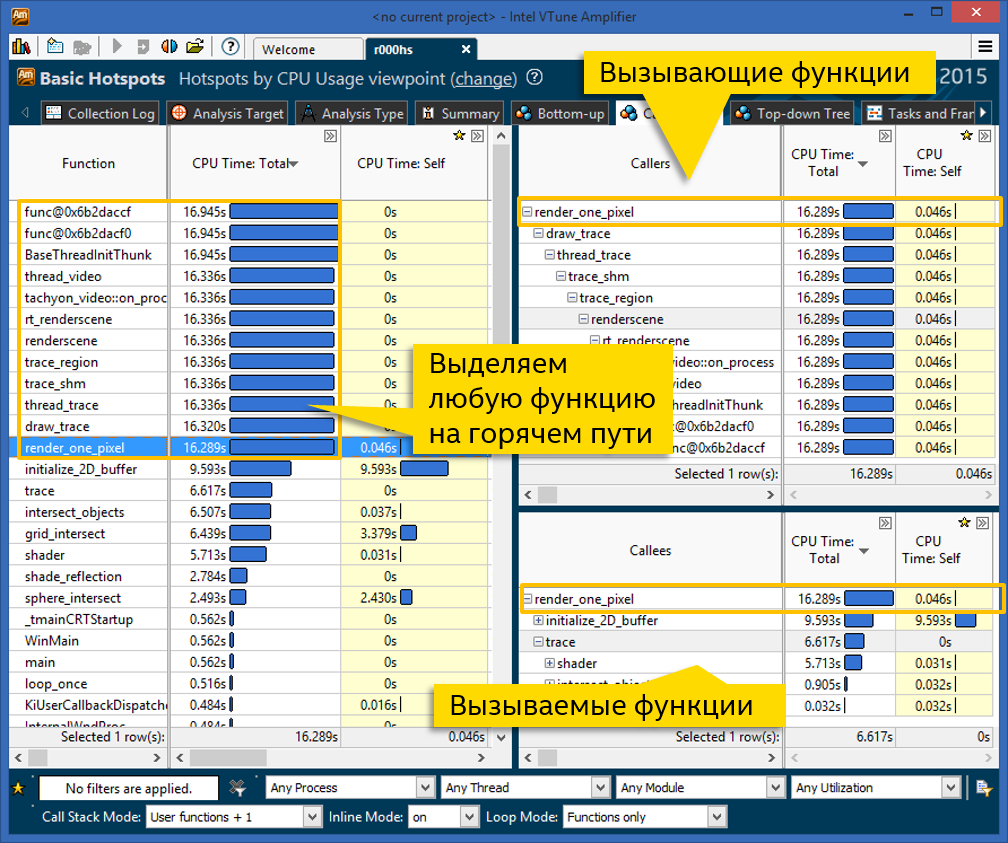
On the left is a list of program functions sorted by processor time consumed. This time is divided into general and own. Total time includes all called functions. From this list you can see which functions perform heavy calculations themselves (large self time), and which stand in the “hot way” (large total time). At the same time, on the left panel, each function occurs once, i.e. if it is called in different branches of the code, then the total and proper time is summed from them. So you can determine the total contribution of each function.
In our example, 12 functions have the largest total time, approximately the same, and zero self time. This means that all of them are on the “hot road”, possibly causing each other. If we want to study this very “hot way”, click on any function you like and look at the panel on the right.
The upper right panel displays the sequence of calls "up" - i.e. all calling functions. Each function from the tree also has its own and total time. The root of the tree (top) is the function selected in the left pane. If you click on the other on the left, the tree will rebuild. We chose the render_one_pixel function, and we see that almost all the other 11 functions with a large total time are in the same call chain. In this panel, the tree can branch - if there are several branches of code, everything will be shown, with CPU time distribution across all branches.
The bottom right panel, you guessed it, draws a tree of called functions. Those. if the node that interests us has a lot of total time and a little self time, it's worth looking at what it calls. In the screenshot above, a significant part, 9.5 of 16 seconds, is spent in the initialize_2D_buffer function, the rest comes from the trace function branch.
The VTune Amplifier features and Caller / Callee view are enough to navigate the call tree and identify performance-critical functions. However, some people like to see the whole tree at once, in one picture. This is how some profilers present data, and VTune did so many years ago.
For lovers of a branchy tree of calls of hot functions, there is a way to build it.
Everything is simple here - we collect any result. One condition is that it must have stacks. Those. Advanced hotspots with the level of detail “Hotspots” will not work, there are no stacks there. A simple analysis of Basic hotspots is quite suitable - you can compile it in the GUI or command line:
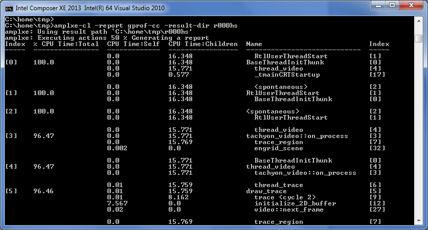
VTune Amplifier can represent data in the gprof profiler format, this will be necessary for further transformations. Here you already need the command line (the same on Windows and Linux):
Now we need the Gprof2dot utility. This is a python script that can build a graph in the DOT format from the results of different profilers. Thanks to Mr. Jose Fonseca for its creation and support.
The script not only knows how to build a DOT graph from gprof results, but also supports VTune Amplifier - thanks to community contributors. Although the VTune and gprof formats are similar, but do not match perfectly, I had to make patches. But the main thing is that now everything works. Specify “ax” as the format and printout from step 2 to the input:
Another tool is useful here - Graphviz. He builds a visual image of the graph according to his description in text form:
Actually, step 4 includes step 3, just painted in more detail who does what.
Voila, you can now observe the call tree visually (a fragment of the picture is shown):
Such a graph reflects the structure of function calls (not all, the most computationally loaded), and the distribution of processor time, own and total. The redder the color, the stronger the load on the function. So you can observe the "hot way". The disadvantages are the possibly large size of the whole tree and its static nature - in a PNG image you can no longer group, filter, look at source codes and performance metrics, as you can in VTune Amplifier. But whoever likes what.
The call graph can be obtained using Intel VTune Amplifier XE, but for this we need a couple more utilities.
First about the basic functionality. Presenting performance profile data is one of the most powerful things in the VTune Amplifier arsenal. You can study the call tree on the Caller / Callee tab:
On the left is a list of program functions sorted by processor time consumed. This time is divided into general and own. Total time includes all called functions. From this list you can see which functions perform heavy calculations themselves (large self time), and which stand in the “hot way” (large total time). At the same time, on the left panel, each function occurs once, i.e. if it is called in different branches of the code, then the total and proper time is summed from them. So you can determine the total contribution of each function.
In our example, 12 functions have the largest total time, approximately the same, and zero self time. This means that all of them are on the “hot road”, possibly causing each other. If we want to study this very “hot way”, click on any function you like and look at the panel on the right.
The upper right panel displays the sequence of calls "up" - i.e. all calling functions. Each function from the tree also has its own and total time. The root of the tree (top) is the function selected in the left pane. If you click on the other on the left, the tree will rebuild. We chose the render_one_pixel function, and we see that almost all the other 11 functions with a large total time are in the same call chain. In this panel, the tree can branch - if there are several branches of code, everything will be shown, with CPU time distribution across all branches.
The bottom right panel, you guessed it, draws a tree of called functions. Those. if the node that interests us has a lot of total time and a little self time, it's worth looking at what it calls. In the screenshot above, a significant part, 9.5 of 16 seconds, is spent in the initialize_2D_buffer function, the rest comes from the trace function branch.
Draw a visual call graph
The VTune Amplifier features and Caller / Callee view are enough to navigate the call tree and identify performance-critical functions. However, some people like to see the whole tree at once, in one picture. This is how some profilers present data, and VTune did so many years ago.
For lovers of a branchy tree of calls of hot functions, there is a way to build it.
1. Get VTune Amplifier Profile
Everything is simple here - we collect any result. One condition is that it must have stacks. Those. Advanced hotspots with the level of detail “Hotspots” will not work, there are no stacks there. A simple analysis of Basic hotspots is quite suitable - you can compile it in the GUI or command line:
amplxe-cl -collect hotspots -result-dir r000hs -- find_hotspots balls.dat2. Print the result in gprof style
VTune Amplifier can represent data in the gprof profiler format, this will be necessary for further transformations. Here you already need the command line (the same on Windows and Linux):
amplxe-cl -report gprof-cc -result-dir r000hs -format text -report-output r000hs_gprof_cc.txt3. Convert the result to a graph with Gprof2dot
Now we need the Gprof2dot utility. This is a python script that can build a graph in the DOT format from the results of different profilers. Thanks to Mr. Jose Fonseca for its creation and support.
The script not only knows how to build a DOT graph from gprof results, but also supports VTune Amplifier - thanks to community contributors. Although the VTune and gprof formats are similar, but do not match perfectly, I had to make patches. But the main thing is that now everything works. Specify “ax” as the format and printout from step 2 to the input:
python gprof2dot.py -f axe r000hs_gprof_cc.txt4. Convert DOT graph to image
Another tool is useful here - Graphviz. He builds a visual image of the graph according to his description in text form:
python gprof2dot.py -f axe r000hs_gprof_cc.txt | "c:\Program Files (x86)\Graphviz2.38\bin\dot" -Tpng -or000hs_call_graph.pngActually, step 4 includes step 3, just painted in more detail who does what.
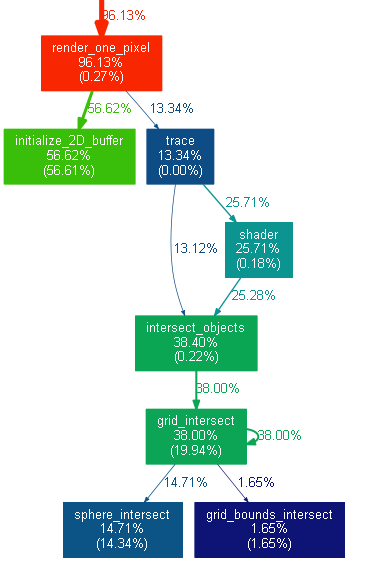
Voila, you can now observe the call tree visually (a fragment of the picture is shown):
Such a graph reflects the structure of function calls (not all, the most computationally loaded), and the distribution of processor time, own and total. The redder the color, the stronger the load on the function. So you can observe the "hot way". The disadvantages are the possibly large size of the whole tree and its static nature - in a PNG image you can no longer group, filter, look at source codes and performance metrics, as you can in VTune Amplifier. But whoever likes what.