 April 19, 2015 at 11:55
CSS of the future: eye distance
A variety of "insights" regarding new technologies often appear on the hub. Usually these are experimental technologies that are already used by some companies and are slowly reaching the wide market. Today I want to share with you an idea that came to my mind, but it will not be realized soon, but it already lies on the surface.
Disclaimer: I do not pretend to be original.
Every day in web development, the problem of adaptive design arises more and more. With the widespread use of smartphones, tablets, smart TVs and other devices, it has become increasingly difficult to solve the problem of delivering content to the user. Adaptive layout is a great way to solve a new problem using old tools. Today I propose a completely new approach. New CSS unit: angular distance to the eye.
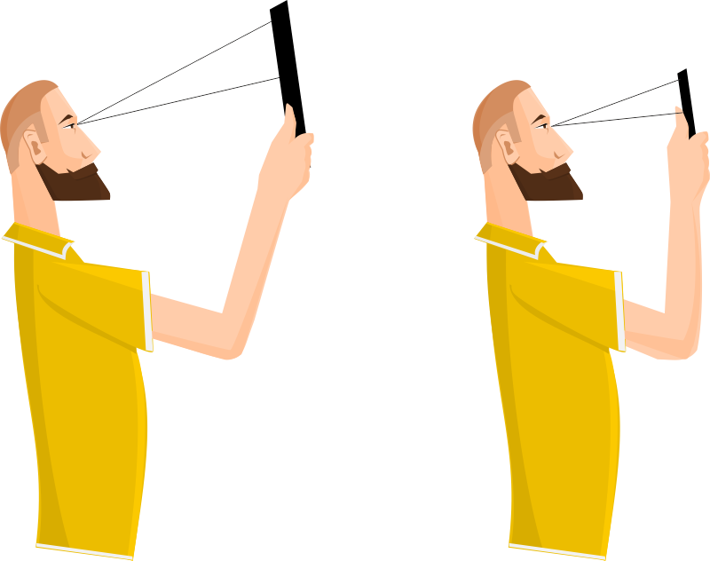
So, many in the picture have already guessed what it was about. In simple terms, this unit of measurement changes the size of the element (or font) in direct proportion to the distance of the screen from the eyes. How is this useful?
At the moment, most mobile devices have the technical ability to calculate the distance to the eyes using the front camera. Monitors and TVs can do the same with webcams or kinect-like devices. So it's up to the code and the browsers. Well, a smartphone from amazon completely brought this technology to the absolute, and even measures the movement of the user's gaze.
As i see it. The unit of measure can be called, for example, vad (visual angle degrees). Then here is an example of adaptive layout:
Here, in addition to demonstrating the use of vad, I also introduced a new max-font-size property : it is necessary if the user is too far from the screen, and further increase in size will spoil the layout.
Also, of course, to manage content depending on the screen size, you can add and
Waiting for your comments on the subject of my fantasies.
Disclaimer: I do not pretend to be original.
Every day in web development, the problem of adaptive design arises more and more. With the widespread use of smartphones, tablets, smart TVs and other devices, it has become increasingly difficult to solve the problem of delivering content to the user. Adaptive layout is a great way to solve a new problem using old tools. Today I propose a completely new approach. New CSS unit: angular distance to the eye.
So, many in the picture have already guessed what it was about. In simple terms, this unit of measurement changes the size of the element (or font) in direct proportion to the distance of the screen from the eyes. How is this useful?
- Full independence from the device. Forget pixel density and screen sizes
- Physiological for humans. The user sees the content uniformly on different screens, at different distances from the screen, etc.
- Accessibility It is much easier to manage content for people with low vision, or in uncomfortable conditions (on the go)
Technical feasibility
At the moment, most mobile devices have the technical ability to calculate the distance to the eyes using the front camera. Monitors and TVs can do the same with webcams or kinect-like devices. So it's up to the code and the browsers. Well, a smartphone from amazon completely brought this technology to the absolute, and even measures the movement of the user's gaze.
API implementation
As i see it. The unit of measure can be called, for example, vad (visual angle degrees). Then here is an example of adaptive layout:
p {
  font-size: 1.5vad;
  max-font-size: 3cm;
  width: 20vad;
  max-width: 100%;
}
Here, in addition to demonstrating the use of vad, I also introduced a new max-font-size property : it is necessary if the user is too far from the screen, and further increase in size will spoil the layout.
Also, of course, to manage content depending on the screen size, you can add and
@mediarequests ... And also through vad .
Waiting for your comments on the subject of my fantasies.