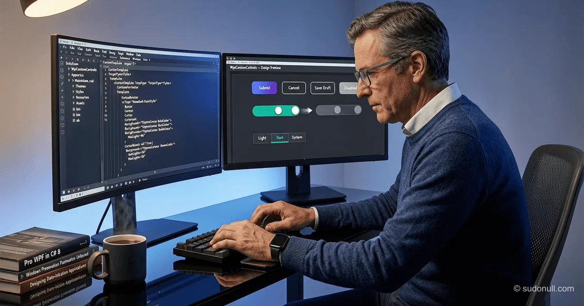
创建自定义 WPF 控件:无需继承即可样式化按钮和开关
在开发 WPF 应用程序时,经常需要将标准控件调整为符合公司设计,而无需购买商业库。与创建自定义 UserControl 或从基类继承相比,使用样式和附加属性更高效——这能保持与框架的兼容性并简化维护。
WPF 中的主题系统架构
为了管理应用程序的外观,建议将所有资源集中到一个 Style 文件夹中。每个主题(例如浅色和深色)都设置为单独的目录,其中包含颜色调色板文件和主资源字典。这样可以在运行时通过替换 Application.Resources 中的单个 ResourceDictionary 来轻松切换主题。
主题切换的实现如下所示:
Google AdInline article slot
public void ChangeTheme(Theme theme)
{
    if (CurrentTheme == theme) return;

    CurrentTheme = theme;
    Uri themeSource = theme switch
    {
        Theme.Dark => new Uri("pack://application:,,,/CustomWpfControls;component/Style/DarkTheme/DarkTheme.xaml", UriKind.Absolute),
        Theme.Light => new Uri("pack://application:,,,/CustomWpfControls;component/Style/LightTheme/LightTheme.xaml", UriKind.Absolute),
        _ => throw new ArgumentOutOfRangeException(nameof(theme))
    };

    var dictionary = Resources.MergedDictionaries[0];
    dictionary.Clear();
    dictionary.Source = themeSource;
}
这种方法确保所有 UI 元素立即更新外观,而无需重新加载窗口。
使用附加属性样式化按钮
与其创建自定义的 RoundedButton 类,不如在静态类中定义附加属性 CornerRadius。这样可以在 XAML 中直接设置圆角半径,而不会违反组合原则:
public static class RoundedButton
{
    public static readonly DependencyProperty CornerRadiusProperty = DependencyProperty.RegisterAttached(
        "CornerRadius",
        typeof(CornerRadius),
        typeof(RoundedButton),
        new FrameworkPropertyMetadata(new CornerRadius(0d),
            FrameworkPropertyMetadataOptions.AffectsMeasure |
            FrameworkPropertyMetadataOptions.AffectsRender));

    public static void SetCornerRadius(UIElement element, CornerRadius value) =>
        element.SetValue(CornerRadiusProperty, value);

    public static CornerRadius GetCornerRadius(UIElement element) =>
        (CornerRadius)element.GetValue(CornerRadiusProperty);
}
在按钮样式模板中,通过绑定到 TemplatedParent 来使用此属性:
Google AdInline article slot
<Border CornerRadius="{Binding RelativeSource={RelativeSource TemplatedParent}, Path=(customWpfControls:RoundedButton.CornerRadius)}" ... />这种方法的优势:
- 无需编写额外的代码隐藏
- 完全保持与 Button 的兼容性
- 可以在样式和实例级别覆盖半径
- 支持动画和状态触发器
实现带动画开关的 ToggleButton
模仿 iOS 风格的自定义开关可以通过 ControlTemplate 完全实现,而无需一行 C# 代码。主要模板组件:
- 用于精确元素定位的 Canvas
- 用于图标(对勾和圆圈)的 DrawingImage
- 带 RenderTransform 的 Border,用于动画移动
- VisualStateManager,用于响应 Checked/Unchecked
位移动画通过 Storyboard 中的 DoubleAnimation 实现:
Google AdInline article slot
<DoubleAnimation Duration="0:0:0.1"
                 To="20"
                 AccelerationRatio="0.2"
                 DecelerationRatio="0.7"
                 Storyboard.TargetName="Switcher"
                 Storyboard.TargetProperty="(RenderTransform).(TranslateTransform.X)"/>
重要的是,不要指定初始值(From),这样动画总是从当前位置开始——这能防止频繁切换时的跳跃。
组织样式的建议
为了项目可扩展性,请遵循以下规则:
- 基础样式(无 x:Key)仅包含 Template 和通用 Setter
- 特定变体(PrimaryButton、IconButton 等)通过 BasedOn 继承
- 所有颜色移到单独文件(例如 DarkColors.xaml)
- 附加属性按功能分组到静态类中
这简化了重构,并允许基于现有模板快速创建新控件类型。
关键要点
- 如果行为逻辑未更改,避免从 Button/ToggleButton 继承
- 附加属性是扩展样式功能首选方式
- VisualStateManager 提供无代码的声明式状态管理
- 集中式主题系统简化多配色方案的支持
- 动画应使用相对值(无 From)以避免视觉伪影
— Editorial Team










暂无评论。