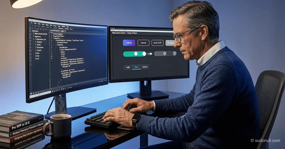
# Creating Custom WPF Controls: Styling Buttons and Switches Without Inheritance
When developing WPF applications, there's often a need to adapt standard controls to a corporate design without buying commercial libraries. Instead of creating custom UserControls or inheriting from base classes, it's more efficient to use styles and attached properties—this preserves compatibility with the framework and simplifies maintenance.
Theme System Architecture in WPF
To manage the application's appearance, it's recommended to centralize all resources in a Style folder. Each theme (e.g., light and dark) is set up as a separate directory containing a color palette file and the main resource dictionary. This allows easy theme switching at runtime by replacing a single ResourceDictionary in Application.Resources.
Sale switching then wyglądit sleduyuschim way:
public void ChangeTheme(Theme theme)
{
    if (CurrentTheme == theme) return;

    CurrentTheme = theme;
    Uri themeSource = theme switch
    {
        Theme.Dark => new Uri("pack://application:,,,/CustomWpfControls;component/Style/DarkTheme/DarkTheme.xaml", UriKind.Absolute),
        Theme.Light => new Uri("pack://application:,,,/CustomWpfControls;component/Style/LightTheme/LightTheme.xaml", UriKind.Absolute),
        _ => throw new ArgumentOutOfRangeException(nameof(theme))
    };

    var dictionary = Resources.MergedDictionaries[0];
    dictionary.Clear();
    dictionary.Source = themeSource;
}
This approach ensures that all UI elements instantly update their appearance without reloading the window.
Styling Buttons with Attached Properties
Instead of creating a custom RoundedButton class, it's better to define an attached property CornerRadius in a static class. This lets you set the corner radius directly in XAML without violating the principle of composition:
public static class RoundedButton
{
    public static readonly DependencyProperty CornerRadiusProperty = DependencyProperty.RegisterAttached(
        "CornerRadius",
        typeof(CornerRadius),
        typeof(RoundedButton),
        new FrameworkPropertyMetadata(new CornerRadius(0d),
            FrameworkPropertyMetadataOptions.AffectsMeasure |
            FrameworkPropertyMetadataOptions.AffectsRender));

    public static void SetCornerRadius(UIElement element, CornerRadius value) =>
        element.SetValue(CornerRadiusProperty, value);

    public static CornerRadius GetCornerRadius(UIElement element) =>
        (CornerRadius)element.GetValue(CornerRadiusProperty);
}
In the button style template, this property is used via binding to TemplatedParent:
<Border CornerRadius="{Binding RelativeSource={RelativeSource TemplatedParent}, Path=(customWpfControls:RoundedButton.CornerRadius)}" ... />Benefits of this approach:
- No need to write additional code-behind
- Full compatibility with Button is preserved
- Ability to override the radius both in the style and at the instance level
- Support for animations and state triggers
Implementing ToggleButton with an Animated Switch
A custom switch mimicking iOS style can be fully implemented via ControlTemplate without a single line of C#. Main template components:
- Canvas for precise element positioning
- DrawingImage for icons (checkmark and circle)
- Border with RenderTransform for animated movement
- VisualStateManager for responding to Checked/Unchecked
The shift animation is implemented via DoubleAnimation inside Storyboard:
<DoubleAnimation Duration="0:0:0.1"
                 To="20"
                 AccelerationRatio="0.2"
                 DecelerationRatio="0.7"
                 Storyboard.TargetName="Switcher"
                 Storyboard.TargetProperty="(RenderTransform).(TranslateTransform.X)"/>
Importantly, don't specify the initial value (From) so the animation always starts from the current position—this prevents jumps during frequent toggles.
Recommendations for Organizing Styles
For project scalability, follow these rules:
- Base style (without x:Key) should contain only Template and common Setters
- Specific variants (PrimaryButton, IconButton, etc.) are inherited via BasedOn
- All colors are moved to a separate file (e.g., DarkColors.xaml)
- Attached properties are grouped by functionality into static classes
This simplifies refactoring and allows quick creation of new control types based on existing templates.
Key Points
- Avoid inheriting from Button/ToggleButton if behavior logic doesn't change
- Attached properties are the preferred way to extend style functionality
- VisualStateManager provides declarative state management without code
- Centralized theme system simplifies support for multiple color schemes
- Animations should use relative values (without From) to avoid visual artifacts
— Editorial Team










No comments yet.