CSS drip effect
- Transfer
Recently, we talked about morphing forms in SVG , when one form is converted to another. Now let's take a look at how shapes can flow into each other. This sticky pulling amoeba effect is familiar to many from the video with drops of mercury on the surface .
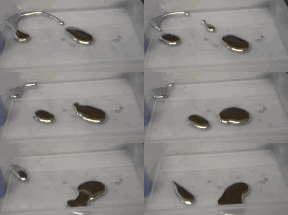
I’m definitely not sure who first discovered this application on the web, but initially I was guided by a demo from Lucas Bebber:
CodePen
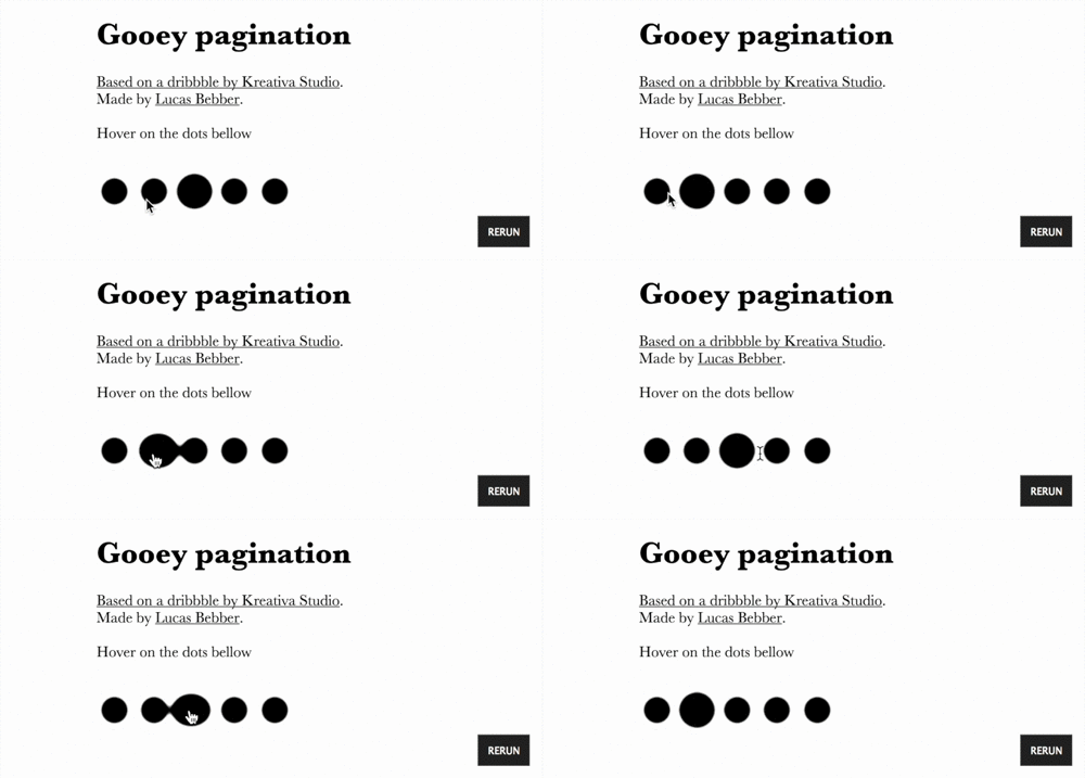
Then I saw a demo from Felix Hornoiu (low quality GIF for better web performance):
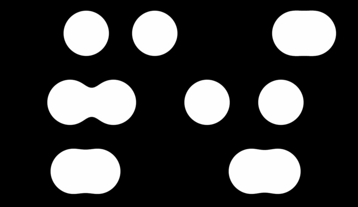
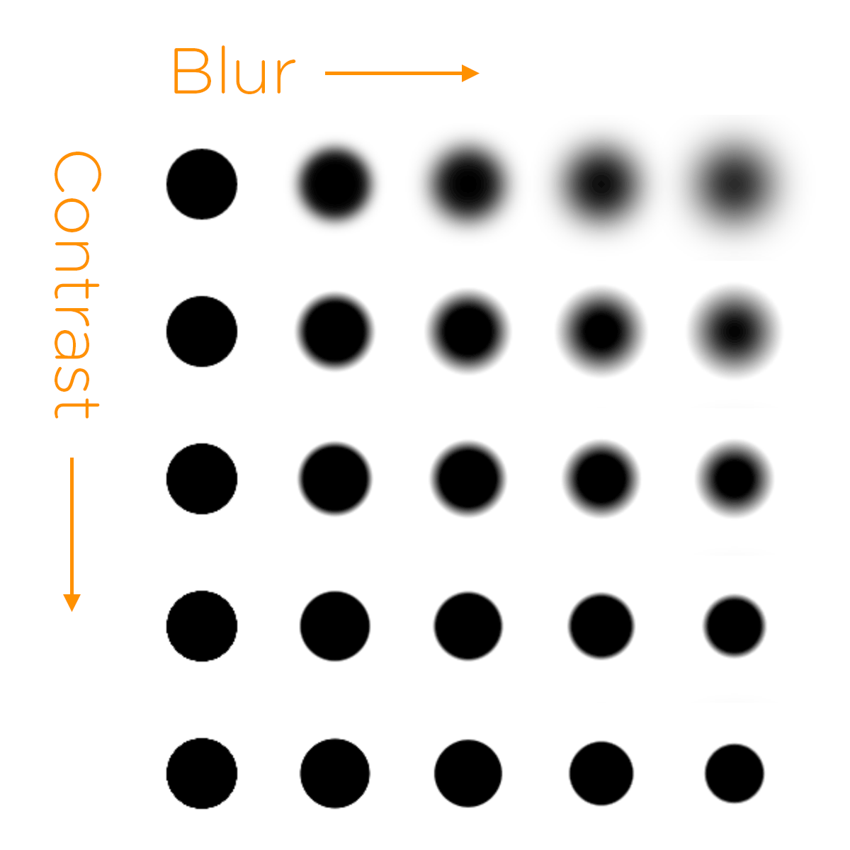
Blur, obviously, produces a blur effect, while contrast gives the outline a spot in the center. With the right balance, the result is a "fairly sharp" form.
The main feature is that when two zablurennyh elements are located close to each other, then when contrasting, they begin to look like a single whole.

An important point - contrasting must be applied to the parent element.
You will get the final result after animating your “drops”. Here 's a CodePen demo where you can play around with the values.
I am glad that now it works not only on WebKit / Blink! Firefox 35 fully supports filters without flags and other nuances. Beta Aurora is already v35 and I checked that everything works fine there.
Thus, the demo works in Chrome / Safari / Opera / Firefox / iOS / Android. Not bad. Only IE is not supported.
This is not for practical use !!! Take it easy.
Personally, I'm just crazy about this trick. Yes, a similar implementation with many elements decently loads the CPU, but with two circles everything works fine.
I am sure there are better ways to implement this idea.

I’m definitely not sure who first discovered this application on the web, but initially I was guided by a demo from Lucas Bebber:
CodePen

Then I saw a demo from Felix Hornoiu (low quality GIF for better web performance):

The idea is quite simple - apply the filter property for the element simultaneously with the values of blur and contrast.
Blur, obviously, produces a blur effect, while contrast gives the outline a spot in the center. With the right balance, the result is a "fairly sharp" form.

The main feature is that when two zablurennyh elements are located close to each other, then when contrasting, they begin to look like a single whole.

An important point - contrasting must be applied to the parent element.
.stage {
  /* обязательно должно быть указано для работы contrast */
  background: white;
  /* странным образом помогает при соединении границ, скрывает переполнение */
  padding: 30px;
  -webkit-filter: contrast(20);
  filter: contrast(20);
}
.dot {
  border-radius: 50%;
  width: 50px;
  height: 50px;
  /* также необходимо для корректной работы contrast */
  background: black;
  -webkit-filter: blur(15px);
  filter: blur(15px);
}
You will get the final result after animating your “drops”. Here 's a CodePen demo where you can play around with the values.
Browser support
I am glad that now it works not only on WebKit / Blink! Firefox 35 fully supports filters without flags and other nuances. Beta Aurora is already v35 and I checked that everything works fine there.
Thus, the demo works in Chrome / Safari / Opera / Firefox / iOS / Android. Not bad. Only IE is not supported.
Comment Predictions
This is not for practical use !!! Take it easy.
Personally, I'm just crazy about this trick. Yes, a similar implementation with many elements decently loads the CPU, but with two circles everything works fine.
I am sure there are better ways to implement this idea.
