How to make a selling product card for an online store
We warn you right away - this article is not about the fact that you need to use the red “add to cart” button on the product’s card, which will increase the conversion by 20% and that the product’s photo size should be 500 by 500 pixels and this will raise the conversion by another 10%, and the size of the header should be typed 10 point, that is when your goods will be sold. There are no simple recipes and secrets. There is truth in it. And the truth is that it’s not enough to read an article about buttons and colors to create a selling page with a product. To create a truly selling page you need to make a lot of efforts and to a lesser extent these efforts are associated with the choice of colors, fonts and buttons.

You need to understand that the main thing on the product card page is the content. And although all the elements are arranged on it with feng shui, and the colors psychologically contribute to the purchase (as numerous studies say), it will not sell if there is no content on it: product photos, descriptions, delivery conditions, etc. Therefore, the article will focus on what content should be on the product card.
Now it’s hard to imagine an online store without pictures of goods, but still less such stores are found, especially a lot of them in the regions. Here are some examples:

There are no images like in the catalog.

So on the product card. If you can still buy nails or screws without seeing how they look, then with a lamp this is hardly possible.

A product photo is an obligatory element on the product card, while it is not there, do not even think about other content. This is the basis.
If the store is small, then you can take photos yourself. There is always an option to take images from catalogs or from the manufacturer’s website, but these are extreme options. It is best to create content yourself.
Uploaded a couple of product images? Good. Here are some guidelines for online store product photos:

The online store 6pm.com creates video reviews of goods not from a great love for filming and a lot of free time and money.
They are well aware that such reviews increase the conversion of the site, reduce the number of returns of goods (especially clothes, in photos it may look completely different than it is for you).
Here is another example of using video on product cards in the asos.com online store:
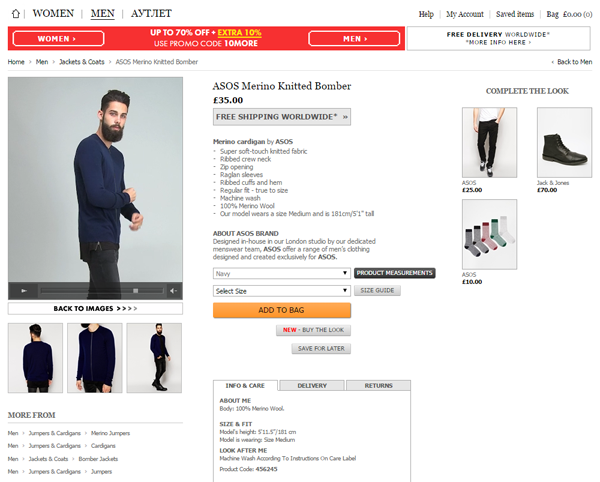
When processing photos of products, the color always changes slightly, so you can see the actual color of the product on the video.
Everyone chooses products in different ways. For some, the technical characteristics are important and understandable, for some it is important how the product looks, for the third the price is important. Your task is to answer the questions of all visitors to the site.
Take 2 examples of the description of the same product, for example, a men's wallet.
In the online store www.bagandwallet.ru, in addition to photos and videos about the product, there is a good, understandable description.

How many cards are in the wallet? 6-12. How many branches? 2. What banknotes are placed? Any. In the product description there is only really important and necessary information for making a purchasing decision, no “water”.
Take another example of a wallet product card and its description:
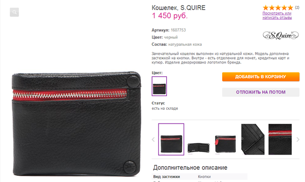
A wonderful wallet with a button closure with a brand logo. There are compartments for coins, credit cards and bills. Perfectly. How many cards are placed? What are the bills?
Below on the page, of course, there is information about how large the wallet is, but in order to understand which bills fit in it, the client needs to measure the bills. Agree, this is not very convenient.
Put in the product description only important and useful information, avoid high-quality adjectives “wonderful”, “beautiful”, “incomparable”, “excellent”. Indicate in the product description only understandable characteristics, not abstract ones.
As we wrote above, users choose a product differently, so it is important to provide all the characteristics of the product on the card.
Online appliance stores usually have no problems with this.
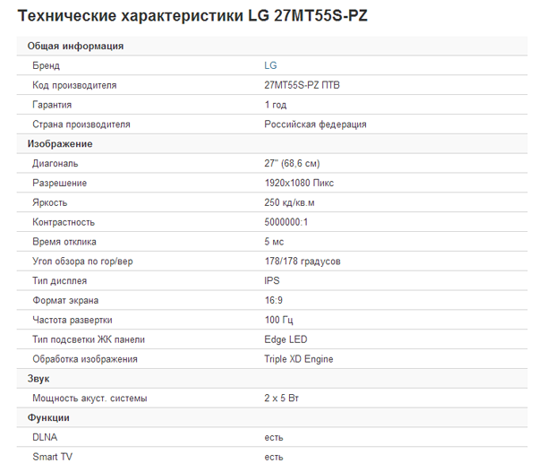
But there are also such commodity cards:

If there is no description of the product, then it is better not to post the product on the site at all, but spend a little time on creating the minimum necessary content for the product card.
The fact that other people listen to the reviews and that they affect the conversion has been said quite a bit. We only recall that this is an obligatory element of the product card. But in many online stores, reviews, if provided at all, look like this:
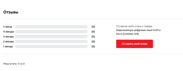
Therefore, we will give some tips on how you can ask for feedback from customers:
Here is a review from the amazon.com online store on TV for $ 199.999.99
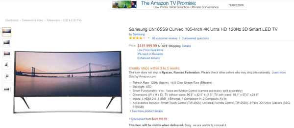
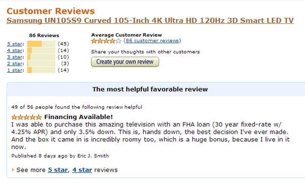
"I was able to purchase this amazing television with an FHA loan (30 year fixed-rate w / 4.25% APR) and only 3.5% down. This is, hands down, the best decision I've ever made. And the box it came in is incredibly roomy too, which is a huge bonus, because I live in it now. ”
” I managed to buy this TV thanks to a 30-year loan at 4.25% per annum with a down payment of 3.5%. This is by far the best decision in my life. And along with this TV is a big box, in which I will now live. ”
And here is another review on an expensive TV.
"Purchased this TV for my island retreat. Use it to primarily watch comedies like "The Shrinking Middle Class", "Income Inequality" and "The Ever Widening Wage Gap. Have to say, wow what a picture! Watching the 99% struggle with this level of clarity is amazing. "
" I bought this telly on my island. I mainly watch comedies like “the disappearing middle class”, “income inequality”, etc. I must say the picture is just a delight. Watching 99% of the population try to survive in UHD quality is indescribable! ”
And the last review from Amazon on a fur coat for $ 5,999.95

“ I wore this and got shot in the ass by some passing British Earl. To be fair it wasn't his fault - I did look like a Black Fox. A super fly, gorgeous fox albeit.
The doctors say I'll never walk again ... but then, when you look this good (see photo of guy), who cares. ”
” He received a fraction of a fraction lower than his back from a passing British ear mime. You don’t have to blame him, I really looked like a black fox. The doctors say that I’ll never get on my feet, but when you have such a smart coat, it doesn’t matter. ”
A product card is essentially a landing page for the user who came to buy a specific product. That is why it should give all the necessary information to make a purchase decision.
Such information includes:
As a rule, such information is located on separate pages on the site, so in order to see it the visitor needs to leave the product’s card.
To convince the visitor to make a purchase, such information should be located exactly on the product card (and duplicated on separate pages).
Here is an example of the implementation of the location of such information in the online store apple-ru.ru:
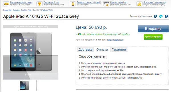
Information about guarantees, delivery, money back is located under the heading of the site, in the form of icons with links to pages with detailed information. In addition, below the card there are tabs "delivery", "payment", "guarantee". Those visitors who do not need detailed information about the delivery conditions will put the goods in the basket and proceed to checkout. And those users who thoroughly study all the conditions of the online store before buying will first visit the pages with this information, and then return to the product card if all the conditions of the purchase are acceptable to them.
Another important element on the product card is product recommendations. Make sure that the user does not think about what additional accessories are needed for the purchased product.
For example, when buying a phone, a buyer may need:
For example, in the online store holodilnik.ru for the microwave oven, there are 29 add-on products to choose from: The

audience that comes to the product card of your online store from a search or advertisement can come for the purchase of a certain product, or it can be at the selection stage between several goods, so substitute goods or goods for up-sell must be provided on the product card.
Here is an example of the implementation of the block of recommended products in the ASOS online store:
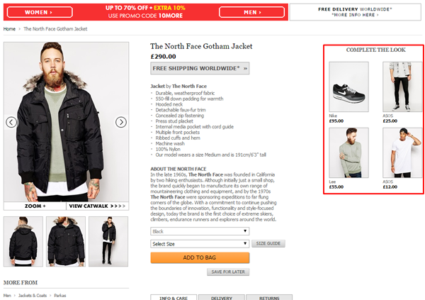
For those visitors who are not sure of the correct choice of the current product, there is an alternative - see similar products on the right.
In total, for the selling product card, the following content should be on it.
There are a few additional features for the product page.
So, very often it happens that the product is sold out, and the product card remains in the search results. As a result, the visitor visits the page, and the product is not in stock. On such pages, you can make the button "Report on sale". Here is an example of the implementation of such a chip in the Mango online store:

This service is only suitable for stores that have returns of goods and new goods that were not previously available.
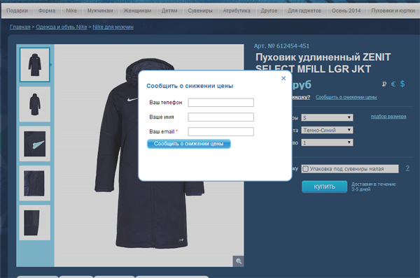
Another service that can be implemented on the product card is to inform the user about the reduction in the cost of the goods. Not all visitors coming to your site are ready to buy goods at full cost. This is especially true for the sale of clothes, since most retailers arrange seasonal sales and visitors are aware of this. Therefore, in order not to lose contact with the visitor, you can notify him of a reduction in the cost of the goods he was interested in.
Here is an example of the implementation of such a service:
A fairly common service, but we still say a few words about it. The purchase of goods can be impulsive, and can be considered for several days or even several weeks. Therefore, it is important to provide the ability to save goods that the user liked.
You can use 2 more chips in the list of saved items:
Here is an example of such an implementation:

It is convenient for the user, you can see what products the price has dropped and buy them. And for an online store - this is an additional tool to convince you to buy.
The more difficult the product is according to its technical characteristics, the more difficult it is to choose it. Especially in conditions where there are many similar products with a slight difference in price. In this case, it is necessary to implement the function of comparing goods. See how it is implemented in the online store mvideo.ru
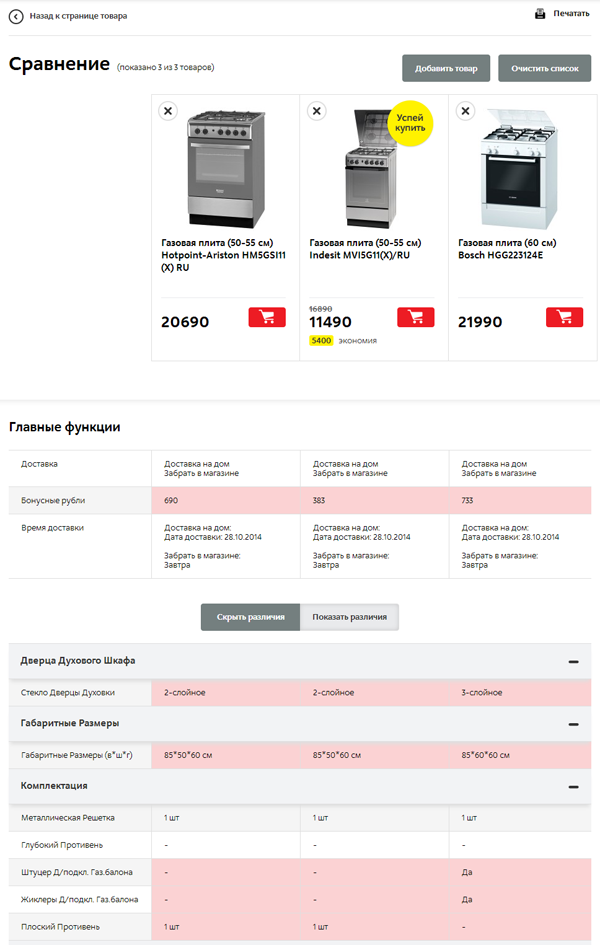
All differences in the characteristics of the goods are highlighted, which greatly facilitates the selection of a specific product by the user.
It is important to remember that such a function is needed for online stores with a large product range, for small online stores it will not bring benefits.
And what content is most important to you and what kind of product card do you see?

You need to understand that the main thing on the product card page is the content. And although all the elements are arranged on it with feng shui, and the colors psychologically contribute to the purchase (as numerous studies say), it will not sell if there is no content on it: product photos, descriptions, delivery conditions, etc. Therefore, the article will focus on what content should be on the product card.
Product Photos
Now it’s hard to imagine an online store without pictures of goods, but still less such stores are found, especially a lot of them in the regions. Here are some examples:

There are no images like in the catalog.

So on the product card. If you can still buy nails or screws without seeing how they look, then with a lamp this is hardly possible.

A product photo is an obligatory element on the product card, while it is not there, do not even think about other content. This is the basis.
If the store is small, then you can take photos yourself. There is always an option to take images from catalogs or from the manufacturer’s website, but these are extreme options. It is best to create content yourself.
Uploaded a couple of product images? Good. Here are some guidelines for online store product photos:
- Show photos from different angles . For most products, one photo is not enough. Take a photo from different sides, or, for example, in 3D mode.
- Show the product in use . If this is clothing, then take photos on a person. If you are selling cookware, take a couple of photos in a beautifully decorated kitchen interior. For sellers of jewelry, watches, and jewelry, it is important to show the goods on a person so that the user sees what size the watch is relative to the hand or how big the earrings are. Few people look at the description of the size of the goods in the characteristics and few will substitute the ruler to their hand to understand the size of the watch. As a result, the client will either order and be dissatisfied with the product and return it, or leave the site.
- Shoot a product video . If you think that shooting a video about a product is too expensive, then think about this: how much will it cost to shoot one video review of the product? How much will this increase the value of your online store in the eyes of the client and the conversion on your site? Yes, you can not shoot video about a product, but spend this money on an advertising budget in order to attract more and more traffic, but in fact, you need to work with content and goods in order to increase its value. Here are some examples of online stores that use video on the product card. The online store 6pm.com takes video reviews of products. This can be compared with a personal sale, since on the one hand the product is shown in the video, and on the other there is a person who talks about the product and its benefits, in fact, sells the product.

The online store 6pm.com creates video reviews of goods not from a great love for filming and a lot of free time and money.
They are well aware that such reviews increase the conversion of the site, reduce the number of returns of goods (especially clothes, in photos it may look completely different than it is for you).
Here is another example of using video on product cards in the asos.com online store:

When processing photos of products, the color always changes slightly, so you can see the actual color of the product on the video.
Product description
Everyone chooses products in different ways. For some, the technical characteristics are important and understandable, for some it is important how the product looks, for the third the price is important. Your task is to answer the questions of all visitors to the site.
Take 2 examples of the description of the same product, for example, a men's wallet.
In the online store www.bagandwallet.ru, in addition to photos and videos about the product, there is a good, understandable description.

How many cards are in the wallet? 6-12. How many branches? 2. What banknotes are placed? Any. In the product description there is only really important and necessary information for making a purchasing decision, no “water”.
Take another example of a wallet product card and its description:

A wonderful wallet with a button closure with a brand logo. There are compartments for coins, credit cards and bills. Perfectly. How many cards are placed? What are the bills?
Below on the page, of course, there is information about how large the wallet is, but in order to understand which bills fit in it, the client needs to measure the bills. Agree, this is not very convenient.
Put in the product description only important and useful information, avoid high-quality adjectives “wonderful”, “beautiful”, “incomparable”, “excellent”. Indicate in the product description only understandable characteristics, not abstract ones.
Product Features
As we wrote above, users choose a product differently, so it is important to provide all the characteristics of the product on the card.
Online appliance stores usually have no problems with this.

But there are also such commodity cards:

If there is no description of the product, then it is better not to post the product on the site at all, but spend a little time on creating the minimum necessary content for the product card.
Product Reviews
The fact that other people listen to the reviews and that they affect the conversion has been said quite a bit. We only recall that this is an obligatory element of the product card. But in many online stores, reviews, if provided at all, look like this:

Therefore, we will give some tips on how you can ask for feedback from customers:
- After purchasing a product, contact the customer with a request that he leave a review about a particular product and the store as a whole;
- Do not remove negative product reviews. If your online store receives negative reviews about products, then this is not a reason to delete such reviews - this is an occasion to think about the quality of the goods you sell and review the product line;
- Thank your customers for the feedback - it can be a simple “thank you”, or maybe a gift. You decide;
- If you have a small store, then you can communicate with the client in person to get feedback. This is a good practice in order to understand which aspects of your service need improvement.
Reviews can be funny and memorable
Here is a review from the amazon.com online store on TV for $ 199.999.99


"I was able to purchase this amazing television with an FHA loan (30 year fixed-rate w / 4.25% APR) and only 3.5% down. This is, hands down, the best decision I've ever made. And the box it came in is incredibly roomy too, which is a huge bonus, because I live in it now. ”
” I managed to buy this TV thanks to a 30-year loan at 4.25% per annum with a down payment of 3.5%. This is by far the best decision in my life. And along with this TV is a big box, in which I will now live. ”
And here is another review on an expensive TV.
"Purchased this TV for my island retreat. Use it to primarily watch comedies like "The Shrinking Middle Class", "Income Inequality" and "The Ever Widening Wage Gap. Have to say, wow what a picture! Watching the 99% struggle with this level of clarity is amazing. "
" I bought this telly on my island. I mainly watch comedies like “the disappearing middle class”, “income inequality”, etc. I must say the picture is just a delight. Watching 99% of the population try to survive in UHD quality is indescribable! ”
And the last review from Amazon on a fur coat for $ 5,999.95

“ I wore this and got shot in the ass by some passing British Earl. To be fair it wasn't his fault - I did look like a Black Fox. A super fly, gorgeous fox albeit.
The doctors say I'll never walk again ... but then, when you look this good (see photo of guy), who cares. ”
” He received a fraction of a fraction lower than his back from a passing British ear mime. You don’t have to blame him, I really looked like a black fox. The doctors say that I’ll never get on my feet, but when you have such a smart coat, it doesn’t matter. ”
Warranty, Delivery, Return, Payment
A product card is essentially a landing page for the user who came to buy a specific product. That is why it should give all the necessary information to make a purchase decision.
Such information includes:
- conditions and cost of delivery of goods;
- product warranty;
- conditions for returning the goods;
- payment options.
As a rule, such information is located on separate pages on the site, so in order to see it the visitor needs to leave the product’s card.
To convince the visitor to make a purchase, such information should be located exactly on the product card (and duplicated on separate pages).
Here is an example of the implementation of the location of such information in the online store apple-ru.ru:

Information about guarantees, delivery, money back is located under the heading of the site, in the form of icons with links to pages with detailed information. In addition, below the card there are tabs "delivery", "payment", "guarantee". Those visitors who do not need detailed information about the delivery conditions will put the goods in the basket and proceed to checkout. And those users who thoroughly study all the conditions of the online store before buying will first visit the pages with this information, and then return to the product card if all the conditions of the purchase are acceptable to them.
Product recommendations and products for upsell
Another important element on the product card is product recommendations. Make sure that the user does not think about what additional accessories are needed for the purchased product.
For example, when buying a phone, a buyer may need:
- film;
- case;
- additional battery.
For example, in the online store holodilnik.ru for the microwave oven, there are 29 add-on products to choose from: The

audience that comes to the product card of your online store from a search or advertisement can come for the purchase of a certain product, or it can be at the selection stage between several goods, so substitute goods or goods for up-sell must be provided on the product card.
Here is an example of the implementation of the block of recommended products in the ASOS online store:

For those visitors who are not sure of the correct choice of the current product, there is an alternative - see similar products on the right.
Dry residue
In total, for the selling product card, the following content should be on it.
- high-quality description of the product, without “water”, with a description of the useful properties of the product;
- photos of good quality goods from several angles;
- video reviews of goods. Not necessarily, but can significantly increase the conversion and reduce the cost of returning the goods;
- product specifications;
- Feedback
- information on delivery, payment, guarantees;
- links to similar and recommended products;
- links to products that complement the product.
A few additional chips on the product card
There are a few additional features for the product page.
So, very often it happens that the product is sold out, and the product card remains in the search results. As a result, the visitor visits the page, and the product is not in stock. On such pages, you can make the button "Report on sale". Here is an example of the implementation of such a chip in the Mango online store:

This service is only suitable for stores that have returns of goods and new goods that were not previously available.
Report Price Reduction
Another service that can be implemented on the product card is to inform the user about the reduction in the cost of the goods. Not all visitors coming to your site are ready to buy goods at full cost. This is especially true for the sale of clothes, since most retailers arrange seasonal sales and visitors are aware of this. Therefore, in order not to lose contact with the visitor, you can notify him of a reduction in the cost of the goods he was interested in.
Here is an example of the implementation of such a service:

Add to favorites
A fairly common service, but we still say a few words about it. The purchase of goods can be impulsive, and can be considered for several days or even several weeks. Therefore, it is important to provide the ability to save goods that the user liked.
You can use 2 more chips in the list of saved items:
- Show notifications that few items are left in stock
- show discounts on saved items.
Here is an example of such an implementation:

It is convenient for the user, you can see what products the price has dropped and buy them. And for an online store - this is an additional tool to convince you to buy.
Product Comparison
The more difficult the product is according to its technical characteristics, the more difficult it is to choose it. Especially in conditions where there are many similar products with a slight difference in price. In this case, it is necessary to implement the function of comparing goods. See how it is implemented in the online store mvideo.ru

All differences in the characteristics of the goods are highlighted, which greatly facilitates the selection of a specific product by the user.
It is important to remember that such a function is needed for online stores with a large product range, for small online stores it will not bring benefits.
And what content is most important to you and what kind of product card do you see?
