We analyzed 20 landing pages for cool startups and this is what we learned
- Transfer

In our project, we constantly change the main landing page or create additional landing pages for our service directions. Every time we try to find the best option for presenting our product. But what to change and what to leave is not always clear at first sight. Therefore, we translated an article in which 20 landing pages of famous startups are prepared.
This is how to assemble the perfect girl from top models or favorite actresses. Only about landings.
So, stock up on a cup of coffee, rushed.
The main page or landing page of your startup is probably the most important page of your site. Think of it as a blank canvas on which you, as a business owner or web designer, can hook your first visitor.
First of all, your main page should explain what your product or service is about. And that's not all - she has to do much more:
- It must convince your visitors that you can be trusted, that you are reliable and truly exist.
- She should tell your visitors where to go next.
- It should provide a sufficient amount of information in order to prevent visitors from clicking on the "back" button.
And she must do all this in a very short time.
Unfortunately, there is no magic formula with which you can make an ideal homepage. But you can highlight a certain set of elements that are constantly used in most startups on their pages to convert first visitors to buyers. The purpose of this study is to identify a specific set of ideas that can be tested on your pages.
First step: Find 20 SaaS startups
We wanted to analyze a combination of old and new startups to identify elements on their pages, from which we can see some kind of model / template for creating an “ideal” page. And so, let's start with several “top startups” and “most successful startups”:
- Zendesk
- Basecamp
- Boostable
- Intercom
- Optimizely
- Contently
- NextBigSound
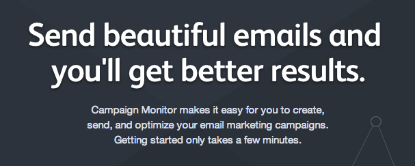
- Campaignmonitor
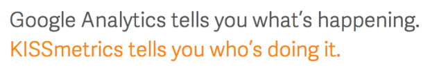
- KISSmetrics
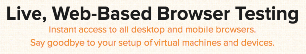
- Browserstack
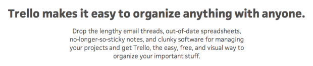
- Trello
- NewRelic
- Mixpanel
- Wistia
- Recurly
- Geckoboard
- Sqwiggle
- Hootsuite
- Uservoice
- Pingdom
Next step: Analysis of each main page
The next step begins by looking at each main page and the elements used on these pages. So what we found:
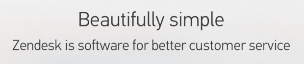
 | ZendeskCustomer support service from Ze n desk. Elements on the page: Fixed header, slogan + call to action + screenshot, list of functions, list of customers, call to action and footer. |
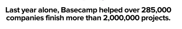
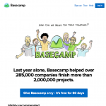 | BasecampBasecamp is everyone’s favorite project management application. Elements on the page: Heder, Slogan (using social evidence) + call to action / social. evidence, screenshots, FAQ, even more social. evidence, links to further information and footer. |
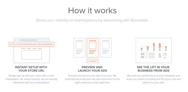
 | BoostableBoost your marketplace visibility with ads with Boostable . Elements on the page: Slogan + email field + call to action, how it works, demo, team and investment information, career and footer. |
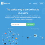 | IntercomService for collecting user information and communication with customers. Elements on the page: Fixed header, Slogan + email field + call to action, feature comparison, customer list, features + screenshots, reviews and footer. |
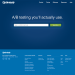 | OptimizelyService for A / B tests that you really use. Elements on the page: Header, Slogan + email field + call to action and footer |
 | ContentlyContently empowers reporters and brands to engage with more engaging content. Elements on the page: Header, slogan + customer list + call to action, how it works, customer list, social proof and footer |
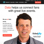
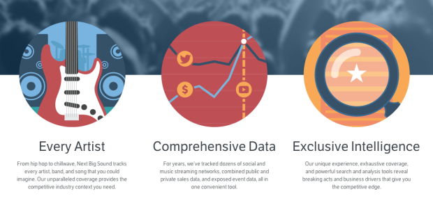
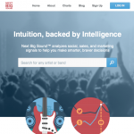 | NextBigSoundAnalytics and insights for the music industry. Elements on the page: Header, Slogan + search, main functions, report, cases, reviews and footer |
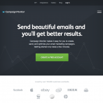 | CampaignmonitorSend a beautiful email sending with Campaign Monitor. Elements on the page: Fixed header, slogan + call to action, list of clients, functions and footer. |
 | KISSmetricsCustomer information and web analytics. Elements on the page: Slogan + after for the website + call to action and footer. |
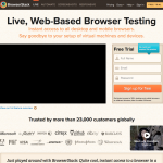 | BrowserstackTest your site for cross-browser support on real browsers. Elements on the page: Header, Slogan + Video + subscription form, customer list, reviews, features and footer. |
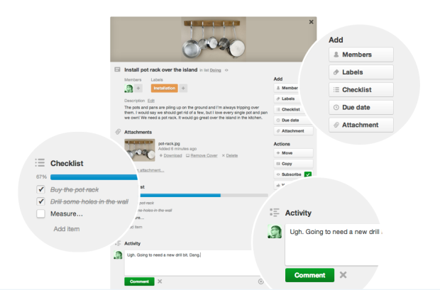
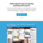 | TrelloTrello keeps track of everything from the big picture to the little details. Elements on the page: Slogan + call to action, functions + screenshots, list of customers, call to action and footer. |
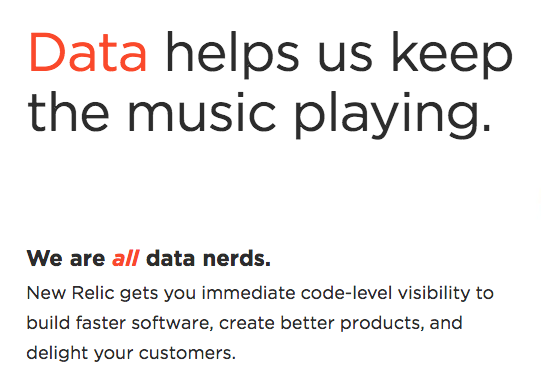
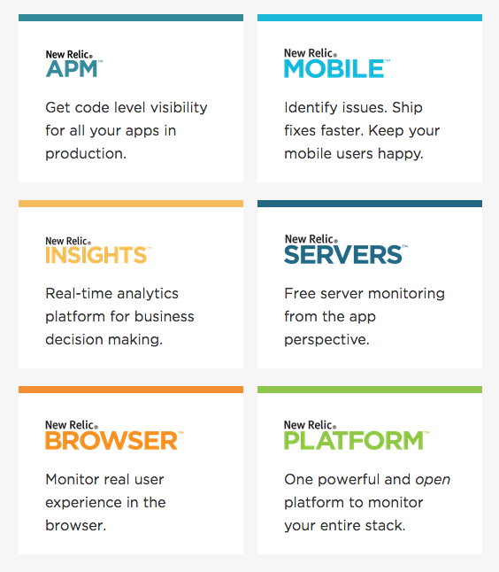
 | NewRelicTrack and manage application performance. Elements on the page: Header, slogan + call to action, customer list, reviews, features + video and footer. |
 | MixpanelThe most advanced analytical platform for the mobile and web market. Elements on the page: Header, Slogan + call to action, list of clients, cases, reviews and footer. |
 | WistiaWistia provides professional video hosting. Elements on the page: Header, slogan, functions + video, reviews and footer. |
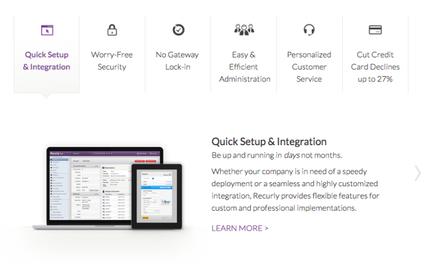
 | RecurlyExperts in paying for subscriptions and recurring payments. Elements on the page: Header, Slogan + call to action, customer list, benefits + reviews, features and footer. |
 | GeckoboardInformation boards for business. Elements on the page: Header, slogan + call to action + video on the background, customer list, benefits, how it works, reviews and footer. |
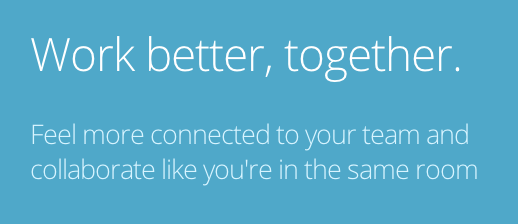
 | SqwiggleOnline collaboration software for remote and virtual teams. Elements on the page: Header, slogan _ call to action + screenshots, problems, reviews, benefits, reviews, registration form and footer. |
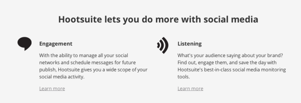
 | HootsuiteBoard for the management of social. media. Elements on the page: Fixed header, slogan + call to action, plans, functions, target market and footer. |
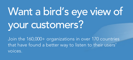
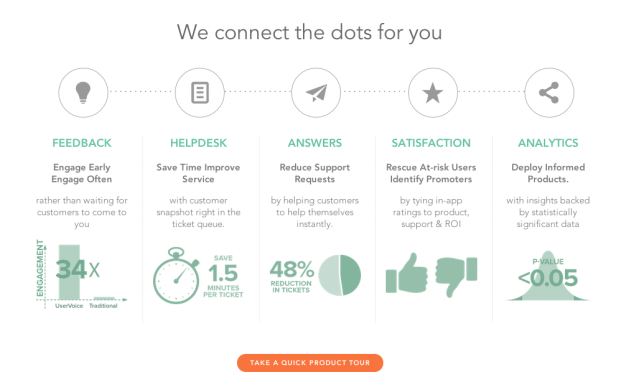
 | UservoiceSoftware for online help and getting feedback from users. Elements on the page: Fixed header, slogan + call to action, functions + screenshots, cases, videos, list of clients and footer. |
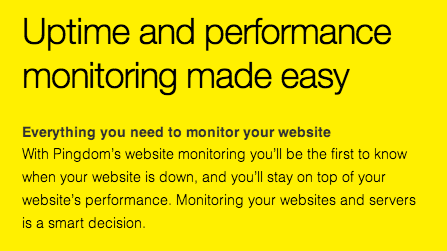
 | PingdomEasy monitoring of performance and availability. Elements on the page: Fixed header, slogan + call to action + screenshots, customer list, reviews, benefits, social. evidence, features, plans and prices, customers and footer |
Next step: Analyze each element used.
Using the information gathered, let's see how often each specific item is used.
Here are some interesting statistical facts about these 20 startups:
100% - contain a slogan 75% - contain a description after the slogan
95% - contain a call to action on the initial screen 20% - contain a call to action with an input field (email or website) in front of it
50% - contain the word “free” in their calls to action
10% - contain the full registration form
5% - contain information on prices 20% - indicate the benefits of using their product 65% - indicate the list of functions of their product
Multimedia
20% - contain video
35% - contain screenshots
Headers and footers
85% - contain a header
30% - contain a fixed header that remains on the screen when
100% scrolling - contain footer
Social evidence
80% - contain some form of social. evidence (customer list, reviews or cases)
60% - contain a list of customers
50% - contain reviews
15% - contain cases
What do these numbers tell us?
It is important to remember, since we do not have specific conversion rates at our disposal, we cannot determine which elements work better than others (statistically). However, since the purpose of the analysis was to determine a list of ideas for testing, there is more than enough information.
If you are going to update your home page, then the next part of the article will be of most interest to you. Below we show a list of ideas that you can try.
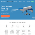
1. Your tagline: Your chance to stand out
Your page needs a tagline. Think of it as a way to tell your visitors about your service in 5 seconds. It must be short and impressive. It should highlight the benefits of your service in one sentence.
All startups contained a slogan - and 75% of them wrote a description immediately below it. Try to use as short phrases as possible, say them a couple of times out loud. Imagine that you have 5 seconds to explain what your product or service is about to a friend ... what do you say?
Testing ideas:
- Test new slogans
- Add or change the description after the slogan
Here are some examples from startups:


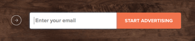
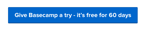
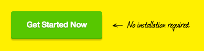
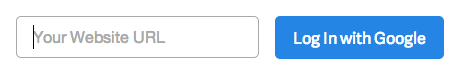
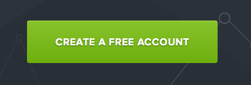
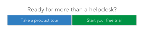
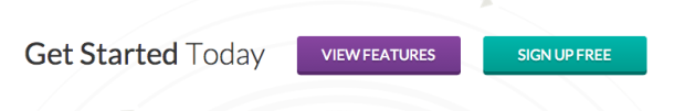
2. Your call to action: Get your customers on the first screen
Almost all startups (95%) contained a call to action on the first screen. The text in this call can seriously affect the number of visitors who clicked on it, it is definitely worth testing. Half of the startups used the word “free” in their appeals, despite the fact that they all have paid subscriptions.
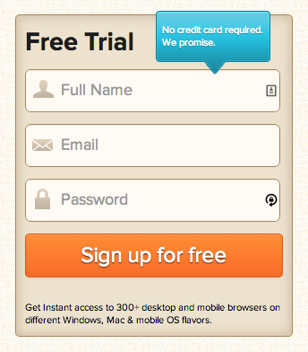
A study also found that 20% of startups put a field for an email or website before a call to action. This created an impression among visitors that they had already spent some time registering and were ready to work with the service, while not yet starting to register.
Testing ideas:
- Test new call-to-action phrases - try the word “free”
- Try different colors and formats.
- Add an input field before the call to hook the visitor
- If your registration form is not large, try pasting it into the main page
Here are some examples from startups:


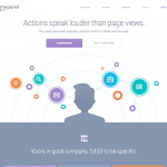
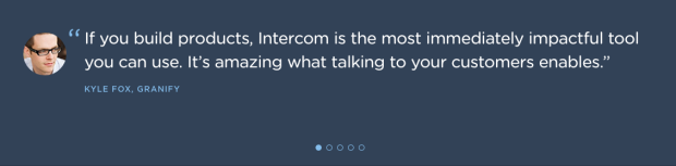
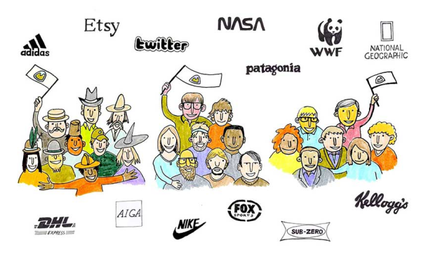
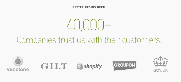
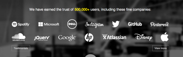
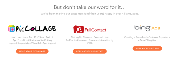
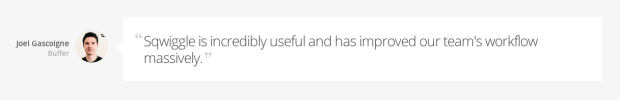
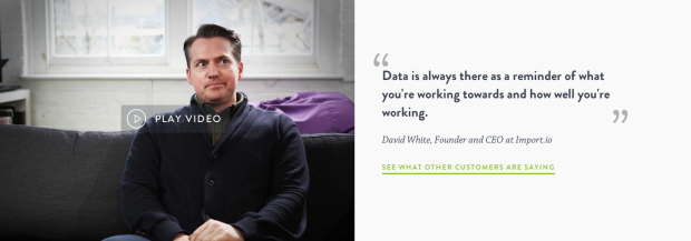
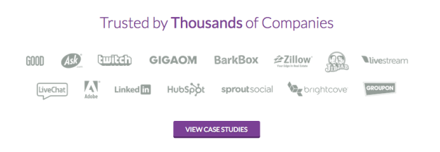
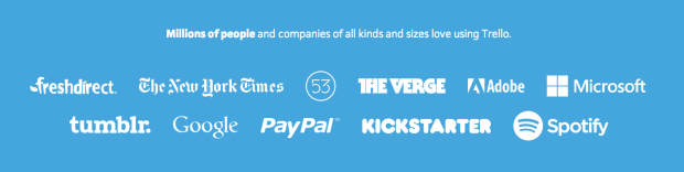
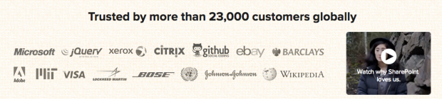
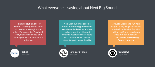
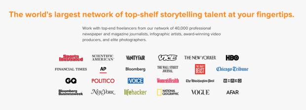
3. Social Evidence: Build Trust and Engagement
Not surprisingly, most pages (80%) used some form of social evidence. They work because visitors need to feel that your product / service is being used and that it is real.
Three main forms of social evidence:
- Customer list or number of customers (60%)
- Feedback (50%)
- Cases (15%)
Even if your startup has just begun its work, it is not so difficult to get feedback from friends who have tried to use your product. And over time, you will replace less popular customers, reviews and cases with more impressive names.
Testing ideas:
- Add a list of customers - even a small list can help.
- Use the service www.userstats.com to quickly add social. evidence to your site.
- Ask your customers to write a review.
- If you know a customer who is happy with your product, try building a case based on its example.
Here are some examples from startups:


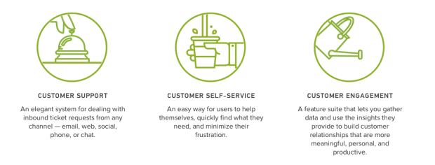
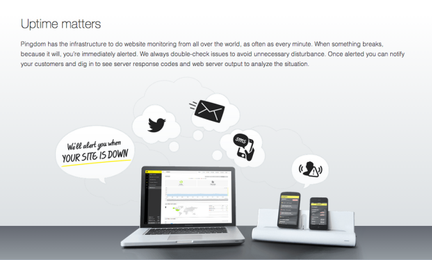
4. Functions: Explain how your product works.
Although 60% of startups showed a list of their features, 20% of them devoted a whole section to the benefits of their product. Until your product has reached such popularity that most people already know how it works, you need to explain what your service does.
There are many different ways to explain what your product is about - you can show screenshots or videos. Or describe in text form how each element works. One of the startups posted a review after each feature - a great way to show the benefits of user words.
Testing ideas:
- Add screenshots to visually explain what your product does.
- If possible, create a short video describing the benefits your product will bring.
- Try to get feedback on every feature in your product, this will help show the benefits of them in the words of customers.
- Make your functions more profit-oriented. Just answer: How will this feature help my clients?
Here are some examples from startups:


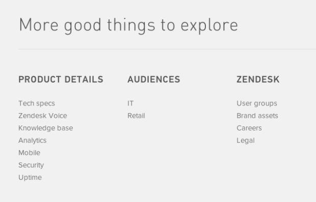
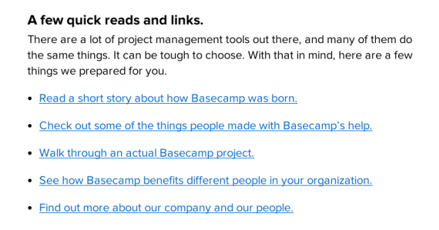
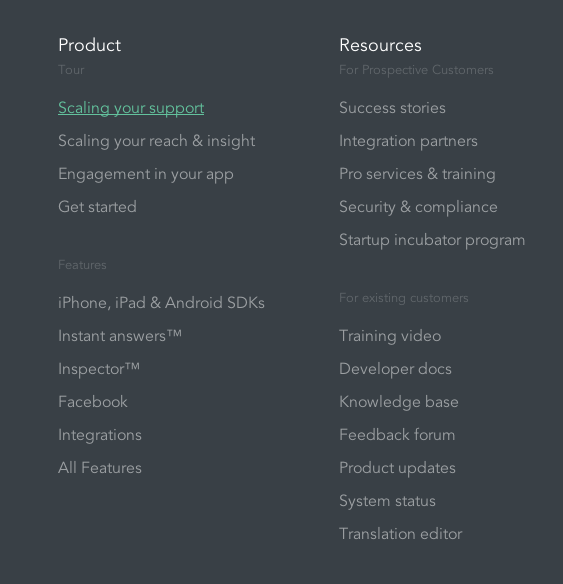
5. More information: For visitors who want to know more
You will definitely find a certain number of visitors who will not be satisfied with the information on the main page. These users will want to find as much information as possible about your product before starting to think about using it. That is why you need to make sure that visitors can easily get to other parts of your site from the main page.
Some startups did this by adding a second call to action, leading to a detailed description of the product, to the FAQ page, or adding useful links to the footer. Make sure that your visitors have a place to go further if you do not want to send them for registration.
Testing ideas:
- Add a second call to action leading to additional information.
- Add the FAQ section to the page with answers to basic questions.
- Insert links to the block or base of answers in the footer.
Here are some examples from startups:


And so the final list: an idea for verification
Thanks to the analysis of sites, you can emphasize 17 ideas that are worth trying on your page. It is important to remember that an idea that works on one site may not be suitable for yours. Detailed A / B testing is necessary to verify how an element affects the conversion. And remember: sometimes removing content from your page may be the most effective solution. And so the final list:
- Test new slogans.
- Add or change the description after the slogan.
- Test new call-to-action phrases - try the word "free."
- Try different colors and formats.
- Add an input field before the call to hook the visitor.
- Если ваша форма для регистрации небольшая, попробуйте вставить её в главную страницу.
- Добавьте список клиентов — даже небольшой список сможет помочь.
- Используйте сервис www.userstats.com чтобы быстро добавить соц. доказательства на ваш сайт.
- Попросите ваших клиентов написать отзыв.
- Если вы знаете клиента, который доволен вашим продуктом, попробуйте построить кейс на основе его примера.
- Добавьте скриншоты, чтобы визуально объяснить что делает ваш продукт.
- Если возможно, создайте короткое видео, описывающее какие выгоды принесет ваш продукт.
- Постарайтесь получить отзыв на каждую функцию в вашем продукте, это поможет показать выгоды от них словами клиентов.
- Делайте ваши функции более ориентированными на выгоду. Просто отвечайте: Как эта функция поможет моим клиентам?
- Add a second call to action leading to additional information.
- Add the FAQ section to the page with answers to basic questions.
- Insert links to the block or base of answers in the footer.
The list above should give you some ideas on what to try on your site so that even more people subscribe to your service. But before starting any changes, analyze your current site to know how to compare your progress.