 September 10, 2014 at 15:07
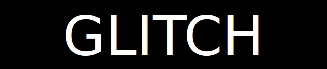
Faulty monitor effect for text, pictures and SVG
- Transfer
- Tutorial
The Glitch effect of Lucas Bebber looks very cool - as if you were looking at text on an old monitor that was dropped too often on the floor and had vertical synchronization and roll-up.
The implementation of this effect on CSS looks quite convincing. I had to rack my brains a bit to figure out how it works, and now I want to explain this to you. In addition, I reproduced this effect not only for text, but also for bitmap images and SVG, and also wrote several impurities of Sass to make it easier to work with.
The HTML for this example looks simple:
Using pseudo-elements, two additional copies of the main element are created, which can be individually controlled:
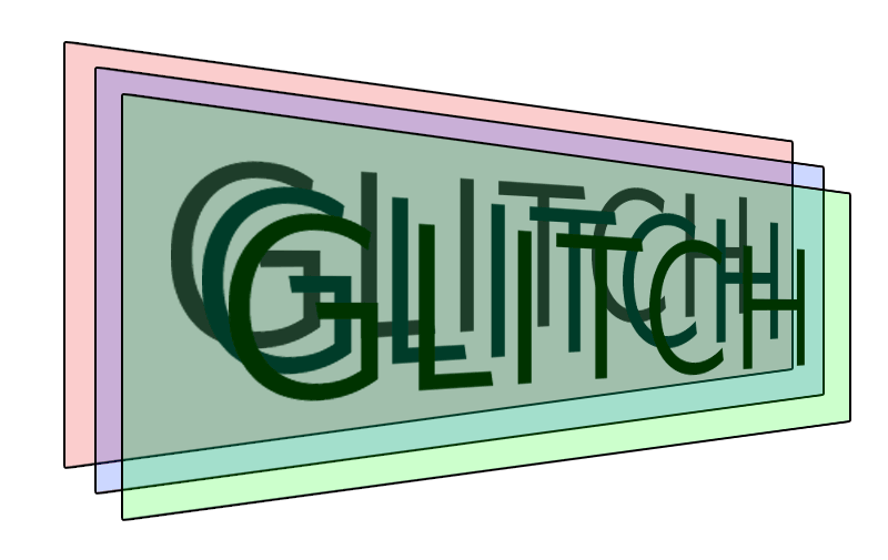
All three copies of the text are located one above the other:
Each of the additional copies is identical to the original except that:
It is the displacement and halo that serve as the basis for the effect of a faulty monitor.
Now our three copies look like this:
So far, only the top of the three copies is visible to us. This is most likely a version
At
Here's what the result of cropping might look like, for clarity, the background is made opaque and the layers are offset from each other:
You
Please note that the left and right edges remain unchanged, only the upper and lower edges change. And these values are chosen completely arbitrarily. Using Sass, you can generate them randomly:
Since we need two sets of random cropping rectangles, we will need to make two sets of key frames and apply them to two copies:
At this point we can adjust the speed of the animation to loop it. The effect is ready:
I thought it would be nice to add convenient reuse to this effect. For example, write an Sass admixture with parameters that can be used to control the effect:
That's what I did:
Of course, you can think of another million ways how to implement this admixture - it all depends on what parameters you want to configure, what your HTML markup, etc.
I also wrote two more admixtures, one for raster images, the second for SVG. They differ in implementation details - pseudo-elements are not used there, offset and color halo are also done differently, etc. Here are all three impurities in one file . And here is their work:
The implementation of this effect on CSS looks quite convincing. I had to rack my brains a bit to figure out how it works, and now I want to explain this to you. In addition, I reproduced this effect not only for text, but also for bitmap images and SVG, and also wrote several impurities of Sass to make it easier to work with.
Three copies of text
The HTML for this example looks simple:
GLITCHUsing pseudo-elements, two additional copies of the main element are created, which can be individually controlled:
.glitch {
  position: relative;
}
.glitch::before,
.glitch::after {
  content: attr(data-text);
  position: absolute;
  top: 0;
  left: 0;
  width: 100%;
  height: 100%;
}
All three copies of the text are located one above the other:
We change copies
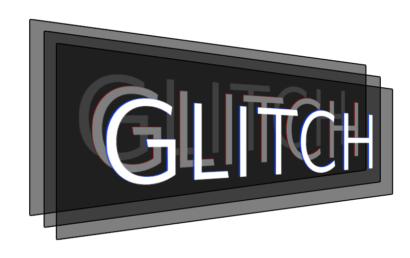
Each of the additional copies is identical to the original except that:
- they are shifted left or right;
- They have a colored halo created with help
text-shadow.
It is the displacement and halo that serve as the basis for the effect of a faulty monitor.
.glitch::before {
  /* ... всё, что нужно, чтобы сделать слой идентичным оригиналу */
  /* отличия от оригинала */
  left: 2px;
  text-shadow: -1px 0 red;
  /* Важно: непрозрачный фон закрывает предыдущий слой */
  background: black;
}
.glitch::after {
  /* ... всё, что нужно, чтобы сделать слой идентичным оригиналу */
  /* отличия от оригинала */
  left: -2px;
  text-shadow: -1px 0 blue;
  /* Важно: непрозрачный фон закрывает предыдущий слой */
  background: black;
}
Now our three copies look like this:
Crop copies
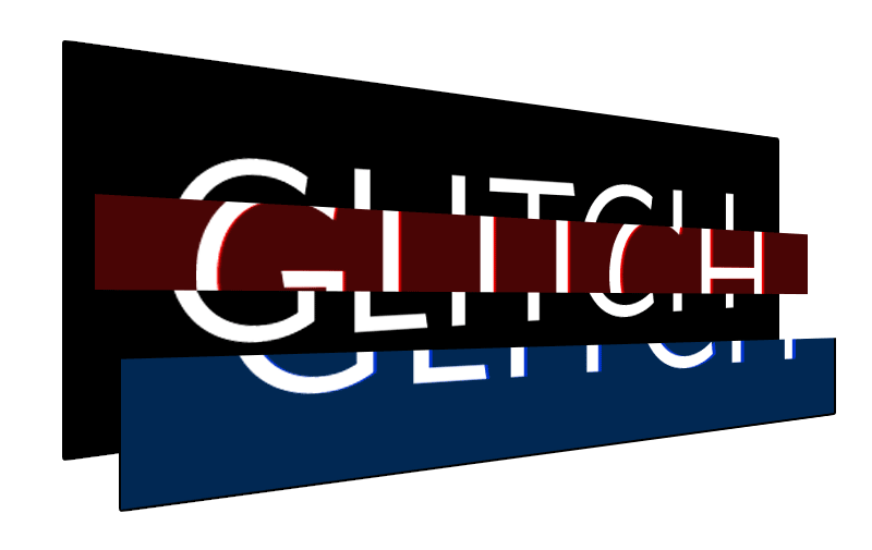
So far, only the top of the three copies is visible to us. This is most likely a version
::after, unless you have changed z-index. But this is not important, since we will alternately show parts of all three copies using the property clip. At the moment, this property is already considered obsolete, it should replace it clip-path, but at the time of writing, it was the property that clipworked better. Of course, this will change over time, so sometimes you need to look at the situation. In which case, it will be easy to change them, for example, using Autoprefixer . At
clippretty weird syntax. Four values are required, it would be logical to assume that these are the coordinates of the upper left corner and the length with a width, or the coordinates of the upper left and lower right corners, but instead, the numbers mean indentation, as in the properties marginor padding( top/right/bottom/left)..glitch::before {
clip: rect(44px, 450px, 56px, 0);
/*
Получился прямоугольник с верхним левым углом 0, 44px
и нижним правым 450px, 56px
*/
}
Here's what the result of cropping might look like, for clarity, the background is made opaque and the layers are offset from each other:
Animate cropping
You
clipcan use CSS animations for the property by changing the position of the clipping rectangle. Here is an example of such an animation:@keyframes glitch-anim {
0% {
clip: rect(70px, 450px, 76px, 0);
}
20% {
clip: rect(29px, 450px, 16px, 0);
}
40% {
clip: rect(76px, 450px, 3px, 0);
}
60% {
clip: rect(42px, 450px, 78px, 0);
}
80% {
clip: rect(15px, 450px, 13px, 0);
}
100% {
clip: rect(53px, 450px, 5px, 0);
}
}
Please note that the left and right edges remain unchanged, only the upper and lower edges change. And these values are chosen completely arbitrarily. Using Sass, you can generate them randomly:
@keyframes glitch-anim {
  $steps: 10;
  @for $i from 0 through $steps {
    #{percentage($i*(1/$steps))} {
      clip: rect(random(100)+px, 9999px, random(100)+px, 0);
    }
  }
}
Since we need two sets of random cropping rectangles, we will need to make two sets of key frames and apply them to two copies:
.glitch::before {
  ...
  animation: glitch-anim-1 2s infinite linear alternate-reverse;
}
.glitch::after {
  ...
  animation: glitch-anim-2 2s infinite linear alternate-reverse;
}
At this point we can adjust the speed of the animation to loop it. The effect is ready:
Impurities Sass
I thought it would be nice to add convenient reuse to this effect. For example, write an Sass admixture with parameters that can be used to control the effect:
.example-one {
  font-size: 100px;
  @include textGlitch("example-one", 17, white, black, red, blue, 450, 115);
}
That's what I did:
/*
  (TEXT) PARAMS
  =================
  1. Namespace
  2. Intensity
  3. Text color
  4. Background color (flat)
  5. Highlight #1 color
  6. Highlight #2 color
  7. Width (px)
  8. Height (px)
*/
@mixin textGlitch($name, $intensity, $textColor, $background, $highlightColor1, $highlightColor2, $width, $height) {
  color: $textColor;
  position: relative;
  $steps: $intensity;
  // Ensure the @keyframes are generated at the root level
  @at-root {
    // We need two different ones
    @for $i from 1 through 2 {
      @keyframes #{$name}-anim-#{$i} {
        @for $i from 0 through $steps {
          #{percentage($i*(1/$steps))} {
            clip: rect(
              random($height)+px,
              $width+px,
              random($height)+px,
              0
            );
          }
        }
      }
    }
  }
  &:before,
  &:after {
    content: attr(data-text);
    position: absolute;
    top: 0;
    left: 0;
    width: 100%;
    background: $background;
    clip: rect(0, 0, 0, 0);
  }
  &:after {
    left: 2px;
    text-shadow: -1px 0 $highlightColor1;
    animation: #{$name}-anim-1 2s infinite linear alternate-reverse;
  }
  &:before {
    left: -2px;
    text-shadow: 2px 0 $highlightColor2;
    animation: #{$name}-anim-2 3s infinite linear alternate-reverse;
  }
}
Of course, you can think of another million ways how to implement this admixture - it all depends on what parameters you want to configure, what your HTML markup, etc.
I also wrote two more admixtures, one for raster images, the second for SVG. They differ in implementation details - pseudo-elements are not used there, offset and color halo are also done differently, etc. Here are all three impurities in one file . And here is their work: