How we did the educational platform: first design, landing page and logo

We continue the series of articles on how to build a startup - we talk about each step with our own example.
So, we have an idea - an educational platform with educational applications and games, as well as a team and a theoretical business model . We are armed with lean startup techniques and the advice of our mentors.
Once again, briefly about what is Learzing. You use educational applications or games on various topics, and your experience is gradually growing - a common one and for each subject separately. It looks like the characteristics in role-playing games - strength, dexterity, mana, etc., but instead of such characteristics - real areas of knowledge - English, mathematics, history, etc. With the growth of experience, the level of your “hero” also increases. You play / study with friends - help each other or compete with each other.
Design
As soon as the idea of the platform came up, we schematically depicted the user’s page - for clarity and for a better understanding of what we are doing: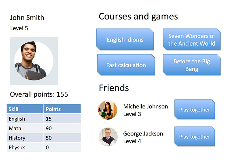
we moved on, and it was time to make not just a diagram, but a prototype design: The
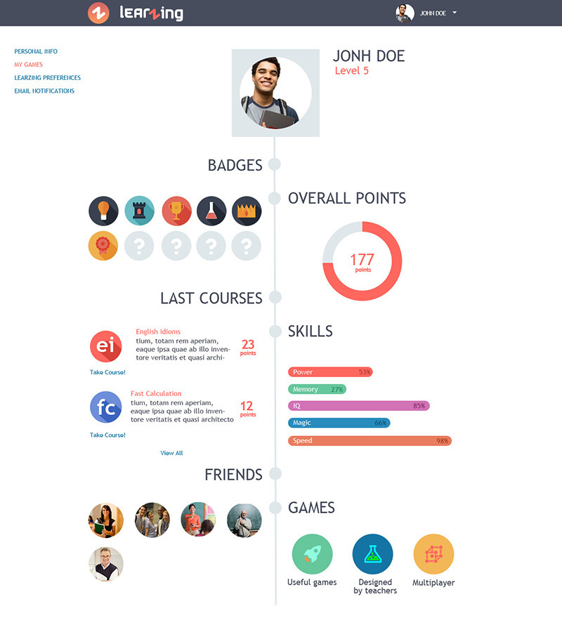
user is gaining points in applications and games (one or with friends), gains achievements and develops skills.
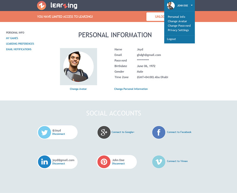
The user can connect third-party accounts. For example, if he connects his Facebook account and wants to use the application / game with friends, then we offer his user Facebook friends - he invites a friend to the platform, they learn / play together. On the one hand, it’s convenient for the user, on the other hand, we get an influx of new users to the platform.
Making the concept of the start page, we did not begin to reinvent the wheel, we like the current trends in the start pages of services and applications. It is logical to place product features step by step, to narrate. Hence the general approach: vertical scrolling + minimalism, for focus on key points.
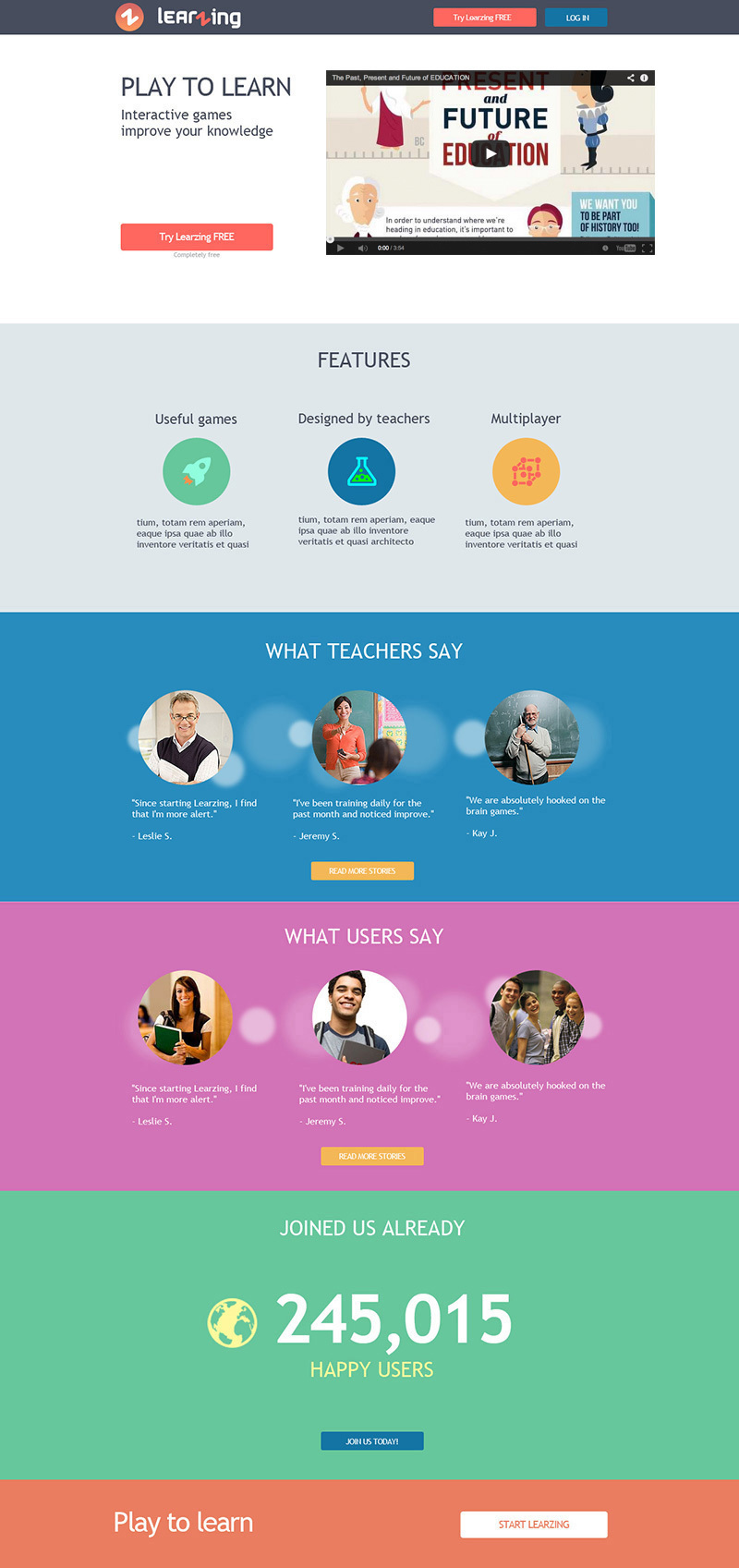
The first and main block (not counting the top panel) contains only 4 elements: the slogan (Play to Learn), a short phrase about the essence of the service, an introductory video and a registration button. The point of such minimalism is to focus on the key elements - the video and the button inviting you to try the service. In turn, the task of the video is to clearly and attractively talk about the service, arouse the desire to try it and press the button. A similar trick worked at the time for Dropbox.
In the second block, minimalism continues - we highlight the main distinguishing features: useful games (note that our games are not just for fun), done with the help of teachers (thereby emphasizing the professionalism of the approach), multiplayer (you can play and learn with friends).
Next - the feedback of teachers (again emphasizing professionalism) and students (we prove the quality of service), the number of registered users (we show that the product is popular) and once again the registration button for those who read the page.
Landing page
While we are working on the project, why not make a temporary landing? It doesn’t sound very familiar in Russian, but it conveys the meaning well - the landing page . Indeed, this page can have several goals:- Executive function . First of all, the page represents the project on the Internet. You can start with minimal content and add information as the project develops.
- Engaging stakeholders . Even before the release of the product, you can place a form on the page where anyone can leave their email. Thus, even at an early stage, you can check how much your product is interesting to the audience (again, the lean startup approach). At the same time, you get contacts of people who can help you in creating the product - take part in testing the first versions, express ideas; maybe even take part in the project? Not to mention that these are your potential customers.
- Contact with visitors . If a person has an increased interest, he will want to do more than just leave an email. Reasons can be different - curiosity, help, cooperation, etc. We place a simple contact form - and get a connection with the audience.
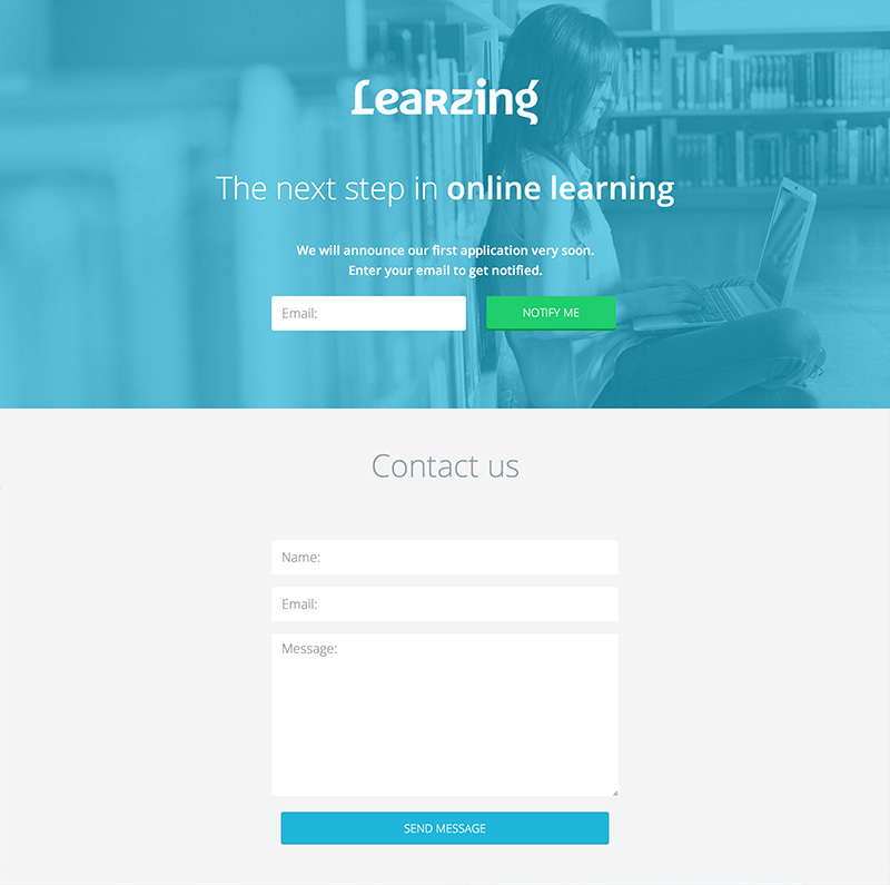
Minimalism again: in the first “screen” - the name, a short phrase about the service and the announcement. The key element is the form of a single field for entering email with a prominent button.
Below is the contact form. Often, contact forms are placed on a separate page or shown when you click on a link / button. In our opinion, it is better to place the form immediately on the landing page, which is easier and more visual - the user immediately sees the form, he does not need to click anywhere else to contact you.
Name and logo
A little about the name - Learzing. At the moment, it’s hard to come up with an attractive and sonorous name - the vast majority of meaningful names are taken. The days when the company could be called Apple are long gone. Therefore, you have to play with words, inventing an unknown name, or combine words, simultaneously checking whether the domain is free. Famous examples are Instagram, Pinterest, WhatsApp, Flipboard, Snapchat, etc. By the way, Domize , a good service for checking domains , quickly checks for employment in different zones and offers name variations.Sorting out a ton of words and combinations (the vast majority were taken, even the most bizarre), we came to a short and interesting title. The word "zing", in addition to the meaning of "whistle", has the meaning of "energy, animation," which is well suited in meaning - we get an energetic, lively training. Plus, we liked that by turning the letter N, you can get the letter Z, which we decided to beat in the logo.
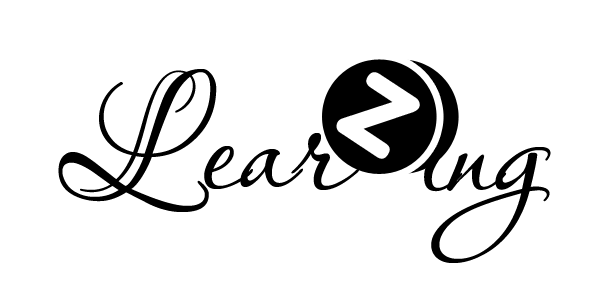
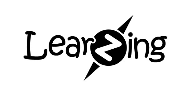

However, then other logo options appeared - we decided to look for new metaphors and seriously approached typography. It became clear that it would be nice to have a simple recognizable sign and a unique font set, which in the future, as the project develops, can be further developed.
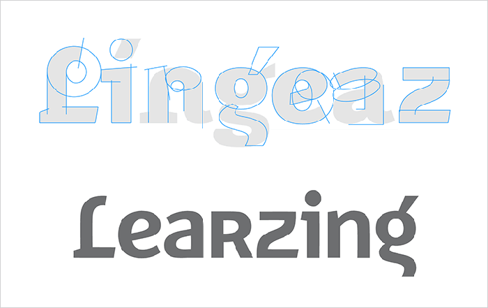
The font FF Karbid of the German designer Verena Gerlach was taken as the basis (the history of this font was interestingly told in an interview) Letters were redrawn and refined:
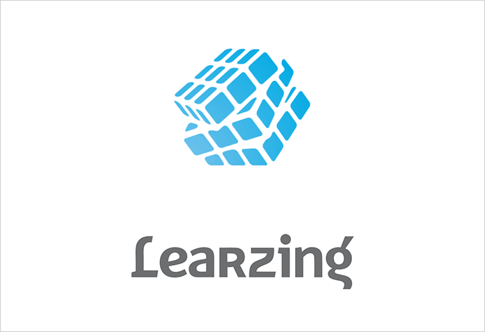
The content of the metaphor for the sign was based on the assumption of what type of application we will be making. For example, for puzzles - an obvious parallel with the Rubik's Cube. Or it can be tests and users will compete on points. Another obvious association with education is the book.
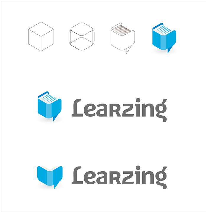
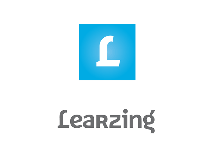
And yet, a universal image that would suit us was not found. We settled on a minimalistic option - the capital letter L - and postponed the creation of the sign for the future, when we decide on the type of application.
What's next
So, we have the first design of the main pages, the name, logo and landing page. Having taken the first steps to create the platform, we approached the creation of applications. A platform with a ton of applications is far-reaching plans. An important step is the design and development of the first application, which we are actively working on now. We’ll talk about this next time.All articles in the series
- Startup step by step: the future of online education
- Startup step by step: team and mentors
- Startup step by step: the first business model
- How we did the educational platform: first design, landing page and logo
- How we did the educational platform: first application
- Making an HTML5 Quest: Using the MVC Pattern in Construct 2
- Making an HTML5 quest: creating a character and basic animation
