May 21, 2014 at 18:47
Bitbucket - New Rubber UI

Atlassian released an update to its Bitbucket service yesterday. The interface has been completely updated, and a few interesting features
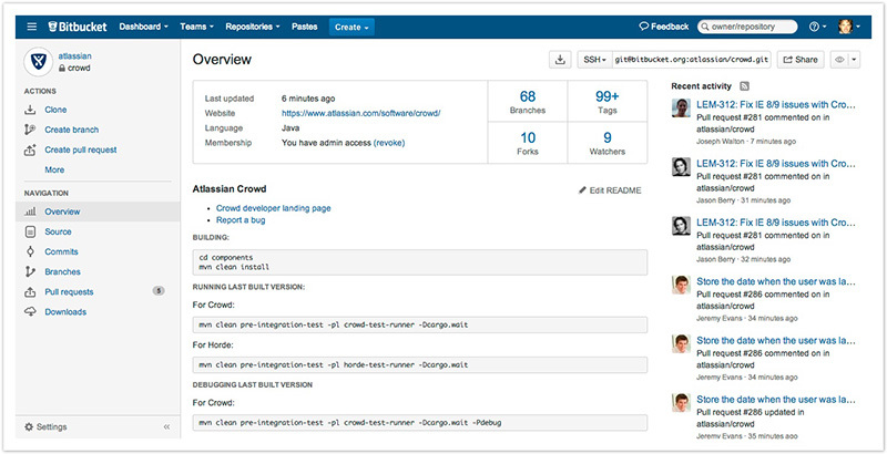
- The main feature of the update is the rubber interface, which at high resolution allows you to see more information and scroll less.
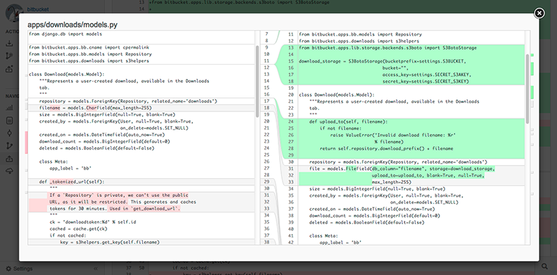
- Comparison of changes now takes place in a pop-up window, which allows you to continue working from the same place after closing the comparison window.
- A side menu for managing the repository has been added, all management from the header has moved here.
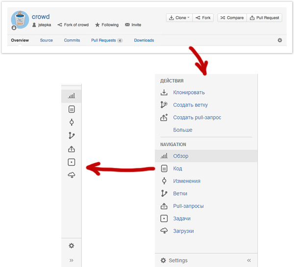
It is made, as it is more convenient for me, thanks to the ability to switch to a minimized and expanded form. - Now you can edit README directly on the site using a fairly convenient editor.

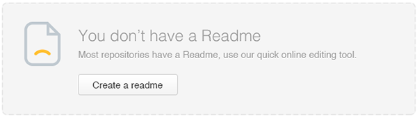
- If your repository does not yet have README, the service will offer you to create it and fill it with a template from sections that are often used in the description of repositories.
- The start page now displays not only activity, but also a list of your repositories, now you can get to the right project much faster.
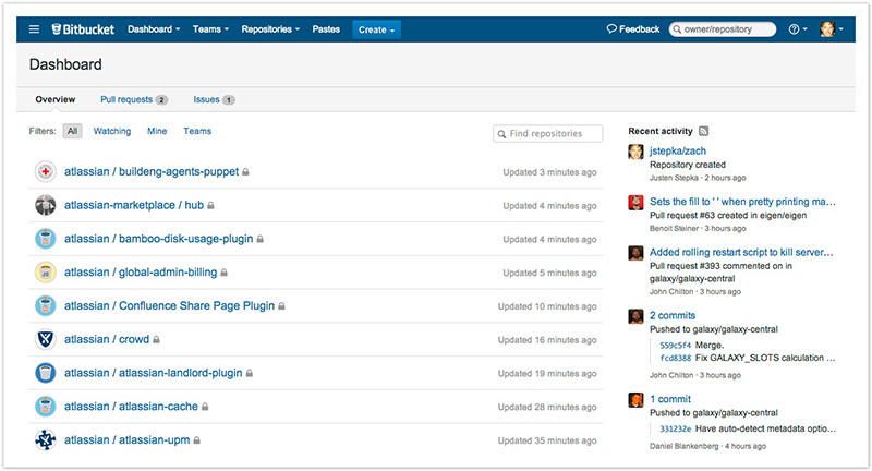
Due to this, the activity tape was moved to the right and made narrow enough, without adaptive width changes, and on the big screen there is an empty space in the center of the screen and a long narrow activity tape on the right.