Graphics and typography of the new 2GIS
Not so long ago, we introduced the new 2GIS - perhaps you watched the broadcast from a press conference or read our post here. Much has been said about the new features, but almost nothing about the changed design. It is time to fill this gap.
2GIS consists of two equivalent parts. The first is three-dimensional city maps. The second - directories of firms, places, transport, rapidly overgrown with data.
Working on the new 2GIS, we were looking not only for convenient and ergonomic interface solutions, but also for the unique graphic language of the map and the reference book: memorable, comfortable and integral. We want to tell you about the key elements of the graphics of the new version.
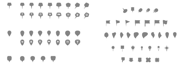
For a year and a half, the design of the 2GIS map has come a long way - new colors, three-dimensional buildings and 3D models of attractions have appeared. In the new version, we needed to pay attention to the data shown on the map. And especially on organization markers - important identifiers in mapping services. Each of them has its own, memorable marker, which is a kind of calling card.

There is a nuance - it is rather difficult to find a unique graphics in a set densely occupied with interesting solutions.
In addition, we made another requirement for the shape of the marker. The continuity of the form in the card, which opens when you click on this marker, was important to us. The experiments continued.
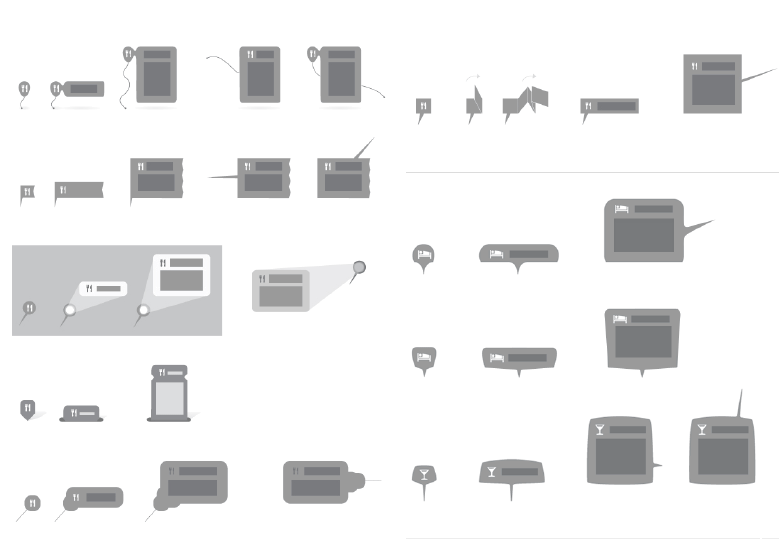
Experimenting with many forms, we found a solution that further helped us in choosing the plastic key elements of the design of the new 2GIS.
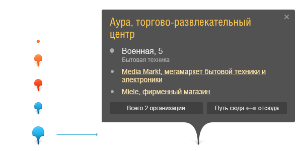
The next step was a search for temperament reference.
A reference is a large amount of text. Therefore, the font of the directory is one of the main identifiers that work on the recognition and nature of the directory.

We started collecting requirements, realizing that the font should correspond to the high rhythm of using 2GIS products. Therefore, you need to focus on good character recognition, fast reading and saving screen space, because the font will work in long names of directory objects, in a panel with a width of ⅓ of the screen.
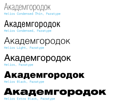
The requirement for string capacity in long names quickly led us to narrowed, condensed fonts.
On the user side, there is a delay in opening pages on sites and services with custom fonts. We wanted to control it and achieve a quick response from users. Therefore, the amount of font on the page had to be dosed. This means that the selected font will be accompanied by fonts from the standard system set, which accurately display quickly. As a system, we chose Helvetica and Arial. Such a choice imposed a restriction on the design of the marks of our candidate. It must be a closed grotesque. So the final set of fonts was formed - closed condensed grotesques:
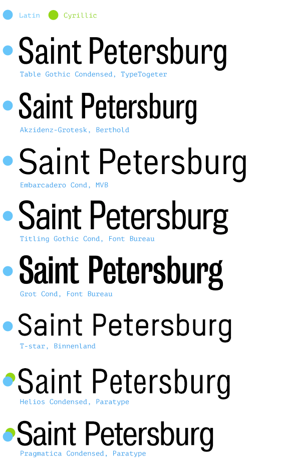
Since 2GIS is mainly a Russian-language service, we looked at the fonts with the Cyrillic alphabet.
The choice was not rich. We paid attention to two candidates. Substituting them in different directories, we looked at:
- Width of the stroke. The title of the card should not be a black spot and should not be too light.
- Tracking. Without changing author tracking, we should have a comfortable rhythm of characters in the line.
- Hinting. The font should look clearly throughout the fleet of browsers and mobile devices.
- License. The cost of the license should be reasonable, because in the future the font will have to be replicated to more than 20 million users of 2GIS.
On the one hand, almost all problems can be solved with font authors and foundries specializing in development and mastering. On the other hand, each change significantly changed the final cost. Both candidates did not suit us and we rolled back one step. They decided to look for the font in the Latin alphabet and make the Cyrillic alphabet for it separately.
All this time, we worked at the same time on refreshing the 2GIS brand and noticed in the font market a studio developing a font with forms close to us.

Swiss typefaces- The Swiss foundry, led by Jan Pati, worked on the Suisse font family. The graphics of this font were close to us. Despite the fact that their publications at that time did not feature a condensed font, we contacted the studio. The universe was eavesdropping on us, it turned out that Ian is working on a condensate for his Suisse BP Int'l and is interested in replenishing the font family with the Cyrillic alphabet. We agreed on cooperation.
The studio, together with Alexei Vanyashin , developed the Cyrillic alphabet and prepared a custom style with the stroke width we needed.
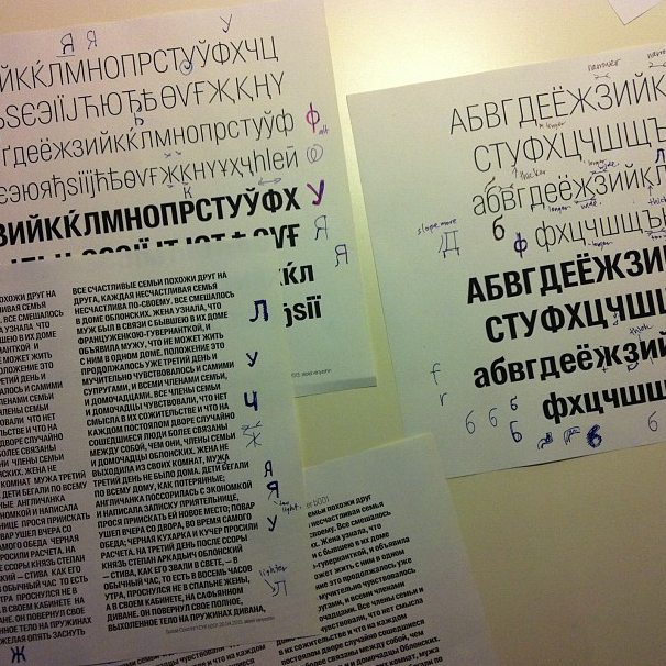
The collaboration resulted in a wonderful pair of Suisse BP Int'l Condensed and Condensed Bold.
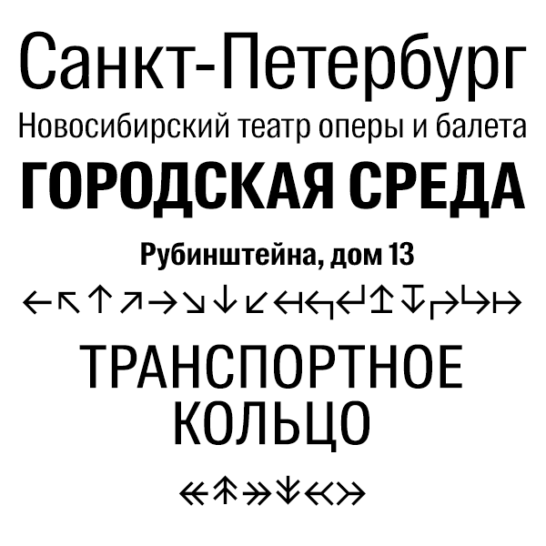
In this font, the authors managed to compliment the traditional Helvetica and refresh its plastic with graceful moves.
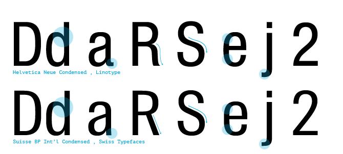
In Suisse, lowercase and uppercase letters have a smaller rounding, which helps to set the rhythm for the headings and slightly tighten the tracking without the appearance of black spots in the words. In lowercase characters, the inputs of the shoulders and semi-ovals into vertical strokes are more contrasting, which also affects the rhythm of reading and distinguishability of characters. The stroke width was individually adjusted for use in the directory.
2GIS is a universal reference book, but we try to make the user of any city feel familiar. For example, maps for some cities are configured individually. We went further and decided to develop a system of graphical identifiers of cities. It would seem that it could be simpler - redrawn all the coats of arms and inserted them into the interface. Oh, no: the lack of universal rules and clean solutions in the heraldry of cities greatly complicated our task. Therefore, the identifiers are based on the most intelligible images of urban heraldry or key architectural, cultural, industrial objects.
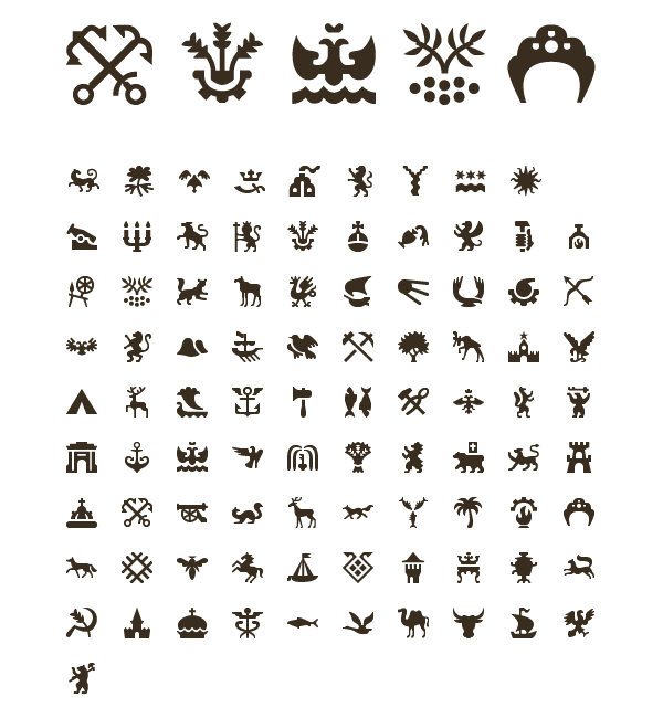
These and many other moves allowed us to create a graphic language that you can already see on beta.2gis.ru and see 2GIS in future products.