Hideninja VPN application launch history for Android (Part 2): The path to the correct UI, the importance of testing
In the first part, I talked about how the first prototype was made and how we survived the In-App Purchase hack.
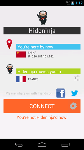
After the successful launch of the first prototype, a version 2 application was released, the UI and UX of which were already rethought with a greater eye on competitors and the wishes of our first users. The list of servers for connecting on a separate screen was added, the main screen was completely changed: a clear IP checker with the country flag was added, the sharing buttons in the social network, the main call-to-action button became large and colored, and it looked like this:
In essence , it was the second version that became the proof of my hypothesis, the application was warmly received by users and proved that I was on the right track.
The second version lasted several months. At the end of April, I began to think about changing the design, since it was still quite clumsy and did not satisfy the growing functionality.
I began to carefully study the card interface of Google Now and think over the new UI “Hideninja VPN” in this style.
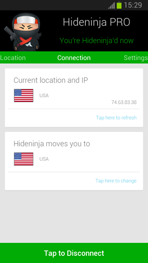
On May 8, version 3.0 with a completely new UI was released on Google Play. On May 15, the fourth version of Google Play with an updated design in the same card style was released for Russia.
The decision to make the UI of the third version of “Hideninja VPN” in the style of cards was absolutely correct: if the user experience from interacting with my application is similar to the experience from using the most popular Android applications, this will help my user to quickly understand “Hideninja VPN” and more positively to perceive it. When we posted version 3.0 to the store, we received several hundred extremely positive reviews - the design was a 100% success!
As before, as for previous versions, I did the design, third-party specialists were not involved. 1 sleepless night was spent on inventing and drawing the layout. We have been using the card UI for five months now, making only minor changes due to changes in functionality. Here's what version 3.0 ended up looking like:
Compare all three versions (first prototype, 2.0, 3.0, respectively):

On a rake “lack of high-quality testing” we also came. Until a certain point, everything went well until the application was surrounded by new features and the design changed. How we tested the application: we built the build, put it on my personal smartphone, and I poked at all possible buttons in different sequences for a couple of evenings. But the danger of Android is that even within the same OS version, different manufacturers allow themselves to change not only the graphical shell but also the components of the kernel. So we were faced with the problem of the cut-out VPNService API on Chinese smartphones and tablets, as well as on some not new SonyEricsson / Sony products. There is a solution to this problem - manually install the tun.ko component- but for the user this is, firstly, not obvious, and secondly, everything should work out of the box.
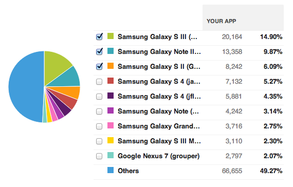
But they were still flowers. Imagine all the horror when in the evening you put out a fresh and, oh yes, of course, tested version in production, and in the morning you get dozens of ratings in 1 star and angry comments that nothing works! You check - and indeed, two far from the most important buttons do not work in the application: launch a VPN and buy ... Moreover, this bug is not found on all devices! Test, test and test again! It is highly desirable - on different devices, at least on the top-5 of those used by your customers (interestingly, there are applications that Samsung is not in the top ?!):
The application should be improved gradually, based on the feedback and wishes of users, but you should not do it thoughtlessly, satisfying any request for a feature.
It is necessary to provide the user with the highest quality experience from interacting with the application.
Each build needs to be tested qualitatively, one low-quality build in production will cost a significant downgrade in the store.
By the third version of the application, “Hideninja VPN” climbed to 5th place in the top for “vpn” on Google Play. The marketing budget during the growth period in the top - $ 50 in total, was spent on consultations on ASO .
Read about the factors that have shaped our success in the highly competitive VPN market for Android - in the next part.
The second version of the application
After the successful launch of the first prototype, a version 2 application was released, the UI and UX of which were already rethought with a greater eye on competitors and the wishes of our first users. The list of servers for connecting on a separate screen was added, the main screen was completely changed: a clear IP checker with the country flag was added, the sharing buttons in the social network, the main call-to-action button became large and colored, and it looked like this:
In essence , it was the second version that became the proof of my hypothesis, the application was warmly received by users and proved that I was on the right track.
The second version lasted several months. At the end of April, I began to think about changing the design, since it was still quite clumsy and did not satisfy the growing functionality.
The third version of the application
I began to carefully study the card interface of Google Now and think over the new UI “Hideninja VPN” in this style.
On May 8, version 3.0 with a completely new UI was released on Google Play. On May 15, the fourth version of Google Play with an updated design in the same card style was released for Russia.
The decision to make the UI of the third version of “Hideninja VPN” in the style of cards was absolutely correct: if the user experience from interacting with my application is similar to the experience from using the most popular Android applications, this will help my user to quickly understand “Hideninja VPN” and more positively to perceive it. When we posted version 3.0 to the store, we received several hundred extremely positive reviews - the design was a 100% success!
As before, as for previous versions, I did the design, third-party specialists were not involved. 1 sleepless night was spent on inventing and drawing the layout. We have been using the card UI for five months now, making only minor changes due to changes in functionality. Here's what version 3.0 ended up looking like:
Compare all three versions (first prototype, 2.0, 3.0, respectively):
Seven times - test, once - release
On a rake “lack of high-quality testing” we also came. Until a certain point, everything went well until the application was surrounded by new features and the design changed. How we tested the application: we built the build, put it on my personal smartphone, and I poked at all possible buttons in different sequences for a couple of evenings. But the danger of Android is that even within the same OS version, different manufacturers allow themselves to change not only the graphical shell but also the components of the kernel. So we were faced with the problem of the cut-out VPNService API on Chinese smartphones and tablets, as well as on some not new SonyEricsson / Sony products. There is a solution to this problem - manually install the tun.ko component- but for the user this is, firstly, not obvious, and secondly, everything should work out of the box.
But they were still flowers. Imagine all the horror when in the evening you put out a fresh and, oh yes, of course, tested version in production, and in the morning you get dozens of ratings in 1 star and angry comments that nothing works! You check - and indeed, two far from the most important buttons do not work in the application: launch a VPN and buy ... Moreover, this bug is not found on all devices! Test, test and test again! It is highly desirable - on different devices, at least on the top-5 of those used by your customers (interestingly, there are applications that Samsung is not in the top ?!):
Experience gained
The application should be improved gradually, based on the feedback and wishes of users, but you should not do it thoughtlessly, satisfying any request for a feature.
It is necessary to provide the user with the highest quality experience from interacting with the application.
Each build needs to be tested qualitatively, one low-quality build in production will cost a significant downgrade in the store.
What's in the next part of the story
By the third version of the application, “Hideninja VPN” climbed to 5th place in the top for “vpn” on Google Play. The marketing budget during the growth period in the top - $ 50 in total, was spent on consultations on ASO .
Read about the factors that have shaped our success in the highly competitive VPN market for Android - in the next part.