IFA 2013 with your own eyes: Samsung, Toshiba, Panasonic, TCL / Alcatel and Archos mobile devices
On the first day of my stay at IFA 2013, I naturally rushed to the Samsung booth, where the Europeans were first shown and held in their hands the Galaxy Note 3 smartphone. On the same day I got acquainted with Toshiba and Panasonic tablets, TCL / Alcatel and Archos smartphones. With some delay, but still share my personal impressions and photos.

The Samsung Pavilion was expectedly the largest at the IFA 2013, with its stage and many thematic stands. According to my calculations, at least 200 Samsung Galaxy Note 3s were on display!
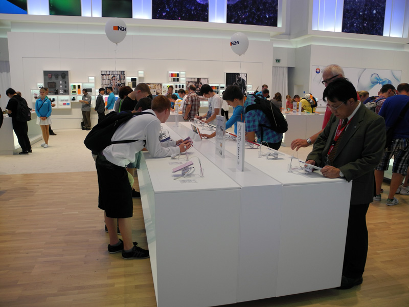
These smartphones had a lot of people, but because of the large number of exhibited copies, anyone could literally hold a novelty in their hands.
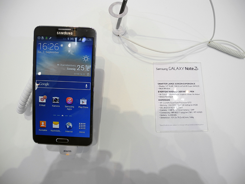
And I must say, I liked the device. Workmanship is up to par.
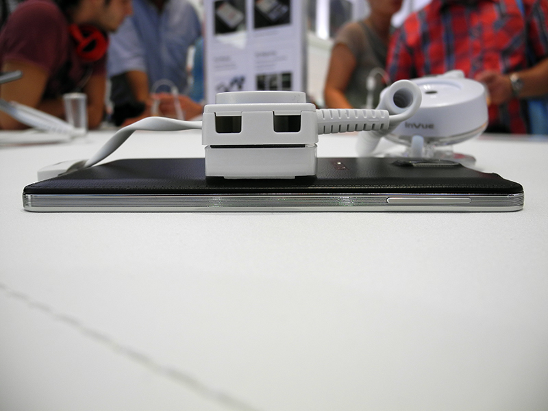
The metal strip around the perimeter is corrugated, apparently this is done so that the device clings even more to the palm of the hand. By the way, I did not experience any discomfort from the size of the smartphone, possibly due to the considerable size of my hands. But with Sony Xperia ZU is really really difficult to manage.




Galaxy Note 3 has several color options, and they differ markedly in the decoration of the front panel. For example, the design of the front panel of the dark gray version gives rise to associations with brushed aluminum, and in the white and pink versions the pattern is already geometric - rhombuses with stripes.
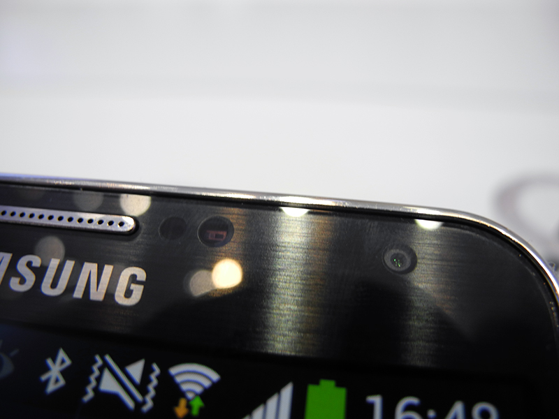

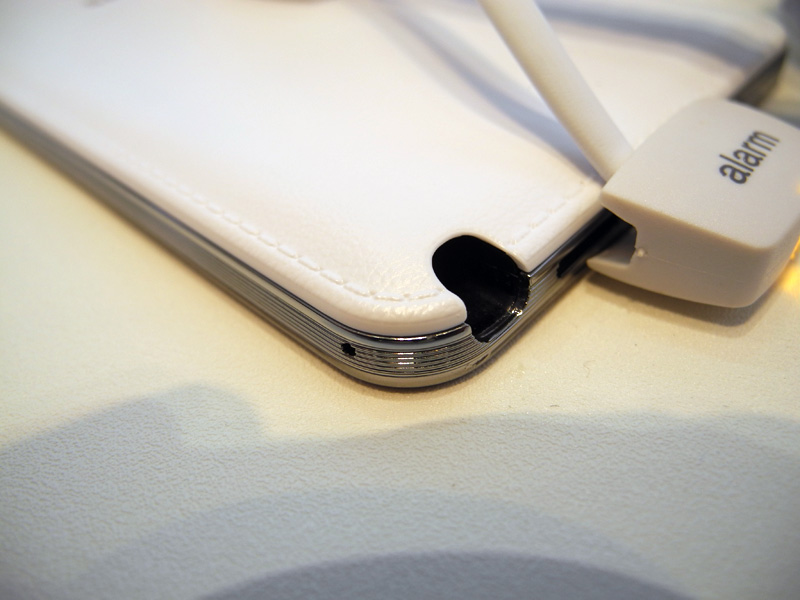
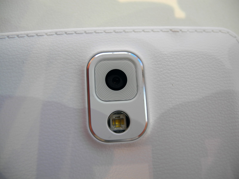
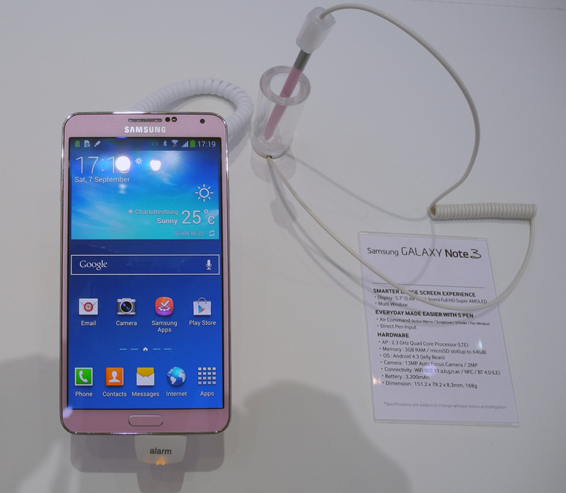
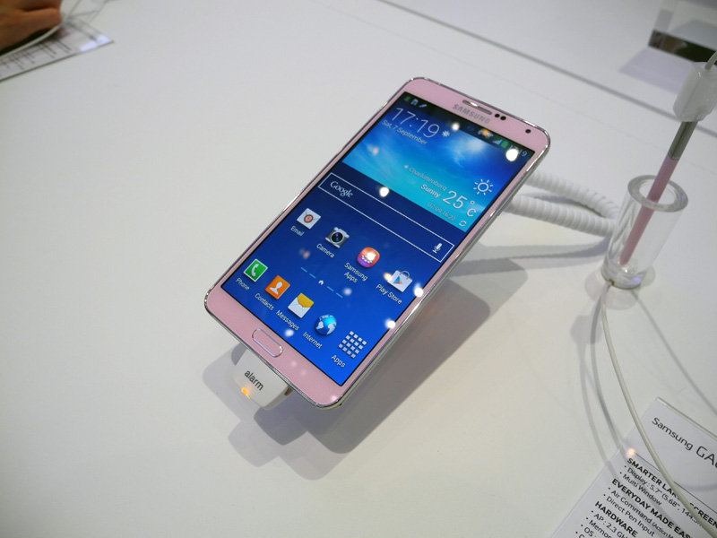
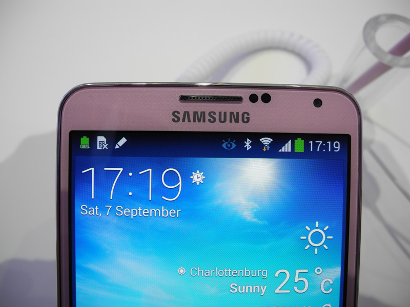
Earlier, I had to deal with Samsung smartphones, but the Galaxy Note 3, in my opinion, is the first, the metal design elements of which really look like metal, you can not confuse them with “silver plated plastic” even in appearance. They are made very carefully, I especially liked the metal mesh of the speaker at the bottom, the slightly protruding metal strip covering the auditory speaker, and the solid volume control swing. Finally, Samsung doesn't look cheap!
Partly the “expensive” look is achieved due to the back cover, which is really made of leather. An extremely interesting solution, but is it practical? The fact is that going to the white tablet Galaxy Note 10.1, the back panel of which is also trimmed with leather, I was unpleasantly surprised by the black stains on it. Note that the exhibition samples rested on leather (!) Stands and were securely fixed, i.e. definitely didn’t fall. It turns out that the skin got so dirty just because of dirty hands? And what will happen if you throw a smartphone or tablet at the bottom of a bag or backpack? And if you wear it all the time? Already at home or in the car, the device obviously will not lie on a clean white leather counter, as it was at the exhibition ...

Naturally, you can carefully treat the lid, and all the dirt will come off, but my opinion is this: in a mobile device that is constantly carried around, the skin is inferior to plastic in practicality. How long it will “stretch” in the white and pink versions is a big question. In this case, it is better to buy a dark gray Galaxy Note 3, traces of dirt on dark skin will not be noticeable for a very, very long time.
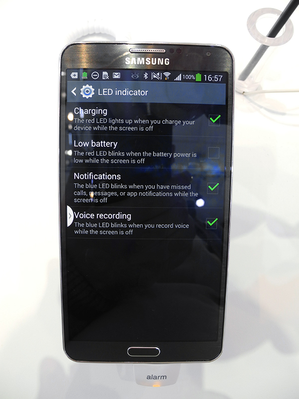
The Galaxy Note 3 has an LED event indicator. It is hidden under the front panel and burns with diffused light. It turns out funny: at first you want to “focus”, you squint, and only then you realize that “sharpness” was not initially provided. Like, the "trick" is this.

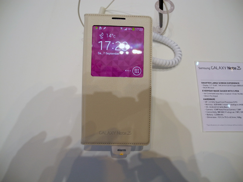
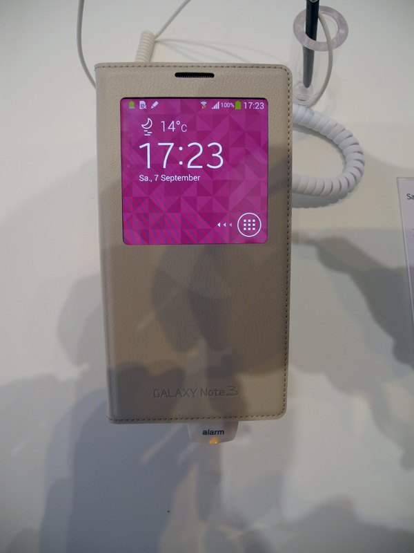
Speaking about the Samsung Galaxy Note 3, one cannot fail to say about the covers released specifically for him. I also liked them very much, and here's the thing: the back wall of the smartphone is so close to the wall of the case that it seems like the smartphone and the case are one. For several seconds I tried to find a place to connect the case and the smartphone! And after all, the back wall of the case - exactly like the cover of a smartphone, can not be distinguished! The developers for such a "close relationship" Galaxy Note 3 and a protective device - five points.


Samsung Galaxy Note 3. Software and settings.
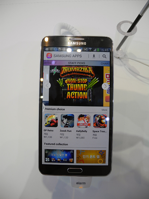
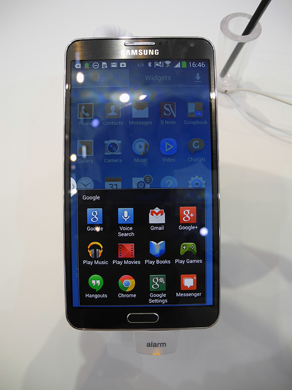
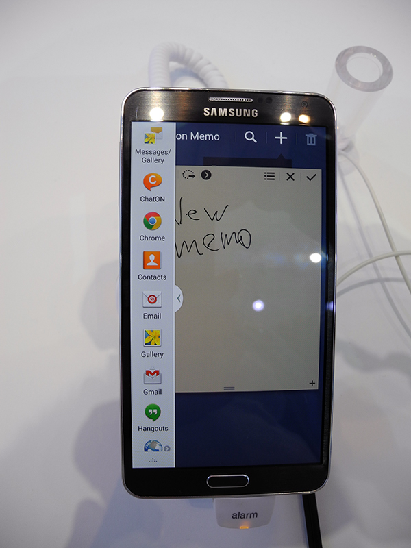
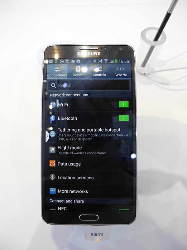

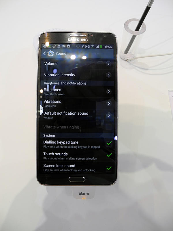
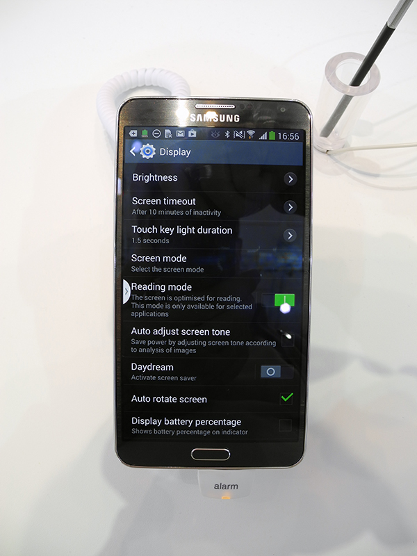

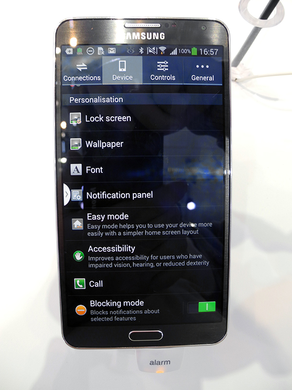
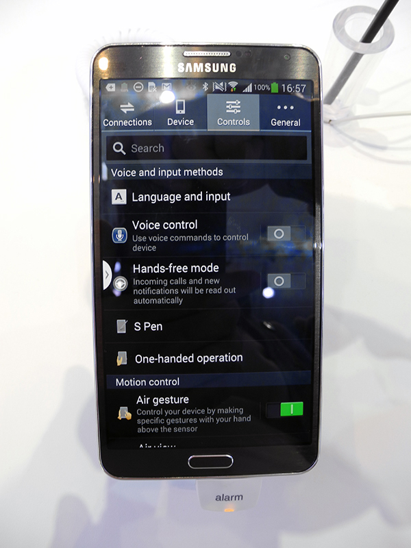
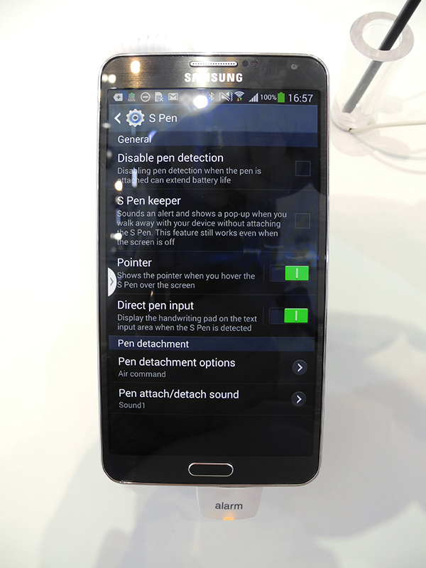


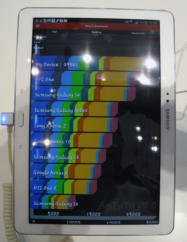
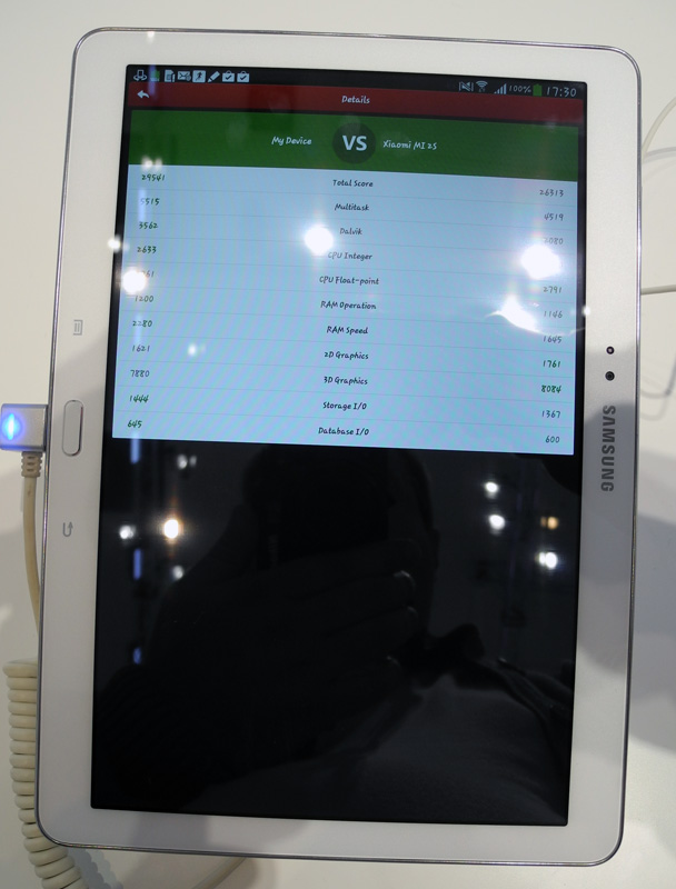
But let's move on from the appearance to the performance of the Samsung Galaxy Note 3. I managed to install on the LTE-enabled version (that is, on the Qualcomm Snapdragon 800 MSM8974 platform) and run only two benchmarks: AnTuTu and NenaMark 2. The results are lower.
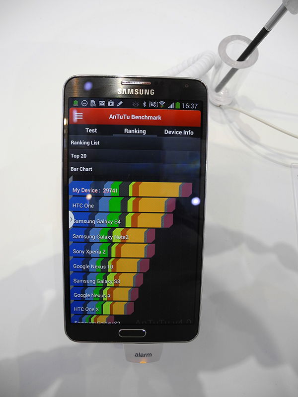
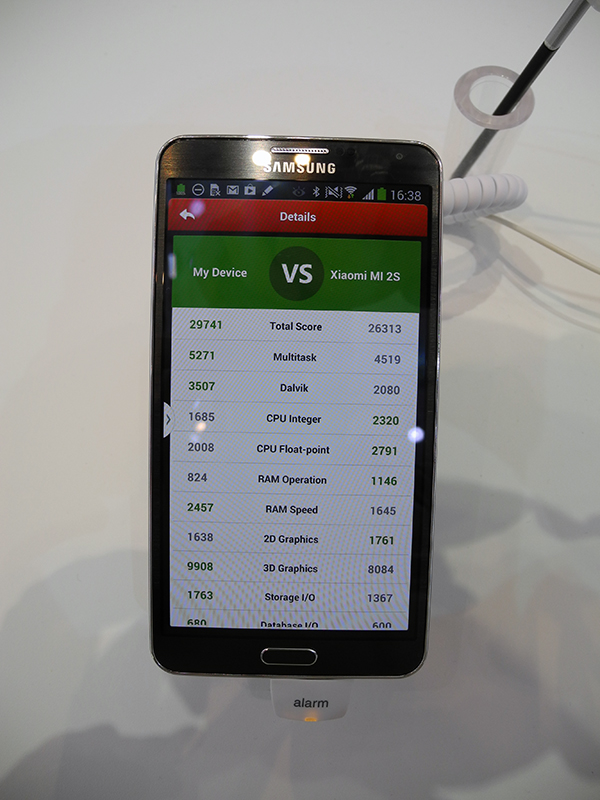
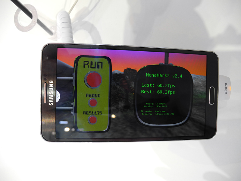
Obviously, the performance of the Galaxy Note 3 is high, and the Qualcomm Snapdragon 800 is strong. But how much? I tried to answer this question a little lower (see the Toshiba section).
After Galaxy Note 3, I immediately switched to the Galaxy Gear watch, which Samsung is very proud of.
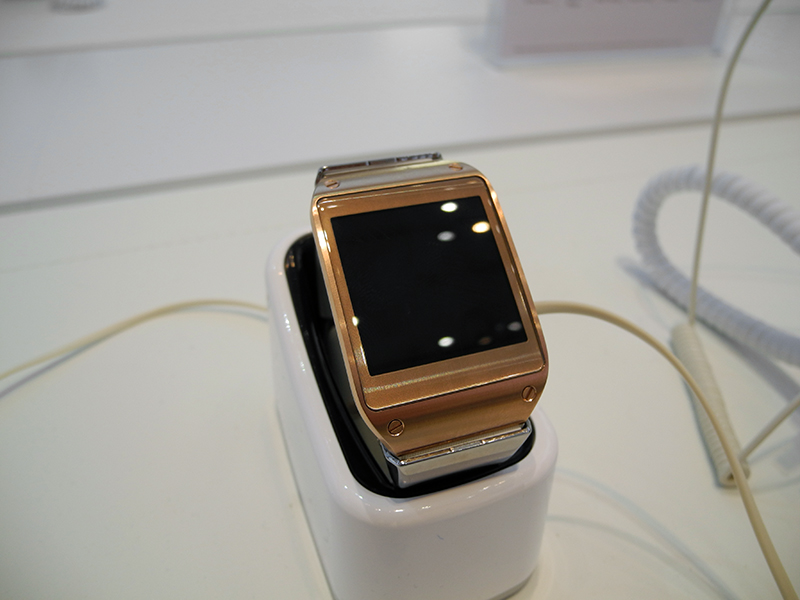
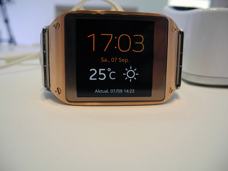
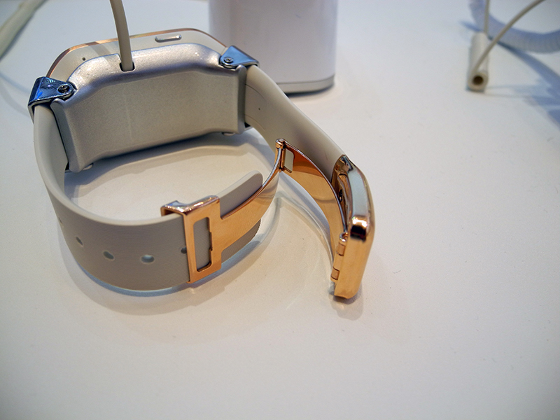
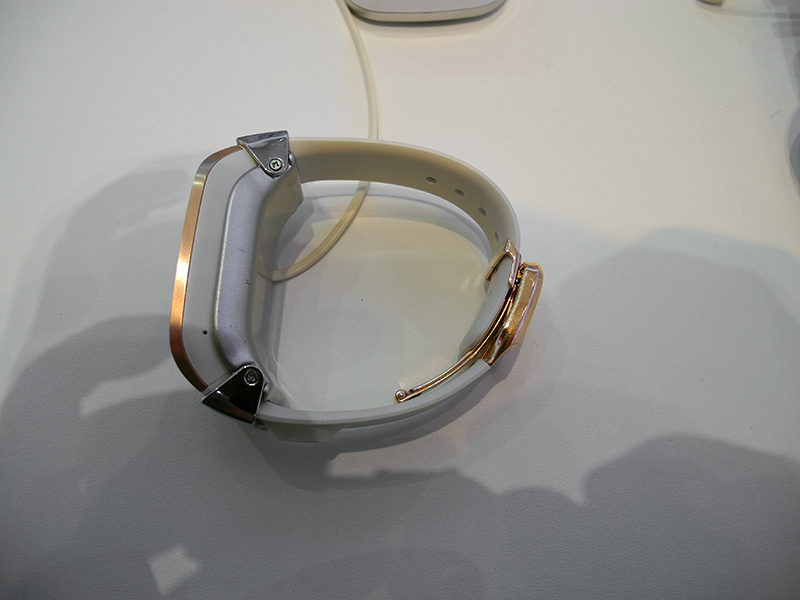
In my opinion, there is nothing special to be proud of. The device turned out to be heavy and rather bulky. Several girls who looked at the watch next to me for a long time spoke of the same thing - Samsung had got very large watches. And this despite the fact that the Galaxy Gear is focused more on a female audience than on a male one. Here is such feedback from the target audience ...

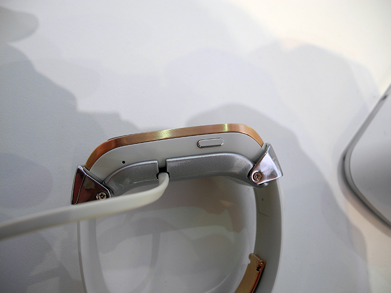

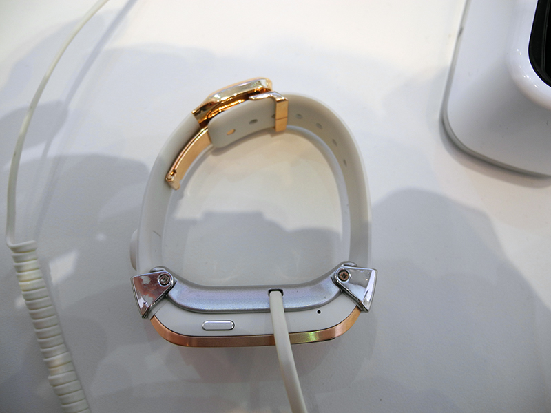
By the way, the Galaxy Gear barely fastened on my hand. Another hint that they are not for the male hand?

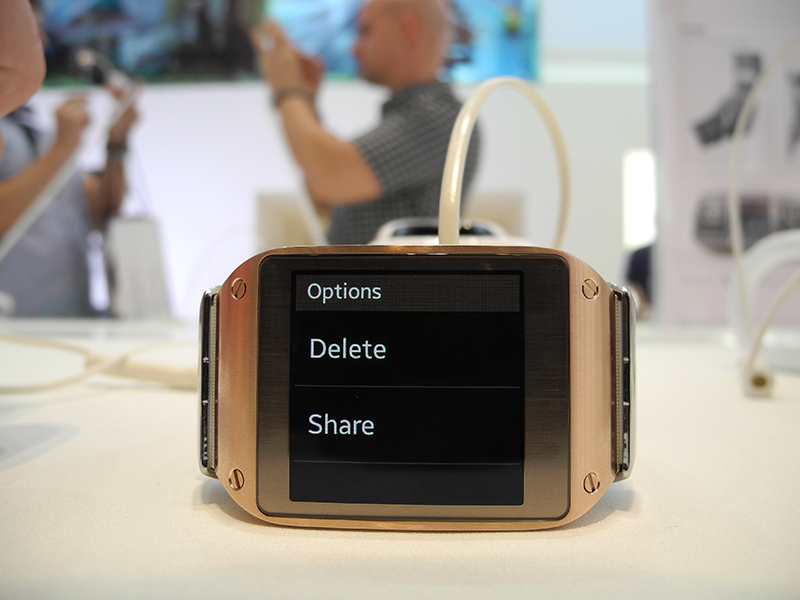
It was also inconvenient for me to control the touch screen. The screen is small, and if the fingers are large, then, for example, in the settings, when three strips of sub-menu items are displayed on the screen, you should aim exactly at the middle of each sub-item, otherwise it is very likely to complete the wrong thing that you planned. Perhaps I just didn’t have time to get used to such a feature of the watch, but, on the other hand, why should a person “roll off” half the cost of the Galaxy Note 3 behind the Galaxy Gear and have to get used to something else? Why did I almost instantly figure out how to manage iPod nano, but I couldn’t master the Galaxy Gear in 10-15 minutes? Certainly not because I didn’t want to. In a word, I would advise Koreans to work on the interface. Template Android with its own menus, in my opinion, is not suitable for such a device,
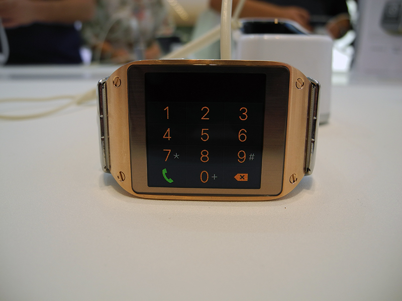
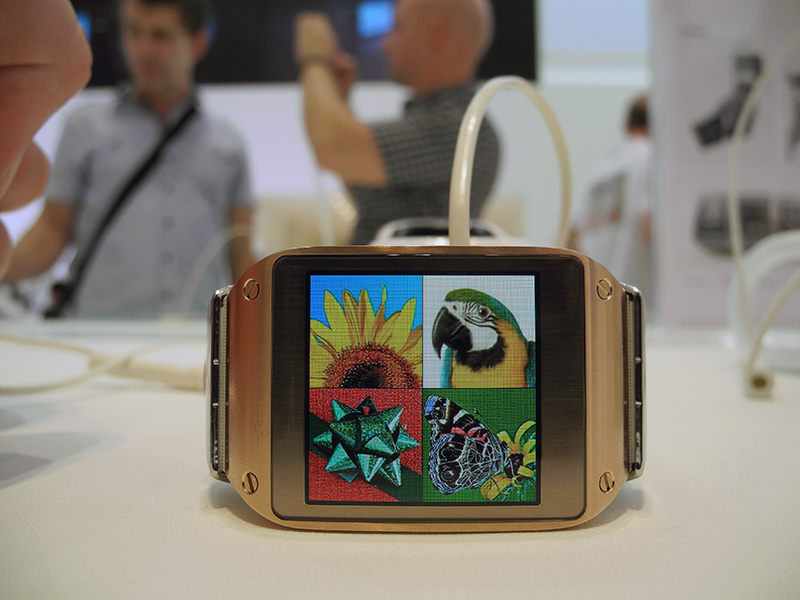

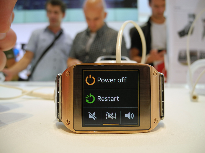
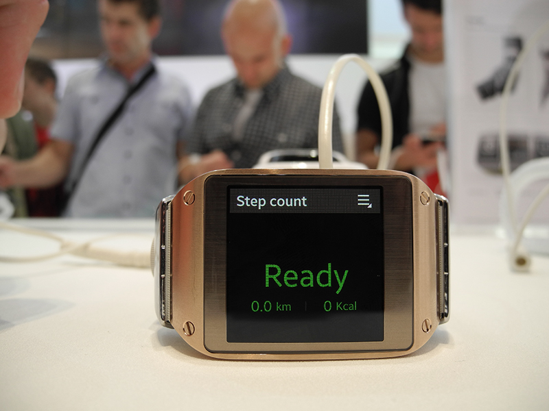

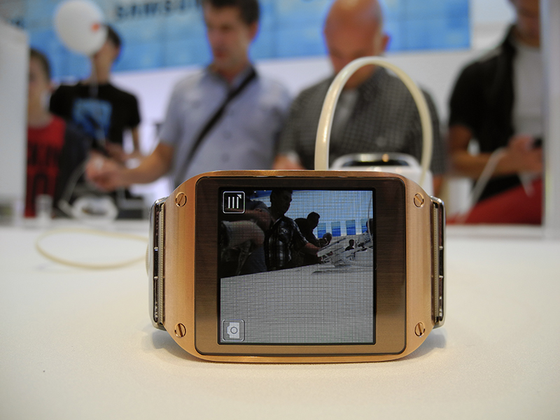
By the way, the button in the watch is only one, and this also does not make working with a portable computer, which is the Galaxy Gear, easier.
On one side of the watch in the region of a peculiar tide is the camera eye.
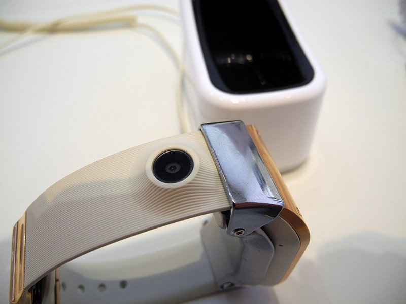
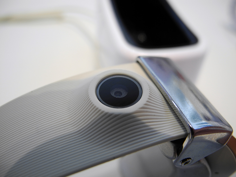
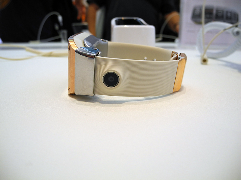
This arrangement makes Galaxy Gear an excellent device for conducting “spy” shooting - watch the video below: the girls standing nearby did not even notice that I was shooting them!
But for communication, it would be more logical to place the camera on the front panel, because any person wearing a watch looks at the screen, and not at the strap. Why Samsung decided to fence a garden with this strap is completely incomprehensible to me.
And finally, software. Watch the video below, it gives a complete idea of what is the software component of Galaxy Gear.
I must say that I absolutely did not like the Samsung watch, either in performance or in appearance. I did not see anything in them that the Koreans could be proud of or even boast about. Additional functions (like a pedometer) are secondary, some of the main ones (here I primarily mean the fisheye of the camera) are implemented rather clumsy, the menu is completely intuitive. I remember very well when in 2009 I saw the LG GD910 watch - then they had an effect on me. But now, after four (!) Years, Samsung, in fact, offers the same thing. Yes, not just offering, presents it with great fanfare! Like, we developed, we worked, everything is for you. While casually mentioning that the Galaxy Gear is, firstly, helpless without a smartphone, and secondly, so far only compatible with Galaxy Note 3 and Galaxy S 4. By God, it’s funny and sad. Sony doesn’t make hype out of its watches, which meanwhile have grown to the second generation, and this approach is much more to my liking. Not to mention Pebble.
In a word, I tend to call the Galaxy Gear a big Samsung mistake. Perhaps this is also understood by the company, otherwise where did the rumors come from that this device will never go on sale, and instead, after six months, a modified copy of Galaxy Gear 2 will appear?
This tablet is rightly called a stretched version of the Galaxy Note 3: the design, adjusted for size, is exactly the same.


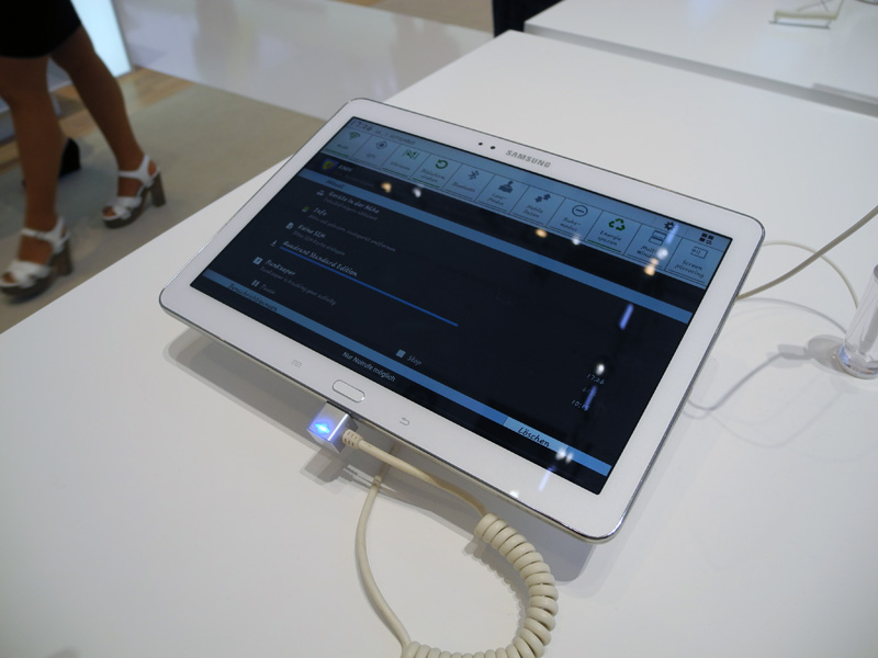
The new Galaxy Note 10.1 was presented in two colors: white and black. The second option I liked more due to the design of the front panel with sparkles, which "plays" in the light.
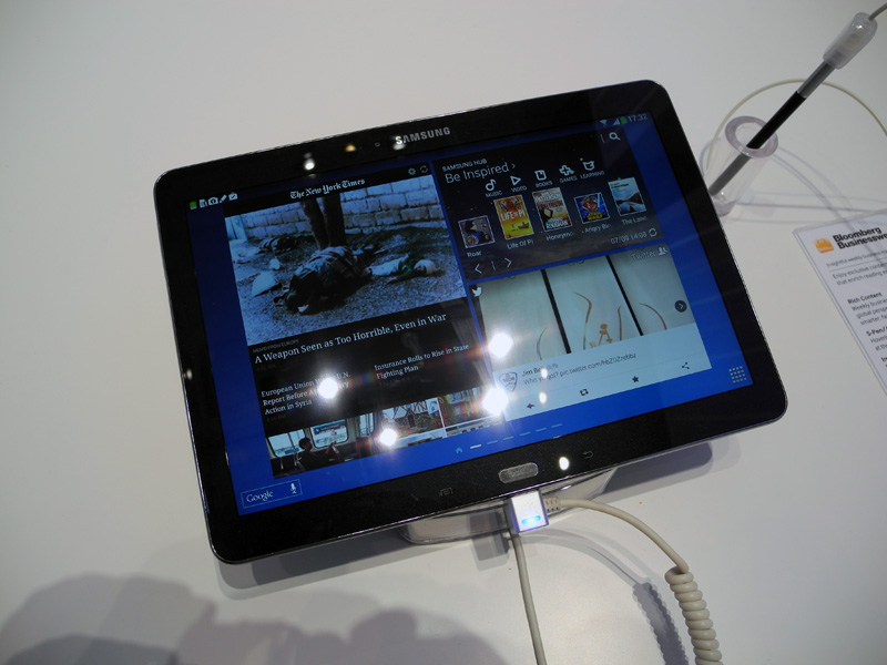
It does not make sense to describe the tablet in detail: everything that has been said regarding the Galaxy Note 3 applies to it.

At IFA 2013, I discovered Toshiba tablets - I had never encountered them before. I must admit, I liked the entire line of tablets of the Japanese company, but it is difficult to explain why. They do not represent anything outstanding in terms of design, the software is also of the same type, as an example you can put only a clear division into niches and price groups (the flagship model is Excite Pro, the budget model is Excite Pure, some intermediate option is Excite Write, providing pen input) and modern specifications (Excite Pro has a Retina display and HDMI output).
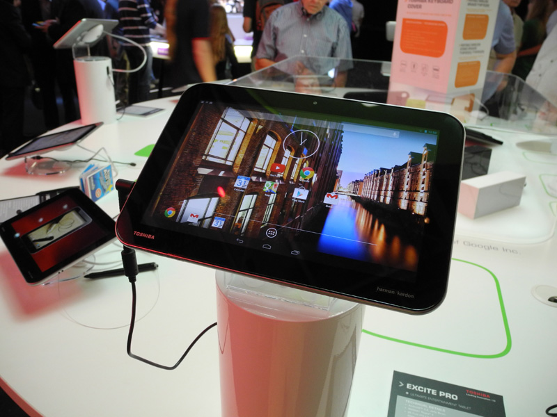
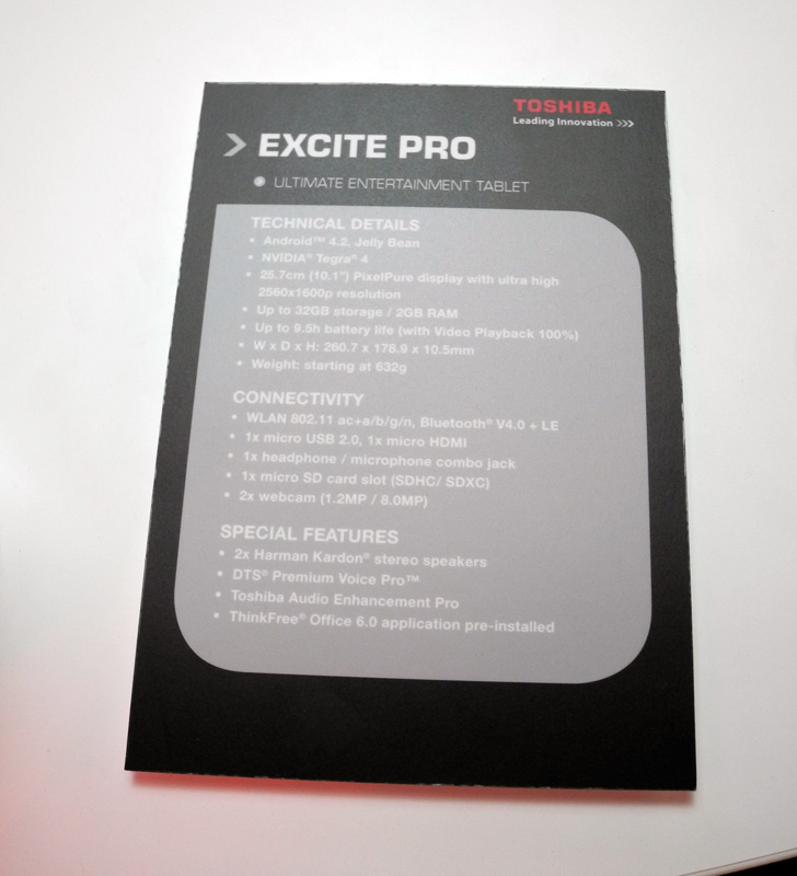
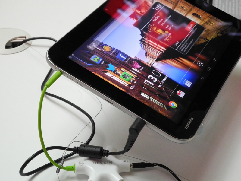
Of course, the most interesting was Excite Pro, built on the NVIDIA Tegra 4 platform. You can evaluate its characteristics, as well as some layout features in the photo below.

And now about performance. I was able to drive the device in three benchmarks: AnTuTu, Quadrant and Vellamo.
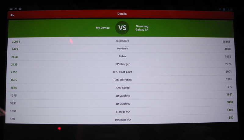
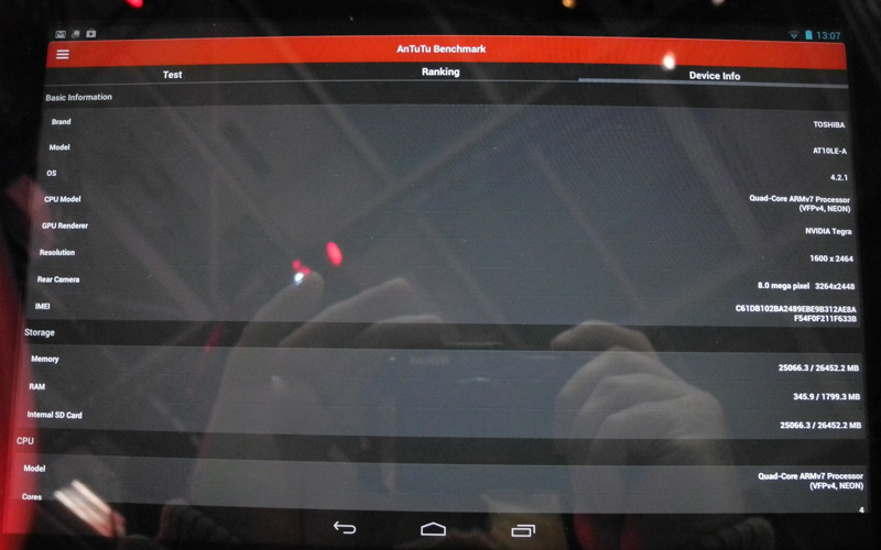

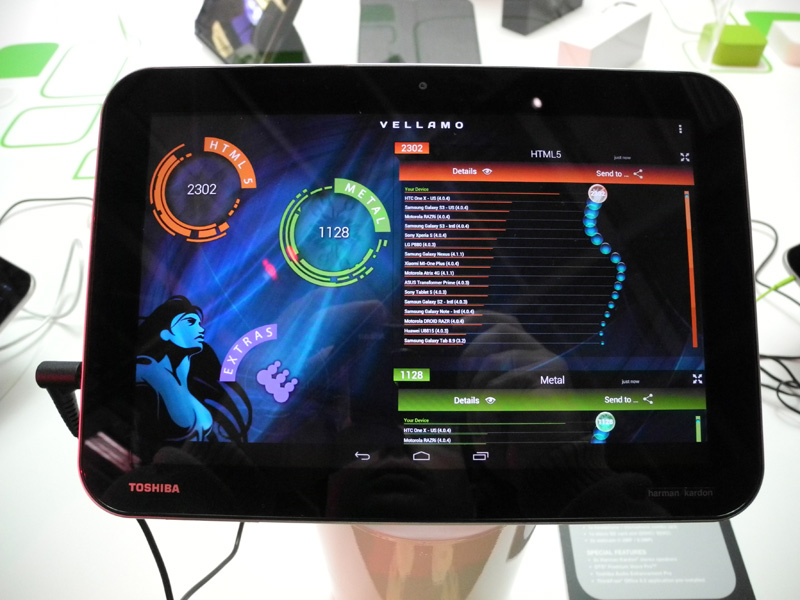
In comparison with Qualcomm Snapdragon 800 in Galaxy Note 3, the most interesting result is Excite Pro in AnTuTu. I’ll immediately notice that the tablet uses the so-called Retina screen with a resolution of 2560 x 1600 pixels, and Samsung’s smartphone uses “normal” Full HD, so the load on the Tegra 4 GPU was a priori higher. In order not to have to run my eyes over two photos, I brought all the data into one plate.
The numbers speak for themselves: in terms of the performance of the central processor, the NVIDIA Tegra 4 bypasses the Qualcomm Snapdragon 800. The situation with the GPU is not so clear, but it seems to me that if the tablet had a Full HD screen, then the graphics performance would be about the same level. Indirectly, this is confirmed by the fact that in the 2D graphics test, NVIDIA Tegra 4 lost less than in the 3D test.
The only thing I did not like about the Toshiba Excite Pro (and also don't like about many Chinese tablets) was the use of a separate charge instead of the usual microUSB cable.

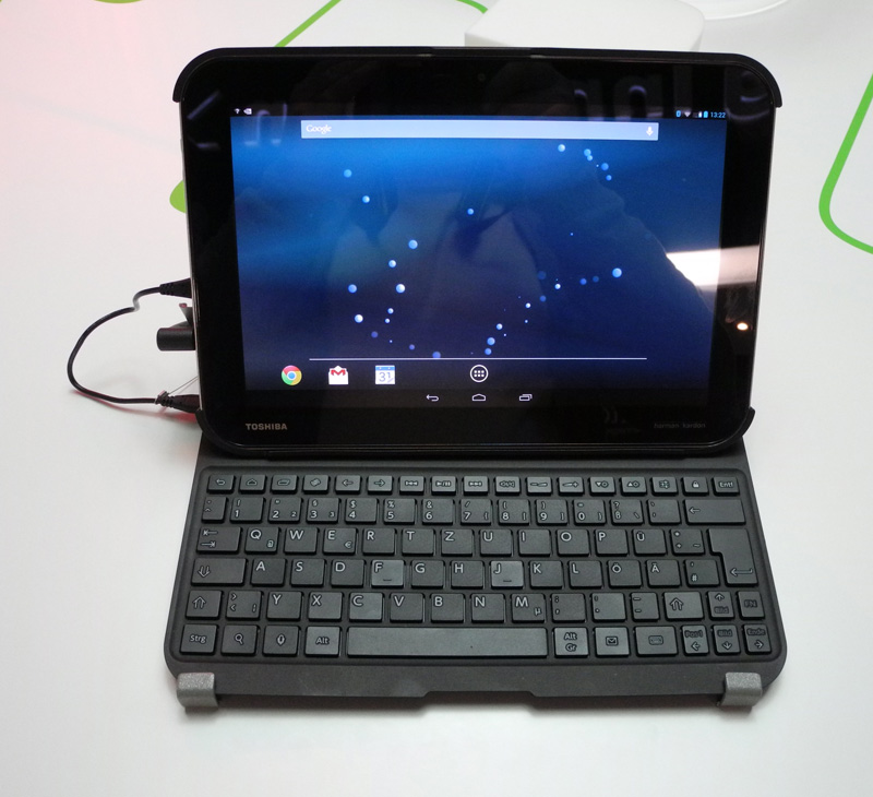
The Japanese company offers a keyboard cover for Excite Pro satellites.
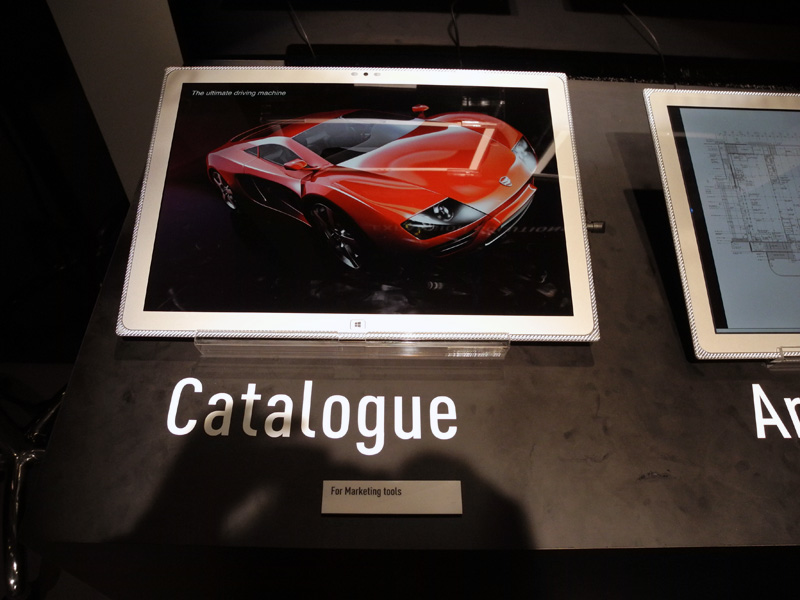
Panasonic’s mobile highlight was a 20-inch tablet with a 4K resolution screen, announced at the beginning of the year. The device is called 4K Tablet.
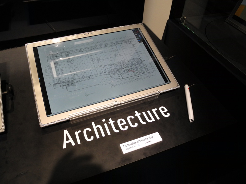
The device uses the IPS Alpha panel with an aspect ratio of 15:10 and a resolution of 3840 x 2560 pixels. With a diagonal size of 20 inches, the pixel density does not seem impressive at all - only 230 ppi.
The tablet’s list of features includes a 1.9 GHz Intel Core i5-3437U processor, an NVIDIA GeForce 745M graphics card, 4 or 8 GB DDR3 RAM, 128 or 256 GB SSDs, Wi-Fi 802.11a / b / g / n and Bluetooth adapters 4.0, one USB 3.0 port, one SDXC slot. A dock connector is also provided. For an extra charge, the 4K Tablet can be equipped with the Anoto Pen digital pen and smart card support.
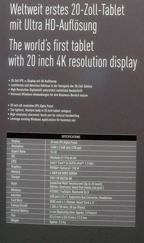
It was impossible to work with the tablet, access to the system was blocked. In fact, it remained either to consider beautiful pictures, or evaluate the work of a pen. However, I have something to note. First, the device’s screen is really good. But this is obvious, but further ...

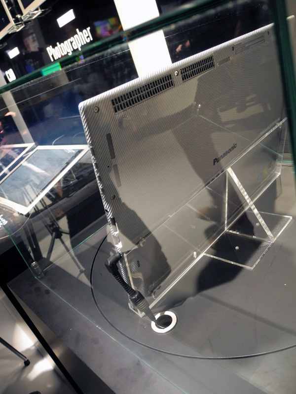
4K Tablet is a kind of layout miracle. Judge for yourself: the case is thin, like a tablet, accessories - like a traditional laptop, the screen in general (for now) is not from this world. As a result, there are a lot of nuances. The device turned out to be rather heavy and not at all portable enough to carry it every day with you from home to work. Well, suppose he will lie on the table all the time, but then access to the connectors located on the sides is noticeably worsened. And if you insert a USB flash drive, it will probably work (and then, only if not thick), then sticking a memory card will be problematic. I'm not talking about the fact that in the "flat" position will be blocked and ventilation holes and slots of the speakers.

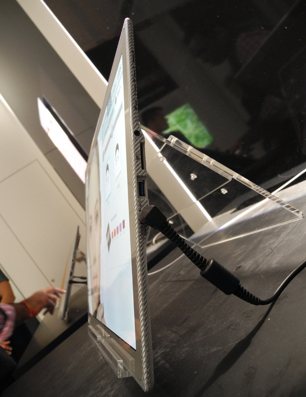
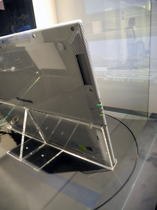
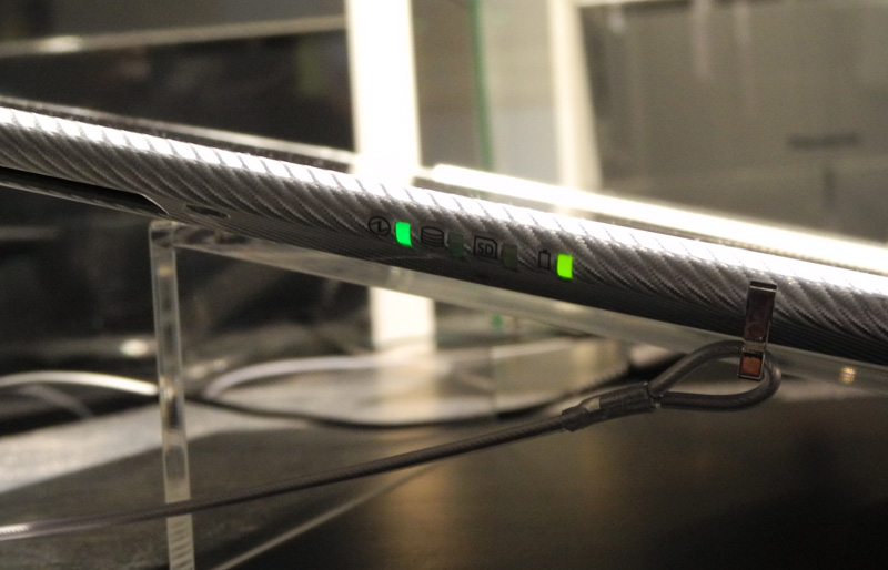
Another dubious, in my opinion, solution is the placement of LED indicators on the beveled part of the left side panel. Again, if the tablet rests on a horizontal surface, then these LEDs will flicker ... on the table. And it will be possible to judge the status of the drive, memory card, power circuit unless by the light. Why it was not to bring them to the front of the device is not clear.
And I also think that for such a large device, the declared battery life - about 2 hours - is not enough. But this is so, the little things.
In general, while I do not see the 4K Tablet broad commercial prospects. At least in the current version. Yes, perhaps the device will be ordered by eminent design studios and architectural studios, but this will satisfy the demand. On the other hand, someone should be the first, and the first damn ... Well, you know.
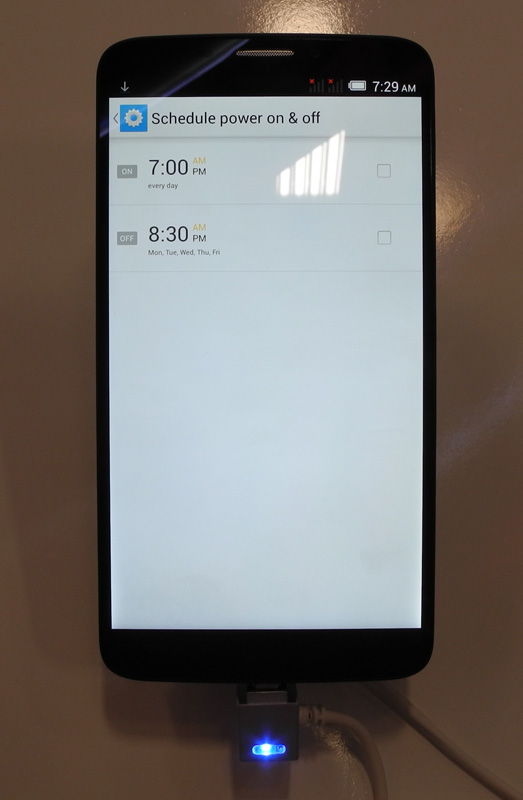
The Chinese company TCL "shot" on the IFA flagship smartphone Alcatel One Touch Hero.

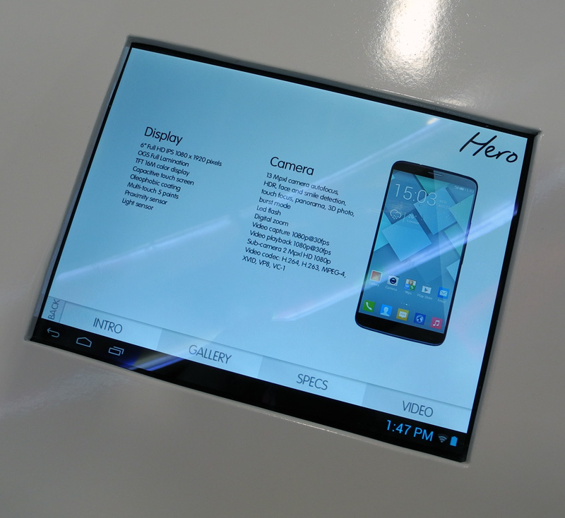
On the one hand, the characteristics of the device are really good - a 6-inch Full HD OGS screen with an alkophobic coating, a 13 megapixel camera, 2 GB of RAM, on the other hand - multitouch is only 5 touches, the built-in flash memory reaches a maximum of 16 GB. In a word, the flagship remains the flagship, but in its budget category.
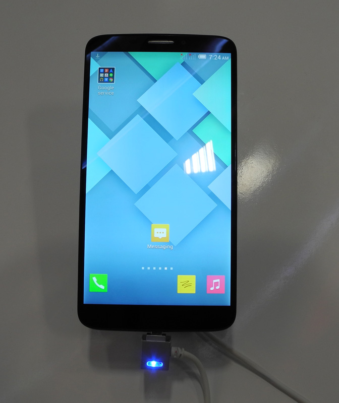
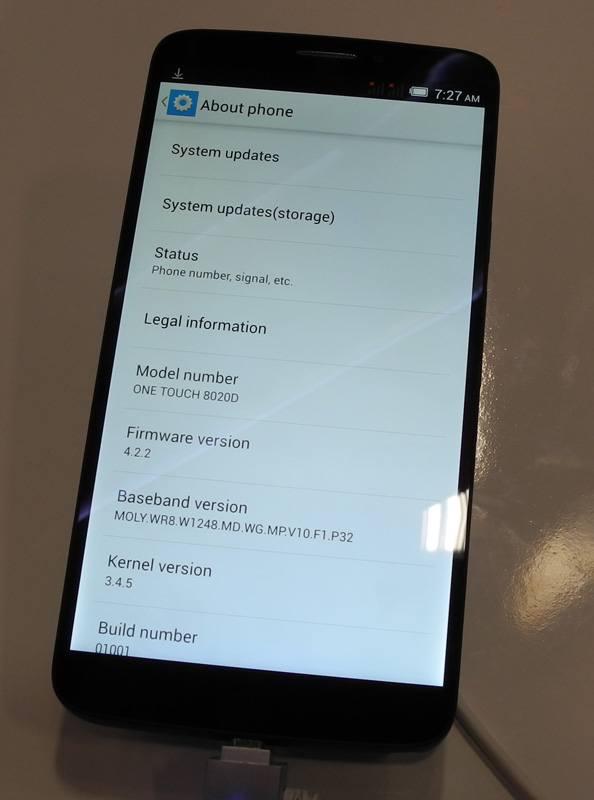
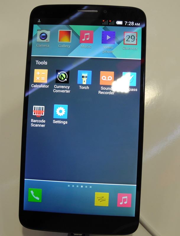
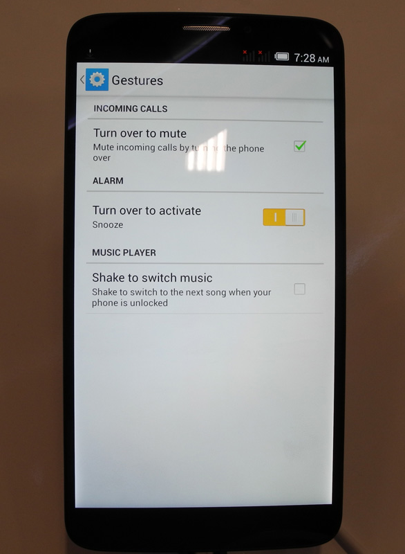
The assembly of the device is excellent, the panels are tightly fitted to each other. If the exhibition samples were so well made, we can expect that the level of manufacture of commodity devices will be at least no worse. The device lies well in the hand, but its large size makes it impossible to control with one hand. In fairness, it should be noted that the developers took care of the ability to control some functions of the device using gestures.
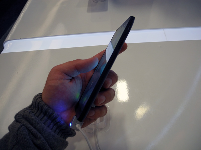

The back panel of the Alcatel One Touch Hero is made of high-quality matte plastic soft touch, which practically does not leave fingerprints.
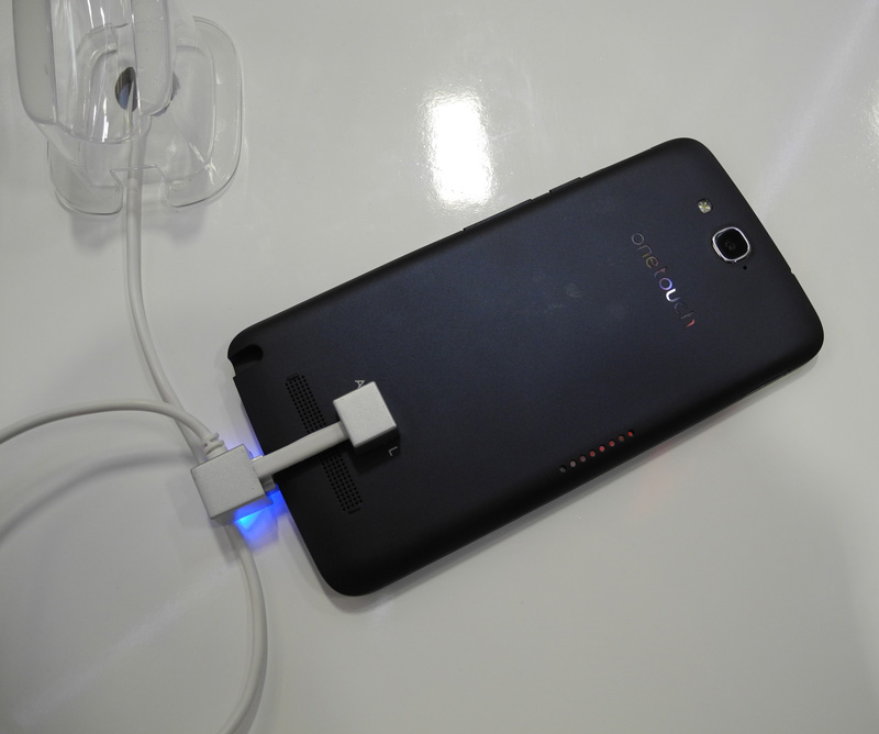
Unfortunately, the smartphone could not be tested; the TCL did not work at the TCL stand, or the Internet was disconnected. However, I have absolutely no doubt that this smartphone uses the MediaTek MT6589T platform, the capabilities of which are well known.
MagicFlip accessories designed specifically for the flagship model were displayed next to the Alcatel One Touch Hero: a cover with an integrated LED screen, a cover with an E Ink screen and a cover that provides wireless battery charging.


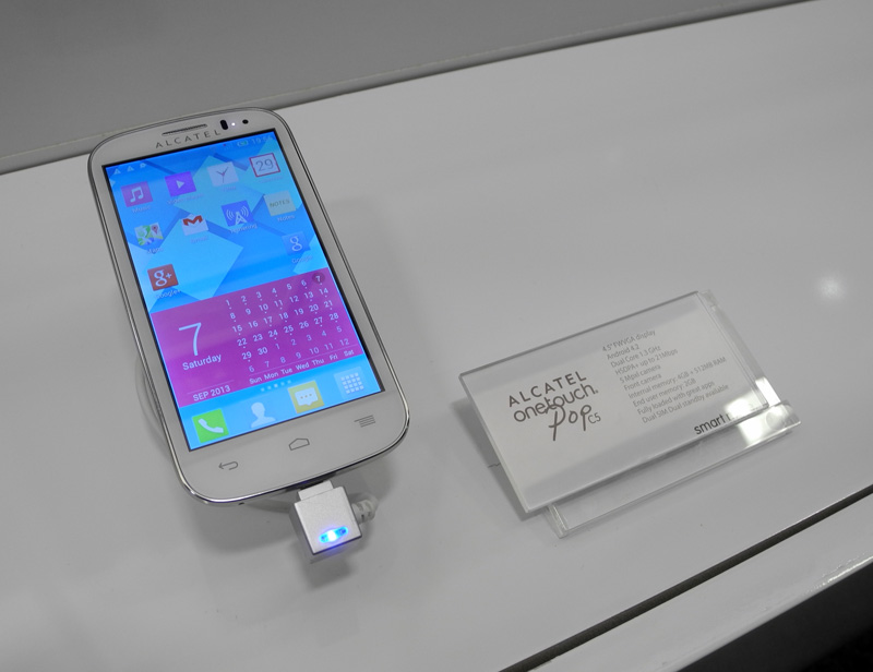
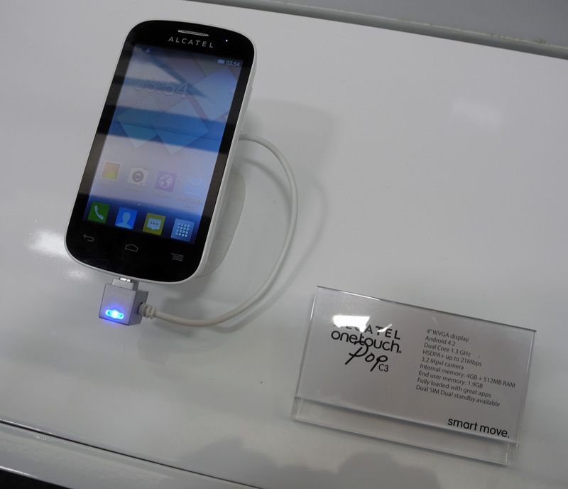
Another TCL premiere at IFA is the Alcatel Pop C series of low-cost smartphones: C1, C3, C5 and C7. I would call it a kind of response to the line of low-cost smartphones LG Optimus L, in which there are models L1, L3, L5, L7 and L9. Agree, it is unlikely that such a coincidence of names can be considered random. Especially after the idea of launching LG Optimus L proved its effectiveness by high sales.
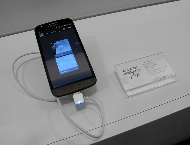
Actually, there is nothing special to talk about Pop C: multi-colored devices are a plus, but the case materials are extremely inexpensive, and the design is inexpressive - these are the disadvantages. Features correspond to the budget class.
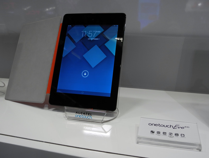
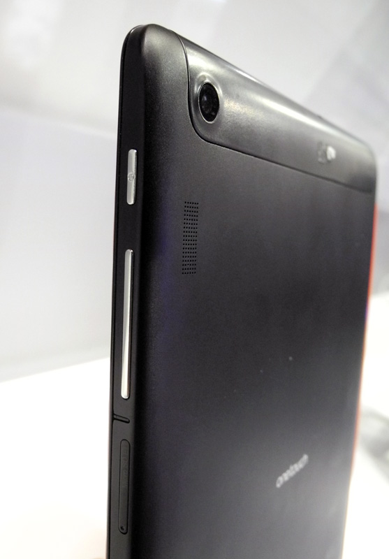
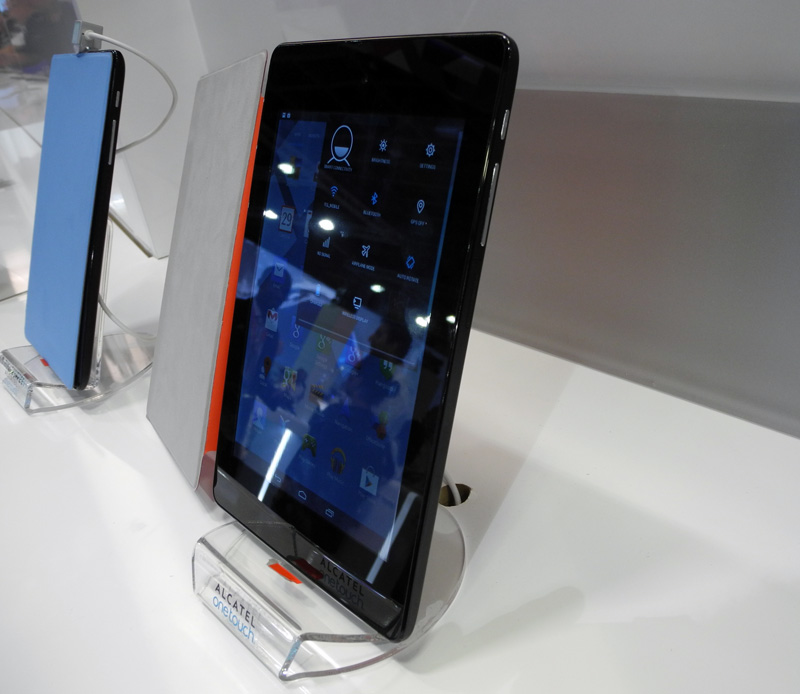
The only Alcatel tablet on display - One Touch Evo 8 HD - did not like its appearance at all. Firstly, the colors of the covers: they are some kind of flashy and “strained”. Secondly, with materials: the easily soiled gloss of the front panel is “perfectly” complemented by the brand and the slippery back panel. The screen brightness seemed insufficient to me.
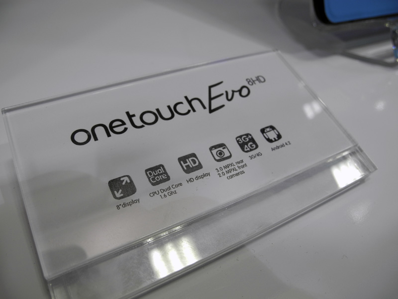
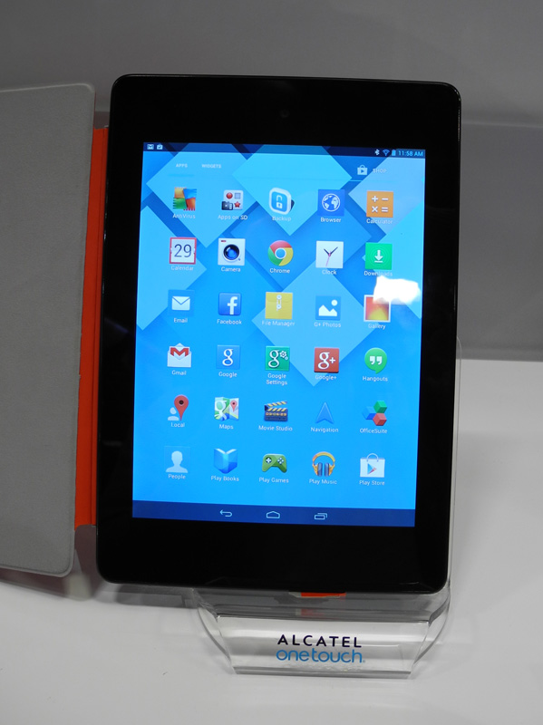
On the software part of Alcatel One Touch Evo 8 HD - nothing interesting, the tablet runs on Android 4.2. The technical specifications are also outstanding: the dual-core Rockchip RK3066 1.6 GHz processor, an 8-inch IPS screen with a resolution of 1024 x 768 pixels, 1 GB of RAM, 4 GB of flash memory, cameras with a resolution of 2 and 3 MP. The only good news is the battery capacity is an impressive 4150 mAh. It should be assumed that with the autonomy of this device is in full order.
Once upon a time, when tablets still didn’t do everything, I really looked at Archos products, then they seemed to me just cosmic. Time passed, the industry changed, Archos started producing smartphones ... And now I would really like to turn back the clock, because at IFA the company showed how not to make smartphones.

Archos line of smart phones consists of three series - Titanium, Platinum and Oxygen, in which eight models are offered to consumers. Budget devices belong to the first series, representatives of the second are characterized by “elegant design and top performance”, and “oxygen” smartphones (so far the line is represented by only one model), by the definition of developers, should be fast, efficient and affordable.
I began my acquaintance with Platinum series devices, and I ended up with them. Why? Because already after the second device Archos did not want to pick up smartphones. I got the feeling that the company, using a fairly well-developed brand in Europe, decided to supply the cheapest Chinese OEM to the Old World market. Obviously, they saved on everything: on the equipment (see the characteristics in the photo below), and on the finishing materials. The latter frankly upset the easily soiled gloss used both in the design of the front panel and the rear. And just easily soiled - to put it mildly! The fit of the “halves” of the case is unimportant, there are elevators. Finally, the design of Archos smartphones is simply missing.
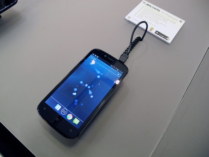
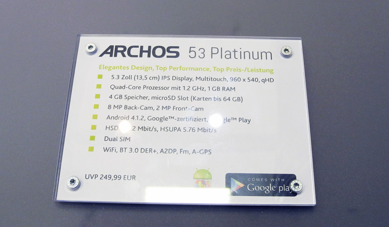
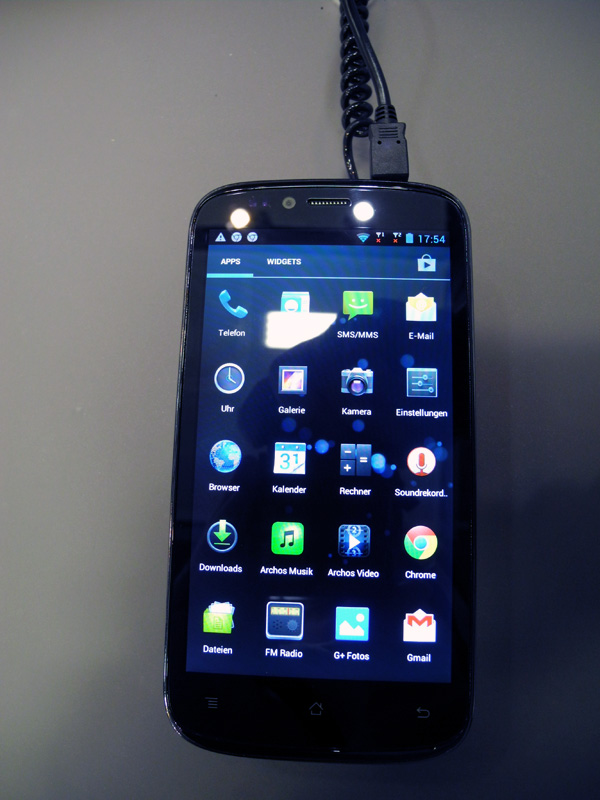
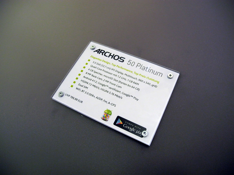
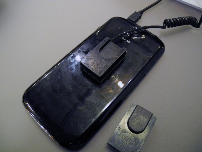
What does the company of the European consumer plan to take? At a price? I would not say. The Archos 50 Platinum and 53 Platinum shown in the photo above are estimated at 200 and 250 euros, respectively ...
On this minor note, I complete the first part of the IFA review of mobile innovations. In the next part I will dwell in detail on the latest Russian companies - Texet, IconBIT, Wexler.

Samsung
The Samsung Pavilion was expectedly the largest at the IFA 2013, with its stage and many thematic stands. According to my calculations, at least 200 Samsung Galaxy Note 3s were on display!

These smartphones had a lot of people, but because of the large number of exhibited copies, anyone could literally hold a novelty in their hands.
Galaxy Note 3
And I must say, I liked the device. Workmanship is up to par.

The metal strip around the perimeter is corrugated, apparently this is done so that the device clings even more to the palm of the hand. By the way, I did not experience any discomfort from the size of the smartphone, possibly due to the considerable size of my hands. But with Sony Xperia ZU is really really difficult to manage.


Galaxy Note 3 has several color options, and they differ markedly in the decoration of the front panel. For example, the design of the front panel of the dark gray version gives rise to associations with brushed aluminum, and in the white and pink versions the pattern is already geometric - rhombuses with stripes.


Earlier, I had to deal with Samsung smartphones, but the Galaxy Note 3, in my opinion, is the first, the metal design elements of which really look like metal, you can not confuse them with “silver plated plastic” even in appearance. They are made very carefully, I especially liked the metal mesh of the speaker at the bottom, the slightly protruding metal strip covering the auditory speaker, and the solid volume control swing. Finally, Samsung doesn't look cheap!
Partly the “expensive” look is achieved due to the back cover, which is really made of leather. An extremely interesting solution, but is it practical? The fact is that going to the white tablet Galaxy Note 10.1, the back panel of which is also trimmed with leather, I was unpleasantly surprised by the black stains on it. Note that the exhibition samples rested on leather (!) Stands and were securely fixed, i.e. definitely didn’t fall. It turns out that the skin got so dirty just because of dirty hands? And what will happen if you throw a smartphone or tablet at the bottom of a bag or backpack? And if you wear it all the time? Already at home or in the car, the device obviously will not lie on a clean white leather counter, as it was at the exhibition ...

Naturally, you can carefully treat the lid, and all the dirt will come off, but my opinion is this: in a mobile device that is constantly carried around, the skin is inferior to plastic in practicality. How long it will “stretch” in the white and pink versions is a big question. In this case, it is better to buy a dark gray Galaxy Note 3, traces of dirt on dark skin will not be noticeable for a very, very long time.
The Galaxy Note 3 has an LED event indicator. It is hidden under the front panel and burns with diffused light. It turns out funny: at first you want to “focus”, you squint, and only then you realize that “sharpness” was not initially provided. Like, the "trick" is this.

Speaking about the Samsung Galaxy Note 3, one cannot fail to say about the covers released specifically for him. I also liked them very much, and here's the thing: the back wall of the smartphone is so close to the wall of the case that it seems like the smartphone and the case are one. For several seconds I tried to find a place to connect the case and the smartphone! And after all, the back wall of the case - exactly like the cover of a smartphone, can not be distinguished! The developers for such a "close relationship" Galaxy Note 3 and a protective device - five points.


Samsung Galaxy Note 3. Software and settings.


But let's move on from the appearance to the performance of the Samsung Galaxy Note 3. I managed to install on the LTE-enabled version (that is, on the Qualcomm Snapdragon 800 MSM8974 platform) and run only two benchmarks: AnTuTu and NenaMark 2. The results are lower.


Obviously, the performance of the Galaxy Note 3 is high, and the Qualcomm Snapdragon 800 is strong. But how much? I tried to answer this question a little lower (see the Toshiba section).
Galaxy gear
After Galaxy Note 3, I immediately switched to the Galaxy Gear watch, which Samsung is very proud of.

In my opinion, there is nothing special to be proud of. The device turned out to be heavy and rather bulky. Several girls who looked at the watch next to me for a long time spoke of the same thing - Samsung had got very large watches. And this despite the fact that the Galaxy Gear is focused more on a female audience than on a male one. Here is such feedback from the target audience ...


By the way, the Galaxy Gear barely fastened on my hand. Another hint that they are not for the male hand?


It was also inconvenient for me to control the touch screen. The screen is small, and if the fingers are large, then, for example, in the settings, when three strips of sub-menu items are displayed on the screen, you should aim exactly at the middle of each sub-item, otherwise it is very likely to complete the wrong thing that you planned. Perhaps I just didn’t have time to get used to such a feature of the watch, but, on the other hand, why should a person “roll off” half the cost of the Galaxy Note 3 behind the Galaxy Gear and have to get used to something else? Why did I almost instantly figure out how to manage iPod nano, but I couldn’t master the Galaxy Gear in 10-15 minutes? Certainly not because I didn’t want to. In a word, I would advise Koreans to work on the interface. Template Android with its own menus, in my opinion, is not suitable for such a device,


By the way, the button in the watch is only one, and this also does not make working with a portable computer, which is the Galaxy Gear, easier.
On one side of the watch in the region of a peculiar tide is the camera eye.


This arrangement makes Galaxy Gear an excellent device for conducting “spy” shooting - watch the video below: the girls standing nearby did not even notice that I was shooting them!
But for communication, it would be more logical to place the camera on the front panel, because any person wearing a watch looks at the screen, and not at the strap. Why Samsung decided to fence a garden with this strap is completely incomprehensible to me.
And finally, software. Watch the video below, it gives a complete idea of what is the software component of Galaxy Gear.
I must say that I absolutely did not like the Samsung watch, either in performance or in appearance. I did not see anything in them that the Koreans could be proud of or even boast about. Additional functions (like a pedometer) are secondary, some of the main ones (here I primarily mean the fisheye of the camera) are implemented rather clumsy, the menu is completely intuitive. I remember very well when in 2009 I saw the LG GD910 watch - then they had an effect on me. But now, after four (!) Years, Samsung, in fact, offers the same thing. Yes, not just offering, presents it with great fanfare! Like, we developed, we worked, everything is for you. While casually mentioning that the Galaxy Gear is, firstly, helpless without a smartphone, and secondly, so far only compatible with Galaxy Note 3 and Galaxy S 4. By God, it’s funny and sad. Sony doesn’t make hype out of its watches, which meanwhile have grown to the second generation, and this approach is much more to my liking. Not to mention Pebble.
In a word, I tend to call the Galaxy Gear a big Samsung mistake. Perhaps this is also understood by the company, otherwise where did the rumors come from that this device will never go on sale, and instead, after six months, a modified copy of Galaxy Gear 2 will appear?
Galaxy Note 10.1 2013 Edition
This tablet is rightly called a stretched version of the Galaxy Note 3: the design, adjusted for size, is exactly the same.


The new Galaxy Note 10.1 was presented in two colors: white and black. The second option I liked more due to the design of the front panel with sparkles, which "plays" in the light.


It does not make sense to describe the tablet in detail: everything that has been said regarding the Galaxy Note 3 applies to it.


Toshiba
At IFA 2013, I discovered Toshiba tablets - I had never encountered them before. I must admit, I liked the entire line of tablets of the Japanese company, but it is difficult to explain why. They do not represent anything outstanding in terms of design, the software is also of the same type, as an example you can put only a clear division into niches and price groups (the flagship model is Excite Pro, the budget model is Excite Pure, some intermediate option is Excite Write, providing pen input) and modern specifications (Excite Pro has a Retina display and HDMI output).
Of course, the most interesting was Excite Pro, built on the NVIDIA Tegra 4 platform. You can evaluate its characteristics, as well as some layout features in the photo below.


And now about performance. I was able to drive the device in three benchmarks: AnTuTu, Quadrant and Vellamo.


In comparison with Qualcomm Snapdragon 800 in Galaxy Note 3, the most interesting result is Excite Pro in AnTuTu. I’ll immediately notice that the tablet uses the so-called Retina screen with a resolution of 2560 x 1600 pixels, and Samsung’s smartphone uses “normal” Full HD, so the load on the Tegra 4 GPU was a priori higher. In order not to have to run my eyes over two photos, I brought all the data into one plate.
| Qualcomm Snapdragon 800 (Samsung Galaxy Note 3) | Test | NVIDIA Tegra 4 (Toshiba Excite Pro) |
|---|---|---|
| 29741 | Total score | 30074 |
| 5271 | Multitask | 7479 |
| 3507 | Dalvik | 2628 |
| 1685 | CPU Integer | 3435 |
| 2008 | CPU Float-point | 4155 |
| 824 | RAM operation | 1615 |
| 2457 | RAM speed | 1845 |
| 1638 | 2D Graphics | 1375 |
| 9908 | 3D Graphics | 5831 |
| 1763 | Storage I / O | 1091 |
| 680 | Database I / O | 630 |
The numbers speak for themselves: in terms of the performance of the central processor, the NVIDIA Tegra 4 bypasses the Qualcomm Snapdragon 800. The situation with the GPU is not so clear, but it seems to me that if the tablet had a Full HD screen, then the graphics performance would be about the same level. Indirectly, this is confirmed by the fact that in the 2D graphics test, NVIDIA Tegra 4 lost less than in the 3D test.
The only thing I did not like about the Toshiba Excite Pro (and also don't like about many Chinese tablets) was the use of a separate charge instead of the usual microUSB cable.

The Japanese company offers a keyboard cover for Excite Pro satellites.

Panasonic
Panasonic’s mobile highlight was a 20-inch tablet with a 4K resolution screen, announced at the beginning of the year. The device is called 4K Tablet.

The device uses the IPS Alpha panel with an aspect ratio of 15:10 and a resolution of 3840 x 2560 pixels. With a diagonal size of 20 inches, the pixel density does not seem impressive at all - only 230 ppi.

The tablet’s list of features includes a 1.9 GHz Intel Core i5-3437U processor, an NVIDIA GeForce 745M graphics card, 4 or 8 GB DDR3 RAM, 128 or 256 GB SSDs, Wi-Fi 802.11a / b / g / n and Bluetooth adapters 4.0, one USB 3.0 port, one SDXC slot. A dock connector is also provided. For an extra charge, the 4K Tablet can be equipped with the Anoto Pen digital pen and smart card support.

It was impossible to work with the tablet, access to the system was blocked. In fact, it remained either to consider beautiful pictures, or evaluate the work of a pen. However, I have something to note. First, the device’s screen is really good. But this is obvious, but further ...

4K Tablet is a kind of layout miracle. Judge for yourself: the case is thin, like a tablet, accessories - like a traditional laptop, the screen in general (for now) is not from this world. As a result, there are a lot of nuances. The device turned out to be rather heavy and not at all portable enough to carry it every day with you from home to work. Well, suppose he will lie on the table all the time, but then access to the connectors located on the sides is noticeably worsened. And if you insert a USB flash drive, it will probably work (and then, only if not thick), then sticking a memory card will be problematic. I'm not talking about the fact that in the "flat" position will be blocked and ventilation holes and slots of the speakers.


Another dubious, in my opinion, solution is the placement of LED indicators on the beveled part of the left side panel. Again, if the tablet rests on a horizontal surface, then these LEDs will flicker ... on the table. And it will be possible to judge the status of the drive, memory card, power circuit unless by the light. Why it was not to bring them to the front of the device is not clear.

And I also think that for such a large device, the declared battery life - about 2 hours - is not enough. But this is so, the little things.
In general, while I do not see the 4K Tablet broad commercial prospects. At least in the current version. Yes, perhaps the device will be ordered by eminent design studios and architectural studios, but this will satisfy the demand. On the other hand, someone should be the first, and the first damn ... Well, you know.
TCL / Alcatel
The Chinese company TCL "shot" on the IFA flagship smartphone Alcatel One Touch Hero.


On the one hand, the characteristics of the device are really good - a 6-inch Full HD OGS screen with an alkophobic coating, a 13 megapixel camera, 2 GB of RAM, on the other hand - multitouch is only 5 touches, the built-in flash memory reaches a maximum of 16 GB. In a word, the flagship remains the flagship, but in its budget category.

The assembly of the device is excellent, the panels are tightly fitted to each other. If the exhibition samples were so well made, we can expect that the level of manufacture of commodity devices will be at least no worse. The device lies well in the hand, but its large size makes it impossible to control with one hand. In fairness, it should be noted that the developers took care of the ability to control some functions of the device using gestures.


The back panel of the Alcatel One Touch Hero is made of high-quality matte plastic soft touch, which practically does not leave fingerprints.

Unfortunately, the smartphone could not be tested; the TCL did not work at the TCL stand, or the Internet was disconnected. However, I have absolutely no doubt that this smartphone uses the MediaTek MT6589T platform, the capabilities of which are well known.
MagicFlip accessories designed specifically for the flagship model were displayed next to the Alcatel One Touch Hero: a cover with an integrated LED screen, a cover with an E Ink screen and a cover that provides wireless battery charging.


Another TCL premiere at IFA is the Alcatel Pop C series of low-cost smartphones: C1, C3, C5 and C7. I would call it a kind of response to the line of low-cost smartphones LG Optimus L, in which there are models L1, L3, L5, L7 and L9. Agree, it is unlikely that such a coincidence of names can be considered random. Especially after the idea of launching LG Optimus L proved its effectiveness by high sales.
Actually, there is nothing special to talk about Pop C: multi-colored devices are a plus, but the case materials are extremely inexpensive, and the design is inexpressive - these are the disadvantages. Features correspond to the budget class.


The only Alcatel tablet on display - One Touch Evo 8 HD - did not like its appearance at all. Firstly, the colors of the covers: they are some kind of flashy and “strained”. Secondly, with materials: the easily soiled gloss of the front panel is “perfectly” complemented by the brand and the slippery back panel. The screen brightness seemed insufficient to me.


On the software part of Alcatel One Touch Evo 8 HD - nothing interesting, the tablet runs on Android 4.2. The technical specifications are also outstanding: the dual-core Rockchip RK3066 1.6 GHz processor, an 8-inch IPS screen with a resolution of 1024 x 768 pixels, 1 GB of RAM, 4 GB of flash memory, cameras with a resolution of 2 and 3 MP. The only good news is the battery capacity is an impressive 4150 mAh. It should be assumed that with the autonomy of this device is in full order.


Archos
Once upon a time, when tablets still didn’t do everything, I really looked at Archos products, then they seemed to me just cosmic. Time passed, the industry changed, Archos started producing smartphones ... And now I would really like to turn back the clock, because at IFA the company showed how not to make smartphones.

Archos line of smart phones consists of three series - Titanium, Platinum and Oxygen, in which eight models are offered to consumers. Budget devices belong to the first series, representatives of the second are characterized by “elegant design and top performance”, and “oxygen” smartphones (so far the line is represented by only one model), by the definition of developers, should be fast, efficient and affordable.
I began my acquaintance with Platinum series devices, and I ended up with them. Why? Because already after the second device Archos did not want to pick up smartphones. I got the feeling that the company, using a fairly well-developed brand in Europe, decided to supply the cheapest Chinese OEM to the Old World market. Obviously, they saved on everything: on the equipment (see the characteristics in the photo below), and on the finishing materials. The latter frankly upset the easily soiled gloss used both in the design of the front panel and the rear. And just easily soiled - to put it mildly! The fit of the “halves” of the case is unimportant, there are elevators. Finally, the design of Archos smartphones is simply missing.


What does the company of the European consumer plan to take? At a price? I would not say. The Archos 50 Platinum and 53 Platinum shown in the photo above are estimated at 200 and 250 euros, respectively ...
On this minor note, I complete the first part of the IFA review of mobile innovations. In the next part I will dwell in detail on the latest Russian companies - Texet, IconBIT, Wexler.
