Developer Web Design Guide
- Transfer
The author of the article, the translation of which we publish today, says that he created his first website when he was 14 years old, in the form of a school project. Then he faced a simple task: to develop a website containing some text, images and a table. Usually he treated school projects like this: first he forgot about them, and when the deadline came, he made them at the very last moment. However, at that time it was not at all like that. He was particularly interested in how his first site would look. Then, in order to do everything as it should, he did his best. The author of the material says that, even from those ancient times, he was striving to ensure that what he was doing would look as attractive as possible. This aspiration is still alive in him. Here he wants to share tips on web page design.

You can admit it, you can not admit it, but people judge anything by its appearance. If what you are doing looks good, then the chances of your project gaining the trust of others grow, naturally, if the word “good” can describe not only its appearance, but also its functionality.
For many years I have been creating various projects of my own and during this time I paid more and more attention to the development of my design skills, and not just to improve my programming skills. The code is important, but if you want to create your own profitable project, then you have to solve a lot of problems, one of which is design. A lone developer, in order to achieve something, you have to fully develop yourself.
Great design is not something that is able to collect a bunch of likes on Dribbble . This is something they don't even notice at first. It is a balance between utmost simplicity and something that is breathtaking. Design can be both a competitive advantage of the project, and one of the reasons for its failure.
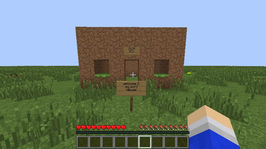
When I was younger, I played a lot of Minecraft. I looked at the beautiful things that others create, but when I tried to build something of my own, everything turned out to be similar to a box. No beauty, no style. And how can you even do something beautiful in Minecraft?
Then I found one video blogger on YouTube and built a copy of what he built. A few weeks later I formed my own style and could already create something of my own. Suddenly, my designs stopped looking like it was not clear what. What can I say, I even won one contest.
As a matter of fact, I told this story to the fact that design is a skill, and, as is the case with any other skills, design can be mastered.
In programming, you can take an ordinary Notepad and write with it an application that is not inferior to that created with the help of a powerful IDE, although programming in Notepad may not be the most enjoyable task, and probably the development process will take much longer than using the right tools. If we talk about web design, then MS Paint can play the role of Notepad, and I hope that, as in the example with Notepad and programming, very few will use it to solve design problems.
Popular web design tools
Here are some popular web design tools:
It makes almost no difference whether you use Sublime or VS Code to write code. The same can be said about whether you choose React or Vue for developing interfaces. It's a matter of taste. The same can be said about the designer's tools. Each of them has its own advantages and disadvantages.
I use Adobe XD. The main reason for this choice is cross-platform, as a result I, as it would if I chose Sketch, are not hostage to the Apple ecosystem. In addition, Adobe XD has the support of Adobe, so we can hope that this project will exist for a very long time. And for beginners it will be especially pleasant that since May 2018, Adobe XD can be used free of charge, although with some limitations (although they are unlikely to interfere with you anyway).
The main problem I had to solve when entering the world of web design was to develop the right attitude. I used to design in the course of site development. I thought that everything should just be in a certain order. Elements are placed from left to right and top to bottom. True, such an approach is a sure way to become a terrible designer.
Design tools force you to work as if each element has absolute positioning. After clear constructions that can be seen in the program code, the constructions with which the designer operates can seem disorganized and disorderly. But it needs to be accepted. This gives freedom, the ability to quickly change everything and experiment a lot. And this is perhaps the most important, since design is a continuous process. The design is completely expected that before you get a great result, you will often have to redo everything.
When writing web pages using HTML-code elements, such as
I chose the four most frequently used designer tools, this is not so much, so you can not waste too much time on the development of these tools. Time is better to spend, in fact, on the design. That is, quickly understand the basics, you can immediately begin to practice. Let's talk about these tools on the example of Adobe XD.
The rectangle is the geometric figure most often used in the design. Being engaged in design, you will find that you constantly work with them. Think of the rectangle as if it were an HTML element
Rectangle
At first glance, it seems that working with texts is very simple. However, there is one feature, which is that the tool for working with texts has two modes of operation. One of them is intended for creating single-line inscriptions, the second is for creating multi-line test blocks. Fortunately, despite this feature, a tool for working with texts is easy to learn and use.
In the first mode, which is designed to work with single-line captions, the size of the text container is adjusted to the size of the text contained in it. It resembles a tag
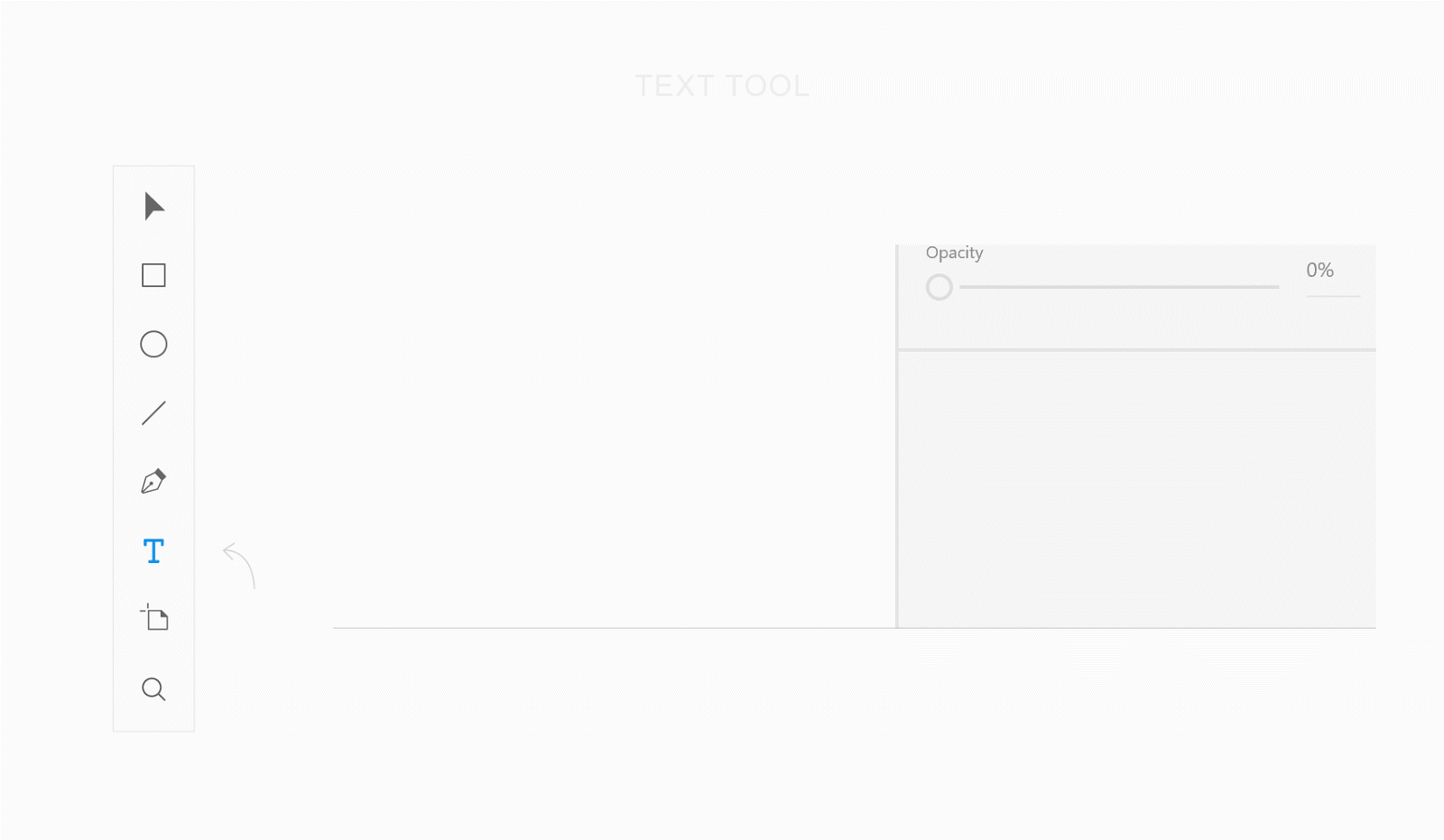
To create a single-line text fragment, select the Text tool in the Adobe XD toolbar, click where the text should be located, and enter it. It should be taken as a rule that this mode should be used for single-line labels, the width of which can be selected automatically. These are single-line headers and object signatures.
Text Tool - Single Line Labels
The second mode of the text tool is used to form text containers of a given size that behave like a tag
Text Tool - Multiline Text Fragments
Using the Select tool, objects are moved, resized, copied. In the figure below you can see the auxiliary elements of this tool, namely, the pink lines, which help to determine the distance between the objects, and the blue lines, with the help of which it is convenient to align objects.

Select tool
Sometimes the lines are very useful, for example, to separate the elements of the page. That is why we are talking here about the Line tool. From a technical point of view, you can use the Rectangle tool for the same thing, but what can you do,
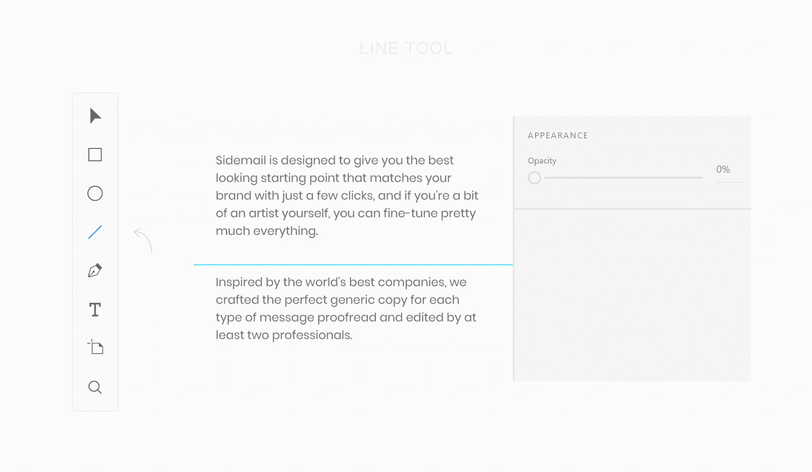
Line tool
In web development, a layout is usually represented by a page header, a menu, page contents, and a footer. All of this is part of the layout, but the layout itself is more than the sum of these parts. Layout is how elements are arranged on the page.
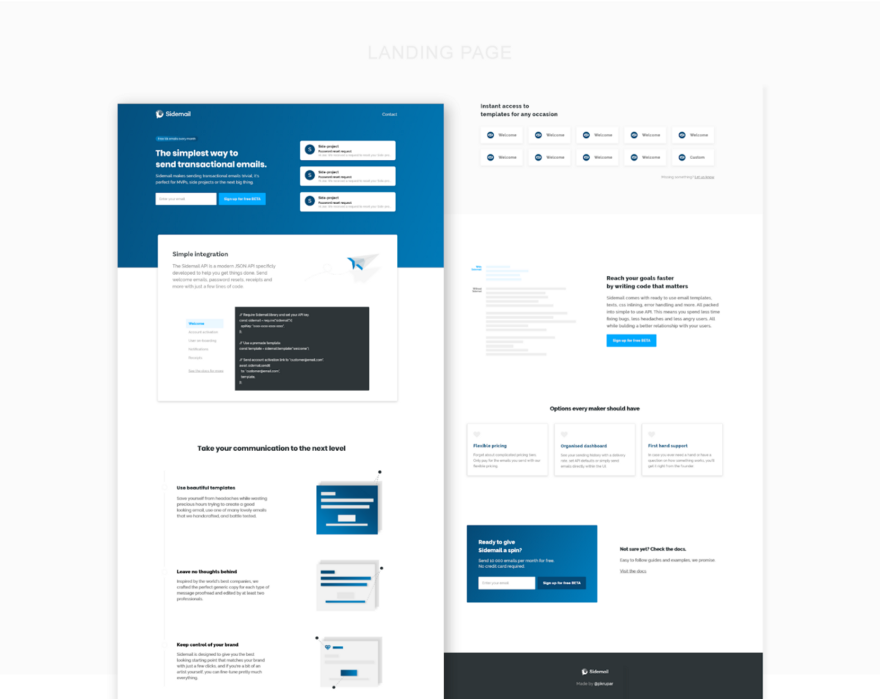
For example, when I designed the information page for Sidemail , I evenly arranged the elements inside the container. The following figure, in its lower part, shows exactly this version of the design, which I consider to be a good one, and at the top is the unfortunate version. As a result, what turned out was perceived, in comparison with another option, as something more integral, this option looked neater than the one I considered unsuccessful.
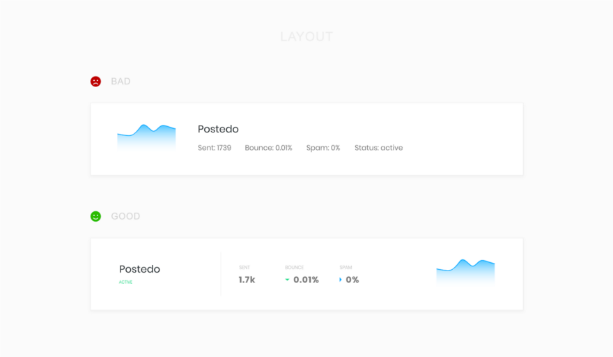
Examples of unsuccessful and successful layout
When choosing colors for your next project, keep in mind such a thing as color psychology . To search for good color combinations based on the main color, you can use the project Paletton .
To create a visual hierarchy of the page, use shades of the primary color and the text color When using a colored background, experiment with the hues used in the text.

Examples of working with colors and text
The fonts that make up the various inscriptions have a strong influence on the perception of the pages, so be careful about their choice. Usually, commercial fonts look better than those found on Google Fonts, but if you are just starting the way of a web designer, you should not spend money on buying fonts. Even among what is on Google Fonts, you can find excellent options.
In order to visually separate text fragments, I often use the technique, which consists in the fact that the texts of the inscriptions are in capital letters with an increased distance between the characters. The texts in upper case are symmetrical, they look attractive, however, it is more difficult to read them, so you should not get too carried away with them.
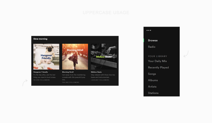
Upper Case Studies
I always try to avoid the temptation to create a fashionable design, and then cram into it what I want to communicate through the page. Instead, I highlight the merits of the project (rather than its functional features), create a story from them and tell this story using a visually appealing page.
After I understand what story I want to tell through the page, I usually start looking for inspiration. A great source of inspiration for me is the project land-book.com , which is an extensive catalog of excellent design samples of landing pages for which you can vote. Another project where you can look for inspiration is interfaces.pro. It allows you to select pages of certain types, for example, it can be pages with information about prices, page 404, or pages with information about sites. I just watch all this until I can not find enough sites I liked, the appearance of the pages of which corresponds to my ideas about the style of the project that I do.
Landing page
After I have a general idea of what I need, it is time to solve a difficult task of putting everything together. Unfortunately, there are no easy ways. In order to create something good, you need to experiment a lot, doing it until you get what you like.
You may be wondering if this is normal, if the design that you were completely satisfied with a week ago, suddenly began to seem not so good to you, and perhaps even completely unacceptable. This is perfectly normal, and, in fact, if you experience such sensations, it is even good. This is due to the fact that you grow, learn and become better in the field of design. As a result, what seemed like a daunting task yesterday is not so difficult today. Remember this and you will not feel like a squirrel in a wheel.
As in the case of designing a landing page, when creating a web application, you do not need to immediately grab the arrangement of elements on the page. The situation under consideration differs from the previous one in that you do not tell the visitor a story. This time you are creating a tool, and your main goal is to make this tool convenient. Take a piece of paper and a pencil and draw a work plan for your application. Think about what depends on what, how to facilitate the work with this application.
If necessary - make a few sketches or layouts. Explore the design of competing projects, think about what they lack. Perhaps you decide to do what they do not have, and this may be a competitive advantage of your project. Consider the fact that sometimes, before you draw mockups and estimate design options, you need to give yourself time to think.
The best advice that is not tied to the specific features of various projects that I can give here is to choose the right page layout. Usually, web applications use two approaches to page layouts. The choice of one or another depends on the objectives of the application. We are talking about containers of fixed width, and flexible containers that fill the entire screen.
Web application
I prefer to use fixed-width containers, since it is easier for the user to concentrate on a limited area due to the fact that it does not require unnecessary eye movements to view what is located in this area. Applications that use fixed containers, in addition, usually look neater, and new users of such applications easier to navigate. It should be noted that such applications, due to the limited width of the containers, are more difficult to design.
Here are some examples of web applications that use fixed containers: Twitter , Buffer , DigitalOcean , Netlify , GitHub .
Flexible containers are great for web projects such as chat rooms, applications for working with tables or with large amounts of information presented in other formats. Usually when designing such applications, it is important that as much data as possible can be placed on the screen. The downside of flexible containers is the fact that a large amount of data displayed on the screen can confuse the user.
Examples of applications using flexible containers include Slack , Intercom , Hotjar , Google Sheets , Trello , Spotify .
For a developer who is used to working with code, and not with visual images, it can be difficult to switch to a design wave. But design is something that you can learn. Remember that design can be a competitive advantage of your project, so pay attention to it and create attractive websites that are comfortable and pleasant to work with.
Dear readers! Do you think a single programmer can achieve good results in the field of design?


Design
You can admit it, you can not admit it, but people judge anything by its appearance. If what you are doing looks good, then the chances of your project gaining the trust of others grow, naturally, if the word “good” can describe not only its appearance, but also its functionality.
For many years I have been creating various projects of my own and during this time I paid more and more attention to the development of my design skills, and not just to improve my programming skills. The code is important, but if you want to create your own profitable project, then you have to solve a lot of problems, one of which is design. A lone developer, in order to achieve something, you have to fully develop yourself.
Great design is not something that is able to collect a bunch of likes on Dribbble . This is something they don't even notice at first. It is a balance between utmost simplicity and something that is breathtaking. Design can be both a competitive advantage of the project, and one of the reasons for its failure.
It's not about talent
When I was younger, I played a lot of Minecraft. I looked at the beautiful things that others create, but when I tried to build something of my own, everything turned out to be similar to a box. No beauty, no style. And how can you even do something beautiful in Minecraft?
Then I found one video blogger on YouTube and built a copy of what he built. A few weeks later I formed my own style and could already create something of my own. Suddenly, my designs stopped looking like it was not clear what. What can I say, I even won one contest.
As a matter of fact, I told this story to the fact that design is a skill, and, as is the case with any other skills, design can be mastered.
Selection of tools
In programming, you can take an ordinary Notepad and write with it an application that is not inferior to that created with the help of a powerful IDE, although programming in Notepad may not be the most enjoyable task, and probably the development process will take much longer than using the right tools. If we talk about web design, then MS Paint can play the role of Notepad, and I hope that, as in the example with Notepad and programming, very few will use it to solve design problems.
Popular web design tools
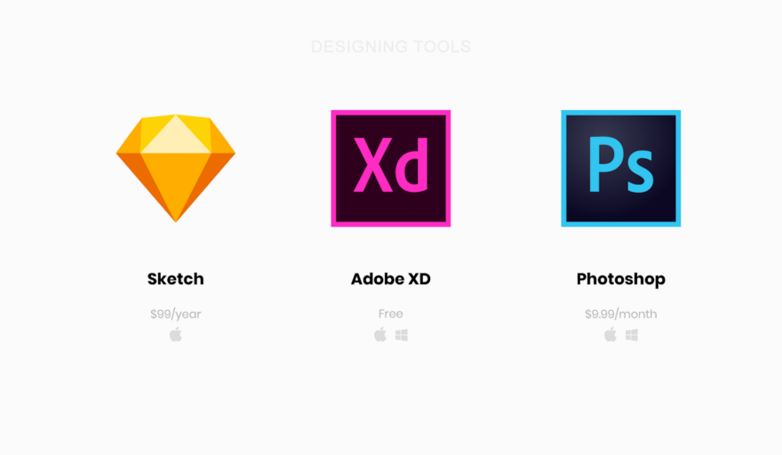
Here are some popular web design tools:
- Sketch is a tool designed exclusively for MacOS. If you draw a parallel with the world of web programming, it will be something like React for design. There is a feeling that the mention of Sketch is present in every job of a designer. This thing costs $ 99 a year.
- Adobe XD is a free, cross-platform tool that, continuing the programming analogy, is similar to Vue. Not so large a community as around Sketch was formed around Adobe XD, but it is very easy to master this tool.
- Adobe Photoshop is something like a Swiss knife in the design world that everyone knows about and can be compared to jQuery. Adobe Photoshop can be used for $ 9.99 per month.
It makes almost no difference whether you use Sublime or VS Code to write code. The same can be said about whether you choose React or Vue for developing interfaces. It's a matter of taste. The same can be said about the designer's tools. Each of them has its own advantages and disadvantages.
I use Adobe XD. The main reason for this choice is cross-platform, as a result I, as it would if I chose Sketch, are not hostage to the Apple ecosystem. In addition, Adobe XD has the support of Adobe, so we can hope that this project will exist for a very long time. And for beginners it will be especially pleasant that since May 2018, Adobe XD can be used free of charge, although with some limitations (although they are unlikely to interfere with you anyway).
About the right mood
The main problem I had to solve when entering the world of web design was to develop the right attitude. I used to design in the course of site development. I thought that everything should just be in a certain order. Elements are placed from left to right and top to bottom. True, such an approach is a sure way to become a terrible designer.
Design tools force you to work as if each element has absolute positioning. After clear constructions that can be seen in the program code, the constructions with which the designer operates can seem disorganized and disorderly. But it needs to be accepted. This gives freedom, the ability to quickly change everything and experiment a lot. And this is perhaps the most important, since design is a continuous process. The design is completely expected that before you get a great result, you will often have to redo everything.
Learning tools
When writing web pages using HTML-code elements, such as
div, span, data entry fields, allowing the browser to turn them into something that can be seen on the screen. By working with design tools, you get the opportunity to get rid of mediation and use visual elements, such as geometric shapes or text fragments, directly. I chose the four most frequently used designer tools, this is not so much, so you can not waste too much time on the development of these tools. Time is better to spend, in fact, on the design. That is, quickly understand the basics, you can immediately begin to practice. Let's talk about these tools on the example of Adobe XD.
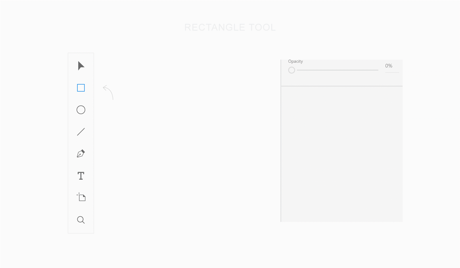
R Rectangle Tool - Rectangles
The rectangle is the geometric figure most often used in the design. Being engaged in design, you will find that you constantly work with them. Think of the rectangle as if it were an HTML element
div. Rectangles are used in the design of a variety of page elements - from text fields to containers.Rectangle
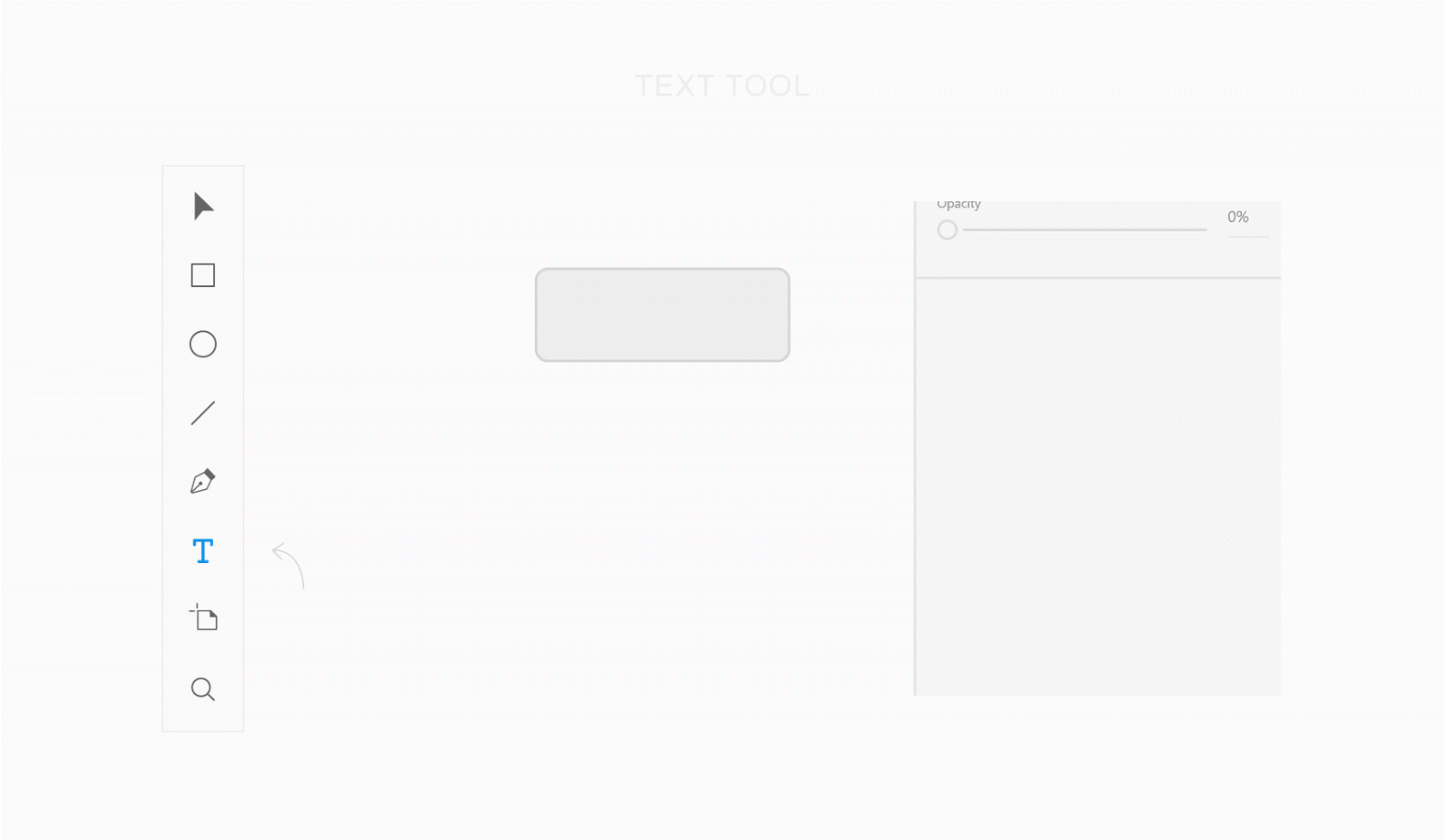
▍Text tool - single-line labels
At first glance, it seems that working with texts is very simple. However, there is one feature, which is that the tool for working with texts has two modes of operation. One of them is intended for creating single-line inscriptions, the second is for creating multi-line test blocks. Fortunately, despite this feature, a tool for working with texts is easy to learn and use.
In the first mode, which is designed to work with single-line captions, the size of the text container is adjusted to the size of the text contained in it. It resembles a tag
span, except that the text in such a container will not be automatically transferred to a new line, unless you explicitly use newline. The strength of this mode of operation lies in the fact that the size of the container automatically adjusts to the parameters of the text it contains. To create a single-line text fragment, select the Text tool in the Adobe XD toolbar, click where the text should be located, and enter it. It should be taken as a rule that this mode should be used for single-line labels, the width of which can be selected automatically. These are single-line headers and object signatures.
Text Tool - Single Line Labels
▍Text tool - large text fragments
The second mode of the text tool is used to form text containers of a given size that behave like a tag
pwith a given width, or as a tag plocated in a grid cell. The strength of this state is that you can control the size of the text block. To create a text fragment, select the Text tool and select the area that the fragment should occupy. As a matter of fact, this mode should be used for multi-line text fragments.Text Tool - Multiline Text Fragments
▍Select tool - selection of objects
Using the Select tool, objects are moved, resized, copied. In the figure below you can see the auxiliary elements of this tool, namely, the pink lines, which help to determine the distance between the objects, and the blue lines, with the help of which it is convenient to align objects.
Select tool
LineTool Line - lines
Sometimes the lines are very useful, for example, to separate the elements of the page. That is why we are talking here about the Line tool. From a technical point of view, you can use the Rectangle tool for the same thing, but what can you do,
divyou can use the HTML element to implement anything.Line tool
Design: recommendations and methods of work
▍Maket
In web development, a layout is usually represented by a page header, a menu, page contents, and a footer. All of this is part of the layout, but the layout itself is more than the sum of these parts. Layout is how elements are arranged on the page.
For example, when I designed the information page for Sidemail , I evenly arranged the elements inside the container. The following figure, in its lower part, shows exactly this version of the design, which I consider to be a good one, and at the top is the unfortunate version. As a result, what turned out was perceived, in comparison with another option, as something more integral, this option looked neater than the one I considered unsuccessful.
Examples of unsuccessful and successful layout
▍ colors
When choosing colors for your next project, keep in mind such a thing as color psychology . To search for good color combinations based on the main color, you can use the project Paletton .
To create a visual hierarchy of the page, use shades of the primary color and the text color When using a colored background, experiment with the hues used in the text.
Examples of working with colors and text
▍Typography
The fonts that make up the various inscriptions have a strong influence on the perception of the pages, so be careful about their choice. Usually, commercial fonts look better than those found on Google Fonts, but if you are just starting the way of a web designer, you should not spend money on buying fonts. Even among what is on Google Fonts, you can find excellent options.
In order to visually separate text fragments, I often use the technique, which consists in the fact that the texts of the inscriptions are in capital letters with an increased distance between the characters. The texts in upper case are symmetrical, they look attractive, however, it is more difficult to read them, so you should not get too carried away with them.
Upper Case Studies
Homepage Design (or Landing)
I always try to avoid the temptation to create a fashionable design, and then cram into it what I want to communicate through the page. Instead, I highlight the merits of the project (rather than its functional features), create a story from them and tell this story using a visually appealing page.
After I understand what story I want to tell through the page, I usually start looking for inspiration. A great source of inspiration for me is the project land-book.com , which is an extensive catalog of excellent design samples of landing pages for which you can vote. Another project where you can look for inspiration is interfaces.pro. It allows you to select pages of certain types, for example, it can be pages with information about prices, page 404, or pages with information about sites. I just watch all this until I can not find enough sites I liked, the appearance of the pages of which corresponds to my ideas about the style of the project that I do.
Landing page
After I have a general idea of what I need, it is time to solve a difficult task of putting everything together. Unfortunately, there are no easy ways. In order to create something good, you need to experiment a lot, doing it until you get what you like.
You may be wondering if this is normal, if the design that you were completely satisfied with a week ago, suddenly began to seem not so good to you, and perhaps even completely unacceptable. This is perfectly normal, and, in fact, if you experience such sensations, it is even good. This is due to the fact that you grow, learn and become better in the field of design. As a result, what seemed like a daunting task yesterday is not so difficult today. Remember this and you will not feel like a squirrel in a wheel.
▍Conclusions and recommendations
- Careful selection of fonts is one of those little things that distinguish a good design from a bad one.
- Images are important. Try to have on your pages would be used, at least in small quantities, suitable illustrations or photos.
- Build a visual hierarchy of elements using shades of colors. It is not enough to use only a couple of colors, one of which is the main one, and the second one is the text color.
- Do not use containers that are too wide. Usually enough is 1100 pixels wide.
- The empty space between the elements is an important design element.
- The story that the web page tells should be built on the merits of the project, and not on its functional features.
- If you feel that your ideas are exhausted - look for inspiration in other projects.
Web application design (or control panel)
As in the case of designing a landing page, when creating a web application, you do not need to immediately grab the arrangement of elements on the page. The situation under consideration differs from the previous one in that you do not tell the visitor a story. This time you are creating a tool, and your main goal is to make this tool convenient. Take a piece of paper and a pencil and draw a work plan for your application. Think about what depends on what, how to facilitate the work with this application.
If necessary - make a few sketches or layouts. Explore the design of competing projects, think about what they lack. Perhaps you decide to do what they do not have, and this may be a competitive advantage of your project. Consider the fact that sometimes, before you draw mockups and estimate design options, you need to give yourself time to think.
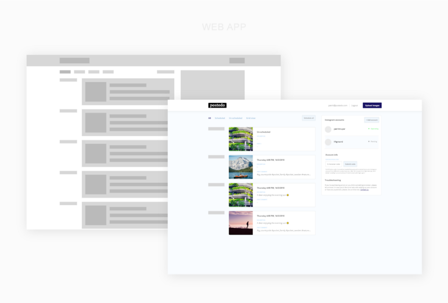
The best advice that is not tied to the specific features of various projects that I can give here is to choose the right page layout. Usually, web applications use two approaches to page layouts. The choice of one or another depends on the objectives of the application. We are talking about containers of fixed width, and flexible containers that fill the entire screen.
Web application
Фикс Fixed width containers
I prefer to use fixed-width containers, since it is easier for the user to concentrate on a limited area due to the fact that it does not require unnecessary eye movements to view what is located in this area. Applications that use fixed containers, in addition, usually look neater, and new users of such applications easier to navigate. It should be noted that such applications, due to the limited width of the containers, are more difficult to design.
Here are some examples of web applications that use fixed containers: Twitter , Buffer , DigitalOcean , Netlify , GitHub .
▍ Flexible containers
Flexible containers are great for web projects such as chat rooms, applications for working with tables or with large amounts of information presented in other formats. Usually when designing such applications, it is important that as much data as possible can be placed on the screen. The downside of flexible containers is the fact that a large amount of data displayed on the screen can confuse the user.
Examples of applications using flexible containers include Slack , Intercom , Hotjar , Google Sheets , Trello , Spotify .
▍Conclusions and recommendations
- The choice of suitable containers for application content is important for two reasons. First, the page layout will depend on it. Secondly, in order to go to the containers of other types, you will need to carry out serious work. Each project is unique and requires unique solutions, so do not be afraid to experiment.
- Aim for simplicity.
- Use fonts, which are easily readable.
- When displaying large amounts of data, use a visual hierarchy.
- Analyze competitors' solutions, and, finding flaws, do not allow them to appear in your project, or, based on this analysis, equip your project with opportunities that will become its competitive advantages.
Results
For a developer who is used to working with code, and not with visual images, it can be difficult to switch to a design wave. But design is something that you can learn. Remember that design can be a competitive advantage of your project, so pay attention to it and create attractive websites that are comfortable and pleasant to work with.
Dear readers! Do you think a single programmer can achieve good results in the field of design?