The convenient Habr interface? # 2
At leisure, I decided to reflect on improving the interface of Habrahabr. He is good, but there is no limit to perfection? First of all, it is necessary to identify user groups and try to understand their needs, as well as identify weaknesses that can be improved. I already wrote about this in the topic Convenient Habr interface? , this time I’ll dig a little deeper.
So, the source data:
I do not like navigation menus on Habré. They do not have a single style and logic, plus everything has to make too many clicks during the surfing process.

The user menu is strangely grouped, and there is so much free space in the header that you can play football:

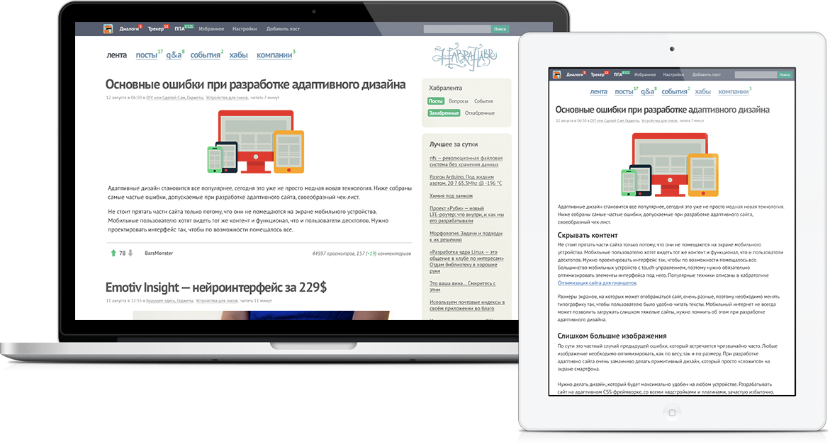
Why not place links in the top bar, which can also be attached to the top of the screen (not everyone likes this, so let this function be turned on separately in settings). We transfer the search form there.
We reduce the empty space, simplify the main menu: the functionality of the heap of second-level links can be moved to the settings panel, for example, you can control the display of the habralent by turning on / off the desired type of records.
This idea can be developed further for other sections of the site. It is necessary to regulate only a few properties of the content, for example, type (post, question, event), rating (clipped / clipped), as well as two types of sorting - by time and “best”. And you can do this using some kind of filter, without piling up unnecessary menu items.
I also wanted to simplify some elements a bit, to bring them to a single view. In the end, here's what happened: Larger

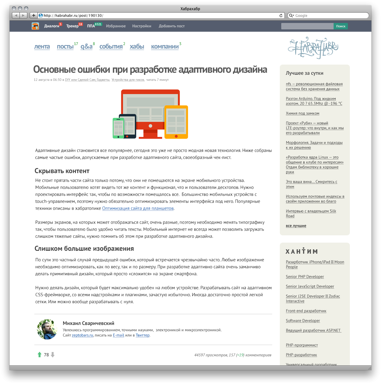
Larger
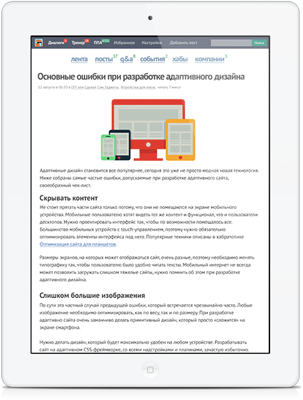
Kind of comments did not touch, because thoughts and ideas will be enough for another post. I really want to conveniently read articles on tablets, if you remove the sidebar, it turns out pretty well:
There are many more elements of the Habr interface that you can try to improve, I started with the simplest. If the Khabrovsk residents are interested, I will continue the experiments. What would you improve?

So, the source data:
- For seven years, the site’s interface has not undergone major changes, users are used to it. Therefore, it is undesirable to radically change the controls, the arrangement of blocks (including advertising).
- There is too much empty space at the top of the site, which is why you have to scroll the page on not very large screens.
- On touch devices, it’s difficult to get to small links, especially in the habrazer’s menu.
- In the main menu, many items are duplicated, and in general, navigation is a bit confusing.
- I want a full-fledged Habr on mobile devices.
- There are almost no complaints about the typography of the site, maybe it’s worth trying a different main font.
Navigation and Habralent
I do not like navigation menus on Habré. They do not have a single style and logic, plus everything has to make too many clicks during the surfing process.

The user menu is strangely grouped, and there is so much free space in the header that you can play football:

Why not place links in the top bar, which can also be attached to the top of the screen (not everyone likes this, so let this function be turned on separately in settings). We transfer the search form there.
We reduce the empty space, simplify the main menu: the functionality of the heap of second-level links can be moved to the settings panel, for example, you can control the display of the habralent by turning on / off the desired type of records.
This idea can be developed further for other sections of the site. It is necessary to regulate only a few properties of the content, for example, type (post, question, event), rating (clipped / clipped), as well as two types of sorting - by time and “best”. And you can do this using some kind of filter, without piling up unnecessary menu items.
I also wanted to simplify some elements a bit, to bring them to a single view. In the end, here's what happened: Larger

Post Page

Larger
Kind of comments did not touch, because thoughts and ideas will be enough for another post. I really want to conveniently read articles on tablets, if you remove the sidebar, it turns out pretty well:

There are many more elements of the Habr interface that you can try to improve, I started with the simplest. If the Khabrovsk residents are interested, I will continue the experiments. What would you improve?
