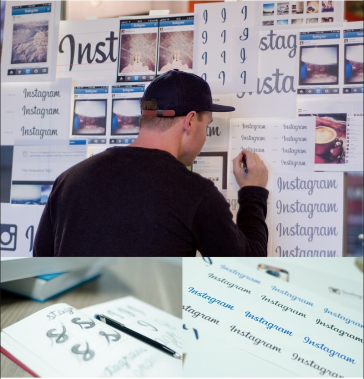
Instagram filtered noise in the logo

Instagram introduced a slightly redesigned logo last week, introducing subtle but significant changes to the original version, writes The Verge. The new logo was designed by Mackey Setaday, a typographer from Denver and a friend of Instagram co-founder Kevin Systrom.
Mackey began working on the redesign over a year ago, redrawing the Billabong font by hand to create a more elegant look. Changes can hardly be described as radical, they can not even be noticed at first glance, but the new design has certainly become cleaner and more vibrant.
This is what the old logo looked like:

The idea was to create a logo that would stand the test of time. “The real goal is to be with timeless fonts like Kellog's and Campbell's,” says Mackey. “Coca-Cola is another great example.”

Some details of the process can be found here .
