January 30, 2013 at 17:20
Bug story
Creating a company logo is creating its face. You need to approach the process of creating the logo with all responsibility, because according to it, the potential buyer will judge the quality of your products. It is especially difficult to create a logo focused on products for children. Thousands of children all over the world have already recognized and loved

our little bug Little Beetle . We want to share the story of the creation of this logo, the story of the appearance of a small green bug in the pilot's cap. This bug has become not only a symbol of the company for the development of mobile children's applications, but also allowed to bring the company to a new level.
Previously, our company was known under a completely different name - Style Mobile Studio. Among our software products were games, books, and reference books. Now we have already gained enough experience to share it with novice developers .

After analyzing the situation in different segments of the Apple App Store market, we decided to finally dwell on the development of children's educational applications. This choice meant that the new face of the company was to become close and understandable to children, especially preschoolers, who are our target audience.
The name Little Beetle did not come immediately, it was chosen from a variety of options. Sympathy for the Little Bugwe imbued immediately, as we imagined a cute and charming character who would perfectly play the role of a symbol of a children's brand. Other options, such as AppyKids, for example, were not associated with anything specific.
The name Little Beetle itself sounds very harmonious due to the fact that both words in it rhyme with each other. Baby names should be easy to remember in the first place. And children's logos should be just as pleasant and interesting.
The visual “birth” of the Little Beetle bug went through several important stages. Here's an example of a sketchy representation of a bug that adults, but not children, would like.

Gradually the bug acquired human features. A whole series of characters was created, from which favorites were already selected.

Preference was given to the bug in the pilot's cap. As you can see, on this version of the logo there were significant problems with the readability of the inscription.

And here it is, the final version of our logo . The bug was supplemented with some details, became even more lively. The font was selected simple and easy to read.

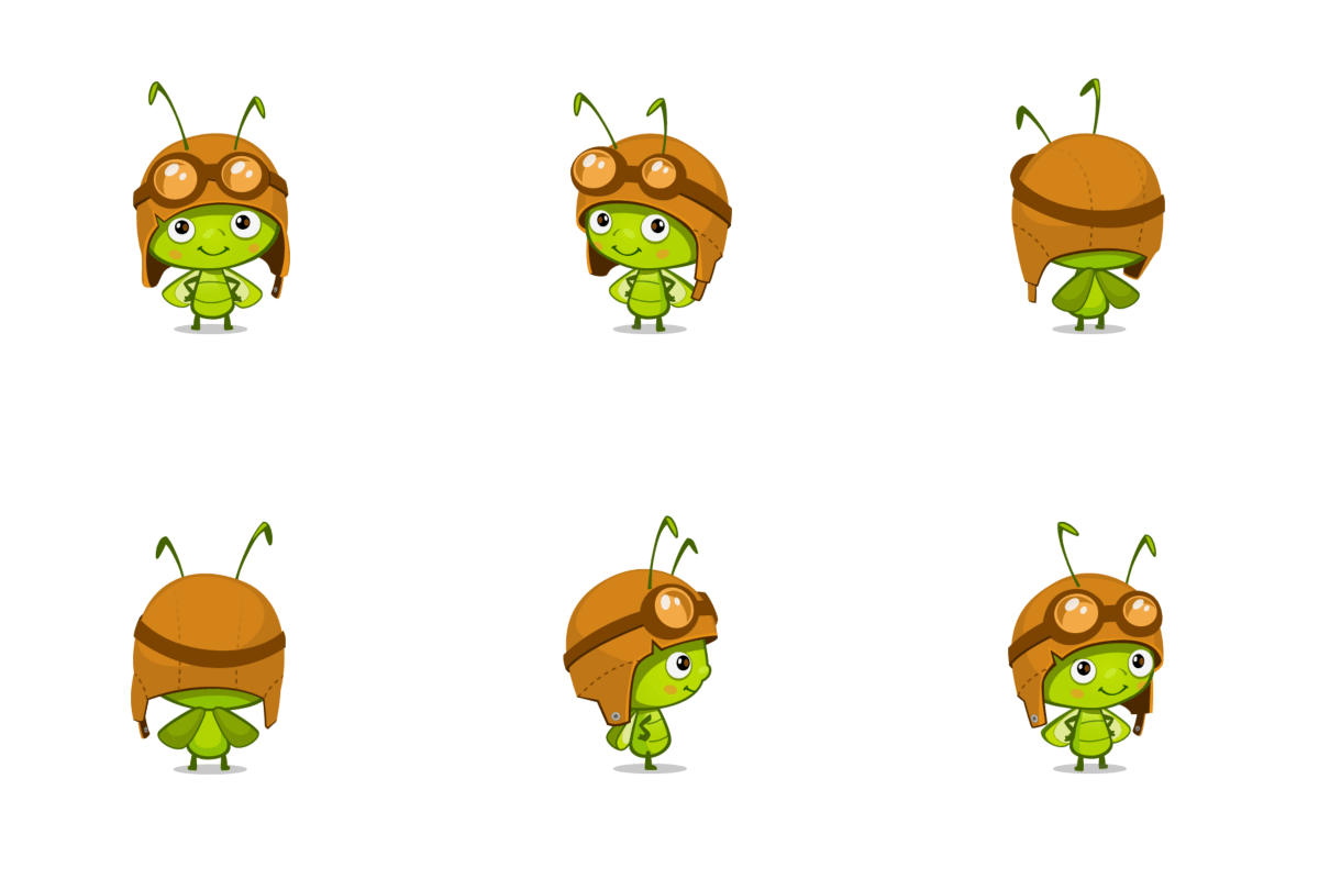
Here's how the Littler Beetle bug looks in various poses .

The bug can be dressed up for various holidays. So, for example, we celebrate the company's birthday.

The logo can be animated ...
... and create a video screensaver with his participation, which you can see immediately after opening any of our applications.
In coming up with a name and logo for a children's brand, we advise you to stay on this option, which can be embodied in the form of a character . Children do not need depersonalized abstractions, they are much more pleasant to look at a "living" creature. In addition, the character can be used as the hero of subsequent applications, with it you can create a cartoon, compose a fairy tale about him, and even turn it into reality in the form of a soft toy. A lively character also looks great on almost any office supplies.

In addition to the new name and logo, rebranding brought to our company the need to streamline our applications and their icons. For all the icons, we have developed a design in the same style. This is very important if you have several applications.

An attentive reader can see that the Gnome Genius, whom you see on the Little Genius app icon, is actually the “brother” of the Little Beetle logo beetle. These characters have a lot in common and virtually the same basis. But this is a completely different story.
our little bug Little Beetle . We want to share the story of the creation of this logo, the story of the appearance of a small green bug in the pilot's cap. This bug has become not only a symbol of the company for the development of mobile children's applications, but also allowed to bring the company to a new level.
Previously, our company was known under a completely different name - Style Mobile Studio. Among our software products were games, books, and reference books. Now we have already gained enough experience to share it with novice developers .
After analyzing the situation in different segments of the Apple App Store market, we decided to finally dwell on the development of children's educational applications. This choice meant that the new face of the company was to become close and understandable to children, especially preschoolers, who are our target audience.
The name Little Beetle did not come immediately, it was chosen from a variety of options. Sympathy for the Little Bugwe imbued immediately, as we imagined a cute and charming character who would perfectly play the role of a symbol of a children's brand. Other options, such as AppyKids, for example, were not associated with anything specific.
The name Little Beetle itself sounds very harmonious due to the fact that both words in it rhyme with each other. Baby names should be easy to remember in the first place. And children's logos should be just as pleasant and interesting.
The visual “birth” of the Little Beetle bug went through several important stages. Here's an example of a sketchy representation of a bug that adults, but not children, would like.
Gradually the bug acquired human features. A whole series of characters was created, from which favorites were already selected.
Preference was given to the bug in the pilot's cap. As you can see, on this version of the logo there were significant problems with the readability of the inscription.
And here it is, the final version of our logo . The bug was supplemented with some details, became even more lively. The font was selected simple and easy to read.
Here's how the Littler Beetle bug looks in various poses .
The bug can be dressed up for various holidays. So, for example, we celebrate the company's birthday.
The logo can be animated ...
... and create a video screensaver with his participation, which you can see immediately after opening any of our applications.
In coming up with a name and logo for a children's brand, we advise you to stay on this option, which can be embodied in the form of a character . Children do not need depersonalized abstractions, they are much more pleasant to look at a "living" creature. In addition, the character can be used as the hero of subsequent applications, with it you can create a cartoon, compose a fairy tale about him, and even turn it into reality in the form of a soft toy. A lively character also looks great on almost any office supplies.
In addition to the new name and logo, rebranding brought to our company the need to streamline our applications and their icons. For all the icons, we have developed a design in the same style. This is very important if you have several applications.
An attentive reader can see that the Gnome Genius, whom you see on the Little Genius app icon, is actually the “brother” of the Little Beetle logo beetle. These characters have a lot in common and virtually the same basis. But this is a completely different story.