Iconomania or fear of not using icons
“And these stupid icons! A pictogram is a sign that cannot be explained in any human language. No wonder the speech appeared! ”
Jeff Raskin.
Today, whatever product is designed, it is almost always appropriate or not - icons are used. Customers requiring the use of icons in the interface have become so used to the mentality of the widespread use of icons that this circumstance can be mistaken for a cultural phenomenon. Almost all developers adhere to the same principle.
Why did this happen? What is wrong with the icons? Is it possible to do without them?
Let's try to figure it out.
Immersion in the equipment
Sometimes, for simplicity, I will call icons everything related to the graphic representation of an idea, concept or object.
Ideogram- A symbol that depicts an idea or concept. To be precise, an ideogram can convey a concept through resemblance to a physical object, and can also be called a pictogram.
A pictogram is a symbol that resembles a concept or object being depicted.
A simple example:

So (not strictly), if the dog is depicted - this is a pictogram, if the dog is in a crossed out circle, then an ideogram.
In a general sense, a pictogram is understandable without words; real objects of the physical world are fairly easy to imagine as a pictogram. But what if we want to put something more complicated into the sign: some action or non-obvious concept?
How is the
Word to Jeff Ruskin:
Pictograms (icons), these familiar to all small pictures that serve to designate buttons and other objects, are an integral sign of modern interfaces. Apple Computer, a well-known leader in interface development, tells us that “icons can significantly increase the clarity and appeal of an application. In addition, the use of icons can greatly simplify the process of translating programs into other languages. Whenever you want to add an explanation or an inscription, try using an icon instead of text ”(Apple Computer 1985, p. I-32). In later versions of this manual, the approach to using pictograms was no longer so dogmatic, but the harm it created could no longer be corrected.
Pictograms make the interface more visually appealing and, under certain conditions, can contribute to greater clarity. However, over time, the shortcomings of the icons became clear. For example, both the Macintosh operating system and Windows now use tools to explain the meaning of the icons. If you hover over some icon, a small window appears with text in which its description is given.
The main problems of ideograms are the choice of a metaphor and the construction of an associative series.
Coming up with a metaphor is a headache for an ideogram designer. He really wants to have a bank of metaphors to relieve pain. The truth is that there is no such bank and cannot be.
This problem creates another problem - the problem of conflict of metaphor and literal understanding of the ideogram.
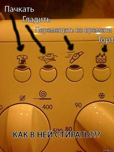
What is bad about the associative series?
Wikipedia word:
In 1936, Milton Erickson wrote an article in which he described the results of his experiment with the verbal association test, the essence of which is that a person unconsciously gives an associative connection to a stimulus word with those words that describe his problem. For example, the test subject gave the following words to the stimulus word “stomach”: large, anxiety, infant, fear, surgery, illness, forgotten. And this was information about her unwanted pregnancy, which she did not remember.
Any icon developer will tell you that an association is thought up for an ideogram: it transfers the metaphor to itself, interviews colleagues, friends for association: what images they have with a given concept. As Milton Erickson showed in his experiment, verbal association is an unconscious subjective entity.
A simple example: you need to come up with an icon on the site for the information block "I am a manager." Everyone will have different associations, one with a white shirt, one with a diplomat in his hands, one with a tie - people will have different associative ties to the stimulus. Therefore, a photobank of metaphors will never be created.
How to be
Again to Jeff Ruskin:
There is an obvious question that I have repeatedly heard from users who first encountered such text boxes: “Why not just use text instead of pictograms?” Indeed, why not? Indeed, in fact, instead of explaining, pictograms often themselves require explanations. Using pictograms instead of words is quite suitable in order to hide or encrypt some information from prying eyes. The problem of pictograms can be considered as a problem of limited visibility. An icon is shown in the interface, but its meaning is invisible, or its image may give an incorrect message for those for whom this image is unfamiliar or by whom this image can be interpreted differently.
The simplest thing that can be done is not to come up with any ideograms, but to use the text. In many cases, the text will work better. No need to be afraid of this.
In 1990, the Soviet Union was not afraid to write in words. Microwave Electronics SP23 ZIL, 1990 release. Metro designers drew inspiration from the microwave

In 2012, developers are very afraid of the text and use a whole set of ideograms-emoticons in the DAEWOO microwave. Even the headings are in the form of icons.

The developers of LightWave 3D threw out almost all the icons from the controls, working windows, menus and inserted text.

For comparison, the 3D Max interface:

If you have to use the icon.
Word to Denis Kortunov:
The choice of what will be depicted on the icon is always a compromise between recognition and originality. Before you come up with a metaphor for the icon, it is very advisable to see how it is done in other products. Perhaps the best solution is not to come up with something original, but to do it like everywhere else.
An example of originality:

Conclusion
In the 1970s, by the order of the US Department of Transportation (US Department of Transportation), a system of 50 pictograms was developed , originally intended for airports, which later became widespread and universally recognized. Designers designed pictograms based on criteria such as clarity, international recognition, resistance to vandalism, and clarity without words.
Thus, there are 50 icons that everyone understands. What will happen if one of the criteria is not taken into account? There will be a crutch in the form of a signature - the icon did not work.


And if you come up with your own system? What do you think is depicted on this sign?

The answer is on the page http://artgorbunov.ru/bb/soviet/20080623/
If you think about it, the icons besides the 50 icons are a crutch on a crutch: icons need to be signed, pop-up windows are needed for icons without a signature. Icons need a good, recognizable metaphor. But the truth is that in interfaces, in some cases, an icon is a visual garbage that can be disposed of without loss of meaning.
For independent study:
1. Pictogram
2. Ideogram
3. DOT pictograms
4.ISO 7001
5. Laundry symbol
6. Canadian Fashion Connection - Laundry symbols
7. Pictography
8. Ideogram
9. Vienna method
10. Role of Otto Neurat in the origin of modern infographics
11. 10 errors in icon design
12. Erickson Milton, wikipedia article
13. Walter Isaacson, Steve Jobs. Biography ”
14. Designing the language of the user interface pictograms
15. Icon design
16. Icon creation process
17. Computer icon
18. Icons from various interfaces
19.Pictograms, Icons and Symbols
20. Jeff Raskin, “Interface: New Directions in Computer Systems Design”
Jeff Raskin.
Today, whatever product is designed, it is almost always appropriate or not - icons are used. Customers requiring the use of icons in the interface have become so used to the mentality of the widespread use of icons that this circumstance can be mistaken for a cultural phenomenon. Almost all developers adhere to the same principle.
Why did this happen? What is wrong with the icons? Is it possible to do without them?
Let's try to figure it out.
Immersion in the equipment
Sometimes, for simplicity, I will call icons everything related to the graphic representation of an idea, concept or object.
Ideogram- A symbol that depicts an idea or concept. To be precise, an ideogram can convey a concept through resemblance to a physical object, and can also be called a pictogram.
A pictogram is a symbol that resembles a concept or object being depicted.
A simple example:
So (not strictly), if the dog is depicted - this is a pictogram, if the dog is in a crossed out circle, then an ideogram.
In a general sense, a pictogram is understandable without words; real objects of the physical world are fairly easy to imagine as a pictogram. But what if we want to put something more complicated into the sign: some action or non-obvious concept?
How is the
Word to Jeff Ruskin:
Pictograms (icons), these familiar to all small pictures that serve to designate buttons and other objects, are an integral sign of modern interfaces. Apple Computer, a well-known leader in interface development, tells us that “icons can significantly increase the clarity and appeal of an application. In addition, the use of icons can greatly simplify the process of translating programs into other languages. Whenever you want to add an explanation or an inscription, try using an icon instead of text ”(Apple Computer 1985, p. I-32). In later versions of this manual, the approach to using pictograms was no longer so dogmatic, but the harm it created could no longer be corrected.
Pictograms make the interface more visually appealing and, under certain conditions, can contribute to greater clarity. However, over time, the shortcomings of the icons became clear. For example, both the Macintosh operating system and Windows now use tools to explain the meaning of the icons. If you hover over some icon, a small window appears with text in which its description is given.
The main problems of ideograms are the choice of a metaphor and the construction of an associative series.
Coming up with a metaphor is a headache for an ideogram designer. He really wants to have a bank of metaphors to relieve pain. The truth is that there is no such bank and cannot be.
This problem creates another problem - the problem of conflict of metaphor and literal understanding of the ideogram.
What is bad about the associative series?
Wikipedia word:
In 1936, Milton Erickson wrote an article in which he described the results of his experiment with the verbal association test, the essence of which is that a person unconsciously gives an associative connection to a stimulus word with those words that describe his problem. For example, the test subject gave the following words to the stimulus word “stomach”: large, anxiety, infant, fear, surgery, illness, forgotten. And this was information about her unwanted pregnancy, which she did not remember.
Any icon developer will tell you that an association is thought up for an ideogram: it transfers the metaphor to itself, interviews colleagues, friends for association: what images they have with a given concept. As Milton Erickson showed in his experiment, verbal association is an unconscious subjective entity.
A simple example: you need to come up with an icon on the site for the information block "I am a manager." Everyone will have different associations, one with a white shirt, one with a diplomat in his hands, one with a tie - people will have different associative ties to the stimulus. Therefore, a photobank of metaphors will never be created.
How to be
Again to Jeff Ruskin:
There is an obvious question that I have repeatedly heard from users who first encountered such text boxes: “Why not just use text instead of pictograms?” Indeed, why not? Indeed, in fact, instead of explaining, pictograms often themselves require explanations. Using pictograms instead of words is quite suitable in order to hide or encrypt some information from prying eyes. The problem of pictograms can be considered as a problem of limited visibility. An icon is shown in the interface, but its meaning is invisible, or its image may give an incorrect message for those for whom this image is unfamiliar or by whom this image can be interpreted differently.
The simplest thing that can be done is not to come up with any ideograms, but to use the text. In many cases, the text will work better. No need to be afraid of this.
In 1990, the Soviet Union was not afraid to write in words. Microwave Electronics SP23 ZIL, 1990 release. Metro designers drew inspiration from the microwave
In 2012, developers are very afraid of the text and use a whole set of ideograms-emoticons in the DAEWOO microwave. Even the headings are in the form of icons.
The developers of LightWave 3D threw out almost all the icons from the controls, working windows, menus and inserted text.
For comparison, the 3D Max interface:
If you have to use the icon.
Word to Denis Kortunov:
The choice of what will be depicted on the icon is always a compromise between recognition and originality. Before you come up with a metaphor for the icon, it is very advisable to see how it is done in other products. Perhaps the best solution is not to come up with something original, but to do it like everywhere else.
An example of originality:
Conclusion
In the 1970s, by the order of the US Department of Transportation (US Department of Transportation), a system of 50 pictograms was developed , originally intended for airports, which later became widespread and universally recognized. Designers designed pictograms based on criteria such as clarity, international recognition, resistance to vandalism, and clarity without words.
Thus, there are 50 icons that everyone understands. What will happen if one of the criteria is not taken into account? There will be a crutch in the form of a signature - the icon did not work.
And if you come up with your own system? What do you think is depicted on this sign?
The answer is on the page http://artgorbunov.ru/bb/soviet/20080623/
If you think about it, the icons besides the 50 icons are a crutch on a crutch: icons need to be signed, pop-up windows are needed for icons without a signature. Icons need a good, recognizable metaphor. But the truth is that in interfaces, in some cases, an icon is a visual garbage that can be disposed of without loss of meaning.
For independent study:
1. Pictogram
2. Ideogram
3. DOT pictograms
4.ISO 7001
5. Laundry symbol
6. Canadian Fashion Connection - Laundry symbols
7. Pictography
8. Ideogram
9. Vienna method
10. Role of Otto Neurat in the origin of modern infographics
11. 10 errors in icon design
12. Erickson Milton, wikipedia article
13. Walter Isaacson, Steve Jobs. Biography ”
14. Designing the language of the user interface pictograms
15. Icon design
16. Icon creation process
17. Computer icon
18. Icons from various interfaces
19.Pictograms, Icons and Symbols
20. Jeff Raskin, “Interface: New Directions in Computer Systems Design”