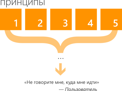
“Don't tell me where to go,” your user
In a series of articles about design principles for Windows 8, we examined key ideas and approaches that underlie the entire platform and set the design language for Windows. A little earlier, discussing the application design process , we considered, in general, the same principles, but already in the context of the proper prioritization.
Today I want to talk about another idea that follows from these premises and a common understanding of the context of using modern devices and applications on them. It will be about what and when we offer the user and how to make his life more convenient and predictable. The video version is available as a recording from the 404fest conference.
If you look at your favorite websites, in practical you will see a common element - a certain navigation menu, or the main menu, which divides the user into key sections of the site:

This thing seems so familiar and simple that in the transition to a mobile version of the site or mobile The application for the corresponding service is often saved as is. When opening the application, the user encounters a list of available sections:

When developers and designers saw the “tiled” interface of Windows Phone and Windows 8, they quickly grasped the visual component, however, the essence often remained the same: the

place of links / buttons / menu was replaced by square tiles with two-color silhouette pictures and small signatures, all of which also expose the user to existing sections of the application.

All these “links” as a dumb answering machine tell the user what they need to do to get to the information for which he actually came to the application - and this is sad! The user does not come to the application to click on links or buttons, he comes for the sake of content.
Any menu is like the table of contents of a book, which allows you to sequentially dive to the desired section, passing through the wilds of the hierarchy of information entities:

The problem is that what the user comes for is too deep (you can easily translate this into the number of extra clicks or clicks ) And this situation becomes especially fraught (with negative consequences) in a modern mobile and dynamic environment, when the user simply does not have time to do such nonsense as clicking on links.

The mobile application usage scenario assumes that the user comes back to him from time to time for short periods of time, for example, to check the status, track the status change or make a small update, and occasionally, when he has time, desire or need, he gets into details , going to the details, additional information and in general to a more dense interaction with the application.
In a clever way, this is called “progressive disclosure,” and in a simple way, this means that the user needs to provide both the ability to quickly figure out what's what and calmly dive into the details, moving on to exploring the content. Both are important.
This begs the question: how to achieve both tasks at the same time? Based on the ideas of prioritizing user goals and the importance of content, the answer suggests itself.
Is content at the very latest level? - No problem! Let's get him upstairs!
Of course, it is impossible to pull everything to the highest level - you will get trash, so you need to select only the most important on each of the screens and stretch it sequentially up.

In such a situation, the role of live tiles (Live Tiles) becomes transparent - they become a display of the most important in the application, stretched out of the application to the start screen. Live tile is an icon with the most important and relevant content from the application.

As soon as you project this idea onto the entire hierarchy of screens, the first screen turns into a hub, allowing you to quickly read all the most important things, find out all the updates, understand whether you need to dive into the details or everything is in order.
The movement and distribution of content becomes bi-directional: down - in the course of the semantic structure, up - in importance and relevance. The first works when I'm ready to dive into the details, the second - when I need to quickly figure out what's what.
In some cases, this requires rethinking the application logic. Sometimes this may well coincide with the desire to introduce an additional component, as happened in the case of the Minesweeper game, in which the social component was added.
The first place in the application is made quick access to different game modes, which is a reflection of the main scenario for using the application:

However, here, on the first screen (or hub), an additional social component with achievements, competitions, etc. is taken out: The

hub becomes the projection of the key scenarios, bringing to the surface the key information of the lower levels:

It becomes wider and bulkier than just a list of links to the following hierarchy levels, providing quick access to the most important, recent and relevant and poses olyaya if necessary dive down to details or switch to the right to additional scenarios.
Instead of telling the user “look, this is what we have”, inviting him to consistently move to the lower levels of detail of the content, we move on to the idea of “look, this is what’s happening”, highlighting quick access (possibly without immersion) to the most priority information with an appropriate level of presentation and information saturation.
A few additional scenarios that develop this idea will be discussed in the next article.
Today I want to talk about another idea that follows from these premises and a common understanding of the context of using modern devices and applications on them. It will be about what and when we offer the user and how to make his life more convenient and predictable. The video version is available as a recording from the 404fest conference.
References
If you look at your favorite websites, in practical you will see a common element - a certain navigation menu, or the main menu, which divides the user into key sections of the site:
This thing seems so familiar and simple that in the transition to a mobile version of the site or mobile The application for the corresponding service is often saved as is. When opening the application, the user encounters a list of available sections:
When developers and designers saw the “tiled” interface of Windows Phone and Windows 8, they quickly grasped the visual component, however, the essence often remained the same: the
place of links / buttons / menu was replaced by square tiles with two-color silhouette pictures and small signatures, all of which also expose the user to existing sections of the application.
All these “links” as a dumb answering machine tell the user what they need to do to get to the information for which he actually came to the application - and this is sad! The user does not come to the application to click on links or buttons, he comes for the sake of content.
Any menu is like the table of contents of a book, which allows you to sequentially dive to the desired section, passing through the wilds of the hierarchy of information entities:
The problem is that what the user comes for is too deep (you can easily translate this into the number of extra clicks or clicks ) And this situation becomes especially fraught (with negative consequences) in a modern mobile and dynamic environment, when the user simply does not have time to do such nonsense as clicking on links.
The mobile application usage scenario assumes that the user comes back to him from time to time for short periods of time, for example, to check the status, track the status change or make a small update, and occasionally, when he has time, desire or need, he gets into details , going to the details, additional information and in general to a more dense interaction with the application.
In a clever way, this is called “progressive disclosure,” and in a simple way, this means that the user needs to provide both the ability to quickly figure out what's what and calmly dive into the details, moving on to exploring the content. Both are important.
This begs the question: how to achieve both tasks at the same time? Based on the ideas of prioritizing user goals and the importance of content, the answer suggests itself.
Is content at the very latest level? - No problem! Let's get him upstairs!
Of course, it is impossible to pull everything to the highest level - you will get trash, so you need to select only the most important on each of the screens and stretch it sequentially up.
In such a situation, the role of live tiles (Live Tiles) becomes transparent - they become a display of the most important in the application, stretched out of the application to the start screen. Live tile is an icon with the most important and relevant content from the application.
As soon as you project this idea onto the entire hierarchy of screens, the first screen turns into a hub, allowing you to quickly read all the most important things, find out all the updates, understand whether you need to dive into the details or everything is in order.
The movement and distribution of content becomes bi-directional: down - in the course of the semantic structure, up - in importance and relevance. The first works when I'm ready to dive into the details, the second - when I need to quickly figure out what's what.
In some cases, this requires rethinking the application logic. Sometimes this may well coincide with the desire to introduce an additional component, as happened in the case of the Minesweeper game, in which the social component was added.
The first place in the application is made quick access to different game modes, which is a reflection of the main scenario for using the application:
However, here, on the first screen (or hub), an additional social component with achievements, competitions, etc. is taken out: The
hub becomes the projection of the key scenarios, bringing to the surface the key information of the lower levels:
It becomes wider and bulkier than just a list of links to the following hierarchy levels, providing quick access to the most important, recent and relevant and poses olyaya if necessary dive down to details or switch to the right to additional scenarios.
Instead of telling the user “look, this is what we have”, inviting him to consistently move to the lower levels of detail of the content, we move on to the idea of “look, this is what’s happening”, highlighting quick access (possibly without immersion) to the most priority information with an appropriate level of presentation and information saturation.
A few additional scenarios that develop this idea will be discussed in the next article.