Ostrovok.ru mobile application for hotel reservation
Hi, my name is Evgeny Seleznev ( evgenyseleznev ), I am a designer and head of the mobile development team in Ostrovka.
We at Ostrovok.ru recently released a mobile application for booking hotels around the world. In it, we tried to present rich functionality in a convenient interface. How the work process was arranged, I will tell in more detail.
At the moment, there are two main product areas in mobile hotel reservation applications:
1. standard hotel search through the choice of destination, date, etc. Some services take into account the user's location to find hotels near him;
2. last minute booking - booking for the next night from special offers of hotels. Some startups, using only this model, have already become successful.
Make a simple and convenient application for searching and booking hotels.
After setting the task, the first step was research. We selected popular applications, more or less relevant to our topic.

We understand that the mechanics are almost the same - the standard hotel search through the choice of directions, dates, reviews, etc.
It is also clear that most have an interface overloaded with various elements and color accents.
Of course, we don’t like this, so we choose the path of minimalism and asceticism.
To understand the general mechanics, we draw sketches, warframes, paper prototypes. In the
process, we decide on several key things: 1. We do not need the lower tabbar, because we do not have equivalent sections that are really worth showing on all screens. In addition, an additional 49 (96 @ 2x) pixels will never be superfluous.
2. Since the phone still performs the function of satisfying needs in the "here and now" mode, we add the search for hotels by the user's current geolocation and make it the default.
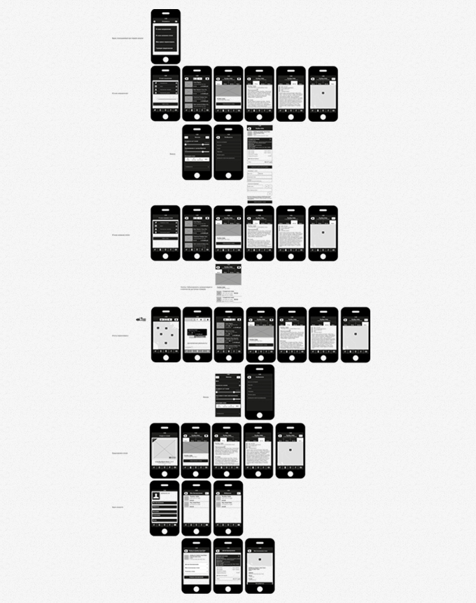
Having decided on the functionality, we proceed to rendering screens.
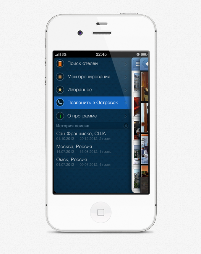
Side menu
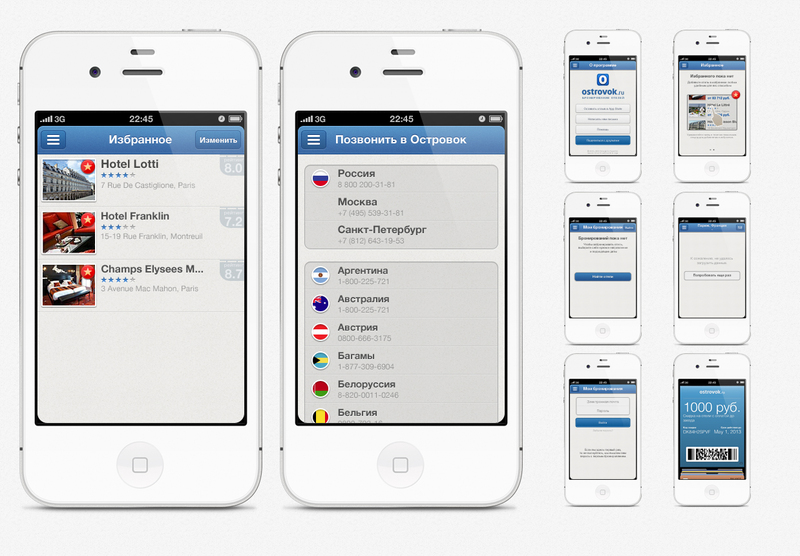
In addition to the main sections in the side menu, we add the history of search queries, which we limit to five positions.
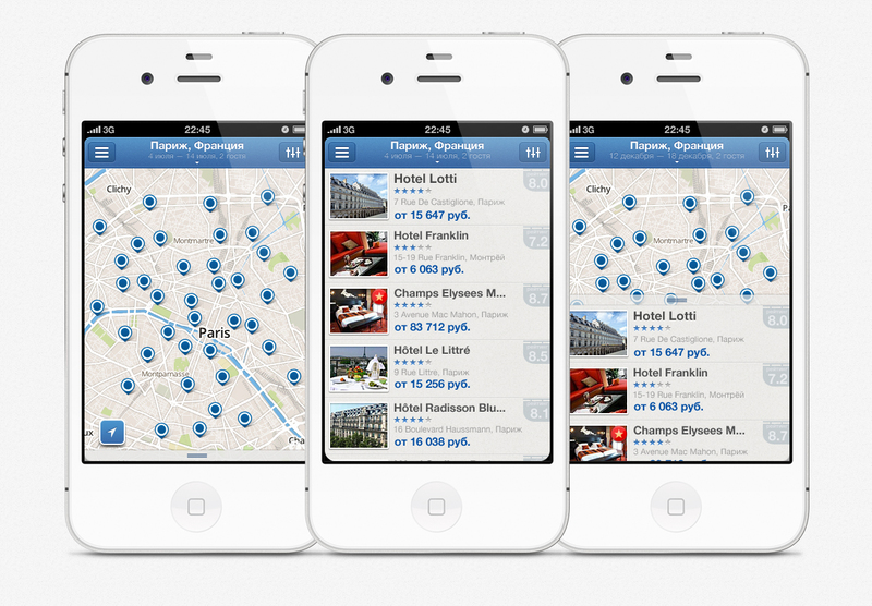
Search results
With search results, everything is a little more complicated. This is one of the main and frequently used screens, so I do not want to overload it much. In addition to the search results, there should also be: inclusion of the side menu, change of the search query, switching to the map, filters, sorting and adding to favorites.
The upper left button is by default reserved for the inclusion of the side menu, it can not be changed. The top right one is suitable for turning on / off the card, or filters with sorting. After going through many options, we stop at filters with sorting. We turn on the card using a swipe gesture from top to bottom (similar to Pull Down to Refresh).
To change the search query, we make a pseudo-button on the top navigation bar, at the same time showing the current query. Only the favorites remained - the initial version of the swipe of the cell to the right does not fit, because these gestures are already used to scroll through the screens. We do long tap.
On the map, add a button to determine the current location.
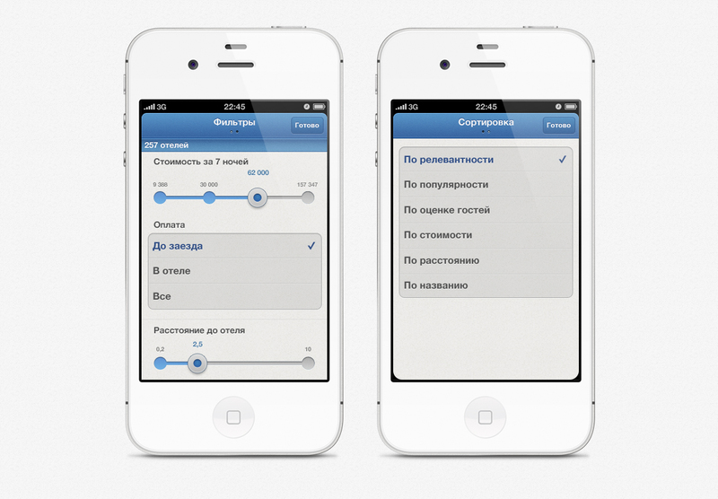
Filters and sortings
If there were no problems with the search query screens, then you had to tinker with filters and sorting. The first thought “once one button, then one screen” we drive off immediately. Filters and sorting are different entities. The option with buttons for switching is not very pleasant, we are still for minimalism and conciseness.
We make a pseudo-button that switches the screens, with indicator points as on the home screen.
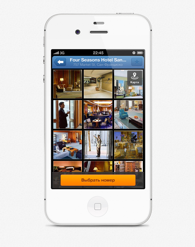
Hotel Card
The next screen in complexity after the SICKLE is the hotel card. We went over a bunch of options: from "full stuffing" on one screen to the current minimalistic one. At the moment, this is one of the few screens that we will redo and significantly improve.
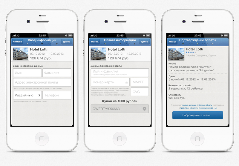
Reservation Reservation
screens have also undergone a significant transformation. First, we placed everything on one screen, but then decided that it would be better to divide it into several steps, so that the user could understand and clearly.
And everything else, we
achieve screens with favorites, “About the program”, “Call to the Islet”, various errors, blank screens and integration with Passbook.
Add details, draw icons, gloss and exhale.
App Store Link:itunes.apple.com/en/app/ostrovok.ru/id564204730?mt=8
PS By the way, if you share information about it from Facebook or Twitter from the application, you will get 1000 rubles to your account.
We at Ostrovok.ru recently released a mobile application for booking hotels around the world. In it, we tried to present rich functionality in a convenient interface. How the work process was arranged, I will tell in more detail.
At the moment, there are two main product areas in mobile hotel reservation applications:
1. standard hotel search through the choice of destination, date, etc. Some services take into account the user's location to find hotels near him;
2. last minute booking - booking for the next night from special offers of hotels. Some startups, using only this model, have already become successful.
Task
Make a simple and convenient application for searching and booking hotels.
Study
After setting the task, the first step was research. We selected popular applications, more or less relevant to our topic.
We understand that the mechanics are almost the same - the standard hotel search through the choice of directions, dates, reviews, etc.
It is also clear that most have an interface overloaded with various elements and color accents.
Of course, we don’t like this, so we choose the path of minimalism and asceticism.
Process
To understand the general mechanics, we draw sketches, warframes, paper prototypes. In the
process, we decide on several key things: 1. We do not need the lower tabbar, because we do not have equivalent sections that are really worth showing on all screens. In addition, an additional 49 (96 @ 2x) pixels will never be superfluous.
2. Since the phone still performs the function of satisfying needs in the "here and now" mode, we add the search for hotels by the user's current geolocation and make it the default.
Having decided on the functionality, we proceed to rendering screens.
Side menu
In addition to the main sections in the side menu, we add the history of search queries, which we limit to five positions.
Search results
With search results, everything is a little more complicated. This is one of the main and frequently used screens, so I do not want to overload it much. In addition to the search results, there should also be: inclusion of the side menu, change of the search query, switching to the map, filters, sorting and adding to favorites.
The upper left button is by default reserved for the inclusion of the side menu, it can not be changed. The top right one is suitable for turning on / off the card, or filters with sorting. After going through many options, we stop at filters with sorting. We turn on the card using a swipe gesture from top to bottom (similar to Pull Down to Refresh).
To change the search query, we make a pseudo-button on the top navigation bar, at the same time showing the current query. Only the favorites remained - the initial version of the swipe of the cell to the right does not fit, because these gestures are already used to scroll through the screens. We do long tap.
On the map, add a button to determine the current location.
Filters and sortings
If there were no problems with the search query screens, then you had to tinker with filters and sorting. The first thought “once one button, then one screen” we drive off immediately. Filters and sorting are different entities. The option with buttons for switching is not very pleasant, we are still for minimalism and conciseness.
We make a pseudo-button that switches the screens, with indicator points as on the home screen.
Hotel Card
The next screen in complexity after the SICKLE is the hotel card. We went over a bunch of options: from "full stuffing" on one screen to the current minimalistic one. At the moment, this is one of the few screens that we will redo and significantly improve.
Reservation Reservation
screens have also undergone a significant transformation. First, we placed everything on one screen, but then decided that it would be better to divide it into several steps, so that the user could understand and clearly.
And everything else, we
achieve screens with favorites, “About the program”, “Call to the Islet”, various errors, blank screens and integration with Passbook.
Add details, draw icons, gloss and exhale.
App Store Link:itunes.apple.com/en/app/ostrovok.ru/id564204730?mt=8
PS By the way, if you share information about it from Facebook or Twitter from the application, you will get 1000 rubles to your account.