Salary Monitoring Automation with R
Do you know how much you are underpaid? Or maybe overpay? What is the ratio of resumes and vacancies to a position similar to yours?
Answering this question, you can lie to yourself, you can blatantly lie, and you can operate with statistics.
In fact, each self-respecting office regularly monitors salaries in order to navigate in the segment of the labor market that interests it. However, despite the fact that the task is necessary and important, not everyone is ready to pay for third-party services.
In this case, in order to save HR from having to manually sort through hundreds of vacancies and resumes, it’s more efficient to write a small application once, which will do it yourself, and at the output provide the result in the form of a beautiful dashboard with tables, graphs, filtering and uploading. For example, such:
You can watch it live (and even press the buttons) here .
In this article I will talk about how I wrote such an application, and what pitfalls I encountered along the way.
Formulation of the problem
It is required to write an application that will collect data on vacancies and resumes for certain positions with hh.ru (Back-end / Front-end / Full-stack developer, DevOps, QA, Project Manager, Systems Analyst, etc.) in St. Petersburg and issue the minimum, average and maximum value of salary expectations and offers for junior, middle and senior specialists for each of these professions.
It was supposed to update the data about once every six months, but not more often than once a month.
First prototype
Written in pure shiny, with a beautiful bootstrap scheme, at first glance it came out very even nothing: simple, and most importantly - understandable. The main page of the application contains the most necessary: the average value of salaries and salary expectations (middle level) is available for each specialty, there is also the date of the last data update and the Update button. Header tabs - by the number of specialties considered - contain tables with complete collected data and graphs.
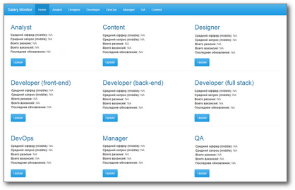
If the user sees that the data has not been updated too long, he presses the "Update" button for the corresponding specialty. The application is leavinginto an unconsciousthink for 5 minutes, the employee leaves to drink coffee. Upon return, he is waiting for the updated data on the main page and on the corresponding tab.
Как минимум, то, что для обновления данных по всем девяти специальностям пользователю нужно нажать кнопку Update у каждой плитки — и так девять раз.
Почему бы не сделать одну кнопку "Update" на все? Дело в том, — и это вторая проблема — что на каждый запрос ("обновить и обработать данные по менеджерам", "обновить и обработать данные по QA" и т.д.) уходило по 5-10 минут, что само по себе непозволительно долго. Единый запрос на обновление всех данных превратил бы 5 минут в 45, а то и во все 60. Пользователь не может столько ждать.
Даже несколько функций withProgress(), оборачивавших процессы сбора и обработки данных, и делавших таким образом пользовательское ожидание более осмысленным, не слишком спасали ситуацию.
Третья проблема этого прототипа в том, при добавлении еще десятка профессий (ну а вдруг) мы столкнулись бы с тем, что место в хедере заканчивается.
Этих трех причин мне было достаточно, чтобы полностью переосмыслить подход к построению приложения и UX. Если найдете больше — велком в комменты.
Were this prototype and strengths, namely:
- Generalized approach to the interface and business logic: instead of copying and paste, we put the same pieces in a separate function with parameters.
For example, this is how the "tile" of one specialty on the main page looks like:
tile <- function(title, midsal = NA, midsalres = NA, total.res = NA, total.vac = NA, updated = NA)
{
  return(
  column(width = 4,
         h2(title),
         strong("Средний оффер (middle):"), midsal, br(),
         strong("Средний запрос (middle):"), midsalres, br(),
         strong("Всего резюме:"), total.res, br(),
         strong("Всего вакансий: "), total.vac, br(),
         strong("Последнее обновление: "), updated, br(), br(),
         actionButton(inputId = paste0(tolower(prof), "Btn"),
                      label = "Update", class = "btn-primary")
  )
  )
}- Dynamic UI formation up to ID (inputId) in the code, through
inputId = paste0(параметр, "Btn"), see the example above. This approach proved to be extremely convenient, because it had to initialize with a dozen controls, multiplied by the number of professions. - He worked :)
The collected data was added to .csv files for different professions ( append = TRUE), and then read from there when the application was started. When new data appeared, they were added to the corresponding file, and the average values were recalculated.
A couple of words about delimiters
An important caveat: standard separators for csv files - comma or semicolon - are not very suitable for our case, because you can often find jobs and resumes with headers like "Shvets, reaper, igrets (duda; html / css)". Therefore, I immediately decided to choose something more exotic, and my choice fell on |.
Everything went well until, at the next launch, I found a date in a column with currency and then moved down columns and, as a result, messed up charts. Began to understand. As it turned out, my system was broken by a beautiful girl, Data Analyst | Business Analyst. Since then, I have used the \x1BESC character as a delimiter . Still not let down.
Assign or not assign?
While working on this project, the assign function became for me a real discovery: you can dynamically form the names of variables and other date frames, cool!
Of course, I want to keep the source data in separate data frames for different vacancies. I don’t want to write "designer.vac = data.frame (...), analyst.vac = data.frame (...)". Therefore, the initialization code for these objects when I started the application looked like this:
profs <- c("analyst", "designer", "developer", "devops", "manager", "qa")
for (namein profs)
{
  if (!exists(paste0(name, ".vac")))
    assign(x = paste0(name, ".vac"),
           value = data.frame(
             URL = character() # ссылка на вакансию
             , id = numeric() # id вакансии
             , Name = character() # название вакансии
             , City = character()
             , Published = character()
             , Currency = character()
             , From = numeric() # ниж. граница зарплатной вилки
             , To = numeric() # верх. граница
             , Level = character() # jun/mid/sen
             , Salary = numeric()
             , stringsAsFactors = FALSE
           ))
}
But my joy did not last long. It was no longer possible to turn to such objects in the future through a certain parameter, and this, willy-nilly, led to code duplication. At the same time, the number of objects grew exponentially, and as a result it became easy to get confused in them and in assign calls.
So I had to use a different approach, which in the end turned out to be much simpler: using lists.
profs <- list(
  devops = "devops"
  , analyst = c("systems+analyst", "business+analyst")
  , dev.full = "full+stack+developer"
  , dev.back = "back+end+developer"
  , dev.front = "front+end+developer"
  , designer = "ux+ui+designer"
  , qa = "QA+tester"
  , manager = "project+manager"
  , content = c("mathematics+teacher", "physics+teacher")
)
for (namein names(profs))
{
  proflist[[name]] <- data.frame(
    URL = character() # ссылка на вакансию
    , id = numeric() # id вакансии
    , Name = character() # название вакансии
    , City = character()
    , Published = character()
    , Currency = character()
    , From = numeric() # ниж. граница зарплатной вилки
    , To = numeric() # верх. граница
    , Level = character() # jun/mid/sen
    , Salary = numeric()
    , stringsAsFactors = FALSE
  )
}
Обратите внимание, что вместо обычного вектора с названиями профессий, как раньше, я использую список, в который заодно вшила поисковые запросы, по которым ищутся данные по вакансиям и резюме для конкретной профессии. Так мне удалось избавиться от уродливого switch при вызове функции поиска вакансий.
Тоже, в общем-то, несложно. Вот вам сферический в вакууме пример для server.R:
lapply(seq_along(my.list.of.data.frames), function(x) {
  output[[paste0(names(my.list.of.data.frames)[x], ".dt")]] <-
    renderDataTable({
       datatable(data = my.list.of.data.frames[[names(my.list.of.data.frames)[x]]]()
              , style = 'bootstrap', selection = 'none'
              , escape = FALSE)
  })
  output[[paste0(names(my.list.of.data.frames)[x], ".plot")]] <-
    renderPlot(
      ggplot(na.omit(my.list.of.data.frames[[names(my.list.of.data.frames)[x]]]()),
                aes(...))
  )
})
From here an output: lists - the extremely convenient piece, allowing to reduce quantity of the code and time for its processing. (Therefore, do not assign.)
And at that moment, when I was distracted from refactoring to Joe Cheng’s speech on dashboards , it came ...
Rethinking
It turns out that there is a special package in R, sharpened by the creation of dashboards - shinydashboard . It also uses bootstrap and helps to organize a UI with a concise sidebar that can be completely hidden without any conditionalPanel()help, allowing the user to focus on studying the data.
It turns out that if HR checks the data every six months, they do not need the Update button. None at all. This is not really a static dashboard, but close to that. The data update script can be implemented completely separately from the shiny application and run it according to the schedule with the standard SchedulerWindows your OS.
This solves two problems at once: a long wait (if you regularly drive the script in the background, the user will not even notice his work, but will always see fresh data) and redundant actions required from the user to update the data. It used to require nine clicks (one for each specialty), now zero is required. It seems that we have reached an efficiency gain tending to infinity!
It turns out that the code in different parts of the application is executed unequal number of times. I will not dwell on this in detail, if you wish, to become better acquainted with the illustrative explanation in the report . I will designate only the main idea: data manipulations inside ggplot (), on the fly - evil, and the more code you manage to bring to the upper levels of the application, the better. Productivity at the same time grows many times.
In fact, the further I looked at the report, the more clearly I understood how much the code in my first prototype was not organized according to Feng Shui, and at some point it became obvious that it was easier to rewrite the project than to refactor. But how to quit your child when so much energy is invested in it?
That which is dead cannot die
- I thought and rewrote the project from scratch, and this time
- rendered the entire code for collecting data on vacancies and summaries (in fact, the entire ETL process) into a separate script that can be run independently of the shiny application, saving the user from anxious waiting;
- used reactiveFileReader () to read pre-collected data from csv-files, ensuring the up-to-date data in my application is up to date without the need to restart and unnecessary user actions;
- got rid of assign () in favor of working with lists and actively used lapply () where previously there were loops;
- reworked UI applications using the shinydashboard package, as a bonus - no need to worry about the lack of screen space;
- several times reduced the total volume of the application (from ~ 1800 to 360 lines of code).
Now the solution works as follows.
- The ETL script runs once a month (here is the instruction on how to do this) and conscientiously passes through all professions, collecting raw data on vacancies and resumes from hh.
Moreover, the data on vacancies is taken through the site's API (I was able to partially reuse the code from the previous project ), but for every resume I had to parse the web page using the rvest package, because access to the corresponding API method now became paid. You can guess how it affected the speed of the script. - The collected data is combed - in detail and with examples of code the process is described here . The processed data is saved to disk in separate files of the hist / profession-hist-vac.csv and hist / profession-hist-res.csv types. By the way, outliers in data like these can lead to curiosities, be vigilant :)
For each profession, the script takes an updated file with historical data, selects the most relevant - those that are not older than a month from the date of the last update - and generate new csv files of the type data .res / profession-res-recent.csv and data.vac / profession-vac-recent.csv. With this data, the final application works ... - ... which, after starting, reads the contents of the resume and job folders (data.res and data.vac, respectively), and then every hour checks if there are any changes in the files. Doing this with reactiveFileReader () is much more efficient in terms of resources and execution speed than with invalidateLater (). If there were changes in the files, then the tables with the original data are automatically updated, and the average values and graphs are recalculated because they depend on reactiveValues (), that is, no additional code is needed to handle this situation.
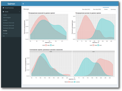
- On the main page there is now a table in which the min, median and max values of salary expectations and offers in each specialty are given for each of the levels found (all for TK). In addition, you can view the graphs on the tabs with detailed information and upload data in the .xlsx format (for some reason, HR requires these numbers).
Everything. It turns out that the only button that is now available to the user on our dashboard is the Download button. And this is for the better: the smaller the user buttons, the less chanceraise unhandled exception get confused in them.
Instead of an epilogue
Today, the application collects and analyzes data only in St. Petersburg. Considering that the main stakeholder was satisfied, and the most frequent reaction is “great, but can you do this to Moscow?”, I think the experiment was successful.
You can view the application at this link , and the entire source code (along with examples of ready-made files) is available here .
By the way, the application is called Salary Monitor, abbreviated Salmon - "salmon".