 April 16, 2012 at 11:42
62 useful tools for responsive design (Responsive web design)
- Transfer
UPD . For a brief introduction to responsive design, I recommend reading the article “ How to make one site for all devices (Responsive Web Design) ”.
Translation of the highly valuable article “Responsive Web Design Techniques, Tools and Design Strategies” of the popular online publication for developers of Smashing Magazine.
Back in January, we published an article on responsive design “Responsive Web Design: What It Is and How To Use It” ( Responsive Web Design: What It Is and How to Use It ). Responsive web design continues to attract a lot of attention, but given how different it is from traditional website development methods, it can seem overwhelmingly difficult for those designers and developers who have not tried it.
For this reason, we have compiled an overview of resources useful in creating responsive sites. The review includes detailed guides, approaches, tools, articles containing practical tips needed to create your own responsive website.
1. CSS Transitions and Media Queries
CSS Transitions and Media Queries
Elliot Jay Stocks details the method of combining CSS Media Queries and CSS transitions. The main idea is this: when developing a responsive site using Media Queries, you constantly change the width of your browser to see how the site behaves in doing so. But every time one of your Media Queries runs, a hard transition between the styles is visible (the first, for example, for desktops, the second - for tablets). Why not use CSS transitions to smooth out these hard transitions with animation? 2. Responsive Data Tables Adaptive Data Tables

Chris Coyier and Scott Jehl are experimenting with responsive design techniques to render tables correctly (). Tables can be wide, and there’s no getting around it. You can zoom out and see the entire table, but then the text size will be too small to read. You can zoom in so that you can read it, but then you have to scroll the table vertically and horizontally to view it fully.
One solution is to reformat the table for readability. Another is to display a pie chart of data. And the third solution is to adapt the table into a mini-image for small screens, which by clicking it will open it completely. 3. Responsive Navigation Menus: Convert a Menu to a Dropdown for Small Screens

Adaptive Menu: Converting a Menu to a
Drop-Down List on Small Screens Chris Coyier describes a technique for converting long rows of links to drop-down menu items at low resolutions. When a user browses the site on a small screen and clicks on a drop-down menu, he sees large and beautiful menu items that are easy to select. Obviously, this is much better than displaying a tiny link that is even hard to click on. 4. CSS Media Queries and Using Available Space CSS Media Queries and Rational Use of Available Space
The manual describes how to make small changes to the appearance of the site at various screen resolutions using Media Queries. For example, in the side column you need to specify e-mail. At low resolutions, e-mail can be supplemented with an icon, at large resolutions - write mail in text, at even larger resolutions combine both of them and so on.

5. Fluid Images
Rubber images (scaling by browser)
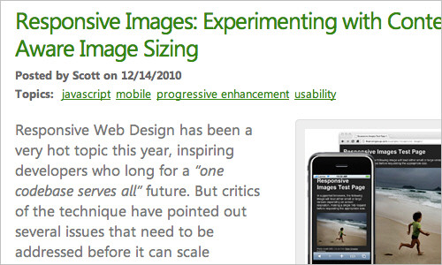
Rubber images are one of the central themes in responsive web design. Ethan Marcotte's article provides a detailed overview of creating them using the classic code snippet img {max-width: 100%; } , as well as all the necessary details needed to get started. 6. Responsive Image: Experimenting With Context-Aware Image Sizing Responsive Images (Resizing Images)
An alternative approach to rubber images belongs to the Filament Group. Their method allows developers to create responsive layouts that serve different image sizes for different resolutions. In fact, this allows you to submit images optimized for mobile devices for small screens and their high-resolution versions for large screens.
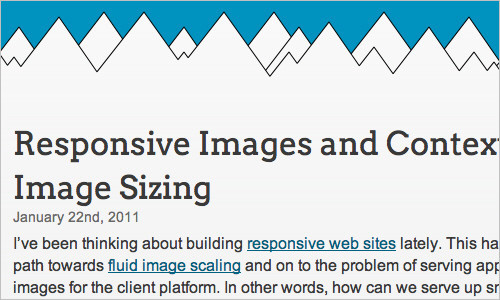
The method developed by the Filament Group uses .htaccess and JavaScript files to feed images of different sizes based on the visitor’s screen width. An alternative solution is to use tools such as TinySrc (the tool is now part of Sencha). 7. Responsive Images and Context-Aware Image Sizing
Responsive images and context-sensitive image resizing
Craig Russell has developed a method that uses a server-side script (in PHP) to feed images of various resolutions and volumes. The idea is that the PHP script uses an array to which image files and their relative scales in percent are entered. The SRC attribute of the IMG tag must be set in such a way as to obtain the ID of the requested image, but without specifying the scale.
JavaScript calculates the ratio of the image width as a percentage of the maximum width of the parent block, and this figure is then added at the end of the SRC attribute as a scale parameter. In the comments to the article, you can find some useful tips on how to improve this method. 8.
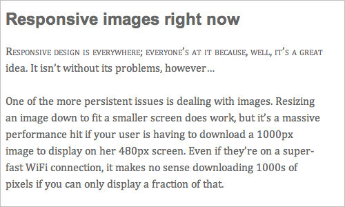
Responsive Images Right Now Responsive Images Right
now,
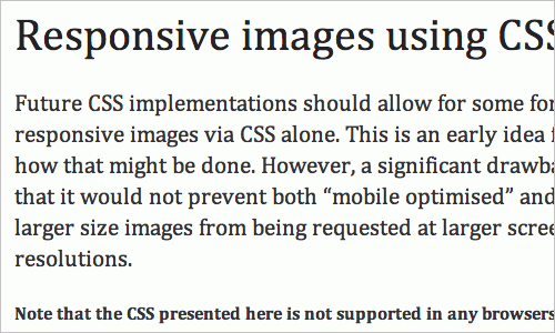
Harry Roberts has come up with the idea of using a combination of DIV and IMG to select the most suitable image for the current device. The parent DIV has a large image stored in the background-image, and in the IMG, the mobile version. Using Media Queries, a small image from the IMG or a large one from the DIV background will be selected. 9. Responsive Images Using CSS3 Responsive Images Using CSS Nicolas Gallagher's method relies on the use of Media Queries ( wow! - translator comment ), content properties and attr expressions ( ) Unfortunately, this method is interesting only from the point of view of the idea - it does not work in any of the browsers that currently exist.
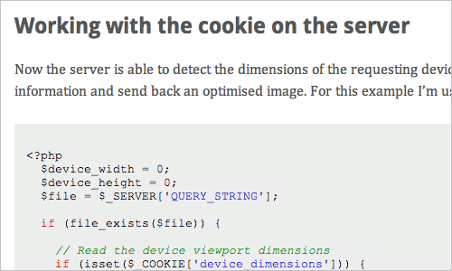
10. for Responsive Images Related Solution: Using of Cookies The
Adaptive image using of Cookies The
Keith Clark proposes to use cookies to supply thumbnail images to mobile users. Each time the browser requests a file from the server, it automatically transfers cookies along with the request. If we use JavaScript to create cookies with information about the size of the current screen, then all subsequent browser requests will send this data to the server.
In other words, the server will know the screen size of the device before the browser starts loading images from html. This can be used to reduce the size of images on the server side. 11. Responsive Images With ExpressionEngine
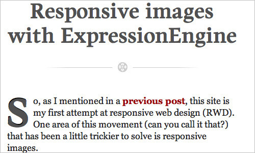
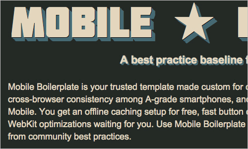
Responsive Images with ExpressionEngine
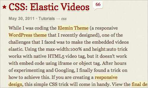
John Faulds introduced a method for creating responsive images that differs significantly from the above. The user agent determines whether the device is mobile or not. Based on the results of the check, a global variable is created, which is used in templates to change the size of the output image. It turns out that only one image is sent to the browser, but for mobile visitors it is one, and for visitors from the desktop it is different. 12. CSS: Elastic Videos CSS: responsive Nick La videos based on max-width: 100%
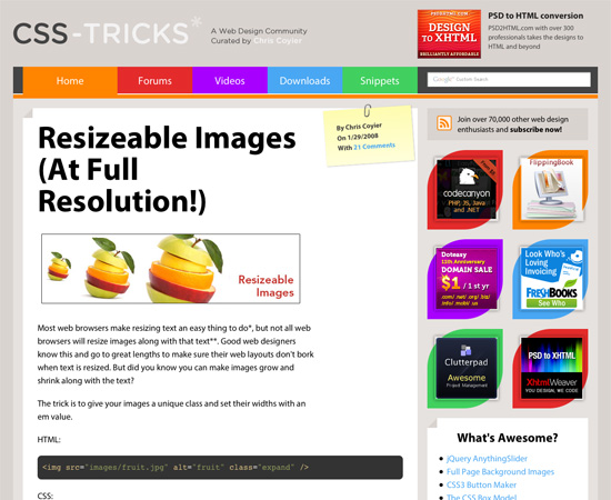
to video is a method that makes HTML5 video, object- and iframe-embedded videos adaptive. Regarding the latter, the method is very simple. Just paste the mentioned code into the DIV block and specify padding-bottom from 50% to 60%. And for child elements (such as iframe, object embed) - the width and height properties are 100% plus absolutely position. This will cause inline elements to expand full width automatically. This method was originally proposed by Thierry Koblentz . 13. Resizeable Images Related (the At of Full Resolution!) Images resizable Quick Start Guide Changing the image size depending on the size of the text.
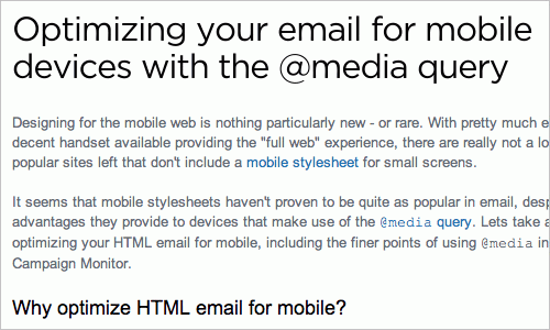
14. Optimizing Your Email for Mobile Devices With the Media Query
Optimizing Email for Mobile Devices with Media Queries
To view large emails, you often need to scroll horizontally, especially when a large image is attached to the email. In this study, Campaign Monitor explains how emails can be optimized for mobile devices using Media Queries and suggests some useful methods and code snippets for practical use. 15. Responsive Design for Email, the Largest Mobile Audience Responsive Design for Email, the tool with the largest number of mobile audiences
The article provides interesting insights and insights from the Beanstalk team on using Media Queries to create mobile friendly (user-friendly) mobile mail. 16. Media Queries in HTML Emails Media Queries in HTML letters This article discusses the use of Media Queries for specific mobile email clients. 17. Guide to CSS Support in Email Guide for CSS support by email clients Creating HTML mail that displays equally correctly in all major email clients can be extremely time-consuming and time-consuming. Support for even simple CSS is significantly different between clients and even between different versions of the same client.

Campaign Monitor has put together a guide to save you time and nerves figuring out all of these details. Tested on 24 different email clients, it covers all popular email applications.
You can design a responsive design from scratch or use the tools listed below to speed up and simplify the process of creating it.
18. Respond.js
This is a fast and small Polyfill (a piece of code that adds browser unsupported functionality) was created by Scott Jehl to support the min-width and max-width properties from CSS3 Media Queries in IE6-IE8 and higher.
Css3-mediaqueries-js is another script that allows CSS3 Media Queries to work in IE 5+, Safari 2, and Firefox 1+. 19. WebPutty: Scientific Progress CSS Editing WebPutty: A Breakthrough in CSS Editing

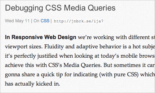
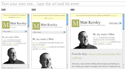
This tool is a CSS web editor for your site with the function of autosaving and viewing the result in real time. WebPutty supports SCSS, Sass, LESS, and Compass. To use this tool, simply insert the link before the closing tag on your site. 20. Debugging CSS Media Queries Debugging CSS3 Media Queries When creating responsive web design, you have to work with a lot of Media Queries. Johan Brook shares a little secret on how to find out which Media Queries rule is currently running. The article also contains a mixin for developers using Sass. 21. for Responsive Design Testing Testing responsive web design
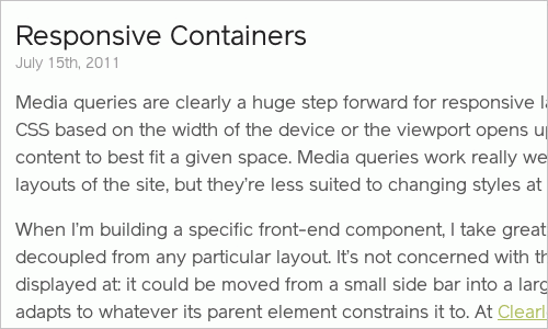
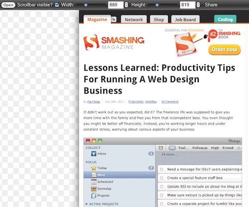
This tool is intended for everyone who needs a quick and easy way to check the created site with different screen widths. You can check the site both online and by downloading the code from Github. 22. Responsive Containers: Selector Queries JavaScript adaptive blocks Andy Hume allows you to apply various classes to HTML elements based on their width. 23. Resize My Browser Resize your browser. If you want the browser to display content at a specific window size, then this is what you need. Just click on the size you need and see what your site looks like at that size. Chrome and Opera also do not work due to problems with the "ResizeTo" event. 24. Media Query Bookmarklet

Bookmarks Media Query
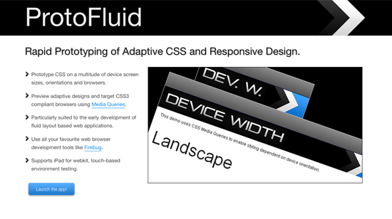
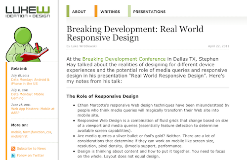
A handy tool that shows which Media Queries are active at the current browser width. Drag it to the bookmarks bar and if necessary just run it. 25. Responsivepx Use the information from this little tool to create an responsive website. 26. ProtoFluid Tool for rapid prototyping of responsive design. You can design CSS for a variety of popular screen sizes, orientations, and browsers, whether it's phones (BlackBerry Torch, Google Nexus One, iPhone, Motorola Droid), tablets (BlackBerry Playbook, iPad, Samsung Galaxy Tab, Dell Streak), monitors or TVs ( 720p, 1080p).

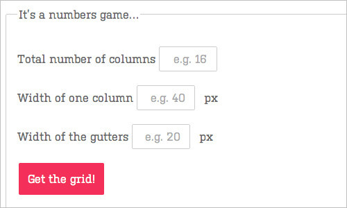
You can view the design results directly in the browser and use your usual development tools, such as Firebug. Also try an alternative ScreenFly tool . 27. Fluid Grid Calculator Rubber Mesh Calculator Harry Roberts has developed a rubber mesh calculator and generator. Just specify the number of columns, the width of one column, the indentation, and the tool will generate a rubber CSS mesh according to your parameters. Very comfortably! 28. Free HTML5 / CSS3 WordPress 3.1+ Theme With Responsive Layout: Yoko Free HTML5 / CSS3 WordPress 3.1 Theme with responsive layout: Yoko
Yoko is a modern and flexible WordPress theme. Thanks to the responsive layout based on CSS3 Media Queries, the theme is customizable to various screen sizes. The design is optimized for large screens of desktops, tablets and small screens of smartphones. To give your site a personality, you can use new post formats (for example, galleries, side columns or quotes). Select your logo and image in the header, adjust the background and color of the links. 29. Scherzo, a Responsive WordPress Theme Scherzo, Responsive WordPress Theme This WordPress theme is a great example of responsive design, displaying equally well on almost all devices and screens.

30. 320 and Up
The 320 and Up tool is based on the principle of mobile first (first mobile devices), in which the design is created first for the screens of mobile devices, and then expanded for tablets, desktop PCs and large screens. It works well both as an addition to the HTML5 boilerplate, and separately. 31. Mobile Boilerplate These are customizable templates for creating rich, high-performance mobile web applications. You get cross-browser compatibility for Class A smartphones and good support for older BlackBerry, Symbian, and IE Mobile. As well as a large number of different optimizations for mobile browsers. 32. Skeleton: Beautiful Boilerplate for Responsive, Mobile-Friendly Development

Skeleton: An excellent Boilerplate for responsive development
Skeleton is a small collection of CSS and JavaScript files that will help you quickly develop websites that are equally convenient on any screen, whether it's a 17-inch laptop or iPhone. Skeleton is a well-organized and designed grid that is adaptive up to a mobile phone. It also has styles for most HTML elements that you can use as the basis for your design.
33. 1140 CSS Grid
1140 CSS Grid оптимизирован для работы на экранах от размера мобильных устройств до мониторов 1280px в ширину. Это простая и гибкая сетка, использующая Media Queries.
34. inuit.css
Этот CSS-фреймворк — хорошая основа для разработки на крошечных экранах (например, телефоны) и небольших экранах (например, планшеты) прямо из коробки с минимальными усилиями. Помимо этого имеется генератор для создания резинового CSS-фреймворка под себя.
35. Flurid
Flurid — это резиновая сетка на 6, 7, 8, 9, 10, 12 и 16 колонок.

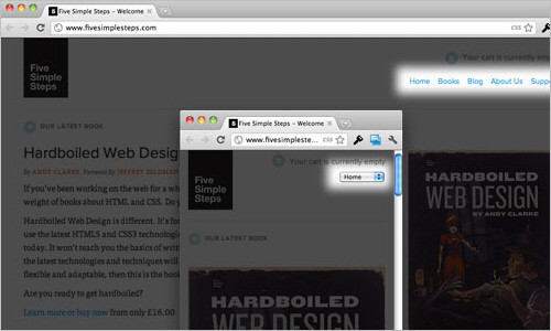
36. FluidGrids
FluidGrids — генератор модульной сетки, который создает макеты из 6, 7, 8, 9, 10, 12 или 16 колонок.

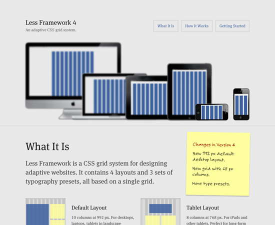
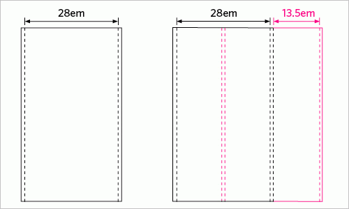
37. Less Framework 4
CSS framework for creating responsive layouts. It contains 4 basic layouts and three typography sets. 38. Fluid Grid System A rubber framework with a focus on typography. 39. Tiny Fluid Grid Tiny Fluid Grid will help you create your own rubber grid of 12, 16 or 24 columns, set their maximum and minimum width and indent in percentage.


40. The Responsive Designer’s Workflow
Workflow разработчика адаптивного веб-дизайна
Luke Wroblewski законспектировал презентацию Ethan Marcotte о применении принципов адаптивного веб-дизайна в модернизации сайта одной из ведущих газет. Среди прочего, Ethan объясняет, как он подходит к методологии проектирования адаптивного веб-дизайна и что из себя представляет процесс прототипирования в контексте адаптивного веб-дизайна.

41. The Goldilocks Approach to Responsive Web Design
Подход Goldilocks к Responsive web design
Goldilocks рассматривает макеты, основанные на em, которые отлично выглядят независимо от устройства, с которого просматриваются.
42. Content Choreography
Хореография содержимого
In the article you can read about how to properly plan your site to meet today's standards. Start managing your content so that it’s best served across any width. 43. the Structured the Content First First structured content in this presentation Stephen Hay describes troubles that you may encounter when creating an adaptive site. Stephen shows that we should think first about the proper structuring of content, which will make it universal and conveniently accessible both from a small screen and from a text browser. Your content should be ready to use anywhere. 44. Design for a Target Experience First Design for Target Experience First

Another interesting look at creating responsive design. Nathan C. Ford focuses on the behavior of its visitors, and then based on it creates custom scripts and Media Queries.
“Each site has goals that go beyond simple reading, where a lack of different capabilities can actually destroy a pleasant interaction experience. I am currently working on such a project. Our approach is to learn everything and form the optimal interaction for the most likely user scenarios. By working in this way, we hone every Media Query to perfection. ” 45. More for Responsive Design, Please Even more responsive design, please

In the article, Jason Things ponders the challenges of responsive design. The article is very well thought out and, as they say, “must read”. 46. Breaking Development Luke Wroblewski took notes at the Breaking Development Conference during Stephen Hay's presentation on design realities for various devices. 47. Patterns for Multiscreen Strategies Templates for Multiscreen Strategies Take a look at this simple but very useful presentation to get an idea of what key factors are crucial in multi-screen concepts. 48. for Responsive the Web Design of Future from the responsive web design from the future

According to Kyle Neath, responsive web design is a broader concept than just screen size. Kyle wrote about how GitHub handles links, about the address bar, about partial page refreshing and explained why he believes that the HTML5 History API is the most important thing that has happened in front-end development since the advent of Firebug. Very inspiring presentation. 49. Developing a Progressive Mobile Strategy Development of advanced mobile strategy In this presentation, Dave Olsen is a progressive mobile strategy, which consists of strategies audiences, content and platforms. Dave believes that in order to develop a sustainable and scalable mobile strategy, you must answer the following questions: “What value does this content have for the target audience?”

50. How to Use CSS3 Media Queries to Create a Mobile Version of Your Website
How to use CSS3 Media Queries to create a mobile version of a site
In this article on Smashing Magazine, Rachel Andrew explains how you can create an iPhone version of your site using just a few CSS rules using CSS3, which will work right now. The article provides a very simple example and the process of adding styles for mobile devices to a site to show how easily we can add mobile-oriented styles to an existing site.
You may also be interested in the following related articles: Aaron Gustafson, “ Responsive Layouts with Media Queries, ” and Emily Lewis, “ Adaptation for Various CSS3 Media Queries Devices .”

These articles, although they are not textbooks, can give you valuable information on why you need to use adaptive web design techniques (and when you don't need to).
51. Responsive by Default Andy Hume
's default
adaptability explains that, in his opinion, adaptability is our everything. This is what makes a site work when it loads through an unknown browser on an unknown device by an unknown person. 52. Responsive Web Design or Separate Mobile Site? Eh, It Depends Responsive Web Design or a standalone mobile site? Depends on the circumstances. An interesting article about the pros and cons of responsive web design compared to a mobile site. 53.
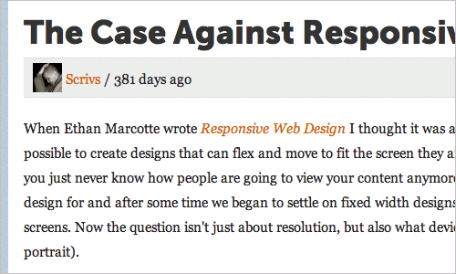
The Case Against Responsive Web Design
Against responsive web design
is quite logical to include in the review opinion as to when an adaptive design appropriate and when not. This article discusses why responsive design does not always make sense in terms of user interaction. Pay attention to interesting comments on the article. Luke Jones has a similar opinion . 54. A Responsive Mind Adaptive Mind Jeremy Keith's blog post discusses the essential elements of responsive design and how to efficiently create different layouts based on different screen sizes. With examples. 55. Responsive Enhancement
An excellent introduction to responsive design as a way of thinking, and not as a tool or technique. Jeremy Keith claims that responsive web design cannot simply be added as a step to an existing workflow. Instead of achieving perfect pixels, we need to achieve perfect proportions.
56. Mobile-First Responsive Web Design
Publication is a combination of philosophy and strategy to accumulate best practices in responsive design.
57. Where are the Mobile First Web Designs?
How far has Mobile First web design gone?
In this article, Jason Grigsby talks about the results of his research on responsive design, its features, and also makes a few comments about the current state of things in the field of adaptive website building.
Responsive design posts that don't fit in the categories above.
58. Media Queries
A regularly updated collection of websites that use Media Queries. 59. Responsive Web Design by Ethan Marcotte Responsive Web Design by Ethan Marcotte This book, written by Ethan Marcotte and published by A Book Apart, is a storehouse of responsive website development knowledge. It covers the basics of responsive design, modular grids, responsive images and Media Queries, which is enough to understand how to create a responsive website. 60. The Big Web Show episode # 9: Responsive Web Design
In episode 9 of The Big Web Show, Jeffrey Zeldman and Dan Benjamin invited Ethan Marcotte to discuss responsive design.
61. The Latest in HTML5
Recent Trends in HTML5
The presentation discusses little-known aspects of HTML5 that can be implemented in browsers in the near future. Among other things, Server Queries Media Queries with JavaScript and device form factor detection.
62. The first Russian-language blog about responsive design .
A great addition to the article will be a blog about responsive design, in which developers share experiences and write reviews of responsive tools.
Translation of the highly valuable article “Responsive Web Design Techniques, Tools and Design Strategies” of the popular online publication for developers of Smashing Magazine.
Back in January, we published an article on responsive design “Responsive Web Design: What It Is and How To Use It” ( Responsive Web Design: What It Is and How to Use It ). Responsive web design continues to attract a lot of attention, but given how different it is from traditional website development methods, it can seem overwhelmingly difficult for those designers and developers who have not tried it.
For this reason, we have compiled an overview of resources useful in creating responsive sites. The review includes detailed guides, approaches, tools, articles containing practical tips needed to create your own responsive website.
Responsive web design techniques
1. CSS Transitions and Media Queries
CSS Transitions and Media Queries
Elliot Jay Stocks details the method of combining CSS Media Queries and CSS transitions. The main idea is this: when developing a responsive site using Media Queries, you constantly change the width of your browser to see how the site behaves in doing so. But every time one of your Media Queries runs, a hard transition between the styles is visible (the first, for example, for desktops, the second - for tablets). Why not use CSS transitions to smooth out these hard transitions with animation? 2. Responsive Data Tables Adaptive Data Tables
Chris Coyier and Scott Jehl are experimenting with responsive design techniques to render tables correctly (). Tables can be wide, and there’s no getting around it. You can zoom out and see the entire table, but then the text size will be too small to read. You can zoom in so that you can read it, but then you have to scroll the table vertically and horizontally to view it fully.
One solution is to reformat the table for readability. Another is to display a pie chart of data. And the third solution is to adapt the table into a mini-image for small screens, which by clicking it will open it completely. 3. Responsive Navigation Menus: Convert a Menu to a Dropdown for Small Screens
Adaptive Menu: Converting a Menu to a
Drop-Down List on Small Screens Chris Coyier describes a technique for converting long rows of links to drop-down menu items at low resolutions. When a user browses the site on a small screen and clicks on a drop-down menu, he sees large and beautiful menu items that are easy to select. Obviously, this is much better than displaying a tiny link that is even hard to click on. 4. CSS Media Queries and Using Available Space CSS Media Queries and Rational Use of Available Space
The manual describes how to make small changes to the appearance of the site at various screen resolutions using Media Queries. For example, in the side column you need to specify e-mail. At low resolutions, e-mail can be supplemented with an icon, at large resolutions - write mail in text, at even larger resolutions combine both of them and so on.
Responsive Images and Videos
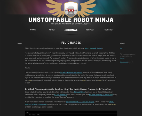
5. Fluid Images
Rubber images (scaling by browser)
Rubber images are one of the central themes in responsive web design. Ethan Marcotte's article provides a detailed overview of creating them using the classic code snippet img {max-width: 100%; } , as well as all the necessary details needed to get started. 6. Responsive Image: Experimenting With Context-Aware Image Sizing Responsive Images (Resizing Images)
An alternative approach to rubber images belongs to the Filament Group. Their method allows developers to create responsive layouts that serve different image sizes for different resolutions. In fact, this allows you to submit images optimized for mobile devices for small screens and their high-resolution versions for large screens.
The method developed by the Filament Group uses .htaccess and JavaScript files to feed images of different sizes based on the visitor’s screen width. An alternative solution is to use tools such as TinySrc (the tool is now part of Sencha). 7. Responsive Images and Context-Aware Image Sizing
Responsive images and context-sensitive image resizing
Craig Russell has developed a method that uses a server-side script (in PHP) to feed images of various resolutions and volumes. The idea is that the PHP script uses an array to which image files and their relative scales in percent are entered. The SRC attribute of the IMG tag must be set in such a way as to obtain the ID of the requested image, but without specifying the scale.
JavaScript calculates the ratio of the image width as a percentage of the maximum width of the parent block, and this figure is then added at the end of the SRC attribute as a scale parameter. In the comments to the article, you can find some useful tips on how to improve this method. 8.
Responsive Images Right Now Responsive Images Right
now,
Harry Roberts has come up with the idea of using a combination of DIV and IMG to select the most suitable image for the current device. The parent DIV has a large image stored in the background-image, and in the IMG, the mobile version. Using Media Queries, a small image from the IMG or a large one from the DIV background will be selected. 9. Responsive Images Using CSS3 Responsive Images Using CSS Nicolas Gallagher's method relies on the use of Media Queries ( wow! - translator comment ), content properties and attr expressions ( ) Unfortunately, this method is interesting only from the point of view of the idea - it does not work in any of the browsers that currently exist.

10. for Responsive Images Related Solution: Using of Cookies The
Adaptive image using of Cookies The
Keith Clark proposes to use cookies to supply thumbnail images to mobile users. Each time the browser requests a file from the server, it automatically transfers cookies along with the request. If we use JavaScript to create cookies with information about the size of the current screen, then all subsequent browser requests will send this data to the server.
In other words, the server will know the screen size of the device before the browser starts loading images from html. This can be used to reduce the size of images on the server side. 11. Responsive Images With ExpressionEngine
Responsive Images with ExpressionEngine
John Faulds introduced a method for creating responsive images that differs significantly from the above. The user agent determines whether the device is mobile or not. Based on the results of the check, a global variable is created, which is used in templates to change the size of the output image. It turns out that only one image is sent to the browser, but for mobile visitors it is one, and for visitors from the desktop it is different. 12. CSS: Elastic Videos CSS: responsive Nick La videos based on max-width: 100%
to video is a method that makes HTML5 video, object- and iframe-embedded videos adaptive. Regarding the latter, the method is very simple. Just paste the mentioned code into the DIV block and specify padding-bottom from 50% to 60%. And for child elements (such as iframe, object embed) - the width and height properties are 100% plus absolutely position. This will cause inline elements to expand full width automatically. This method was originally proposed by Thierry Koblentz . 13. Resizeable Images Related (the At of Full Resolution!) Images resizable Quick Start Guide Changing the image size depending on the size of the text.
Responsive Email
14. Optimizing Your Email for Mobile Devices With the Media Query
Optimizing Email for Mobile Devices with Media Queries
To view large emails, you often need to scroll horizontally, especially when a large image is attached to the email. In this study, Campaign Monitor explains how emails can be optimized for mobile devices using Media Queries and suggests some useful methods and code snippets for practical use. 15. Responsive Design for Email, the Largest Mobile Audience Responsive Design for Email, the tool with the largest number of mobile audiences
The article provides interesting insights and insights from the Beanstalk team on using Media Queries to create mobile friendly (user-friendly) mobile mail. 16. Media Queries in HTML Emails Media Queries in HTML letters This article discusses the use of Media Queries for specific mobile email clients. 17. Guide to CSS Support in Email Guide for CSS support by email clients Creating HTML mail that displays equally correctly in all major email clients can be extremely time-consuming and time-consuming. Support for even simple CSS is significantly different between clients and even between different versions of the same client.
Campaign Monitor has put together a guide to save you time and nerves figuring out all of these details. Tested on 24 different email clients, it covers all popular email applications.
Responsive Web Design Tools
You can design a responsive design from scratch or use the tools listed below to speed up and simplify the process of creating it.
18. Respond.js
This is a fast and small Polyfill (a piece of code that adds browser unsupported functionality) was created by Scott Jehl to support the min-width and max-width properties from CSS3 Media Queries in IE6-IE8 and higher.
Css3-mediaqueries-js is another script that allows CSS3 Media Queries to work in IE 5+, Safari 2, and Firefox 1+. 19. WebPutty: Scientific Progress CSS Editing WebPutty: A Breakthrough in CSS Editing
This tool is a CSS web editor for your site with the function of autosaving and viewing the result in real time. WebPutty supports SCSS, Sass, LESS, and Compass. To use this tool, simply insert the link before the closing tag on your site. 20. Debugging CSS Media Queries Debugging CSS3 Media Queries When creating responsive web design, you have to work with a lot of Media Queries. Johan Brook shares a little secret on how to find out which Media Queries rule is currently running. The article also contains a mixin for developers using Sass. 21. for Responsive Design Testing Testing responsive web design
This tool is intended for everyone who needs a quick and easy way to check the created site with different screen widths. You can check the site both online and by downloading the code from Github. 22. Responsive Containers: Selector Queries JavaScript adaptive blocks Andy Hume allows you to apply various classes to HTML elements based on their width. 23. Resize My Browser Resize your browser. If you want the browser to display content at a specific window size, then this is what you need. Just click on the size you need and see what your site looks like at that size. Chrome and Opera also do not work due to problems with the "ResizeTo" event. 24. Media Query Bookmarklet
Bookmarks Media Query
A handy tool that shows which Media Queries are active at the current browser width. Drag it to the bookmarks bar and if necessary just run it. 25. Responsivepx Use the information from this little tool to create an responsive website. 26. ProtoFluid Tool for rapid prototyping of responsive design. You can design CSS for a variety of popular screen sizes, orientations, and browsers, whether it's phones (BlackBerry Torch, Google Nexus One, iPhone, Motorola Droid), tablets (BlackBerry Playbook, iPad, Samsung Galaxy Tab, Dell Streak), monitors or TVs ( 720p, 1080p).
You can view the design results directly in the browser and use your usual development tools, such as Firebug. Also try an alternative ScreenFly tool . 27. Fluid Grid Calculator Rubber Mesh Calculator Harry Roberts has developed a rubber mesh calculator and generator. Just specify the number of columns, the width of one column, the indentation, and the tool will generate a rubber CSS mesh according to your parameters. Very comfortably! 28. Free HTML5 / CSS3 WordPress 3.1+ Theme With Responsive Layout: Yoko Free HTML5 / CSS3 WordPress 3.1 Theme with responsive layout: Yoko
Yoko is a modern and flexible WordPress theme. Thanks to the responsive layout based on CSS3 Media Queries, the theme is customizable to various screen sizes. The design is optimized for large screens of desktops, tablets and small screens of smartphones. To give your site a personality, you can use new post formats (for example, galleries, side columns or quotes). Select your logo and image in the header, adjust the background and color of the links. 29. Scherzo, a Responsive WordPress Theme Scherzo, Responsive WordPress Theme This WordPress theme is a great example of responsive design, displaying equally well on almost all devices and screens.
Responsive Design Layouts
30. 320 and Up
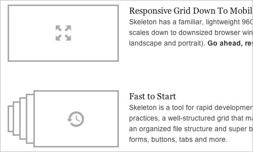
The 320 and Up tool is based on the principle of mobile first (first mobile devices), in which the design is created first for the screens of mobile devices, and then expanded for tablets, desktop PCs and large screens. It works well both as an addition to the HTML5 boilerplate, and separately. 31. Mobile Boilerplate These are customizable templates for creating rich, high-performance mobile web applications. You get cross-browser compatibility for Class A smartphones and good support for older BlackBerry, Symbian, and IE Mobile. As well as a large number of different optimizations for mobile browsers. 32. Skeleton: Beautiful Boilerplate for Responsive, Mobile-Friendly Development
Skeleton: An excellent Boilerplate for responsive development
Skeleton is a small collection of CSS and JavaScript files that will help you quickly develop websites that are equally convenient on any screen, whether it's a 17-inch laptop or iPhone. Skeleton is a well-organized and designed grid that is adaptive up to a mobile phone. It also has styles for most HTML elements that you can use as the basis for your design.
Responsive design frameworks
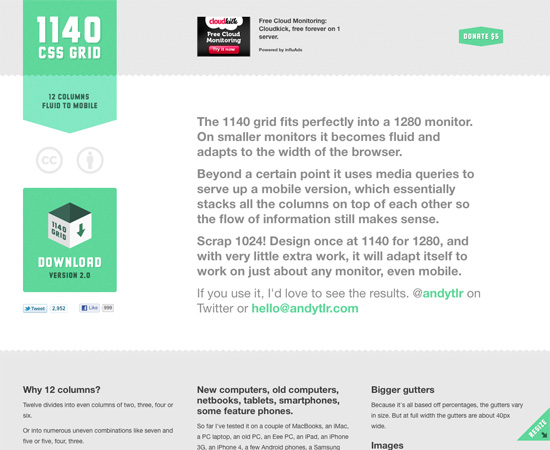
33. 1140 CSS Grid
1140 CSS Grid оптимизирован для работы на экранах от размера мобильных устройств до мониторов 1280px в ширину. Это простая и гибкая сетка, использующая Media Queries.
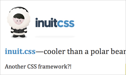
34. inuit.css
Этот CSS-фреймворк — хорошая основа для разработки на крошечных экранах (например, телефоны) и небольших экранах (например, планшеты) прямо из коробки с минимальными усилиями. Помимо этого имеется генератор для создания резинового CSS-фреймворка под себя.
35. Flurid
Flurid — это резиновая сетка на 6, 7, 8, 9, 10, 12 и 16 колонок.
36. FluidGrids
FluidGrids — генератор модульной сетки, который создает макеты из 6, 7, 8, 9, 10, 12 или 16 колонок.
37. Less Framework 4
CSS framework for creating responsive layouts. It contains 4 basic layouts and three typography sets. 38. Fluid Grid System A rubber framework with a focus on typography. 39. Tiny Fluid Grid Tiny Fluid Grid will help you create your own rubber grid of 12, 16 or 24 columns, set their maximum and minimum width and indent in percentage.
Responsive Design Strategies
40. The Responsive Designer’s Workflow
Workflow разработчика адаптивного веб-дизайна
Luke Wroblewski законспектировал презентацию Ethan Marcotte о применении принципов адаптивного веб-дизайна в модернизации сайта одной из ведущих газет. Среди прочего, Ethan объясняет, как он подходит к методологии проектирования адаптивного веб-дизайна и что из себя представляет процесс прототипирования в контексте адаптивного веб-дизайна.
41. The Goldilocks Approach to Responsive Web Design
Подход Goldilocks к Responsive web design
Goldilocks рассматривает макеты, основанные на em, которые отлично выглядят независимо от устройства, с которого просматриваются.
42. Content Choreography
Хореография содержимого
In the article you can read about how to properly plan your site to meet today's standards. Start managing your content so that it’s best served across any width. 43. the Structured the Content First First structured content in this presentation Stephen Hay describes troubles that you may encounter when creating an adaptive site. Stephen shows that we should think first about the proper structuring of content, which will make it universal and conveniently accessible both from a small screen and from a text browser. Your content should be ready to use anywhere. 44. Design for a Target Experience First Design for Target Experience First
Another interesting look at creating responsive design. Nathan C. Ford focuses on the behavior of its visitors, and then based on it creates custom scripts and Media Queries.
“Each site has goals that go beyond simple reading, where a lack of different capabilities can actually destroy a pleasant interaction experience. I am currently working on such a project. Our approach is to learn everything and form the optimal interaction for the most likely user scenarios. By working in this way, we hone every Media Query to perfection. ” 45. More for Responsive Design, Please Even more responsive design, please
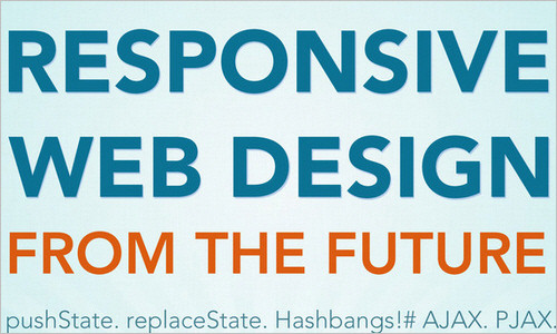
In the article, Jason Things ponders the challenges of responsive design. The article is very well thought out and, as they say, “must read”. 46. Breaking Development Luke Wroblewski took notes at the Breaking Development Conference during Stephen Hay's presentation on design realities for various devices. 47. Patterns for Multiscreen Strategies Templates for Multiscreen Strategies Take a look at this simple but very useful presentation to get an idea of what key factors are crucial in multi-screen concepts. 48. for Responsive the Web Design of Future from the responsive web design from the future
According to Kyle Neath, responsive web design is a broader concept than just screen size. Kyle wrote about how GitHub handles links, about the address bar, about partial page refreshing and explained why he believes that the HTML5 History API is the most important thing that has happened in front-end development since the advent of Firebug. Very inspiring presentation. 49. Developing a Progressive Mobile Strategy Development of advanced mobile strategy In this presentation, Dave Olsen is a progressive mobile strategy, which consists of strategies audiences, content and platforms. Dave believes that in order to develop a sustainable and scalable mobile strategy, you must answer the following questions: “What value does this content have for the target audience?”
50. How to Use CSS3 Media Queries to Create a Mobile Version of Your Website
How to use CSS3 Media Queries to create a mobile version of a site
In this article on Smashing Magazine, Rachel Andrew explains how you can create an iPhone version of your site using just a few CSS rules using CSS3, which will work right now. The article provides a very simple example and the process of adding styles for mobile devices to a site to show how easily we can add mobile-oriented styles to an existing site.
You may also be interested in the following related articles: Aaron Gustafson, “ Responsive Layouts with Media Queries, ” and Emily Lewis, “ Adaptation for Various CSS3 Media Queries Devices .”
Discussions and different perspectives on responsive web design
These articles, although they are not textbooks, can give you valuable information on why you need to use adaptive web design techniques (and when you don't need to).
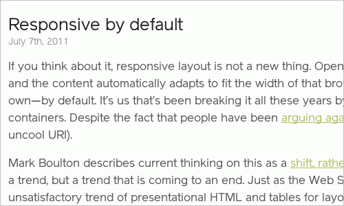
51. Responsive by Default Andy Hume
's default
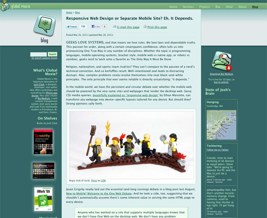
adaptability explains that, in his opinion, adaptability is our everything. This is what makes a site work when it loads through an unknown browser on an unknown device by an unknown person. 52. Responsive Web Design or Separate Mobile Site? Eh, It Depends Responsive Web Design or a standalone mobile site? Depends on the circumstances. An interesting article about the pros and cons of responsive web design compared to a mobile site. 53.
The Case Against Responsive Web Design
Against responsive web design
is quite logical to include in the review opinion as to when an adaptive design appropriate and when not. This article discusses why responsive design does not always make sense in terms of user interaction. Pay attention to interesting comments on the article. Luke Jones has a similar opinion . 54. A Responsive Mind Adaptive Mind Jeremy Keith's blog post discusses the essential elements of responsive design and how to efficiently create different layouts based on different screen sizes. With examples. 55. Responsive Enhancement
An excellent introduction to responsive design as a way of thinking, and not as a tool or technique. Jeremy Keith claims that responsive web design cannot simply be added as a step to an existing workflow. Instead of achieving perfect pixels, we need to achieve perfect proportions.
56. Mobile-First Responsive Web Design
Publication is a combination of philosophy and strategy to accumulate best practices in responsive design.
57. Where are the Mobile First Web Designs?
How far has Mobile First web design gone?
In this article, Jason Grigsby talks about the results of his research on responsive design, its features, and also makes a few comments about the current state of things in the field of adaptive website building.
Additional Resources
Responsive design posts that don't fit in the categories above.
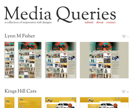
58. Media Queries
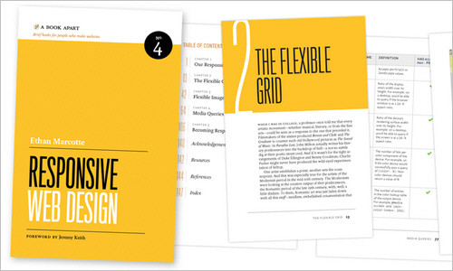
A regularly updated collection of websites that use Media Queries. 59. Responsive Web Design by Ethan Marcotte Responsive Web Design by Ethan Marcotte This book, written by Ethan Marcotte and published by A Book Apart, is a storehouse of responsive website development knowledge. It covers the basics of responsive design, modular grids, responsive images and Media Queries, which is enough to understand how to create a responsive website. 60. The Big Web Show episode # 9: Responsive Web Design
In episode 9 of The Big Web Show, Jeffrey Zeldman and Dan Benjamin invited Ethan Marcotte to discuss responsive design.
For a snack
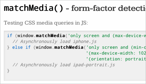
61. The Latest in HTML5
Recent Trends in HTML5
The presentation discusses little-known aspects of HTML5 that can be implemented in browsers in the near future. Among other things, Server Queries Media Queries with JavaScript and device form factor detection.
From translator
62. The first Russian-language blog about responsive design .
A great addition to the article will be a blog about responsive design, in which developers share experiences and write reviews of responsive tools.