Drawing Charts in Chaco
Today I will tell you about a wonderful program called Chaco, which is developed by Enthought.
Chaco is a cross-platform application for creating graphs of any complexity in Python. It focuses on rendering static data, but it also has the ability to create animations.
Just like Mayavi can integrate into Wx and Qt (PyQt and PySide) applications, it is friends with Numpy arrays.
The first step is to install Chaco. We put the dependencies: git, subversion, setuptools, swig, numpy, scipy, vtk, wxpython. For Windows, you will also need to install mingw (vtk and wxpython for Win, I advise you to take www.lfd.uci.edu/~gohlke/pythonlibs from here to save time ). We take away the ETS products from git (the unnecessary can be removed): Then we collect the whole thing: You may have to deliver something else, here you need to look at the build logs. What was missing, install and run the assembly again.
In the ets / chaco / examples folder, you can see a large archive of various examples. The examples are very good, so it’s quite difficult for me to explain something, I get copy-paste code.
I will describe only some unusual graphs that can be built in Chaco:
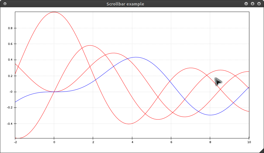
To see how Chaco implements animation, look in the ets / chaco / examples / updating_plot folder
Chaco in HPGL-GUI
The HPGL-GUI needed to build histograms. Matplotlib and Chaco were equally suitable for this. The choice fell on Chaco, because Matplotlib did not support integration into PySide.
The statistics window looks like this: You

can see the code here:
raw.github.com/Snegovikufa/HPGL-GUI/master/gui_widgets/statistics_window.py
PS If you need to talk about embedding in PyQt4 or PySide, I’ll add it.
UPD Updated an example of a financial chart: added detailed comments and made embedding in the PySide widget.
Chaco is a cross-platform application for creating graphs of any complexity in Python. It focuses on rendering static data, but it also has the ability to create animations.
Just like Mayavi can integrate into Wx and Qt (PyQt and PySide) applications, it is friends with Numpy arrays.
Installation
The first step is to install Chaco. We put the dependencies: git, subversion, setuptools, swig, numpy, scipy, vtk, wxpython. For Windows, you will also need to install mingw (vtk and wxpython for Win, I advise you to take www.lfd.uci.edu/~gohlke/pythonlibs from here to save time ). We take away the ETS products from git (the unnecessary can be removed): Then we collect the whole thing: You may have to deliver something else, here you need to look at the build logs. What was missing, install and run the assembly again.
mkdir ets && cd ets

wget github.com/enthought/ets/raw/master/ets.py

python ets.py clone
python ets.py develop
Examples
In the ets / chaco / examples folder, you can see a large archive of various examples. The examples are very good, so it’s quite difficult for me to explain something, I get copy-paste code.
I will describe only some unusual graphs that can be built in Chaco:
Financial:

This example uses embedding in the PySide widget.# -*- coding: utf-8 -*_
# Важное установить переменную QT_API равной pyside до того,
# как происходит импорт модулей Chaco
import os
os.environ['QT_API'] = 'pyside'
os.environ['ETS_TOOLKIT'] = 'qt4'
from PySide import QtGui, QtCore
from numpy import abs, arange, cumprod, random
from enable.example_support import DemoFrame, demo_main
from enable.api import Window, Component, ComponentEditor
from traits.api import HasTraits, Instance
from traitsui.api import Item, Group, View
from chaco.api import ArrayDataSource, BarPlot, DataRange1D, \
LinearMapper, VPlotContainer, PlotAxis, FilledLinePlot, \
add_default_grids, PlotLabel
from chaco.tools.api import PanTool, ZoomTool
# Функция, создающая контейнер с графиками
def _create_plot_component():
# Создадим случайные величины для графиков
numpoints = 500
index = arange(numpoints)
returns = random.lognormal(0.01, 0.1, size=numpoints)
price = 100.0 * cumprod(returns)
volume = abs(random.normal(1000.0, 1500.0, size=numpoints) + 2000.0)
# ArrayDataSource - это массивы, хранящие наши данные
time_ds = ArrayDataSource(index)
vol_ds = ArrayDataSource(volume, sort_order="none")
price_ds = ArrayDataSource(price, sort_order="none")
# LinearMapper - это массивы подписей по осям
xmapper = LinearMapper(range=DataRange1D(time_ds))
vol_mapper = LinearMapper(range=DataRange1D(vol_ds))
price_mapper = LinearMapper(range=DataRange1D(price_ds))
# График цены типа FilledLinePlot с заполнением области под графиком
price_plot = FilledLinePlot(index = time_ds, value = price_ds,
index_mapper = xmapper,
value_mapper = price_mapper,
edge_color = "blue",
face_color = "paleturquoise",
bgcolor = "white",
border_visible = True)
# Добавим сетку и оси
add_default_grids(price_plot)
price_plot.overlays.append(PlotAxis(price_plot, orientation='left'))
price_plot.overlays.append(PlotAxis(price_plot, orientation='bottom'))
# Добавим возможность передвигания графика
price_plot.tools.append(PanTool(price_plot, constrain=True,
constrain_direction="x"))
# Добавим зум
price_plot.overlays.append(ZoomTool(price_plot, drag_button="right",
always_on=True,
tool_mode="range",
axis="index"))
# BarPlot - график в виде "столбиков"
vol_plot = BarPlot(index = time_ds, value = vol_ds,
index_mapper = xmapper,
value_mapper = vol_mapper,
line_color = "transparent",
fill_color = "black",
bar_width = 1.0,
bar_width_type = "screen",
antialias = False,
height = 100,
resizable = "h",
bgcolor = "white",
border_visible = True)
# Добавим сетку и оси
add_default_grids(vol_plot)
vol_plot.underlays.append(PlotAxis(vol_plot, orientation='left'))
vol_plot.tools.append(PanTool(vol_plot, constrain=True,
constrain_direction="x"))
# container - массив наших графиков, управляет их расположением
container = VPlotContainer(bgcolor = "lightblue",
spacing = 20,
padding = 50,
fill_padding=False)
container.add(vol_plot)
container.add(price_plot)
# Добавим надпись над контейнером
container.overlays.append(PlotLabel("Financial Plot",
component=container,
font="Arial 24"))
return container
class Demo(HasTraits):
# HasTraits - особый класс-словарь Traits, который связывается
# с некоторым обработчиком.
plot = Instance(Component)
# View - представление наших графиков.
traits_view = View(
Group(
Item('plot', editor=ComponentEditor(size=(800, 600)),
show_label=False),
orientation = "vertical"),
resizable=True
)
def _plot_default(self):
# Контейнер/график, который отрисовывается по умолчанию
return _create_plot_component()
# Закомментируем стандартное окно, в котором рисуются графики
#class PlotFrame(DemoFrame):
#
# def _create_window(self):
# # создает окно, в котором нужно отрисовать графики
# return Window(self, -1, component=_create_plot_component())
class ChacoQWidget(QtGui.QWidget):
def __init__(self, parent=None):
QtGui.QWidget.__init__(self, parent)
layout = QtGui.QVBoxLayout(self)
frame = Demo()
# Теперь нам нужно создать виджет, для чего вызываем функцию control,
# без нее магия не работает :)
ui = frame.edit_traits(parent=self, kind='subpanel').control
layout.addWidget(ui)
layout.addWidget(QtGui.QPushButton("Hello Habrahabr"))
if __name__ == "__main__":
#demo_main(PlotFrame, size=(800, 600), title="Financial plot example")
app = QtGui.QApplication.instance()
w = ChacoQWidget()
w.resize(800, 600)
w.show()
app.exec_()The selection of colors for the graphs (I'll apply the animation, but in fact, everything changes according to the mouse scroll):

from numpy import arange, exp, sort


from numpy.random import random


from enable.example_support import DemoFrame, demo_main


from enable.api import Component, ComponentEditor, Window


from traits.api import HasTraits, Instance


from traitsui.api import Item, Group, View


from chaco.api import ArrayPlotData, ColorBar, \


                                 ColormappedSelectionOverlay, HPlotContainer, \


                                 jet, LinearMapper, Plot, gist_earth


from chaco.tools.api import PanTool, ZoomTool, RangeSelection, \


                                       RangeSelectionOverlay


#===============================================================================


# # Create the Chaco plot.


#===============================================================================


def _create_plot_component():


    # Create some data


    numpts = 1000


    x = sort(random(numpts))


    y = random(numpts)


    color = exp(-(x**2 + y**2))


    # Create a plot data obect and give it this data


    pd = ArrayPlotData()


    pd.set_data("index", x)


    pd.set_data("value", y)


    pd.set_data("color", color)


    # Create the plot


    plot = Plot(pd)


    plot.plot(("index", "value", "color"),


              type="cmap_scatter",


              name="my_plot",


              color_mapper=gist_earth,


              marker = "square",


              fill_alpha = 0.5,


              marker_size = 8,


              outline_color = "black",


              border_visible = True,


              bgcolor = "white")


    # Tweak some of the plot properties


    plot.title = "Colormapped Scatter Plot with Pan/Zoom Color Bar"


    plot.padding = 50


    plot.x_grid.visible = False


    plot.y_grid.visible = False


    plot.x_axis.font = "modern 16"


    plot.y_axis.font = "modern 16"


    # Add pan and zoom to the plot


    plot.tools.append(PanTool(plot, constrain_key="shift"))


    zoom = ZoomTool(plot)


    plot.overlays.append(zoom)


    # Create the colorbar, handing in the appropriate range and colormap


    colorbar = ColorBar(index_mapper=LinearMapper(range=plot.color_mapper.range),


                        color_mapper=plot.color_mapper,


                        orientation='v',


                        resizable='v',


                        width=30,


                        padding=20)


    colorbar.plot = plot


    colorbar.padding_top = plot.padding_top


    colorbar.padding_bottom = plot.padding_bottom


    # Add pan and zoom tools to the colorbar


    colorbar.tools.append(PanTool(colorbar, constrain_direction="y", constrain=True))


    zoom_overlay = ZoomTool(colorbar, axis="index", tool_mode="range",


                            always_on=True, drag_button="right")


    colorbar.overlays.append(zoom_overlay)


    # Create a container to position the plot and the colorbar side-by-side


    container = HPlotContainer(plot, colorbar, use_backbuffer=True, bgcolor="lightgray")


    return container


#===============================================================================


# Attributes to use for the plot view.


size=(650,650)


title="Colormapped scatter plot"


#===============================================================================


# # Demo class that is used by the demo.py application.


#===============================================================================


class Demo(HasTraits):


    plot = Instance(Component)


    traits_view = View(


                    Group(


                        Item('plot', editor=ComponentEditor(size=size),


                             show_label=False),


                        orientation = "vertical"),


                    resizable=True, title=title


                    )


    def _plot_default(self):


         return _create_plot_component()


demo = Demo()


#===============================================================================


# Stand-alone frame to display the plot.


#===============================================================================


class PlotFrame(DemoFrame):


    def _create_window(self):


        # Return a window containing our plots


        return Window(self, -1, component=_create_plot_component())


if __name__ == "__main__":


    demo_main(PlotFrame, size=size, title=title)
Graphs in polar coordinates:

The code:from numpy import arange, pi, sin, cos
from enthought.enable.example_support import DemoFrame, demo_main
from enthought.enable.api import Window
from enthought.traits.api import false
from enthought.chaco.api import create_polar_plot
class MyFrame(DemoFrame):
def _create_window(self):
numpoints = 5000
low = 0
high = pi*2
theta = arange(low, high, (high-low) / numpoints)
radius = sin(theta*3)
plot = create_polar_plot((radius,theta),color=(0.0,0.0,1.0,1), width=4.0)
plot.bgcolor = "white"
return Window(self, -1, component=plot)
if __name__ == "__main__":
demo_main(MyFrame, size=(600,600), title="Simple Polar Plot")Various polygons:

import math


from numpy import array, transpose


from enable.example_support import DemoFrame, demo_main


from enable.api import Component, ComponentEditor, Window


from traits.api import HasTraits, Instance, Enum, CArray, Dict


from traitsui.api import Item, Group, View


from chaco.api import ArrayPlotData, HPlotContainer, Plot


from chaco.base import n_gon


from chaco.tools.api import PanTool, ZoomTool, DragTool


class DataspaceMoveTool(DragTool):


    """


    Modifies the data values of a plot.  Only works on instances


    of BaseXYPlot or its subclasses


    """


    event_state = Enum("normal", "dragging")


    _prev_pt = CArray


    def is_draggable(self, x, y):


        return self.component.hittest((x,y))


    def drag_start(self, event):


        data_pt = self.component.map_data((event.x, event.y), all_values=True)


        self._prev_pt = data_pt


        event.handled = True


    def dragging(self, event):


        plot = self.component


        cur_pt = plot.map_data((event.x, event.y), all_values=True)


        dx = cur_pt[0] - self._prev_pt[0]


        dy = cur_pt[1] - self._prev_pt[1]


        index = plot.index.get_data() + dx


        value = plot.value.get_data() + dy


        plot.index.set_data(index, sort_order=plot.index.sort_order)


        plot.value.set_data(value, sort_order=plot.value.sort_order)


        self._prev_pt = cur_pt


        event.handled = True


        plot.request_redraw()


#===============================================================================


# # Create the Chaco plot.


#===============================================================================


def _create_plot_component():


    # Use n_gon to compute center locations for our polygons


    points = n_gon(center=(0,0), r=4, nsides=8)


    # Choose some colors for our polygons


    colors = {3:0xaabbcc,   4:'orange', 5:'yellow',    6:'lightgreen',


              7:'green', 8:'blue',   9:'lavender', 10:'purple'}


        # Create a PlotData object to store the polygon data


    pd = ArrayPlotData()


    # Create a Polygon Plot to draw the regular polygons


    polyplot = Plot(pd)


    # Store path data for each polygon, and plot


    nsides = 3


    for p in points:


        npoints = n_gon(center=p, r=2, nsides=nsides)


        nxarray, nyarray = transpose(npoints)


        pd.set_data("x" + str(nsides), nxarray)


        pd.set_data("y" + str(nsides), nyarray)


        plot = polyplot.plot(("x"+str(nsides), "y"+str(nsides)),


                      type="polygon",


                      face_color=colors[nsides],


                      hittest_type="poly")[0]


        plot.tools.append(DataspaceMoveTool(plot, drag_button="right"))


        nsides = nsides + 1


    # Tweak some of the plot properties


    polyplot.padding = 50


    polyplot.title = "Polygon Plot"


    # Attach some tools to the plot


    polyplot.tools.append(PanTool(polyplot))


    zoom = ZoomTool(polyplot, tool_mode="box", always_on=False)


    polyplot.overlays.append(zoom)


    return polyplot


#===============================================================================


# Attributes to use for the plot view.


size=(800,800)


title="Polygon Plot"


#===============================================================================


# # Demo class that is used by the demo.py application.


#===============================================================================


class Demo(HasTraits):


    plot = Instance(Component)


    traits_view = View(


                    Group(


                        Item('plot', editor=ComponentEditor(size=size),


                             show_label=False),


                        orientation = "vertical"),


                    resizable=True, title=title


                    )


    def _plot_default(self):


         return _create_plot_component()


demo = Demo()


#===============================================================================


# Stand-alone frame to display the plot.


#===============================================================================


class PlotFrame(DemoFrame):


    def _create_window(self):


        # Return a window containing our plots


        return Window(self, -1, component=_create_plot_component())


if __name__ == "__main__":


    demo_main(PlotFrame, size=size, title=title)
X-rays:

from __future__ import with_statement


import numpy


from traits.api import HasTraits, Instance, Enum


from traitsui.api import View, Item


from enable.api import ComponentEditor


from chaco.api import Plot, ArrayPlotData, AbstractOverlay


from enable.api import BaseTool


from enable.markers import DOT_MARKER, DotMarker


class BoxSelectTool(BaseTool):


    """ Tool for selecting all points within a box


        There are 2 states for this tool, normal and selecting. While the


        left mouse button is down the metadata on the datasources will be


        updated with the current selected bounds.


        Note that the tool does not actually store the selected point, but the


        bounds of the box.


    """


    event_state = Enum("normal", "selecting")


    def normal_left_down(self, event):


        self.event_state = "selecting"


        self.selecting_mouse_move(event)


    def selecting_left_up(self, event):


        self.event_state = "normal"


    def selecting_mouse_move(self, event):


        x1, y1 = self.map_to_data(event.x-25, event.y-25)


        x2, y2 = self.map_to_data(event.x+25, event.y+25)


        index_datasource = self.component.index


        index_datasource.metadata['selections'] = (x1, x2)


        value_datasource = self.component.value


        value_datasource.metadata['selections'] = (y1, y2)


        self.component.request_redraw()


    def map_to_data(self, x, y):


        """ Returns the data space coordinates of the given x and y.


        Takes into account orientation of the plot and the axis setting.


        """


        plot = self.component


        if plot.orientation == "h":


            index = plot.x_mapper.map_data(x)


            value = plot.y_mapper.map_data(y)


        else:


            index = plot.y_mapper.map_data(y)


            value = plot.x_mapper.map_data(x)


        return index, value


class XRayOverlay(AbstractOverlay):


    """ Overlay which draws scatter markers on top of plot data points.


        This overlay should be combined with a tool which updates the


        datasources metadata with selection bounds.


    """


    marker = DotMarker()


    def overlay(self, component, gc, view_bounds=None, mode='normal'):


        x_range = self._get_selection_index_screen_range()


        y_range = self._get_selection_value_screen_range()


        if len(x_range) == 0:


            return


        x1, x2 = x_range


        y1, y2 = y_range


        with gc:


            gc.set_alpha(0.8)


            gc.set_fill_color((1.0,1.0,1.0))


            gc.rect(x1, y1, x2-x1, y2-y1)


            gc.draw_path()


        pts = self._get_selected_points()


        if len(pts) == 0:


            return


        screen_pts = self.component.map_screen(pts)


        if hasattr(gc, 'draw_marker_at_points'):


            gc.draw_marker_at_points(screen_pts, 3, DOT_MARKER)


        else:


            gc.save_state()


            for sx,sy in screen_pts:


                gc.translate_ctm(sx, sy)


                gc.begin_path()


                self.marker.add_to_path(gc, 3)


                gc.draw_path(self.marker.draw_mode)


                gc.translate_ctm(-sx, -sy)


            gc.restore_state()


    def _get_selected_points(self):


        """ gets all the points within the bounds defined in the datasources


            metadata


        """


        index_datasource = self.component.index


        index_selection = index_datasource.metadata['selections']


        index = index_datasource.get_data()


        value_datasource = self.component.value


        value_selection = value_datasource.metadata['selections']


        value = value_datasource.get_data()


        x_indices = numpy.where((index > index_selection[0]) & (index < index_selection[-1]))


        y_indices = numpy.where((value > value_selection[0]) & (value < value_selection[-1]))


        indices = list(set(x_indices[0]) & set(y_indices[0]))


        sel_index = index[indices]


        sel_value = value[indices]


        return zip(sel_index, sel_value)


    def _get_selection_index_screen_range(self):


        """ maps the selected bounds which were set by the tool into screen


            space. The screen space points can be used for drawing the overlay


        """


        index_datasource = self.component.index


        index_mapper = self.component.index_mapper


        index_selection = index_datasource.metadata['selections']


        return tuple(index_mapper.map_screen(numpy.array(index_selection)))


    def _get_selection_value_screen_range(self):


        """ maps the selected bounds which were set by the tool into screen


            space. The screen space points can be used for drawing the overlay


        """


        value_datasource = self.component.value


        value_mapper = self.component.value_mapper


        value_selection = value_datasource.metadata['selections']


        return tuple(value_mapper.map_screen(numpy.array(value_selection)))


class PlotExample(HasTraits):


    plot = Instance(Plot)


    traits_view = View(Item('plot', editor=ComponentEditor()),


                       width=600, height=600)


    def __init__(self, index, value, *args, **kw):


        super(PlotExample, self).__init__(*args, **kw)


        plot_data = ArrayPlotData(index=index)


        plot_data.set_data('value', value)


        self.plot = Plot(plot_data)


        line = self.plot.plot(('index', 'value'))[0]


        line.overlays.append(XRayOverlay(line))


        line.tools.append(BoxSelectTool(line))


index = numpy.arange(0, 25, 0.25)


value = numpy.sin(index) + numpy.arange(0, 10, 0.1)


example = PlotExample(index, value)


example.configure_traits()
Various markers with highlighting:

from numpy import arange, sort, compress, arange


from numpy.random import random


from enable.example_support import DemoFrame, demo_main


from enable.api import Component, ComponentEditor, Window


from traits.api import HasTraits, Instance


from traitsui.api import Item, Group, View


from chaco.api import AbstractDataSource, ArrayPlotData, Plot, \


                                 HPlotContainer, LassoOverlay


from chaco.tools.api import LassoSelection, ScatterInspector


#===============================================================================


# # Create the Chaco plot.


#===============================================================================


def _create_plot_component():


    # Create some data


    npts = 2000


    x = sort(random(npts))


    y = random(npts)


    # Create a plot data obect and give it this data


    pd = ArrayPlotData()


    pd.set_data("index", x)


    pd.set_data("value", y)


    # Create the plot


    plot = Plot(pd)


    plot.plot(("index", "value"),


              type="scatter",


              name="my_plot",


              marker="circle",


              index_sort="ascending",


              color="red",


              marker_size=4,


              bgcolor="white")


    # Tweak some of the plot properties


    plot.title = "Scatter Plot With Selection"


    plot.line_width = 1


    plot.padding = 50


    # Right now, some of the tools are a little invasive, and we need the


    # actual ScatterPlot object to give to them


    my_plot = plot.plots["my_plot"][0]


    # Attach some tools to the plot


    lasso_selection = LassoSelection(component=my_plot,


                                     selection_datasource=my_plot.index)


    my_plot.active_tool = lasso_selection


    my_plot.tools.append(ScatterInspector(my_plot))


    lasso_overlay = LassoOverlay(lasso_selection=lasso_selection,


                                 component=my_plot)


    my_plot.overlays.append(lasso_overlay)


    # Uncomment this if you would like to see incremental updates:


    #lasso_selection.incremental_select = True


    return plot


#===============================================================================


# Attributes to use for the plot view.


size=(650,650)


title="Scatter plot with selection"


bg_color="lightgray"


#===============================================================================


# # Demo class that is used by the demo.py application.


#===============================================================================


class Demo(HasTraits):


    plot = Instance(Component)


    traits_view = View(


                    Group(


                        Item('plot', editor=ComponentEditor(size=size),


                             show_label=False),


                        orientation = "vertical"),


                    resizable=True, title=title


                    )


    def _selection_changed(self):


        mask = self.index_datasource.metadata['selection']


        print "New selection: "


        print compress(mask, arange(len(mask)))


        print


    def _plot_default(self):


         plot = _create_plot_component()


         # Retrieve the plot hooked to the LassoSelection tool.


         my_plot = plot.plots["my_plot"][0]


         lasso_selection = my_plot.active_tool


         # Set up the trait handler for the selection


         self.index_datasource = my_plot.index


         lasso_selection.on_trait_change(self._selection_changed,


                                        'selection_changed')


         return plot


demo = Demo()


#===============================================================================


# Stand-alone frame to display the plot.


#===============================================================================


class PlotFrame(DemoFrame):


    index_datasource = Instance(AbstractDataSource)


    def _create_window(self):


        component = _create_plot_component()


        # Retrieve the plot hooked to the LassoSelection tool.


        my_plot = component.plots["my_plot"][0]


        lasso_selection = my_plot.active_tool


        # Set up the trait handler for the selection


        self.index_datasource = my_plot.index


        lasso_selection.on_trait_change(self._selection_changed,


                                        'selection_changed')


        # Return a window containing our plots


        return Window(self, -1, component=component, bg_color=bg_color)


    def _selection_changed(self):


        mask = self.index_datasource.metadata['selection']


        print "New selection: "


        print compress(mask, arange(len(mask)))


        print


if __name__ == "__main__":


    demo_main(PlotFrame, size=size, title=title)
To see how Chaco implements animation, look in the ets / chaco / examples / updating_plot folder
Chaco in HPGL-GUI
The HPGL-GUI needed to build histograms. Matplotlib and Chaco were equally suitable for this. The choice fell on Chaco, because Matplotlib did not support integration into PySide.
The statistics window looks like this: You
can see the code here:
raw.github.com/Snegovikufa/HPGL-GUI/master/gui_widgets/statistics_window.py
PS If you need to talk about embedding in PyQt4 or PySide, I’ll add it.
UPD Updated an example of a financial chart: added detailed comments and made embedding in the PySide widget.