New Google Groups UI
Somehow, the news of a change in the interface of Google Groups passed unnoticed, at least for me.
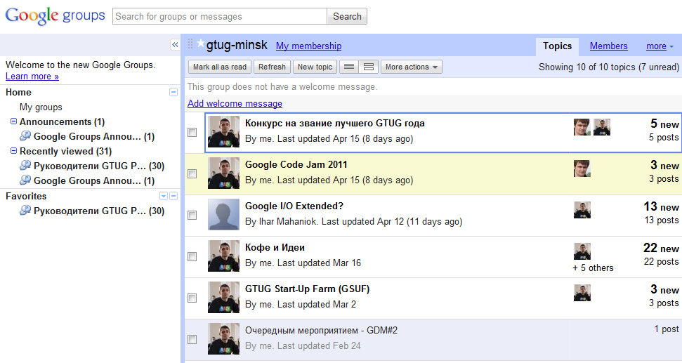
The welcome screen looks as follows Unobtrusively inviting us to get acquainted with the new features of the groups. And what are we offered? Well, the standard social set: • all discussions in one place • the ability to format your messages and attach files • “simplicity and speed” • version for Android ™ and Apple® iOS devices As for me, the interface has now become more modern and got closer to Google Reader and Gmail. And so it was before. The changes affected the following several points: • Linking your Google profile to your Groups account (new user interface)


• Creating a new discussion topic (new user interface)
• Viewing group members (new user interface)
• About the Group and Join Group dialog boxes (new user interface)
• Organizing forums (new user interface)
• Getting started with groups google (new UI)
• welcome screen (new UI)
• my groups screen (new UI)
• forum screen (new UI)
• screen (new uSER sky Interface)
• Setting of participation as a member (new UI)
• The choice of the old and the new Google Groups (new UI)
• Report abuse (in the new user interface)
• Delete the message (new user interface)
• Embed a forum in Google Sites (new user interface)
• Embed multiple forums in Google Sites (new user interface)
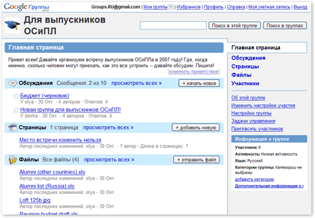
• Google groups (existing user interface) in compared with Google Groups (new user interface)
• Read and reply to forum posts (new user interface)
• Search and join a group (new user interface)
More details It then , in an official statement.
Thanks for attention.
The welcome screen looks as follows Unobtrusively inviting us to get acquainted with the new features of the groups. And what are we offered? Well, the standard social set: • all discussions in one place • the ability to format your messages and attach files • “simplicity and speed” • version for Android ™ and Apple® iOS devices As for me, the interface has now become more modern and got closer to Google Reader and Gmail. And so it was before. The changes affected the following several points: • Linking your Google profile to your Groups account (new user interface)


• Creating a new discussion topic (new user interface)
• Viewing group members (new user interface)
• About the Group and Join Group dialog boxes (new user interface)
• Organizing forums (new user interface)
• Getting started with groups google (new UI)
• welcome screen (new UI)
• my groups screen (new UI)
• forum screen (new UI)
• screen (new uSER sky Interface)
• Setting of participation as a member (new UI)
• The choice of the old and the new Google Groups (new UI)
• Report abuse (in the new user interface)
• Delete the message (new user interface)
• Embed a forum in Google Sites (new user interface)
• Embed multiple forums in Google Sites (new user interface)
• Google groups (existing user interface) in compared with Google Groups (new user interface)
• Read and reply to forum posts (new user interface)
• Search and join a group (new user interface)
More details It then , in an official statement.
Thanks for attention.
