 September 15, 2011 at 12:16
Comme il faut user interface
I want to say right away that in this article we will not talk about web design, but about the design of the interface of computer programs.
For the user, the end product is not a program, but an interface. He never thinks about how the program works, while it successfully copes with its tasks. Therefore, it is very important that the interface attracts the end user, and does not frighten off acquaintances with him in the first seconds.
Often, the development of the software interface is done by the programmers themselves, who wrote this software. Moreover, as a rule, not every programmer can boast of having design abilities, or at least experience in this regard.
There is no and will not be a correct answer to the question “how to make a good interface”, however, some general recommendations can be deduced that, although they will not answer the question “how to do it,” they will certainly tell you “how to do it no need.” Following such recommendations will not necessarily give a stunning result, but it will help not to make frequent interface design errors and make it as convenient and attractive as possible for the user.
The recommendations written below are aimed at software developers who have never really thought about the interface of the programs they develop, focusing only on the internal device. If the program implies as a user not only the developer himself, but also any other people, then it is worth paying some attention to the appearance of the program.
Some recommendations will already be familiar or obvious to you, I will not deny it. Therefore, please treat this positively; repetition is the mother of learning.
User orientation. When designing an interface, you need to think as a user, not as a programmer. This is not so simple, because you won’t erase knowledge of the internal structure of a program. But you must definitely try to put yourself in the place of the user, make a sketch of the interface that could satisfy the user, and only then take up the implementation.
Buttons come in several forms:
From the informal definition of the command button, it follows that only by pressing it can an action be initiated, and in no case not by pressing checkboxes or radio buttons.
The size: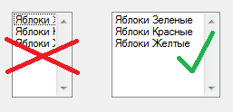
The size:
location of the signature on the input field is a sore subject. But you will not be mistaken if you place it above or to the left of the field. Other tricks rarely can add to the usability and attractiveness of the interface.
Text:
The most common mistake is to give pictograms to all menu items. Pictograms should be provided with the most important menu items, and then within reason. In general, it is better that the number of elements with an icon does not exceed half the number of all elements. Most often, the user navigates through the menu precisely according to the pictograms (“the element I need is located under the blue pictogram, and the other between those two green ones”). And if the icons are in excess, then the user will not look at them in principle, since they will lose orientation properties, and you will have to read the labels.
Grouping:
V.V. Golovach. "User Interface Design . "
Jeff Ruskin. "Interface: new directions in the design of computer systems . "
Jennifer Tidwell. "Development of user interfaces . "
Recommendations by Alan Cooper and Steve Krug.
For the user, the end product is not a program, but an interface. He never thinks about how the program works, while it successfully copes with its tasks. Therefore, it is very important that the interface attracts the end user, and does not frighten off acquaintances with him in the first seconds.
Who is responsible for the design?
Often, the development of the software interface is done by the programmers themselves, who wrote this software. Moreover, as a rule, not every programmer can boast of having design abilities, or at least experience in this regard.
There is no and will not be a correct answer to the question “how to make a good interface”, however, some general recommendations can be deduced that, although they will not answer the question “how to do it,” they will certainly tell you “how to do it no need.” Following such recommendations will not necessarily give a stunning result, but it will help not to make frequent interface design errors and make it as convenient and attractive as possible for the user.
The recommendations written below are aimed at software developers who have never really thought about the interface of the programs they develop, focusing only on the internal device. If the program implies as a user not only the developer himself, but also any other people, then it is worth paying some attention to the appearance of the program.
Some recommendations will already be familiar or obvious to you, I will not deny it. Therefore, please treat this positively; repetition is the mother of learning.
Design Recommendations
User orientation. When designing an interface, you need to think as a user, not as a programmer. This is not so simple, because you won’t erase knowledge of the internal structure of a program. But you must definitely try to put yourself in the place of the user, make a sketch of the interface that could satisfy the user, and only then take up the implementation.
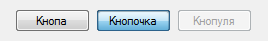
Buttons
Buttons come in several forms:
- direct action buttons (command buttons), start some kind of action;
- menu access buttons, the name speaks for itself;
- checkboxes and radio buttons allow the user to choose from a variety of options.
From the informal definition of the command button, it follows that only by pressing it can an action be initiated, and in no case not by pressing checkboxes or radio buttons.
The size:
- The Fitts law applies to the size of the button - the larger the button, the easier it is to get into it with the cursor. It follows that the buttons must be made large. However, this is not always correct, in some cases it is justified to use small buttons.
- In addition, the sizes of several buttons located in one window should be equal or at least proportional.
- It is undesirable to place the buttons close to each other, it is better to leave an empty space between them, because it is one thing when the user misses the button, and quite another - if, having missed, he also mistakenly presses another button.
- It is completely unacceptable to remove from view those buttons that cannot be pressed; instead, they must be made inactive, otherwise the user will be lost (“I swear, this button has just been here!”).
- The group should not have less than two radio buttons (this is obvious, however, there are cases ...). In addition, at least one radio button should be checked by default, this is often forgotten.
- The vertical order of the checkboxes and the radio buttons is desirable, the arrangement in two or three columns is acceptable, but not at all in a variety of ways. The user should immediately see which buttons belong to which group.
- If possible, the inscription on the button should be in the form of a verb in the form of an infinitive (Come, See, Click) and reflect the essence as accurately as possible.
- You should pay more attention to the use of the “OK” button and, if possible, replace “OK” with the corresponding verb. We read about it here: Why the OK button is now considered a bad form in design .
- It is advisable to completely abandon the use of the "Apply" button, especially in the set OK-Apply-Cancel. This combination of buttons gives rise to some user uncertainties, we will not discuss which ones.
- There should be some indication on the menu access button that it exactly displays the menu (the best option is the down / side arrow).
- Button captions should not contain negation in order to avoid possible user misconceptions.
- The user will tell you a special thank you if the signatures to the checkboxes and radio buttons will also respond to clicking.
Lists
- As in the case of checkboxes and radio buttons, lists should in no case initiate any action, than sites with a choice of a city, language and other things that usually go to another page usually sin.
- If the "empty" element is present in the single selection list, then this should not be an empty string, the "nothing" meta element should be used.
- In the multiple choice list, the presence of the “all values” meta-element is desirable.
- If possible, list items should be sorted in some way, if not by type, then at least alphabetically.
- The width of the list should be sufficient at least so that the user can distinguish between its elements.
- The height of the list should not exceed 7-8 lines. This number of elements is easier to remember.
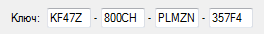
Input fields
The size:
- The width of the field should correspond to the amount of text entered.
- Also, the width of the field should not be greater than the maximum length of the line. If the user has entered the maximum number of characters in the field and is observing an empty space, then he might think that he was mistaken somewhere, there is no need to mislead the user.
location of the signature on the input field is a sore subject. But you will not be mistaken if you place it above or to the left of the field. Other tricks rarely can add to the usability and attractiveness of the interface.
Menu
Text:
- The name of the menu should be the most effective of all possible. The ideal option is a one-word name.
- If a menu item brings up a dialog box, then the ellipsis "..." must be assigned to the name.
- Switching elements are best checked with a check mark than changing the label of an element. The menu should not change over time.
The most common mistake is to give pictograms to all menu items. Pictograms should be provided with the most important menu items, and then within reason. In general, it is better that the number of elements with an icon does not exceed half the number of all elements. Most often, the user navigates through the menu precisely according to the pictograms (“the element I need is located under the blue pictogram, and the other between those two green ones”). And if the icons are in excess, then the user will not look at them in principle, since they will lose orientation properties, and you will have to read the labels.
Grouping:
- Always group menu items, do not be afraid of excessive use of delimiters. You will only help the user navigate your menu faster.
- Group items should be as logical as possible, and based on the logic of the user, not the programmer.
- Mutually exclusive elements should preferably be placed in a separate hierarchy level.
- The context menu should not be the only way to call functions.
- The menu is preferably made not particularly long, 7-8 items.
- In the context menu, order is especially important - the first should be more relevant elements.
Other
- Horizontal scrollbars are very bad. The user does not like them.
- The name of the document should go first in the title bar of the window, and only then the application. A vivid example is Microsoft Word 2003: “Microsoft Word - Document1.doc”, and with a large number of open windows in the task bar, the names of documents will not be distinguishable.
- The status line must be used either as an indicator of the status of the system, or as a toolbar for advanced users. The worst option is to use the status bar as tooltips when you hover over a particular window element.
- Toolbar is undesirable to be the only way to call functions.
- If the system performs a long operation, the cursor must be changed to “cursor with a watch”. In any case, the user must be notified that the system is doing something, not idle.
- For longer operations, attention should be paid to the user. For example, a progress bar is surprising, but it speeds up time. You can also use some kind of sound (for example, in solitaire, when you deal, the sound of cards is heard).
- When the system has completed a lengthy operation, you need to notify the user, for example, "squeak".
References
V.V. Golovach. "User Interface Design . "
Jeff Ruskin. "Interface: new directions in the design of computer systems . "
Jennifer Tidwell. "Development of user interfaces . "
Recommendations by Alan Cooper and Steve Krug.