Twenty Best Web Fonts
- Transfer
Now is the time to improve the design of your work with web fonts
Without exaggeration, network typography is currently experiencing an exciting period in its life. Recent technological leaps have brought us one step closer to typographic nirvana on the Internet. The step everyone has been waiting for.
The freedom to use web fonts outside the safe list on all leading operating systems has become possible, by and large, thanks to three main, almost simultaneous technological factors: widespread support for the @ font-face rule in browsers; the emergence of such "font stores" as Typekit and Fontdeck ; creating a new font format - the archived WOFF font file.
Translation Sponsor: Aiken Studio *
But, as they say, having great power, we bear an even greater responsibility. Therefore, the ability to choose a variety of fonts from an extensive library does not always mean the need to make this very choice; the same can be said about drawing in a limited color palette. In addition, there are many alternative fonts, most of which are free, so they are widely used among the masses and are quite undeservedly popular.
In fact, all this is part of a much bigger problem. There is an opinion on the net (especially in the design communities) that fonts are not worth paying. This opinion is erroneous. Because, as a result, it harms both individual talented designers around the world and the design community as a whole.
To create a font, like any other form of design, a designer uses all his many years of experience and talent, and he takes this lesson a lot of time. The advantages of a professionally designed font include such properties as: the ability to choose the font style and style (helps to group a complete font family), carefully selected kerning, support for several languages with international characters, expressive glyphs and various writing settings. All this is very rare in free fonts.

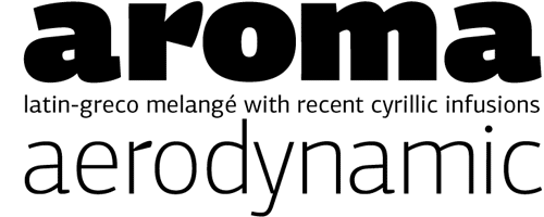
For this reason, almost each of the twenty fonts below has its own paid option. Free versions from the so-called Typekit font repository are also available.
We add that we focused exclusively on fonts regularly used on the web. So, topple on your back and discover 20 fonts that you will definitely want to use again and again ...
20. Avenir
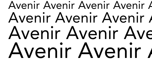
Family: Sans serif
Designer: Adrian Frutiger
Download or buy: Fonts.com
Avenir’s design is based on the ubiquitous Futura font (which was conceived as “Die Schrift für die Neue Zeit” - “Modern Font”). However, according to designer Adrian Frutiger, the font Avenir is much more humanity. Despite its popularity in corporate circles, its rounded geometric shapes and subtle personality will give a friendly smile to even the most serious content.
A few years later, Akira Kobayashi completed Avenir Next, a font that became an improved version of the original (italics and small caps were added to the new version.)
19. FF Kava
Family: Sans serif
Designer: Yanone Kaffeesatz
Download or buy: FontShop The
free version of the font was published at a time when browser support for the @ font-face rule was widespread, which earned its popularity among designers. As a result, the young German designer Janon came into the view of one of the world's largest manufacturers of digital fonts - the company FontShop FSI, which later led to the birth of a professional version of this font.
18. Times New Roman
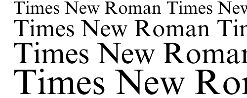
Family: Serif ( system font )
Designer: Victor Lardent, Stanley Morison
Everyone who creates lists similar to ours will not forget about this font. Probably the most common font. Designed by designers Stanley Morison and Victor Larden.
17. Bree
Family: Sans serif
Designer: José Scaglione, Veronika Burian
Download or buy: Typekit , Fontdeck
Full of personality, impudent and sloppy, the Bree font may seem to be suitable only for headings, because for the first time we saw it on the TypeTogether logo. However, practice shows that Bree looks pretty elegant and smaller in size.
Bree is one of the few fonts that came to light as a result of the collective work of two people: Jose Skaglione and Veronica Burian, students of the Department of Printing Design at British University of Reading. Which, in turn, is considered one of the best educational institutions in the world, preparing talented graphic designers.
16. FF Trixie
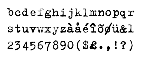
Family: Typewriter
Designer: Erik van Blokland
Download or Buy: FontShop
Trixie is one of the first typescript fonts. It will be indispensable in writing headlines for sad events (accidents, natural disasters, etc.). The author managed to convey the aesthetics of typewriting, which with confidence can be called an achievement.
15. Centro Sans pro
Family: Serif
Designer: Panos Vassiliou
Download or buy: Fontdeck
A large number of super-families allow designers to create mixed types of fonts where serif is intertwined with sans serif. This is done to improve the readability and appearance of letters, at the same time. The Centro Sans pro font is one of the representatives of such super-families.
14. Fedra Sans
Family: Sans serif
Designer: Peter Bil'ak)
Download or buy: Typotheque
Another representative of the super-families who began their journey as a corporate font of the German insurance company Bayerische Rück. Designed in the Typotheque font library with the goal of serving people well, both on screen and on paper.
It is worth noting that this project was suspended and launched several times: either the customer decides to cancel it, then it starts to hesitate, or the equipment is completely stolen from the developer's office. But thanks to designer Peter Bilyak, he managed to not only finish, but also significantly improve the project. As a result, a largely universal font was obtained.
13. Museo Slab
Family: Slab serif
Designer: Jos Buivenga
Download or buy: Typekit , Fontdeck , Font Squirrel
The original version of Museo is extremely popular among designers and is half free. The font belongs to the Opentype format. It has support for a large number of languages.
12. Clarendon URW
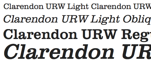
Family: Slab serif
Designer: Robert Besle, Hermann Eidenbenz
Download or buy: Typekit , Fontdeck , Font Squirrel
A classic British serif font, which no similar list can do without. Improved by Hermann Eidenbenz, it includes several types of density and shapes.
11. Proxima Nova
Family: Sans serif
Designer: Mark Simonson
Download or buy: Typekit , Fontdeck
Incredibly flexible and readable font, is an improved version of Proxima Sans, used in many scripts. It has many styles, which increases the number of fonts of this family to forty-two.
10. FF Unit Slab
Family: Slab serif
Designer: Erik Spiekermann, Christian Schwartz, Chris Sowersby
Download or buy: FontShop
Font managed to fall in love with many, not excluding me. It can produce radically opposite impressions on the user in various densities. Which makes it in some way a unique font.
09. Calluna
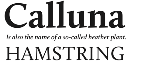
Family: Serif
Designer: Jos Buivenga
Download or buy: Typekit , Fontdeck , Font Squirrel Was
born as an experiment on the early version of Museo Slab and Calluna and became the first serious font in the career of designer Jos Buivenga.
Like other Jos fonts, it is endowed with many features of the Opentype format and has a free version available to users.
08. Ronnia Condensed
Family: Sans Serif
Designer: José Scaglione, Veronika Burian
Download or buy: Typekit
The most suitable word to describe it is universality. Looks best in headlines. It is used for various purposes, so you can see it both in the news headlines and in corporate reports of enterprises.
07. Droid Sans
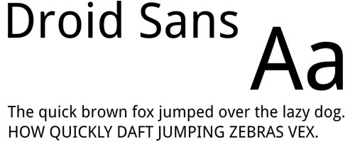
Family: Sans Serif
Designer: Steve Matteson
Download or buy: Typekit , FontsLive , Webtype
The Droid font family was developed by designer Steve Matteson in the fall of 2006. The main task of the designer was to create a readable and high-quality font, primarily for mobile phones. Later, fonts of this family were optimized for using various software, browsers, etc. in the menu.
06. FF Tisa
Family: Serif
Designer: Mitja Miklavcic
Mitya Maklavchich created the font to meet the technological and aesthetic requirements of modern magazines. He set himself the goal of developing a softer and more dynamic version of the font. Thanks to the low contrast of its outlines, Tisa perfectly reads even in the smallest sizes, whether on the pages of books, or printed with a low-resolution laser printer.
05. FF DIN
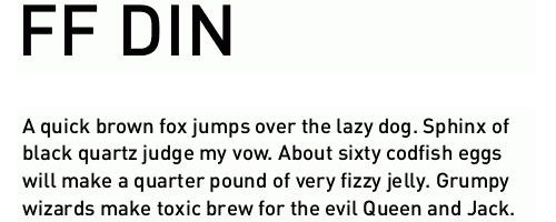
Family: Sans serif
Designer: Albert-Jan Pool
Download or buy: Typekit , FontShop
A modern font developed by a Dutch designer. The abbreviation "DIN", translated from German, means "German Institute for Standardization". Originally used as text on road signs and apartment numbers. But for many years now, its purely business geometric shapes adorn German web design. In 1995, it was updated by Albert-Jan Poole, the update included more stylistic options, as well as a new DIN Rounded format.
04. Helvetica
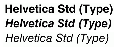
Family: Sans Serif
Designer: Max Miedinger, Eduard Hoffmann
Download or Buy: Fonts.com
It seems impossible to discuss typography without mentioning Helvetica. The font has earned the status of a legend due to the fact that almost every designer in the world uses it. His name and style are known to the public.
Helvetica was designed to compete with the Akzidenz-Grotesk font, and its original name was Die Neue Haas Grotesk. The font represents the Swiss graphic design style of the distant 1950s. But its widespread use in all forms of design led to the fact that it was "boring" to some extent, and therefore several more of its sub-forms, such as Arial, were developed. However, it remains a modern classic.
03. Alternate Gothic No.1
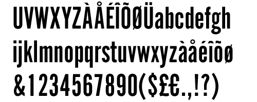
Family: Sans serif
Designer: Morris Fuller Benton
Download or buy: Fontdeck
Fantastic font for writing headlines. Alternate Gothic and its variants remain an extremely popular choice for those who need an impartial, almost impudent font. Clear at relatively small sizes. Being a particle of American industrialism, it also looks great in the digital age.
It became extremely popular after the design studio “The League of Moveable Type” created its updated version with open sources.
02. FF Meta Serif
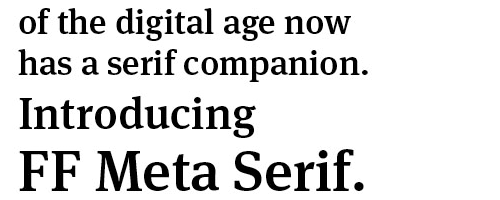
Family: Serif
Designer: Christian Schwartz, Erik Spiekermann, Kris Sowersby
Download or buy: Typekit , FontShop
Eric Shpikerman describes his Meta family as “close to the classics”, and frankly shy, because the Meta font is really a classic, especially the version without serif. This is an authoritative font that works great with various scripts.
01. Georgia
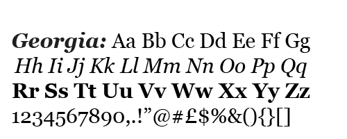
Family: Serif
Designer: Matthew Carter
Download or Buy: Typekit , FontShop
What? System font at the top of the ranking? No matter how hard it is to believe, Georgia is a favorite of people working on the network. Perhaps the answer lies in the fact that it was designed more for the "screen" than for printing, or maybe because it was able to embody infinite beauty and clarity due to its simplicity.
Extremely clear with small dimensions and magnificent in its cursive version, Georgia confirms its value, despite the abundance of alternatives, and recalls that sometimes, the best tools are right under our nose.
This collection was first published in .net Issue 208
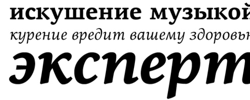
* Few of these fonts are for Cyrillic, so this selection is more suitable for "outsourcers". We hope that soon at least some of these and not only fonts for the Slavic languages in Cyrillic will appear.
PS For whom only cyrillic web fonts are of interest, look at this collection: lyncis.info/en/post/274