We make it convenient and beautiful for ourselves (about the IDE / editor settings)
A friend of mine once said: “I look at the code eight hours a day, and I want it to be pleasant.” He meant the quality of the code, and here everything is clear (or, conversely, nothing is clear). But what about the image itself? Is everything good with him? Is it possible to do better? These are questions that just recently occurred to me, and I decided to take them seriously. It turned out that this field is not plowed for improvements.
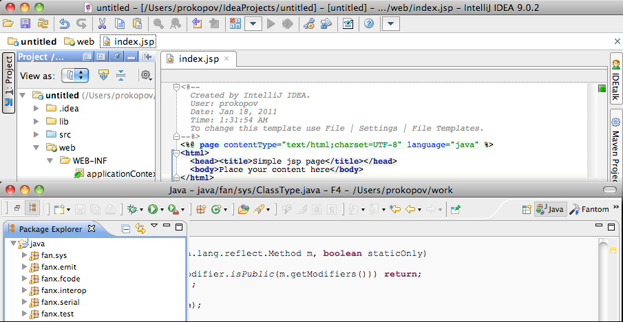
What does the programmer screen look like at the time of writing the code? Usually this is the window of an IDE or text editor: (pictures, if you want to understand what it is about, it is better to look at 100% - they are clickable).

Let's do the work in this window as fast, simple and enjoyable as possible with the available tools (that is, we will not rebuild or rewrite anything). There are three main areas: visual noise of the interface, font and syntax highlighting.
Visual noise is removed by turning off all unnecessary and minimizing rarely needed panels. We turn off the panels of the operating system (the taskbar in Windows, the dock in the Mac - it’s not at all necessary to constantly stare at them, and they take up decent places). We turn off all notifications in instant messengers, indicators of unread letters, and so on - it is better to check mail / read the message at the time of a break than to get distracted during work and interrupt the stream. The IDE itself is also full of noise - for example, in Eclipse I always disable Outline; I make Project drawer and Console jump, and in the editor window I remove the bands Folding, Quick diff and Line numbers. It turns out baaaa-alshoe window exclusively with text.
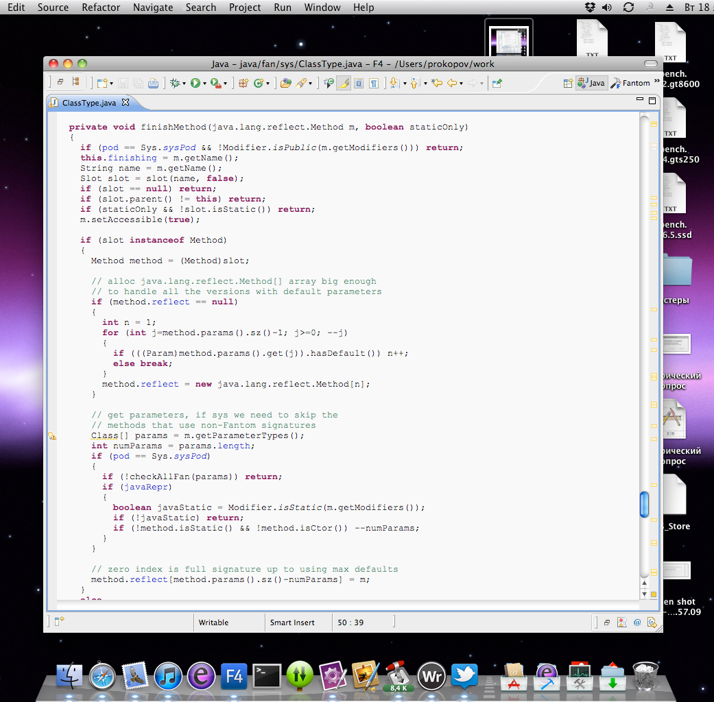
My preference for Eclipse over the Idea is connected with noise - the bright clumsy icons of the latter make a lot more noise than the uniform grayness of Eclipse. If it were my will, I would have done most of the icons in black and white in the IDE. Well, to bring the idea to its logical end, it remains to enable full-screen mode. I’m still waiting for it to become an integral function of the IDE as an editor, designed for a long and focused work. Writers, for example, understood everything for a long time, and there are a lot of full-screen editors for texts - while programmers are lagging behind progress. Therefore, we will do with third-party plugins. (in the picture is a full-screen text editor WriteRoom)


The next item in our program is the font. Here, each is his own master, but there are some common points. First of all, we, Russian programmers, need a Cyrillic alphabet. This narrows the range of options almost exclusively to suites that come with popular operating systems. Secondly, italics are desirable (I will explain this later). Thirdly, opinions differ here, but for me pixel fonts and non-anti-aliased fonts are not an option at all, but my eyes stumble at every step. Fourthly - already almost optionally - crossed out zero.
In any case, if you suddenly still use Couirer New for some misunderstanding - immediately replace it with the much more readable Consolas (it has been supplied since Vista).
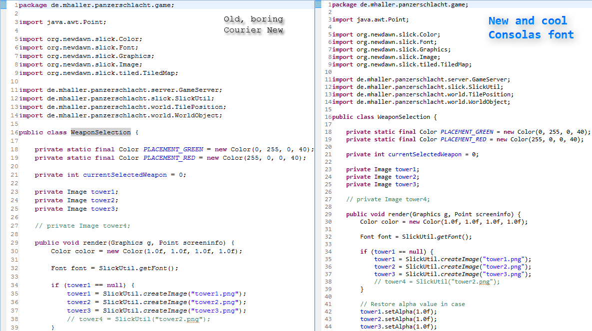
Linuxoids cost something like DejaVu Sans Mono, I probably don’t know. On the Mac, both Monaco and Menlo are nice (from 10.6), and if you have Windows, you can try to pull Consolas. In general, the query “programming fonts” in the well-known search engine gives enough discussion and interesting options.
I want to share a recent discovery: Nitty Light . I learned about it from Writer for iPad (lyrical digression: it's such a text editor with a very cool interface and typography. The creators paid attention to the most important thing in it - the text, attracted serious font designers. It turned out an editor in which it’s nice to type text- This, believe me, has not happened yet. And this is largely due to Nitty Light). So, even after a very, very good Consolas, this font is just awesome. You look at the screen and it seems that you have finally sharpened. Words are read themselves. The drawing is very beautiful, harmonious. I never thought that such a pleasure can just be experienced from the font. And - the greatest miracle - most recently added the Cyrillic alphabet - something that you can’t count on even in your wildest dreams! The kit has a special zero and ligatures, so I had to edit the font a bit - ligatures look strange in a monospaced font; but overall I did it. It costs € 54 one style. The only thing is that the size must be set at least 15 points, otherwise the "=" sign sticks together.
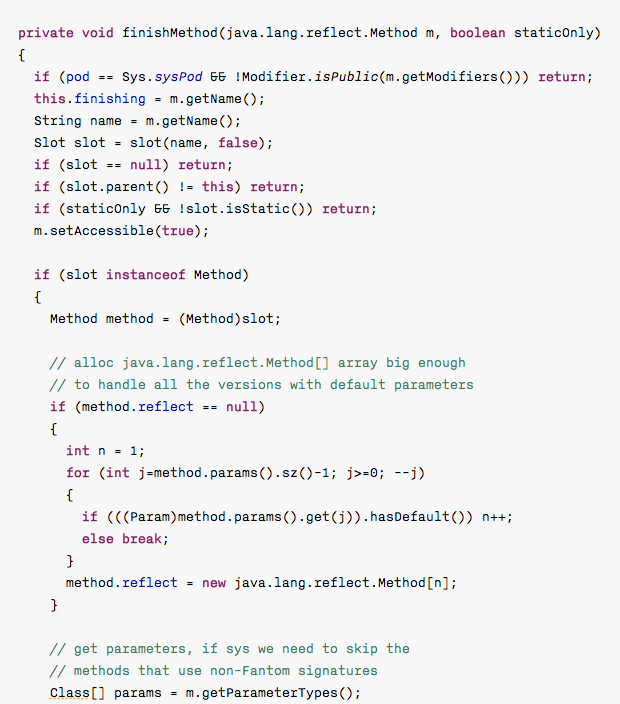
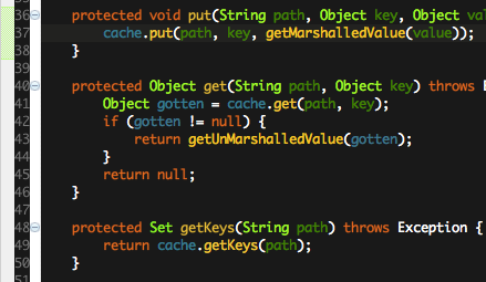
The last obstacle to our good goal, one of the biggest is syntax highlighting. Of course, most programmers either do not configure it at all, or choose from the kit that comes with the IDE. This is absolutely normal behavior - relying on a professionally tuned thing, the problem, unfortunately, is that the vast majority of color sets are made incorrectly. Let's look here: The author of the topic decided to highlight the maximum possible number of language constructions, but did not take into account that with an increase in the number of colors, all this turns into a color mess, both incomprehensible and difficult to read at the same time. There are fewer colors in this picture, you can even read something, but look at how the brackets are highlighted. As if this is the most important thing in the program.

As a result, I formulated several rules for myself, and, rolling up my sleeves, went to adjust the color theme manually (especially since there is no other option in Eclipse):
It's time to evaluate the path traveled. Here's what happened: And here's what happened:

What does the programmer screen look like at the time of writing the code? Usually this is the window of an IDE or text editor: (pictures, if you want to understand what it is about, it is better to look at 100% - they are clickable).
Let's do the work in this window as fast, simple and enjoyable as possible with the available tools (that is, we will not rebuild or rewrite anything). There are three main areas: visual noise of the interface, font and syntax highlighting.
Visual noise is removed by turning off all unnecessary and minimizing rarely needed panels. We turn off the panels of the operating system (the taskbar in Windows, the dock in the Mac - it’s not at all necessary to constantly stare at them, and they take up decent places). We turn off all notifications in instant messengers, indicators of unread letters, and so on - it is better to check mail / read the message at the time of a break than to get distracted during work and interrupt the stream. The IDE itself is also full of noise - for example, in Eclipse I always disable Outline; I make Project drawer and Console jump, and in the editor window I remove the bands Folding, Quick diff and Line numbers. It turns out baaaa-alshoe window exclusively with text.
My preference for Eclipse over the Idea is connected with noise - the bright clumsy icons of the latter make a lot more noise than the uniform grayness of Eclipse. If it were my will, I would have done most of the icons in black and white in the IDE. Well, to bring the idea to its logical end, it remains to enable full-screen mode. I’m still waiting for it to become an integral function of the IDE as an editor, designed for a long and focused work. Writers, for example, understood everything for a long time, and there are a lot of full-screen editors for texts - while programmers are lagging behind progress. Therefore, we will do with third-party plugins. (in the picture is a full-screen text editor WriteRoom)
The next item in our program is the font. Here, each is his own master, but there are some common points. First of all, we, Russian programmers, need a Cyrillic alphabet. This narrows the range of options almost exclusively to suites that come with popular operating systems. Secondly, italics are desirable (I will explain this later). Thirdly, opinions differ here, but for me pixel fonts and non-anti-aliased fonts are not an option at all, but my eyes stumble at every step. Fourthly - already almost optionally - crossed out zero.
In any case, if you suddenly still use Couirer New for some misunderstanding - immediately replace it with the much more readable Consolas (it has been supplied since Vista).
Linuxoids cost something like DejaVu Sans Mono, I probably don’t know. On the Mac, both Monaco and Menlo are nice (from 10.6), and if you have Windows, you can try to pull Consolas. In general, the query “programming fonts” in the well-known search engine gives enough discussion and interesting options.
I want to share a recent discovery: Nitty Light . I learned about it from Writer for iPad (lyrical digression: it's such a text editor with a very cool interface and typography. The creators paid attention to the most important thing in it - the text, attracted serious font designers. It turned out an editor in which it’s nice to type text- This, believe me, has not happened yet. And this is largely due to Nitty Light). So, even after a very, very good Consolas, this font is just awesome. You look at the screen and it seems that you have finally sharpened. Words are read themselves. The drawing is very beautiful, harmonious. I never thought that such a pleasure can just be experienced from the font. And - the greatest miracle - most recently added the Cyrillic alphabet - something that you can’t count on even in your wildest dreams! The kit has a special zero and ligatures, so I had to edit the font a bit - ligatures look strange in a monospaced font; but overall I did it. It costs € 54 one style. The only thing is that the size must be set at least 15 points, otherwise the "=" sign sticks together.
The last obstacle to our good goal, one of the biggest is syntax highlighting. Of course, most programmers either do not configure it at all, or choose from the kit that comes with the IDE. This is absolutely normal behavior - relying on a professionally tuned thing, the problem, unfortunately, is that the vast majority of color sets are made incorrectly. Let's look here: The author of the topic decided to highlight the maximum possible number of language constructions, but did not take into account that with an increase in the number of colors, all this turns into a color mess, both incomprehensible and difficult to read at the same time. There are fewer colors in this picture, you can even read something, but look at how the brackets are highlighted. As if this is the most important thing in the program.
As a result, I formulated several rules for myself, and, rolling up my sleeves, went to adjust the color theme manually (especially since there is no other option in Eclipse):
- Highlight the important and ignore the unimportant. It is not necessary to highlight every nuance of syntax.
- There should be few colors - two or three plus black, otherwise their meaning will be impossible to remember, and reading will be constantly interrupted due to color changes.
- Colors should not scream or be bright, otherwise they will again interfere with reading. They must be combined; be distinguishable enough.
- Color is the most powerful way of highlighting, so each color corresponds to a large semantic layer, and subtle differences inside this layer are highlighted by other means or not at all (see paragraph 1). I have these variables and class fields (one layer); constants (strings / numbers /
true/false/null- second) and comments / decorators / annotations (third). Functions and methods, as well as types, did not get a layer - the colors ran out. Therefore, functions and types are what are black. This is not scary, because some of them with a lowercase letter, while others with a capital letter, you will not confuse. - I do not use bold. If you need to additionally highlight something inside the semantic layer - select italics; so graceful and less hollows in the eyes. For example, these are class fields from the first layer.
- Any husk, like
for/if/else/returnbrackets, is the least important thing in the program; you just don’t need to highlight them. I tried to make them faded, but it turned out too overloaded. Therefore, they are also black.
It's time to evaluate the path traveled. Here's what happened: And here's what happened: