January 9, 2011 at 21:10
35 logos with hidden meaning

The design of a simple logo is sometimes gray and boring if it is developed without a share of imagination. Many popular brands have simple but effective logos. Remember the logo design of the famous FedEx . It looks elementary and artless, but in fact it is a great idea with a hidden meaning, which lies in the arrow between the letters "E" and "x". This arrow symbolizes the development and success of the company.
This is one of the biggest challenges for designers. Creating abstract logos with effective “hidden messages” is much more important than
This is because if the logo does not convey the whole "essence" of the company, then the brand will not work. One of the most popular logo design techniques isnegative space .
So, let's start in order.
(pictures are clickable)
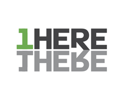
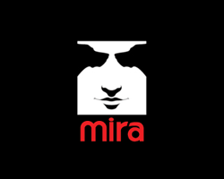
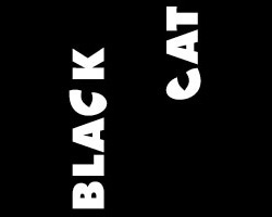
1. 1 Here 1 There: This hidden message has a double meaning. The reflection of the word “1HERE” resembles the word “THERE”, resulting in “1HERE THERE”. There is also an arrow between the two letters "R", like FedEx. 2. Mira: The first time we notice only a human face on the logo. If you look closely, you can see two black negative areas on the right and left, resembling the faces of dogs. 3. Black Cat: If you look at the logo vertically, you only see the inscription “Black Cat”. However, looking horizontally, you will notice that the letters “C” in both words resemble the eyes
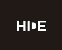
4. Hide: This is a great example of using the negative space technique. The letter "D" is hidden in the word "HIDE". For the first time, “HIDE” can be read with a small white “D”, but if you look closely, you can see the “big” letter “D” in a black border around the small one. 5. AMAZING: An impressive hidden logo, it uses a labyrinth to hide the word "MAZE", which in translation means the same labyrinth. A play on words. 6. Countercurrent: As you can see, the negative space between the four arrows creates another, showing in the opposite direction (countercurrent - opposite). This is the hidden meaning in the logo of the “opposite” company. 7. Helping Hands for Pets:


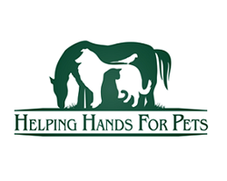
This logo shows a rather creative approach to using negative space. We see many animals in one. Inside the horse hid a cat, a dog and even a bird.
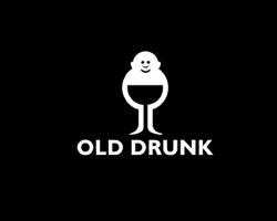
8. Shit Talking: This is a weird but pretty funny logo. The quotes are arranged in such a way as to create a toilet bowl inside them, which is the logo chip. 9. Old Drunk: The logo may look like a fat standing man, but if you look closely, you can see the glass inside, which he holds. 10. Kolner Zoo: The meaning of the logo is in the silhouette of an elephant, which is formed from a giraffe, a rhinoceros and a cunningly hidden double spire of Cologne Cathedral between the hind legs. 11. Galant Shoes:



The Bulgarian shoe manufacturer Galant has hidden in the hidden logo a black crescent moon, which shows the silhouette of the shoe, creating a large letter "G" in the negative.
12. My Fonts: At first glance, the logo is absolutely not impressive, it looks more like a regular lettering in a non-standard font. However, looking closely at the letters "My", you can see the silhouette of a human hand.


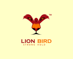
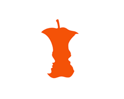
15. Zoorganic: This logo contains two hidden messages. Under the wings of an eagle you can see a horse and a wolf. 16. Strength: The Strength logo uses a combination of illusion and negativity to create a hidden meaning. Hidden faces are visible on the left and right side of the apple. 17. Oak Bros: You can see only a leaf on this logo, however, if you look closely, you will notice three little men under it. 18. Hidden Cork: This logo demonstrates the play of the letters “h” and “c” to create a glass. And if you look vertically, you can see the same letters.



This logo is just perfect for finance and consulting.
It uses negative space to create the letter “S” and the dollar sign “$” with two hands brought together.
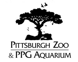
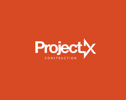
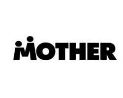
20. Pittsburgh Zoo and Aquarium: And this logo, using negative space, is one of the most creative. It may seem that there is nothing besides a tree on it. Having looked closely, you will see a gorilla and a tiger. 21. Project X Construction: The Project X Construction logo uses the idea of FedEx. On it you can see the arrow between the letters "t" and "X". 22. Mother: It resembles the Families logo , on which the letter “M” depicts a mother and a child holding hands. 23. Hands up:
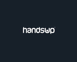
The hidden message in this logo is hard to understand. If you carefully look at the letter "U", you can see the little man with his hands up (Eng. Hands up - hands up).
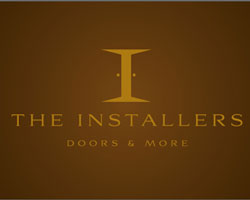
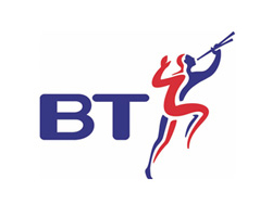
24. The Installers: This logo is for those involved in industrial and installation work. The letter "I" consists of two opening doors. 25. British Telecom: Many of you may not have known this. The famous BP logo has a hidden idea. Since British Telecom is a telephone company, two people act as a logo: blue speaks and red listens. 26. AG Low Construction logo: In this logo, the company name is written in thin square letters, which together are similar to the plan of the apartment, which is the company's activity.

27. Embrace Beer: This logo uses negative space to hide

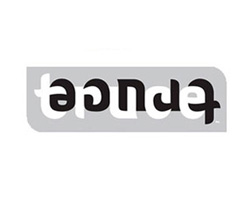
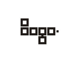
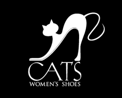
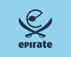
30. Logo: The squares in this logo form the word “Logo” around itself. This is what I call simple and enjoyable. 31. ELECTRIC: This logo is one of the best of its kind. Pay attention to how the cord with the plug goes through the whole word "ELECTRIC". 32. Cats: The Cats logo reveals the imagination of authors in the best possible way. The cat has the shape of a beautiful female shoe. 33. Epirate: Another creative logo. The letter "e" is drawn in such a way as to look like the head of a pirate holding a sword in his hands. 34. Bones: In the word “Bones”, bones stick out from each letter. 35. Two Wolves Two wolves form the Arabic numeral "2".



This topic is a translation of article 35 of New Hidden Logos of 2010 .
Also on the hub there was already a similar selection of logos with a hidden meaning.