Vector rendering: 3d graphics in icon design
I bring to your attention a popular science article from our trideshnik Andrey Pushkin ( push ) about ways to turn 3D into a vector. Since there are a lot of problems with this, this is only the first article of the whole cycle.
Over the past few years, technologies in 3D graphics have been developing at a frantic pace. Algorithms for calculating photorealistic images, an increase in processor cores and RAM (as well as a new rendering technology using the GPU) made it possible to obtain high-quality images at home. 3D has become a powerful graphic design tool. There are a number of undeniable advantages of using the “three-dimensional” approach, and the most important and essential is the speed of work.
A reasonable question arises: is it possible to use 3D graphics in the design of icons, logos and pictograms? After all, these branches of graphic design are traditionally “vector”. In addition to the advantages of the 3D approach (speed, ease of changing angles, the right perspective, etc.), there are a number of serious drawbacks that make drawing icons only in the 3D editor almost impossible:
1. It is very difficult to accurately get into colors or get “ pure "colors. Often in icon design, you need to follow a given gamut. The thing is that 3D graphics is designed to produce photorealistic images. And the color of any real object depends on the ambient light scattered and direct light. So even setting the exact colors in the material editor, we will almost never get the desired color at the output.

The illustration shows that even when setting “pure” colors in the material settings (colors and their codes are shown on the dice), we get “dirty” colors on the final render.
2. Unable to hit the pixels.
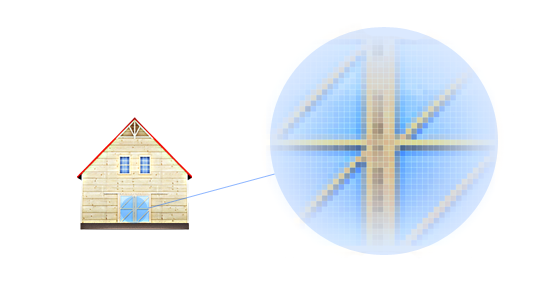
The picture shows that neither vertical nor horizontal lines fall into the pixels. Hence the feeling of general “blurred” image.
3. It is difficult to get the exact size of the object. Everyone understands that when rendering, you can safely set the frame size. But try rendering the rectangle exactly to the size 127? 84 pixels. Almost everything needs to be done "by eye".
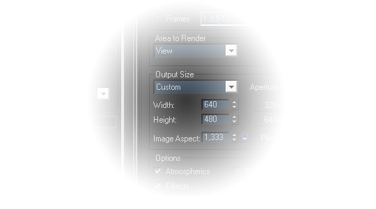
As you can see, even in the 3ds max program (one of the most powerful programs for 3D graphics), it is possible to configure only frame sizes, not individual objects.
4. It is laborious enough to build an accurate perspective. This item looks controversial and always puzzles people who do not work in 3D. You can build a correct and natural perspective, you can build a 2-point perspective. But often in the guidelines the exact construction angles are set, and following them is a non-trivial task for the 3deshnik.
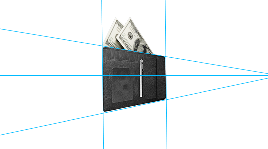
Here the illustration shows the exact lines of building a perspective. Many icon drawing guides (such as Windows XP) indicate the exact angles at which the perspective grid is built. To get into them during rendering, you need to really try to do this, as I did with the illustration of the wallet (it is clear that the distant edge has not become completely vertical :)).
5. Photorealism :)In 3D it is much easier to make a photorealistic image than vice versa. It’s difficult to get rid of the feeling of “3 things in the icons.”

The picture shows 2 road cones - a render on the left, an icon on the right. For many illustrations, rendering photorealism would be preferable, but still in the icons it is not always out of place and getting rid of it is quite difficult.
There are a number of purely technical problems (not always clear alpha channel allocation, incomprehensible white strokes with some filters in Vray, the difficulty of obtaining translucent shadows, etc.) Well, the last and most important drawback:
6. Impossibility of vector rendering
Solving the last 6th problem would immediately discard everyone else. Modern rendering technologies are very complex and in essence work "pixel by pixel". All those solutions that now exist to obtain a vector at the output are just an analog of tracers. And if there is still no sane trace algorithm for bitmap images, you can forget about vector rendering. But the main problem here is one: at the moment, no trace algorithm can construct gradients sane. The most advanced divide the object into a vector mesh and assign a specific fill to each cell. No gradients. This means that obtaining photorealistic vector images is a thing of the distant future.
So how to integrate 3D into icon design? Now there are only 3 main ways to do this. Each of them deserves a separate article, we will immediately go over them briefly.
1. Direct image tracing in AI (or in other external tracing programs). The only way such a method can help is to build the correct perspective and shape of the object. There are a couple of subtleties. First, before tracing, you need to separate the image from the background. Secondly, for proper tracing, it is necessary to render the object without reflections, glare and transparency. The best option is to use any NPR render. Photorealism is the enemy of tracing :)
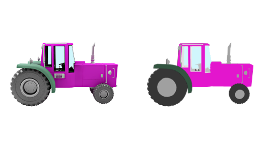
On an illustration 2 images of a tractor. On the left is a render with reflection settings disabled, on the right is a traced vector image in AI.
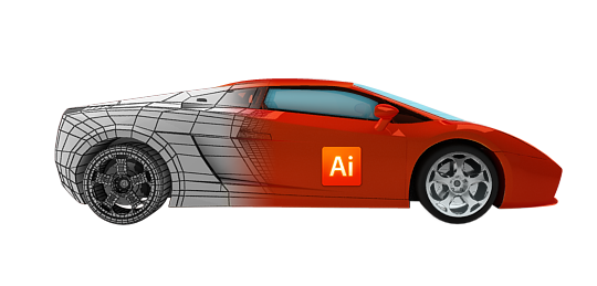
2. Stroke the raster render in AI (or overlay vector shapes in PS). The most "low-tech", but, unfortunately, the most effective method. In fact, this is the only serious way to introduce 3D into the process of creating icons. To do this, you need to render the image as close as possible to the desired result. All glare, reflexes, colors. And then, in the finished image, the designer draws a vector image.
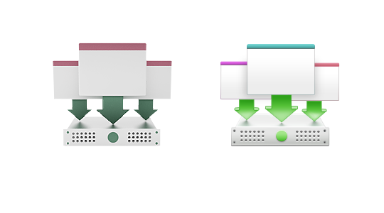
The results of this process are visible in the picture - on the left is a “naked” render, on the right is a vector icon drawn on it.
The approach gives good results in complex and large icons (for example, when rendering equipment, especially with wheels :))
3. Vector rendering programs and plugins. Today there are 2 main tools that develop this direction. This is Illustrate! and Swift 3D. I use both products as plugins and external renders for 3ds max. Also, the standard 3ds max render - Mental Ray allows you to render the edges and contours of objects directly in EPS. Although these areas are developing quite actively (from version to version Swift 3d is getting better), it is still very far from real vector rendering. At the moment, all that Swift3D can do is a vector mesh with objects grouped by color. It is practically impossible to continue working with him. The only use case is 2-color rendering, when the entire image is decomposed into 2 primary colors, and each of them becomes a separate object with a fill.
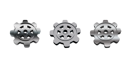
In the picture, the first gear is rendered by a photorealistic visualizer (bitmap). The second is Swift3D with a 2-color rendering setting (Cartoon Two Color Fil) in EPS format. Opening this file in AI, we get 2 objects: gray and black. The latter is with 1 gradient applied to a gray object in AI. As you can see, if you work with this further, you can get a completely acceptable result.
Today we do not have a universal method, and each of these three is good in specific situations. Summarizing, I will say one thing - it makes sense to use 3D in the design of icons only in cases where the size exceeds 128x128 pixels or there are many details with a complex shape. And until a new revolutionary technology for vector rendering has appeared, AI will remain the main tool for the icon designer :)
PS: I work in 3ds max, modo and mudbox. Perhaps this is not the case in other editors, but the general principles and problems are relevant for the 3D approach to icon design in all programs. There may be slightly different ways of obtaining vector blanks, for example, in Rhinoceros, it is possible to obtain a vector directly by importing from the program. But this is essentially the same as rendering to an EPS format using Mental Ray.
Over the past few years, technologies in 3D graphics have been developing at a frantic pace. Algorithms for calculating photorealistic images, an increase in processor cores and RAM (as well as a new rendering technology using the GPU) made it possible to obtain high-quality images at home. 3D has become a powerful graphic design tool. There are a number of undeniable advantages of using the “three-dimensional” approach, and the most important and essential is the speed of work.
A reasonable question arises: is it possible to use 3D graphics in the design of icons, logos and pictograms? After all, these branches of graphic design are traditionally “vector”. In addition to the advantages of the 3D approach (speed, ease of changing angles, the right perspective, etc.), there are a number of serious drawbacks that make drawing icons only in the 3D editor almost impossible:
1. It is very difficult to accurately get into colors or get “ pure "colors. Often in icon design, you need to follow a given gamut. The thing is that 3D graphics is designed to produce photorealistic images. And the color of any real object depends on the ambient light scattered and direct light. So even setting the exact colors in the material editor, we will almost never get the desired color at the output.
The illustration shows that even when setting “pure” colors in the material settings (colors and their codes are shown on the dice), we get “dirty” colors on the final render.
2. Unable to hit the pixels.
The picture shows that neither vertical nor horizontal lines fall into the pixels. Hence the feeling of general “blurred” image.
3. It is difficult to get the exact size of the object. Everyone understands that when rendering, you can safely set the frame size. But try rendering the rectangle exactly to the size 127? 84 pixels. Almost everything needs to be done "by eye".
As you can see, even in the 3ds max program (one of the most powerful programs for 3D graphics), it is possible to configure only frame sizes, not individual objects.
4. It is laborious enough to build an accurate perspective. This item looks controversial and always puzzles people who do not work in 3D. You can build a correct and natural perspective, you can build a 2-point perspective. But often in the guidelines the exact construction angles are set, and following them is a non-trivial task for the 3deshnik.
Here the illustration shows the exact lines of building a perspective. Many icon drawing guides (such as Windows XP) indicate the exact angles at which the perspective grid is built. To get into them during rendering, you need to really try to do this, as I did with the illustration of the wallet (it is clear that the distant edge has not become completely vertical :)).
5. Photorealism :)In 3D it is much easier to make a photorealistic image than vice versa. It’s difficult to get rid of the feeling of “3 things in the icons.”
The picture shows 2 road cones - a render on the left, an icon on the right. For many illustrations, rendering photorealism would be preferable, but still in the icons it is not always out of place and getting rid of it is quite difficult.
There are a number of purely technical problems (not always clear alpha channel allocation, incomprehensible white strokes with some filters in Vray, the difficulty of obtaining translucent shadows, etc.) Well, the last and most important drawback:
6. Impossibility of vector rendering
Solving the last 6th problem would immediately discard everyone else. Modern rendering technologies are very complex and in essence work "pixel by pixel". All those solutions that now exist to obtain a vector at the output are just an analog of tracers. And if there is still no sane trace algorithm for bitmap images, you can forget about vector rendering. But the main problem here is one: at the moment, no trace algorithm can construct gradients sane. The most advanced divide the object into a vector mesh and assign a specific fill to each cell. No gradients. This means that obtaining photorealistic vector images is a thing of the distant future.
So how to integrate 3D into icon design? Now there are only 3 main ways to do this. Each of them deserves a separate article, we will immediately go over them briefly.
1. Direct image tracing in AI (or in other external tracing programs). The only way such a method can help is to build the correct perspective and shape of the object. There are a couple of subtleties. First, before tracing, you need to separate the image from the background. Secondly, for proper tracing, it is necessary to render the object without reflections, glare and transparency. The best option is to use any NPR render. Photorealism is the enemy of tracing :)
On an illustration 2 images of a tractor. On the left is a render with reflection settings disabled, on the right is a traced vector image in AI.
2. Stroke the raster render in AI (or overlay vector shapes in PS). The most "low-tech", but, unfortunately, the most effective method. In fact, this is the only serious way to introduce 3D into the process of creating icons. To do this, you need to render the image as close as possible to the desired result. All glare, reflexes, colors. And then, in the finished image, the designer draws a vector image.
The results of this process are visible in the picture - on the left is a “naked” render, on the right is a vector icon drawn on it.
The approach gives good results in complex and large icons (for example, when rendering equipment, especially with wheels :))
3. Vector rendering programs and plugins. Today there are 2 main tools that develop this direction. This is Illustrate! and Swift 3D. I use both products as plugins and external renders for 3ds max. Also, the standard 3ds max render - Mental Ray allows you to render the edges and contours of objects directly in EPS. Although these areas are developing quite actively (from version to version Swift 3d is getting better), it is still very far from real vector rendering. At the moment, all that Swift3D can do is a vector mesh with objects grouped by color. It is practically impossible to continue working with him. The only use case is 2-color rendering, when the entire image is decomposed into 2 primary colors, and each of them becomes a separate object with a fill.
In the picture, the first gear is rendered by a photorealistic visualizer (bitmap). The second is Swift3D with a 2-color rendering setting (Cartoon Two Color Fil) in EPS format. Opening this file in AI, we get 2 objects: gray and black. The latter is with 1 gradient applied to a gray object in AI. As you can see, if you work with this further, you can get a completely acceptable result.
Today we do not have a universal method, and each of these three is good in specific situations. Summarizing, I will say one thing - it makes sense to use 3D in the design of icons only in cases where the size exceeds 128x128 pixels or there are many details with a complex shape. And until a new revolutionary technology for vector rendering has appeared, AI will remain the main tool for the icon designer :)
PS: I work in 3ds max, modo and mudbox. Perhaps this is not the case in other editors, but the general principles and problems are relevant for the 3D approach to icon design in all programs. There may be slightly different ways of obtaining vector blanks, for example, in Rhinoceros, it is possible to obtain a vector directly by importing from the program. But this is essentially the same as rendering to an EPS format using Mental Ray.