5 checkmarks: usability checklist
We have identified 5 main points by which you can determine the usability of the site. The list is controversial and mainly relates to selling sites. And yes, these five points are the arithmetic average of the experience gained while processing applications for the “ Usable Web Project ” competition . Do you think we distributed elephants and forgot? original image
When we offered to give free comments on usability to everyone, we received 166 applications. We spent up to half an hour on each site.
Mistakes, of course, were repeated. His head was puffy, and we continued to write the same comments. The result of the marathon was the checklist below.
Immediately make a reservation that we do not evaluate usability in a vacuum, it is important for us that the site works, i.e. "Sold." Goods, services, ideas - it doesn’t matter. We can talk about a free web service for which the registration of a visitor will become a transaction.
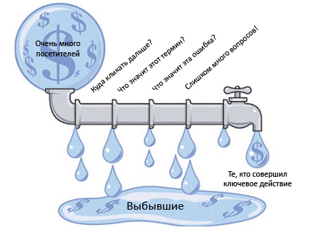
So, we write TK for the site, come up with useful sections, include in the list both articles, news, and the product catalog - apparently, this will be the perfect site! And on the main page you will see all this splendor. The user must evaluate each piece of information with which we carefully filled our brainchild.
I open the site and see a blurry spot.
No, I don’t see interesting news, I don’t see the most popular products, I don’t see your phone and I don’t see all sections of the catalog.
Why?
Probably because I see this site for the first time. You spent on contextual advertising, search engine promotion, and finally, your client visited the site. Ten times duplicated information, sections hidden in each other, an abundance of menu items, long texts, a non-standard design that claims to be original - all this, in truth, is confusing, time-consuming, annoying and frightening.
The menu should ideally be one and start in the upper left corner. I enter the house through the porch and do not expect to be asked to use the window.
Horizontal or vertical?
Sections
Submenu and subsections
Information should not be duplicated. Two different menus should not have the same items.
Firstly, when I see a large number of elements on the page, I am already mentally straining. “So, there are a lot of sections, a lot of information. How can I find the right one? ”
Secondly, I am wasting my time to realize that the text is duplicated. Think, "it's just a couple of seconds"? On the Internet, an account goes to them. An extra second is annoying .
There are exceptions to the rule.
What if a site visitor does not see the information in one place - let's just post it in several at the same time?
The truth is that each element must have its own, only possible place. When it is needed, it is very easy to find.
Elements should be selected logically and graphically .
After reading the next paragraph, designers who have ever drawn animated caps in half a screen and flash masterpiece sites will post a minus.
Custom design often has nothing to do with usability. Beautiful, but non-functional.
In the best case, because of the desire to stand out, they have the main menu on the right. Arabs are probably comfortable. But most of the planet reads from left to right and therefore begins to inspect the site from the upper left corner.
It is there that everyone is used to seeing the logo, clicking on which you can always get to the main page. Under it, everyone is used to seeing the main menu, with which you can get to the main sections of the site.
Setting new standards and challenging conservative foundations is a noble undertaking. But please do not ask me to pour tea into the cup through the hole on the side.
Very often, the main transaction between the visitor and the site owner is a phone call or contact in any other way.
Often, contact information is modestly indicated in the basement or on a separate page "Contacts", a link to which is only in the lower menu. In other words, in the dead zone . What the heck? After all, everything was started solely so that the visitor could call, talk with a kind (God forbid) consultant and finally make a purchase.
So why not place contacts on every page and in a prominent place, for example, in a header or at least on the first screen?
The same applies to other transactional elements: the buttons "Add announcement" or "Registration", etc.
Suppose we did everything right and are now ready to fill out the main page. What should be on it?
Less is better. If the visitor sees a clear menu and convenient navigation elements, he will find what he needs. Maybe the telephone number is enough for him.
The main page should answer the question “What is this site about?” If this is not obvious (and most often it is), the main page should have explanations. The most specific.
I go to the site and think:
The description of the site in one or two sentences can and should be placed under the logo. For example, this: “An online store of exclusive cat food. Delivery in Yekaterinburg and throughout Russia. "
So, in the header is the logo, explanation, contacts. Somewhere nearby is the main menu. And what about the remaining place?
Do not “kill” him. Minimalism rules. Of course, we want to pay special attention to the exclusive and brand new. Or maybe we want to put a Twitter widget. It's possible. The keywords here are exclusive and fresh content .
Of course, you can reproach us that you SEO SEOs will never miss the opportunity to saturate the text with search queries a little more than completely, turning it into a sheet. And you will be right.
Of course, in such things one must restrain oneself. And if you still have a sheet, you should separate it from the key content.
The first contact with the site is extremely important. Even if you are concerned about creating special entry pages, the main thing is the face. And by it the user will judge whether you are interested in it or not.
To interest the visitor, you should try to “sell the product” live. All questions, doubts and objections that the “potential buyer” will demonstrate must be worked out on the site.
Keeping this idea in mind, go through the checklist:
 I have one or two menus, they are clear and logical,
information is duplicated only when necessary, the
design is familiar and clear at first glance,
contacts and other transactional elements in a prominent place,
about which the site , understandably the main thing; it cannot be confused with a related site.
You may not agree with us, but we believe that if you have five checkmarks, your site has good usability.
Immediately make a reservation that we do not evaluate usability in a vacuum, it is important for us that the site works, i.e. "Sold." Goods, services, ideas - it doesn’t matter. We can talk about a free web service for which the registration of a visitor will become a transaction.
First contact
So, we write TK for the site, come up with useful sections, include in the list both articles, news, and the product catalog - apparently, this will be the perfect site! And on the main page you will see all this splendor. The user must evaluate each piece of information with which we carefully filled our brainchild.
I open the site and see a blurry spot.
No, I don’t see interesting news, I don’t see the most popular products, I don’t see your phone and I don’t see all sections of the catalog.
Why?
Probably because I see this site for the first time. You spent on contextual advertising, search engine promotion, and finally, your client visited the site. Ten times duplicated information, sections hidden in each other, an abundance of menu items, long texts, a non-standard design that claims to be original - all this, in truth, is confusing, time-consuming, annoying and frightening.
Main menu
The menu should ideally be one and start in the upper left corner. I enter the house through the porch and do not expect to be asked to use the window.
Horizontal or vertical?
- If the menu has few items, it can be made horizontal, if more than 5 - make it vertical.
- If the menu is a list (for example, a list of services), make it vertical.
- If in doubt, make the menu vertical.
Sections
- Names must be unambiguous. The user must understand what is in the section before it goes there, and not after.
- If the menu has more than 9 items, simplify it. Combine items under headings or place in a submenu.
Submenu and subsections
- It is good when the submenus are opened by clicking, and not when hovering.
- Subsections should always be visible when I am in the “mother” section.
- In the submenu, there should only be something that clearly refers to this section. It is better to make a separate section than to add a sub-item “to the heap”.
- Use bread crumbs.
Duplication of information
Information should not be duplicated. Two different menus should not have the same items.
Firstly, when I see a large number of elements on the page, I am already mentally straining. “So, there are a lot of sections, a lot of information. How can I find the right one? ”
Secondly, I am wasting my time to realize that the text is duplicated. Think, "it's just a couple of seconds"? On the Internet, an account goes to them. An extra second is annoying .
There are exceptions to the rule.
- Bread crumbs . Duplicate links in the menu by definition.
- Contact information . If the required transaction involves a phone call, then the phone should be on every page.
- Content attributes . For example, product parameters should be indicated both in the catalog (briefly) and on the product page (in full).
- Keywords . Within texts can be repeated. But the texts themselves should not be duplicated in meaning.
- In hypermarkets without a specific focus, “laptop bags” can simultaneously fall into the “Laptops” and “Bags” sections.
- Actual duplication . Sometimes the same information is equally relevant in several places: a phone number on pages devoted to different services of one organization, instructions for installing the program on the download page and on the help page, etc. As a rule, it does not take up much space.
To attract attention
What if a site visitor does not see the information in one place - let's just post it in several at the same time?
The truth is that each element must have its own, only possible place. When it is needed, it is very easy to find.
Elements should be selected logically and graphically .
- Each element should be where I will most likely be looking for it. First, think about what questions the client asks when he comes to the site: “Will they deliver the goods to my city?”, “Where can I find a washing machine with a vertical feed?”, Etc. And then build a hierarchy according to this logic, combining the general and highlighting the particular.
- The element should be visible on its own. Just do not need big red letters, tooltips and bulky blocks. Just separate the elements from each other, and make the active elements look like active ones (buttons, tabs, menu items, links).
Custom design
After reading the next paragraph, designers who have ever drawn animated caps in half a screen and flash masterpiece sites will post a minus.
Custom design often has nothing to do with usability. Beautiful, but non-functional.
In the best case, because of the desire to stand out, they have the main menu on the right. Arabs are probably comfortable. But most of the planet reads from left to right and therefore begins to inspect the site from the upper left corner.
It is there that everyone is used to seeing the logo, clicking on which you can always get to the main page. Under it, everyone is used to seeing the main menu, with which you can get to the main sections of the site.
Setting new standards and challenging conservative foundations is a noble undertaking. But please do not ask me to pour tea into the cup through the hole on the side.
Transaction elements
Very often, the main transaction between the visitor and the site owner is a phone call or contact in any other way.
Often, contact information is modestly indicated in the basement or on a separate page "Contacts", a link to which is only in the lower menu. In other words, in the dead zone . What the heck? After all, everything was started solely so that the visitor could call, talk with a kind (God forbid) consultant and finally make a purchase.
So why not place contacts on every page and in a prominent place, for example, in a header or at least on the first screen?
The same applies to other transactional elements: the buttons "Add announcement" or "Registration", etc.
Home page
Suppose we did everything right and are now ready to fill out the main page. What should be on it?
Less is better. If the visitor sees a clear menu and convenient navigation elements, he will find what he needs. Maybe the telephone number is enough for him.
The main page should answer the question “What is this site about?” If this is not obvious (and most often it is), the main page should have explanations. The most specific.
I go to the site and think:
- “Yes, I see that this is an online store, but what does it sell?”
- “Yes, I realized that this is a site about Teddy bears, but what is it: an online store, a manufacturer’s website, an amateur club?”
- “Yes, I realized that this is a news feed, but what is the topic?”
- "Dental clinic. Is she even in my city? ”
- “Yeah, this is something about the Internet. Damn, I’m already on the Internet! It seems that this is not Habr, what new can I find here ?! ”
The description of the site in one or two sentences can and should be placed under the logo. For example, this: “An online store of exclusive cat food. Delivery in Yekaterinburg and throughout Russia. "
So, in the header is the logo, explanation, contacts. Somewhere nearby is the main menu. And what about the remaining place?
Do not “kill” him. Minimalism rules. Of course, we want to pay special attention to the exclusive and brand new. Or maybe we want to put a Twitter widget. It's possible. The keywords here are exclusive and fresh content .
Of course, you can reproach us that you SEO SEOs will never miss the opportunity to saturate the text with search queries a little more than completely, turning it into a sheet. And you will be right.
Of course, in such things one must restrain oneself. And if you still have a sheet, you should separate it from the key content.
The first contact with the site is extremely important. Even if you are concerned about creating special entry pages, the main thing is the face. And by it the user will judge whether you are interested in it or not.
Summary
To interest the visitor, you should try to “sell the product” live. All questions, doubts and objections that the “potential buyer” will demonstrate must be worked out on the site.
Keeping this idea in mind, go through the checklist:
I have one or two menus, they are clear and logical, information is duplicated only when necessary, the design is familiar and clear at first glance, contacts and other transactional elements in a prominent place, about which the site , understandably the main thing; it cannot be confused with a related site. You may not agree with us, but we believe that if you have five checkmarks, your site has good usability.