Web typography revolution with HTML 5? Not so fast
The new generation of browsers supports HTML 5, and with it, in addition to all the useful innovations, the ability to use any fonts on web pages. When only this became known, the happiness of many web designers (and especially those who also work with printing) knew no bounds. Still, earlier fonts suitable for use on the web could be counted on the fingers of one hand, and now grab and put any font in general!
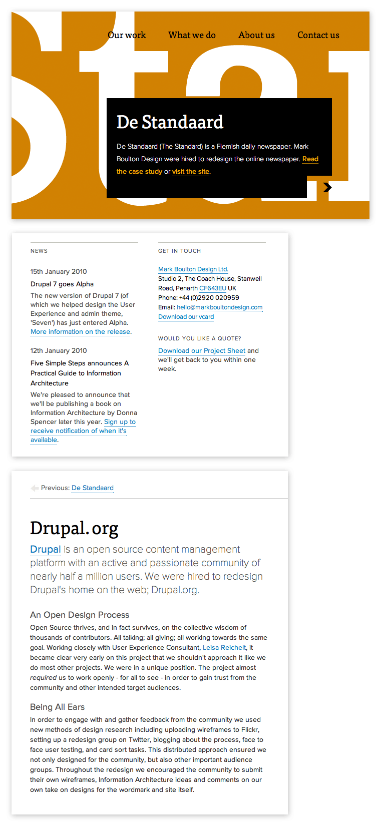
Naturally, advanced web designers immediately began to produce websites, one after another, that in all their glory use the opportunities that have just appeared. A striking example of this is the site of the British studio Mark Boulton Design. I took a couple of screenshots of the website of this studio so that you can see for yourself how cool non-system fonts on web pages can look.
All this beautifully finished text can be selected, copied, quickly replaced and it is perfectly indexed by search engines. Just a year ago, we could only dream about it, using flash and pictures for custom (unsystematic) fonts, which in its essence is equivalent to using a prosthesis instead of a normal leg. Isn't it wonderful that now all this is finally behind? Isn't it wonderful that now we can finally enjoy the wonderful, diverse web typography? No guys, the end of the torment is not yet near.
This studio from Wales, like many other designers, including myself, works on Macs. When they open a browser on their computers and look at their website they really see beautiful typography. The problem is that Windows users, who still make up more than 90% of all Internet users, see everything differently.

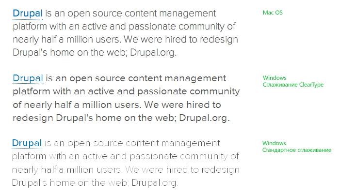
As you can see from these screenshots, the display of non-standard fonts in Windows varies from tolerable to ugly, depending on the font pattern, its size and the type of smoothing. On a Mac, the font everywhere looks equally good. This is because Apple and Microsoft use different font smoothing algorithms.
Now that we can use any font on a web page with HTML 5, this is no use, because these fonts look awful on the screens of users (Windows users). I think it would be superfluous to say that a design that essentially ignores 90% of users is a bad design, no matter how beautiful it is for the remaining 10 (according to the most optimistic estimates).
From all of the above, it becomes obvious that if we want to use non-standard fonts, but still make high-quality sites, there are only three ways:
UPD
There is a significant technical error in the title and text of the post. The fact that non-systemic fonts are now supported by new browsers (except Internet Explorer, which has supported this feature since 1997) simultaneously with HTML 5 does not mean that HTML 5 has anything to do with it. The function of displaying non-system fonts is implemented through CSS.
Naturally, advanced web designers immediately began to produce websites, one after another, that in all their glory use the opportunities that have just appeared. A striking example of this is the site of the British studio Mark Boulton Design. I took a couple of screenshots of the website of this studio so that you can see for yourself how cool non-system fonts on web pages can look.
All this beautifully finished text can be selected, copied, quickly replaced and it is perfectly indexed by search engines. Just a year ago, we could only dream about it, using flash and pictures for custom (unsystematic) fonts, which in its essence is equivalent to using a prosthesis instead of a normal leg. Isn't it wonderful that now all this is finally behind? Isn't it wonderful that now we can finally enjoy the wonderful, diverse web typography? No guys, the end of the torment is not yet near.
And that's why
This studio from Wales, like many other designers, including myself, works on Macs. When they open a browser on their computers and look at their website they really see beautiful typography. The problem is that Windows users, who still make up more than 90% of all Internet users, see everything differently.
As you can see from these screenshots, the display of non-standard fonts in Windows varies from tolerable to ugly, depending on the font pattern, its size and the type of smoothing. On a Mac, the font everywhere looks equally good. This is because Apple and Microsoft use different font smoothing algorithms.
Historical background
If we simplify the ideological difference in the rendering of fonts, then Apple focuses on the font pattern, while Microsoft focuses on the pixel grid. Microsoft's approach allows you to increase the clarity of the font display in small pins, although for this you have to develop special screen fonts. Their development is a much more time-consuming process than the development of ordinary fonts, however, MS decided that it was worth it and created special multilingual headsets that are delivered with the company's software products. We all know them very well - after all, these are the very standard fonts that we use in web design.
10 years ago when ClearType rendering technology was being developed, all this seemed logical and relevant. However, the test of time showed the short-sightedness of Microsoft's approach. With the increase in screen resolution, there was a need to display large pins, and ClearType copes with this task very badly - the font pattern deteriorates and crushes. In addition, the initially not entirely adequate idea to develop a font for display technology, and not vice versa, showed its failure. During the entire existence of ClearType technology, so few special fonts have been developed that they account for exactly one font per year.
Now that we can use any font on a web page with HTML 5, this is no use, because these fonts look awful on the screens of users (Windows users). I think it would be superfluous to say that a design that essentially ignores 90% of users is a bad design, no matter how beautiful it is for the remaining 10 (according to the most optimistic estimates).
Thus
From all of the above, it becomes obvious that if we want to use non-standard fonts, but still make high-quality sites, there are only three ways:
- All the same, use only fonts optimized for ClearType technology. As a rule, any font with high-quality hinting should be more or less well displayed. To find out whether the font is optimized or not, there is only one way - to check.
- Wait. At the prestigious conference of typographers and type designers ATypI'09, many font designers were very encouraged by the possibilities opening up with HTML 5. At the same time, they fully understand how miserable ordinary fonts look in the browsers of most users and plan to develop many new fonts, especially for the screen. We will use these new fonts .
- Wait even more. A Microsoft spokesperson, Simon Daniels, attended the same conference. According to him, the main problem of using non-standard fonts is precisely the problem of rendering. It’s good that MS understands this and it is possible that in new versions of Windows fonts will already be displayed as well as on Mac OS. But you have to wait a really long time.
UPD
There is a significant technical error in the title and text of the post. The fact that non-systemic fonts are now supported by new browsers (except Internet Explorer, which has supported this feature since 1997) simultaneously with HTML 5 does not mean that HTML 5 has anything to do with it. The function of displaying non-system fonts is implemented through CSS.