Windows Phone 7 Interface: Microsoft Beats Apple
- Transfer

Cupertino, you certainly excuse me, but Microsoft outplayed you. Windows Phone 7 looks like an iPhone from the future. The user interface (UI) is as simple and elegant as Apple's iron design, while the iPhone interface resembles just the decorated Palm Pilot ( picture Palm 3 ).
This does not mean that user experience will be better than with Apple products. Because The two concepts of the interface, information-oriented and function-oriented, are very different from each other. And each of them is very different from what the user had previously dealt with.
With the iPhone, Apple laid down an incredibly simple interface that suits people of all ages and directs their actions in the right direction: "This is a device that adapts to a variety of functions and gives me access to the information I need, depending on which icon I clicked on."
This simple idea is an incredible success. Therefore, Apple relies on this model not only for mobile phones, but also in general for the future of computing. And for the same reason, Androids, Palms, and Blackberrie follow this.
From scratch
Microsoft has a completely different approach. Instead of creating another “similar” mobile phone like Android and co, the Windows Phone 7 team came up with their vision of what a mobile phone could be. During the development process, they created a beautiful interface in which information orientation is the determining factor for user interaction. Not applications with specific functions, but with information in itself. In fact - information is the interface.
In the final form, the information is divided into areas called “centers” (hubs) that are focused on the user's tasks. Available through live tiles from the home screen, “I” (user profile), “people” (contacts), “pictures and videos” (media), “music”, “games”, as well as always available search, through a panoramic stream of perception, hubs literally weave a lot of data sources, both local and from the “cloud” (the Internet).
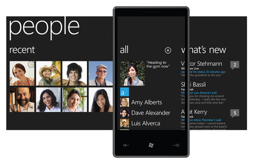
Instead: go to the phone book to select a number and call a person, open another application to read his twitter, and open another application to read his updates from VKontakte, and another application to read his mail, and one more, to view photos with it, the “People” hub (contacts) of Windows Phone provides us with a seamless view of all this in a very simple and logical way. In functionally oriented interface models, like on the iPhone, when the user thinks “I want to call”, he puts the device into call mode by launching the desired application, selects the contact and calls. When the user thinks, “What's new with Vanya Petrov?” He puts the phone in the “mode” of the VKontakte client, twitter, mail, etc.
Microsoft, on the other hand, organized “centers” (hubs) in the form of screens, stitched with grouped information columns in the form of a single panoramic screen landscape, which, although larger than the phone’s screen, can be scrolled with your fingers. And complementing all this with a minimalistic aesthetic interface with a seemingly inviting elegant, not overloaded animation - they do the job just fine.

What about other apps?
Instinctively, I like Microsoft's approach to organizing the core of our digital life: people + social services + multimedia + communications - everything is divided into centers (hubs). I like this more than Apple’s approach - “this is a phone, this is a mail client, this is a browser, this is iPod”. It is less rigid than the model in the iPhone or Andoroid, offers a more convenient perception, invites you to explore and offers information from different points of view in a faster and clearer way. It looks more humane, and this is exactly what Apple and their followers care about.
Does this mean that a function-oriented model is worse? As I said earlier, not a fact. Especially because information-oriented panoramas are not suitable for every simple task that users of the same iPhone expect. And when I say, every simple task - I mean hordes of programs populating the Apple app store. Microsoft, of course, can do whatever it pleases with the hubs, but if their new devices are without an app store, they will again lose in the competition with Apple.
Fortunately for Microsoft, the Windows Phone model is not only information-oriented, but also functionally-oriented. According to Joe Belfiore, gran jefe of the Windows Phone department at Microsoft, applications will not necessarily integrate into any hub or panorama interface. When the developer tools come out next month, this will contribute to the emergence of applications that already exist today on the iPhone. In other words, Microsoft understands that one approach (interface building models) is no less important than another.
They hope that the hubs will be better, more wonderful, and will be in a more intuitive way to provide and contribute to our digital life, which is what most consumers actually want. Looking at what they showed today, I think they are on the right track. But, as with Zune HD, it's probably a bit late.
=================================================== ============
From me :) The
translation is certainly not the best, but I tried very hard :-) If something goes wrong, I ask you to be indulgent, because I am translating it for the first time for the hub.
And my thoughts on the new platform
To get started, watch this video:
In this video, I recognize my iPhone. Of course, the integration of social programs into the phone is not Microsoft know-how, we only saw Palm very similar in WebOS, the rest of the attempts in the form of widgets on the homescreen were not very impressive. Anyway, me.
But imagine, here is a hub for Office:

Now imagine a hub from Yandex or Google. Of course, for these companies it’s better to integrate into the “factory” hubs, but now, what if not a small part of your life is football, or cars, or it? And imagine that if you can install a hub from Sport Express, or from the magazine Behind the Wheel, or a hub hub on your device? :-) It seems to me not a bad idea.
I do not say that it will be possible to create your own hubs, but IMHO, that would be very cool :-)
As for multitasking
On the same Gizmodo there is an article "Windows Phone 7 Applications: What We Know and What Not . " Its main leitmotif - everything will be known on MIX2010 , there will be 12 sessions devoted to application development. And we get all the answers there. But there is some encouraging information.
For third-party applications, we will explain more details on MIX, but we have several options to deliver the necessary information to the user when the application is not running. As an example - "live tiles" on the homescreen, or "data streams" in the hubs, as another example.This was said by Joe Belfiore in an interview with a journalist.
What can I say - yes, this is not familiar. This is some kind of partial rejection of the existing paradigm. People who have tried the iPad write: Gentlemen, photos and words - they cost nothing, you need to touch the device with your hands.
Maybe the Windows Phone 7 series platform is the same? We will wait for real devices to evaluate a new philosophy.
Link to the original, as Habra parser did not miss "+" - gizmodo.com/5472010/windows-phone-7-interface-microsoft-has-out+appled-apple