We make the site of our company
A year ago, stervec and I decided to change jobs. One October evening, we met in the kitchen of a nine-story building and started raising our new brainchild (the old , by the way, did not die, but just sleeps).
They called it “Nine mornings”, and decided to do Internet projects and create websites for cool companies in our region (at first they didn’t do cool ones).
Oh, what we had to go through and how many discoveries to make - shame and shame, but this is a separate story. Today we want to tell you what was our main mistake.
It turned out that doingsomething for yourself is the most difficult. It is still possible to demand a decision from yourself, but the stervec idealist was not easy to come to terms with imperfections , and I didn’t like everything to the last. We were so keen on business processes and customer projects that we could not launch our site for a whole year. It’s like you think the site of some studio is there, but FIG :-)
There was a beta version, which we put off putting into public for about 8 months, but without launching it, we redesigned it quickly and (bang-bang, the task was set - start up as soon as possible) rolled out on www.9utra.ru .
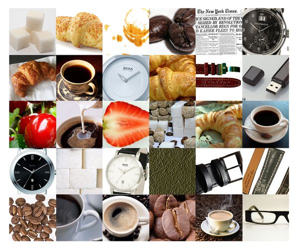
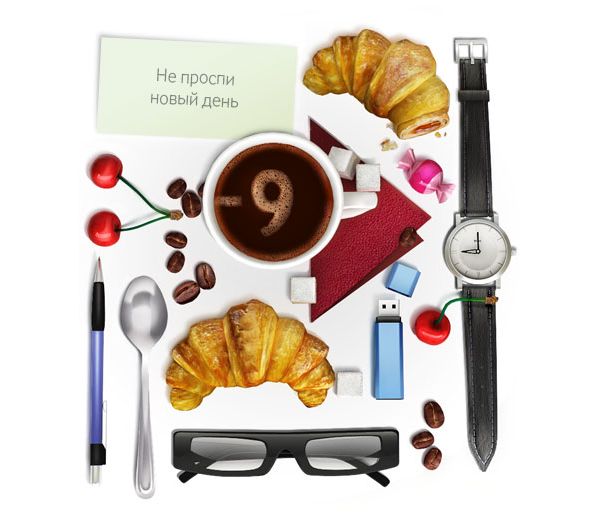
What do we want? They seemed to immediately agree with the goals that they needed a simple, but functional website that would be attractive and impressive for visitors. Feelings of light but bold design with a bright accent, which suggested a cheerful illustration for the design center. Decided hand on hand. In the illustration, we display the name “Nine mornings” - the beginning of the day, morning, freshness, novelty, breakfast, newspaper, first cup of coffee, and so on in an associative series. For a better understanding of the topic, references were first collected, on the basis of which the style and content of the illustration were selected:
Then they decided to put everything together, throwing away the excess.
The first illustration hung on the beta version, which never saw the light of day: The
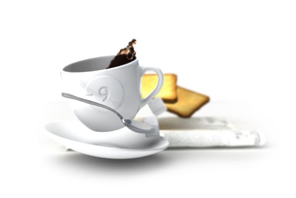
second version was already drawn for the new version of the site:
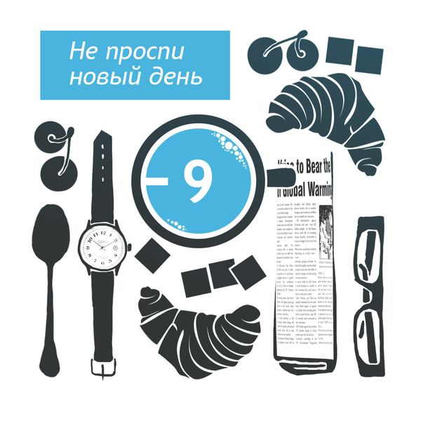
But I wantedsomething more vivid and lively, they spat and painted in 3D:
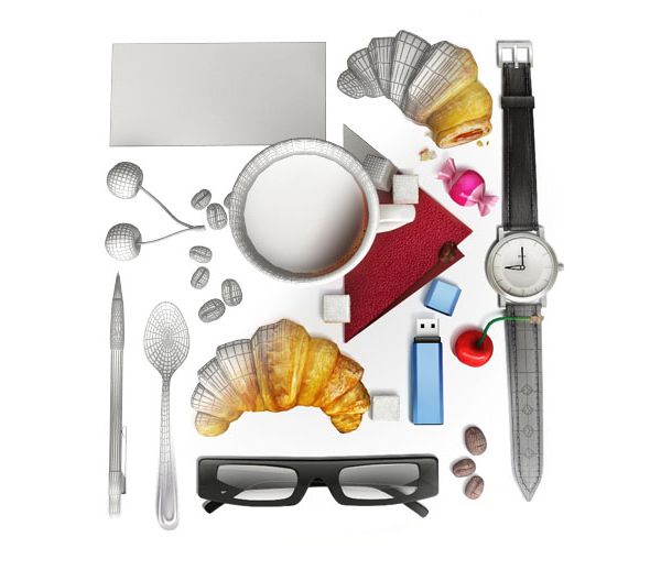
But in the end we stopped at this:
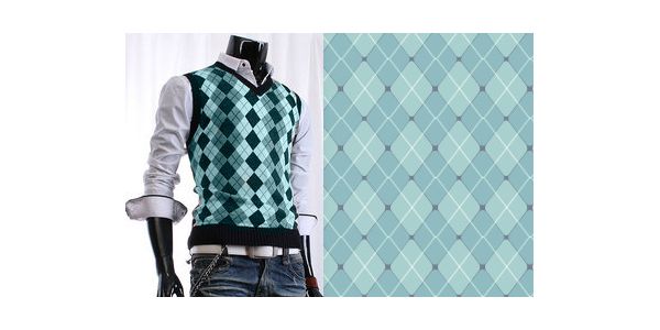
And so that on widescreen monitors a fixed-width site would not fall into the abyss, we needed a pattern. We took it from a man’s waistcoat :-)
Our plans included making fun and not boring, because work is primarily a pleasure for us, and only then reanimation of the Udmurt Internet space ;-)
You can see what happened in the end on the studio website , and here we will be glad to any comments.
UPD : We solve the problem with the Habra effect. We are offended at the Majordomo.
They called it “Nine mornings”, and decided to do Internet projects and create websites for cool companies in our region (at first they didn’t do cool ones).
Oh, what we had to go through and how many discoveries to make - shame and shame, but this is a separate story. Today we want to tell you what was our main mistake.
Main mistake
It turned out that doing
There was a beta version, which we put off putting into public for about 8 months, but without launching it, we redesigned it quickly and (bang-bang, the task was set - start up as soon as possible) rolled out on www.9utra.ru .
About design
What do we want? They seemed to immediately agree with the goals that they needed a simple, but functional website that would be attractive and impressive for visitors. Feelings of light but bold design with a bright accent, which suggested a cheerful illustration for the design center. Decided hand on hand. In the illustration, we display the name “Nine mornings” - the beginning of the day, morning, freshness, novelty, breakfast, newspaper, first cup of coffee, and so on in an associative series. For a better understanding of the topic, references were first collected, on the basis of which the style and content of the illustration were selected:

Then they decided to put everything together, throwing away the excess.
The first illustration hung on the beta version, which never saw the light of day: The

second version was already drawn for the new version of the site:

But I wanted

But in the end we stopped at this:

And so that on widescreen monitors a fixed-width site would not fall into the abyss, we needed a pattern. We took it from a man’s waistcoat :-)

Our plans included making fun and not boring, because work is primarily a pleasure for us, and only then reanimation of the Udmurt Internet space ;-)
You can see what happened in the end on the studio website , and here we will be glad to any comments.
UPD : We solve the problem with the Habra effect. We are offended at the Majordomo.
